3 Colors Interior Designers Love to Use in a Period Kitchen — They're Shades That "Feel Historically Rooted and Material-Driven,” They Tell Me
Decorating a period kitchen requires a careful balancing act, of which color plays a key role; these are the three shades interior designers say work best for these spaces

The Livingetc newsletters are your inside source for what’s shaping interiors now - and what’s next. Discover trend forecasts, smart style ideas, and curated shopping inspiration that brings design to life. Subscribe today and stay ahead of the curve.
You are now subscribed
Your newsletter sign-up was successful
We've got some good news — old is officially in; at least, it is for kitchens, but in the right context. We're not saying your decade-old fridge is suddenly the height of chic (keep dreaming), we're talking about period homes with traditional kitchens — think high ceilings, original features, and big, range ovens. As gorgeous as they are, though, they're not always the easiest to pull off, and color is certainly a key factor.
Your typical list of the best kitchen colors may not necessarily apply in these circumstances. Here, the focus is on authenticity and elegance; anything too modern or 'on-trend' and you run the risk of your period kitchen looking disjointed and awkward.
Picking the right color is a delicate balancing act, and we're on the hunt for timeless perfection. This is something our favorite interior designers already know a thing or two about, so I turned to them for advice, and their list of the best colors for a period kitchen did not disappoint.
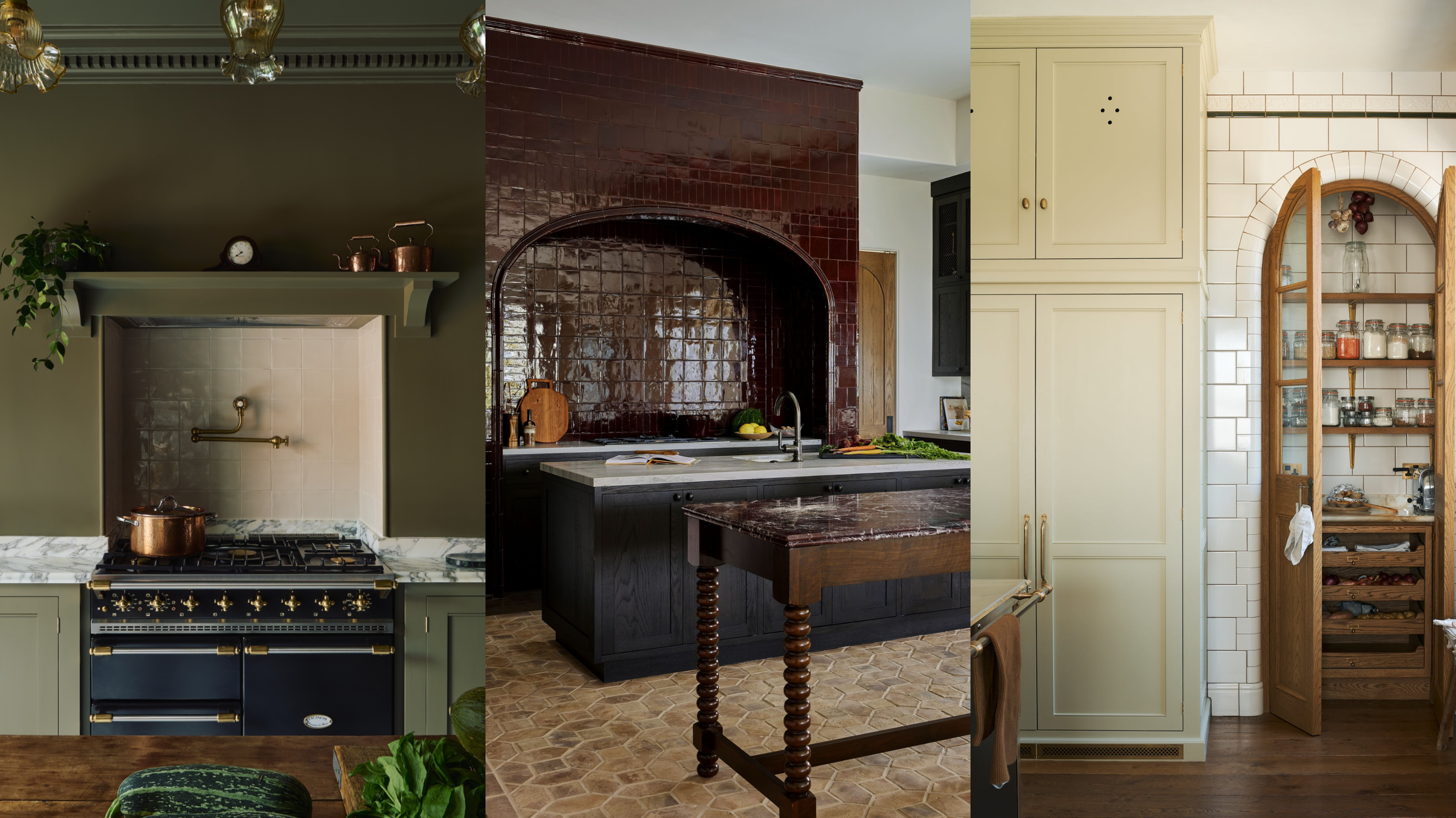
Article continues below1. Timeless Shades of White
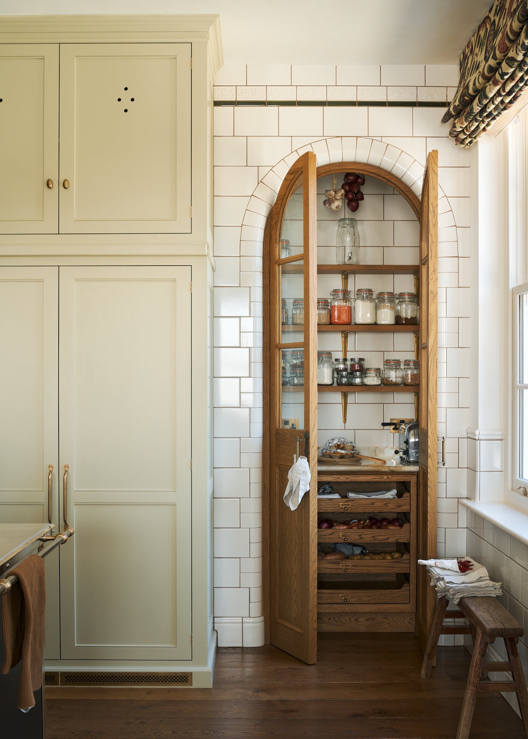
Pair off-white, creamy cabinetry with darker wooden features for a balanced, rich look.
You may hear 'white kitchen' and think of those not-so-aesthetic, spaceship-like designs of the 2010s — don't worry, that isn't what we're talking about here. Remove any images of bright, stark tones and replace them with the softer, more muted side of things. Buttery, creamy, milky tones — basically, any color that could describe a dairy product should be along the right lines.
When you're designing a period home, your color palette should feel cohesive with the original features in your property, which is exactly why this color family makes such a natural fit. "Soft off-whites and stone tones echo traditional limewash and plaster finishes, making them particularly suited to Georgian and Victorian homes," says Katerina Tchevytchalova, director at K’Arte Design.
Natural materials and textures are key traditional kitchen features, so finding paint colors that echo this sense of materiality will help to create a finish that feels appropriate to a period kitchen.
"Soft whites and warm cream tones are timeless choices for period kitchens, drawing from the historically accurate chalky finishes once used in heritage homes," says Esra Kumbasar, senior design director at Accouter.
The Livingetc newsletters are your inside source for what’s shaping interiors now - and what’s next. Discover trend forecasts, smart style ideas, and curated shopping inspiration that brings design to life. Subscribe today and stay ahead of the curve.
One of the most significant issues people find with older kitchens is the lack of natural light, a problem that this color palette is particularly well-suited to alleviating. "These lighter shades are particularly well suited to older properties, helping to lift and brighten more enclosed or shadowed spaces," Esra explains.
Soft, butter yellows, and muted, creamy off-white shades feel welcoming and bright, with an unpretentious warmth that makes them effortlessly timeless. Plus, they make the rest of the design process easy, working beautifully alongside almost any material.
If you're going for a more classic look, prioritize natural materials and aged finishes. "We often pair them with natural stones such as limestone or marble, complemented by unlacquered, aged brassware. For flooring, nothing captures the character of a period home quite like traditional stone or oak timber," says Esra.
White doesn't have to mean boring or sterile, either, especially when you move away from true whites and instead shift to warmer, off-white tones. We expect to see this shift popping up more and more this year — as deVOL's Helen Parker says, "It’s the gentle, undramatic colors that are becoming more popular; no more bold statements, back to good old-fashioned creams."
K’Arte Design is a luxury interior design studio and art consultancy founded by Katerina Tchevytchalova. Based in West London with an additional presence in Cyprus, the studio delivers refined, globally inspired interiors for discerning clients worldwide. With over 14 years of experience in the luxury interiors industry — including working for world-renowned design companies prior to setting up K’Arte Design — Katerina brings a distinctive balance of creativity and precision to every project.

One of Farrow & Ball's most iconic shades, School House White is the perfect, off-white neutral paint color. It's a timeless classic that has stood the test of time.

Butter yellow may have been the color of the summer, but we love it year-round, and this muted version would be a gorgeous kitchen cabinet color for a period kitchen.
2. Deep, Warm Browns
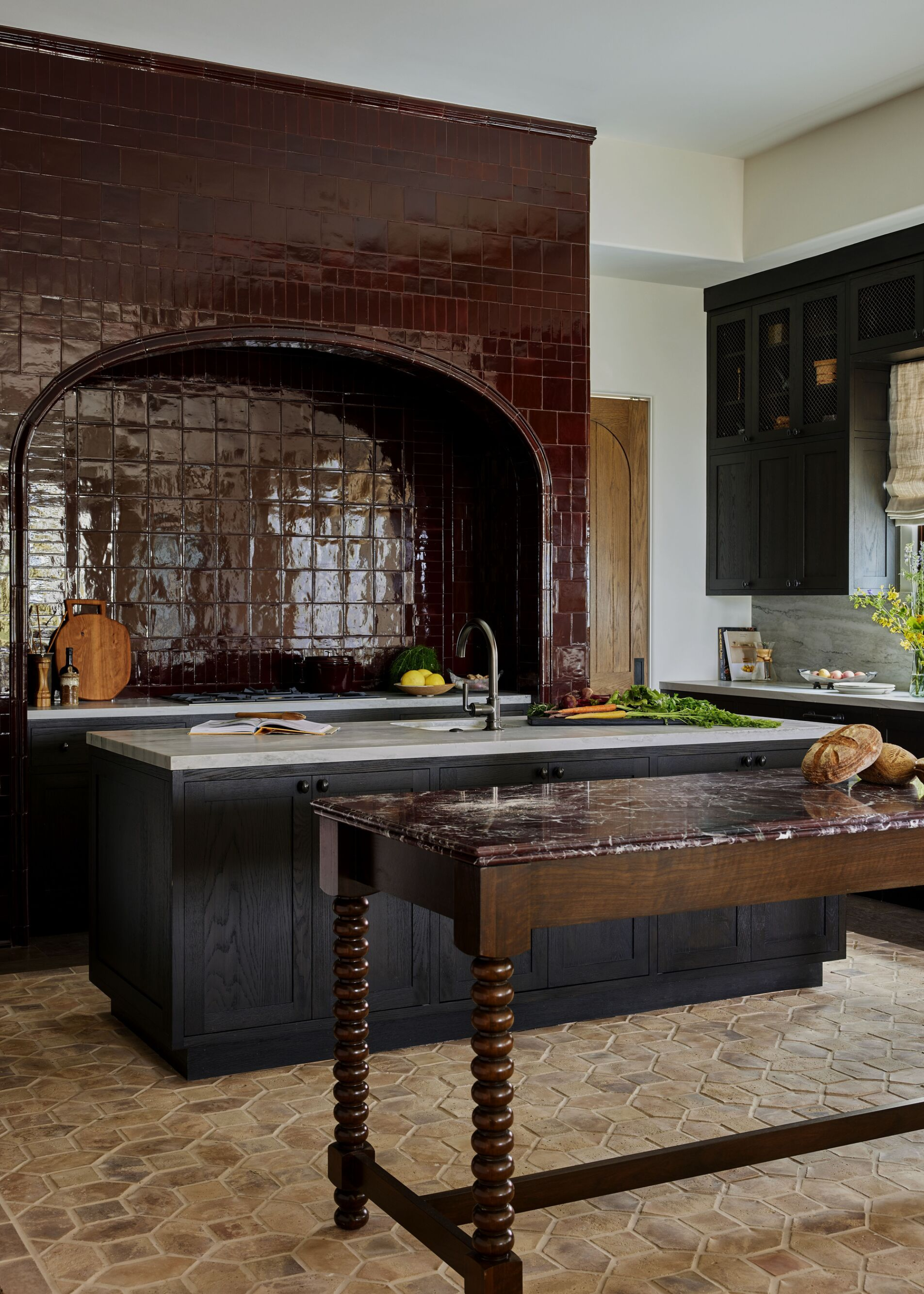
Dark brown tiling can create a particularly striking effect, especially with a glossy, zellige tile, as seen in this kitchen.
If one color has captured the attention of design lovers, in interiors and fashion alike, it's that rich, chocolate brown tone. Over the past year, we've all become obsessed with decorating with brown, relishing in the sumptuous richness it brings into our home, and that appeal translates beautifully in the kitchen.
For Taylor Leigh, at House of Rolison, decorating a period home is all about balance — finding colors that emphasize the home's history, without becoming a caricature. "For period kitchens, we gravitate toward colors that feel historically rooted and material-driven. Deep Reddish Brown is a favorite for this," says Taylor. "It reads as a rich, wine-stained brown rather than a true red, which gives it depth and warmth without feeling decorative or theatrical."
The atmospheric moodiness of this popular Farrow & Ball paint color brings out the natural drama of a historical property, complementing any original architectural features while bringing a modern warmth to the home.
"Period kitchens often benefit from a higher level of architectural detail and, frequently, generous ceiling heights, which allow them to comfortably carry darker, more atmospheric palettes," says Hannah Stannard from Cor Domi.
Higher ceilings and more imposing architecture mean you don't have to worry about dark colors making your space feel smaller; to the contrary, the coziness and intimacy a deep brown can create can actually help make these spaces feel more welcoming. As well as on the walls, this color can work beautifully on your kitchen cabinets. "Using deeper colors on full-height cupboards can emphasize verticality, creating a sense of grandeur rather than heaviness," suggests Hannah.
If you're nervous that your space might appear dark and feel heavy, though, this can easily be remedied with careful styling. "Darker palettes are best balanced with natural materials that soften the overall scheme," suggests Hannah. "Marble works especially well, introducing light and subtle movement, while lighter contrasting paint colors or veneered finishes can add depth and texture."
Rich browns also make for a beautiful backdrop to experiment with some of the latest hardware trends, though Taylor does say that "This color works best alongside materials with age and patina." So antiqued brass and aged bronze finishes could work particularly nicely in this setting.

With the esteemed honor of being named Graham and Brown's color of the year 2025, Elderton has all the hype it deserves. It's a soft, muted brown inspired by the leaves of the Elder Tree, and would look beautiful drenching your kitchen in warmth.
3. Nature's Green Tones
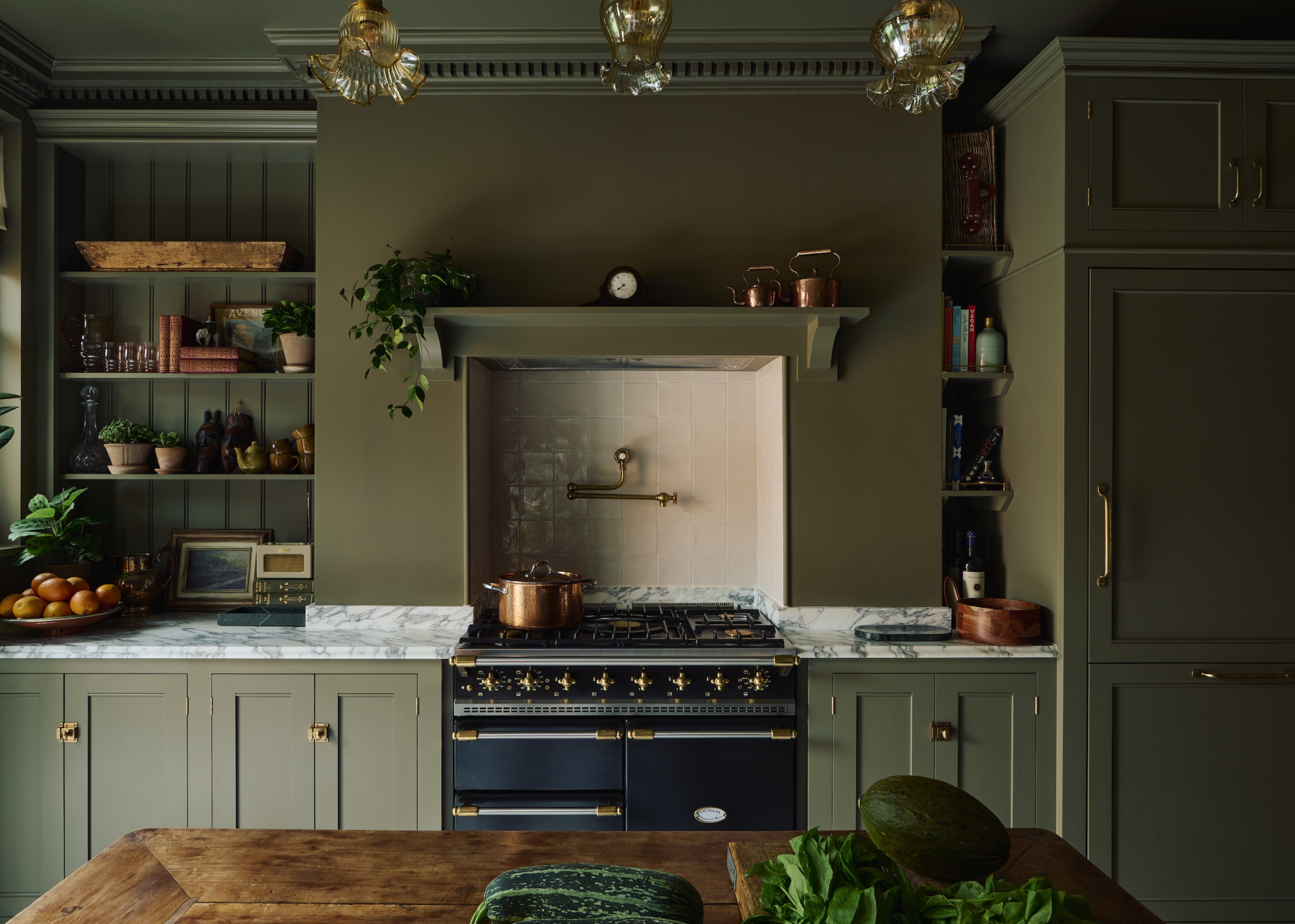
Olive green kitchen cabinets also work beautifully when the color is used across the ceilings and walls, too, for a full color-drenched design.
It's no secret that designers love muted, earthy color palettes, and it just so happens that these tones are perfectly suited to period kitchens.
As Lindsey Colhoun of Lindsey Colhoun Design explains, "The most successful period kitchens lean into colors that feel timeless rather than nostalgic. Muted earth tones, softened neutrals, and nature-inspired shades such as warm stone, olive, clay, and smoky off-white work beautifully."
Drawing from nature is a sure-fire way to find timeless beauty — muted greens and warm neutrals may look trendy in modern kitchens, but they also read as natural elements in a more traditional design. This duality of trendiness and timelessness is exactly what works so well in period kitchens.
Plus, it's hard for natural colors to look overpowering, but they still manage to make an impact. As The Brownstone Boys say, "These softer, more nuanced shades complement original architectural details like moldings, plaster walls, and woodwork without overpowering them. They allow the bones of the space to shine while still feeling fresh and livable for modern use."
Historically, paints and pigments were created using natural ingredients, meaning these nature-inspired tones are inherently reminiscent of what you would have found in period homes, making for a more authentic finish. "They create continuity with the home’s original character while offering a sense of restraint and modernity," says Lindsey.
To further this sense of authenticity in your design, try to highlight natural materials and classic finishes. "These tones pair beautifully with classic materials such as marble, soapstone, and butcher block, as well as aged or unlacquered metals," The Brownstone Boys suggest.
"We also love how they interact with original wood floors, vintage hardware, and handmade tile — materials that reinforce the authenticity and timelessness of a period home."
Lindsey Colhoun is a native of Los Angeles and was exposed to architecture at birth as she was brought home from Cedars Sinai to a Frank Gehry home. Her mom is an accomplished interior designer, and her father, a successful comedic television producer. Lindsey grew up where your home is your sanctuary, a place to entertain, laugh and gather.
The backbone of a period kitchen, before you can even begin to explore your color palette, is the original architecture of the room. But, if modern renovations have removed any of this charm, don't give up — our guide on how to unupdate an ugly modern kitchen in a period home is here to save you.

Maya Glantz is a Design Writer at Livingetc, covering all things bathrooms and kitchens. Her background in Art History informed her love of the aesthetic world, and she believes in the importance of finding beauty in the everyday. She recently graduated from City University with a Masters Degree in Magazine Journalism, during which she gained experience writing for various publications, including the Evening Standard. A lover of mid-century style, she can be found endlessly adding to her dream home Pinterest board.


