5 Colors You Should Never, Ever Paint Your Kitchen — And the Ways Interior Designers 'Solve' Troublesome Shades
When it comes to the colors you should never use in the kitchen, the experts had some pretty strong opinions — and some of them might surprise you

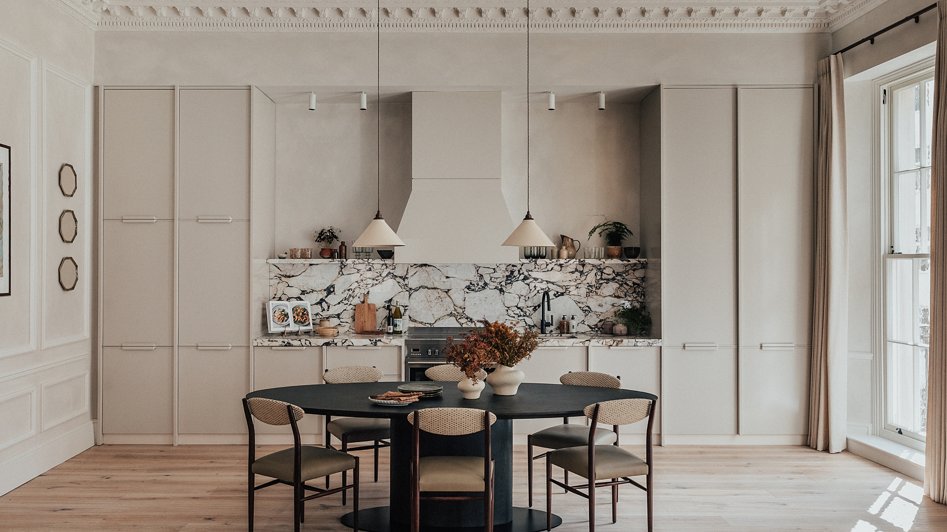
If you're preparing for a kitchen renovation, knowing which colors to lean into and which to avoid can be the easiest way to begin. It's no secret that colors come in and out of trend — take the recent butter-yellow obsession, or the current hatred of the once-popular bright-white kitchen, as examples.
And while buying into a trend can be perfectly fine when choosing a winter knit, or even changing up your hair color, when it comes to your kitchen color, it's best to stick with the classics. There's no point investing in a brand new kitchen only to find out that it's completely outdated one year on.
So, to prevent any of us from making rookie mistakes, I turned to the experts to ask for their thoughts on all the colors we should absolutely never, under any circumstances, use to paint our kitchens, as well as all the timeless alternatives they've been loving. And while their opinions varied on which colors to avoid, they were pretty unanimous on what they love — and I have a feeling you're going to love them just as much as they do.
Article continues below1. Bright White
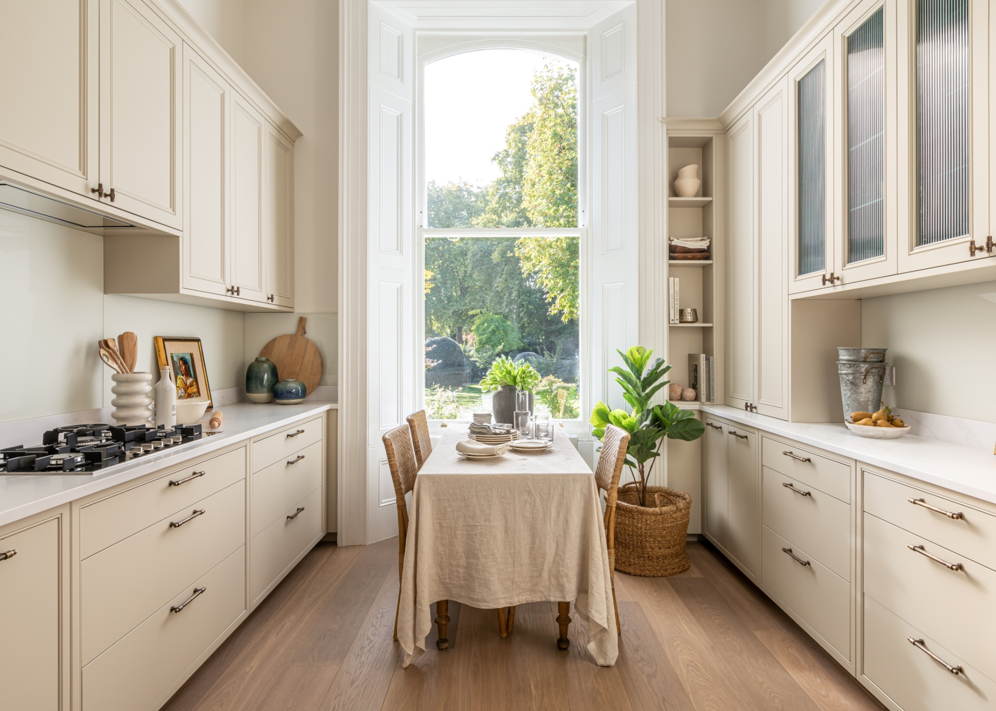
DO INSTEAD: "I would opt for warm greige or chalky stone tones that add depth while keeping the space light," says Katerina Tchevytchalova.
Perhaps the most divisive kitchen color of them all — love it or hate it, everyone seems to have something to say about an all-white kitchen, and more often than not, it's not the most positive.
There's an obvious appeal with this shade, with its crisp, clean connotations, but it can often end up looking more sterile than anything else. "White kitchens continue to appeal because people associate white with openness and creating a bright space, but designers are often cautious about specifying a single, stark white across cabinetry, walls, ceilings, and worktops with no tonal variation," says Richard Davonport, managing director at Davonport.
Combine this stark, one-note color palette with harsh, artificial kitchen lighting, and you'll end up with a kitchen that more closely resembles a doctor's waiting room than the heart of a home.
This combination is often the reason why white kitchens look so harsh, as Richard explains, "In British homes, natural light is generally softer and more variable, and when that is combined with warm artificial lighting, pure white surfaces can shift noticeably, taking on cooler gray or blue casts by day and warmer tones by evening. Over time, this can leave the space feeling flatter and more clinical than homeowners expect."
The Livingetc newsletters are your inside source for what’s shaping interiors now - and what’s next. Discover trend forecasts, smart style ideas, and curated shopping inspiration that brings design to life. Subscribe today and stay ahead of the curve.
Katerina Tchevytchalova, founder of K’Arte Design, agrees, explaining: "The color that I would avoid is probably pure white in a gloss finish as it can feel clinical, especially in electric lighting." It's also, she notes, a particularly unforgiving finish, and will quickly show signs of wear and tear.
This, however, doesn't mean white has to be avoided entirely; it's just about doing it in the right way. "For kitchens designed to be lived in day after day, the goal is a space that feels balanced and comfortable under changing light and over many years of use," says Richard. Opting for a softer, off-white tone and combining it with warmer, natural materials is an easy way to maintain that sense of brightness, without it feeling clinical.
K’Arte Design is a luxury interior design studio and art consultancy founded by Katerina Tchevytchalova. Based in West London with an additional presence in Cyprus, the studio delivers refined, globally inspired interiors for discerning clients worldwide. With over 14 years of experience in the luxury interiors industry — including working for world-renowned design companies prior to setting up K’Arte Design — Katerina brings a distinctive balance of creativity and precision to every project.
2. Any Saturated Statements
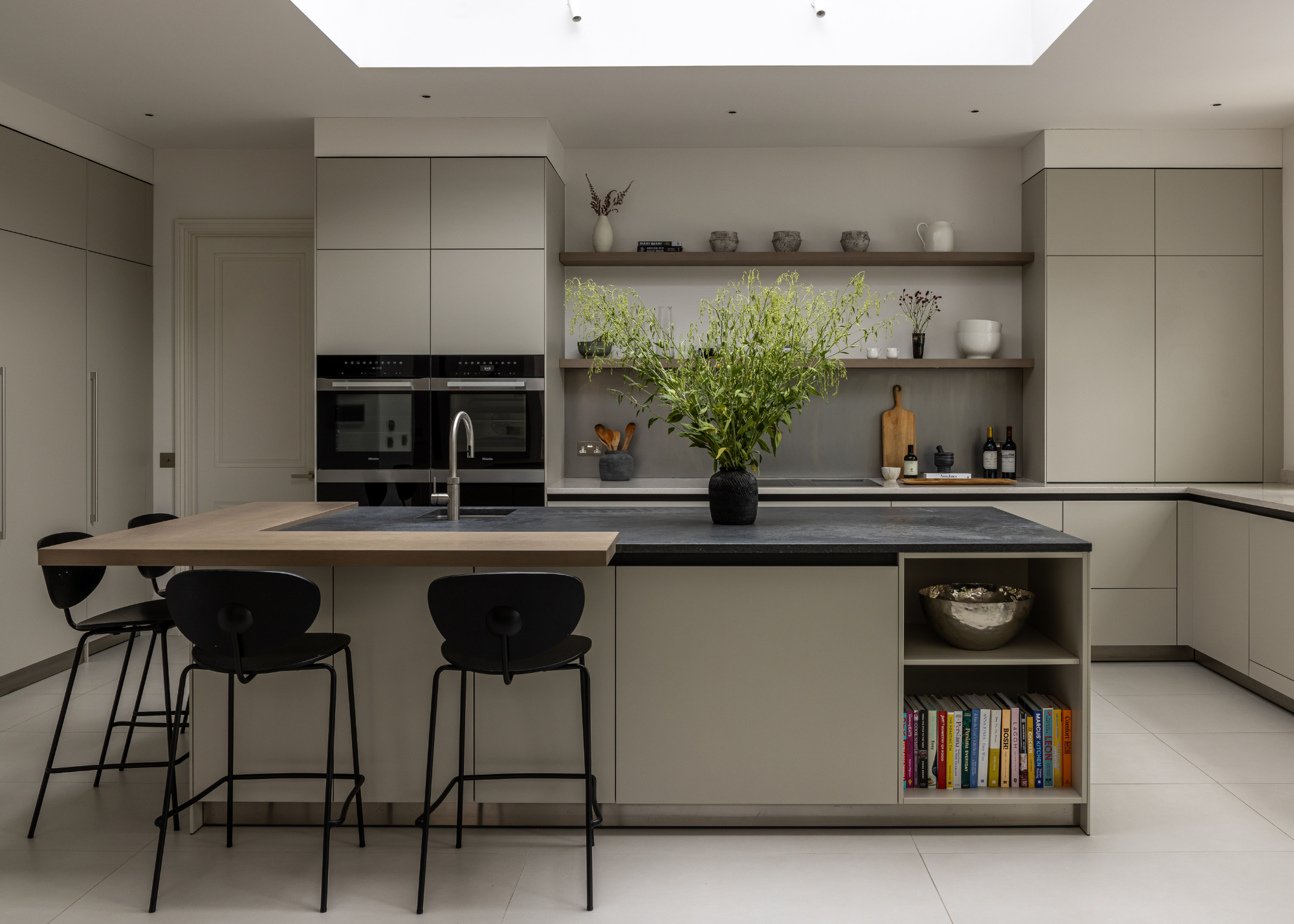
DO INSTEAD: "Opt for colors that offer a sense of calm and cohesion. I love using warm neutrals, think stone, oatmeal, or plaster pinks. They feel inviting rather than clinical," says Lara Clarke.
It seems people are becoming increasingly comfortable decorating with color, and bright, statement-making shades have been sneaking into our homes with more frequency than ever before. But, as much as we love this dopamine decor-led trend, your kitchen may not be the best place to experiment with it.
The issue with these shades is exactly that: they are a trend, and there's no knowing whether it will hold up in future years. And while this is fine for your wardrobe and even smaller home accessories, it's too big a risk to take in the kitchen.
"When designing kitchens with longevity in mind, I always advise avoiding colors with high saturation," agrees interior designer Lara Clarke. "Highly pigmented shades like turquoises, deep purples, or candy colors tend to have a jarring effect in a space as functional as a kitchen."
As much as these shades may spark joy, they are more liable to fall out of favor, especially when compared to the more classic shades you'll find in a kitchen that exudes timeless style.
These colors can become overwhelming, and in a space like the kitchen, where you'll likely spend a lot of time and money, it can be smart to play it slightly safer. "A kitchen renovation is a significant investment, so we want to choose paint colors that transcend fleeting trends," says Lara, "Saturated colors can feel jarring and disconnected from the rest of the home, whereas more muted tones allow the cabinetry and finishes to shine."
HOLTE's co-founder, Fiona Ginnett, agrees: "I’d err on the side of caution with high-energy shades like vivid reds, lime greens, or strong purples as these could feel abrasive over time in a room you spend so much of the day in."
The kitchen is the heart of the home, the center of family life, so creating a space that feels relaxing is key, and these vibrant shades can sometimes have the opposite effect, particularly if not executed properly.
3. Purple
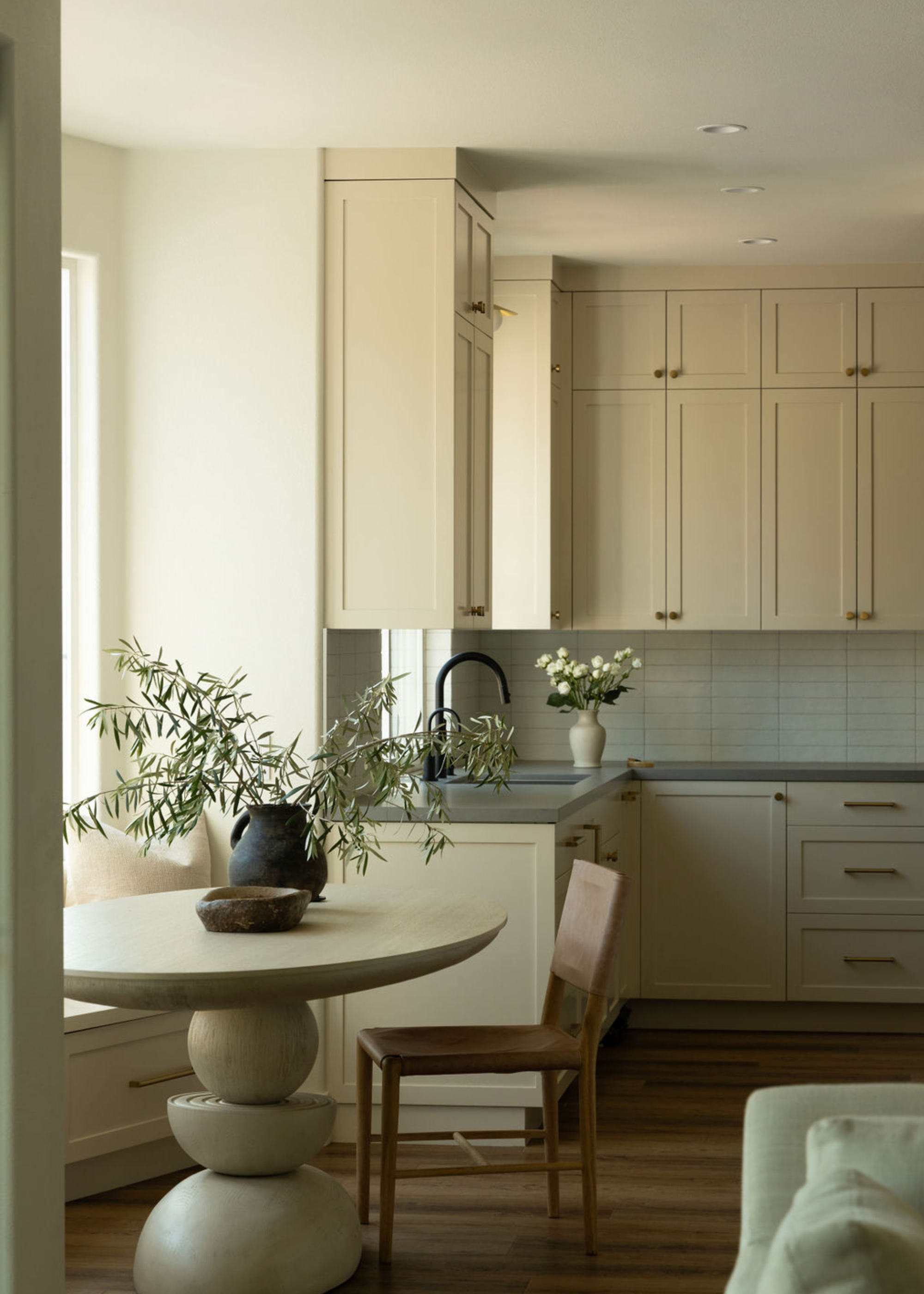
DO INSTEAD: "Instead, I champion the soft off-whites. The core white color speaks of new beginnings and quiet confidence; it resets all of your senses. In a space as naturally hot and hectic as a kitchen, I like the room itself to play the calm observer while the food and conversation provide the drama," says Lindi Reynolds.
"If there is one color I’d never let near a kitchen, it’s purple and every cousin in its extended family: lilac, mauve, magenta," states interior designer Lindi Reynolds.
For many years, people shied away from decorating with purple in their homes, often deemed tacky or outdated. However, more recently, it's had a definite comeback, as seen with the trending of purple sofas, and indeed, purple kitchens, too.
And while this return to the spotlight certainly has its merits (I'm personally a great fan of a rich, purple rug), it's arguably best kept away from the kitchen. "It’s a color steeped in wealth, creativity, and intrigue, which is precisely the problem: it is far too busy commanding your attention to remember you’ve left something burning on the hob," says Lindi.
It's important to consider the core function of your kitchen: a space to cook and eat. And while purple is an inspiring shade to be around, it's not necessarily the most well-suited for this particular space.
Lindi Reynolds & Co is an award-winning architectural interior design studio specialising in luxury residential projects in London, Surrey and beyond. Their primary focus is to create uniquely personal interiors to the highest standards for their clients which reflect their personality and life vision.
4. Cool Grays
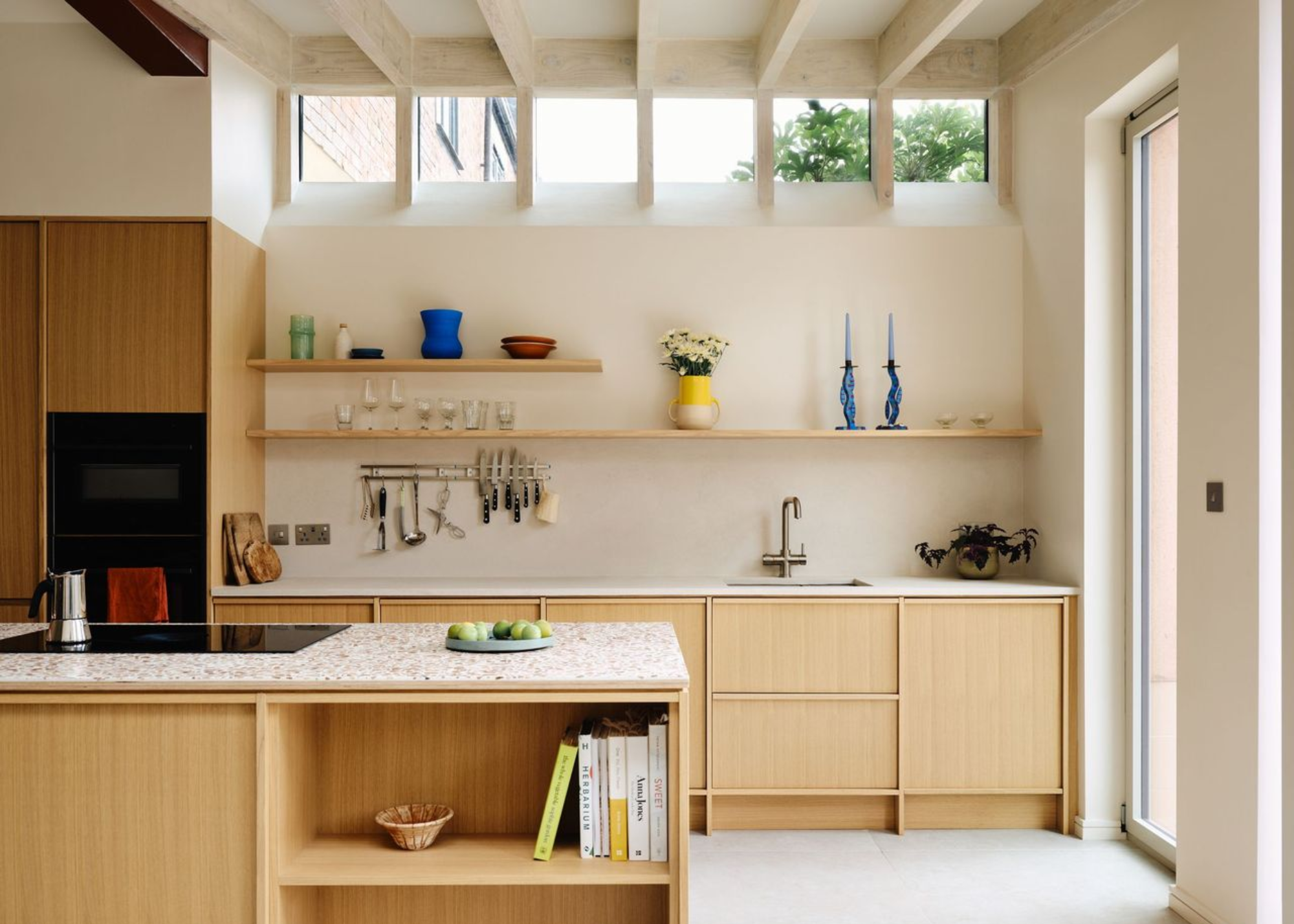
DO INSTEAD: "The best kitchen colors tend to be those with warmth and depth. Soft, warm neutrals and beiges are wonderfully failsafe and timeless, especially when paired with natural materials like wood or stone," says Fiona.
Much of the dislike of all-white kitchens comes down to the feeling of sterility and coldness you can often find within these spaces. Nowadays, trends have shifted towards softer, warmer, earthy color palettes, with overly cold or stark shades being left in the dust — and that's certainly the case with cool gray tones.
"We are seeing clients move away from cool grays and high-contrast black and white in favor of softer, earth-driven tones," notes Lauren Lerner, from Living with Lolo. While these monochromatic shades were once celebrated for their chic simplicity, over time, this minimalist look has become less desirable, and people are now searching for kitchen finishes with more character and texture.
While Fiona notes that no specific color should be avoided altogether, she does add: "I’d generally be cautious with cool grays, which can feel flat or cold in a kitchen." Of course, context is key, and when styled carefully, this color can still look incredibly beautiful, but when done wrong, "it can quickly tip into feeling clinical rather than lived-in."
This is not the only complaint with this shade, either. As its nickname 'milennial gray' clearly demonstrates, gray has fallen from public favor since its heyday in the early 2010s and is now considered more boring than stylish. But who knows, maybe it's due to make its grand return?
5. Shades of Blue
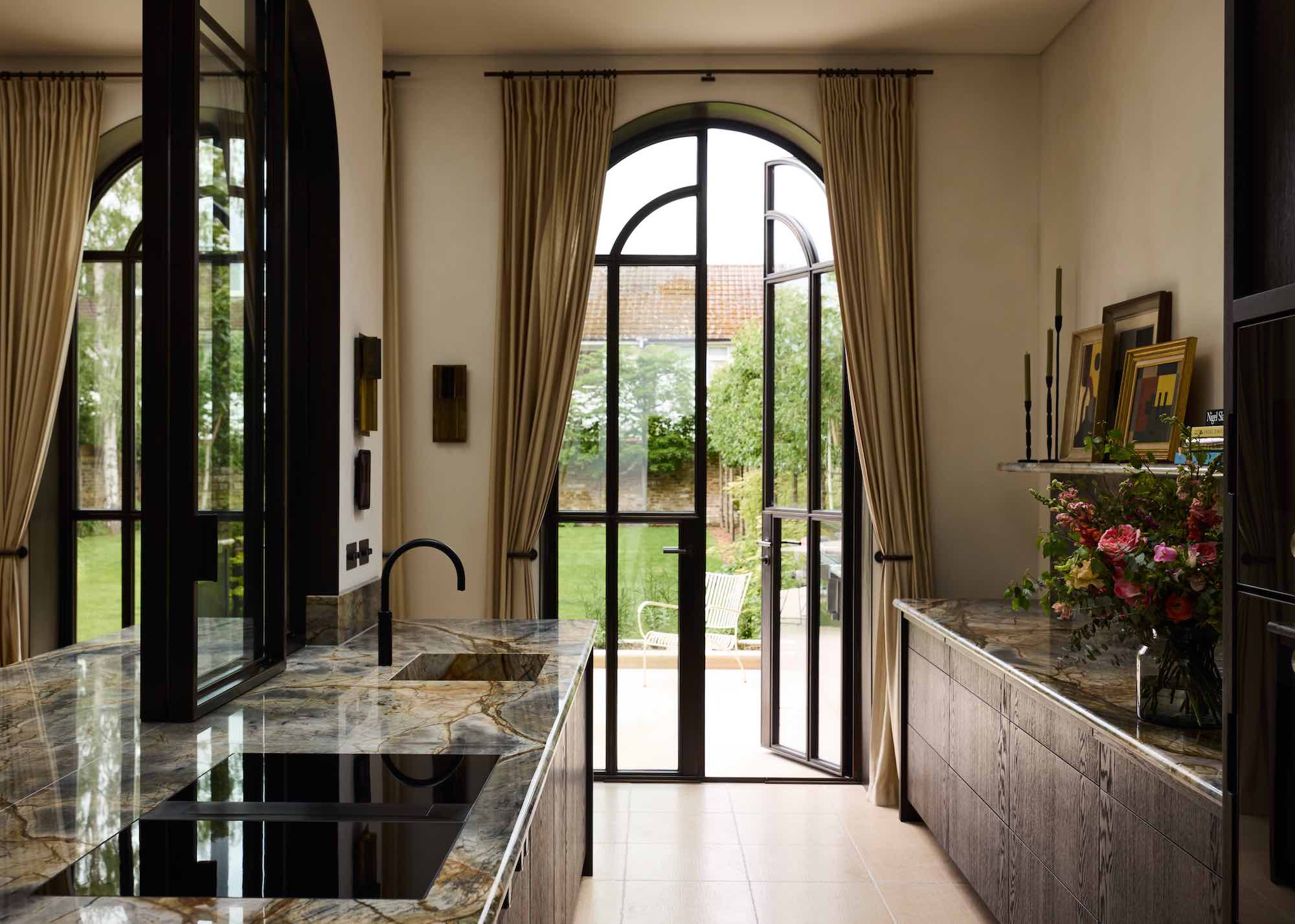
DO INSTEAD: "In a kitchen where the goal is to create a space that encourages cooking and dining, using warmer tones such as taupe, creamy whites and butter yellows are a better choice," says Jennifer.
"While blue can be a versatile and calming color in many contexts, it is not the best choice for kitchens," argues Jennifer Jones, from Niche Interiors.
A surprising answer, considering the recent boom in icy-blue kitchens, but there's actually a strong argument, rooted in color theory, that backs up Jennifer's point.
As she explains, "Blue has been shown in studies to suppress appetite, likely due to the fact that blue is not a color commonly found in natural foods."
The act of preparing, creating, and enjoying food should be at the heart of your kitchen design, from layout to materials, to colors — all of these elements should come together to support this goal — and while it can look beautiful, blue is not the most natural choice for this.
Some Timeless Alternatives

Benjamin Moore's neutral paint selection is great, but there is something especially lovely about the classic warmth of Shaker Beige. It's an ideal color for kitchens, and makes for a comforting, relaxing backdrop.

I love the romantic feel of a pink kitchen, and this peachy shade from Little Greene still feels nice and neutral, with just a hint of pink undertones.
So, the experts have spoken, and as you can see, their love for a warm, neutral kitchen color is pretty consistent across the board. One of my favorite ways to style these tones is in the soft kitchen trend — it just hits the right note every time.

Maya Glantz is a Design Writer at Livingetc, covering all things bathrooms and kitchens. Her background in Art History informed her love of the aesthetic world, and she believes in the importance of finding beauty in the everyday. She recently graduated from City University with a Masters Degree in Magazine Journalism, during which she gained experience writing for various publications, including the Evening Standard. A lover of mid-century style, she can be found endlessly adding to her dream home Pinterest board.
