7 Farrow & Ball Colors That Interior Designers Swear Are Perfect for Kitchens — In Case You're Stuck With 'Decision Paralysis'
Picking the right color for your kitchen can be overwhelming, but Farrow & Ball continues to be a go-to for these spaces, as these projects prove

The Livingetc newsletters are your inside source for what’s shaping interiors now - and what’s next. Discover trend forecasts, smart style ideas, and curated shopping inspiration that brings design to life. Subscribe today and stay ahead of the curve.
You are now subscribed
Your newsletter sign-up was successful
No paint brand has become quite so synonymous with understated, tasteful decor as Farrow and Ball, but with such a vast selection of kitchen color ideas, it has become increasingly difficult to pick out the best Farrow and Ball paint color, especially in a space where color holds so much importance, like in the kitchen.
I'm no stranger to the troubles of decision paralysis. When my brain is presented with a catalogue of colors to choose from (especially when the colors are as beautiful as those included in the Farrow and Ball range), it simply enters overdrive. Suddenly, I'm Sylvia Plath beneath the fig tree, but instead of ripe fruit for the picking, I'm surrounded by countless beautiful buckets of paint. Will I go bold and paint my kitchen bright yellow? Or do I stick to neutrals and go for a more calming color scheme?
So, if you're anything like me in this regard, I think my following findings might just help you out. Instead of driving myself crazy, seeing paint swatches in my sleep, I decided to turn to some of the most trusted designers instead and ask them for their favorite shades, and they did not disappoint.
Article continues below1. School House White
School House White can work in just about any space, though it's a particularly nice, bright base for kitchens.
For a classic look, it doesn't get much better than School House White. In fact, the shade was initially developed by the brand's own color curator, Joa Studholme, for her own home.
And it's remained a favorite of designers ever since. "School House White is my number-one go-to," shares Fiona Ginnett, co-founder of HØLTE.
"It’s a soft, warm off-white that works with everything, especially if you want a calm, neutral palette paired with oak or other mid-toned timbers," she explains. Unlike other white paints, it doesn't have any of that cold, stark sterility that has given all-white kitchens a bad rap. Instead, it's a softly comforting shade, an ideal backdrop for natural materials and bolder additions alike.
2. Pink Ground
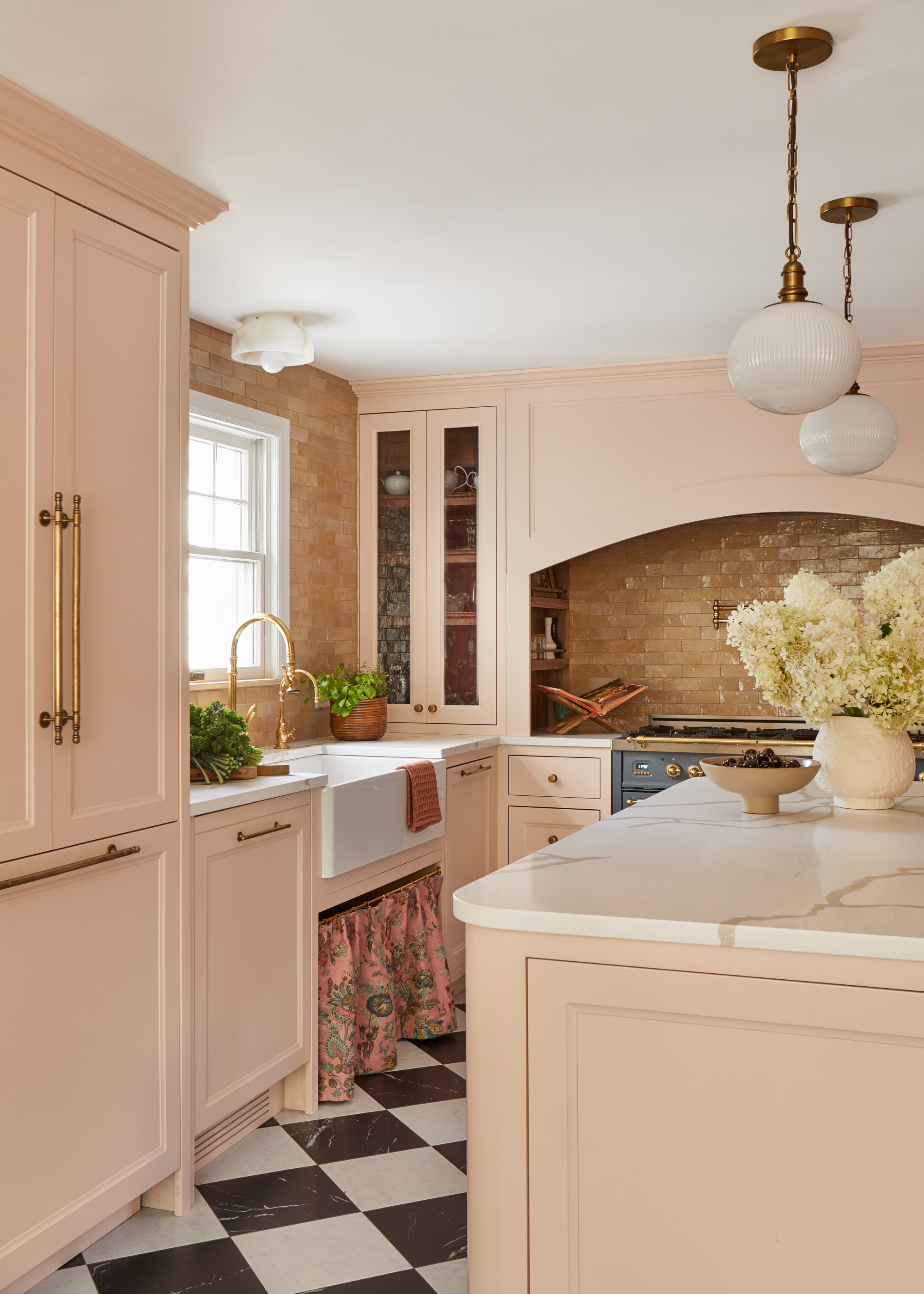
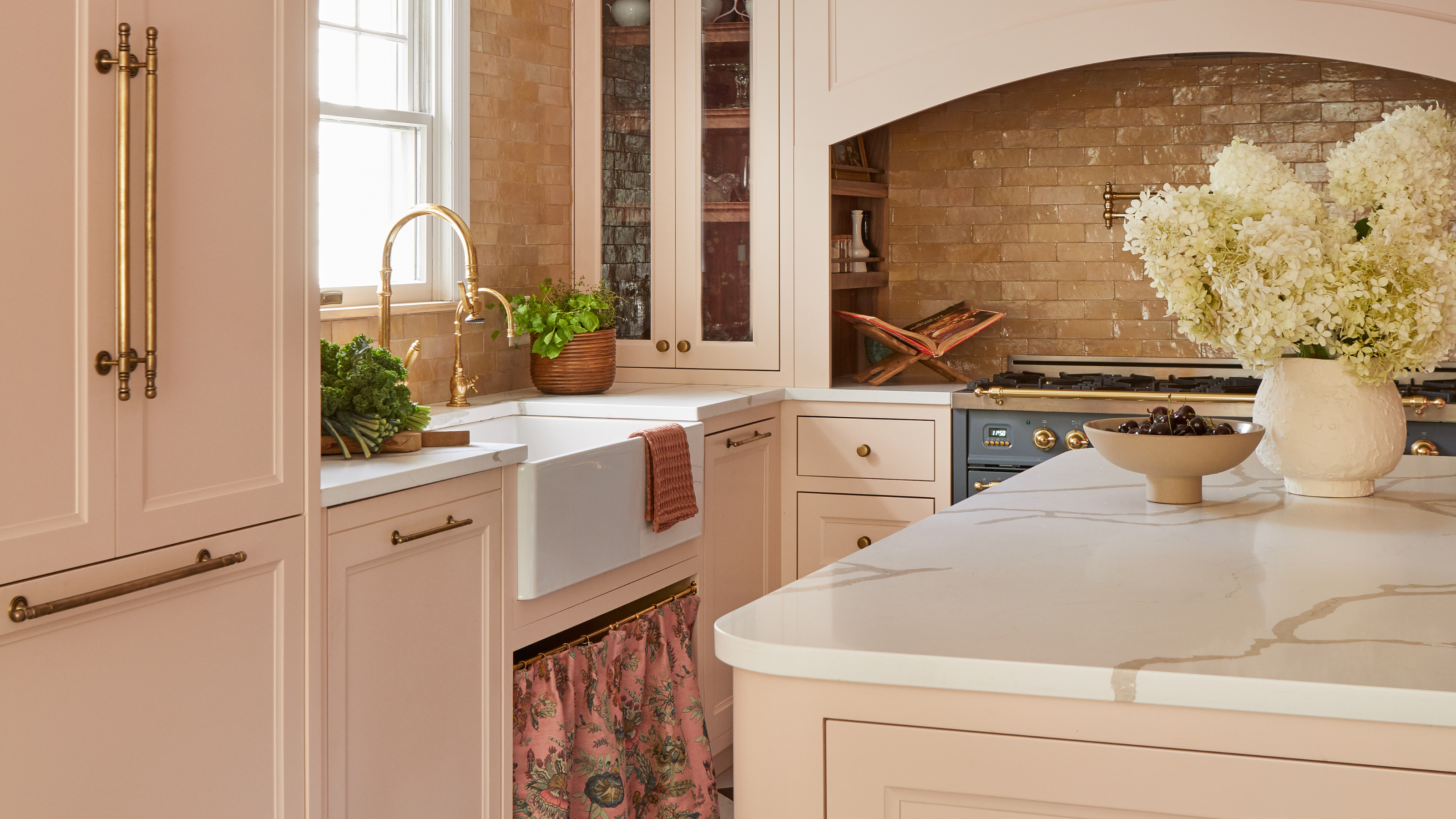
With checkerboard flooring and a skirted sink, the pale pink cabinetry creates a kitsch, cozy vibe.
There's something endlessly charming about a pink kitchen, but it has to be done right. Too bright and you end up with your very own Barbie Dreamhouse, and not in a good way.
The Livingetc newsletters are your inside source for what’s shaping interiors now - and what’s next. Discover trend forecasts, smart style ideas, and curated shopping inspiration that brings design to life. Subscribe today and stay ahead of the curve.
With Pink Ground, however, you're safe from that risk. Its soft, almost neutral tone means it barely even registers as pink.
It pairs gorgeously with other materials, and Jennifer Acito from Dama and Wood says she "loved pairing this feminine yet grounded pink tone with brown details, giving a slightly more masculine tone, such as the walnut spice shelves in the range alcove, zellige backsplash, and the stained cane detailing on the pantry cabinets."
With checkerboard floors and warm wooden details, the kitchen feels cozy, classic, and inviting. "I find many people shy away from unexpected colors for their millwork, but I found this tone of pink to truly be a neutral tone, as it seemed to pair with most colors and materials," Jennifer explains.
Jennifer is a self-taught Interior Designer and Renovator based in Northern New Jersey. A few years ago, Jenn took a leap of faith and began taking on design clients, while simultaneously working her corporate job. In late 2021, Jenn left the corporate world to pursue Interior Design full-time and hasn’t looked back.
3. De Nimes
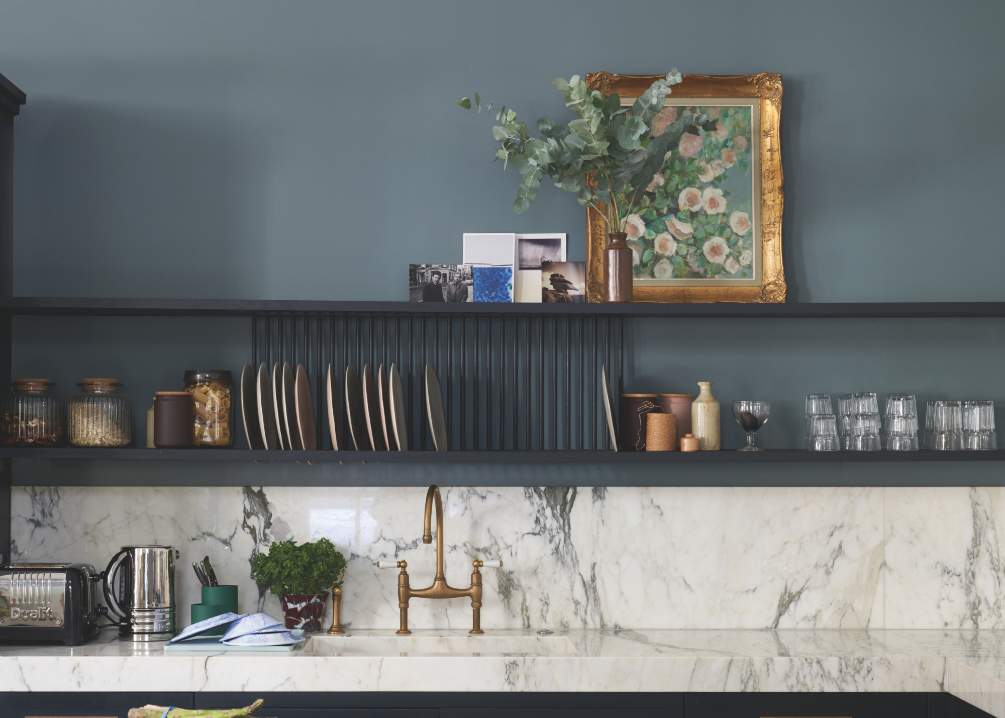
De Nimes pairs beautifully with this marble countertop, where the shade complements the veining in the stone.
The kitchen is often the room where you most want to create an inviting, welcoming atmosphere, and the colors you use will have a major impact on that. One of the most effective shades for making a kitchen feel cozy is a soft, comforting blue, and for that, De Nimes is the perfect fit.
It's got an almost antique quality to it, making it an obvious favorite for Barry Bordelon and Jordan Slocum of The Brownstone Boys. They say, "De Nimes is another go-to: it’s a muted blue-gray that feels both modern and classic, and it works beautifully with natural textures like wood, brass, and stone."
Despite the grey undertones, this shade never feels cold or uninviting; instead, the muted softness of the paint brings a gentle depth to the room. If it feels too intense for a full color drenching moment for you, it would work especially beautifully saved for your cabinets, and paired with a brighter shade on the walls.
4. Studio Green
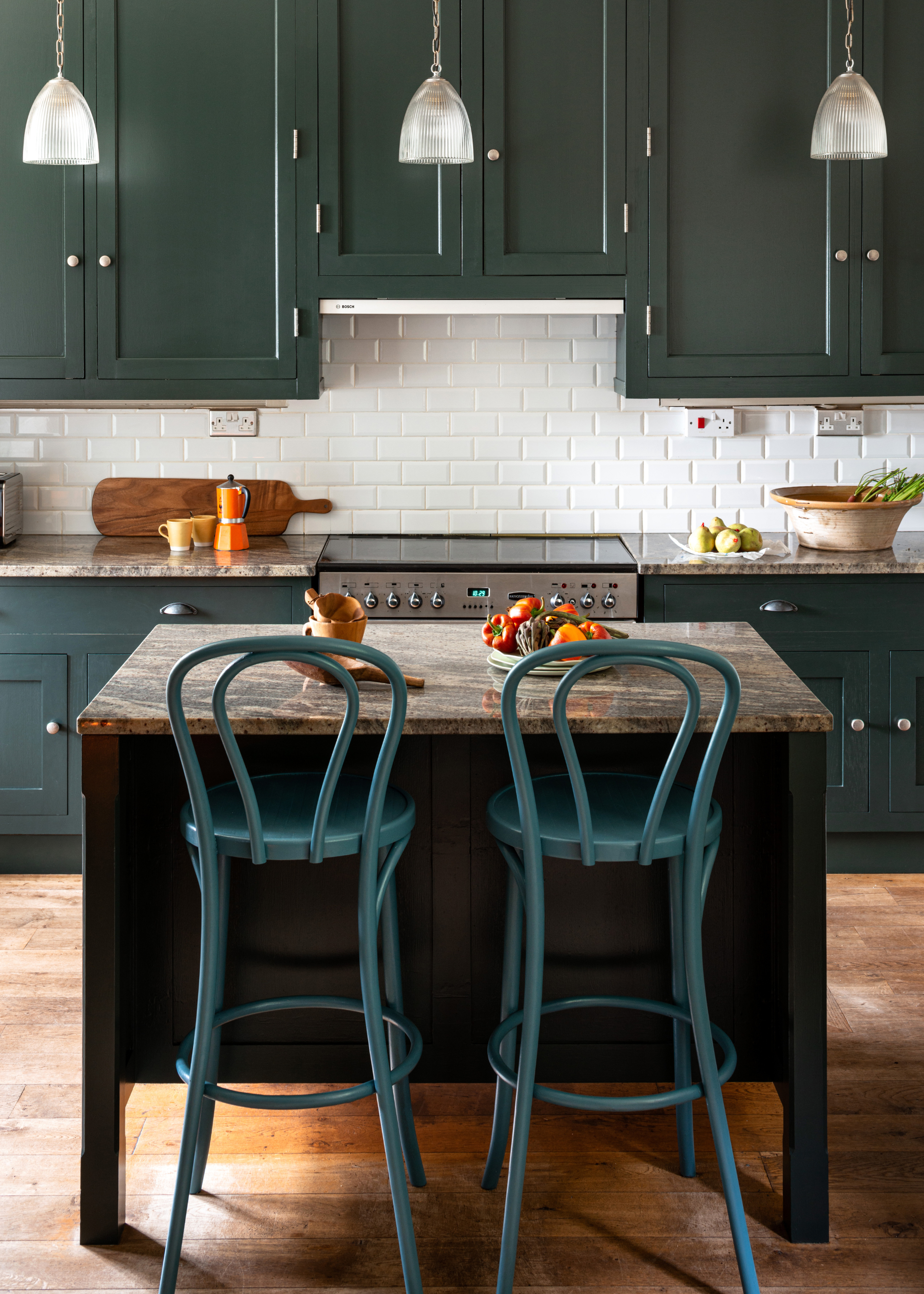
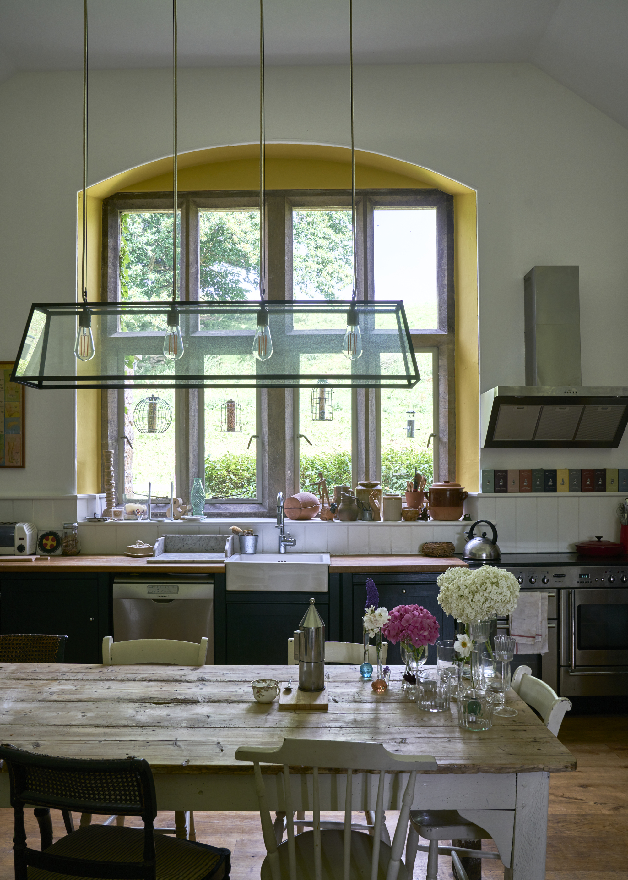
Studio Green is beautiful in kitchen extensions, where the dark green tone can echo the colors found outside.
One of their classic shades, Studio Green, is the deepest, darkest green offered by Farrow and Ball. What makes this shade so special is the way the color shifts throughout the day, at times appearing almost black, and at other points, a rich forest green.
"Our go-to for the dark shades that appeal to most is Studio Green," explains Allison Lynch, a senior designer at Roundhouse. While a true black can feel slightly harsh in the kitchen, this shade offers a new path into achieving that deep, moody look, while still maintaining a slightly earthy color palette.
"It teams up well with concrete worktops, timber flooring, and complements the views to the garden. It works in spaces that don’t have natural light, too, because it’s so rich and warm," says Allison.
Barry and Jordan also love using this paint when they're trying to create a moodier atmosphere. "It highlights cabinetry details and brings a sense of coziness and sophistication," they tell me.
5. Railings
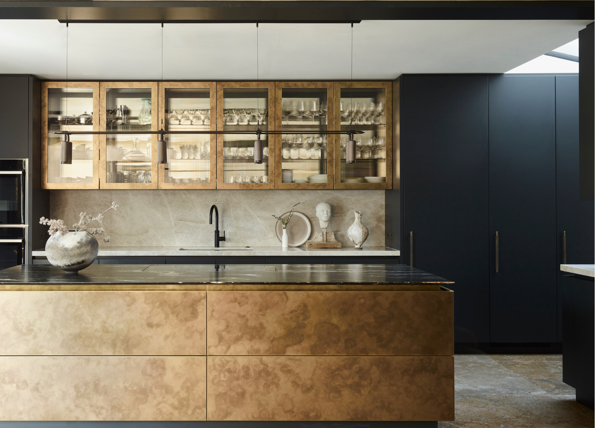
The dark, moody blue makes the perfect backdrop for this antiqued bronze kitchen island.
A natural counterpart to Studio Green, Railings captures the same deep, moody spirit as the dark green shade, but instead uses blue as its base color.
"The other go to if the client likes more blue tones, is Railings," comments Allison.
The color can be used in much the same way as the previous, providing that cocooning coziness that can be particularly lovely in small kitchens.
"It’s a classic for the old dark blue kitchen. It works with all choices of flooring, timber or stone, and then the natural beauty of veined stone work surfaces pop with the dark blue/grey as the backdrop," Allison says.
Much like Studio Green, Railings also has that color-shifting quality, as interior designer Kimberly Oxford describes, "It sits in that refined space between charcoal and blue, shifting with the light to create depth and quiet movement. In lower-light rooms, the blue undertone softens and the color reads closer to a rich charcoal, which can be beautiful if balanced with layered lighting."
What makes Farrow and Ball unique is not just their rich color selections, but their vast array of finishes, too, and as Kimberly rightly says, "The finish matters, too." She continues, explaining, "On cabinetry, a durable eggshell brings out its subtle sheen, while a matte finish on walls gives it a more relaxed quality."
With over 20 years of experience in design, Kimberly’s aesthetic is rooted in elevated simplicity layered with warmth and functionality. She uses natural materials, thoughtful textures, and an emphasis on the connection to nature to create spaces that feel elegant, approachable, and timeless. Kimberly has worked on a variety of projects from urban apartments to sprawling country estates, and everything in between.
6. Old White
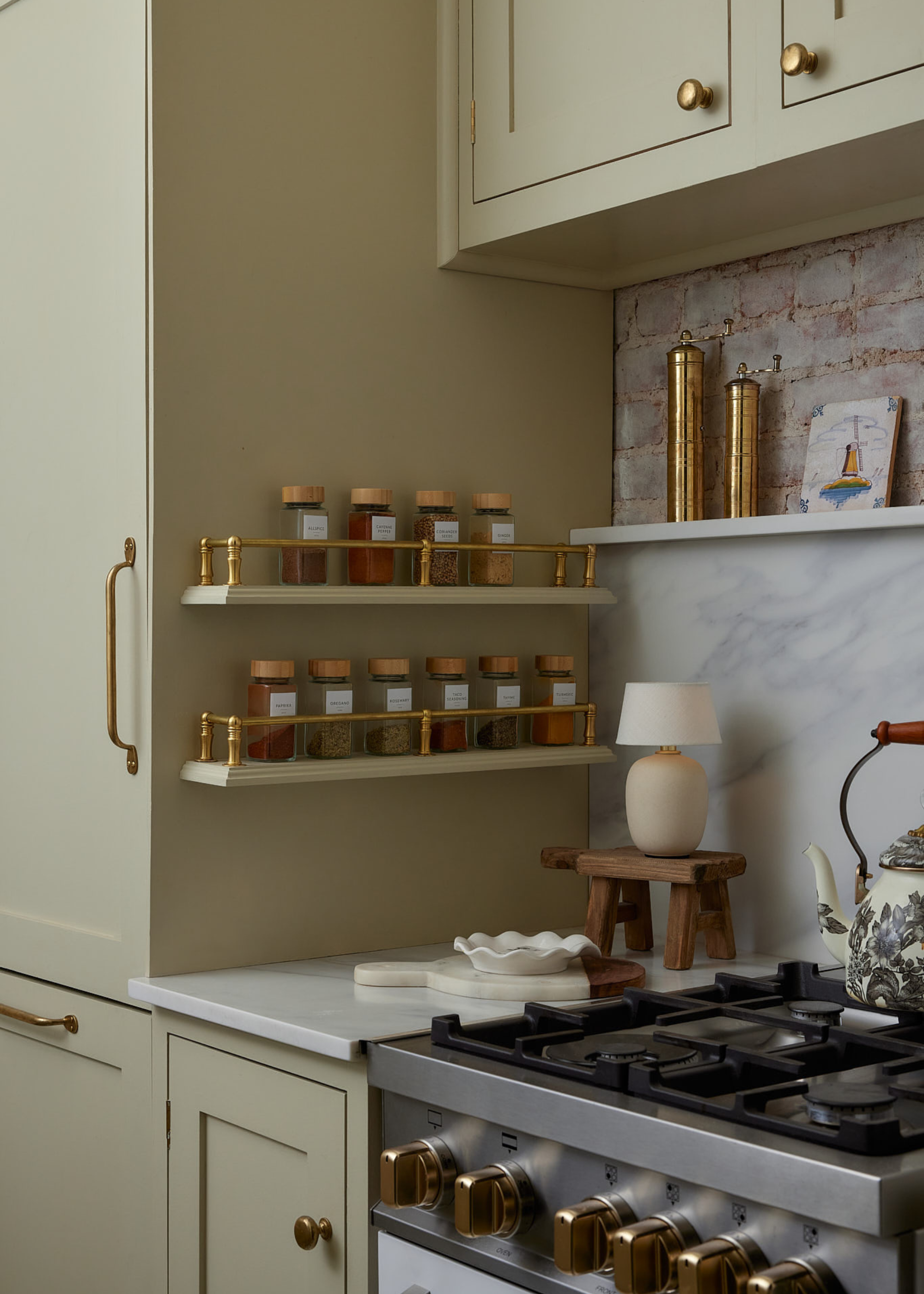
In this tiny kitchen, Old White brings a soft, grounding warmth.
Despite its name, Old White is not really a white paint at all. The shade is a truly unique one, somewhere between a beige and a sage, with soft, grey undertones - and works beautifully in antique-inspired kitchens or in period homes.
It earns its name from its historic position as one of Farrow and Ball's original Traditional Neutral paint shades, and has an appeal that has persisted through the years.
"Our favorite Farrow & Ball shade for kitchens is Old White," says Jordan and Barry. They continue, "It’s soft, warm, and brightens a space without the coldness of a true white. It’s especially beautiful in historic homes where we want the room to feel fresh but still connected to its architectural character."
7. Setting Plaster
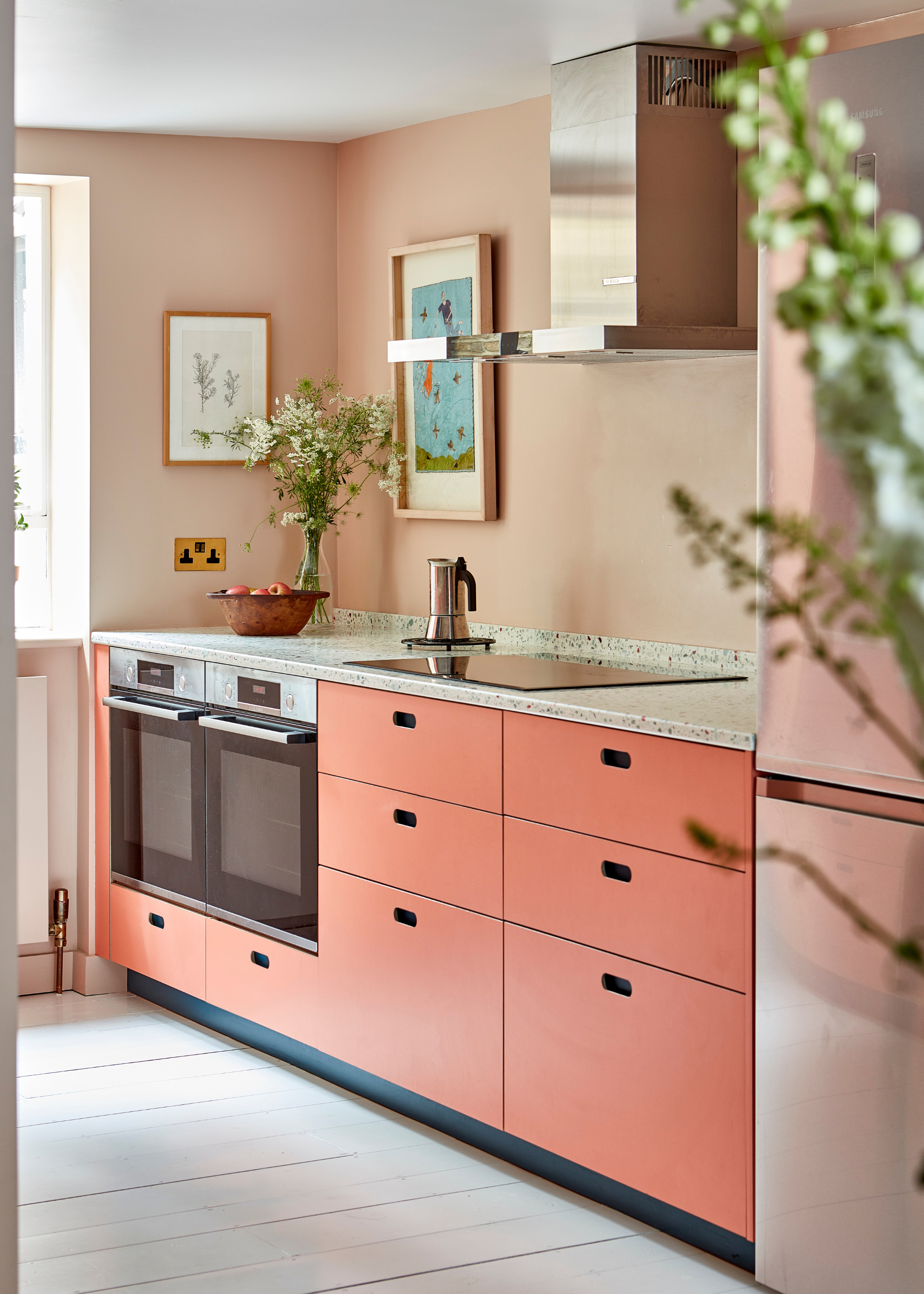
"Pluck’s Ritzy, vibrant coral pink cabinetry has been paired with dusty pink Setting Plaster to create a color-drenched room," says Leila from Pluck.
The raw plaster effect wall look has arguably been one of the defining trends of the 2020s, but Farrow and Ball have known the appeal of the pink-toned finish for quite some time. Setting Plaster was designed to replicate this look, only in a slightly more polished way.
It's a soft, dusky pink that is surprisingly neutral, pairing beautifully with a wide range of colors and finishes. Fiona notes, "For kitchens with bold or dark colors, Setting Plaster offers a gentle, softer contrast that keeps the space balanced."
Although it is technically a pink shade, the yellow undertones keep it feeling warmer and more neutral. However, depending on what you pair it with, you could easily emphasize the soft, pink tones more.
If you're still undecided on what colors work best in a kitchen, perhaps the best next step is spending some time studying some beautiful modern kitchen ideas and seeing what jumps out at you there.

Maya Glantz is a Design Writer at Livingetc, covering all things bathrooms and kitchens. Her background in Art History informed her love of the aesthetic world, and she believes in the importance of finding beauty in the everyday. She recently graduated from City University with a Masters Degree in Magazine Journalism, during which she gained experience writing for various publications, including the Evening Standard. A lover of mid-century style, she can be found endlessly adding to her dream home Pinterest board.


