The Best Farrow & Ball Paint Colors — 12 Shades Chosen by Designers to Inspire Your Next Decorating Project
Get inspired and pick the best Farrow & Ball paint colors from this vibrant, designer-approved selection

Lilith Hudson
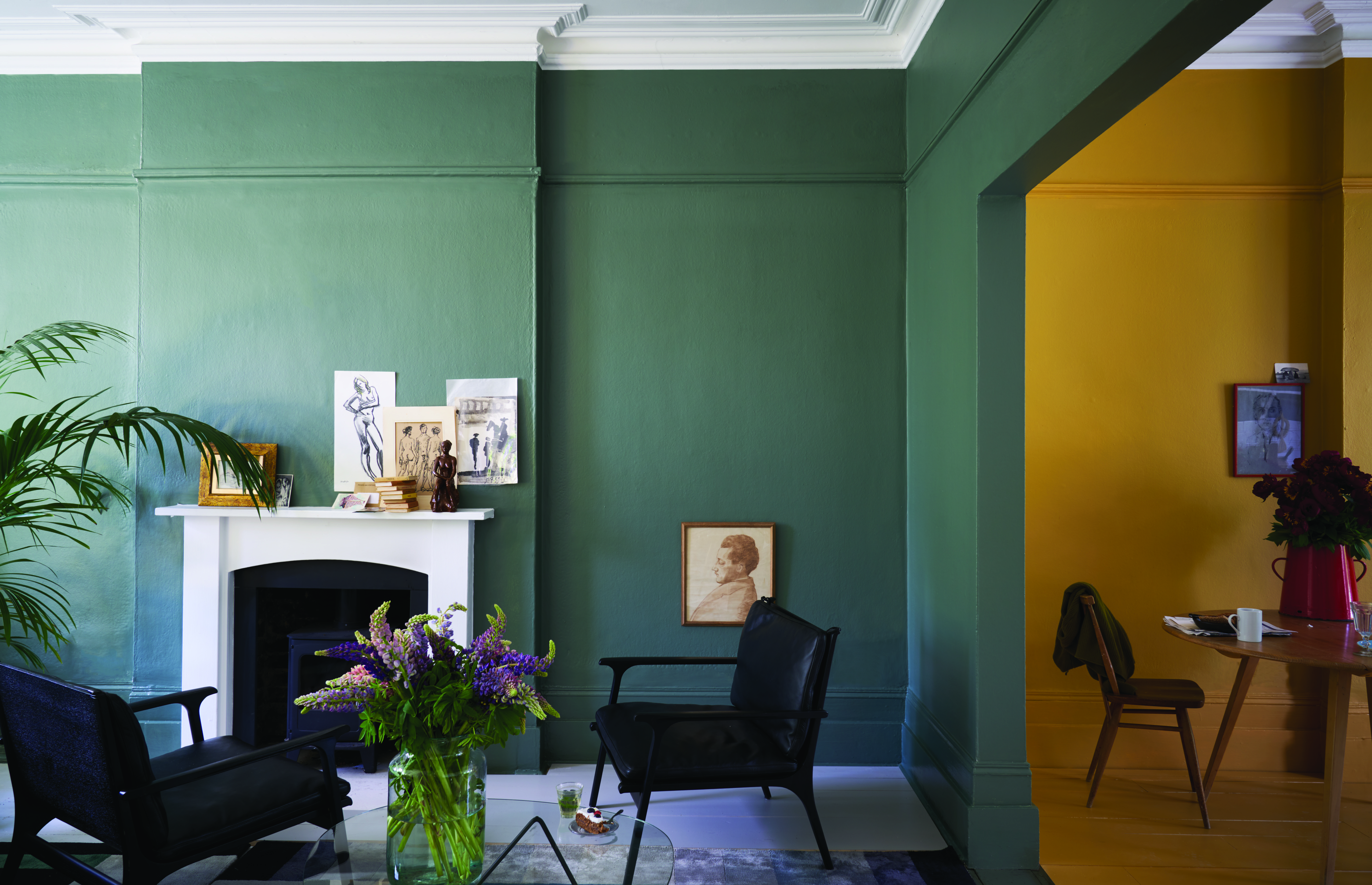
Trying to pick the best Farrow & Ball paint colors is a tough job – after all, we're spoilt for choice. A favorite brand of interior designers, Farrow & Ball has a kaleidoscope of colors available with all the shades and undertones you can think of, so there's a hue out there for every decorating project.
Adding a new lick of paint to walls is one of the quickest and most cost-effective ways to transform a room, but the problem comes when trying to narrow down your paint ideas, even once you've decided on a Farrow & Ball palette. Then, of course, there are color trends to take into account. 'Our use of color has transitioned so much in the last two years, moving away from anything too cool to empathetic neutrals, earth tones, and colors that spark optimism and joy,' says Patrick O’Donnell, brand ambassador and color consultant for Farrow & Ball.
'If it's neutrals you love, consider School House White which will sit happily against many colors,' he goes on to suggest. 'From the mid-century aesthetic of Bancha to the warming mustard tones of India yellow, through to wonderful earthy mid neutrals of Jitney, we have a large selection in place.' So that's Patrick's top picks, but what about the best Farrow & Ball shades account to interior designers? We went on a hunt to find out and rustled up 12 paint options to appeal to your inner aesthete.
Article continues below12 Best Farrow & Ball Paint Colors that Come Expert-Approved
Before you jump right into our paint edit, take a moment to consider the best way to choose a color that suits you, your lifestyle, and your interiors. Take for instance that you want to color your room blue. How do you narrow down which shade of blue is perfect?
One way to select paint shades is to think about the vibe you want to create in your room. If you want a cozier feel, pick a blue on the darker end; perhaps one with a gray undertone. For a more serene vibe, a lighter shade - say, a sea blue - may be better. You could choose to paint an accent wall or drench the entire room in the color depending on how intense you want the color to feel.
You'll also notice that paint colors look different in artificial light, in the sunlight, and even during different times of the day, so be sure to test with a swatch before you take your brush to the wall.
1. Green Smoke
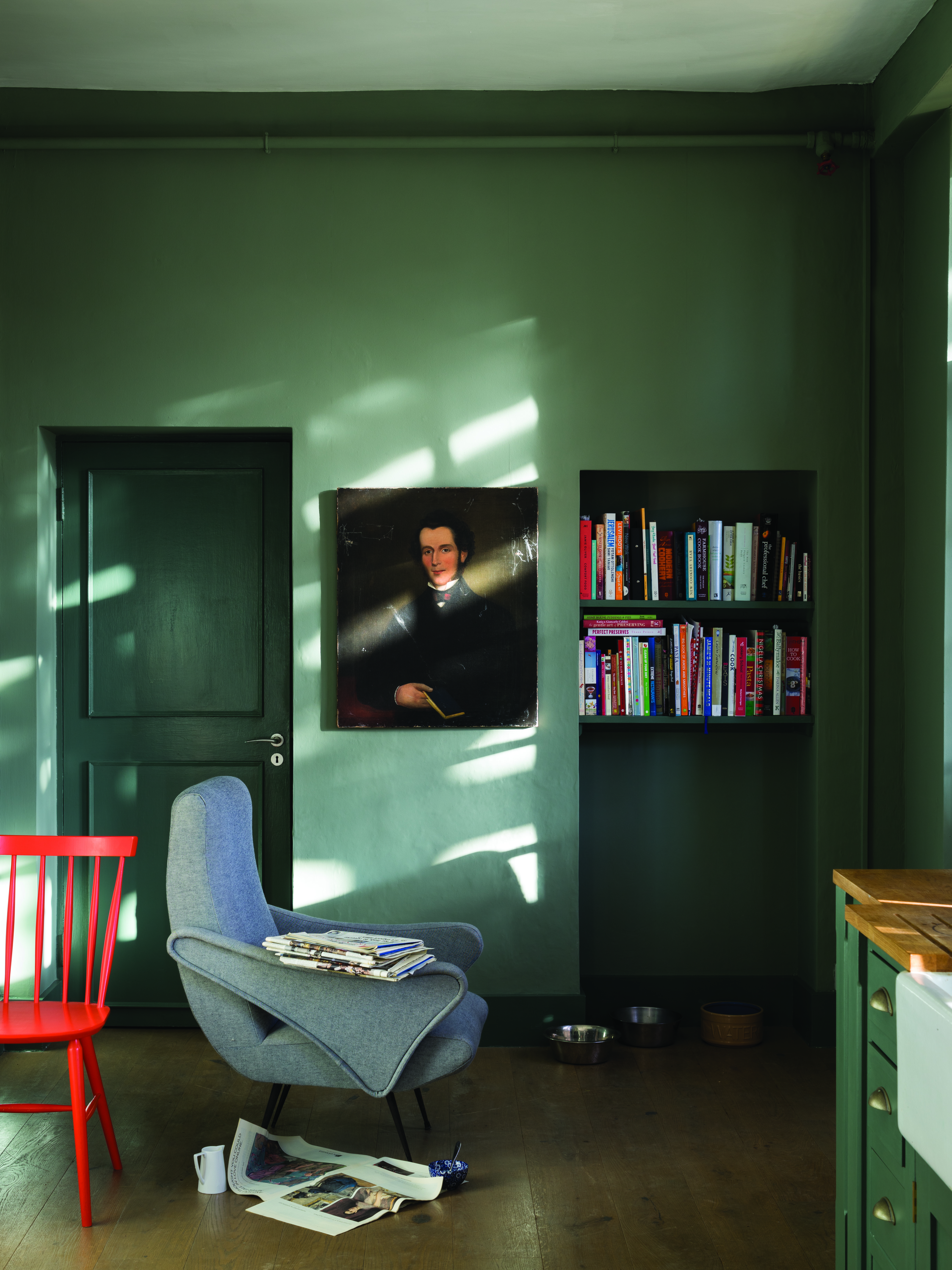
Green proves to be an enduring color trend, and Farrow & Ball's Green Smoke is a perfect tone for a relaxing space. 'Green Smoke has lots of blue in it, and proves to be fantastically popular,' says Joa Studholme, color expert at the brand. She also says it's perfect for north-facing rooms despite being a cool tone.
The Livingetc newsletters are your inside source for what’s shaping interiors now - and what’s next. Discover trend forecasts, smart style ideas, and curated shopping inspiration that brings design to life. Subscribe today and stay ahead of the curve.
We love seeing this soft sage-like shade alongside warm woodwork or pops of bolder color, like the red accent chair pictured above.
2. Railings
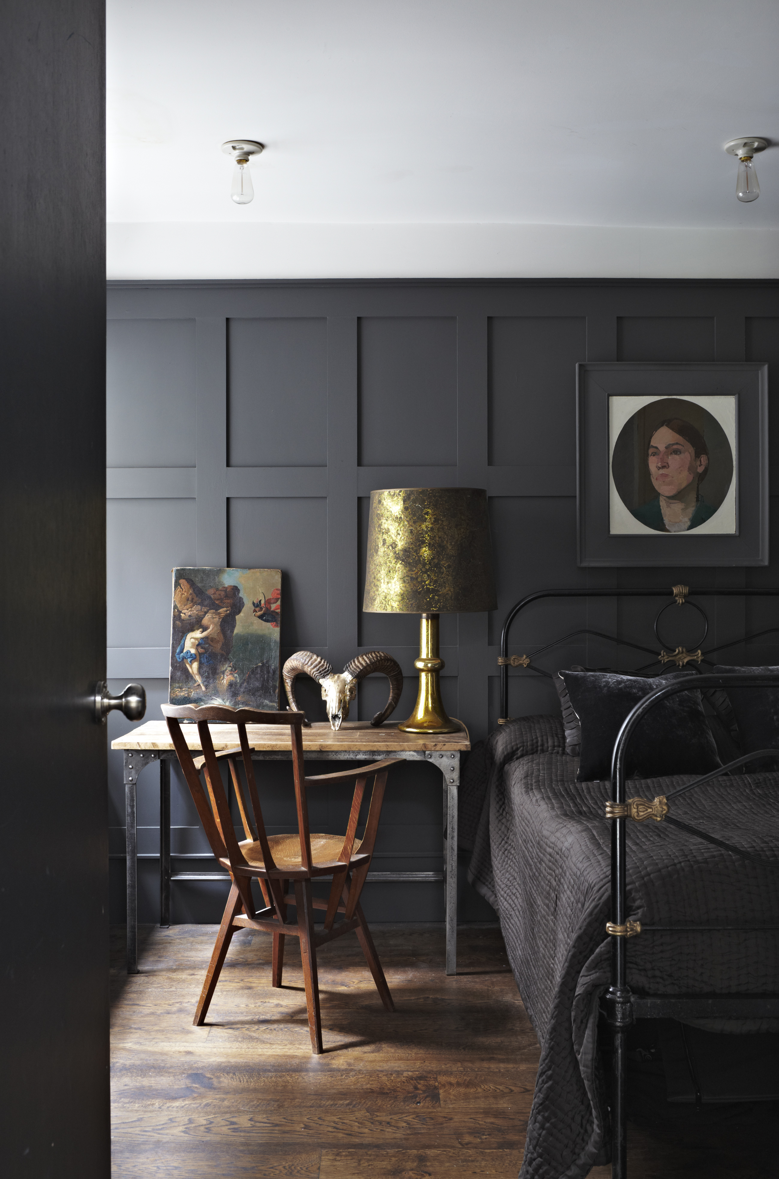
Dark grays have all the drama of a black, but with just the right amount of softness, and the shade Railings offers just that. 'The beauty of Farrow & Ball really lies in its rich pigments; the colors are so dynamic that they evolve as the light changes throughout the day,' says designer Cristina Cleveland, who quotes Railings as one of her favorite shades.
'I used Railings on my kitchen cabinets and at times it looks inky blue, moody gray, and in the evenings a dramatic black,' she adds. 'I find it's a more nuanced alternative to stark black paint.' We think these qualities make it the perfect choice for a monochromatic color scheme.
3. Elephant's Breath
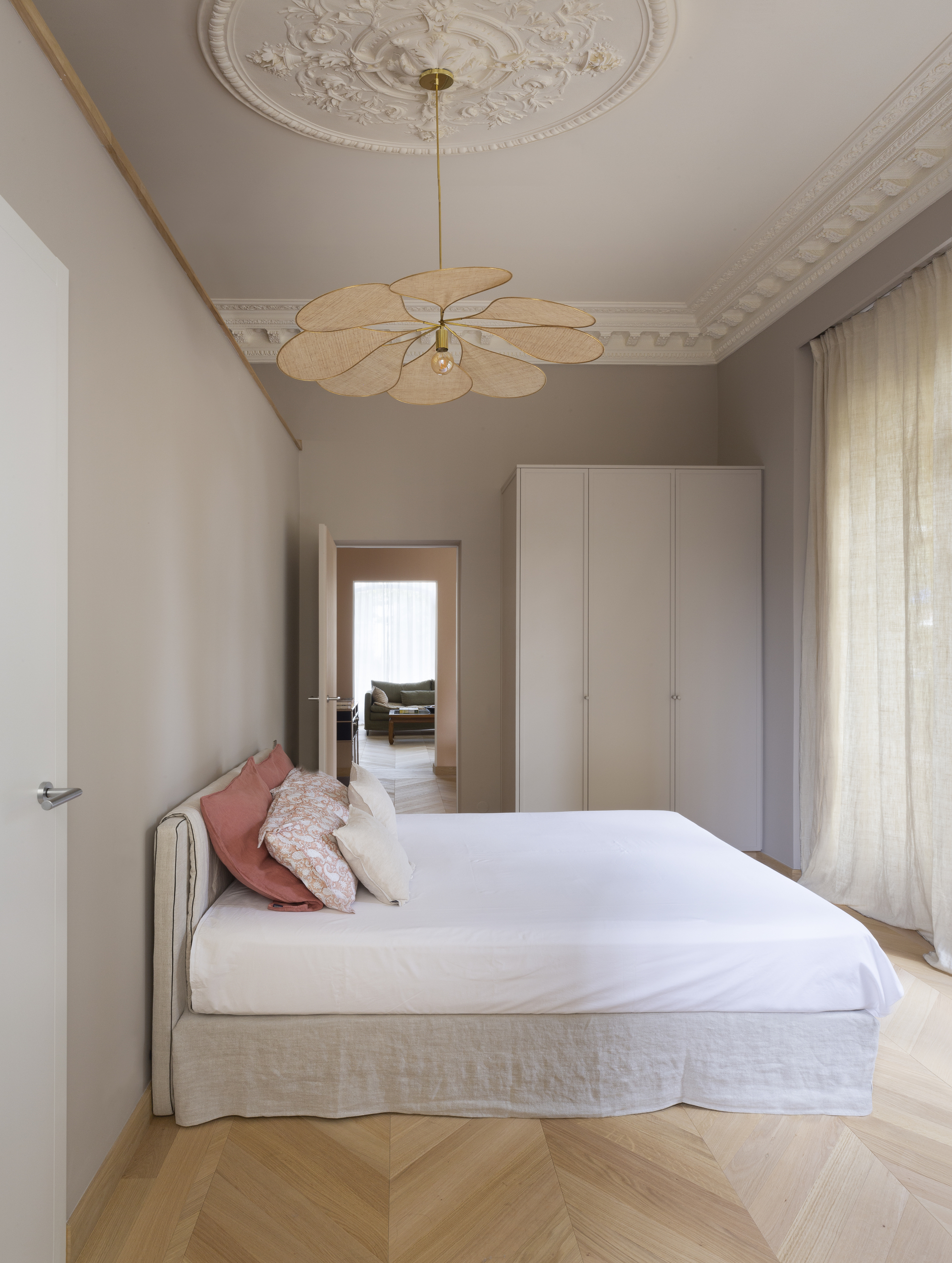
One of the best greige shades, Elephant's Breath is a great mid-neutral for dousing your walls. Designer Adriana Schor of Iconique Design Studio quotes it as one of her favorite Farrow & Ball shades and thinks it's a shade that's often overlooked.
'Whilst some people might think a neutral palette like greige is boring, it actually allows space for creativity that feels more sophisticated, as you can play around with different shades and textures to create movement and depth,' she says. 'The neutral greige tone also reflects light exceptionally well, and creates an ideal canvas to add a splash of color.'
4. Calamine
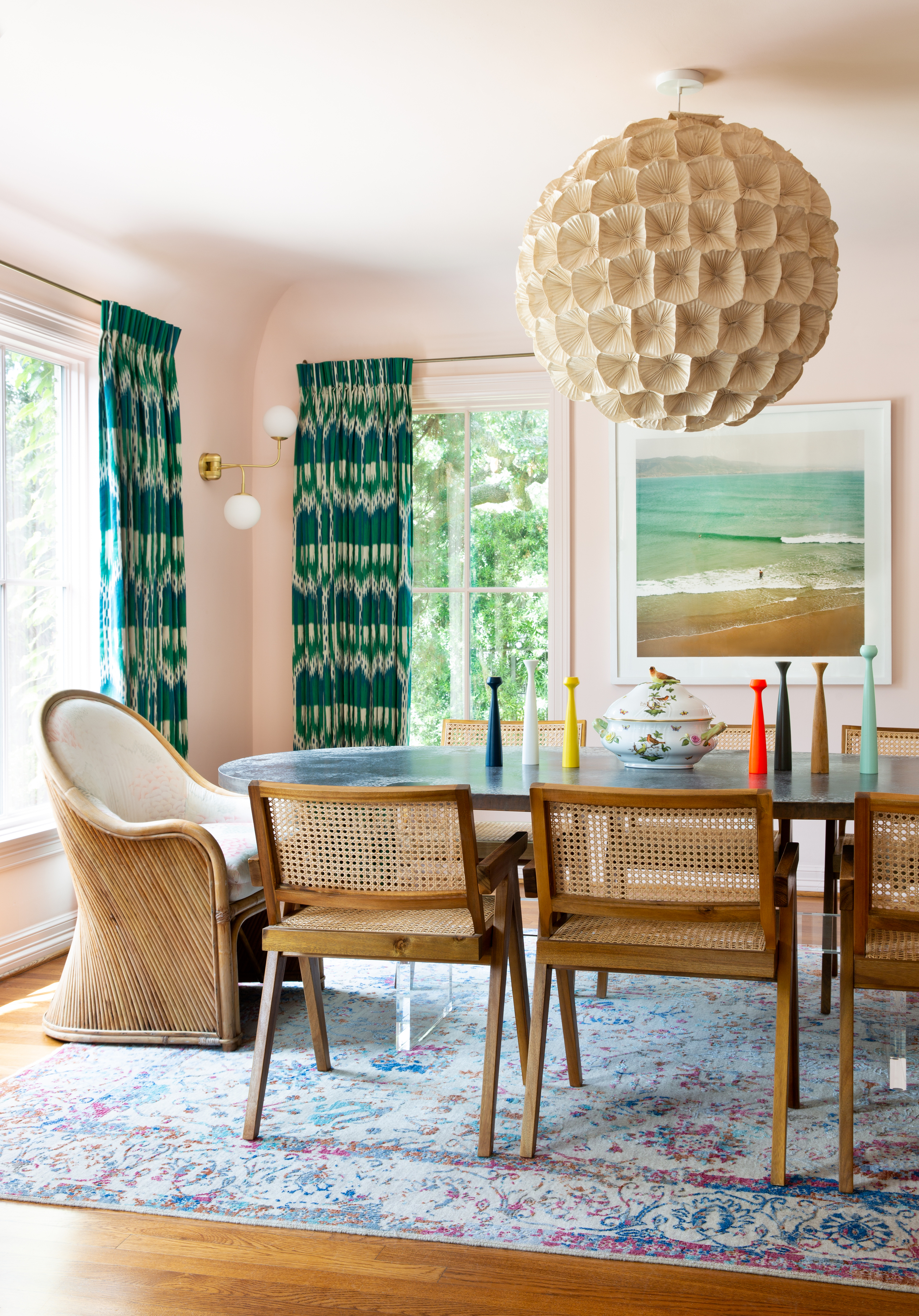
Those who don't fear pink can jump onto the bandwagon of Calamine; a beautiful, milky pink with a gray undertone. The presence of gray prevents the pink from looking too sugary and gives it a deeper grounding. The tone is easy on the eyes and can be used sparingly or even painted on walls across rooms for a perfect pink living room.
'My favorite is Calamine by Farrow & Ball; I've used it in dining rooms, bathrooms, bedrooms, sunrooms, and even closets,' says interior designer Mary Patton. 'It is the perfect soft pink neutral.'
5. Treron
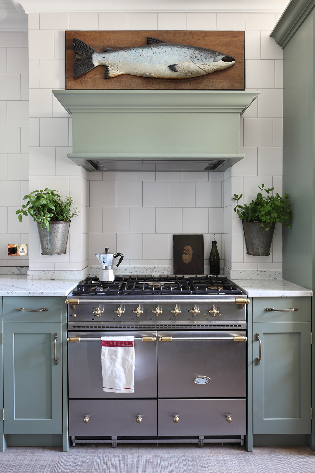
Treron is a soft, yet dark green hue perfect for modern homes that receive plenty of natural light. The color can be used in large amounts as it has a muted vibe and plays well in any space.
'When selecting paints, we find it's important to get the mineral balance right, to give a tone that is natural and has a calm, muted quality,' says Tom Cox, principal designer, HÁM Interiors. 'In this project, the custom-made HÁM kitchen is painted in deep green Treron.'
6. All White
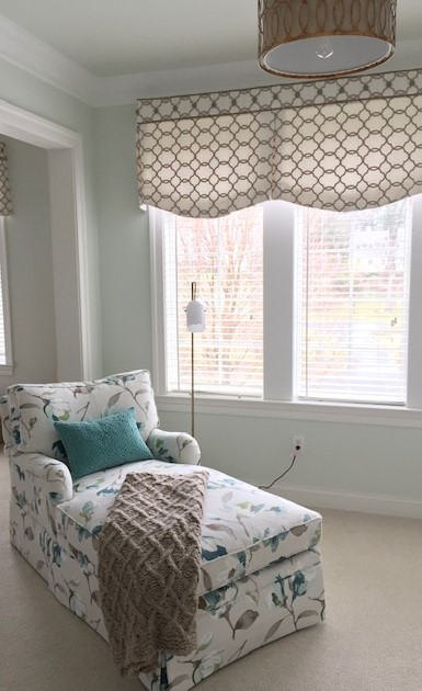
Colors play an imperative role in interior design, and our minds. A room's entire mood can be enhanced or completely ruined by one paint decision. Usually, neutrals are the safest bet. But even neutrals need some consideration.
When it comes to the best white paint for walls, remember that this color has associated temperature, mood, light reflectivity, and style. If you don't consider that, your seemingly fresh, crisp white paint will make your room look flat and cold. Usually, warmer whites can look welcoming. When painted in a room that has lots of sunlight, a clear white will optimize the light and keep things cool.
White works especially well in small rooms. Consider painting the trim to match, as eliminating the lines between the walls and woodwork will allow the space to remain frameless, expanding the proportions of the room.
To that end, Farrow and Ball's All White is a good choice. It isn't stark like Brilliant White but it contains no other pigment except for creamy white, creating the softest interior.
'Farrow & Ball colors respond so beautifully to the north-eastern light in our region – they have the kind of luminosity that our clients love,' says Maria Viola-Kuttruff, principal designer at Viola Interior Design. 'All White #2005 has also been a winner for walls and woodwork as it reads as a pure white, no gray tones, no yellow tones.. just gorgeous.'
7. Pitch Blue
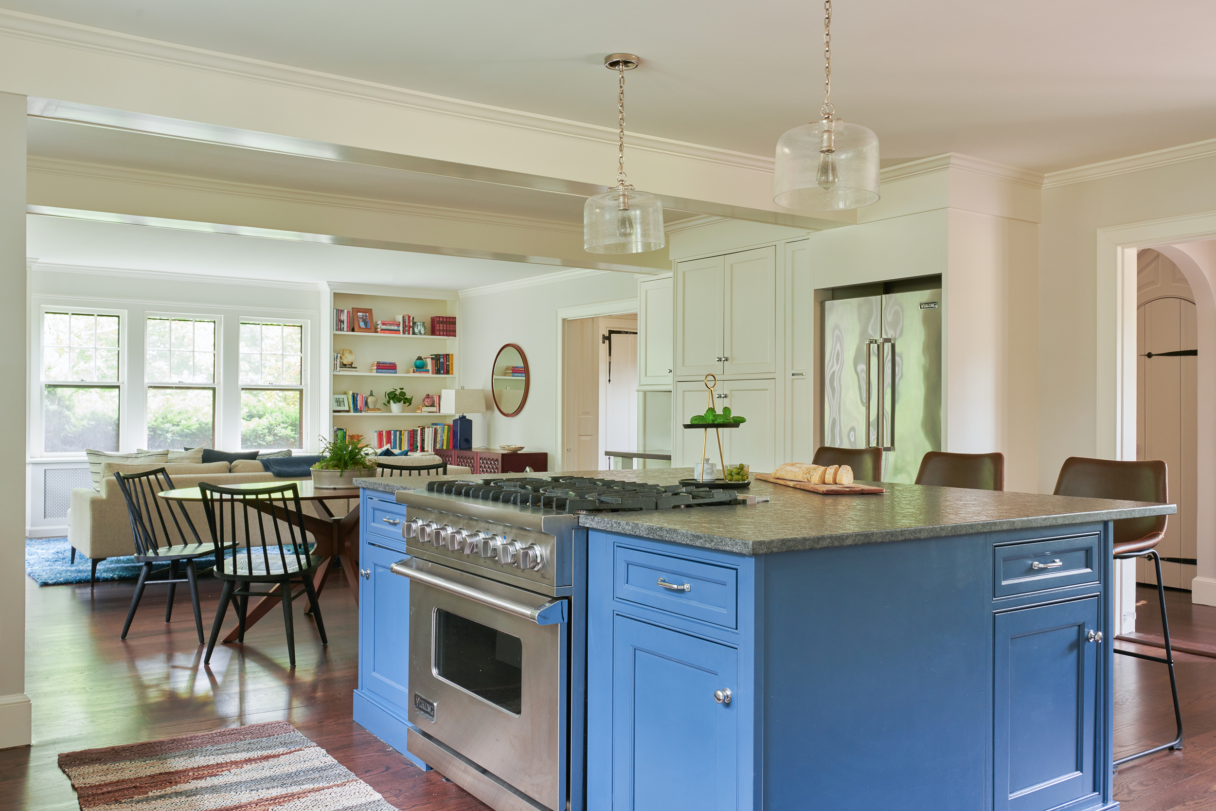
Sometimes a single blast of color can refresh a tired space. Most people are used to playing it safe with whites, grays, and even going as far as sky blues but nothing gives a better boost of energy and personality to a space than this dreamy cobalt hue.
The paint color has an inherent glam side to it and looks especially great against other jewel tones or metallics. In fact, several colors go with blue and can lift a space. It's a color of nature, a trusted hue that manages to be fresh and sophisticated all at once.
Pitch Blue by Farrow & Ball has a small dose of black pigment, and gives the paint an almost purple feel at times, especially in south-facing rooms. It looks deeper and soberer in dimly-lit areas or spaces lit by candles.
'We loved using Pitch Blue No. 220 in this client’s otherwise white kitchen,' says Georgia Zikas of Georgia Zikas Design. 'The vibrancy of the island reflects the spirit of their young family. This color is youthful but has depth and agelessness. We prefer using Farrow & Ball paints because of its color saturation, and the luster of its finishes feels special and bespoke.'
8. Cromarty
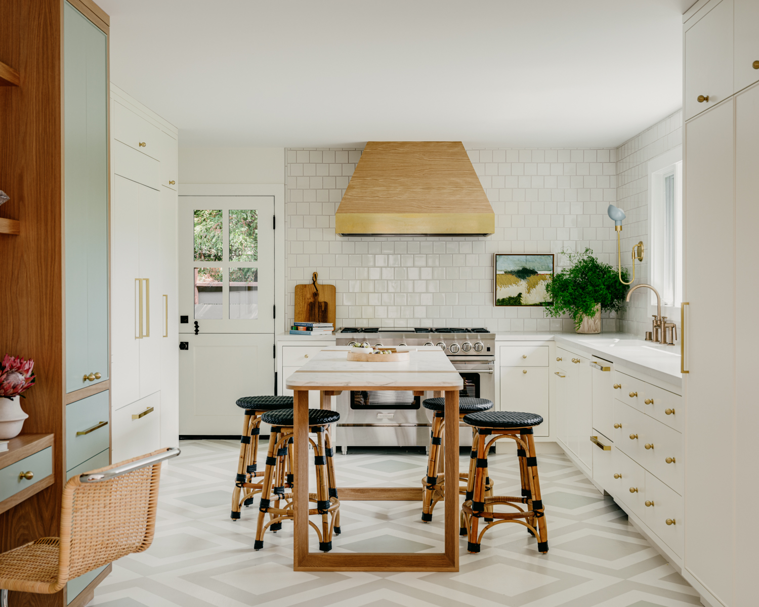
A combination of gray and green can look very refreshing and modern, resulting in a serene and unexpectedly beautiful look. Think of lush green fields and smooth pebbles – it's a pairing made in nature.
This paint with its deep, silken tones is ideal for layering with texture-rich materials, soft furnishings, and artworks. Even contrasting colors can creep in, to punctuate the color scheme. If you're wondering how to paint a room using this tone, you could consider a fully drenched space in Cromarty or even go half-and-half with another color like pink.
This neutral tone is neither too gray nor too green; it's just right and can add muted softness to any room. Cromarty from Farrow & Ball works especially well when grouped with Blue-Gray or Pigeon.
'We chose the Farrow & Ball Cromarty shade of green for its beautiful muted quality,' says Stephanie Waskins, interior designer at LARK+PALM. 'Working well into the diamond pattern on the floor, we designed for this custom kitchen space. We love using shades of green in many of our designs. We see green being just as much a neutral as the shades of white.'
9. Hague Blue
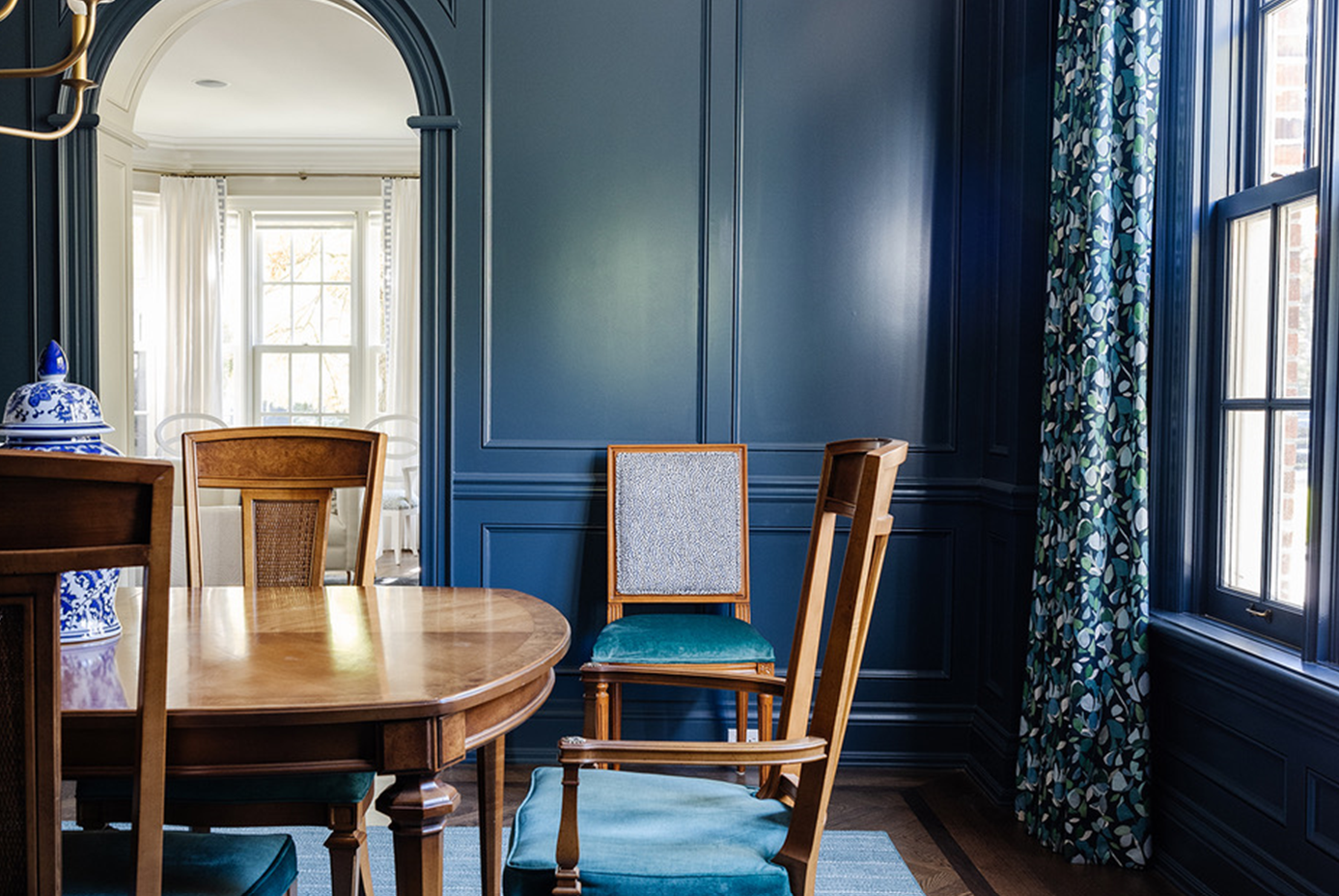
Whether it comes to painting the walls or painting furniture, the right blue can set a dramatic tone. Blues remind one of the East Coast peppiness, antiques, and the deep blue sea. Blues also offer a crisp contrast to neutrals and are friends with metallic tones.
A nice, saturated blue like Hague Blue can inspire the ideal home decor. It looks fantastic on woodwork, skirtings, or as an accent color on the walls. With its slight green undertone, the paint color has a beautiful, natural finish. It's a perfect living and dining room color idea for this vibrant design, for example.
'At times it reads teal and at others navy, but either way, it ensures full-on drama and I’m here for it,' says interior designer Cindy McKay, who curated the space pictured above. 'This dining room I designed in Toronto features Hague Blue on the walls. I love how it adds such richness to the space and highlights the incredible wall molding.'
10. De Nimes
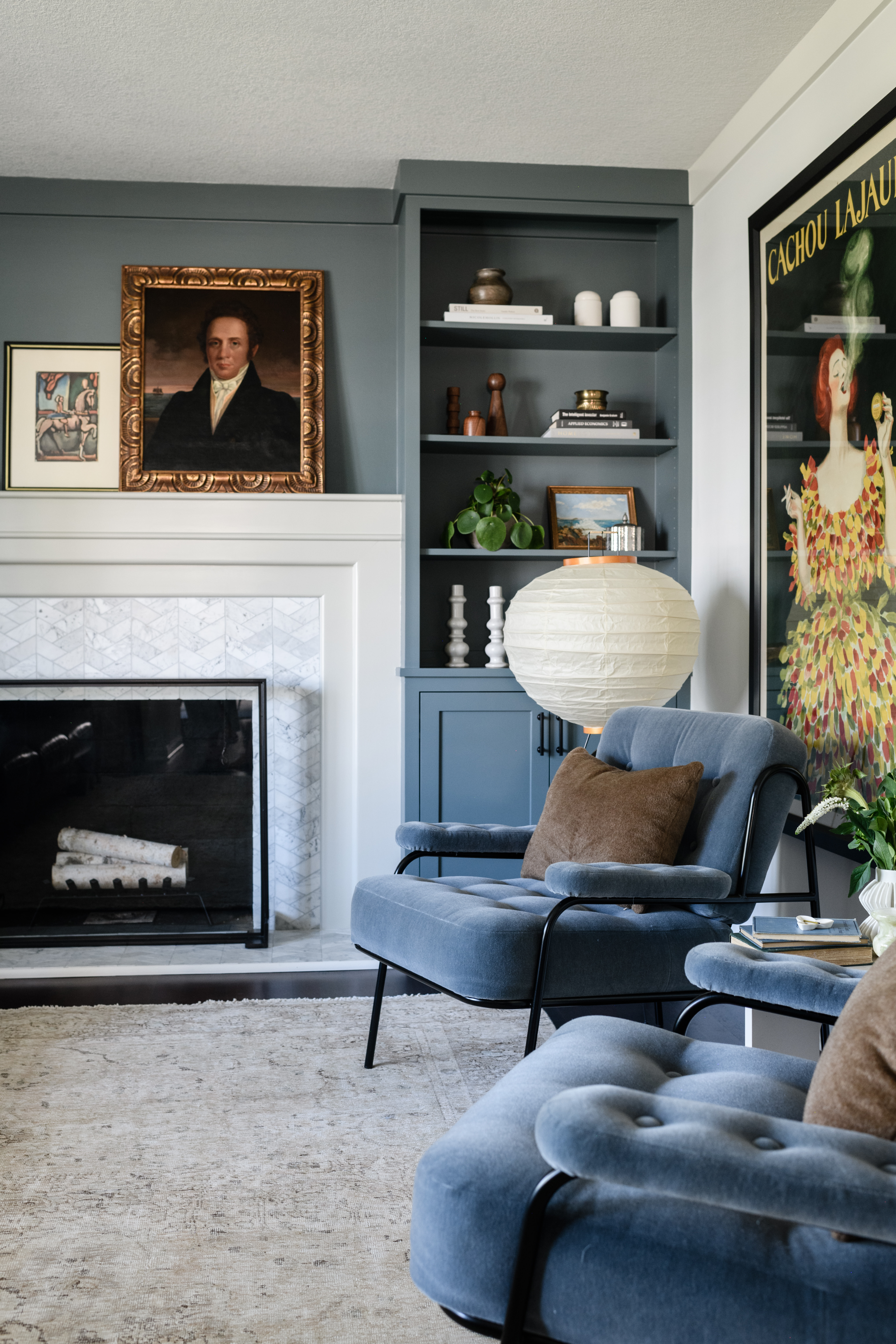
Deep blues make a great background for a mix of antiques, and vintage and modern pieces. You can use this color to even design a wall mural if it's that artsy touch you're looking for. Blue can anchor elements and create a unifying surrounding.
The elegant De Nimes by Farrow & Ball has an earthy quality to it and can be used in a kitchen island to an airy drawing room. 'The layered blues in this Indianola living room are beautiful – the Farrow and Ball De Nimes built-ins mirror the color of the nearby armchairs nicely,' says interior designer Julia Miller of Yond Interiors.
11. Brinjal
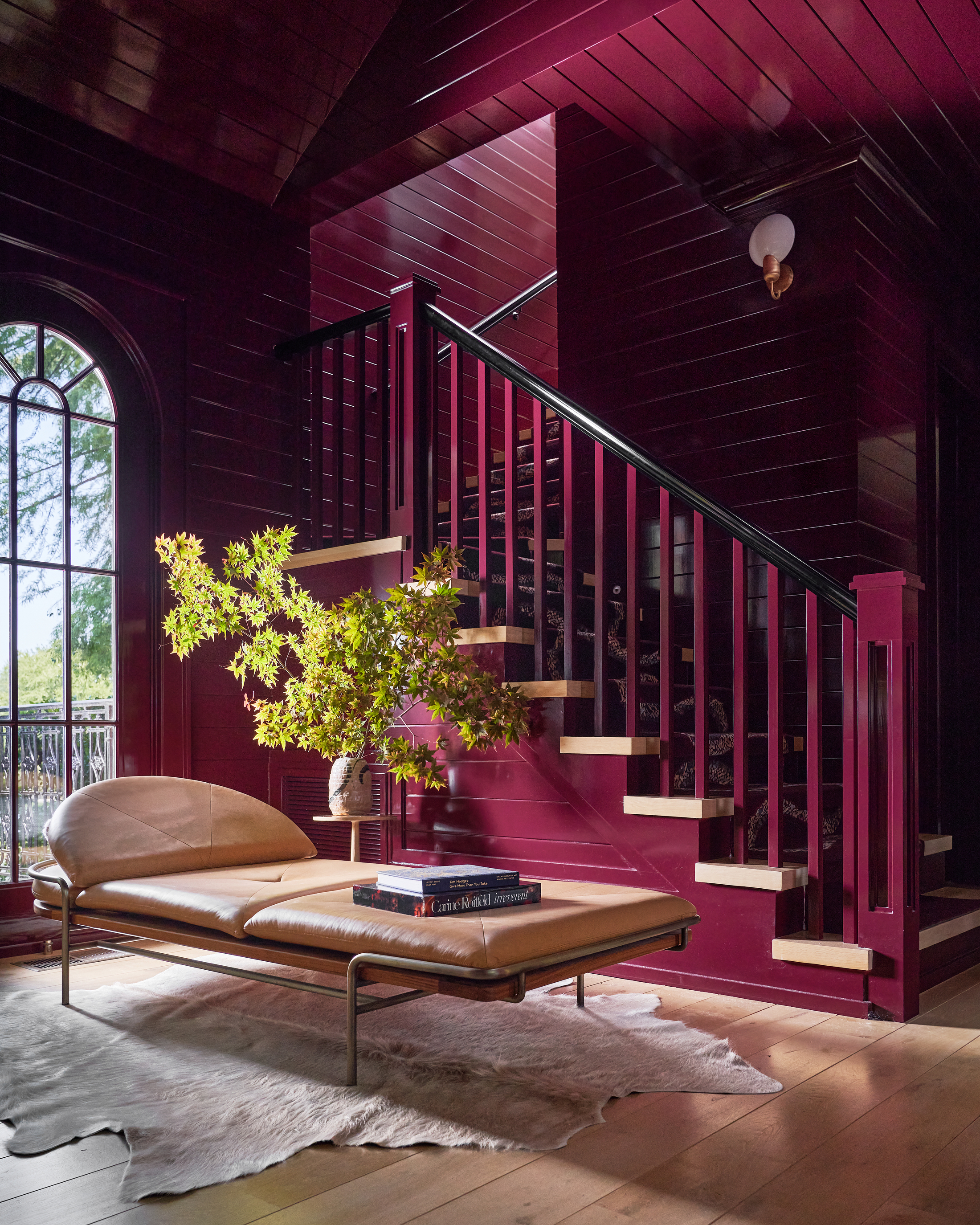
Aubergine or purple can invoke a visceral reaction – you either love it or you don't. But let's not forget, this color has been related to royalty for eons and has an inherent rich appeal.
If used in the right proportions, purple can fill a space with a style that very few other colors can achieve. It is a good alternative to brighter colors and, in the right shade, can even play the role of a neutral.
With it comes colors that go with purple, deep brown wood tones and creams make a happy pairing. Orange can play off well with purple too; a classically playful theme. To have a more royal theme, consider adding silvery tones for elegance.
Brinjal looks great in full Gloss and is ideal for feature walls. The paint color is the best contrast to neutral tones like gray or white.
'The best Farrow & Ball color is Brinjal,' says Chad Dorsey, principal designer and founder of Chad Dorsey Design. 'In this space we turned a secondary kitchenette into an adult lounge inspired by the color of Cabernet.'
12. Parma Gray
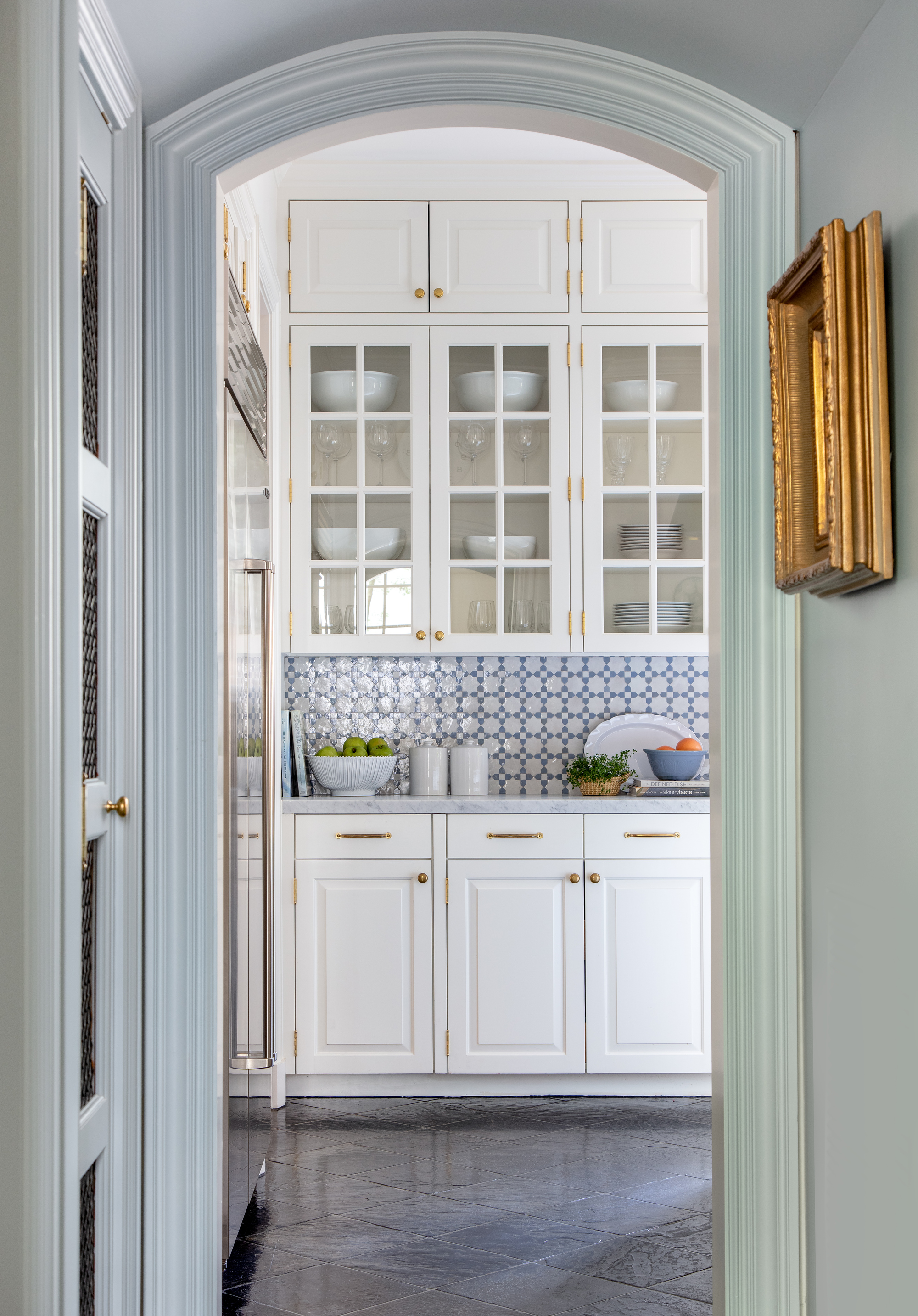
'Farrow & Ball's Parma Gray is the perfect blue-toned gray that adds interest while keeping it fresh and bright,' says Katie Davis of Katie Davis Design. The hue can create a period feel, especially when paired with neutrals, and because this color is so easy on the eyes, there are lots of colors that go with blue on the color wheel.
'The walls of this living room are painted Farrow & Ball Parma Gray,' says Lauren Stern, principal at Lauren Stern Design. 'We love this blue-gray because it feels rich and complex, without being too strong. It provides a perfect backdrop, without distracting or overwhelming the other elements in a room. Parma can feel playful and sophisticated at the same time it complements both cool tones and warm tones like vermillion and brass.'
FAQS
What's the most popular Farrow and Ball color?
The best Farrow & Ball color isn't necessarily the most popular shade since whites and neutrals tend to drive the most sales — as seen in the edit of the most popular Farrow & Ball neutral paint colors — but these kinds of insights can give us a bit of guidance when it comes to decorating.
'From an analytical sales perspective, we see a rise in the popularity of blues with Hague Blue, Railings, and Inchyra Blue all featuring in the top 15 best sellers,' says Joa. 'Consumers are broadly being bolder with their color choices with sales of Pointing and Studio Green being the fastest growing colors of the past year.'
More than specific paint shades themselves, Joa has also seen a change in the way people are using paint. 'Particularly the color drenching trend with people utilizing Dead Flat across woodwork, trim, and ceilings,' she says.

Aditi Sharma Maheshwari started her career at The Address (The Times of India), a tabloid on interiors and art. She wrote profiles of Indian artists, designers, and architects, and covered inspiring houses and commercial properties. After four years, she moved to ELLE DECOR as a senior features writer, where she contributed to the magazine and website, and also worked alongside the events team on India Design ID — the brand’s 10-day, annual design show. She wrote across topics: from designer interviews, and house tours, to new product launches, shopping pages, and reviews. After three years, she was hired as the senior editor at Houzz. The website content focused on practical advice on decorating the home and making design feel more approachable. She created fresh series on budget buys, design hacks, and DIYs, all backed with expert advice. Equipped with sizable knowledge of the industry and with a good network, she moved to Architectural Digest (Conde Nast) as the digital editor. The publication's focus was on high-end design, and her content highlighted A-listers, starchitects, and high-concept products, all customized for an audience that loves and invests in luxury. After a two-year stint, she moved to the UK and was hired at Livingetc as a design editor. She now freelances for a variety of interiors publications.
- Lilith HudsonFormer News & Trends Editor


