How to master a monochromatic color scheme – expert advice for this bold, modern look
Create a modern monochromatic color scheme with our expert advice and ideas for how to replicate the style at home

The Livingetc newsletters are your inside source for what’s shaping interiors now - and what’s next. Discover trend forecasts, smart style ideas, and curated shopping inspiration that brings design to life. Subscribe today and stay ahead of the curve.
You are now subscribed
Your newsletter sign-up was successful
Monochromatic color schemes have become a modern design staple that followed after the 'color pop' trend in interior design. By contrast, monochromatic color schemes are all about layering the same color, or similar tones of the same color, consistently throughout the room, color drenching everything from skirting boards to ceilings. The impact of a monochromatic scheme can add real depth to your interiors.
The effect of using one color throughout a room can really convey and evoke a range of feelings, from warmth and coziness to energy and vibrancy. ‘I find that a using a tonal scheme you can be more manipulative with a color to create a mood,’ says interior designer Daniel Hopwood.
Sue Wadden, director of color marketing at Sherwin-Williams paint also identifies this growing trend correlating with homeowners wanting a certain mood reflected in their interiors. ‘We're seeing people using paint color ideas in deep earthy colors, and going monochrome,' she says, 'especially in a deep hue helps create a cocoon-like feeling. Homeowners want their spaces to feel calm, cozy and like a retreat from the rest of the world. Using a single color that exudes warmth can help achieve this.'
Article continues belowBut a monochromatic scheme is not limited or confined to darks and neutral schemes. From bright yellows to daring pinks, a monochromatic room, when executed with precision, is bold and impressive. For advice on how to make a monochromatic color scheme work in your interior design plans, we asked the expert for tips and inspiration.
7 ways to make a monochromatic color scheme work for your room
'The monochromatic look is true commitment and will reward you with a cohesive and always impressive look,’ says Helen Parker, creative director of deVOL Kitchens. ‘The all-encompassing colour creates an atmosphere of calm where nothing is fighting for dominance. Limited colour palettes make styling a room easier too, you can be much more selective, not necessarily keeping to that same colour but being a little more restrained with your choices.’ However you want to style your monochrome room, here are our top tips for ideas that will work and how to get it right.
1. Use texture as part of the scheme
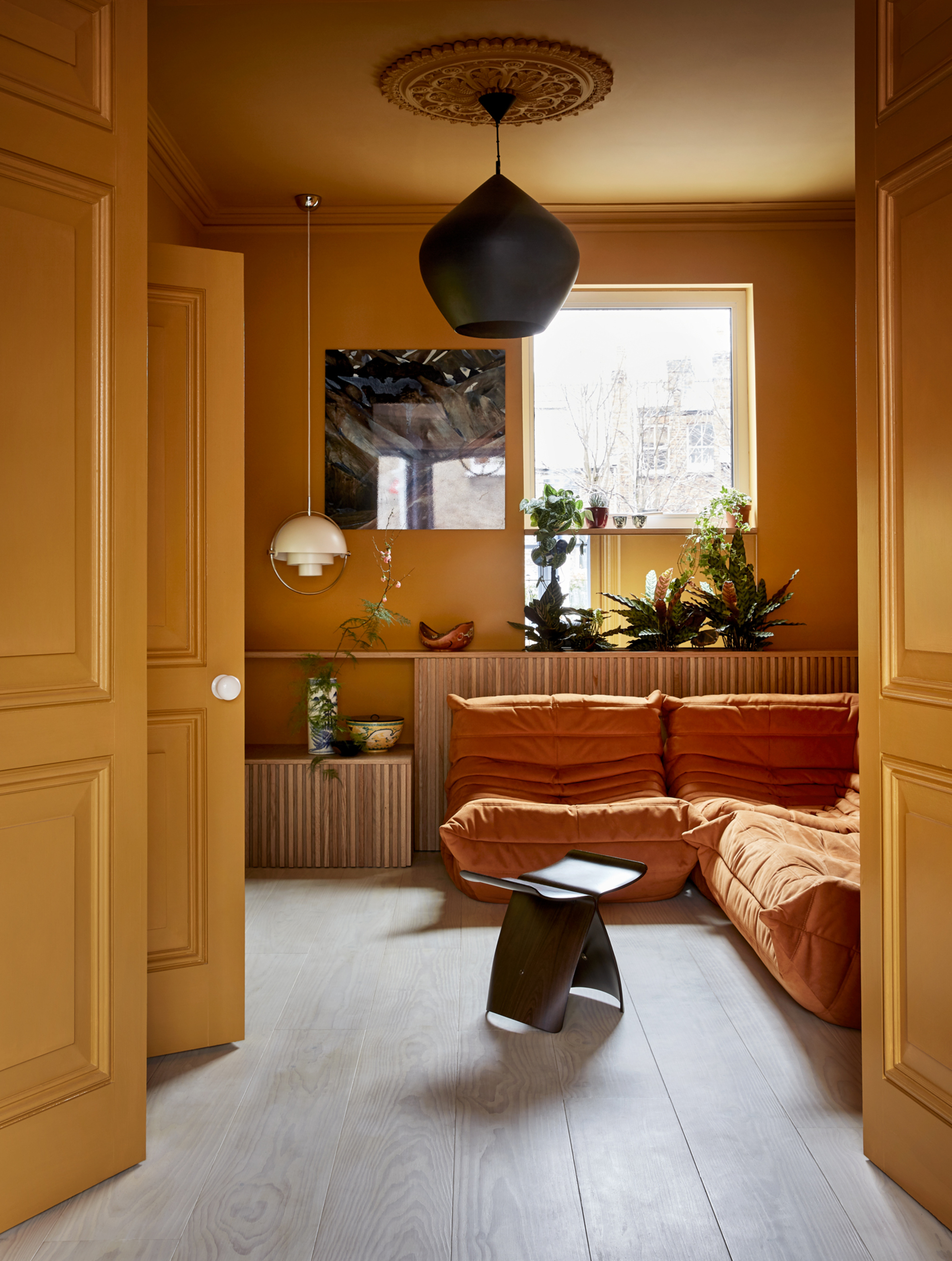
A monochromatic color scheme is about more than your choice of paint, and texture and soft furnishings have a key part to play in your monochromatic aesthetic. 'The whole is greater than the rest of the parts', says Juan Carretero of Capital C Interiors. 'The key to me is using different patterns and textures in an interesting way. It becomes more about the volumes, the negative and positive space between all objects.'
Working with soft furnishings, from rugs and curtains, to harder elements of the room will add an abundance of different shades as the light hits the surface and throws out a varied tone. In this yellow living room idea by Collective Works, the orange Togo sofa creates shadow, texture and interest to the otherwise single-tone ochre walls.
The Livingetc newsletters are your inside source for what’s shaping interiors now - and what’s next. Discover trend forecasts, smart style ideas, and curated shopping inspiration that brings design to life. Subscribe today and stay ahead of the curve.
4. Get graduated tones right
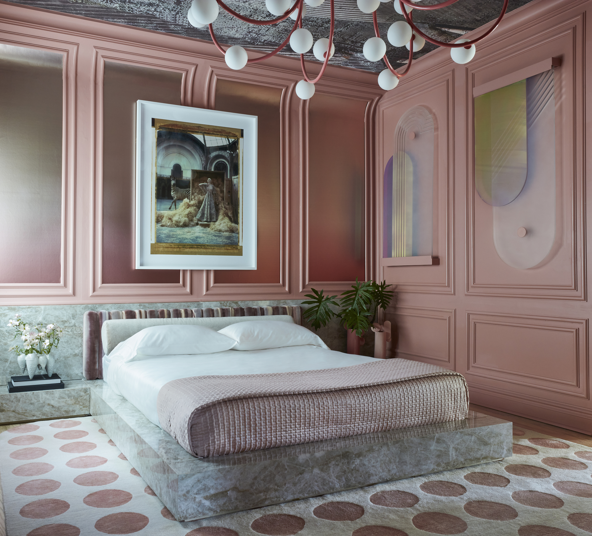
Getting the monochromatic look right is about selecting a group of tonally coordinating colors that have the same base tone before using them across the room. Pick your fundamental shade and look at the paint strip, comparing and contrasting your chosen hue with graduated tones from the same color family in lighter and darker shades. This will ensure the colors work together for a seamless, clean look.
In this example from Nina Magon for Kips Bay Palm Beach, the goal was to replicate the location in the colors in a pink bedroom. 'I used coral pink, Rosy Tan from Benjamin Moore, that I associate with the island,' explains the designer.
'I decided to also pair it with other pink hues, as well as an accent of soft cream. All of my interiors are greatly influenced by my love of Italian design, so I incorporated striking classic Italian elements and paired them with distinguished furniture pieces creating a modern and futuristic design with a monochromatic color palette that was chic and sophisticated. By keeping the pink color hues similar in tone throughout the space and accenting it with soft creams, I was able to create a space that has a vibrant atmosphere that is also elegant and warm.'
3. Use the look to highlight a piece of furniture
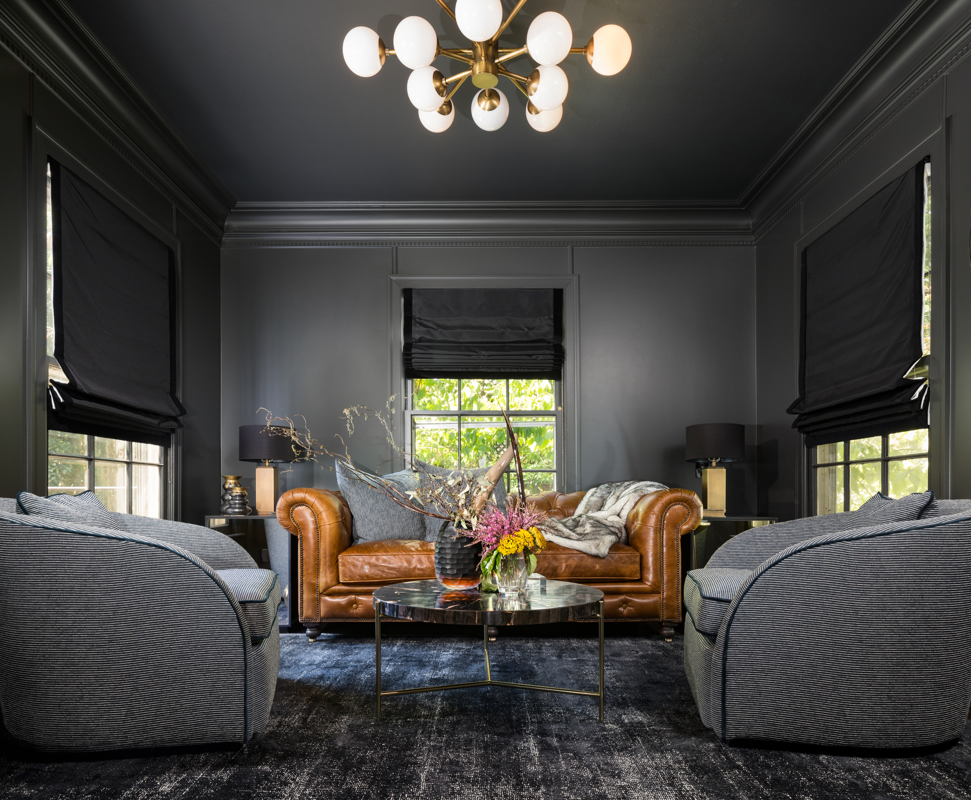
A tone on tone scheme is a clever way of elevating your furniture, says interior designer Daniel Hopwood, from an exquisite chandelier to a centrally positioned sofa. ‘Monochromatic is a perfect backdrop to show off a piece of furniture or work of art without distraction,’ says the UK-based interior designer. 'It’s about using the colour as a stage.'
In this grey living room idea from Maestri Studio, the grey tones of curtains, the rug and paint on the walls creates a space for the Chesterfield sofa to bring a strong contrast and take the spotlight.
'This room was originally used as a library in this Dallas 1941 Colonial. The client wanted to keep the special footprint of this space, but use it in a more modern way as a gentleman's lounge,' explains Janelle Burns, lead interior designer at Maestri Studio.
'From the start, he told us he wanted this room to feel different and special. It's off the main entry to the home, as well as connected to the formal living room. Knowing this space was visible from both of those key areas, we followed the project's handsome palette of neutrals, blues and black and used the dark colors in a stronger way for this particular space. This room has three windows so it still lets in a lot of light during the day, and the all-over dark color helps it feel cozy and moody, which is exactly what you want in a lounge space at the end of a day as the sun goes down.'
4. Go bold with your paint
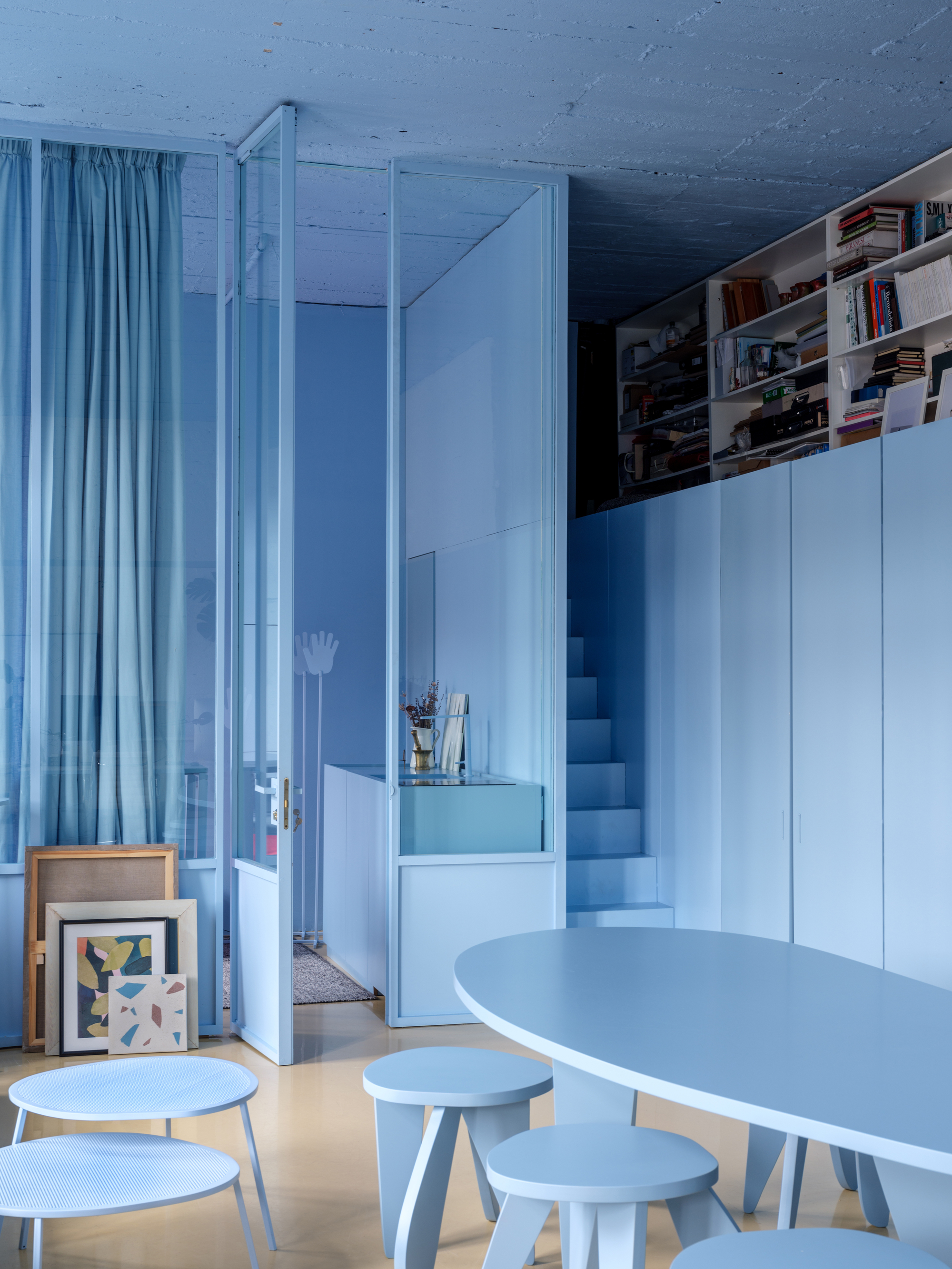
Don’t be afraid to go bold with the monochromatic scheme and opt for something that will surprise guests to your home. In this scheme, the Crosby Studios blue sets a stage and creates vibrancy and a sense of sophisticated elegance.
'Think inside of the blocks,' says founder of Crosby Studios, Harry Nuriev, who designed this baby blue loft apartment style space. 'One color can change the perception of the whole room.'
Don't leave anything out of your monochromatic look either. Color drenching is as much about the skirting, woodwork, cornices and ceiling as it is about the walls.
5. Try a neutral scheme
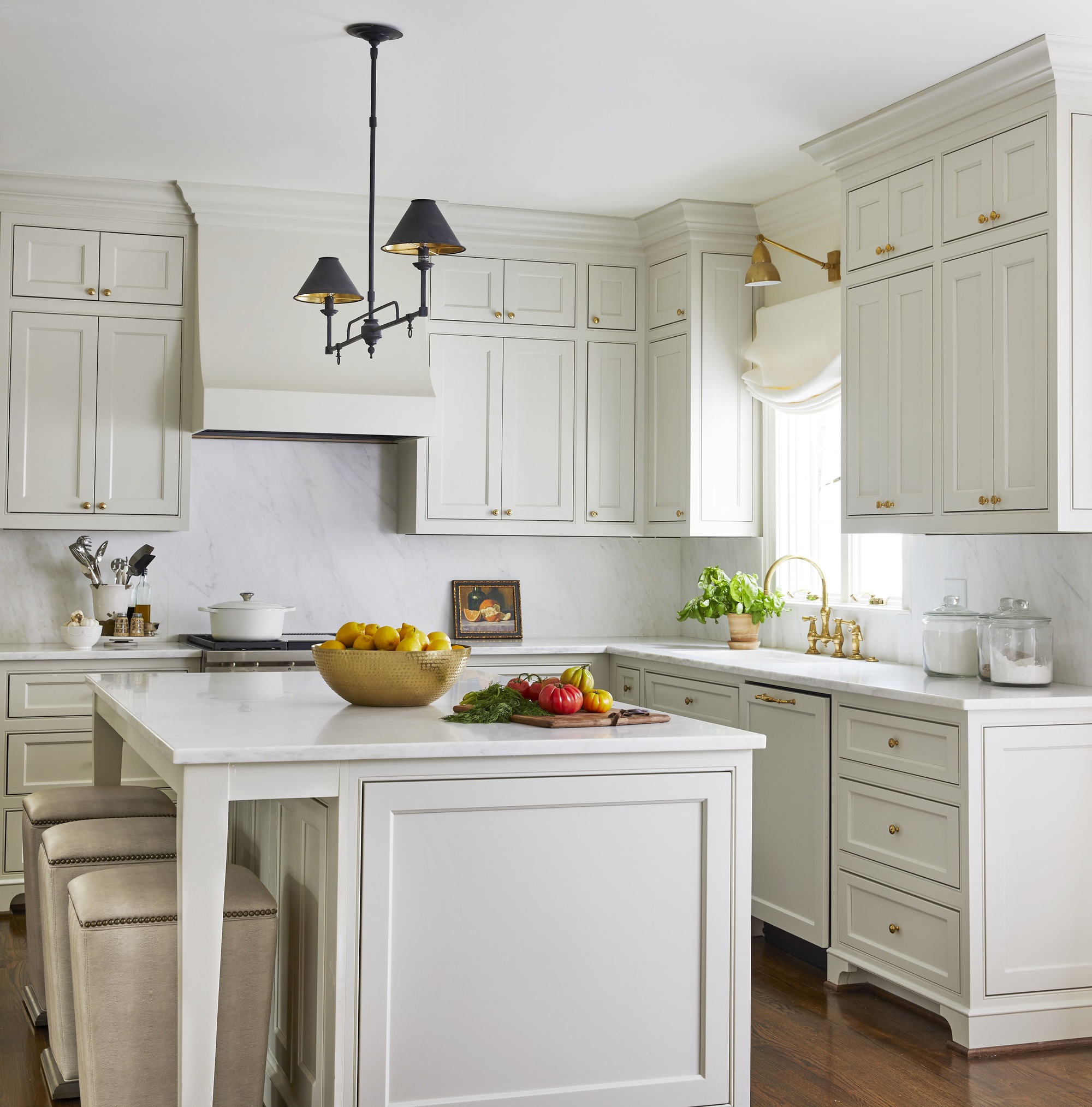
For those looking to try out the scheme but might be a bit more timid to go all out on a bright pop of primary color, start by going neutral. Inoffensive and calming, the bedroom or kitchen a great place for a neutral scheme where you might want to create a peaceful space through the use of whites, greys, taupes and beige. This white kitchen idea is by Caroline Brackett, an interior designer based in South Carolina.
6. Introduce glimmers of other colors
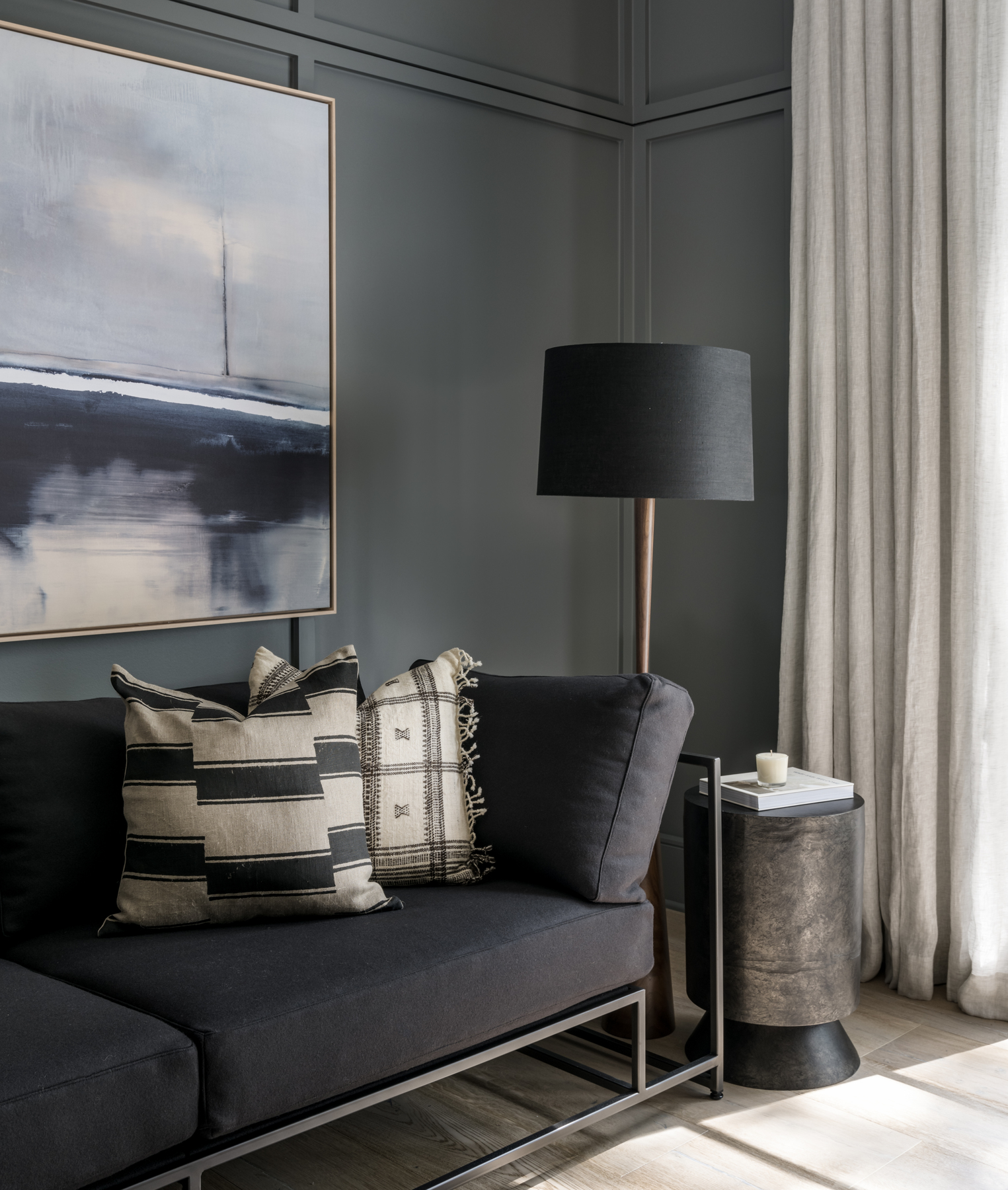
Add some interest with other colors creeping in there as well as your chosen dominant shade. This will keep the space interesting and add a flow to the interiors. ‘The pops of beige in this painting is carried through the room on the pillows and the curtains,’ explains Lindye Galloway, founder of Lindye Galloway Studio. ‘It helps to add more dimension to the room against the dark background without drawing attention away from the bold impact the grey scheme makes.’
7. Think about placement of color
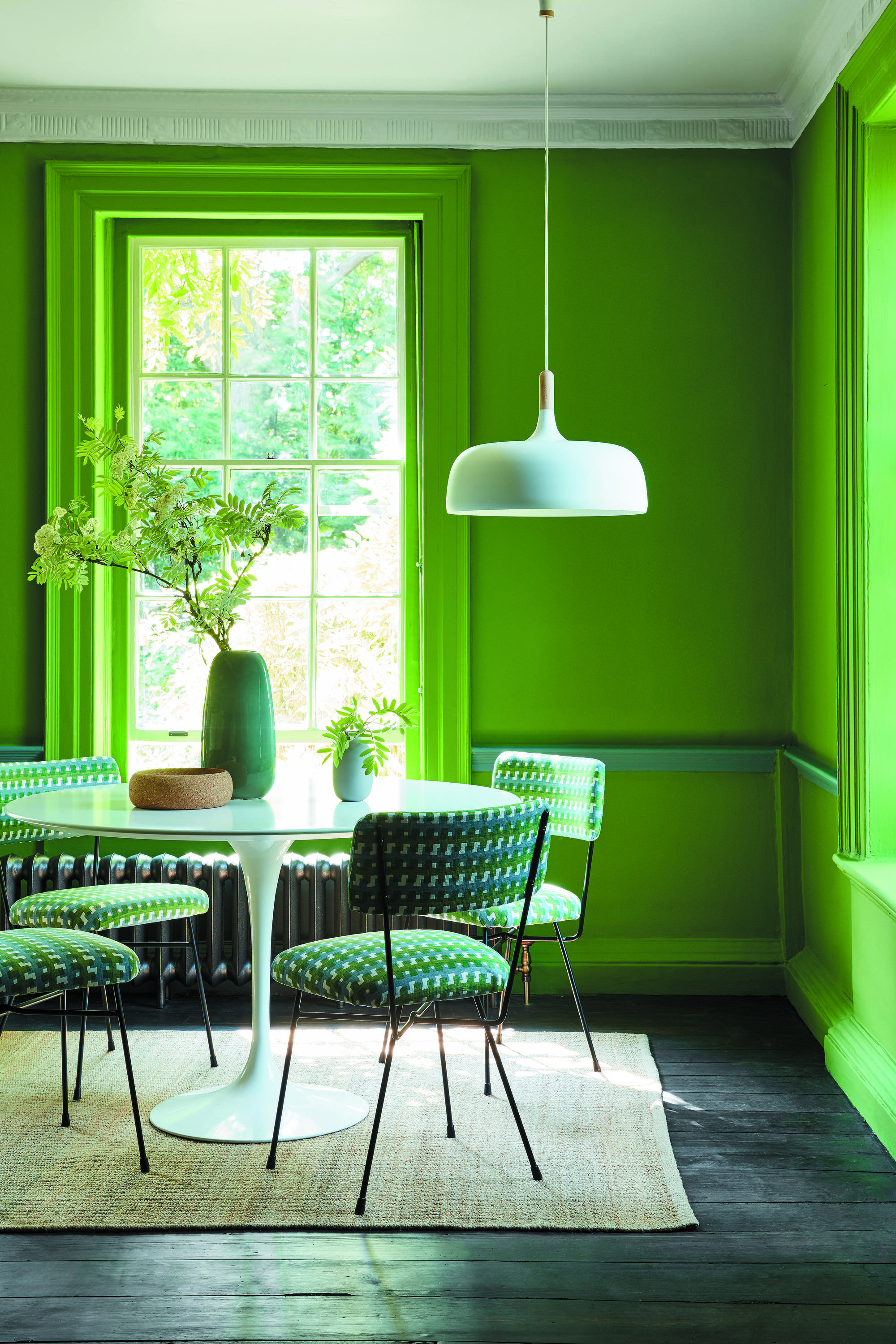
When considering how to order your colors from light to dark, think about the intention of the room and the brightness you want to achieve. ‘If you’re wanting to create as much space and light as possible, then it is best to use the lightest tone on the walls and a darker tone on the woodwork,’ says Joa Studholme from Farrow & Ball. Stronger tones can be added on joinery or in the back of shelves or on a dado rail to add some depth and interest and make the most ordinary features look special.
'Similarly, simple patterned wallpaper ideas in the same colour, can be added into recesses or inside cupboards to create a more luxury feel without breaking the overall calmness of a single colour scheme.’
How do I use a monochromatic color scheme in interior design?
The golden rule can be a great tool to use in creating a cohesive and comforting monochromatic scheme, explains founder of Andrew Martin, Martin Waller. 'Some call it the 60/30/10 rule, making it much easier to apply practically as you consider each element of your room using this ratio, from the scale of your furniture and structural details, right down to the colour scheme and textural components.
'Colour is a great way to get started with this theory, choose your three tones and split them into these ratios, 60 per cent of your space should be one colour, perhaps through the paint on your walls and larger pieces of furniture. Choose another shade to be your 30 per cent colour and apply it through textiles such as curtains and rugs. Finally use your third colour throughout accents and accessories, using it across 10 per cent of your space to create a balanced and well thought out look that will appear almost effortless.’

Former content editor at Livingetc.com, Oonagh is an expert at spotting the interior trends that are making waves in the design world. She has written a mix of everything from home tours to news, long-form features to design idea pieces, as well as having frequently been featured in the monthly print magazine. She is the go-to for design advice in the home. Previously, she worked on a London property title, producing long-read interiors features, style pages and conducting interviews with a range of famous faces from the UK interiors scene, from Kit Kemp to Robert Kime. In doing so, she has developed a keen interest in London's historical architecture and the city's distinct tastemakers paving the way in the world of interiors.