10 Colorful Scandinavian Schemes That Prove This Style Is So Much More Than Pared-Back White Rooms
Believe it or not, there’s no shortage of colorful decorating ideas coming out of the Scandinavian region

The Livingetc newsletters are your inside source for what’s shaping interiors now - and what’s next. Discover trend forecasts, smart style ideas, and curated shopping inspiration that brings design to life. Subscribe today and stay ahead of the curve.
You are now subscribed
Your newsletter sign-up was successful
The Scandinavian aesthetic is about so much more than a pale color palette. In fact, we’ve noticed the region’s interior designers are taking a far more vibrant approach lately, proving that the right combination of shades can make spaces look and feel uplifting, while maintaining their Scandi sensibilities.
Of course, even the most colorful Scandinavian interior design ideas still reflect the considered look the region is known for. Whether you’re inspired to embrace Scandinavian maximalism with a playful patterned wallpaper or opt to create an elegant look with richly-hued furniture, finding the right balance is key to ensuring your scheme appears colorful, not chaotic.
So, how can you take a Scandinavian approach to creating a colorful space in your own home? We asked leading interior designers and color experts to share their ideas.
Article continues below1. Start From the Ground Up
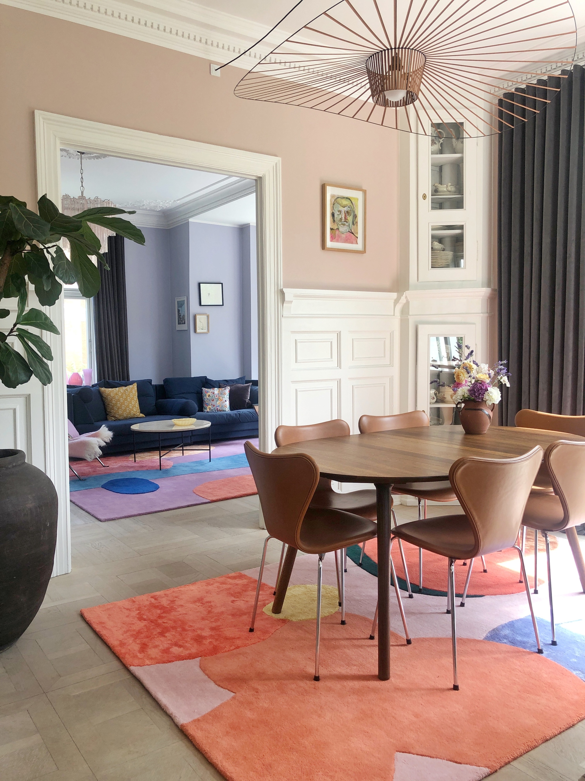
Colorful rugs become an instant feature in this open-plan living and dining room.
To add an instant boost of color to Scandinavian design, think about what’s underfoot — a new rug, whether you go for a playful pattern or more of a graphic design, can transform the look and feel of a room and become a real focal point within it.
“Adding a colorful rug into a room creates joy, warmth, and even a bit of drama,” says Malin Glemme, founder and creative director of LAYERED.
The more colorful, the better. “There’s a clear appetite for bolder expressions at the moment, and rugs are an excellent way to experiment with colors in a really artistic way,” explains Malin.
2. Balance Bolder Hues
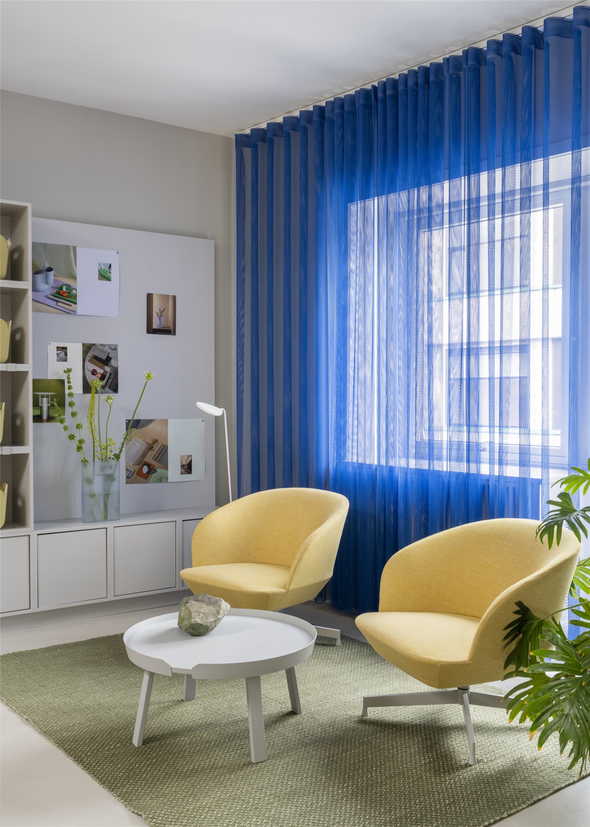
While the walls in this colorful Scandinavian interior are neutral, the textiles are anything but.
This colorful Scandinavian interior, designed by Muuto and spotted recently at Copenhagen’s 3daysofdesign festival, combines bold cobalt with softer yellow and green shades in a room that’s otherwise neutral white. “This palette is layered and intentional rather than overwhelming,” explains Eloise Pfeiffer from Pfeiffer Design.
The Livingetc newsletters are your inside source for what’s shaping interiors now - and what’s next. Discover trend forecasts, smart style ideas, and curated shopping inspiration that brings design to life. Subscribe today and stay ahead of the curve.
“The space reflects the shift we’re noticing in our own clients, especially in projects inspired by the Scandinavian aesthetic,” she adds. “While there’s still an enduring love for calm, clean minimalism, we’re embracing bolder tones and richer textures to bring personality and warmth.”
“It’s about restraint, understanding where to be bold and where to soften," Eloise continues. "A deep-toned curtain or a vibrant accent chair can bring just the right amount of drama to enliven a room without overpowering it.”
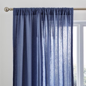
Often an overlooked design element, your choice of curtain color gives you an opportunity to inject a bit of playfulness into your interior.
3. Climb the Walls
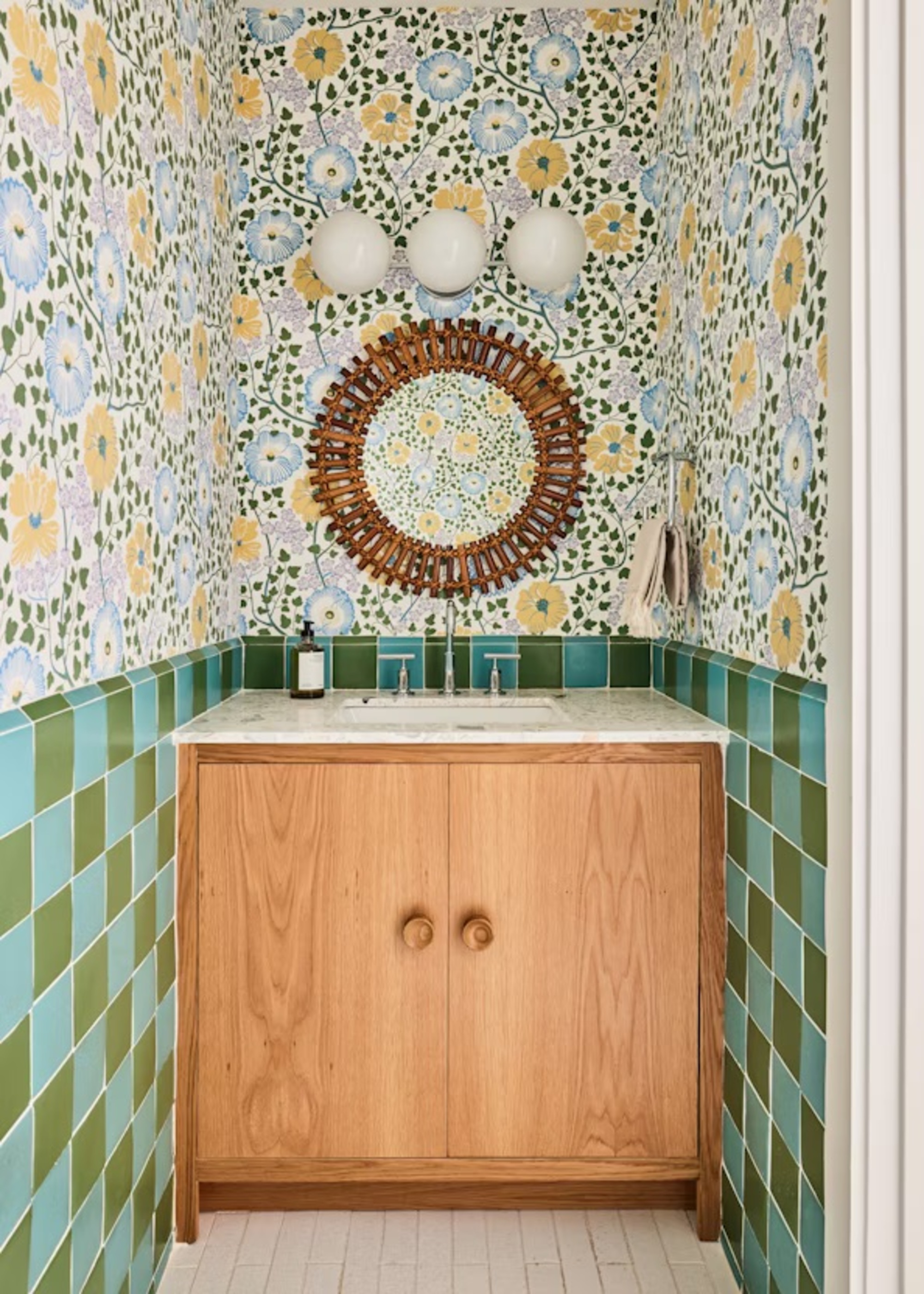
Scandinavian design giant Josef Frank’s wallpapers set a joyful tone in any space.
As one of the trailblazers of Scandinavian maximalism, Josef Frank created beautiful textile and wallpaper designs that are perfect for colorful Scandinavian interiors, whether they’re in Copenhagen or California.
“We use a lot of his designs in our projects,” explains Jennifer Bunsa from Bunsa Studio, who created this powder room as part of a wider project in South Florida. “He captured a vibrancy and fascination with the natural world that really resonates.”
“In this space, we balanced the organic floral pattern with the checkerboard geometry of hand-painted terracotta tiles. When mixing color and pattern, we like contrast.”
Born and raised in Miami, Jennifer takes a global approach to design and decoration. She has worked on projects across the world, collaborating with her clients and blending influences to create soulful, layered spaces.
4. Have Some Fun
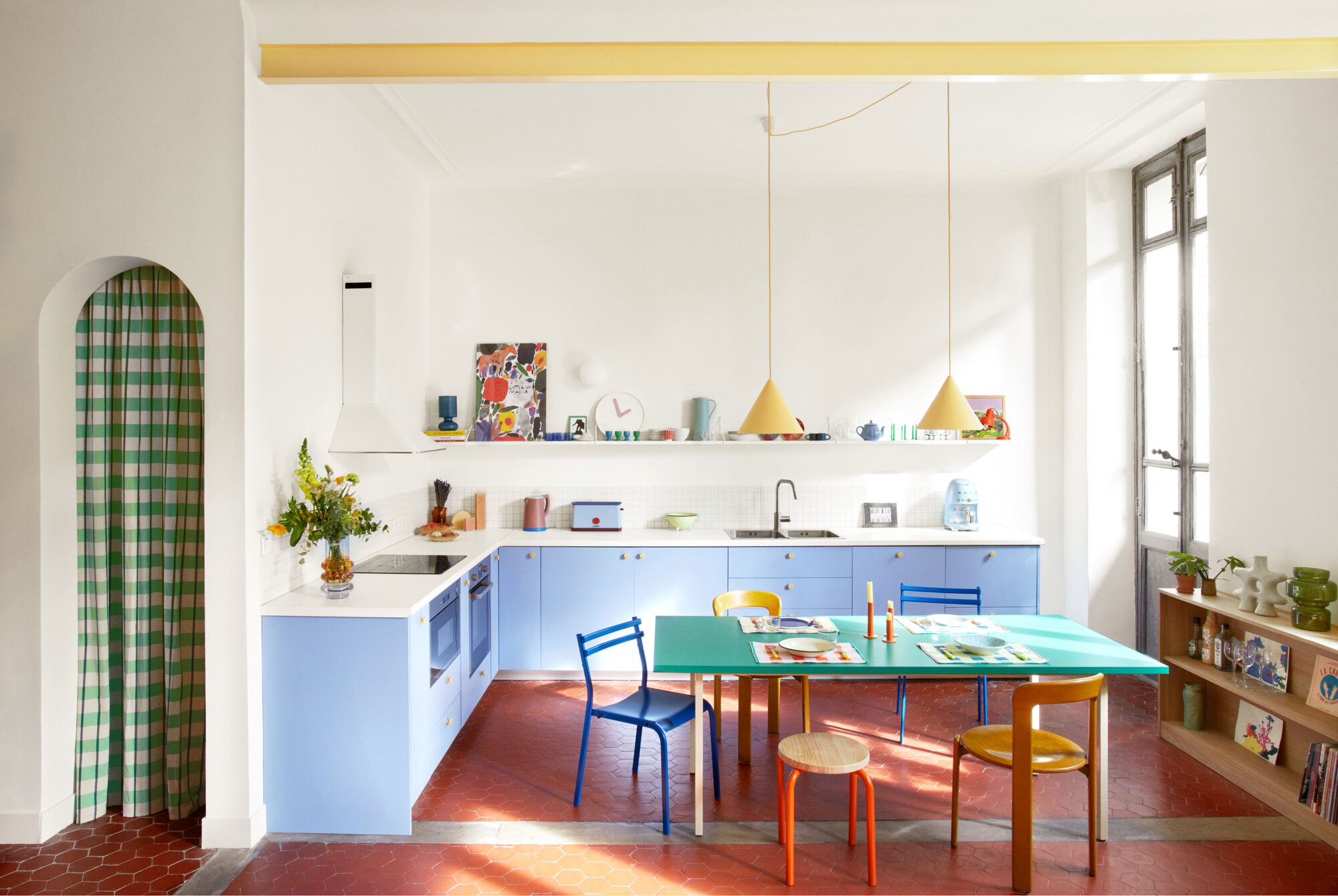
This kitchen features bright colors designed to boost the mood.
Decorating with color can transform how a space feels. In Scandinavian countries, lighter colors respond beautifully well to natural light and can, importantly, energize spaces on darker days.
“Bright and joyful colors can create a playful look, and you can use them to make a space feel really fresh,” says the interior designer Sophie Sarian, who created this lavender-blue kitchen to have a distinctly Scandinavian vibe.
“I see a project like a painting, and I always pay attention to the balance of colors and materials,” explains Sophie. “Here, I used colorful pieces from the Scandinavian brand HAY, which always makes everyday objects very desirable, and repeated the same exact yellow shade for lights, chairs, and even cabinet knobs.”
5. Create a Sense of Contrast
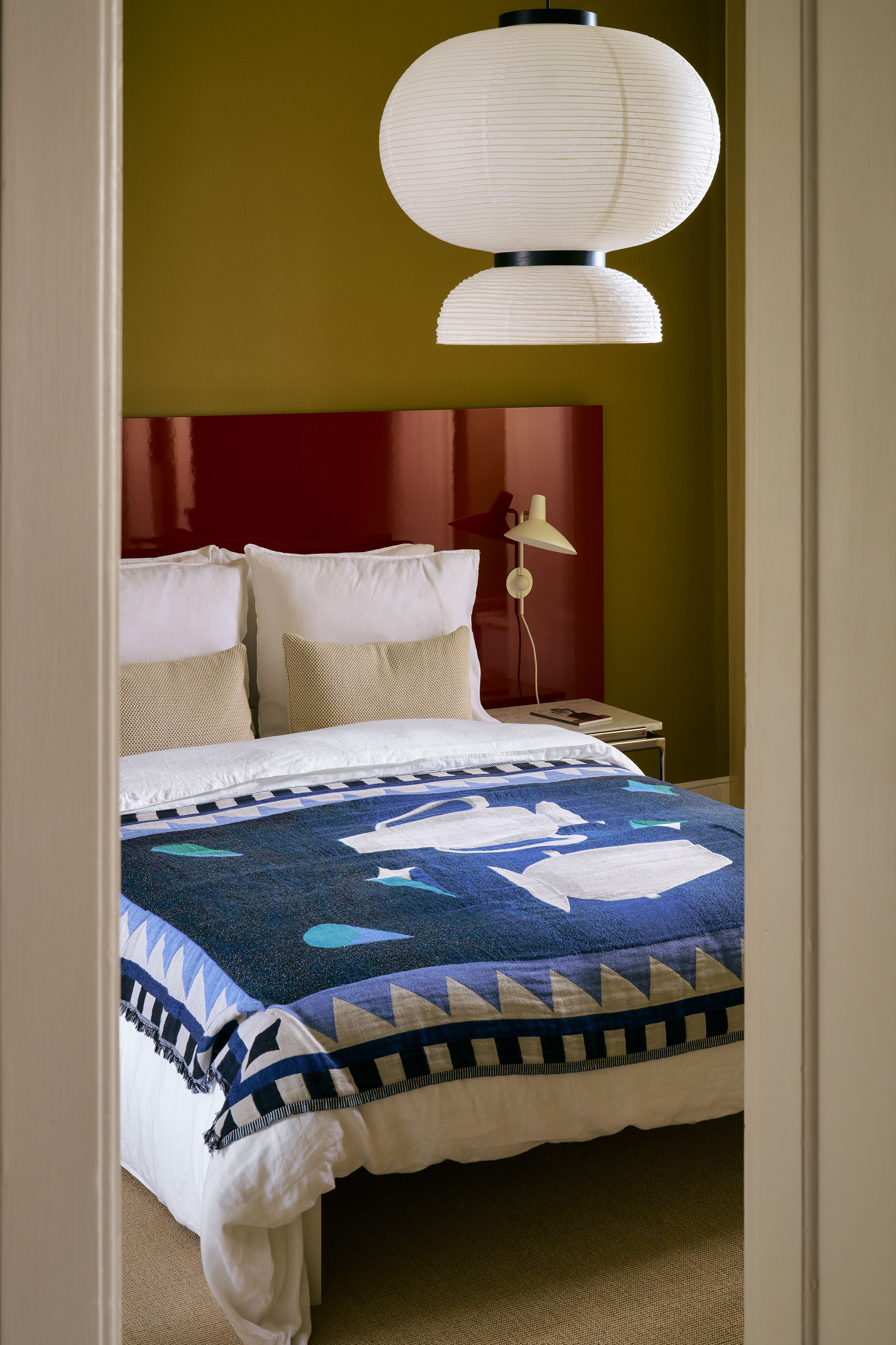
Deep, rich shades are perfect for a bedroom, especially when contrasted with crisp bright white.
“Rich colors need room to breathe,” says Stephen Nash, founder of All & Nxthing Interior Design Studio. “In this space by &Tradition in Copenhagen, the olive green wall and high-gloss oxblood headboard create a grounding warmth, but it’s the contrast with the white bedding and paper pendant that lifts the colors up.”
“It’s a great example of how contrast, when used deliberately, can energize a palette,” he explains. "Rather than everything blending softly, there’s a dynamic push and pull: the white isn’t just a neutral, it’s active. The white acts as a kind of punctuation that keeps the overall look graphic and modern.”
Another key takeaway here is that texture can also impact how color is seen. “The glossy headboard reflects light differently to the matte olive wall, which adds subtle depth even within a light tonal range,” Stephen explains.
6. Celebrate the Fifth Wall
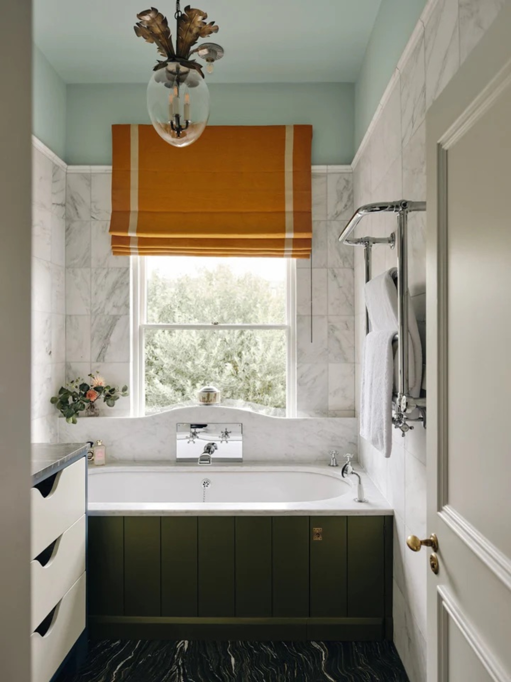
Beata Herman’s bathroom is layered with color, but in a way that feels relaxed rather than riotous.
If you’re creating a colorful bathroom, don’t forget the ceiling — the ‘fifth wall’ is the canvas you’ll be gazing up at as you enjoy a soak in the tub.
“Painted ceilings offer an opportunity to add atmosphere, as shown here in Beata Heuman’s bathroom,” says Dominic Myland, who collaborated with the Swedish designer on a range of colors for his paint brand Mylands. “Here, it becomes a moment of surprise, drawing the eye upward and transforming the feel of the room.”
“Use a contrasting accent color to bring character,” Dominic suggests. “The juxtaposition between the dark marble flooring, cloud-like marble walls, and the soft sky blue of the ceiling highlights the importance of balance in Scandinavian design.”
7. Design Around Artwork
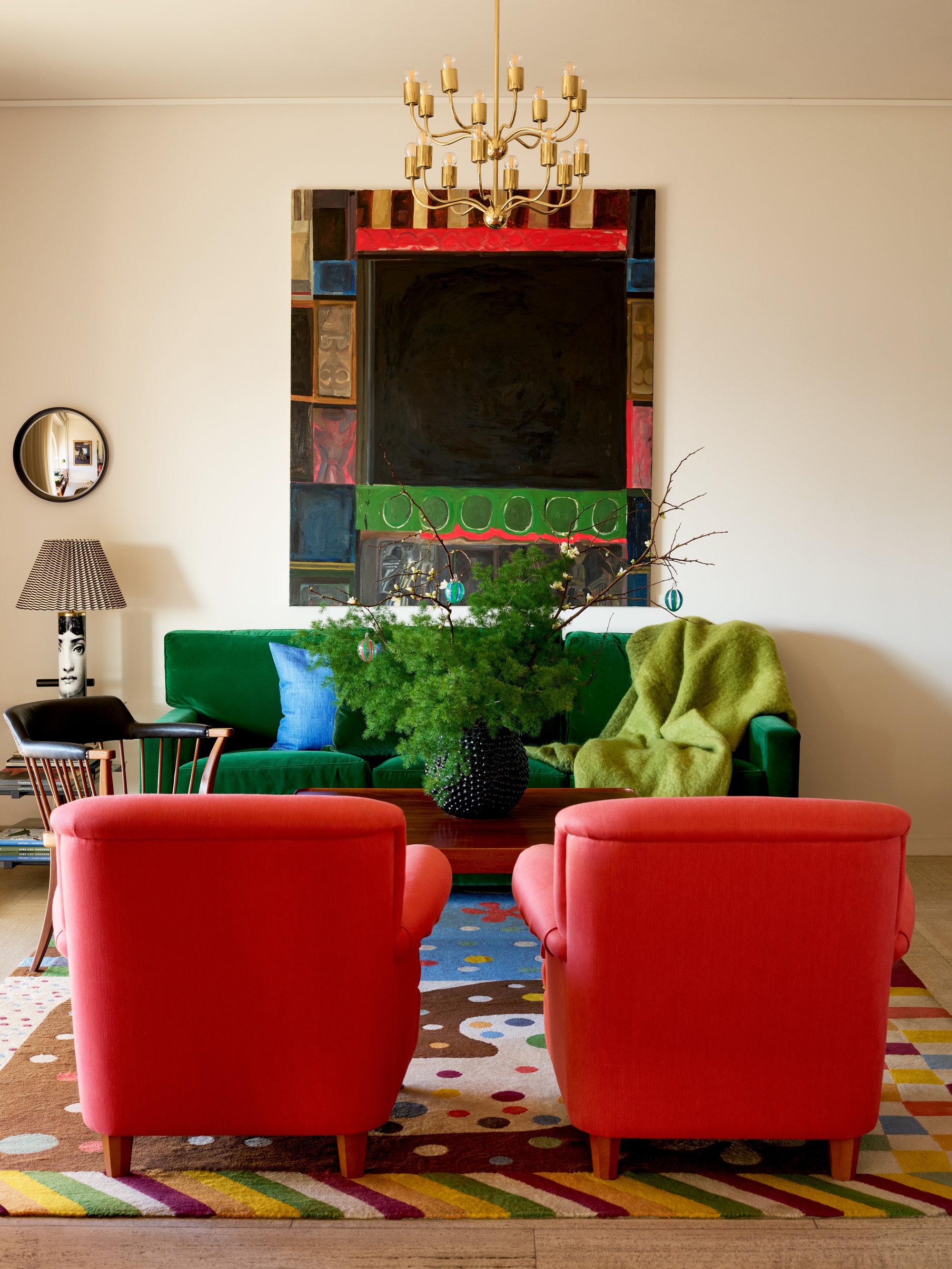
A painted canvas is the inspiration behind the palette in this colorful Scandinavian interior.
In this space, created by the iconic Scandinavian design emporium Svenskt Tenn, a colorful painting takes center stage and becomes the starting point for the color palette. “Art plays a pivotal role in informing the design narrative for many of our projects, too,” reveals the interior designer Rebecca Hughes.
“I love how the colors in the painting echo the surrounding interiors, with the stripe of red in the armchairs and the rich green mirrored in the velvet sofa," she says. "The rug, with its beautiful mix of blues, anchors the space and pulls the whole room together.”
“A simple trick is to keep the color palette simple, picking out just a few colors from a design, whether that’s wallpaper, fabric, or, yes, a painting, and incorporating them throughout," she adds. "This will create balance and harmony.”
8. Choose Your Hues Carefully
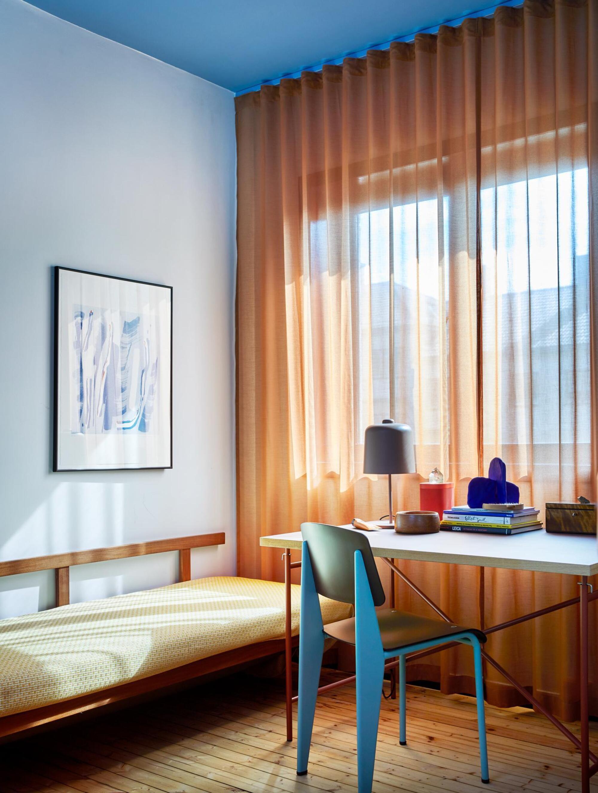
Shades of blue are ideal for promoting productivity and have been shown to boost focus.
In spaces designed for creativity or study, blue is an excellent anchor color. “It works well in natural and artificial light, but also combines easily with other colors,” explains Danielle Duijin from Pure & Original, who collaborated with Norway-based Koi Color and Design Studio on the paints in this space.
“We used a monochrome palette consisting of one base color in different shades, so the darker blue on the ceiling to make the space feel cozy and intimate, and the walls in a lighter one for a modern, calming effect,” she explains.
The drapes, upholstery, and furniture, meanwhile, are in pared-down shades of green and yellow. “Complementary colors can create an exciting and dynamic contrast, but my tip would be to use one main dominant shade in a space and then others as more of an accent,” says Danielle.
9. Mix It Up
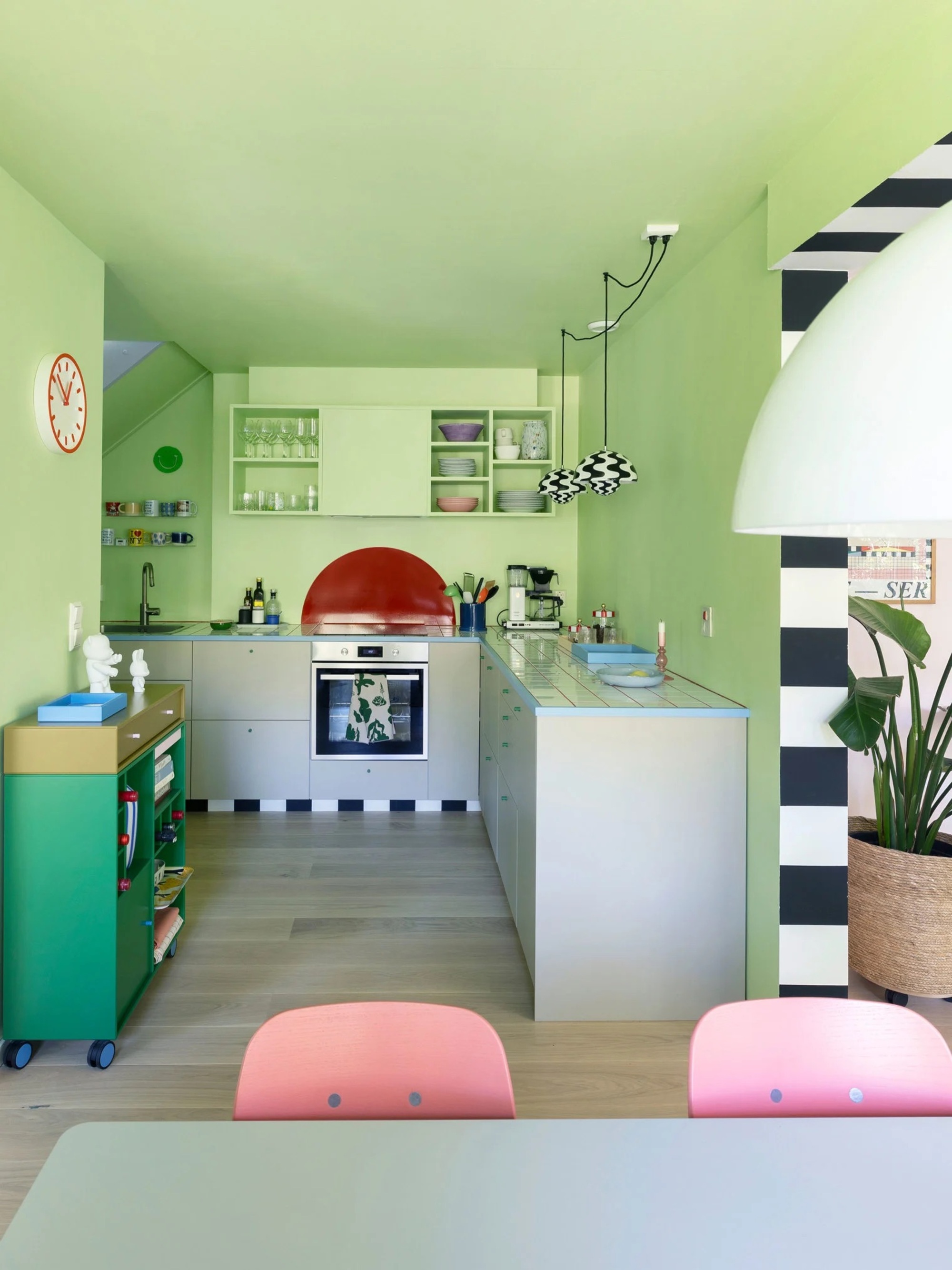
This Scandinavian-style kitchen shows that playfully designed rooms can still look and feel polished.
“Life is simply better in color,” says Karoline Nygaard Petersen, the creative lead of Montana Furniture. “I genuinely feel happier when I’m surrounded by it!” Her apartment in Oslo includes a colorful kitchen, which speaks to her love of decorating with many different hues.
From pink dining chairs and blue-trimmed worktops to a green storage unit, Karoline was inspired by Camile Walala for the black and white stripes, as well as the Memphis movement more generally. The pastel green walls contrast beautifully with other unexpected color details.
“For me, color combinations work best when they happen along the way. When a space is too perfect, it can become boring — so don’t worry about being carefully coordinated. I care a lot about personal style, and love the more-is-more philosophy,” says Karoline.
10. Make Fitted Furniture a Feature
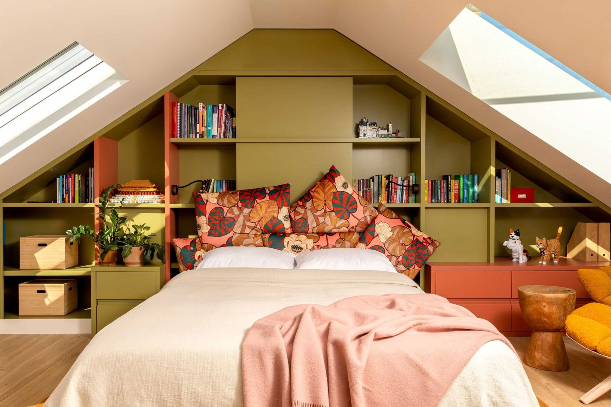
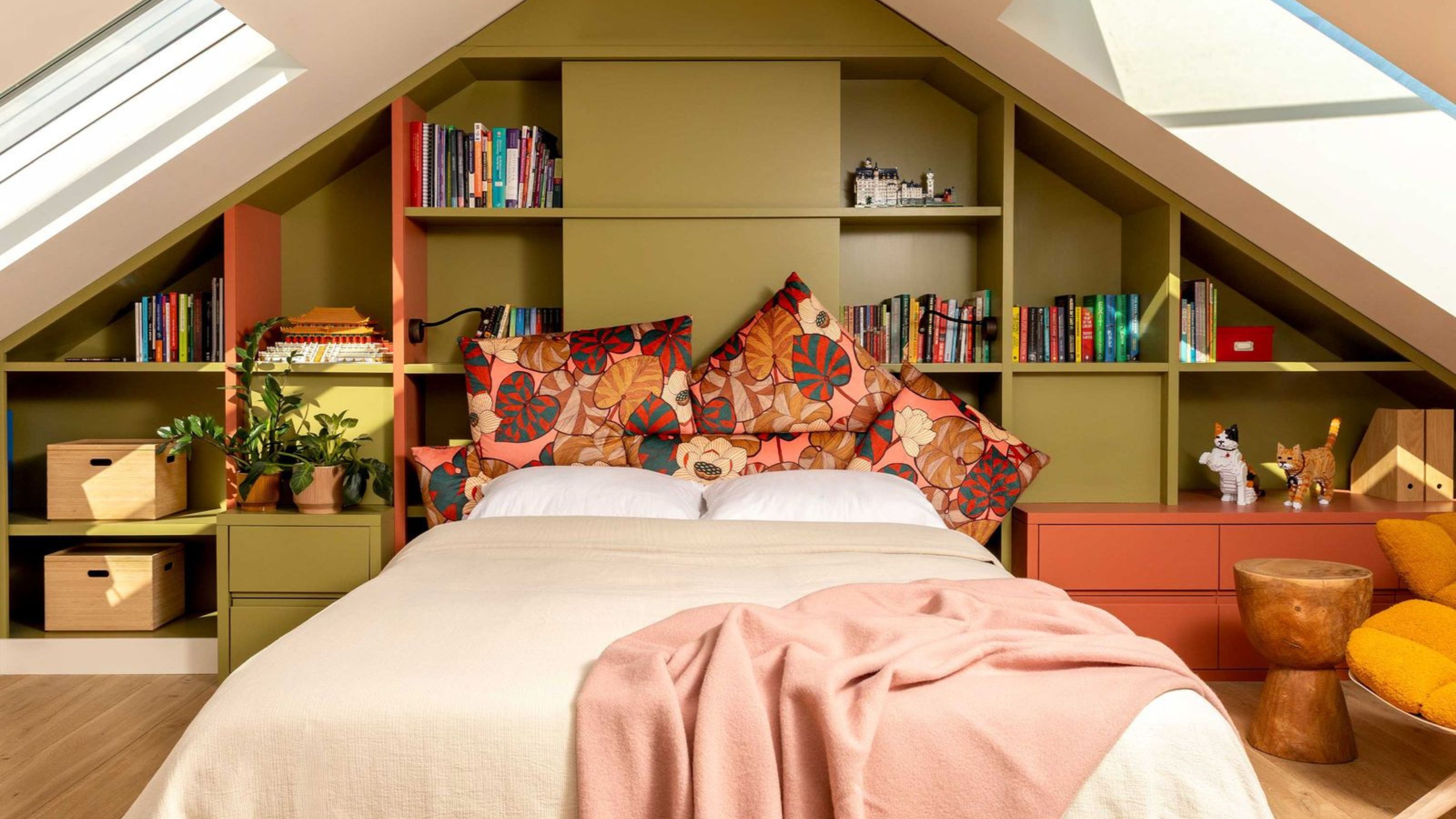
The green and orange cabinetry in this attic bedroom becomes a colorful focal point.
“While Scandinavian design is often linked with neutral palettes, we wanted to explore how we could use color in a way that still felt clean, intentional, and calm,” says interior designer Mia Karlsson.
“Using color on the cabinetry rather than the walls allowed us to highlight the joinery as a design feature in its own right,” she explains. “Color draws the eye to the craft and detail, which makes the built-in elements feel more bespoke.”
“The orange and green color combination was a conscious decision to bring a sense of rhythm to the space, and the two shades complement each other well — one warm, one cool, which creates a visual balance,” Mia says. “By color-blocking the shelving, it becomes much more than just simple storage.”
Mia started her interior design firm back in 2004 and has since completed over three-hundred projects. She leads a team of designers, architects and creatives to bring her signature Scandinavian sensibilities to clients across the world.
FAQs
How Do You Balance Color in Scandinavian Interiors?
The key is restraint. Even with colorful Scandinavian interior design dedicated to maximalism, there’s a sense of order and structure to the mix of colors and patterns.
Keep to a palette of three or four colors, rather than an overly eclectic blend of shades. Having a main base color, typically on the walls, allows you to weave further colors in through textiles, furniture, and accessories in a layered way.
Whether you’re considering a bathroom remodel or painting a new shade on walls, these colorful Scandinavian interior design ideas are bursting with inspiration to create joyful spaces no matter where you live.
Can’t be convinced to go beyond the pale? If you prefer a more neutral take, then take a peek at our Scandinavian coastal ideas where a gentle palette reigns supreme.

James Cunningham is a freelance journalist based in London. He has written extensively on design and decorating for some of the UK’s leading publications, including House Beautiful, ELLE Decoration, and Country Living, and previously served as Homes and Gardens Editor at Good Housekeeping. When he’s not at his desk, James can be found globetrotting in search of good food, better wine, and the best architecture.
