3 'Rich' Color Combinations to Borrow That Will Make Your Home Look the Most Expensive It Ever Has
You may love sophisticated and heavily saturated colors, but they're not always so easy to layer together — here's how to do it

A home rich with color is a home steeped with character and emotion. But color demands consideration. Whether your tastes lie with enveloping teals reminiscent of deep ocean water or warming coral reds that light up a room, selecting cohesive, rich color combinations requires careful deliberation.
Rich colors convey opulence and luxury. When it comes to incorporating rich color combinations in your home, your first thought may be to pair dark browns and blues with light neutrals. However, the most successful pairings are often all about embracing deeply pigmented hues with more delicate layering.
Think of the details, don't be afraid of texture, and use furniture and decor as a way of balancing the palette. And when it comes to decorating with colors such as these, interior designers swear by these three rich color combinations.
Article continues below1. Teal, Purple, and Taupe
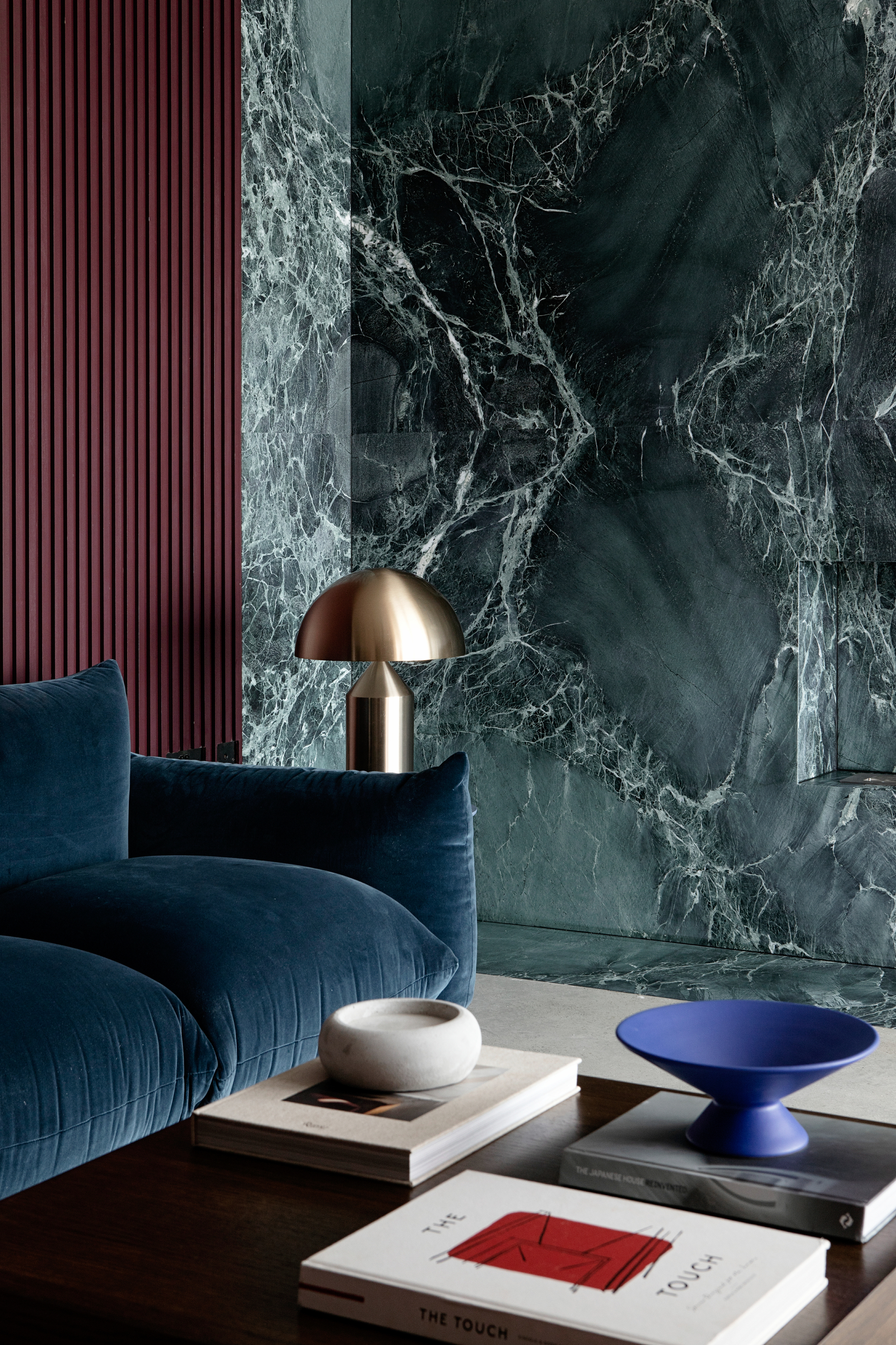
Every inch of this rich color combination is saturated, moody, and exciting. Pro tip: using different materials helps break up solid colors.
Dark teal, plum purple, and taupe are a scheme that feels romantic and considered. "This scheme is a rich color combination that we curated for the Soho House palette (specifically using Teal 03, Purple 03, and Taupe 03)," says Tash Bradley, director of interior design at Lick. "It's designed for moments where you want to slow down and create atmosphere."
Think velvet textures, soft lighting, and a glass of wine. Teal and oxblood-leaning purples (pictured in the image above) typically have a more yellow undertone, while purple and taupe are grounded by red. "The result is warm, inviting, and beautifully cohesive — it’s the kind of palette that envelops you," says Tash.
So, how should you style them? "These colors absolutely come alive when you go all in and color-drench the space," recommends Tash. "You’ve really got to hold your nerve with these darker colors and wrap the space in color, to create a rich, cocooning atmosphere."
For a dramatic look, use oxblood on the walls in a dining room or sitting room. From there, interior designer Lauren Saab, founder of Saab Studios, recommends, "Bringing in burgundy velvet or mohair on the chairs or accents, and let ivory come in through soft textures like plaster ceilings, linen panels, or vintage lampshades."
The Livingetc newsletters are your inside source for what’s shaping interiors now - and what’s next. Discover trend forecasts, smart style ideas, and curated shopping inspiration that brings design to life. Subscribe today and stay ahead of the curve.
A rich color combination like this is best used in rooms where boldness matters and the design needs to carry visual weight, such as in kitchens, libraries, or formal dining rooms.
It's deep, saturated, and slightly mysterious. Oxblood sets the base, teal adds dimension, and ivory keeps it from collapsing into shadow. The whole palette feels elevated and soulful.
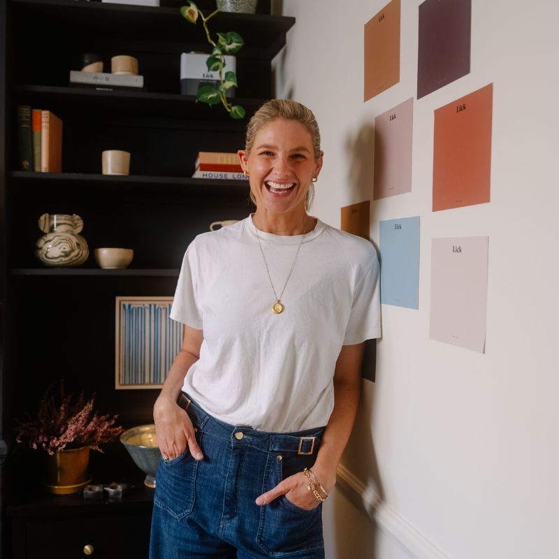
Tash Bradley is the director of interior design and curator of Lick’s collection of 100 pigment-rich paint colors. Tash has given color consultations on over 6,000 projects across the UK, EU, and US, giving homeowners the color confidence they need to transform their homes. Leveraging her expertise in color psychology and theory, Tash helps people find the colors that will positively impact not only their personal spaces but also their lifestyle and well-being, and has also authored a book, Master the Art of Colour.
2. Dark Green and Deep Brown
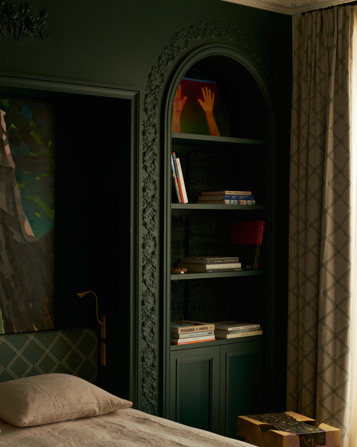
Something about a dark green room oozes luxury with a hint of dark academia. Use wooden furniture to bring in those dark brown accents.
"We love pairing emerald green with a deep brown of a similar tone for a classic take on a rich color combination," says interior designer Oksana Zavarzina, founder of LakeandWalls. "Together they feel both elegant and grounded."
Greens and browns are classic colors, meaning they won't go out of style anytime soon. "Olive green brings an organic imprint to a room while the brown offers a modern, sultry backdrop," Oksana adds. "Perfect in a grounded yet slightly edgy, confident space."
As for how to use them? Go bold, always. "Consider applying these special colors to pieces with presence: sculptural chairs, unexpected silhouettes, or lacquered cabinetry, and let them command attention," suggests Amanda Sinistaj, founder of Ellwood Interiors.
Adding touches of brass or a lighter neutral, like Benjamin Moore's Swiss Coffee paint color, brings in a layer of freshness and quiet luxury.

Amanda Sinistaj is the founder of Ellwood Interiors, an award-winning interior design studio based in Birmingham, Michigan. Since 2012, Ellwood Interiors has been known for its elevated residential work across the United States. Amanda is a graduate of Michigan State University and, along with her team, the recipient of 51 awards for design excellence in metro Detroit, MI, and has been featured in over 30 publications both locally and nationally.
3. Burgundy, Coral, and Golden Yellows
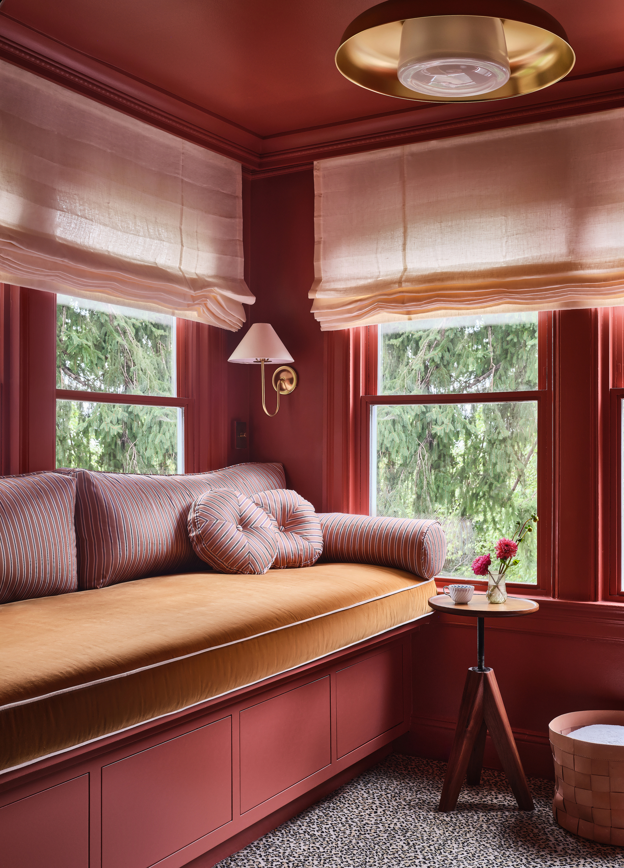
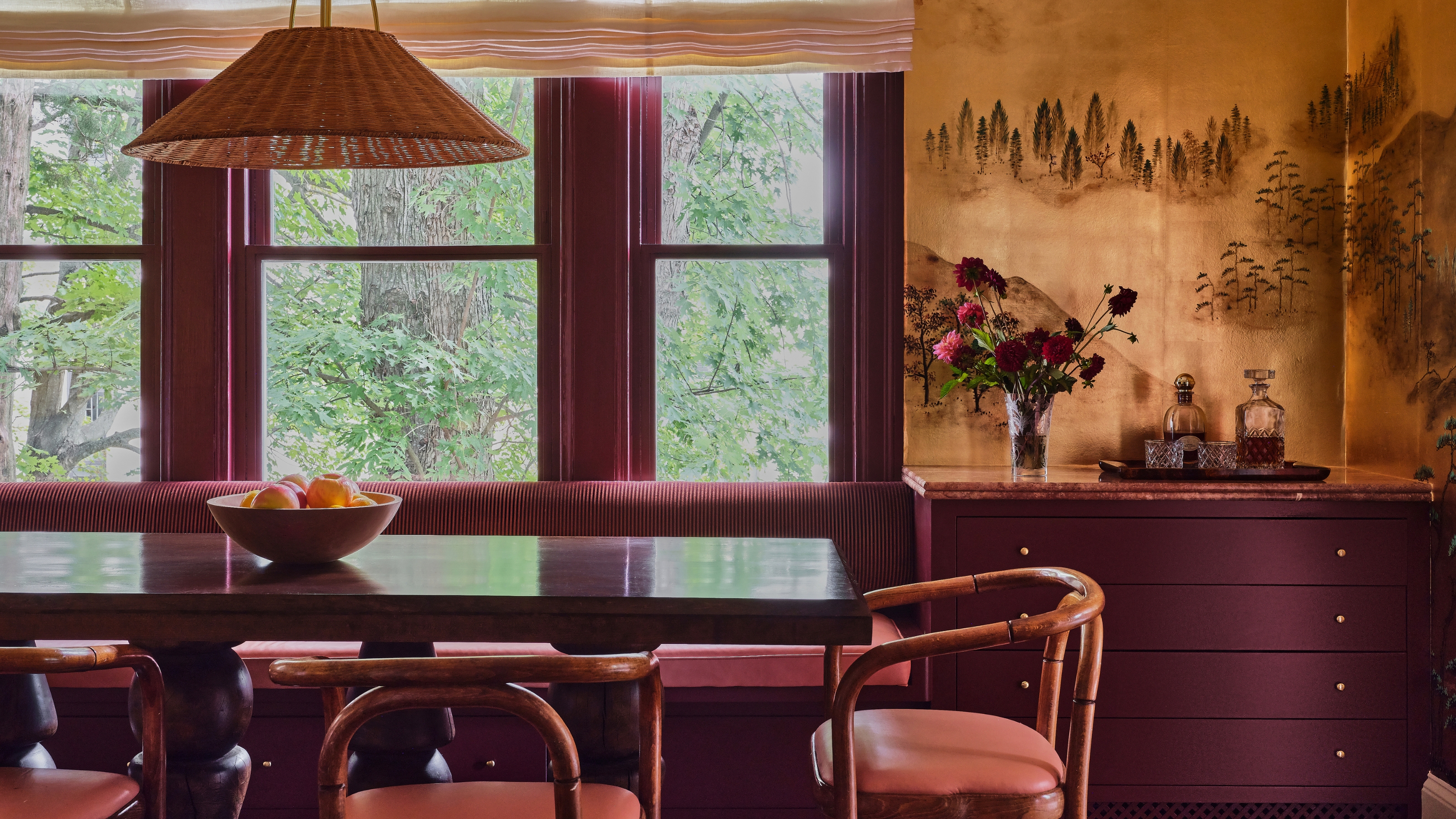
Here, coral makes a stunning color-drenched base, while the golden finishes and darker red accents help create depth.
Another favorite rich color combination is burgundy with coral and golden yellows. This palette proves that rich shades don't have to be dark and moody; they can shine bright with saturation and still look elegant.
Burgundy or coral reds work extremely well on large surfaces to create a bold yet cohesive look. "Burgundy is an unusual but highly effective choice for compact spaces," Oskana explains. "It doesn’t break up the volume; on the contrary, it unifies and deepens it. Painting both the walls and ceiling in rich reds can be especially striking, enveloping the room and giving it strong character."
Red and yellow together may seem outwardly primary, but with the right tonal mix, it's a chic combination. Introduce golden yellows through decor moments such as velvet cushions, metallic hardware, and even warm-hued lamp lighting.
Making the lightest tone your dominant color and using the deeper shades as an accent works well if you love the richness but don’t want it to feel too dark. "That way, you still get the drama, just with a softer finish," says Tash.
Oksana Zavarzina is a Russian interior designer who founded design studio, Lake and Walls, with her business partner, Evgeny Shevchenko, in 2016. Lake and Walls creates interiors, architecture, and furniture for creatively minded clients. With extensive experience in design, management, and procurement, they provide services from project consultation to full implementation.
Rich color combinations can be daunting pairings to pull off, but high risk often yields high reward. "These tones are not meant to whisper; they are meant to be heard, felt, and remembered," says interior designer Amanda Sinistaj.
And once you've decided to commit, it's worth thinking about how to coordinate paint colors throughout your home so that it feels considered, balanced, and, most importantly, beautiful.

Olivia Wolfe is a Design Writer at Livingetc. She recently graduated from University of the Arts London, London College of Communication with a Masters Degree in Arts and Lifestyle Journalism. In her previous experience, she has worked with multiple multimedia publications in both London and the United States covering a range of culture-related topics, with an expertise in art and design. At the weekends she can be found working on her oil paintings, reading, or antique shopping at one of London's many vintage markets.


