Millennials Might Have Pink, but Gen Z Paved the Way for a New Yellow Trend That "Soothes and Sustains," Says a Color Forecaster
It brought back decorating our homes with bold color, but done in a softer, more sophisticated manner

Yellow is a color that sparks strong opinions — loved by some, disliked by others. But over the past decade, it has made a significant cultural impact, becoming emblematic of a generation. Where millennial pink defined the late 2010s, the Gen Z yellow trend emerged as its vibrant successor: a bright, energetic hue tied to the optimism, visibility, and boldness of Gen Z.
This vivid yellow wasn’t just a color trend; it symbolized a shift. It marked the beginning of a new era where bold colors became culturally acceptable again, paving the way for a wave of dopamine brights.
Among these was Pantone’s 2021 Color of the Year, Illuminating Pantone, a yellow described as “a bright and cheerful yellow sparkling with vivacity, a warming shade imbued with solar power.” It captured the spirit of hope and resilience in a post-2020 world and reflected the mood Gen Z yellow helped define.
Article continues belowInitially seen primarily in apparel, decorating with yellow has since evolved into a far more versatile color story, crossing over into interiors, product design, tech, and lifestyle categories.
The Rise of Soft Yellow
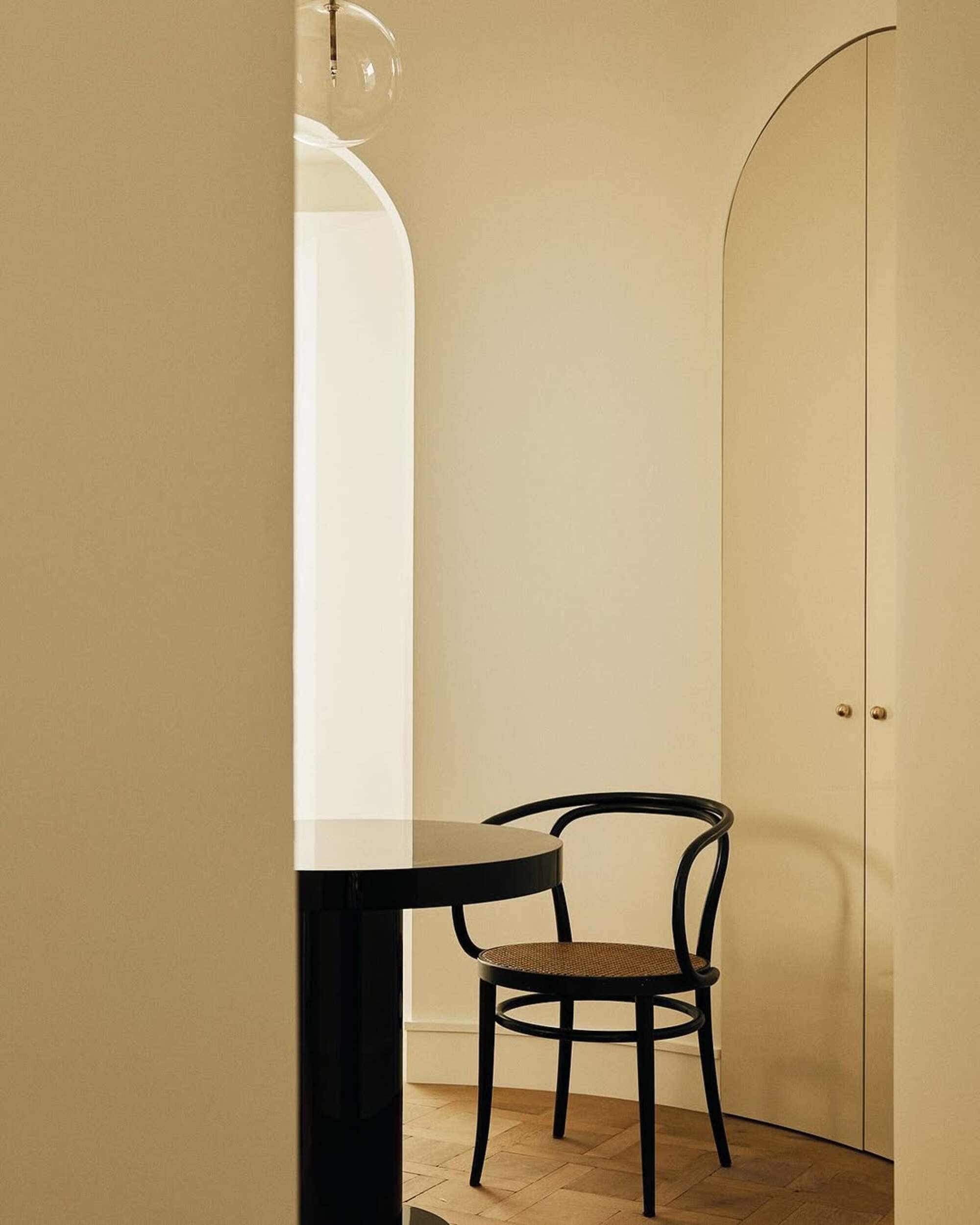
Butter yellow paint colors have dominated 2025.
One of the most significant colors for 2025 and beyond is soft yellow — a gentle, creamy hue that once characterized early 2000s interiors but is now experiencing a sophisticated resurgence. Previously dismissed as bland or unimaginative, soft yellow has been reimagined with a modern sensibility: warm, cocooning, and inherently tactile.
This revival aligns perfectly with the ethos of quiet luxury, where elegance is conveyed through subtle textures, tonal depth, and refined restraint rather than bold statements. In this renewed context, soft yellow serves as a deeply saturated neutral — gentle, sophisticated, and rich with emotional warmth. It represents a shift in design thinking: from attention-seeking hues to those that nourish, soothe, and sustain.
Soft yellow is also an evolution of the neutral palette — one where color doesn’t dominate but gently breathes personality into calm environments. It offers a counterpoint to sterile minimalism by introducing soft liveliness and a sense of wellbeing.
The Livingetc newsletters are your inside source for what’s shaping interiors now - and what’s next. Discover trend forecasts, smart style ideas, and curated shopping inspiration that brings design to life. Subscribe today and stay ahead of the curve.
As quiet luxury matures, we’re seeing a deeper embrace of nuanced tones — hues that rest close to neutral but bring light, comfort, and poetic energy.
Soft yellow is at the forefront of this shift, offering a serene optimism that works across tactile materials, layered lighting, and timeless silhouettes. Whether used on walls, textiles, or product design, soft yellow invites warmth without overwhelming the space — bringing harmony, emotional depth, and a new kind of modern richness.
This shade can be approached in two ways:
Creamy Soft Yellows

Creamy soft yellows enhance without overpowering, offering warmth with a soft, unobtrusive radiance.
With a soft inner glow, these slightly more saturated levels introduce added depth — shifting gently toward warmer undertones with hints of orange that evoke a more natural, sun-warmed feel.
Softness remains essential; these are colors reminiscent of creamy panna cotta, fresh churned butter, and indulgent Cornish cream — tones that feel both nourishing and luxurious.
Rich in comfort and tactility, the sensorial quality of this creamier level of soft yellow is a defining characteristic, inviting a deeper emotional and physical connection.
There’s a nostalgic undertone — shades that lean toward primroses, light petalled daffodils, and springtime buttercups, recalling familiar seasonal cues and the natural softness of early bloom. These soft yellow tones bring a quiet charm and a subtle sense of simplicity. A gentle luminosity gives the palette its signature appeal, with a light glow that feels clean and uplifting.
Tangy Soft Yellows
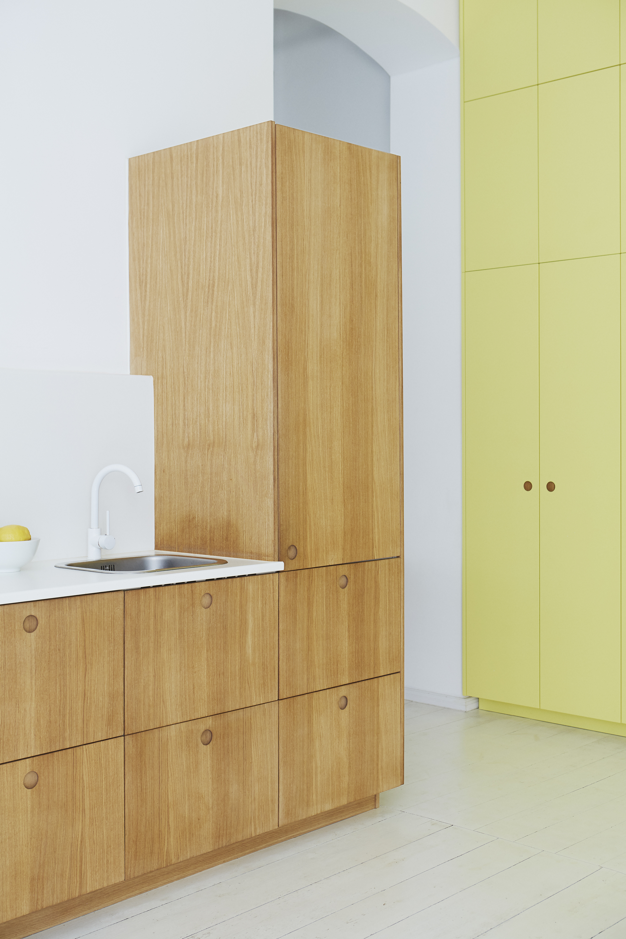
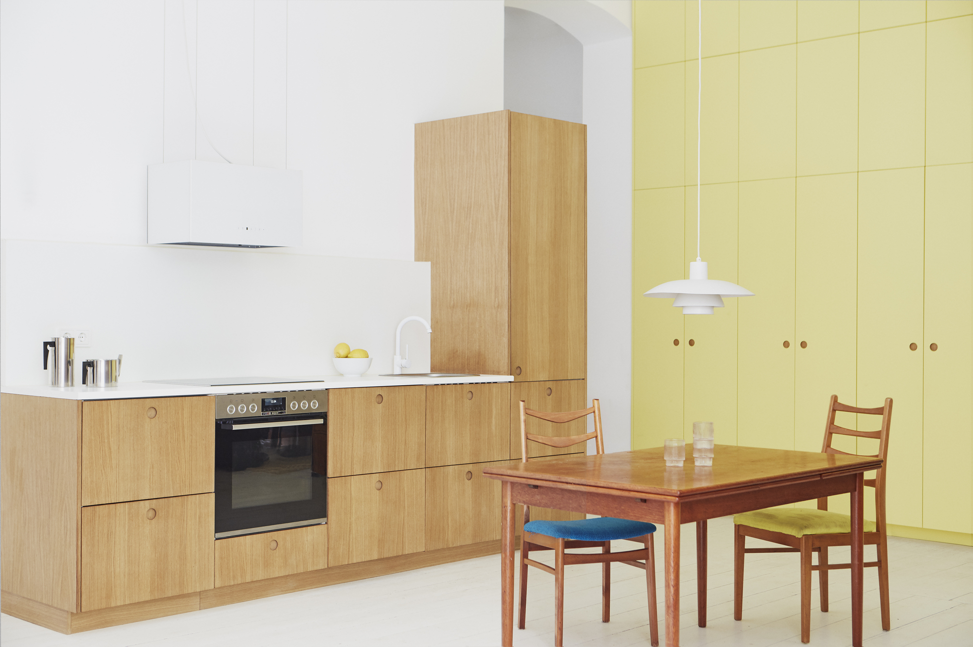
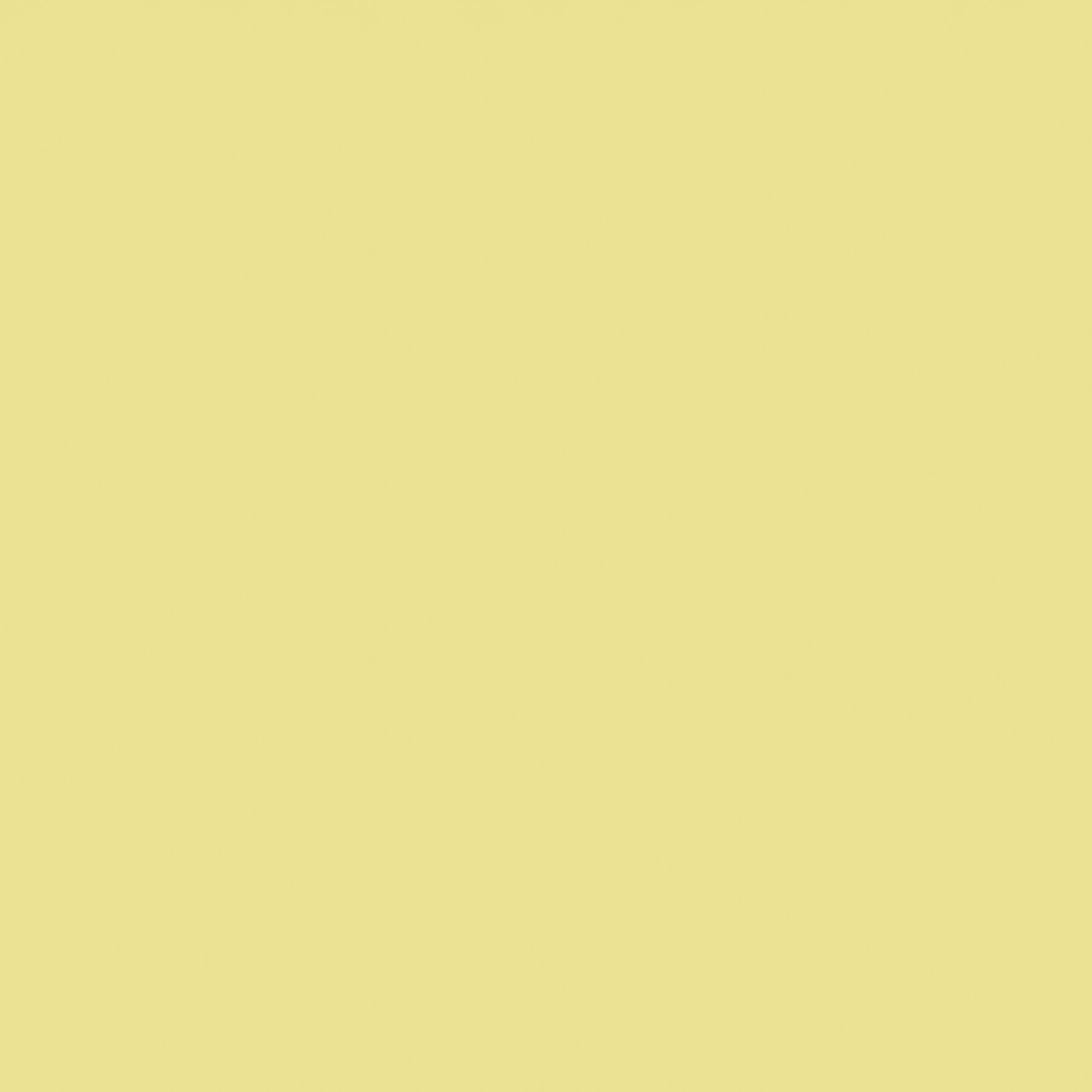
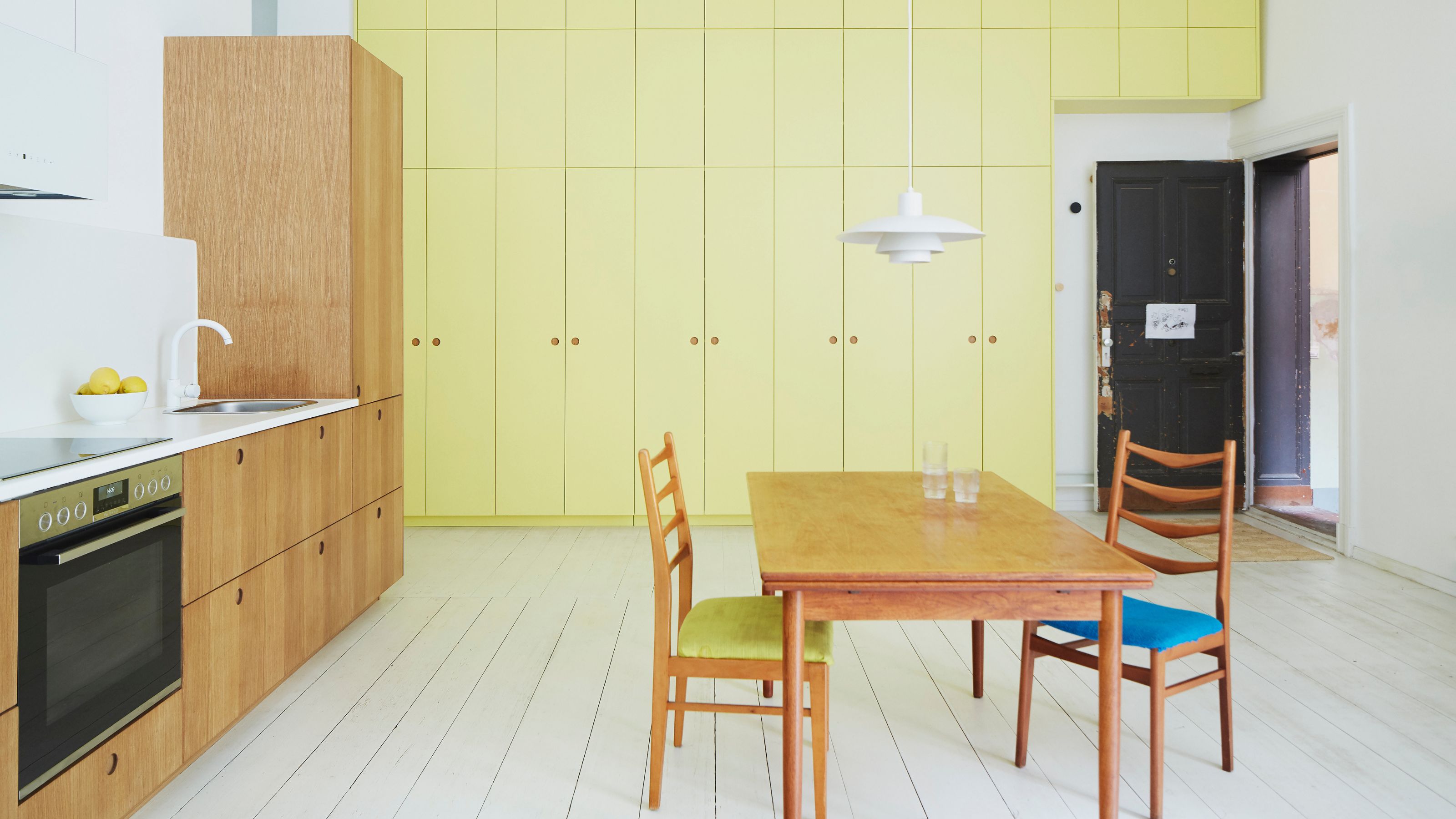
The alternative expression of soft yellow becomes brighter, tinged with citrus and cooled by subtle green undertones. The result is a sharper, more clarified yellow — light yet alert, with a luminous edge.
It appears fresh and precise, with a refined, almost technical clarity that feels clean and modern. Tangier and more assertive than its creamier counterpart, this tone exudes quiet confidence. Sleek and minimalist, it’s a yellow for contemporary minimalists — bright enough to energize, subtle enough to stay composed.
Moving away from nostalgic warmth, it adopts a more modern, forward-looking vibe. Its clean, invigorating qualities exude a fresh energy, perfect for themes of futurism, innovation, and minimalism.
These soft yellow tones work beautifully within neutral environments, where their subtle energy can truly resonate. Set against low-key backdrops — think warm grays, putty tones, soft taupes, or chalky whites — they become quiet statements, standing out without overwhelming.
The restraint of the surrounding palette allows soft yellow’s nuance to come through, highlighting its glow, depth, and personality. Whether creamy and cocooning or citrus-fresh and modern, this yellow trend thrives when given space to breathe, offering a point of warmth, focus, and understated impact within minimalist, considered interiors.
