These 3 Pink Trends — Picked by a Color Forecaster — Are the Wall Colors That Perfectly Capture the Mood for 2025
The pink of 2025 doesn’t shout — it welcomes. It creates space to breathe, to feel, and to reconnect

The Livingetc newsletters are your inside source for what’s shaping interiors now - and what’s next. Discover trend forecasts, smart style ideas, and curated shopping inspiration that brings design to life. Subscribe today and stay ahead of the curve.
You are now subscribed
Your newsletter sign-up was successful
Color taps into something primal — an instinctive language we’ve understood since the beginning of time. It connects us to nature, memory, and emotion in ways that words often can’t. Among all hues, pink color trends hold a particularly special place. They stir a range of emotional responses, which helps explain the color's continued cultural resonance and resurgence.
Few colors have shaped the past decade like Millennial Pink. When Pantone named Rose Quartz the Color of the Year in 2016, it signaled more than a fleeting fashion moment — it marked a cultural shift. As a color trend, Millennial Pink, soft and ethereal, transcended gender norms and became a generational emblem of subtlety, emotional nuance, and self-expression.
Now, in 2025, pink’s story isn’t about chasing trends but about recontextualizing its original appeal. The digital optimism of the early 2010s has given way to a more fragmented, cynical online world. In this climate, pink feels grounding — offering comfort, familiarity, and a visual reminder of when digital spaces felt lighter and more communal.
Article continues below 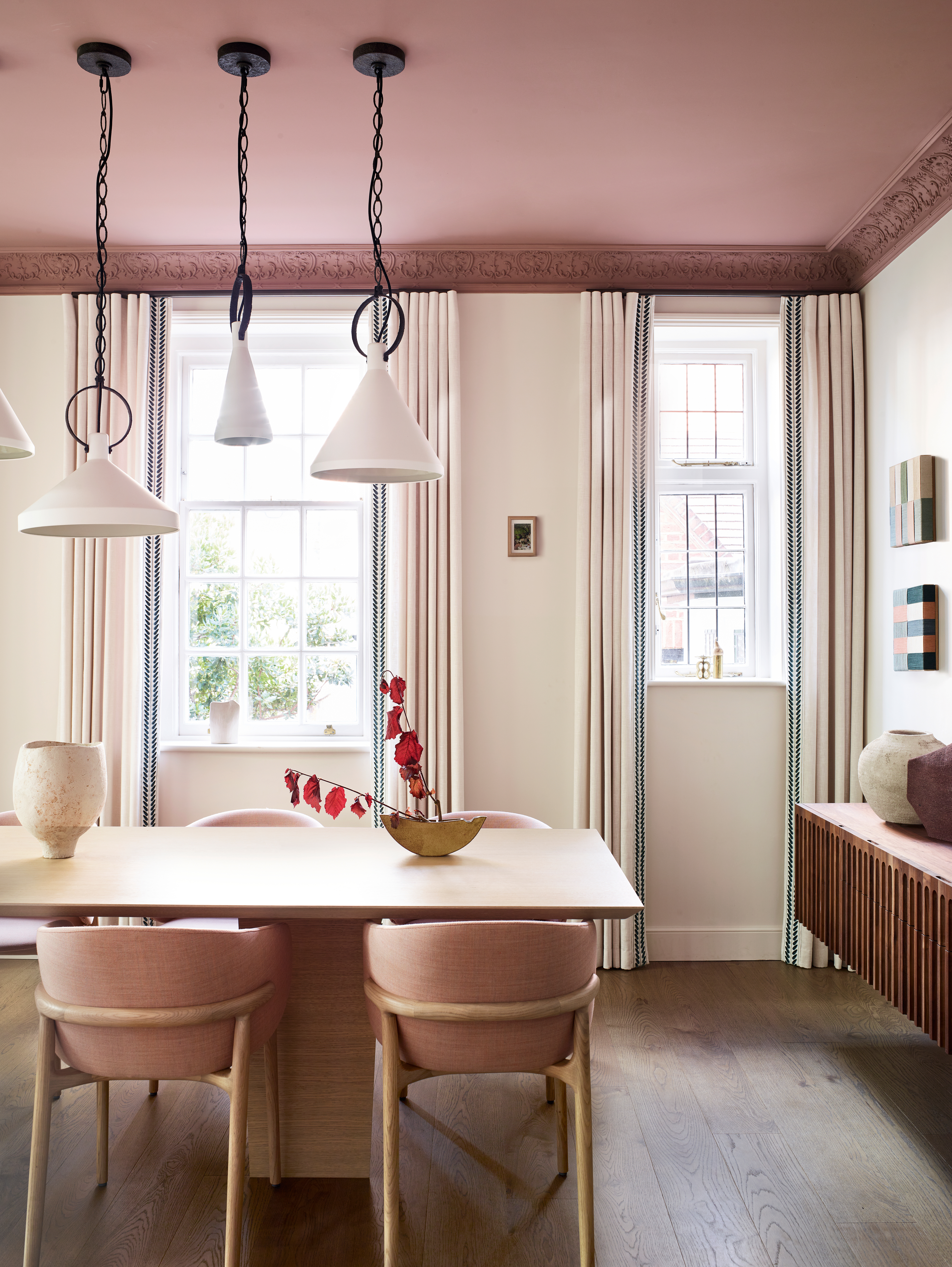
Sun-baked shades of pinks help to ground us, embodying a sense of slowness and tactility.
There’s a sense of nostalgia surrounding pink, but it’s layered with self-awareness. This new wave of pink color trends doesn’t just revisit the past — it redefines it for a more thoughtful, reflective era. Sparked in part by the 2023 Barbie film and the rise of Barbiecore, pink has re-emerged as a quiet yet powerful symbol of feminist resistance, reclaiming softness as strength and challenging outdated ideas of power and femininity.
At the same time, as conversations around loneliness and digital fatigue become louder, many are looking for ways to disconnect from endless scrolling and reconnect with real life. In this shift, joy itself becomes a form of resistance — and pink plays a meaningful role as a color trend.
More than just a color, decorating with pink can bring people together. It’s warm, open, and emotionally generous — a soft antidote to isolation. In a world that’s craving face-to-face connection and shared experiences, pink offers lightness, play, and the gentle joy of simply being with others. It reminds us that happiness often lives in the small, shared moments — and that sometimes, joy really is enough.
As we move into 2025 and beyond, pink color trends continue to evolve. No longer defined by a single look or message, modern pink is branching into three distinct yet interconnected paths — each reflecting the layered emotional and cultural shifts shaping our world today.
The Livingetc newsletters are your inside source for what’s shaping interiors now - and what’s next. Discover trend forecasts, smart style ideas, and curated shopping inspiration that brings design to life. Subscribe today and stay ahead of the curve.

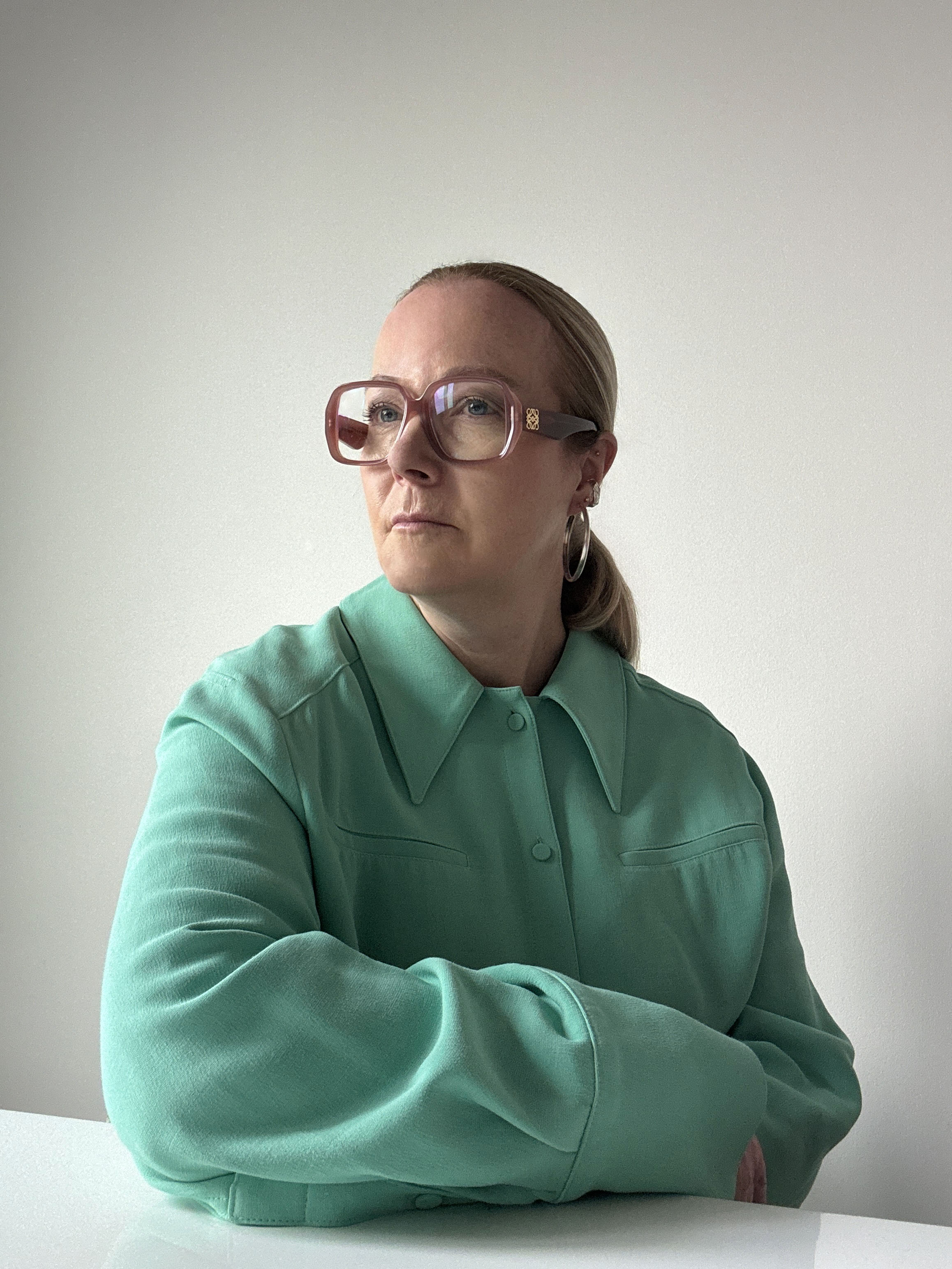
A pivotal figure at the Pantone Colour Institute, Jane contributes to trend publications and serves as the European Creative Director for Pantone’s Interiors annual trends publication, Pantone View Home and Interiors. Her approach to forecasting color focuses on observing current events and cultural trends to understand how perceptions of color are evolving.
1. Digital Pink
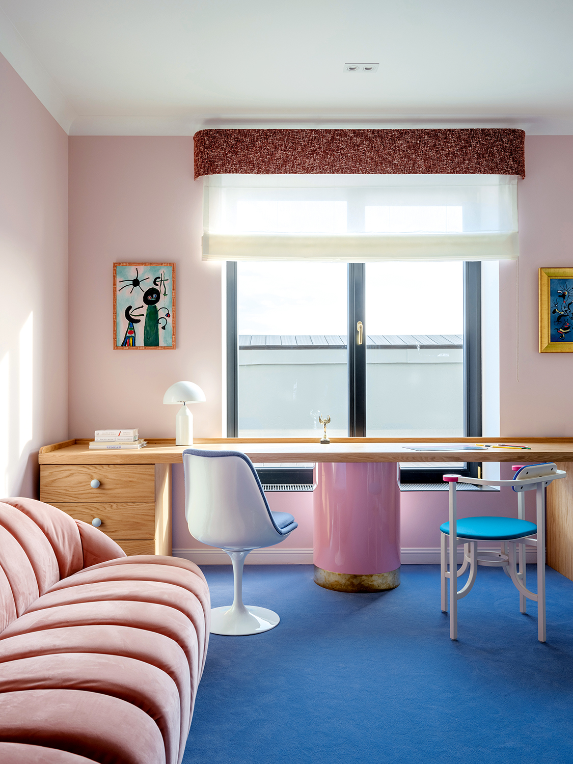
The pinks in this home office have undertones of blue and lilac — hence why they layer so well with the blue carpet — which gives them a 'digital' aesthetic.
The first is cool and crisp, layered with undertones of blue and lilac that lend it a sharp, digital clarity. Though pink is traditionally a warm hue, this version feels noticeably cooler — refined by its icy undertones and synthetic sheen.
It’s this lilac-blue-inflected pink that represents the newest evolution of the color: sleek, hyper-modern, and shaped by the aesthetics of technology and virtual space.
These luminous pinks feel futuristic and tech-driven, often evoking the aesthetics of AI-generated imagery, virtual environments, and synthetic realities. They speak to our increasingly screen-based lives, offering a sleek, hyper-modern feel that is at once detached and fascinating.
This is pink at its most refined and forward-facing — a nod to innovation, clarity, and digital exploration. These shades work especially well within hard materials like acrylic, glass, and polished metal, or when expressed through modern LED lighting, where their cool luminosity can be fully activated and heightened.
2. Sun-Baked Pink
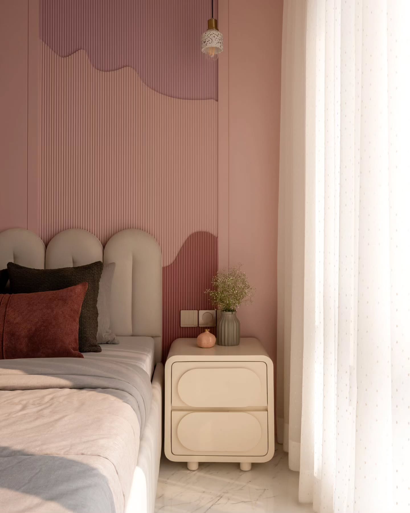
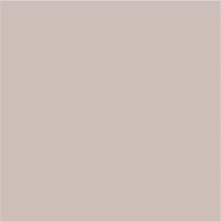
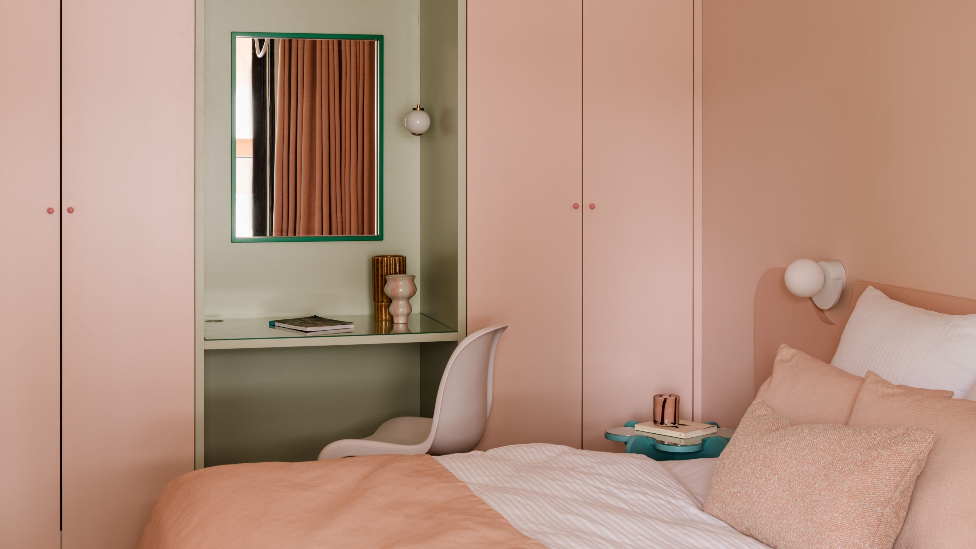
Sun-baked pinks are those almost neutral, earthy color palettes that feel slightly brighter, uplifting, and energizing.
The second path is quiet, natural, and earthy. Think sun-baked clay, desert sands, pink salt. Tones that feel grounded and deeply human. These softened pinks carry a sense of slowness and tactility, creating space for pause and reflection.
They counterbalance the digital sheen of their cooler counterparts, inviting us back into the physical world and offering comfort, calm, and a connection to the land beneath our feet. In these earthy color palettes, pink becomes a healing color — gentle, honest, and deeply rooted.
Often, these pinks blur into the realm of neutrals, seamlessly infusing themselves into creams, beiges, and taupes. They may only reveal their rosy undertones under certain lighting conditions, giving them a subtle, almost atmospheric presence.
This pink color trend is particularly suited to textiles and matte, soft surfaces — where light is absorbed rather than reflected — enhancing its natural, grounded quality. The sensorial effect is soothing and tactile. Here, pink doesn’t shout — it settles, envelops, and restores.
3. Juicy Pink
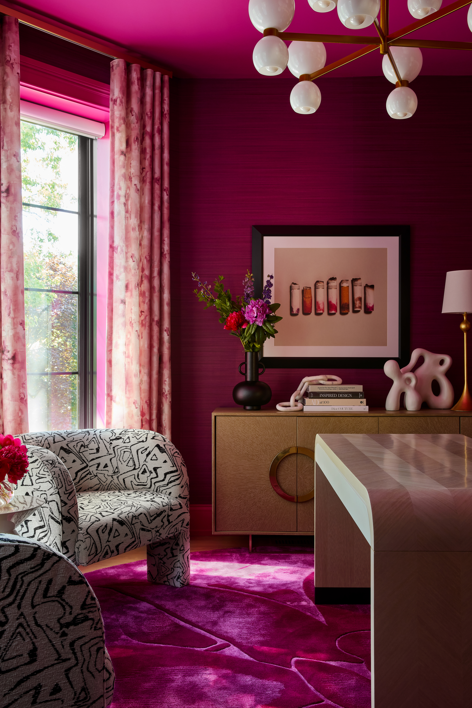
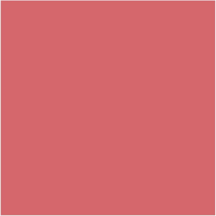
This is pink, made fun. It's got energy and vibrancy, and feels the most alive.
The third key pink group is bold, playful, and bursting with fruit-like energy. These juicy pinks feel vibrant and unfiltered, evoking the richness of dragon fruit, raspberries, and other naturally vivid hues.
While this pink color trend aligns more closely with traditional associations, what sets it apart is its grounding in the natural world. There’s a clarity to these tones — a brightness that feels alive and organic rather than artificial or overly sweet. They celebrate the exuberance of nature’s palette while maintaining a sense of freshness and balance.
There’s a sense of youthful spontaneity here — a reminder that pink can still be light-hearted and full of fun, even when decorating with saturated colors. But even in its brightness, there's a natural quality that keeps it grounded, never artificial. It feels fresh, energizing, and communal.
Together, these three pink color trends show just how versatile the color has become. Whether it’s cool and techy, soft and grounded, or bursting with playful optimism, modern pink reflects the full spectrum of how we feel today — and where we’re headed.
In a world where we’re constantly connected but often feel disconnected, color is stepping up. It’s no longer just about aesthetics — it’s about emotion, experience, and connection. And pink, in particular, reminds us that happiness doesn’t have to be loud or dramatic. Sometimes it’s found in the tiniest, most delightful moments — a playful accent, a joyful burst, a sweet visual treat.
The pink of 2025 doesn’t shout — it welcomes. It creates space to breathe, to feel, and to reconnect. It’s not about looking back, but about carrying the best bits of optimism forward. In this way, pink becomes more than a color. It becomes an invitation: to pause, to smile, and to come back together — one joyful moment at a time.
