10 Pink and Green Living Room Ideas That'll Make You Think Again About This Color Combination
This iconic pairing can be as sophisticated as it is playful — here’s how the experts create contemporary pink and green living rooms

The Livingetc newsletters are your inside source for what’s shaping interiors now - and what’s next. Discover trend forecasts, smart style ideas, and curated shopping inspiration that brings design to life. Subscribe today and stay ahead of the curve.
You are now subscribed
Your newsletter sign-up was successful
Pink and green living rooms make for a timeless color combination, and one that interior designers continuously come back to. The shades instantly uplift a space, as both natural hues tend to bring in a feeling of lightness, creating a serene feel without sacrificing the joy of color.
But how are designers giving these living room color ideas a new twist, especially with a pairing as classic as pink and green? Well, it's all about how the shades are used. From pink or green paint on the walls (ideal for creating moments of contrast) to introducing the colors through softer elements, the key to giving this combination a modern makeover is all about how you layer the two shades into the space.
To help inspire you, below, we asked ten designers to share their favorite pink and green living room ideas that feel fresh and modern and prove that pink and green absolutely go together. Here's what to do.
Article continues below1. Don't Forget to Think Vertically
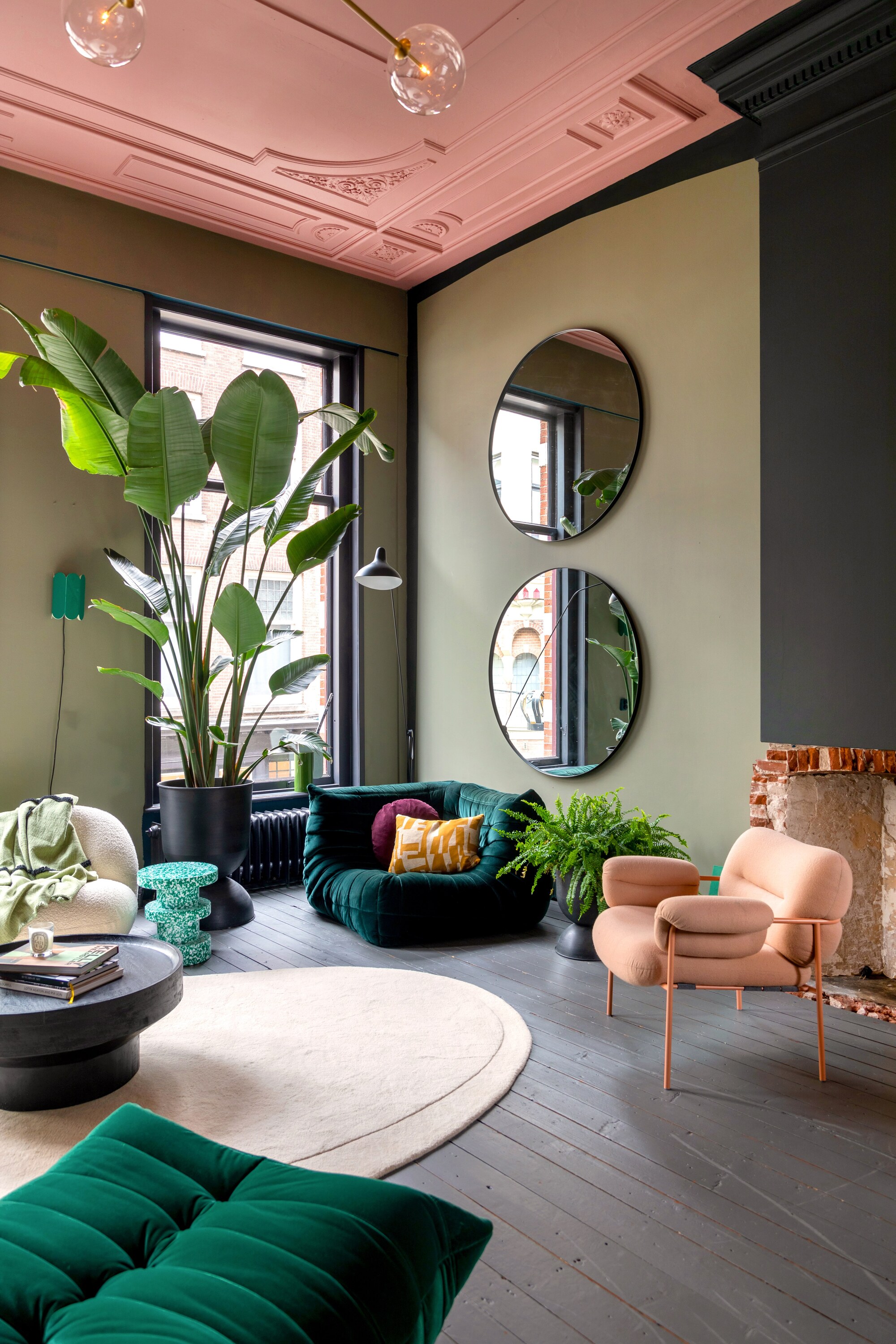
Think of ceilings as ‘the fifth wall’ and consider painting them to turn them into a design highlight in your room.
If you're coming up with living room paint ideas, don't forget to look up — the ceiling is a brilliant canvas for color, and should be treated with as much thought as the walls.
“Painting the ceiling instantly makes a space more exciting,” says interior stylist and color expert Theo-Bert Pot (also known as The Nice Stuff Collector). “It’s always worth drawing attention to a ceiling, especially if it has ornamentation.”
“Pink works well with green, and the colors are a must for me at home," Theo continues. "Surprisingly, combining botanical green with a beautiful, fresh, dusty pink shade can be less bold than having either color beside white, as there’s a soft contrast rather than a bold one.”
2. Start From The Ground Up With A Colorful Rug
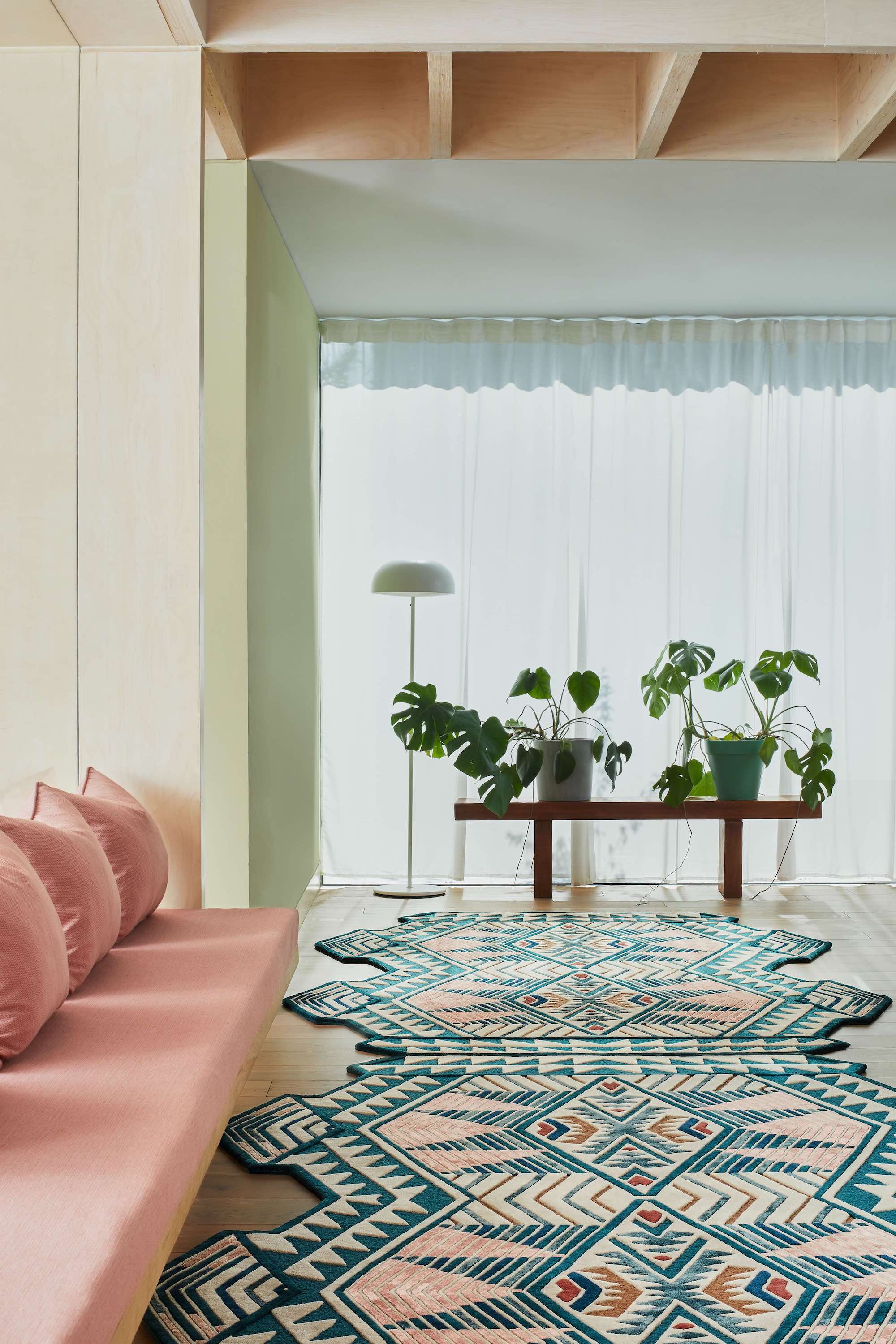
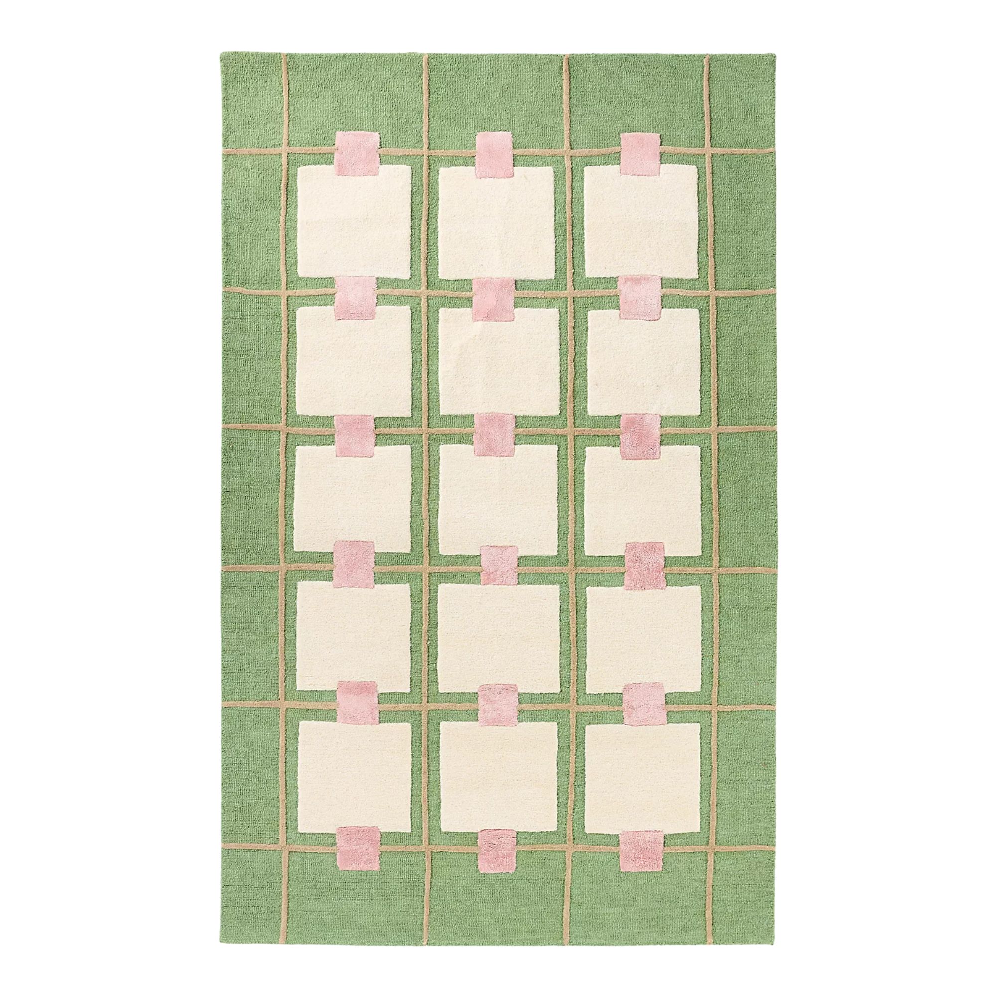
An eye-catching pink and green rug can make an excellent starting point for a contemporary room design.
“I love to start a room with a patterned rug,” says the interior designer Natasha Lyon from Appreciation Project. “It’s an excellent way to create a space that’s unique, and there are so many ways to draw upon the colors of it in the rest of your space.”
The Livingetc newsletters are your inside source for what’s shaping interiors now - and what’s next. Discover trend forecasts, smart style ideas, and curated shopping inspiration that brings design to life. Subscribe today and stay ahead of the curve.
The best rug to use is one with a design that features lots of color, such as this stunningly shaped piece from A Rum Fellow, which brings in deep shades of teal green with blush pink and some earthier neutrals.
“Consider one that has bold details,” advises Natasha. “Layer the colors in the rug elsewhere in your space with paint, wallpaper, and upholstery — just because the flooring is bold, doesn't mean the rest of the space has to be neutral.”

Natasha Lyon created her design studio in 2020, making the move into interiors after two decades in the fashion industry working with brands including Acne Studios and Loewe. She uses her expert eye to create spaces full of color.
3. Make It All About A Motif
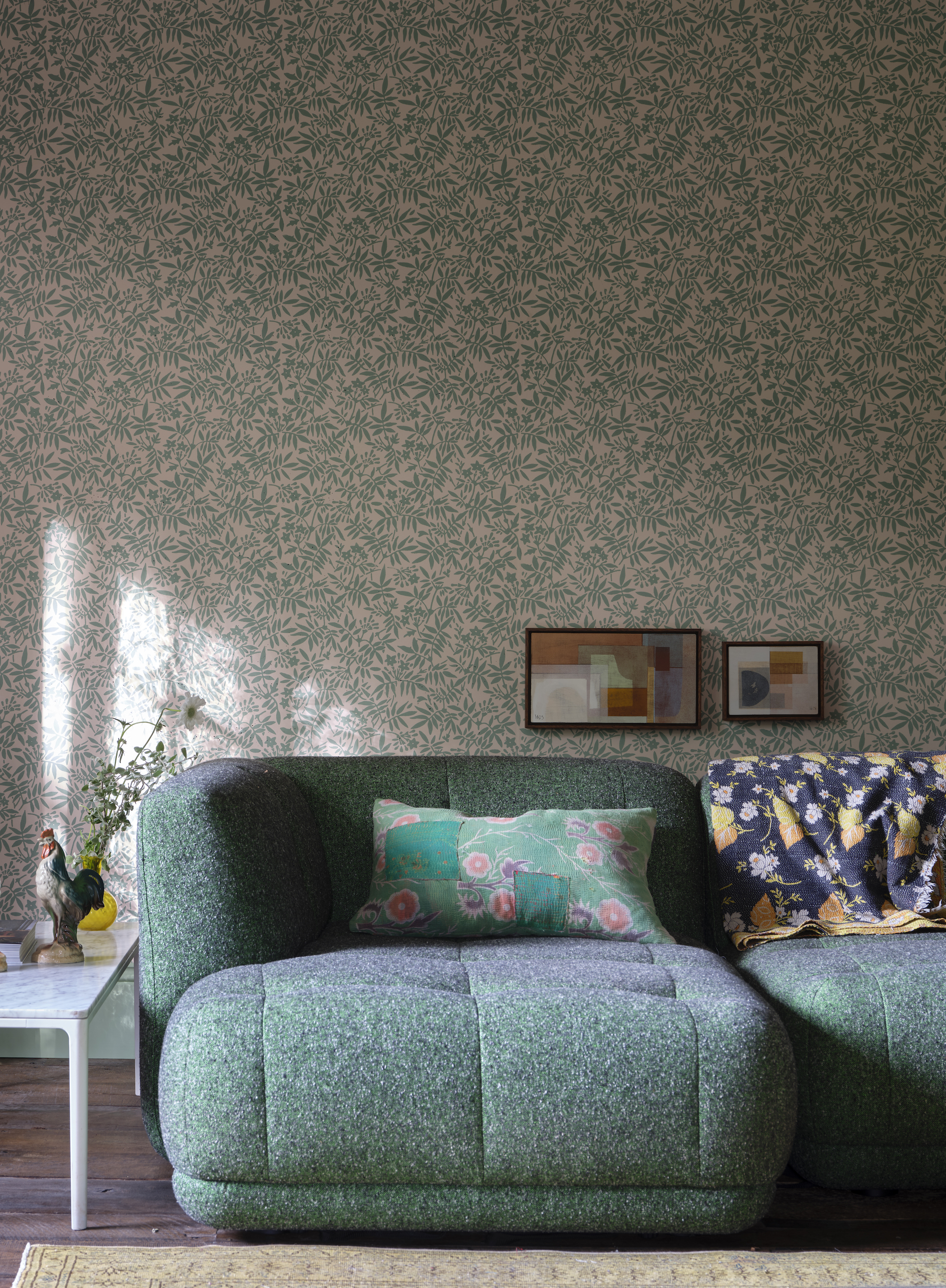
A botanical wallpaper is the ideal medium for bringing shades of green and pink into a contemporary space.
Pattern is an excellent way to combine two colors, like in a pink and green living room, and walls are the perfect place to experiment with different designs. Don't be afraid to go bold.
“Wallpaper is there to add a flourish of texture to a space,” explains Patrick O’Donnell, a color consultant and brand ambassador for Farrow & Ball. “Combining two colors together in this way allows you to respond to them in different ways. For a modern aesthetic, you may wish to opt for tonal plains in the two hues elsewhere in the space, or perhaps layer in other prints for a bolder rhythm and style.”
Current wallpaper trends are full of ways to incorporate different colors and patterns, and a statement wallpaper, like this botanical motif, can appear soothing in delicate shades of pink and green, compared to more dramatic versions of the color.
4. Use The Colors To Create A Focal Point
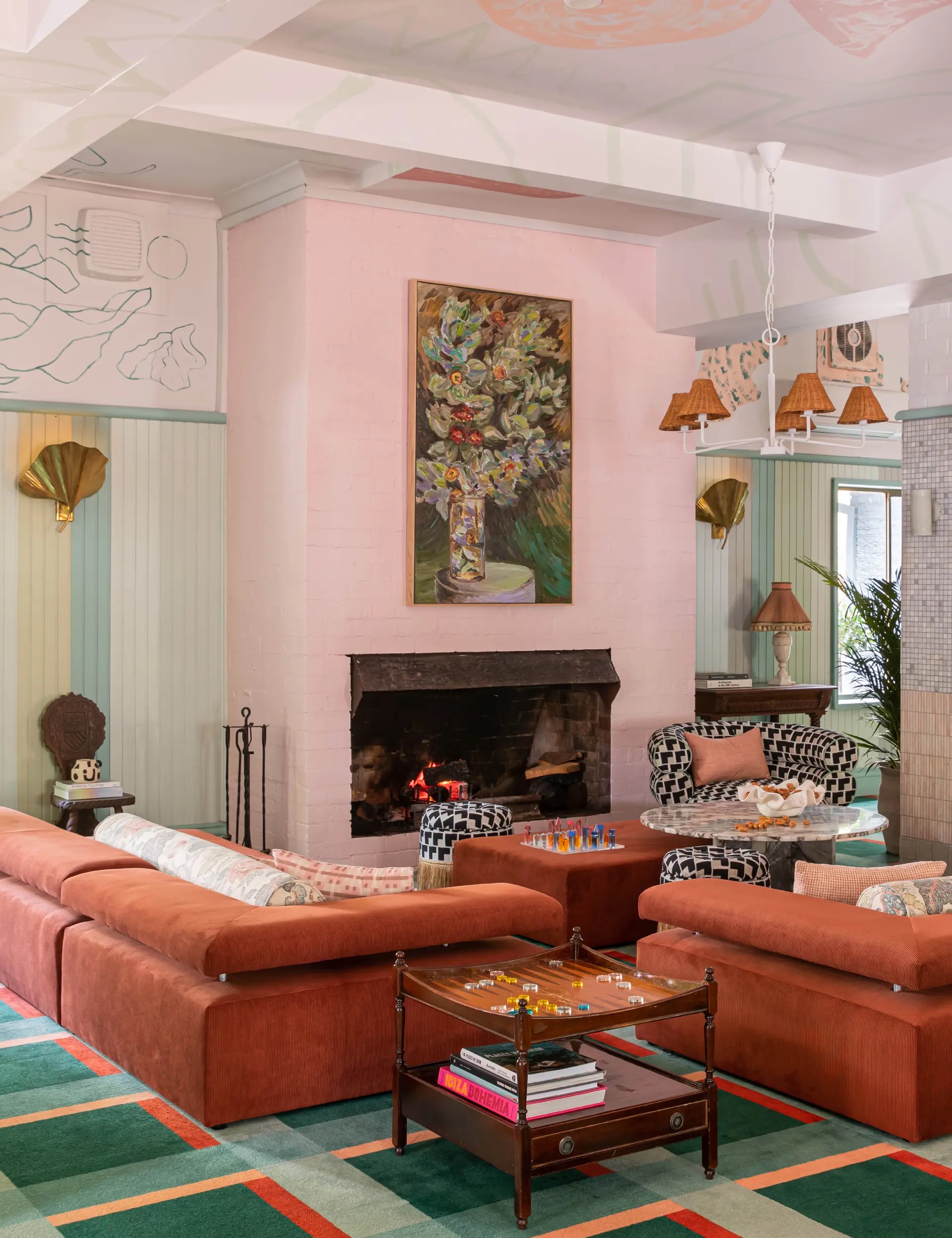
Color blocking is an effective way of creating visual ‘breathing space’ in an eclectic environment.
“For this space, we leaned into a spirited, ‘more is more’ approach,” explains Benjamin Selke from Studio Pulp. “Pink and green can be used to create an immersive, joyful experience in a room, and we wanted to create somewhere that feels eclectic yet harmonious.”
In this New South Wales project, Benjamin and his team used pink as an anchor on the fireplace in the centre of the room. It provides something of a visual ‘break’ from the patterned floors and walls in a way that looks and feels considered.
For colors that go with green, pink is right up there. “The color brings cohesion in the space,” Benjamin says. “The rich color pairing with the green was chosen to evoke nostalgia but in a timeless way.”
5. Take A Subtle Approach
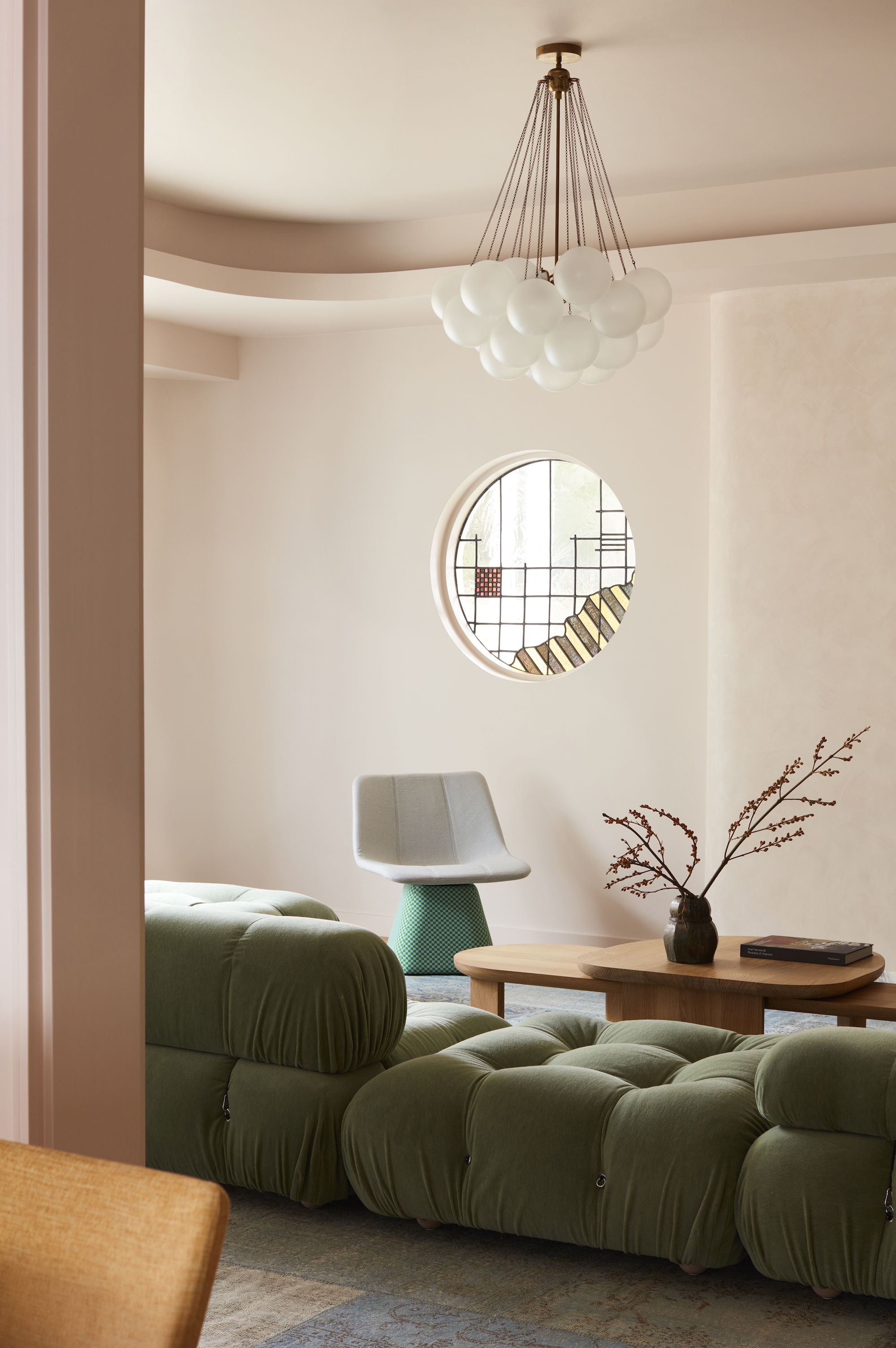
In this modern living room, gentle versions of pink and green create a calming look and feel.
Dialling the saturation of colors down is an effective way to make a pink and green living room seem more restrained. In this Sydney project, Suzanne Gorman (from Studio Gorman) applied her intuitive approach to color.
“This lounge is painted in a warm, pale pink that has hints of yellow undertones, giving it an under-glow of warmth,” she explains. “Color drenching the entire room in this single hue adds to the glow of the space — walls, ceiling, skirtings, doors, and architraves are all in the one color.”
“Adding the pale green sofa is energizing, yet both colors are so muted, which means the effect is subtle. The result is a color combination that draws attention but does not overwhelm, which I always think feels interesting,” Suzanne says. A wonderful green couch living room idea, in our book.
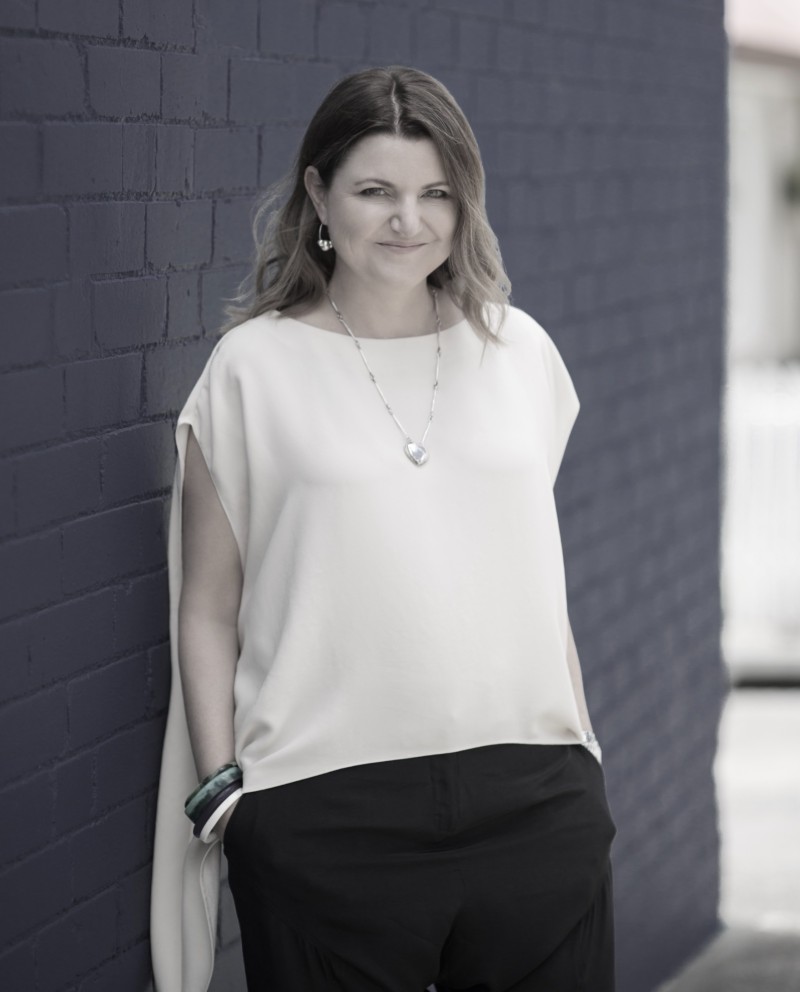
Sydney-based Suzanne Gorman has spent the last fourteen years working on residential projects across Australia and around the world. She leads a talented team of designers who are known for creating textural spaces packed with detail.
6. Layer Multiple Versions Of The Same Shade
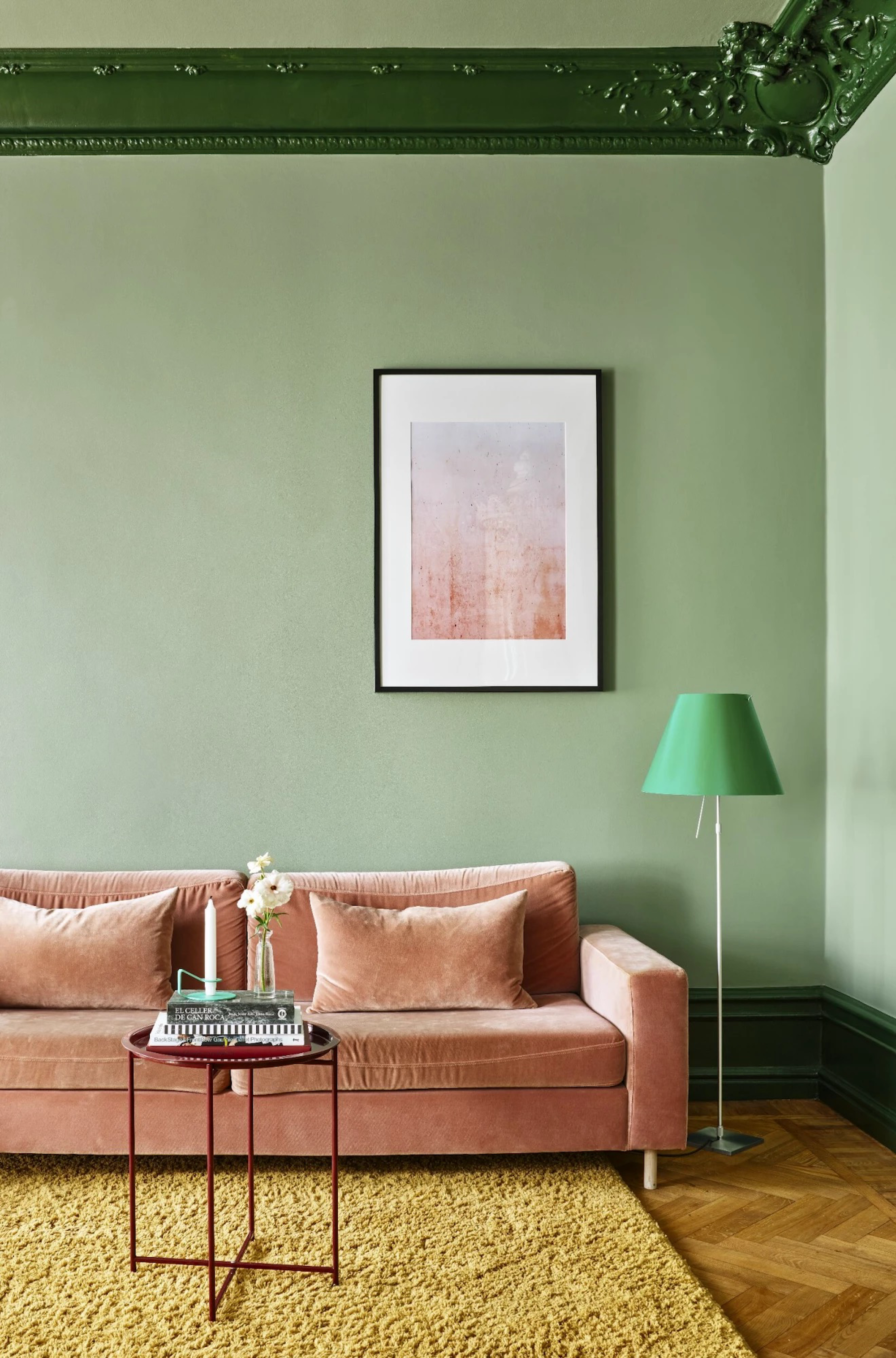
Using multiple green tones alongside a single pink gives a layered look in this living room.
“Pink and green is a color combination that brings an effortless blend of vitality and character to a space,” says the interior designer Emma Deterding, creative director at Kelling Designs. “It is soothing and grounding, whether you’re using deeper shades or soft, muted tones.”
In this space, a blush pink sofa adds an instant layer of softness against multiple shades of green, from the lampshade and painted walls.
“Paint is an incredibly powerful design tool, and is key when I experiment with combinations: I like to use one version of green on walls but then highlight architectural details in a different shade of the color. This brings depth and instant definition to a room,” says Emma. “It’s a creative way to add interest without overwhelming.”
7. Add Softness With Window Dressings
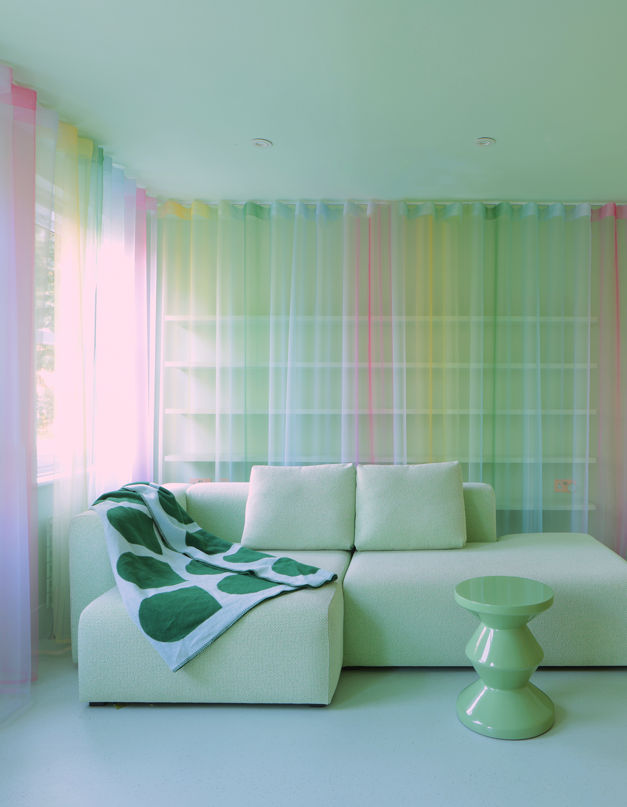
It can be hard for colorful drapes to look contemporary, but these Kvadrat drapes are a case in point.
Don’t overlook the decorative possibilities of curtains, drapes, and window treatments — they can be the perfect way to introduce layers of color into a pink and green living room. But how to do them in a way that feels contemporary? Follow the example of Studio Sam Buckley and extend them beyond just the window.
“To add a cocooning effect, I used this Kvadrat sheer with green and pink dyes not only on the windows but also on the wall behind the sofa, giving the textile more of an architectural, sculptural presence that helps to smooth out the impact of the shelving behind,” explains the designer Sam Buckley.
“The sheers move and alter the light as the breeze comes through the open window, and when the sheers are pulled to one side, the colors intensify even more,” Sam adds.
8. Create Warmth With Pops of Color
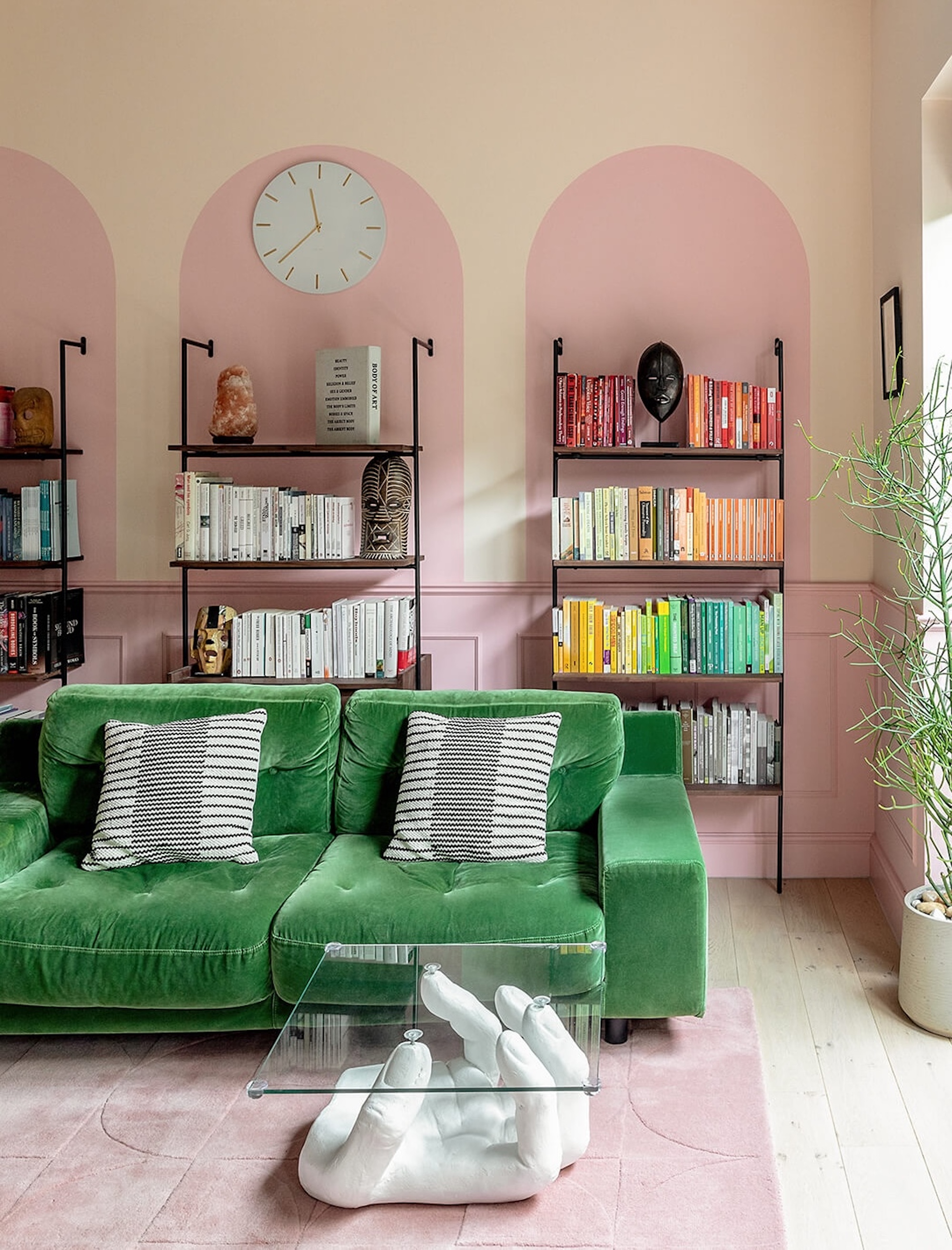
This London project uses color to adeptly create a sense of calm intimacy with plenty of character.
“The soft pink and rich green work together in this space to create warmth and softness,” says Sabrina Panizza, who designed the room for PL Studio. "The priority was to feel at ease in this space and evoke feelings of comfort.”
A bold mid-century sofa is covered in green velvet that contrasts with the room’s otherwise delicate shades of pink. “The green sofa brings a balance and has a grounding presence in the space, rather than being too strong,” says Sabrina.
Panelling was added to the walls to make the space more welcoming, and Sabrina cleverly used the brighter shade of pink on the woodwork to create playful arches around the shelving. “This helps to create a visually calming environment,” she explains.
9. Don’t Restrict Your Color Choices
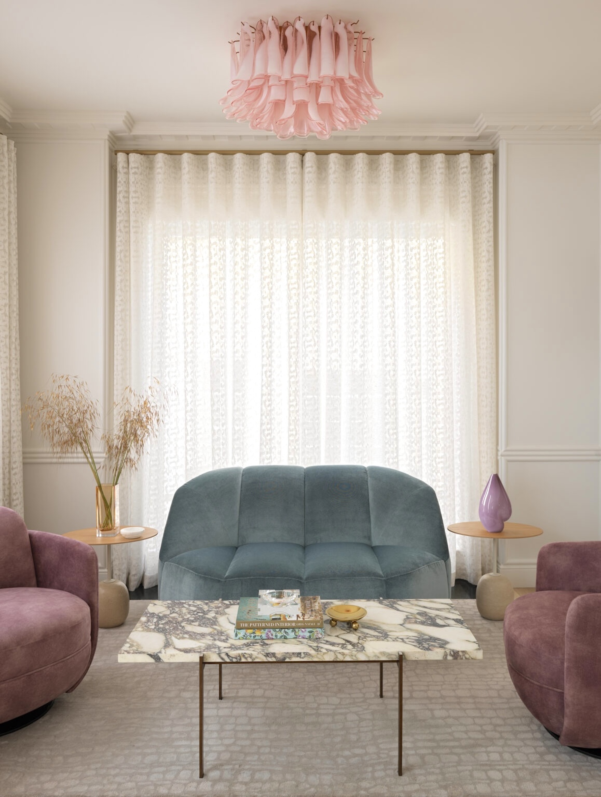
There’s no need to instinctively reach for one particular shade of pink or green — the most elegant palettes often feature slightly more unexpected combinations.
Pink doesn’t necessarily have to be a shade of blush, and green doesn’t necessarily have to be an overtly botanical tone. Other iterations of the colors, as in this London project by interior designer Greg Natale that features a more grounded dusky pink and almost jewel-like turquoise green, can create a super smart look.
“This cooler, more nuanced palette presents a more sophisticated take on the pairing,” Greg explains. “The grayish-green tint on the sofa and the amethyst armchairs bring depth and richness to a space that is otherwise relatively neutral yet layered in texture.”
“It’s about being playful and elegant without making a space feel overly sweet or overwhelmingly feminine,” he says.
10. Play With Paint
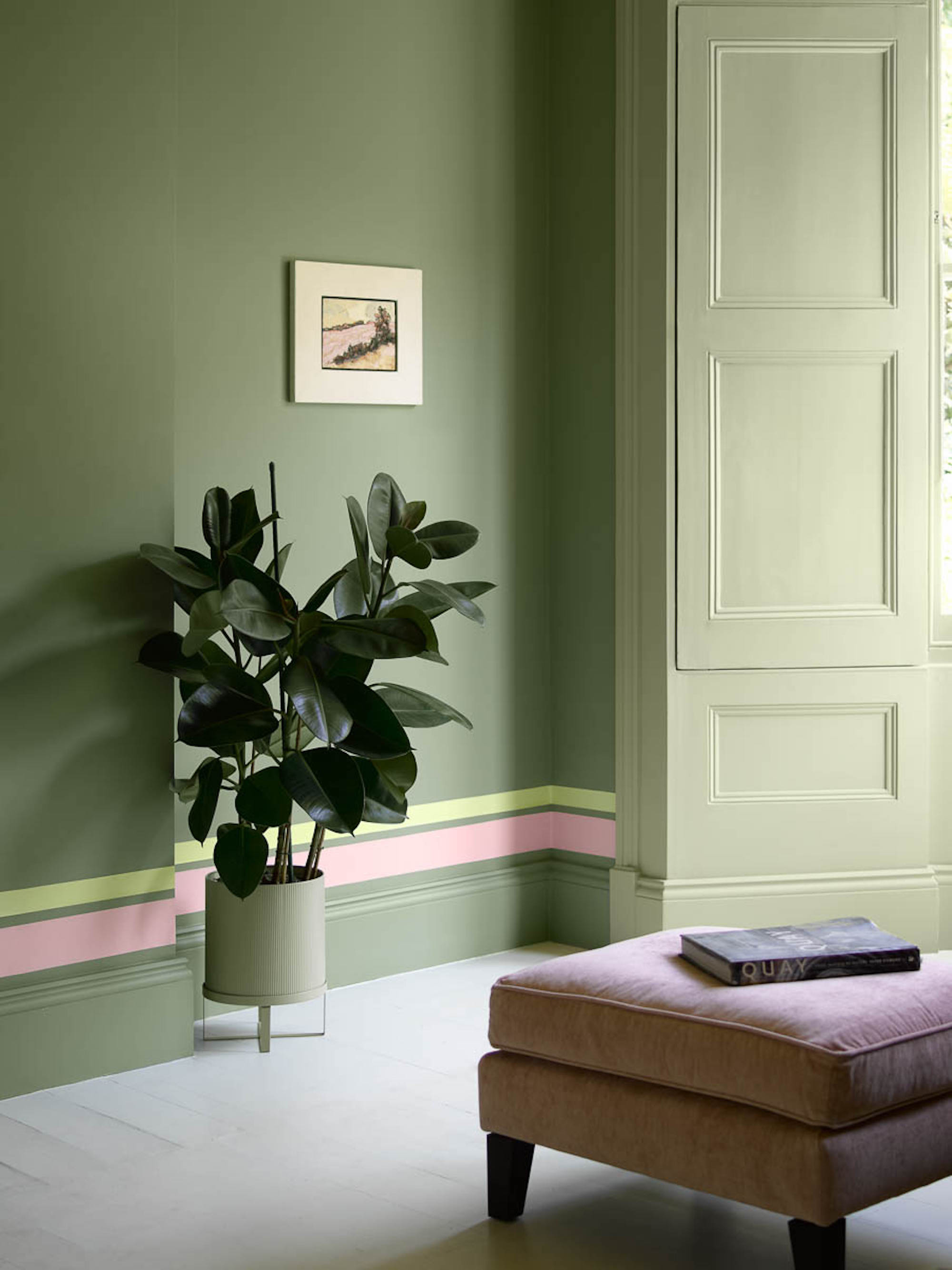
Experiment with paint effects to introduce extra flashes of color into a living room — a contrasting (or complementary) vertical line can seem to elongate the space.
“Pink and green work well to elevate each other,” says Helen Shaw from Benjamin Moore. “Sitting on opposite sides of the color wheel, they create contrast but aren’t harsh, and they feel fresh and optimistic together.”
For a contemporary living room with a playful touch, consider experimenting with paint in a creative way. “Following the line of your room with painted stripes in brighter pastel pinks or complementary greens will create an eye-catching element, like we did in this project,” Helen suggests.
For the result to feel sophisticated, it’s best to go below (or above) eye level by echoing the line of a trim, picture rail, or ceiling and to keep the rest of your space pared-back with furniture in matching or neutral shades.
FAQ's
Which shade of pink goes best with green in the living room?
Color choices have a lot to do with personal preference and your own aesthetic tastes, of course, but as a general rule of thumb, blush pink is the most versatile choice for contemporary pink and green living room ideas.
As it has a softness that complements both warmer and cooler shades, it can lend a sense of romance to more dramatic emerald shades and bring a grounding look to powdery sage greens. It responds well in low-lit and well-lit spaces, making it a flexible option, too.
Pink and green living room ideas are a classic color combination for a reason — interior designers know that these two colors pair together perfectly.
Whether you opt for bolder shades for a more dramatic look or decide to pair them back using near-neutral hues, the key is to weave them together in a way that feels effortless and elegant.
Still not completely sold on pairing pink and green? Discover what other colors go with pink, for a palette that fits your preference better.

James Cunningham is a freelance journalist based in London. He has written extensively on design and decorating for some of the UK’s leading publications, including House Beautiful, ELLE Decoration, and Country Living, and previously served as Homes and Gardens Editor at Good Housekeeping. When he’s not at his desk, James can be found globetrotting in search of good food, better wine, and the best architecture.
