Wait, There's a Difference Between a Hue, Tint, Tone, and Shade? Here's How to Talk About Color the Right Way
I'm a specialist in behavioural color and design psychology, and here's what most people get wrong when describing colors


Color surrounds us every day, yet many of us rely on only a handful of words to describe it. We say, “I like a soft blue” or “maybe a darker pink,” but without the right terms, it can be tricky to explain exactly what we mean. Did you know there is actually a difference between the terms hue, colour, tint, tone, and shade?
This guide will walk you through some of the main color terms to help you make sense of what you see. From the pure hues that are the starting point of every color, to the tints, tones, and shades that shape how they appear, you will discover how these terms give you a clearer way to understand and describe color.
Along the way, you’ll also pick up simple ways to notice subtle details and talk about color with confidence, whether you are decorating with color in your home or choosing a palette for any creative project.

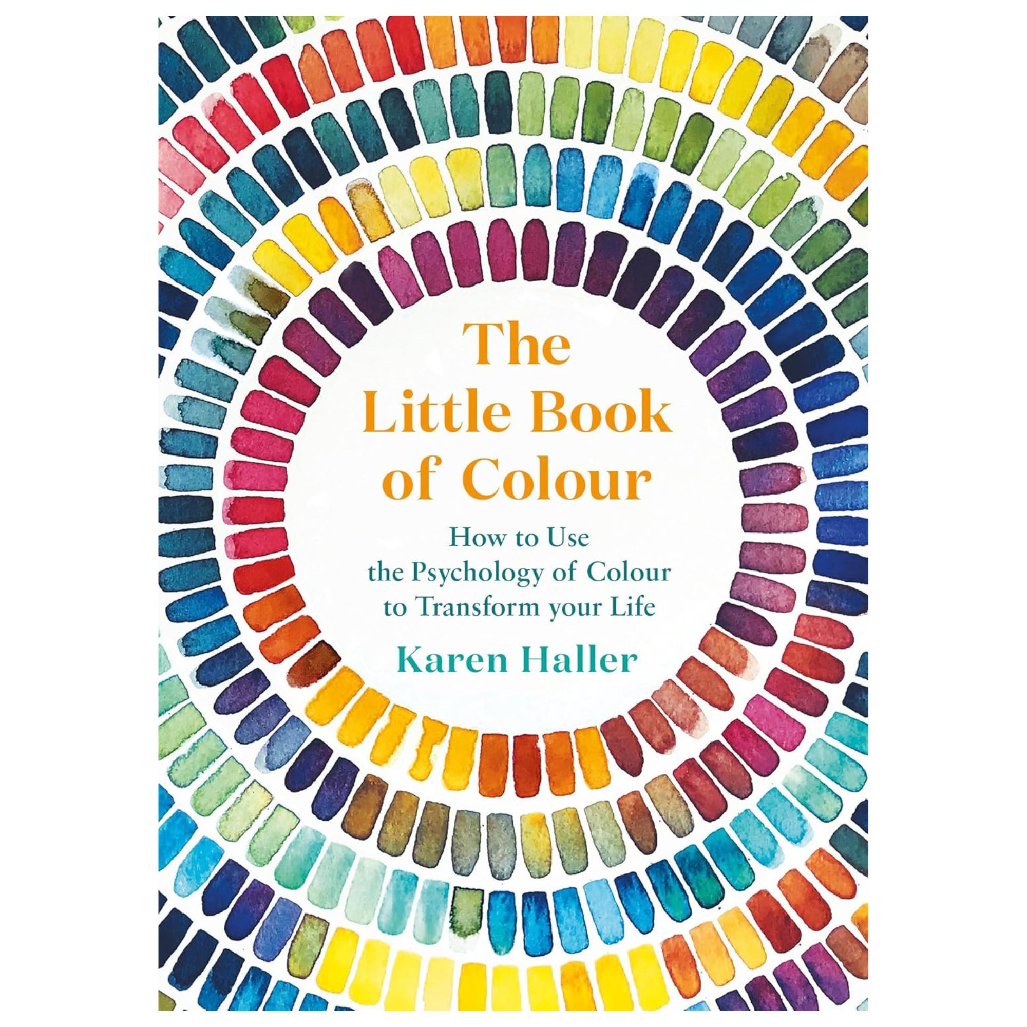
Karen is a color psychology expert who wrote the book, quite literally, on how to use it when designing your home. She's the author of The Little Book of Colour which explains how to use color in interior design to improve you happiness, wellbeing, and confidence.

A hue is where every other color begins.
What is a Hue?
Hue is the name for a color in its purest form. Think red, yellow, blue, green, orange, or violet. Each one has its own wavelength of light, which is what gives it that instantly recognizable look.
A hue is the foundation before anything else comes into play. The moment you start adding white, black, or gray, or blending it with another hue, you are no longer looking at the pure hue. You are seeing a version of it, shaped by what has been added, but the original hue is always its starting point.
What is a Color?
Color is what happens once a pure hue has been changed. Add white, and that hue turns into a tint. Add black and you get a shade. Add gray and it becomes a tone. You can even mix one hue with another to create something new. These changes turn a pure hue into the colors we see and talk about every day.
What is a Tint?
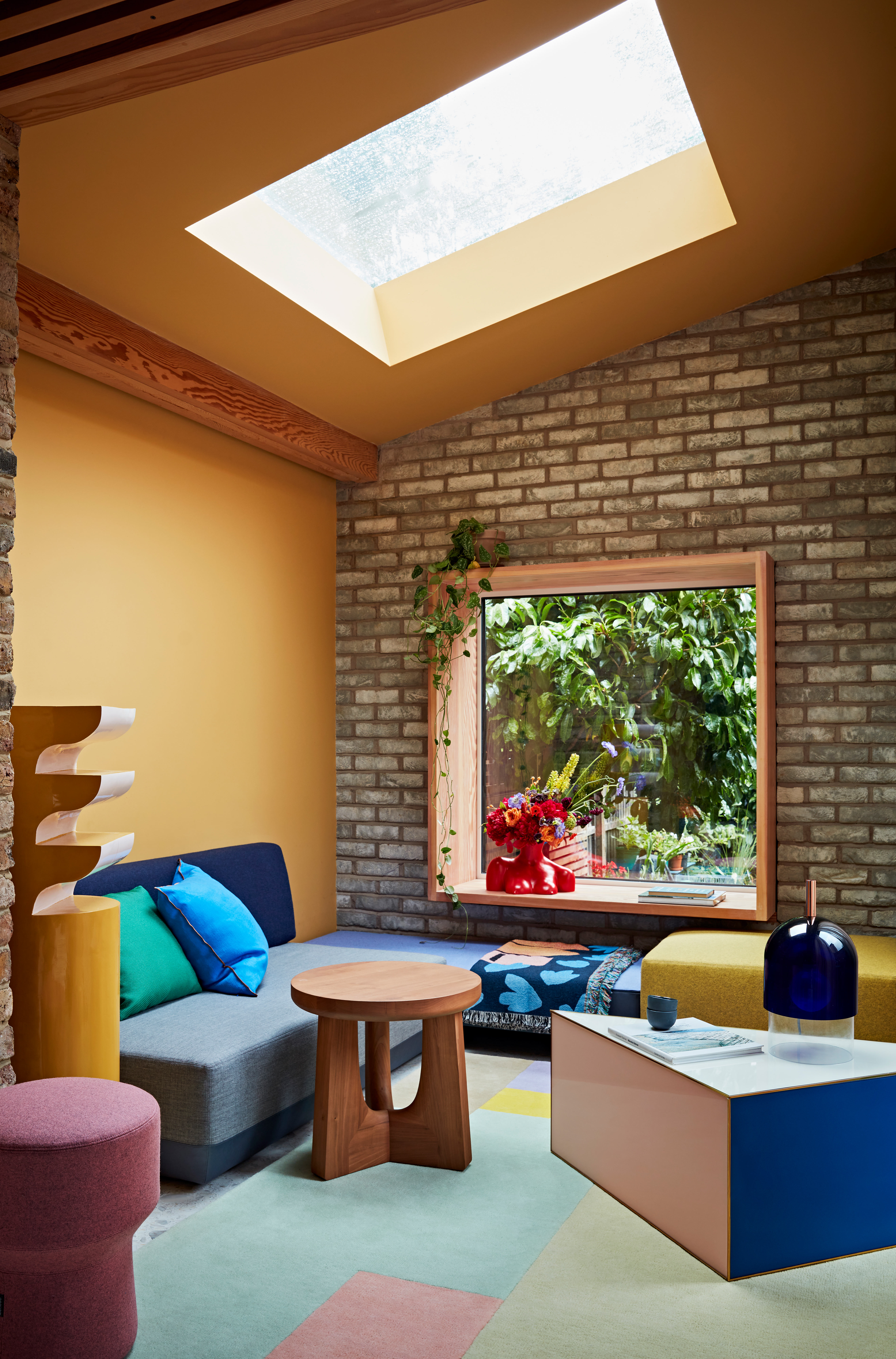
Tint is created when white is added to a hue or a color. This lightens its appearance and softens how it feels. A red turns into a soft pink, while an earthy terracotta becomes a gentle peach. Tints feel light and delicate. They are often referred to as pastels, the French word for a soft, pale color.
The Livingetc newsletters are your inside source for what’s shaping interiors now - and what’s next. Discover trend forecasts, smart style ideas, and curated shopping inspiration that brings design to life. Subscribe today and stay ahead of the curve.
What is a Tone?
Tone is created when gray, which is a mix of black and white, is added to a hue or a color. This softens the color and reduces its intensity, giving it a more muted appearance. Muted is another way of describing tone. Think of dusty rose, slate blue, or soft lavender.
Tones became especially popular when grays were at the height of fashion in interiors. Farrow and Ball’s famous colors like Elephant’s Breath and Down Pipe are classic examples of tonal colors that defined that color trend.
What is a Shade?
Shade has become a catch-all word for any color, but it specifically refers to a color that has had black added. This is what gives it depth and weight.
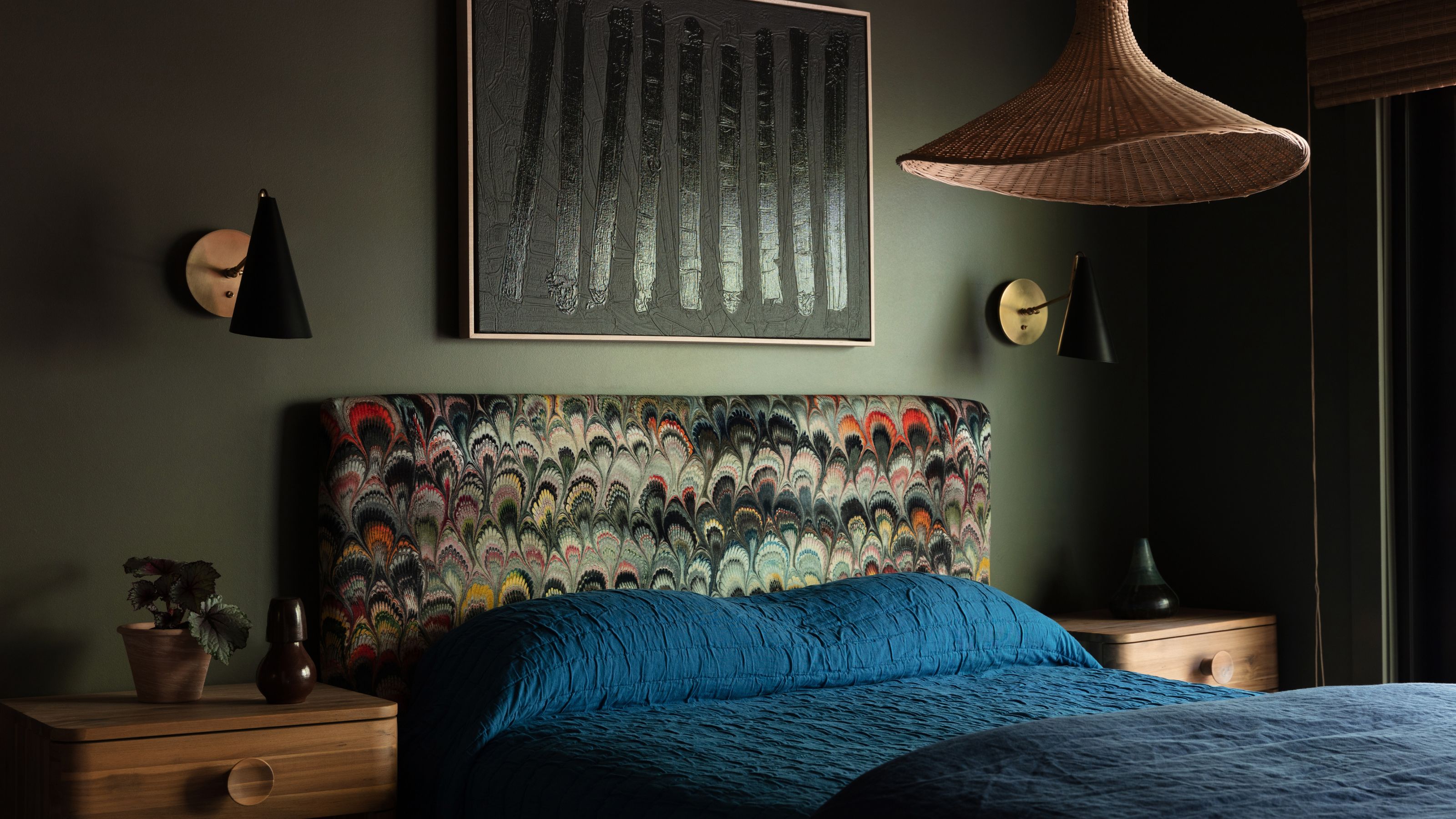
Burgundy is a shade of red, forest green is a shade of green, and mustard is a shade of yellow. Shades can feel grounding and dramatic, often creating a strong, earthy presence.

Once you understand the difference, you'll be able to see color in a whole new way.
Once you understand the difference between a hue, a tint, a tone, and a shade, you start to see color in a whole new way. You realize that every color you see comes from a pure hue that has been lightened, darkened, or softened.
A request for a “neutral tone white” is really asking for a gray. And the next time you hear someone talk about decorating with “shades of blue”, describing everything from sky blue to powder light to teal to navy, you will know they are really talking about tints, tones, and shades.
FAQs
What Is the Difference Between Hue and Undertone?
The way I explain undertones to my students and my clients is that they are simply the ‘color you can see within another color’. They only appear in colors that are not pure hues.
Take beige as an example. At first glance, it appears to be a light brown. However, when you place it next to another color, you may notice a subtle color within the beige begin to stand out.
This subtle color is what’s referred to as the undertone, the underlying color that becomes more noticeable when beige is viewed in contrast with different colors.
What Does Neutral Mean with Colors?
Ask ten people what neutral means and you'll likely get ten different answers. For some, it is any light color; for others, it is simply the dominant color in a room. I have even heard dark blues and magenta pink being described as neutrals. The word has become another catch-all term that means different things to different people.
From a color psychology perspective, there is no such thing as a truly neutral color because every color will create an emotional response, whether that's positive or adverse. This is why I tend not to use the term.
If someone describes a color as neutral, I will always ask what they mean, so I can understand how they are using it and how that might influence the emotional experience of the space or design they are creating.
What Does Saturation Mean in Color?
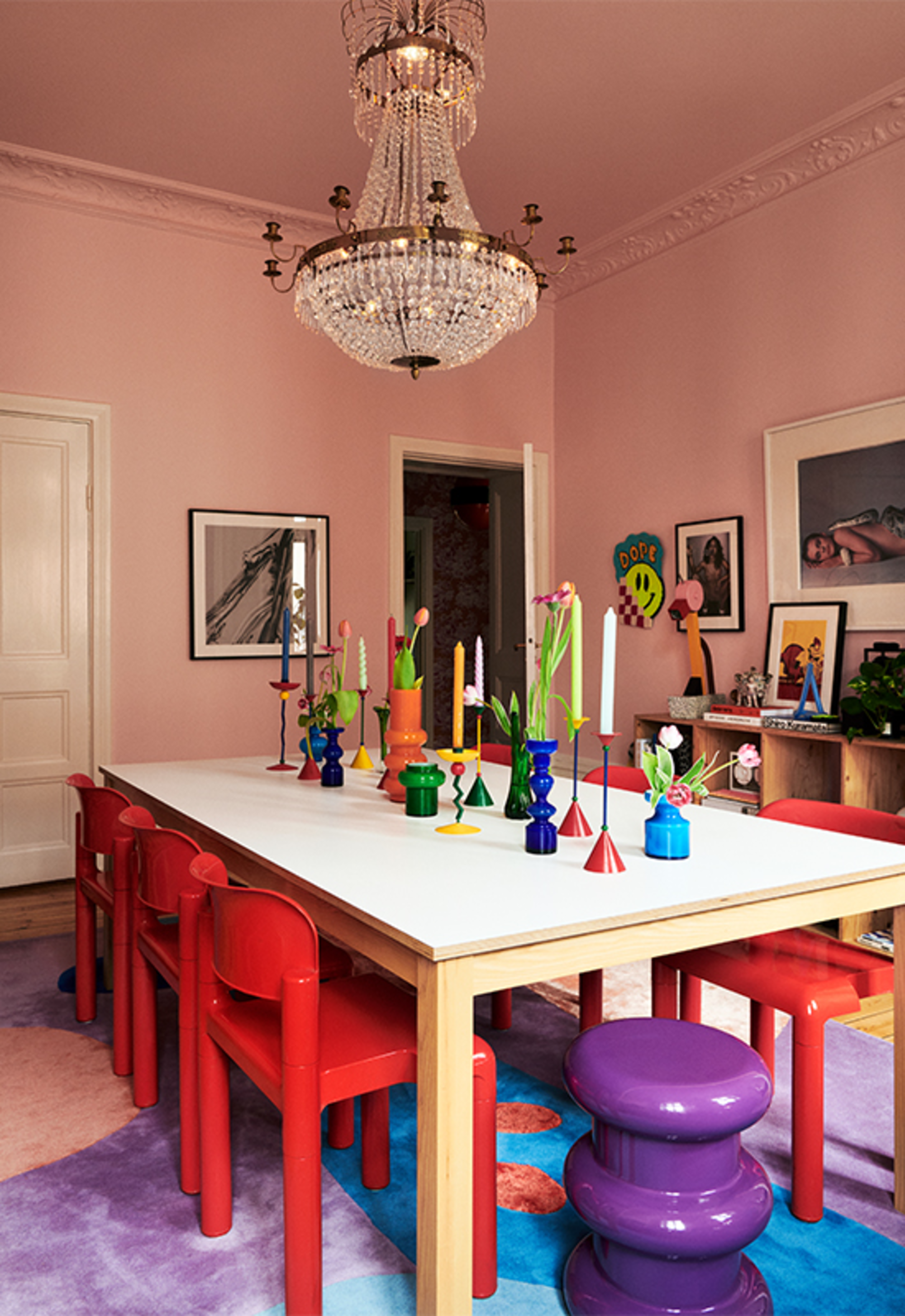
Saturation in color refers to how strong or vivid a color appears. Highly saturated colors look bold and vibrant, like turquoise or magenta pink. Colors with low saturation appear softer, like a dusty rose or a soft sky blue.
The more a color moves away from its pure, intense state, whether by softening it with white, darkening it with black, muting it with gray, or mixing with another color, the likelihood the lower its saturation becomes.
One of the biggest mistakes when decorating with color is not knowing how to properly talk about color or accurately describe it. And it's not just about sounding smart (although you will), but it will help you notice the details you might have missed, choose colors with more confidence, and explain what you like without confusion.
Getting familiar with these common color terms gives you a clearer way to see and discuss color, so you can make choices with ease and enjoy the process even more.

Karen Haller is a leading international authority when it comes to behavioural color and design psychology. Specializing in human-centered design, Karen works with businesses, design professionals, and individual clients, to help them understand our relationships with color, and how it influences the way we interact with a space. She has authored a book on the topic, called The Little Book of Colour which explains how to use color for your home and your everyday life to improve your happiness, wellbeing, and confidence.

