As a Color Psychology Expert, These Are 7 Things I'd Never Do When Decorating — From Following Trends to a 'Red Thread' Approach
Because color is never just about looks, especially in the home

The Livingetc newsletters are your inside source for what’s shaping interiors now - and what’s next. Discover trend forecasts, smart style ideas, and curated shopping inspiration that brings design to life. Subscribe today and stay ahead of the curve.
You are now subscribed
Your newsletter sign-up was successful
It is easy to think of color as something that comes at the end, a finishing touch once the main elements of a room are in place. But for me, it is always the beginning. I start by asking how I want a space to support me emotionally, behaviourally, and practically, and I build my color choices from there.
In my own home, every color has a specific job to do. I use color as a tool for shaping behavior, with each choice acting as an expression of how I want to live and feel in the space.
This same principle guides my work with clients. I begin by understanding how they want to use the space and the positive behaviors they want it to support, then I create a bespoke palette that reflects this. It is not about following trends or playing it safe.
Article continues belowColor psychology in interior design is about using color with intention, so it works for you rather than against you. Over the years, I have developed some firm principles. Here are seven things I will never do when decorating with color in a home.

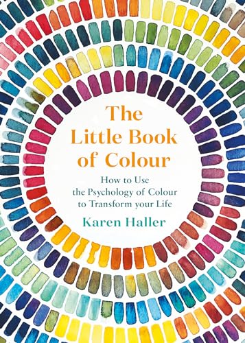
Karen is a color psychology expert who wrote the book, quite literally, on how to use it when designing your home. She's the author of The Little Book of Colour which explains how to use color in interior design to improve you happiness, wellbeing, and confidence.
1. I’d Never Follow a Trend If It Disrupts How I Want to Live
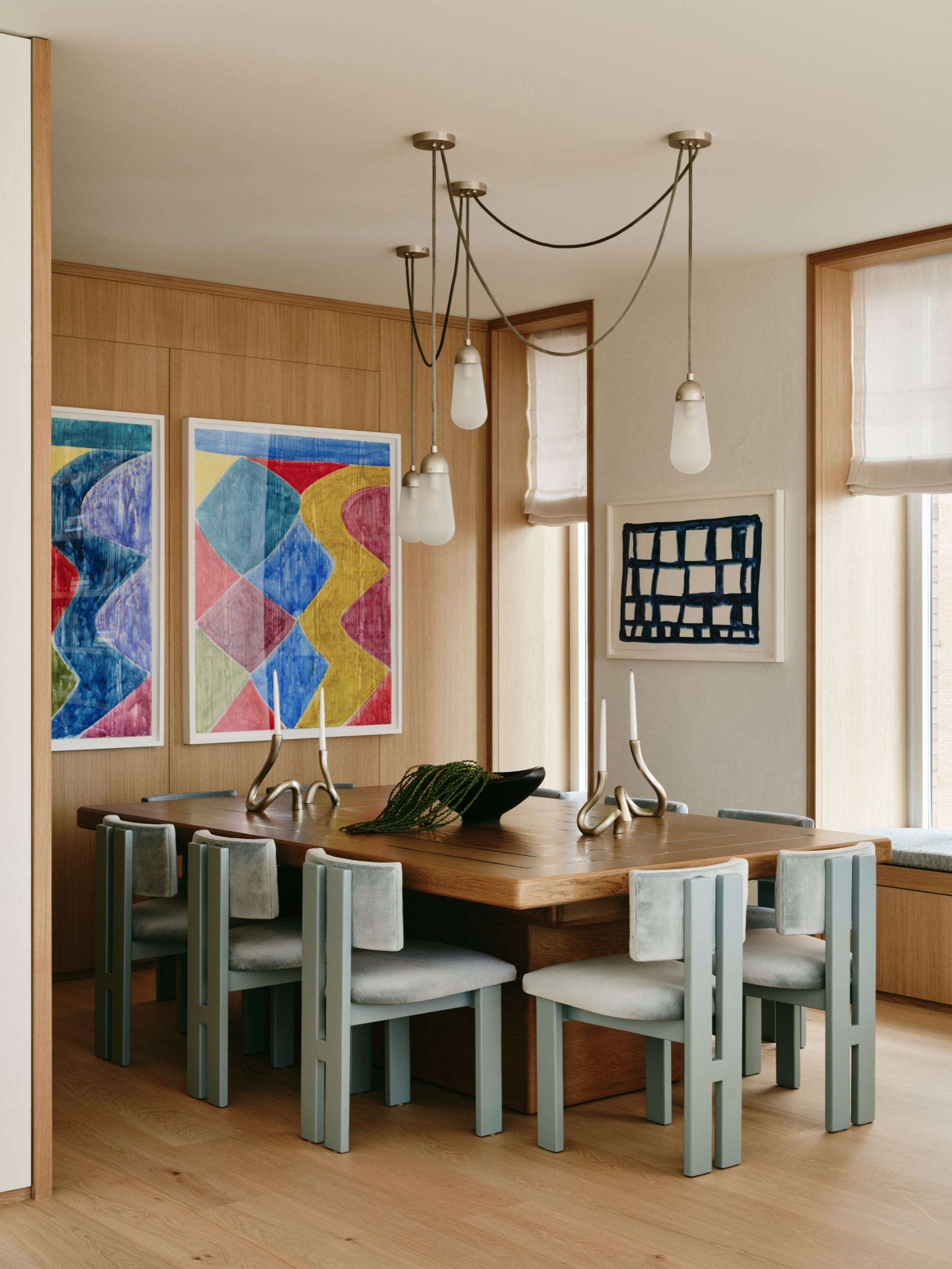
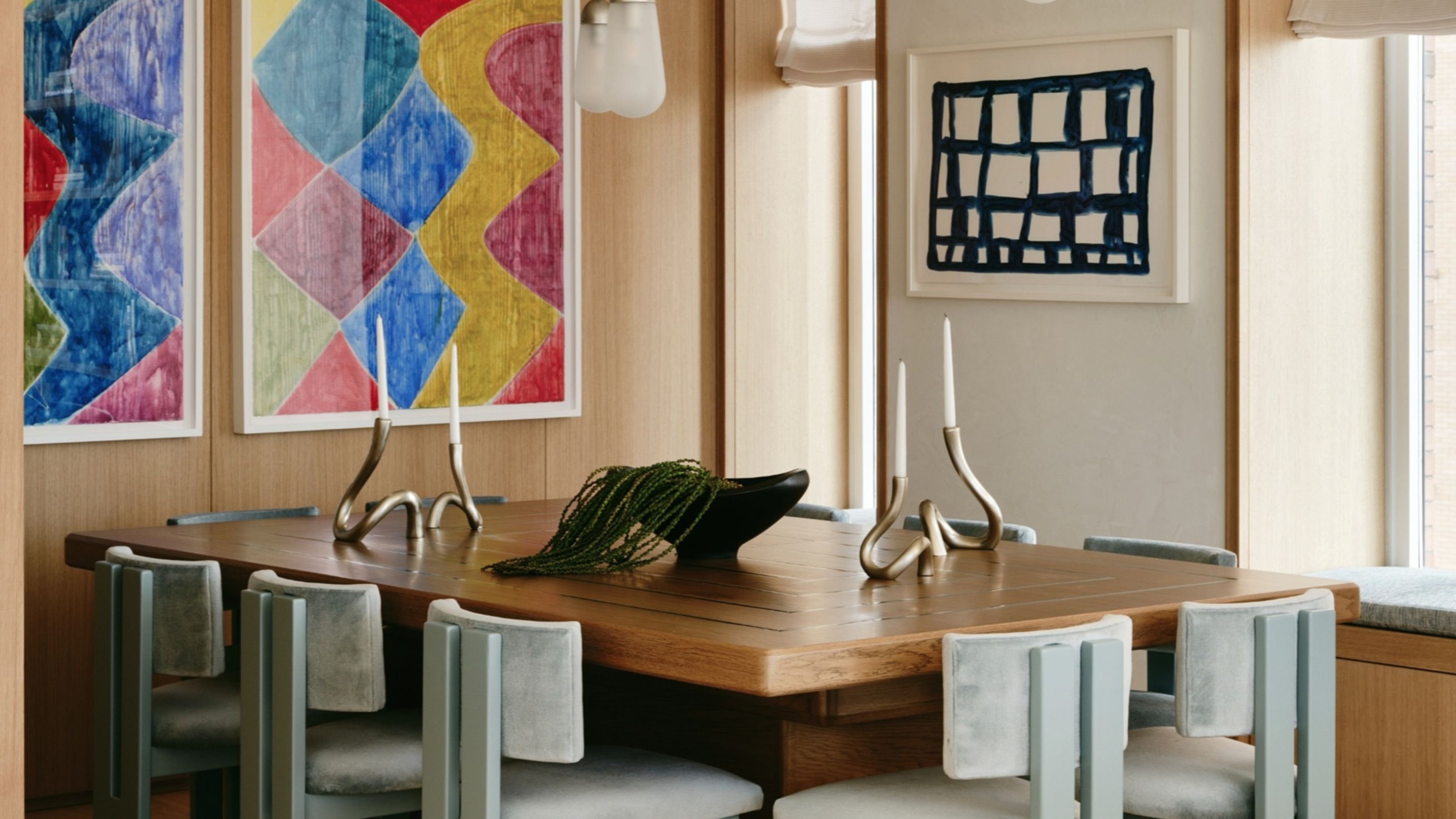
I choose colors that support who I am and how I want to live, not just what is trending at the time.
Color trends can be a great source of inspiration, and I enjoy seeing what is out there. But I will never choose a color just because it’s popular. It has to support the way I want to live in my home. If it throws off the balance of daily life or just doesn’t feel like me, I let it go.
A trend-driven choice can look good in theory but feel completely disconnected in practice. I have learned that no matter how beautiful something looks in someone else’s space, it still has to work for me. That is why personal alignment will always come first in my home.
2. I’d Never Treat Every Room the Same
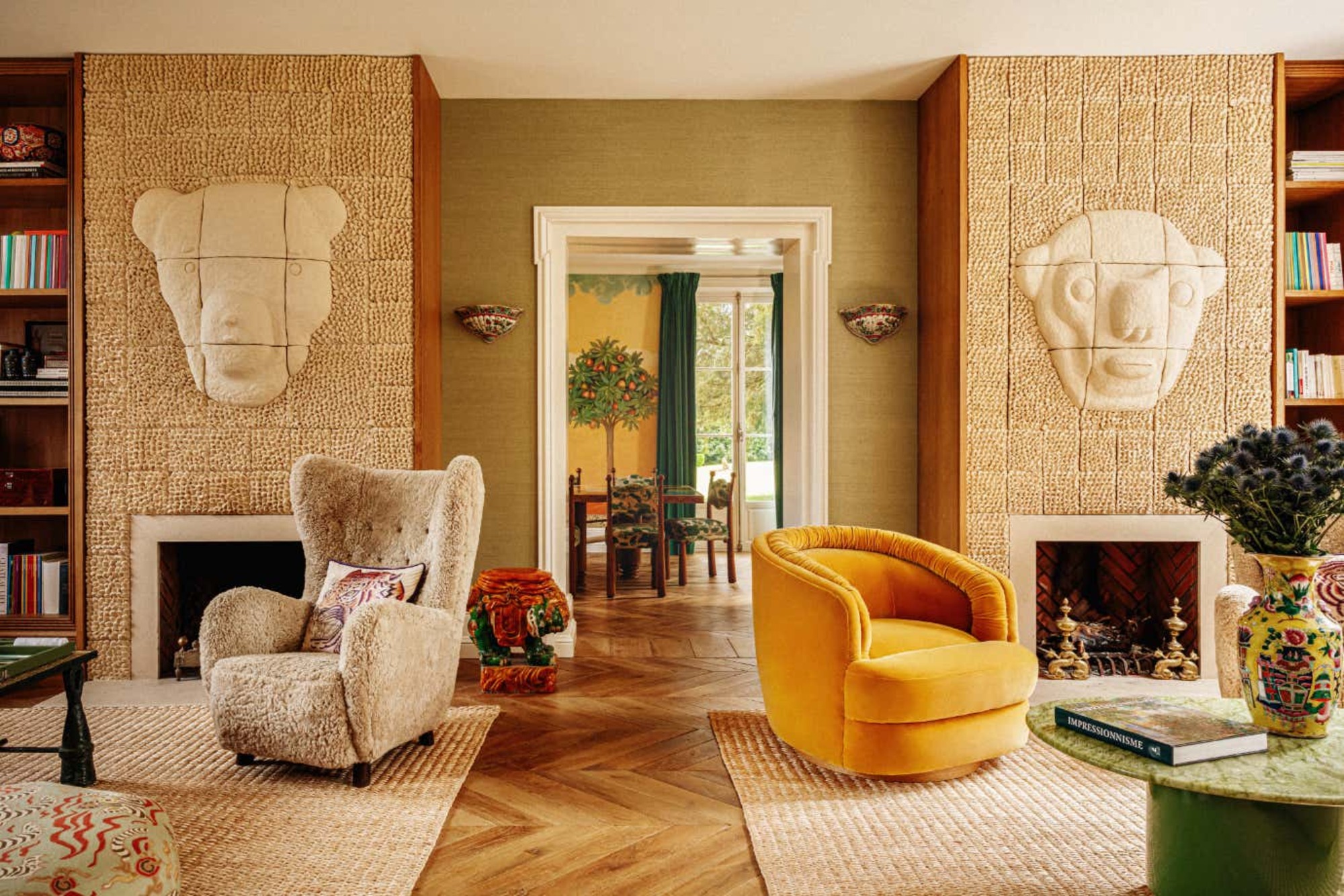
I design each room based on how it will be used and the specific behaviors I want it to support.
A popular way to design is to use the same color throughout the home, often referred to as the ‘red thread’. That might work for some, but it's not how I do it.
The Livingetc newsletters are your inside source for what’s shaping interiors now - and what’s next. Discover trend forecasts, smart style ideas, and curated shopping inspiration that brings design to life. Subscribe today and stay ahead of the curve.
I always let the function of the space and the way I want to behave in it be the starting point to guide my color choices. My bedroom is not designed to feel like my home office, because I use those spaces in completely different ways. A room for rest and recovery needs very different colors from one where I need clarity, creativity, and focus.
If I used the same color everywhere, it would feel like I was living in just one emotional state, and that is not a healthy way to live or a true reflection of how we move through our day.
3. I’d Never Copy Someone Else’s Color Scheme
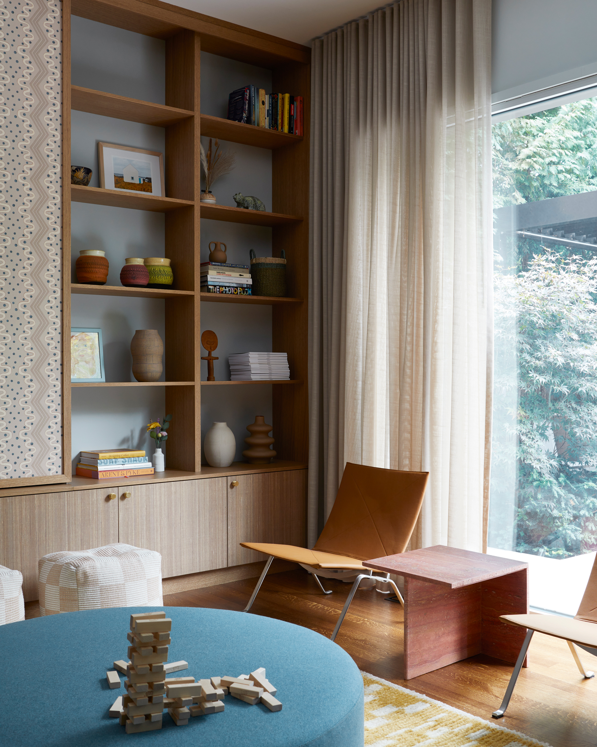
Ask yourself: do the colors I'm choosing reflect the way I want to live in this space?
It's easy to see a beautiful home in a magazine or on social media and think, I want that too. But I’ll never choose colors based on someone else’s life. What works in one home can fall completely flat in mine, because it is not a reflection of who I am or how I live. It would feel like stepping into someone else’s personality.
I once saw an influencer change her entire home from one color to another, and many of her followers felt they had to do the same. This is what can happen when we copy what we see without stopping to ask whether those colors actually support us.
Sometimes, without realizing it, we are trying to live vicariously through someone else’s version of home and self. I always bring it back to this: do the colors support who I am and how I want to behave in the space? If it does, I will consider it. If it doesn’t, I move on.
4. I’d Never Assume My Favorite Color Is the Right Choice
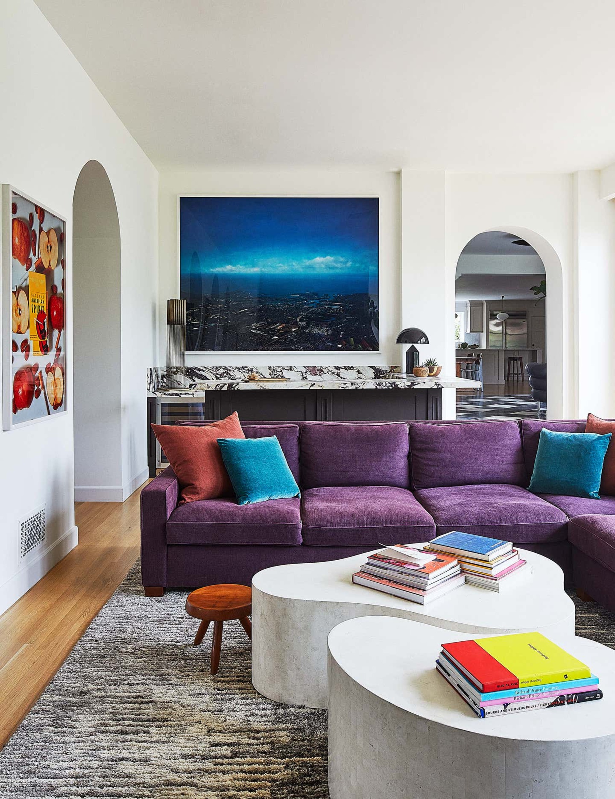
Consider your favorite color as an option, of course, but don't let it compromise how you'll live in the space.
It is easy to think that using our favorite color in a room will automatically make the space feel right. But I have learned that paint color ideas I love are not always the one that will support how I want to live in that space. What lifts me in one context can overwhelm me in another.
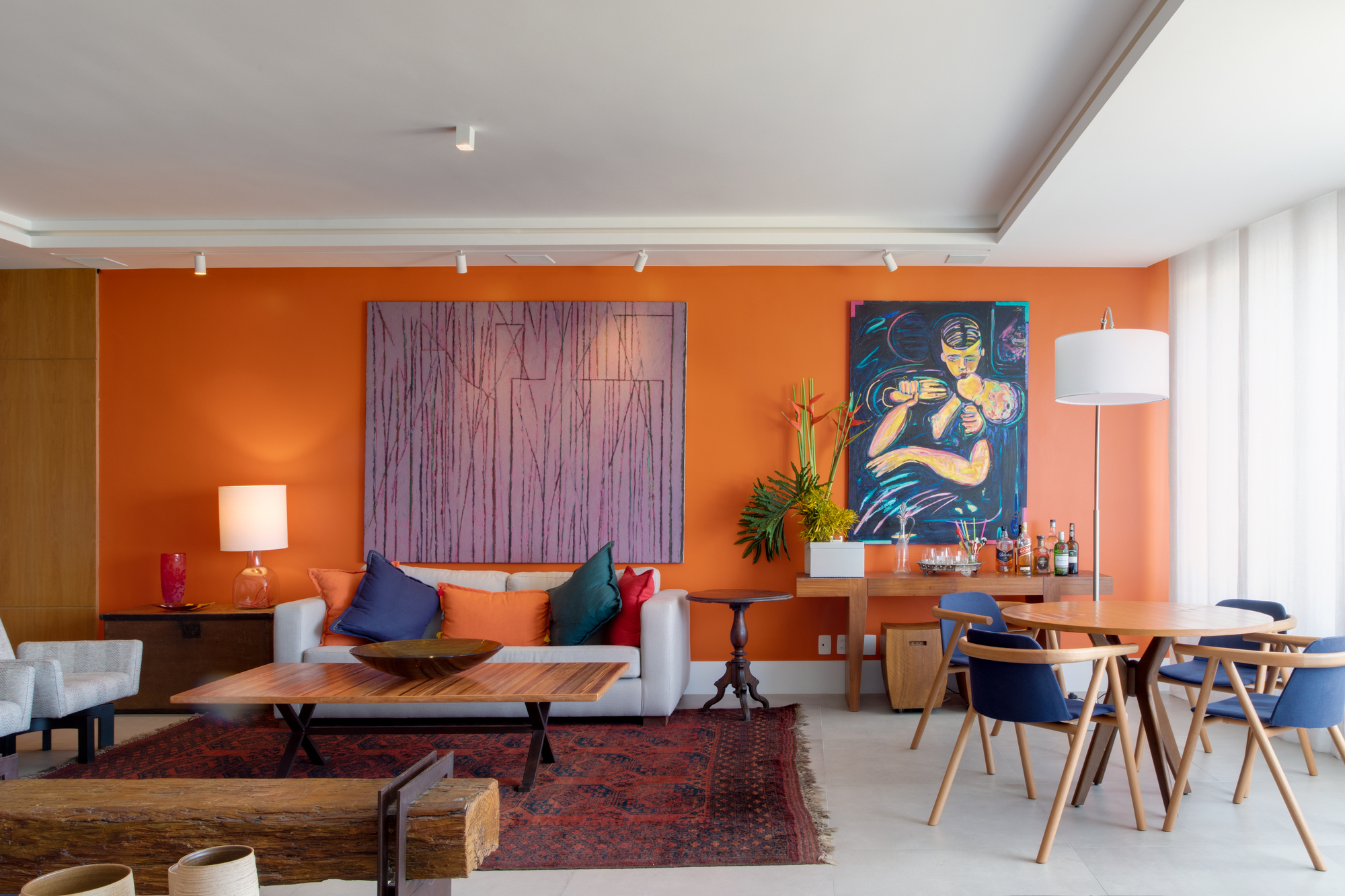
My favorite color is calendula marigold orange. It is bright, vibrant, and full of life. But in my home, anything more than small doses would have me ‘bouncing off the ceiling’.
That is why I always come back to the purpose of the room and the behaviors I want to support. If a color distracts from that or unsettles the space, I leave it out.
5. I’d Never Start With What I Want a Room to Look Like
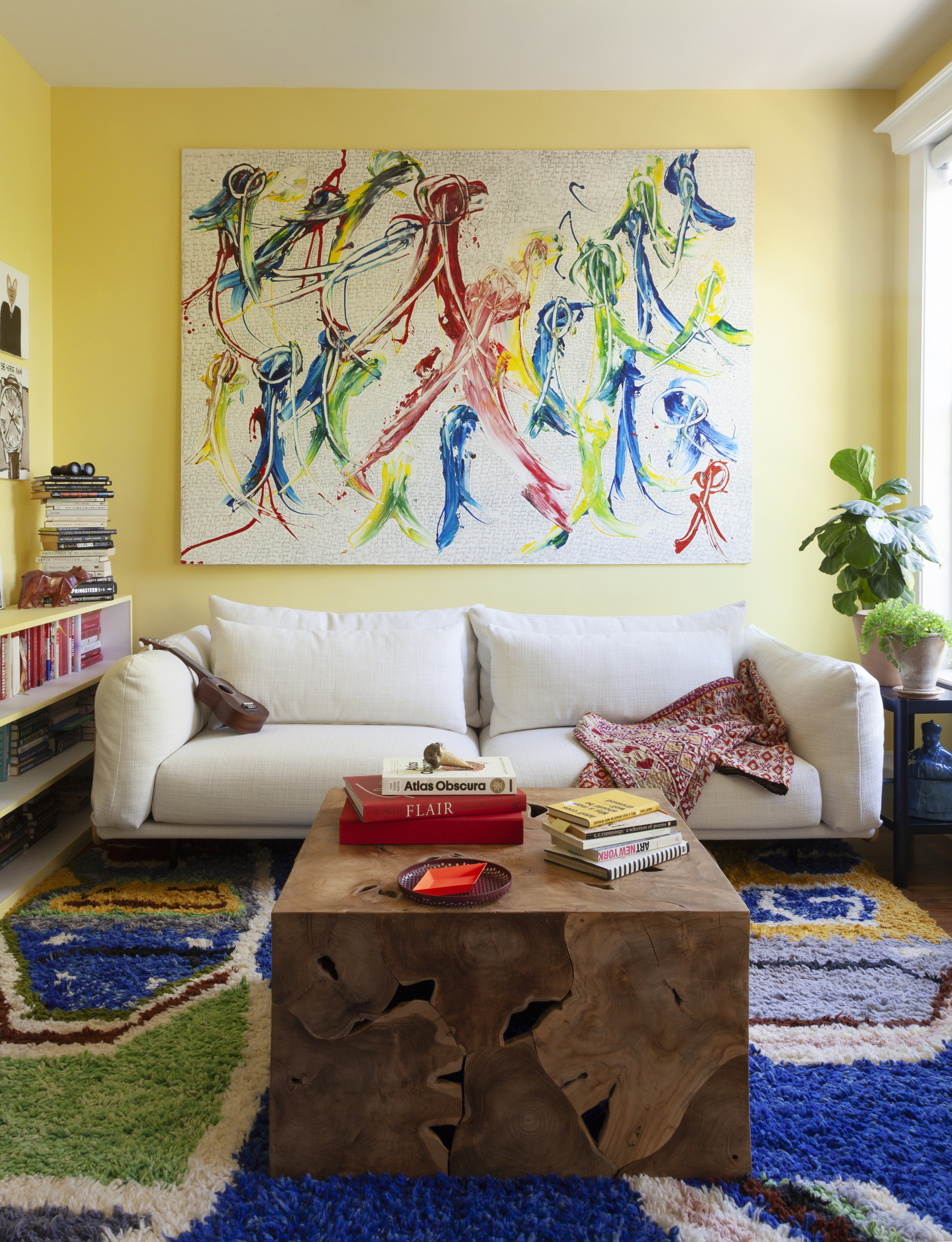
In a space such as a living room, look to energizing colors that encourage socializing and conversation.
This is the biggest shift for most people. Many begin with Pinterest boards, paint charts, and visual inspiration. But in color psychology in interior design, I start with something else entirely — the intention behind the space.
As I've said, I always begin by asking how I want the space to support me and what kind of behavior I want it to encourage. Do I need to feel energized? Nurtured? Focused? That question shapes everything that follows and often leads to choices that have nothing to do with current trends.
From there, I choose colors based on the behavioral impact they have. I ask how they influence the way I think, feel, and behave in the space, rather than judging them by how they appear in someone else’s home or on social media.
6. I’d Never Choose Colors in Isolation
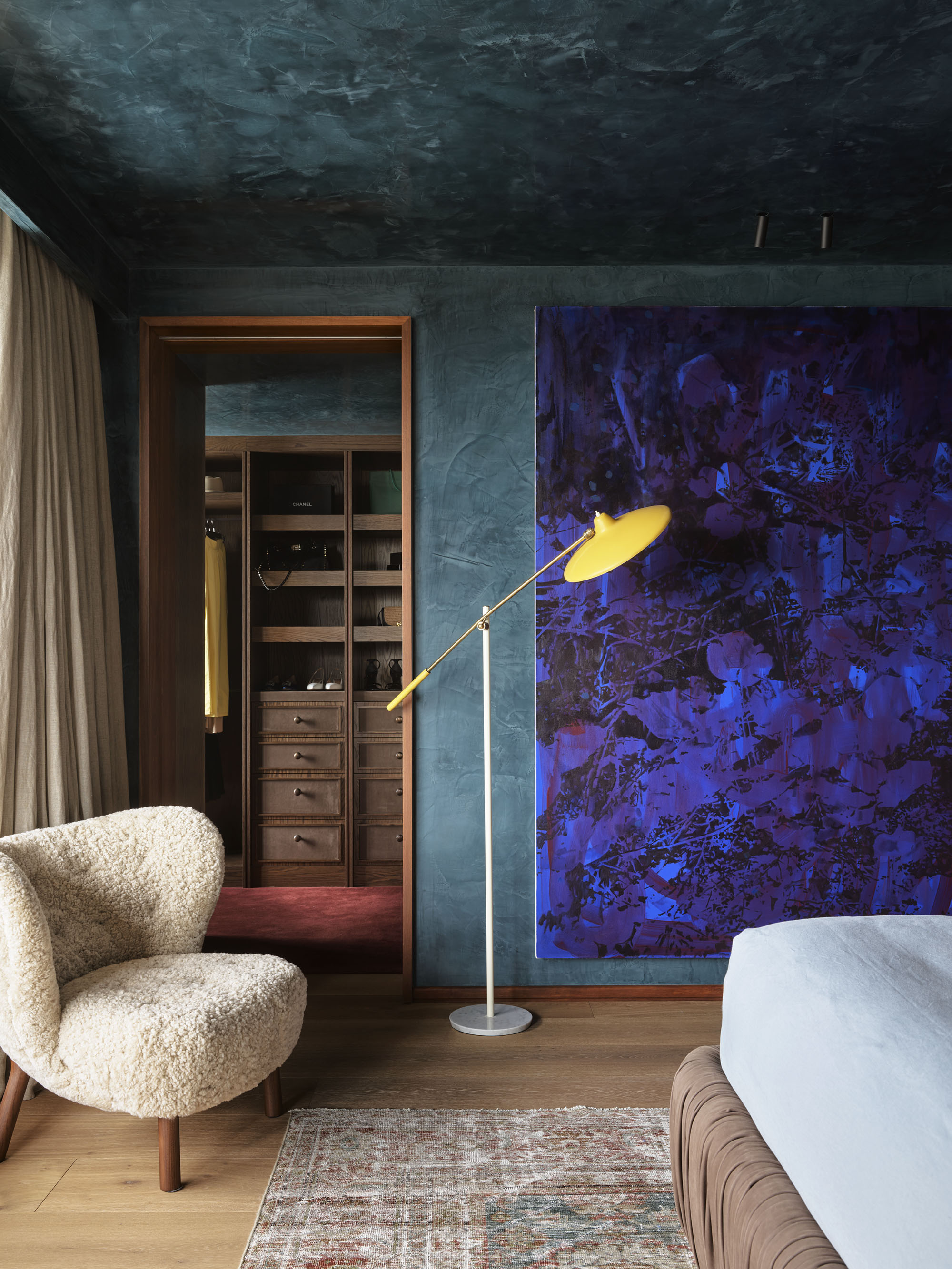
Choosing color is never as simple as just choosing a color — you need to consider the room as a whole.
It is easy to pick a color from a chart or sample and decide it feels right on its own. But color is never experienced in isolation in a real space. Each color carries its own psychological meaning, but that meaning can shift depending on what it is paired with.
That is why I always look at how colors interact with the other elements in a room — the walls, flooring, furniture, and materials — because together they can create a very different emotional message than any one color might on its own.
I create a color palette as a whole, testing how the colors relate to each other and asking whether, as a group, they support the behaviors I want that space to encourage.
7. I’d Never Ignore the Effect of Natural light
Learning how to use paint samples properly is crucial when picking colors for your home.
Light affects color, or the way we see it at least. I never make color decisions without seeing how the light in a room, both natural and artificial, influences how the color appears.
A color that feels soft and warm in the morning sun can look cold or muddy by late afternoon. That same color can appear flat and lifeless under a blue-based artificial light. Its appearance can shift dramatically throughout the day, which is why I never rely solely on a color card or digital image.
I always test colors in the actual room, at different times of day. I need to see how the light interacts with all the colors in that specific space before making any decisions because that relationship shapes how the room feels and how well it supports the way I want to live.
FAQs
What Are the Most Negative Colors in Color Psychology?
In color psychology, there are no entirely negative or positive colors. Every color has the potential to support or disrupt, depending on how it is used. What feels right for one person can feel completely wrong for someone else. It always depends on the individual, the space, and the role the color is playing.
That said, there are two colors I rarely recommend. Harsh whites can feel clinical, sterile, and emotionally cold. And flat grays made from pure black and white often feel draining, tiring, or lifeless.
This is why I always choose colors based on how they will support the people using the space, not just emotionally, but behaviourally, and energetically, too.
Once decorating with color is done with intention rather than trends or guesswork, everything changes. A home becomes more than just beautiful and one that you love.
It becomes a space that actively supports how you want to live, how you want to feel in each room, and the way you move through your day. And that is something I will never compromise on, for myself or for my clients.

Karen Haller is a leading international authority when it comes to behavioural color and design psychology. Specializing in human-centered design, Karen works with businesses, design professionals, and individual clients, to help them understand our relationships with color, and how it influences the way we interact with a space. She has authored a book on the topic, called The Little Book of Colour which explains how to use color for your home and your everyday life to improve your happiness, wellbeing, and confidence.
