The 10 Secrets Behind 'Biophilic Colors' That Bring Nature's Power Into Your Home — And It's Not All Just About Green
There are certain colors that can blur the line between indoors and out, and their impact on space can be transformative

The Livingetc newsletters are your inside source for what’s shaping interiors now - and what’s next. Discover trend forecasts, smart style ideas, and curated shopping inspiration that brings design to life. Subscribe today and stay ahead of the curve.
You are now subscribed
Your newsletter sign-up was successful
In a world where our brains are being constantly overstimulated with information and interruptions, designers are actively looking at ways to turn down the stimulation in our homes, creating nurturing environments that help support and repair our frazzled nervous systems. One way is with biophilic colors.
Biophilic interior design is an approach that is gaining momentum in the design industry, and understandably so. Its principles focus on integrating natural elements and patterns into our built environments to foster a connection with nature that aims to improve well-being and create healthier spaces.
The use of biophilic color within the home is one of the most cost-effective and least disruptive ways we can introduce a connection to nature. A particularly effective way to reduce overstimulation at home is by desaturating the colors within our living spaces. And here's how design experts recommend doing it.
Article continues below1. Take Inspiration From What’s Outside Your Window
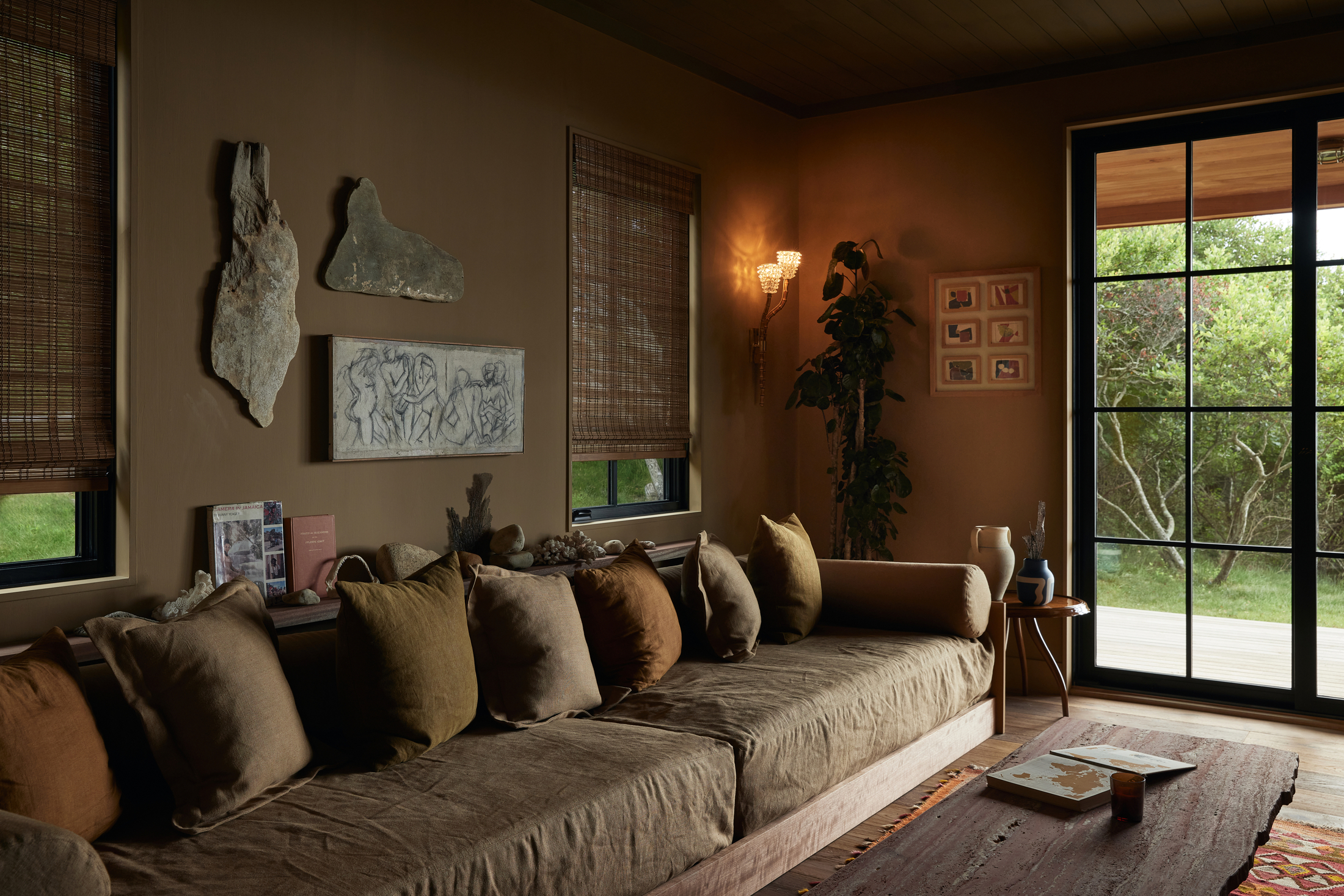
For the best biophilic color inspiration, just look out your windows.
Our love affair with nature isn't just a fleeting trend. For millennia, humans' main focus was to be close to fresh water and vegetation — in fact, it was a matter of life and death. So, it's no wonder our brains let out a sigh of relief when we feel surrounded by nature, and what better way to connect to the great outdoors than to be inspired by what’s directly outside your window?
Look closely at the earthy color palette in your immediate view — the subtle greens of leaves, the shifting blues of the sky, and the earthy browns of bark. These biophilic colors offer an effortless and harmonious starting point for your interior color choices, creating a seamless connection between your indoor and outdoor worlds. What’s more, to deliberately ignore or go against the colors that are directly outside of your window would surely create a sense of disconnect, undermining the very essence of biophilia.
It doesn’t have to be so literal, though, says Robin Heard, founder and principal designer at Robin Heard Design. "One of the biggest misconceptions about using nature as a design reference is that you’re trying to 'match' what’s outside," she says. "That’s not the goal. Instead, it’s about taking cues — pulling inspiration from the tones and textures of the surroundings."
Robin goes on to explain that, "Artwork is one of the easiest ways to experiment with color in a space. A painting that incorporates tones from the view outside, such as the cool greens of vineyards or the warm oranges of fall foliage, can anchor a room. From there, you can layer in accessories like pillows, throws, or rugs that repeat those colors in complementary shades."
The Livingetc newsletters are your inside source for what’s shaping interiors now - and what’s next. Discover trend forecasts, smart style ideas, and curated shopping inspiration that brings design to life. Subscribe today and stay ahead of the curve.
2. Channel Your Happy Place
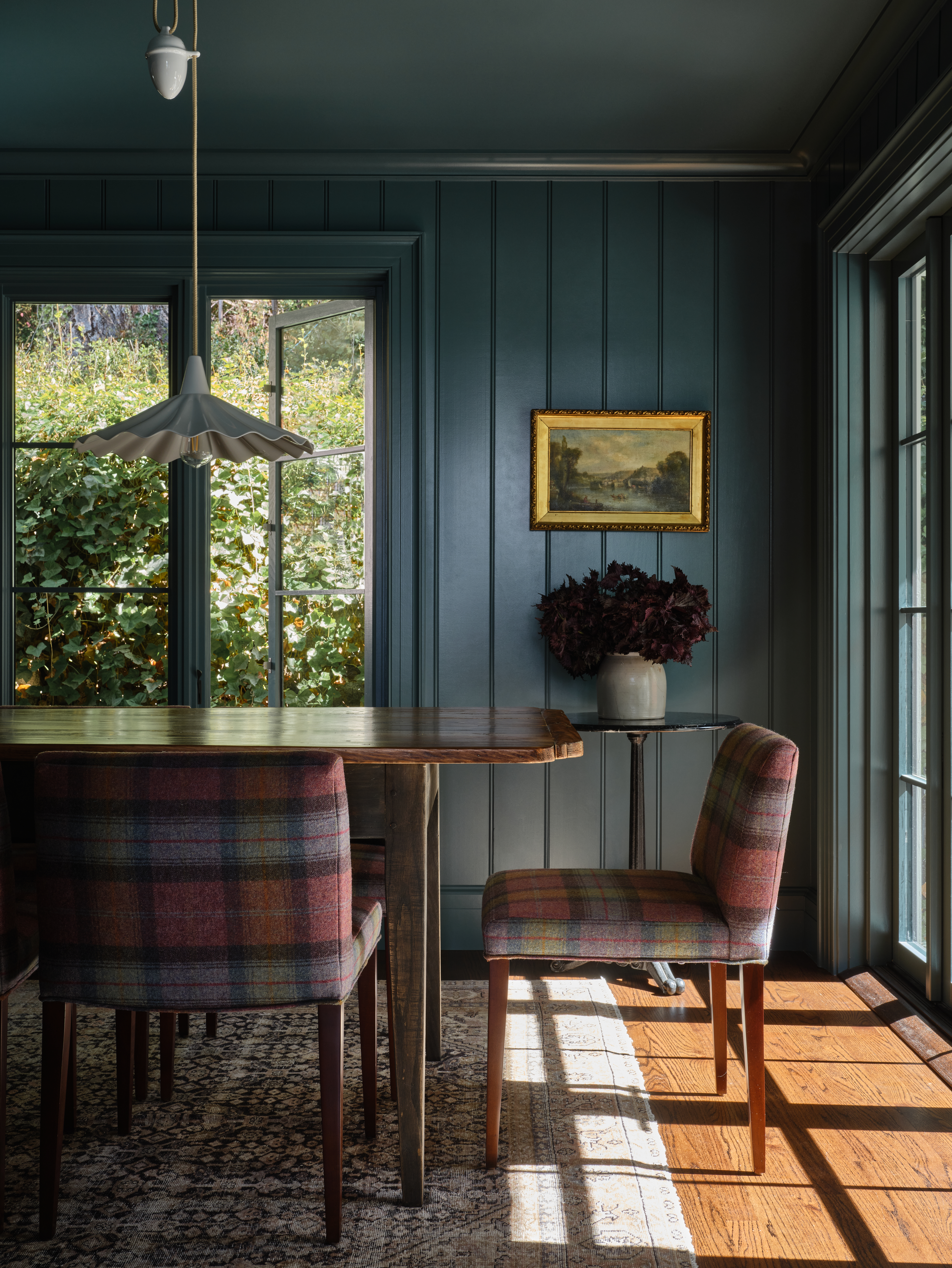
Thinking of where in nature makes you most happy and what colors are represented is another way to build a biophilic color scheme.
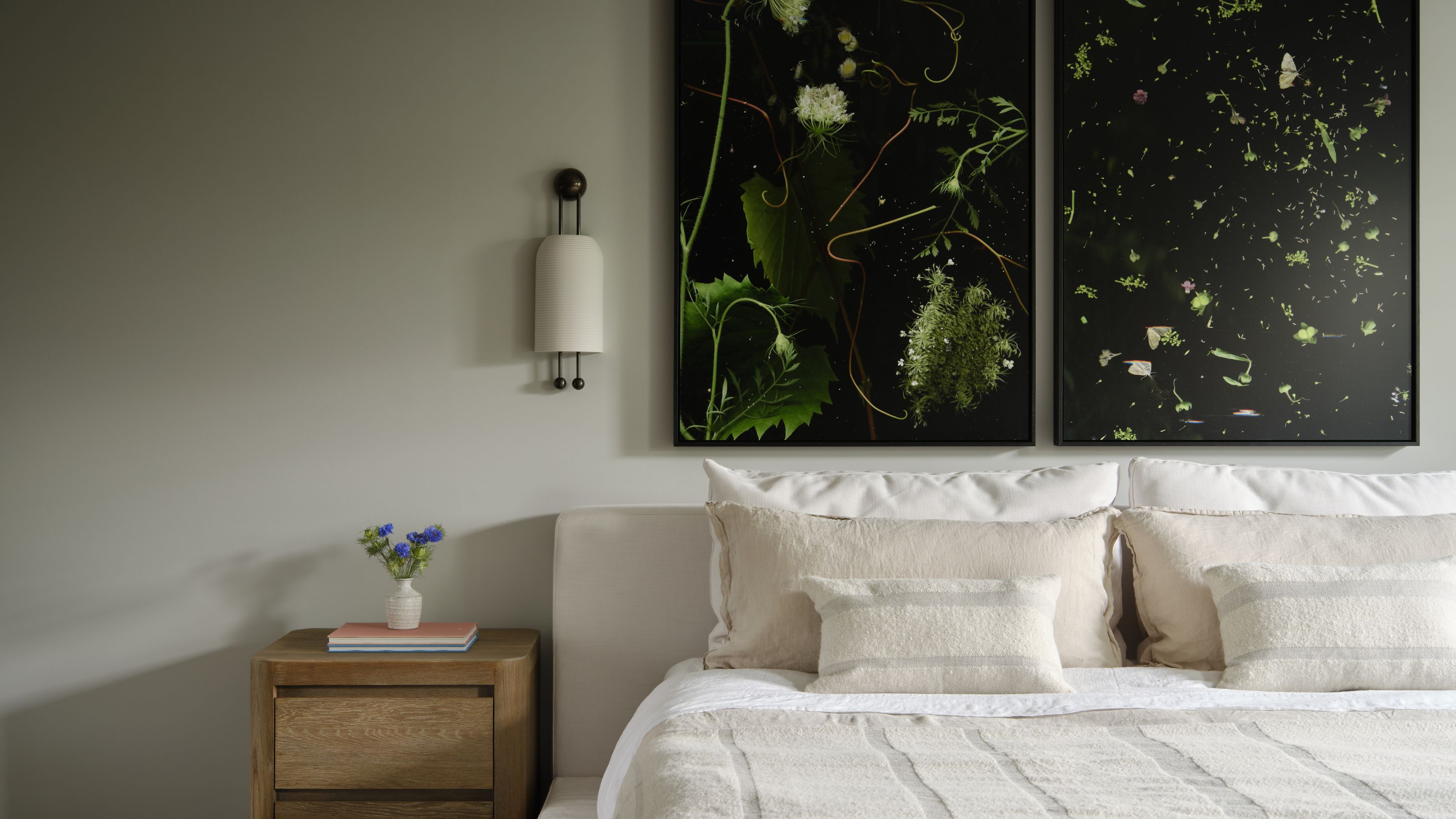
No natural views? No problem. Finding your biophilic color starting point can be as simple as reflecting on the natural landscapes that evoke your deepest sense of contentment. If the vibrant sea invigorates you, a coastal color palette could suit your home office. If the deep greens of a forest bring you calm, consider them for a restful bedroom.
The saturation of color also wields significant power in shaping the mood of a space. Highly saturated hues, bursting with vibrancy, can inject energy and excitement into a space, making them ideal for busy areas such as kitchens or playrooms. Whereas desaturated colors containing neutral undertones evoke a sense of calm and tranquillity, often finding their rightful place in bedrooms or relaxation zones. By carefully considering the intensity of the color, we can subtly yet effectively influence the emotional atmosphere within our homes, creating spaces that can either invigorate or soothe, depending on our desired intention.
Claire Gaudion, artisan textile designer and biophilic design specialist, says, "My top tip is to notice the tones of colors around you when you are out in nature and notice how they make you feel."
This may require a little self-exploration. Claire encourages you to reflect on how the various landscapes in nature make you feel so that you can apply a similar palette to your home. "Are you uplifted by the greens and whites of hedgerows in spring?" she asks. "Or drawn to the rich, warm apricots and blue hues of a sunrise over the ocean? Or do you feel most relaxed amongst the quiet tones of dappled skies and shadows in a late summer meadow? Choose the tones that work for you, according to how you wish to feel."
"When you have identified the right tonal pitch for you, the biophilic colors which trigger the right emotions for you, nature gives you the colors in the right proportions for use in the home," she adds.
Claire Gaudion is an artisian textile designer who grew up in Guernsey in the Channel Islands. Her art of weaving traditional Guernsey fishing baskets was passed down from her father, and today, as a member of Heritage Crafts and the Basketmakers’ Association, as well as being featured in the Crafts Council Directory, Claire's designs are innately linked to the natural world around her, making her somewhat of an expert in the world of biophilic design.
3. Be Considerate of Others Color Sensitivities

It's important to consider the saturation of colors, and how that impacts the way a space feels.
It’s important to recognize that the people you share your home with will have varying sensitivities — what works for one might overwhelm another. So, how can we design shared spaces to accommodate everyone's sensory requirements?
A common misconception around sensory design is that it should be limited in color and personality. Interior designer Sophia Fish of Golden Feathers Interiors explains, "Sensory design doesn’t mean plain and bland. We need to feed the senses to create the correct emotion for that area — then zone to define those feelings."
Thoughtful color zoning in shared environments is crucial for accommodating diverse sensory needs. By strategically applying the principles of color psychology in interior design — using calming hues in areas requiring focus and relaxation and more stimulating tones in social zones — we can create spaces that feel supportive and comfortable for everyone who lives in them.
Ultimately, a sensory-led approach to color within the home is about understanding how different hues and their intensities can evoke specific feelings and support different activities for each individual living there.
4. Be Purposeful With Color Choices

When introducing biophilic colors into your scheme, be intentional with where and how much you include.
In biophilic design, the intentional selection and placement of color play a crucial role in fostering a genuine connection with nature and supporting well-being.
According to Karen Haller, applied color psychology practitioner and author of ‘The Little Book of Colour’ (available on Amazon), "There is no such thing as a wrong color. It’s just where and how it is used."
Karen explains that ‘Color is actually the first thing that we see whenever we walk into any space," and adds that ‘We have an immediate emotional response to color whether we are aware of it or not."
She continues, "When it comes to biophilic or sensory design, color is the missing piece in creating spaces that foster positive change. This is why, moving forward, color is going to feature much more prominently in design, because it supports designers in meeting those emotional needs in a positive way."
Applying the right color to the right space is the key to creating a successful, biophilic scheme. Consider calming greens in bedrooms to promote a restful and restorative atmosphere. In home offices, opt for fresher shades of green and blue, as these tones are believed to enhance focus and mental clarity, making them ideal for productive spaces.
For living rooms and snugs, earthy browns, ochres, and warm neutrals offer a sense of comfort, helping to create a cozy, welcoming environment. In the kitchen, fresh greens paired with natural wood tones bring an organic, grounded feel that complements the space’s functionality.
Meanwhile, water-inspired blues and soft, earthy neutrals are perfect for bathrooms, where they can evoke a tranquil, spa-like atmosphere.
Karen Haller is a leading authority on behavioural color and design authority. She specializes in human-centered design, helping to decode our relationship to certain colors — including biophilic colors — and how it influences how we interact with a space. She's even written the book on it: The Little Book of Colour.
5. Keep Biophilic Colors Seasonal

Layering biophilic colors in a neutral scheme through soft furnishings means it's easier to switch them out at the turn of a season.
Just as nature changes with the seasons, our interiors should too. Subtle shifts in color, like layering warm ochres and rusts in autumn or introducing lighter, airy tones in spring, can keep a space feeling vibrant and emotionally attuned.
I realize that initially, this may sound a little extreme, but before you think that I’m recommending you redecorate four times a year, I’m not. It could be as simple as refreshing your space with a spring bedroom idea, such as switching up a pillowcase, styling seasonal fruit and vegetables in your kitchen, or introducing a seasonal color through a coffee table book or a bunch of dried or fresh blooms.
Mary Lambrakos, principal designer at Lambrakos Studio, also decorates using natural elements to align with the seasons. "Complement the seasonal shift with wooden candle holders, dried organic florals, and delicate branch structures, mirroring the serene beauty of the outdoors," she recommends.
6. Use Wood As A Neutral
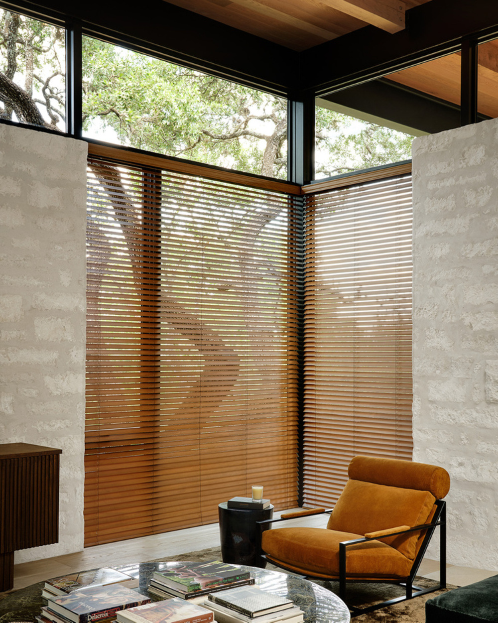
Don't forget to include natural textures like wood — and its varying tones — into your biophilic color palettes.
Whether you prefer a pale Douglas fir or you’re more drawn to a warm walnut, there’s a timber out there for you. Timber is the perfect complement to a biophilic color palette because it brings an immediate sense of warmth, texture, and authenticity that echoes the natural world.
Its organic grains and earthy tones effortlessly anchor interiors grounded in nature-inspired colors like mossy greens, muted clays, and sky blues. Whether left untreated, gently stained, or aged to a natural patina, timber offers a tactile and visual connection to the outdoors, reinforcing the sense of calm, balance, and harmony that biophilic design aims to nurture.
Once you’ve picked your type of timber, use it as the linchpin for selecting a natural, biophilic color palette. It’s the perfect way to bring warmth into a neutral scheme or to ground a vibrant and bouncy one.
Vanessa, resident color specialist at Lick Paint, explains that, "Just like paint colors, woods have undertones. For example, lighter woods like oak, pine, and birch all have gentle yellow undertones that create a subtle warming effect, whilst ash has gray undertones and a cooling effect."
When it comes to pairing paint, "You can balance a wood with warm undertones by using a cool paint color or match your color choices to the undertones for a cohesive look," she adds.
7. Paint Charts Are Your Friend
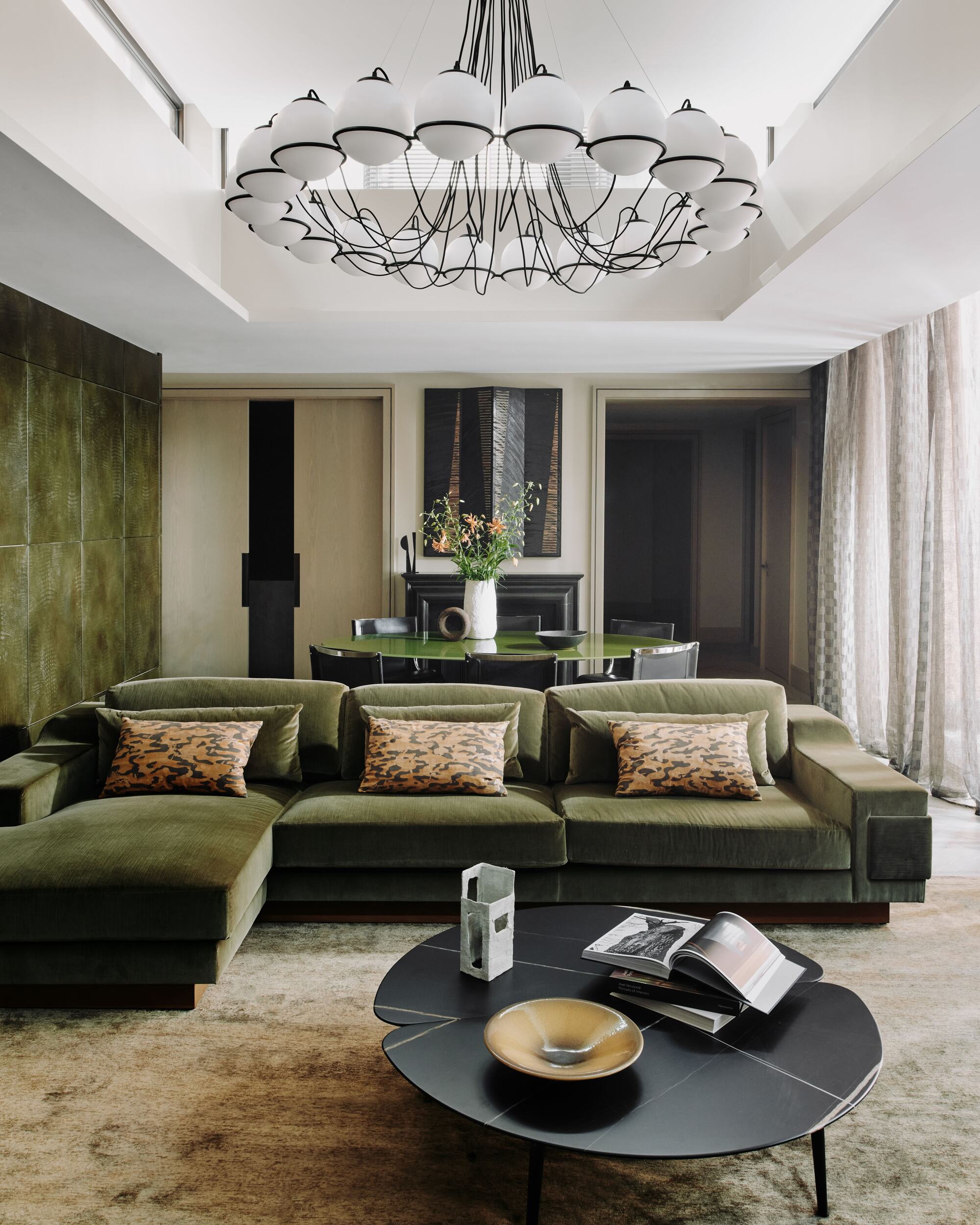
Before committing to any biophilic — or any color, really — it's worth swatching it in your space.
So, you've explored your inner landscape to identify the natural hues that resonate most deeply, but how do you translate that feeling into the ideal biophilic color for your room? With countless options available, finding the right hue to suit a room's purpose can feel overwhelming amidst a sea of paint swatches.
Paint chip color charts aren’t just pretty swatches — they're a strategic way to see how a color might behave in your space, under your light, and against your finishes, and many paint companies have put together nature-inspired collections to help you on your way to creating a soothing biophilic scheme at home.
Independent British paint manufacturers, Little Greene, offer one of my favorite nature-inspired palettes called the 'Stone' collection, developed in collaboration with the National Trust. This collection features 36 natural colors, all designed to bring warmth, tranquillity, and harmony to your interiors.
The 'Stone' palette is organized into six columns of graduated families, each representing the breadth of individual stone hues. These families are divided according to undertones based on naturally occurring pigments: Red Ochre, Burnt Sienna, Yellow Ochre, Burnt Umber, Lamp Black, and Green Earth. This arrangement simplifies color selection, allowing for harmonious tonal schemes or dynamic contrasting combinations.
Creative director Ruth Mottershead explains that, "More than ever, there is a greater need to surround ourselves with comforting, soothing colors that are easy to live with. Equally crucial is the colors’ ability to provide warmth and serenity within our living environments."
She adds that when it comes to applying the brand's 'Stone' palette to create a nature-inspired scheme in your space, "Natural stone tones aren’t just about the more obvious sand shades, but also incorporate soft reds and muted greens. Green is the true color of nature, one that we feel comfortable with within the home."
8. Let the Light Be Your Guide
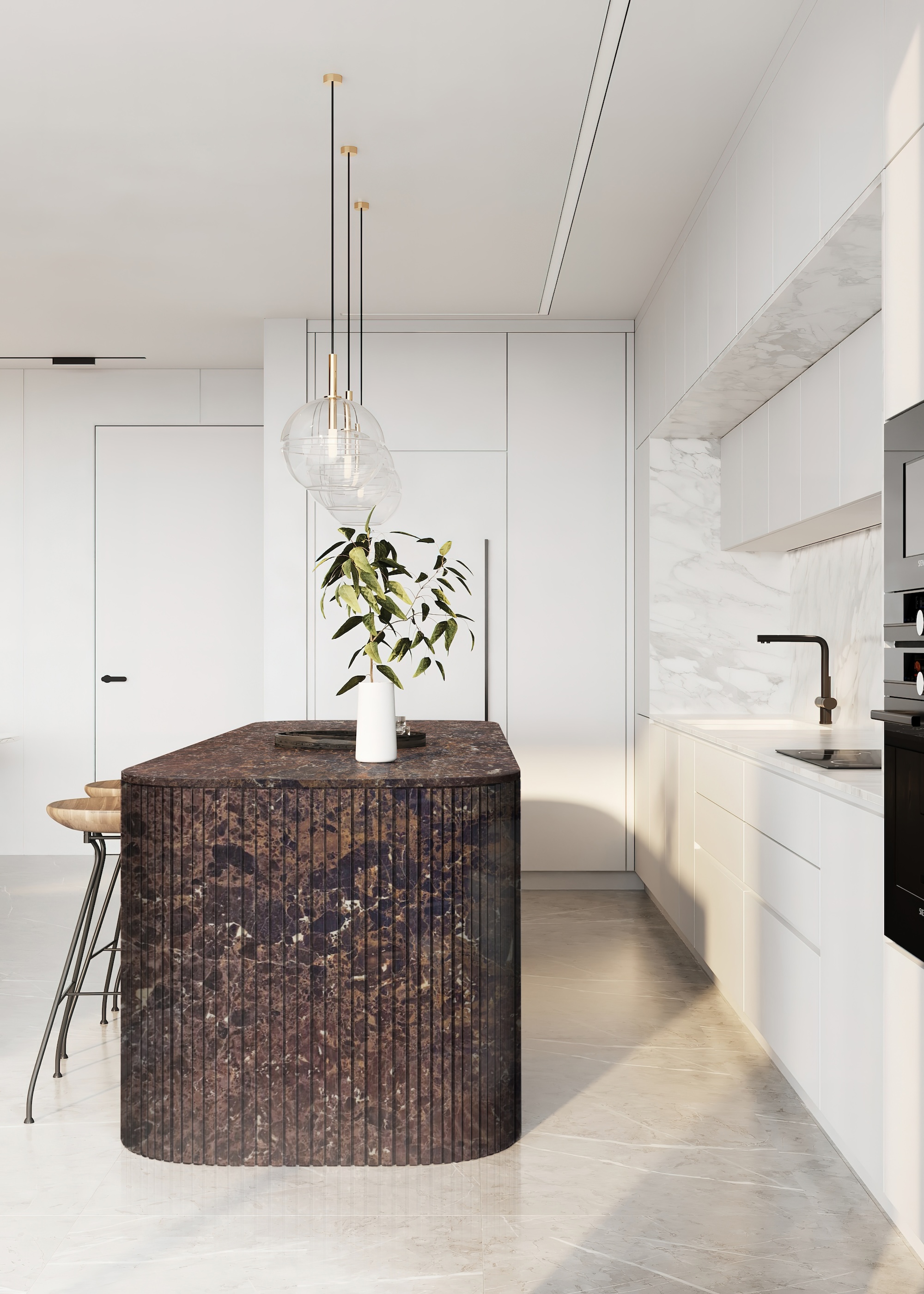
It's important to consider the natural light your space receives, and how that will impact any biophilic colors you include.
Understanding how light can affect color is crucial to creating a considered room that is firmly grounded in nature, as it can significantly alter the appearance and mood of a space.
There’s no point trying to fight against nature in a north-facing room by choosing lighter, cooler shades. In this instance, warmer colors with yellow undertones will help turn up the coziness and prevent your biophilic scheme from looking flat and cold. You could try leaning into the dark atmosphere of the room, painting it in a darker color to create a cocooning feel.
Interior designer Sara Charlesworth of Chalk White Arrow says, "Think about how colors will interact with your home's natural light and existing architecture. Pick colors that make sense for your home and don’t try to fight the light. Oftentimes, you can like a color on the card, but once you get it on the walls, it's way darker or way brighter."
She explains how you can avoid costly mistakes by taking your time and watching how a color interacts with the light throughout the day. "It's really important to test a color, paint it on a board, hold it up to your walls, and maneuver it through the room during the day, because the color can look so beautiful in the morning, but it might feel completely different at night," she says. "Seeing how that color is going to transform through the day can help you make an informed decision."
The same goes for your material palette.
9. Live With It for a Bit
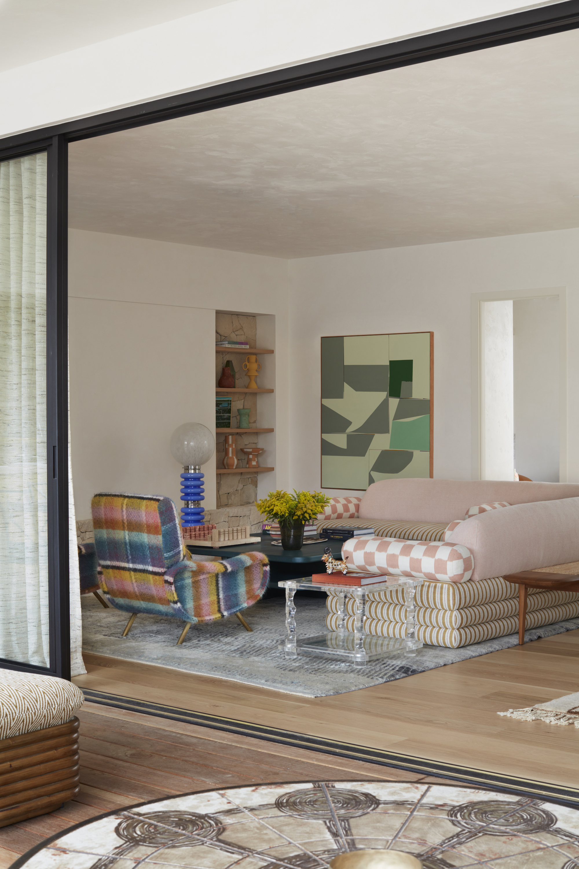
When working out the best biophilic color for your space, try living with it for a bit, and see how it shifts the energy of the space.
In a considered room rooted in biophilic principles, color is far more than a decorative choice. Taking your time with color selection is essential because choosing the right hues can support mood, energy, and well-being, echoing the restorative qualities of nature.
It's important to live with the color for a while, in the form of a cushion cover or print. You could paint some pre-loved frames in varying tester shades of your desired biophilic color and then live with it for a while to see how it feels.
Interior designer Phoebe Oldrey of holistic interior design studio Smartstyle Interiors says, "So many people make their design choices for their home in a shop. They don’t think about it in advance and don’t prepare before purchasing. They just rush into a decision to pick a paint, right there in the DIY store. Color can be a tricky thing to get right, there’s a lot of nuance to it. Without planning, mistakes happen, and often these can be expensive."
10. Contrasting or Complementary
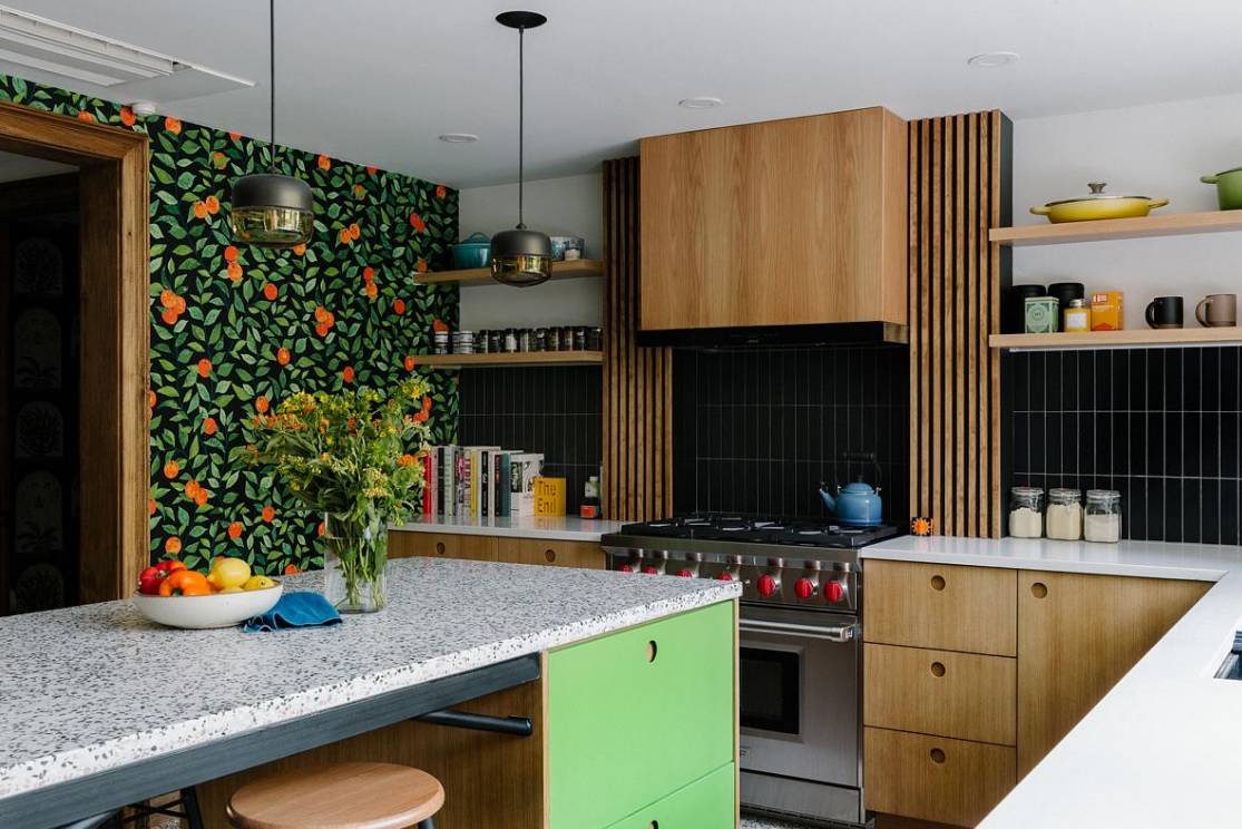
Biophilic colors doesn't have to mean boring — it's all about how you layer them within a scheme.
Color forms a large part of the sensory language in biophilic design and speaks to our innate connection with nature, so asking yourself if you want to turn up the energy in a space or dial it down is crucial for creating a supportive environment.
Whether you choose contrasting or analogous colors, each approach offers a different way to reflect the harmony and diversity found in the natural world. Contrasting schemes, like olive green paired with warm clay or sky blue against a sunlit yellow, create dynamic energy that mimics the vibrancy of natural landscapes.
Analogous palettes, on the other hand, such as a gradient of olive, moss, and sage, evoke a sense of calm continuity, much like the subtle transitions seen in a forest canopy. Both approaches, when inspired by nature's cues, can support the core goals of biophilic color palettes: connection, comfort, and balance.
"In the natural world, you just have to look at a sunset and enjoy the red seeping into the orange and yellow peachy hues," says Emma Bestley, the creative director and co-founder of YesColours, a paint brand that focuses on the emotional impact of color and sustainability. "Or, a peacock with its incredible indigo, teal, and green feathers. It’s naturally pleasing to the eye."
FAQs
What Colors Are Best Suited to Biophilic Design?
- Blues and Cyan immediately remind us of clear skies and the ocean. Through their inherent associations with nature, blues create a calming environment and help to reduce tension. This may be the reason why blue comes out on top time and time again as the world's favorite biophilic color.
- Shades of green are, perhaps unsurprisingly, associated with health as they remind us of lush vegetation and natural landscapes. Medium greens have been shown to enhance creative performance, whereas dark to medium greens are proven to lower the heart rate, improve blood pressure, and alleviate stress. Green, in particular, is a trigger for motivation, enthusiasm, and productivity, too.
- Yellow is commonly voted the happiest color, and when used in the right intensity, hue, and saturation, it reminds us of the sun’s warmth, arouses feelings of happiness, and improves creativity and optimism. Yellows and golds blend well with neutrals and blue tones; they add warmth and even enhance the feel of natural light, especially in cooler, north-facing rooms.
- Red is generally associated with fruits such as berries or apples in biophilia. It can support cognitive behaviour for complex, intense tasks, but too much of it can be over-stimulating, so aim to use bright colors in balance with other, more calming hues.
- Earthy browns and Grays are also prevalent in our natural landscapes: soft browns, gentle stone grays, and warm sandy tones are reflective of our shores and coastlines, conjuring up associations of natural timbers and the earth underneath our feet. They are thought to ground us, making them the ultimate go-to colours for cozy, rustic living.
- Black can be found in our more rocky and dramatic cliffscapes, and of course, more obviously in the night sky. Black is a great biophilic color to use as an accent; it can help to anchor a design and add contrast to a room. Lush green plants spring to life against it, which is why black fencing has become such a popular choice in garden design.
- White — the yin to black’s yang — is similarly seen in various shades within nature: stony cliff faces, an overcast sky, bright fluffy clouds, and the foam atop waves. It’s often thought of as a neutral and non-threatening biophilic color and is a great starting point to showcasing other contrasting hues. Similar to yellow, shades of white can be useful to enhance natural light.
As with all aspects of biophilic design, the key is mindfulness. Observe the colors that occur naturally around you — those seen from your window, on your walks, or throughout the seasons — and consider how they might influence your interior palette.
Allow biophilic colors to be a quiet echo of the outdoors or a bold celebration of nature’s diversity. In doing so, you’ll create a home with a sense of indoor-outdoor living that not only looks beautiful but also feels deeply rooted, restorative, and in tune with the natural world.
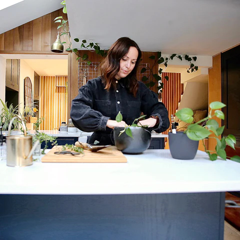
Marianna Popejoy is an interior designer specializing in biophilic design. She’s worked on numerous projects from outdoor bathrooms and garden layouts, to jungle-inspired interiors. Her work and home have been featured globally by Architectural Digest and Apartment Therapy and she is currently in the process of writing a book aimed at helping people make realistic, achievable changes to their homes by incorporating elements from nature.