5 Power Colors That Can Completely Shift the Way You See and Feel in Your Home
Power colors in interior design aren't just about being loud and dominating, they're about empowering you to express your true self

The Livingetc newsletters are your inside source for what’s shaping interiors now - and what’s next. Discover trend forecasts, smart style ideas, and curated shopping inspiration that brings design to life. Subscribe today and stay ahead of the curve.
You are now subscribed
Your newsletter sign-up was successful
We often hear about power dressing in fashion — the idea of using bold, confident outfits to influence how we feel. But what about our homes? If what we wear can influence our emotions, then the 'power colors' we live with can surely do the same.
Color psychology in interior design explains how our spaces have the power to support how we think, feel, and show up, not just to rest, but to feel focused, motivated, and emotionally strong. The colors we choose play a vital role in reinforcing that inner power.
Power colors in the home aren't about being loud or dominant. It’s the kind of power that helps you feel clear, anchored, and ready to take on what life brings. You want colors around you that positively support you, not ones that ask more of you than you’ve got to give.
Article continues belowColor is energy. It’s a frequency that interacts with us on a deep, often unconscious level, influencing how we think, feel, and behave. Some colors uplift, while others energize and motivate. Others bring calm, offering steady support and emotional ease.
Here are five power colors that can help you feel more empowered in your home, each creating a different kind of strength in the space around you.

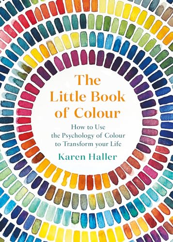
Karen is a color psychology expert who wrote the book, quite literally, on how to use it when designing your home. She's the author of The Little Book of Colour which explains how to use color in interior design to improve you happiness, wellbeing, and confidence.
Red — Purposeful and Decisive
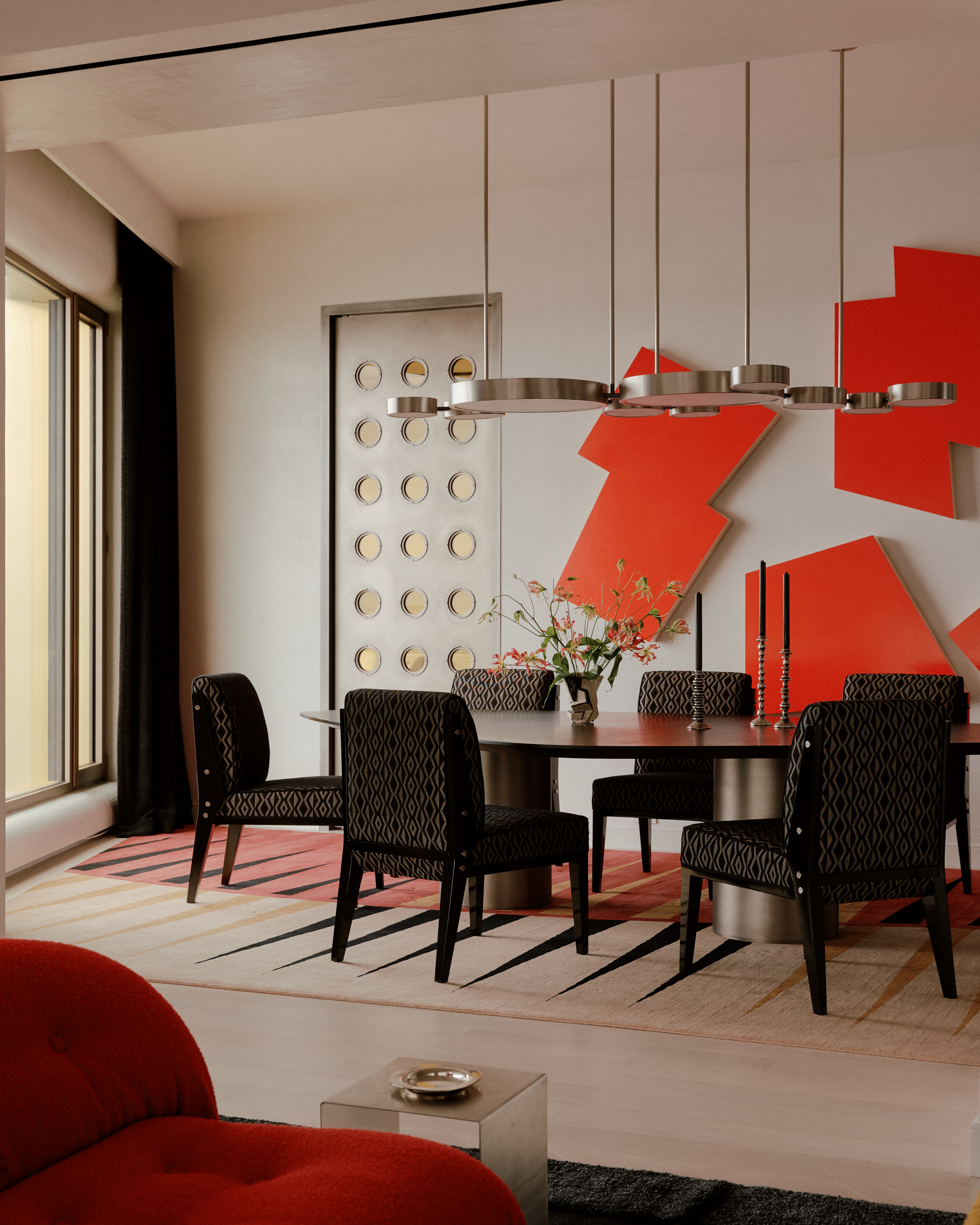
Red is the ultimate power color. It’s pure high-octane energy, like a double espresso for you and your space. Bold, assertive and full of intention, red in color psychology is linked to physical energy, drive, and motivation. It’s the color of taking action, of stepping forward with purpose.
There is no single red. There's warm rust red, deep tomato, and soft watermelon through to the cooler raspberry and the vibrant fire engine red.
The Livingetc newsletters are your inside source for what’s shaping interiors now - and what’s next. Discover trend forecasts, smart style ideas, and curated shopping inspiration that brings design to life. Subscribe today and stay ahead of the curve.
Decorating with red works best in small, intentional touches. A chair, a cushion, a lampshade, or a piece of art can be enough. Bold and commanding, red is best used as a statement feature or a striking accent.
But be mindful that too much red or the wrong red for you could overpower the space (and you).
Soft Pink — Nurturing and Compassionate
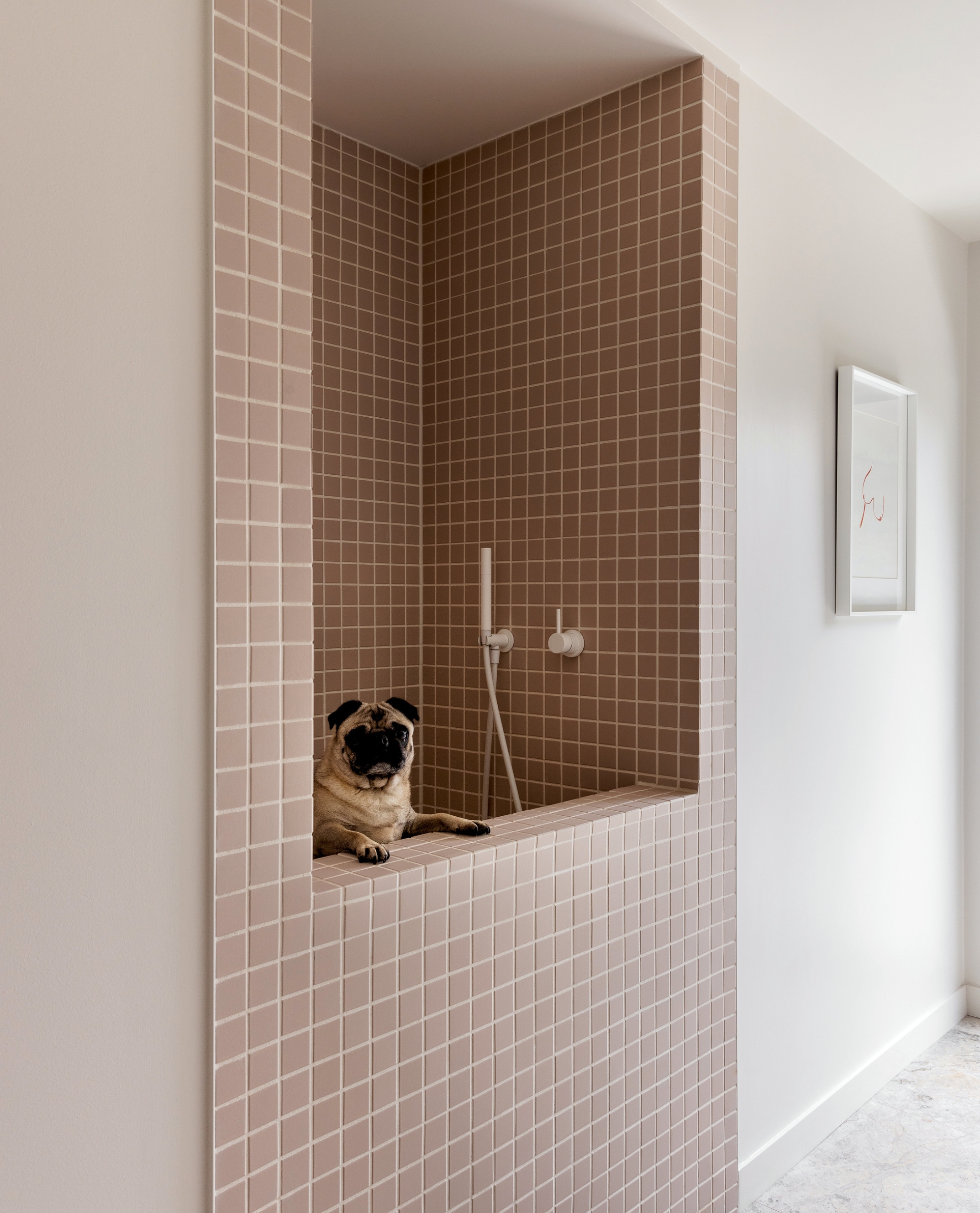
Soft pink shows us that power colors don't have to be loud. It’s soothing, gentle, and deeply supportive.
In color psychology, soft pink is linked to nurturing, care, and compassion. It can help create an environment where you can soften, reconnect and feel safe enough to open up — and that’s powerful.
Where red pushes forward, soft pink holds space. It brings a sense of ease and calm. It doesn’t demand attention, but it’s always there, gently reinforcing a feeling of comfort and empathy.
There are many versions of soft pink. Blush feels delicate and open. Rose quartz adds warmth and grace. A dustier pink can feel more grounded and grown up. Each brings its own emotional temperature, from soothing and serene to quietly confident.
Soft pink works beautifully in bedrooms, living rooms, and anywhere you want to create a feeling of emotional ease. It’s a power color that lets you exhale.
Yellow — Optimism and Uplifting
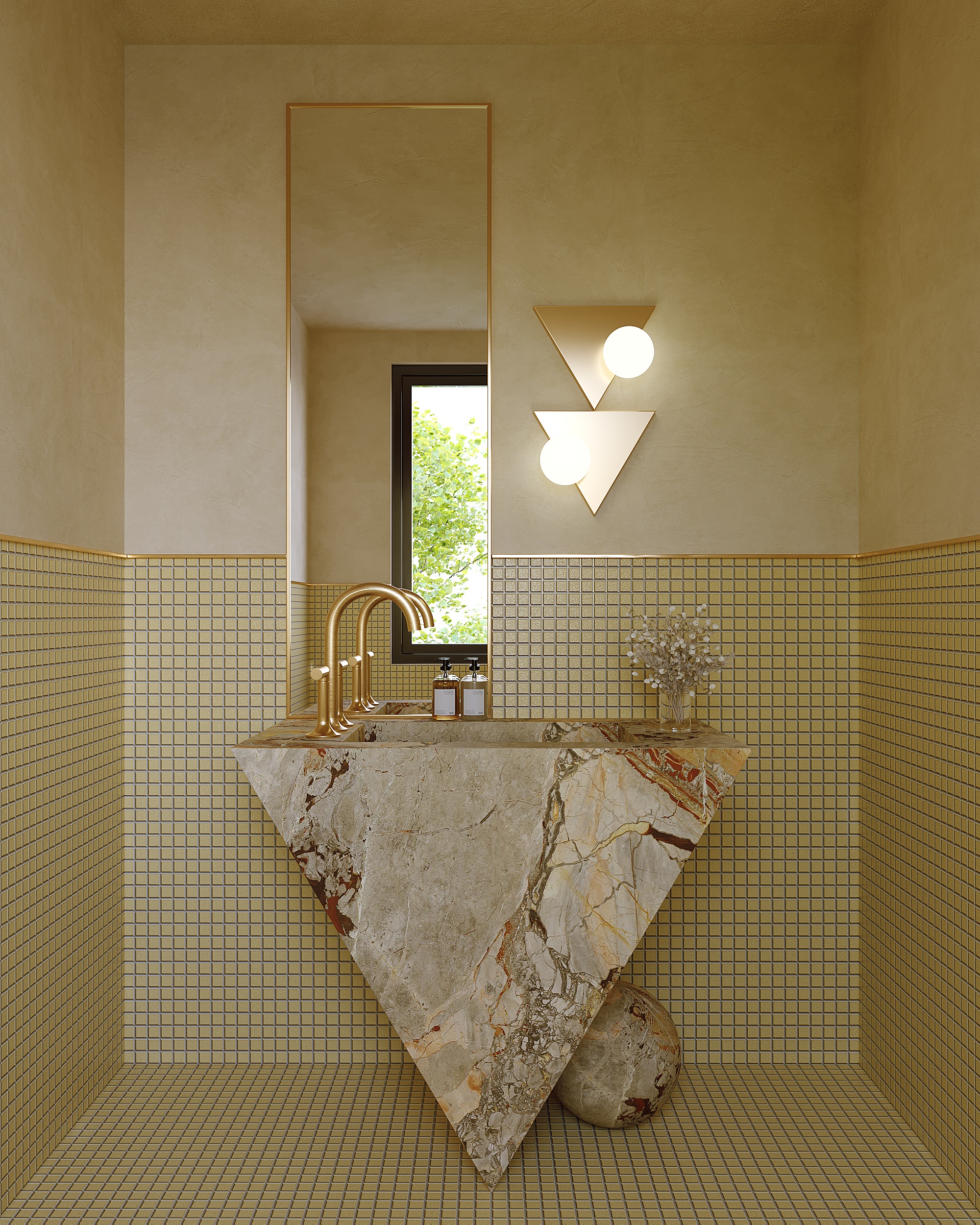
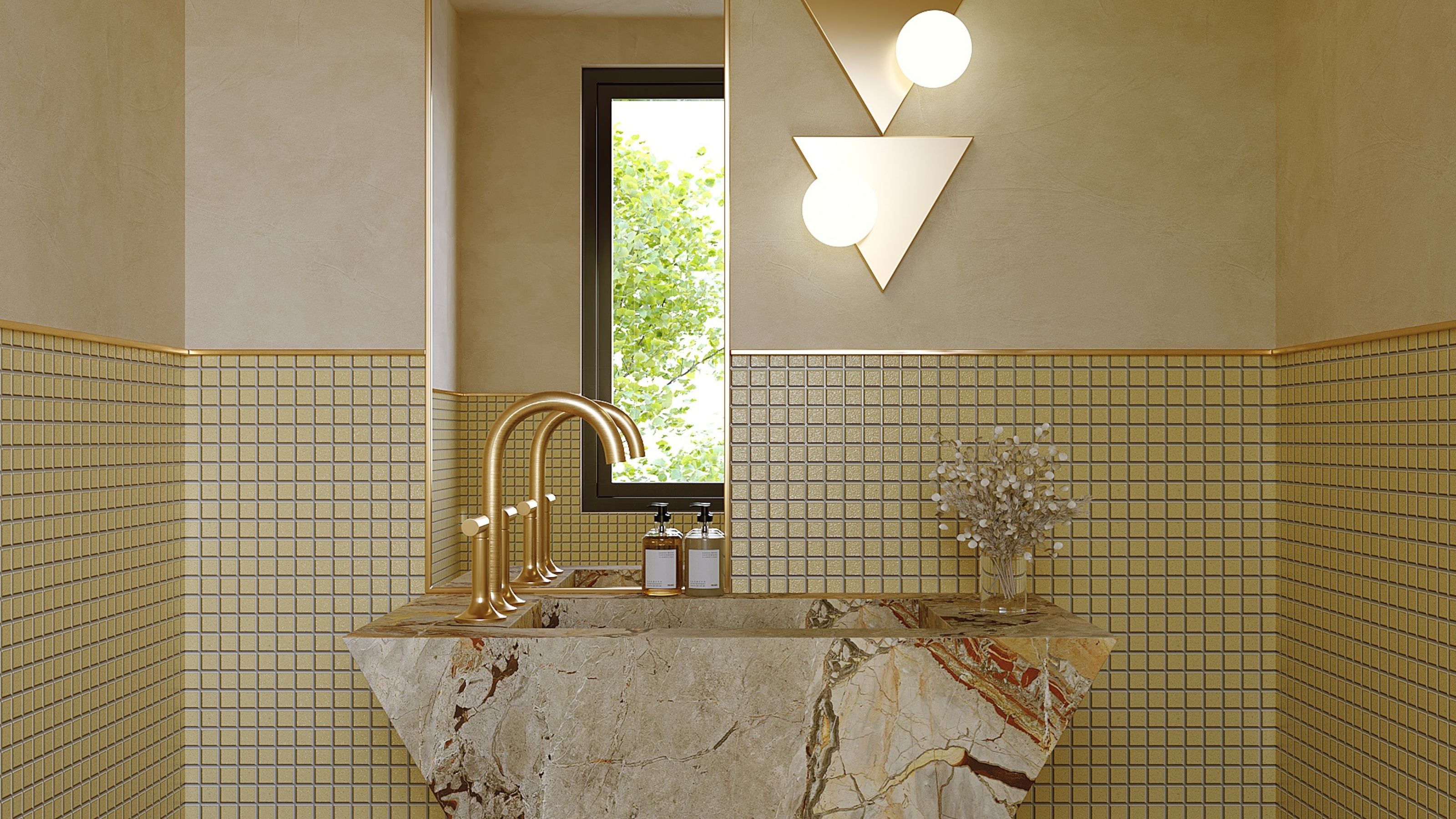
Just as yellow features in power dressing to lift the mood and project confidence, it brings that same quality into the home.
In color psychology, the color yellow means optimism, self-confidence, and self-esteem. It’s the color that greets you like a ray of sunshine, helping you feel more open, cheerful and supported.
Bright yellows such as warm sunflower, daffodil and cool lemon bring an uplifting presence. Decorating with yellow in these shades is especially useful in spaces that feel flat or where natural light is limited. Yellow has a way of lifting both the room and your spirits.
A yellow chair, a splash of color on the wall, or even a single vase can add just the right amount. When used in balance, yellow feels uplifting. But too much, and it can quickly become overstimulating and irritating.
Not all yellows need to be vivid. Softer variations like butter, cream, pale straw and cool lemon sorbet offer a gentler version of what bright yellow brings. They still uplift, but with a lighter touch.
Blue — Composure and Clarity
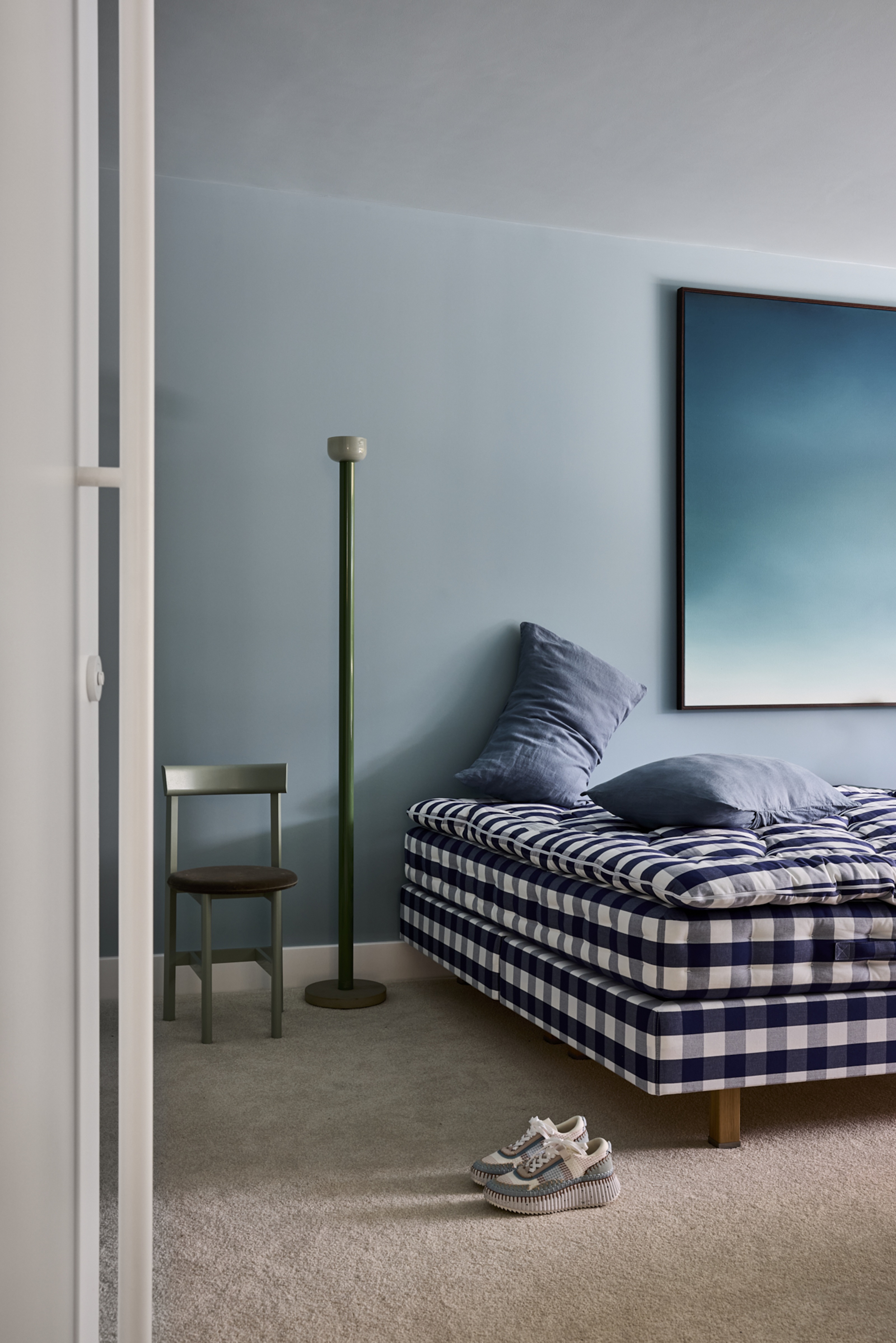
Blue brings focus without force, the kind of strength that doesn’t need to raise its voice. In color psychology, it’s linked to clear thinking, calm, and composure. This is a power color that’s steady and quietly assured.
Dark blues support focused concentration. They stimulate the mind and help create an atmosphere of depth and attention. Think warm periwinkle, teal, navy, indigo in a study, a reading corner, or anywhere you want to stay mentally anchored.
Soft, light blues bring a gentler presence. They soothe, calm, and invite the mind to slow down. These are the blues that open up a space and help it breathe, ideal for bedrooms, bathrooms or anywhere that calls for quiet ease.
Whether strong or subtle, decorating with blue gives the mind somewhere to land and the space a steady, reassuring presence.
Brown — Grounded and Dependable
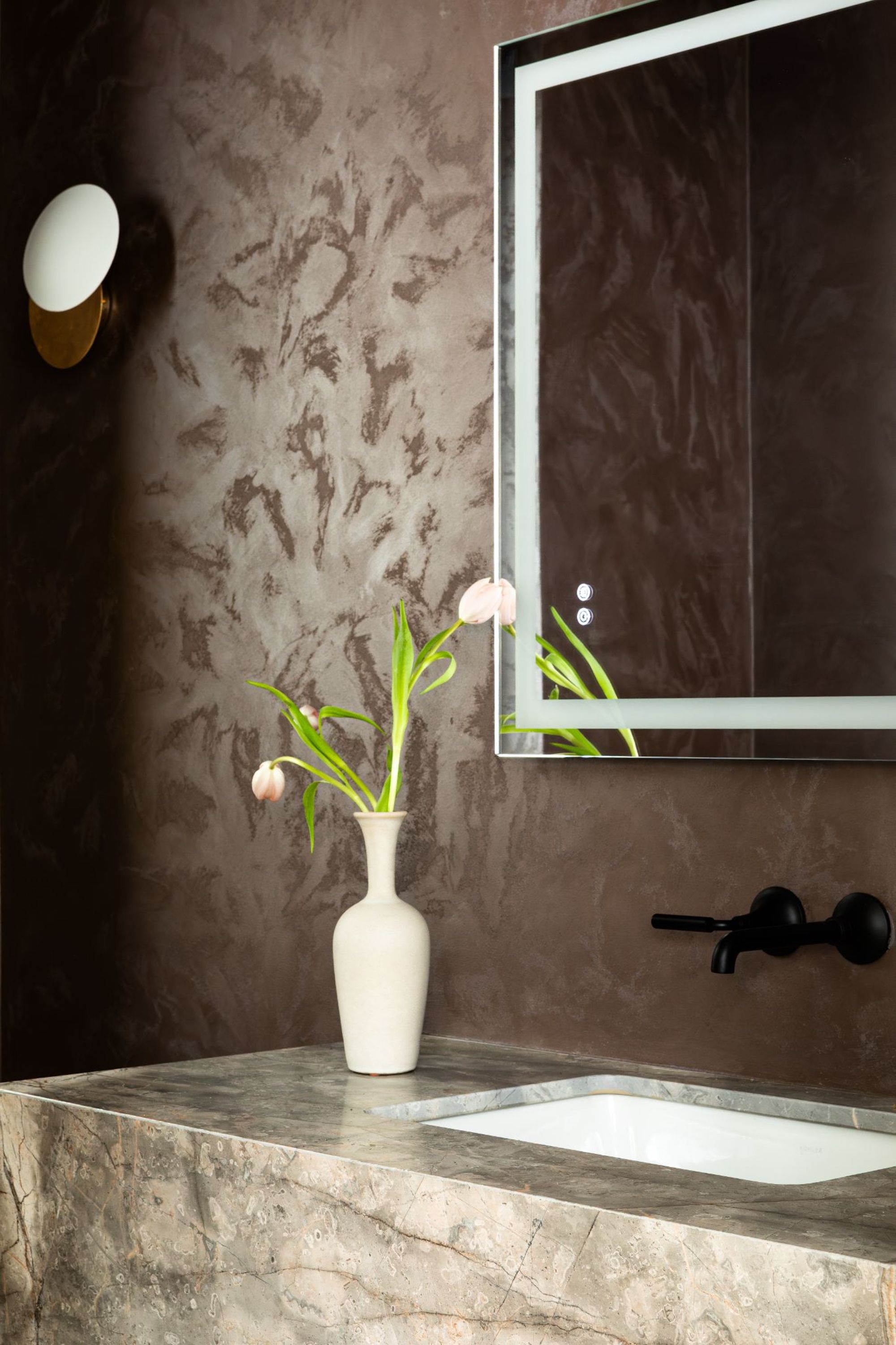
Brown is the color of quiet strength, like the steady trunk of a tree holding firm through every season.
In color psychology, it’s linked to stability, reassurance, and the feeling of being grounded. Where some power colors bring boldness or uplift, brown offers a steady presence, the kind of strength that holds firm and that you can depend on.
Whether it’s the richness of deep warm chocolate brown, walnut, chestnut, cool wenge, or the soft warmth of caramels and tans, decorating with brown creates a sense of belonging. It brings us back to the earth. It’s power without push, support without noise.
FAQs
Which power color is the strongest?
The most powerful color is the one that supports you in the way you need. That might be the bold push to take action, the calm to gather your thoughts, or the quiet assurance that keeps you grounded.
Power colors aren't about which color is loudest, it’s about which one helps you feel most like yourself.
When you choose colors that align with who you are and how you want to feel, you’re not following rules or trends. You’re creating a space that reflects your inner strength. And that’s the real power.
Just as power dressing uses color to shift how we feel and carry ourselves; the power colors we choose for our homes can do the same.
Color isn’t about dominating a space. It’s about creating an environment that supports you to feel confident, capable, and fully yourself.
Whether you’re drawn to bold brights or prefer softer strength, the power lies in choosing colors that reflect who you are and how you want to feel, not what anyone else expects.
When your home is filled with colors that express your inner power, it becomes more than a place to live. It becomes a space that helps you rise, every day.

Karen Haller is a leading international authority when it comes to behavioural color and design psychology. Specializing in human-centered design, Karen works with businesses, design professionals, and individual clients, to help them understand our relationships with color, and how it influences the way we interact with a space. She has authored a book on the topic, called The Little Book of Colour which explains how to use color for your home and your everyday life to improve your happiness, wellbeing, and confidence.
