Turns Out, Three Isn't a Crowd — A Color Consultant Explains How Triadic Palettes Bring Balance to Bold Color
Choosing colors for your interiors can be daunting, but this theory helps you build dynamic schemes that still feel harmonious

The Livingetc newsletters are your inside source for what’s shaping interiors now - and what’s next. Discover trend forecasts, smart style ideas, and curated shopping inspiration that brings design to life. Subscribe today and stay ahead of the curve.
You are now subscribed
Your newsletter sign-up was successful
Choosing colors for your home can feel like stepping into a maze — full of possibilities, but often overwhelming. As a color consultant, my role is to help simplify the process: curating options, giving clients confidence, and helping to create color ‘flow’ in their homes. One of the tools I often use is triadic color schemes, a clever way to create playful and bold interiors that still feel balanced and cohesive.
So, what exactly is a triadic color scheme? The name gives it away: ‘triad’ meaning three. Picture a traditional color wheel, then imagine placing an equilateral triangle over it. The three points land on hues spaced evenly around the wheel; those become your triadic colors.
Confused? Stay with me. Below, I go into a little bit more detail on specific triadic color palettes and how to put this color theory into practice in your own home.
Article continues belowWhat Are Triadic Color Schemes?

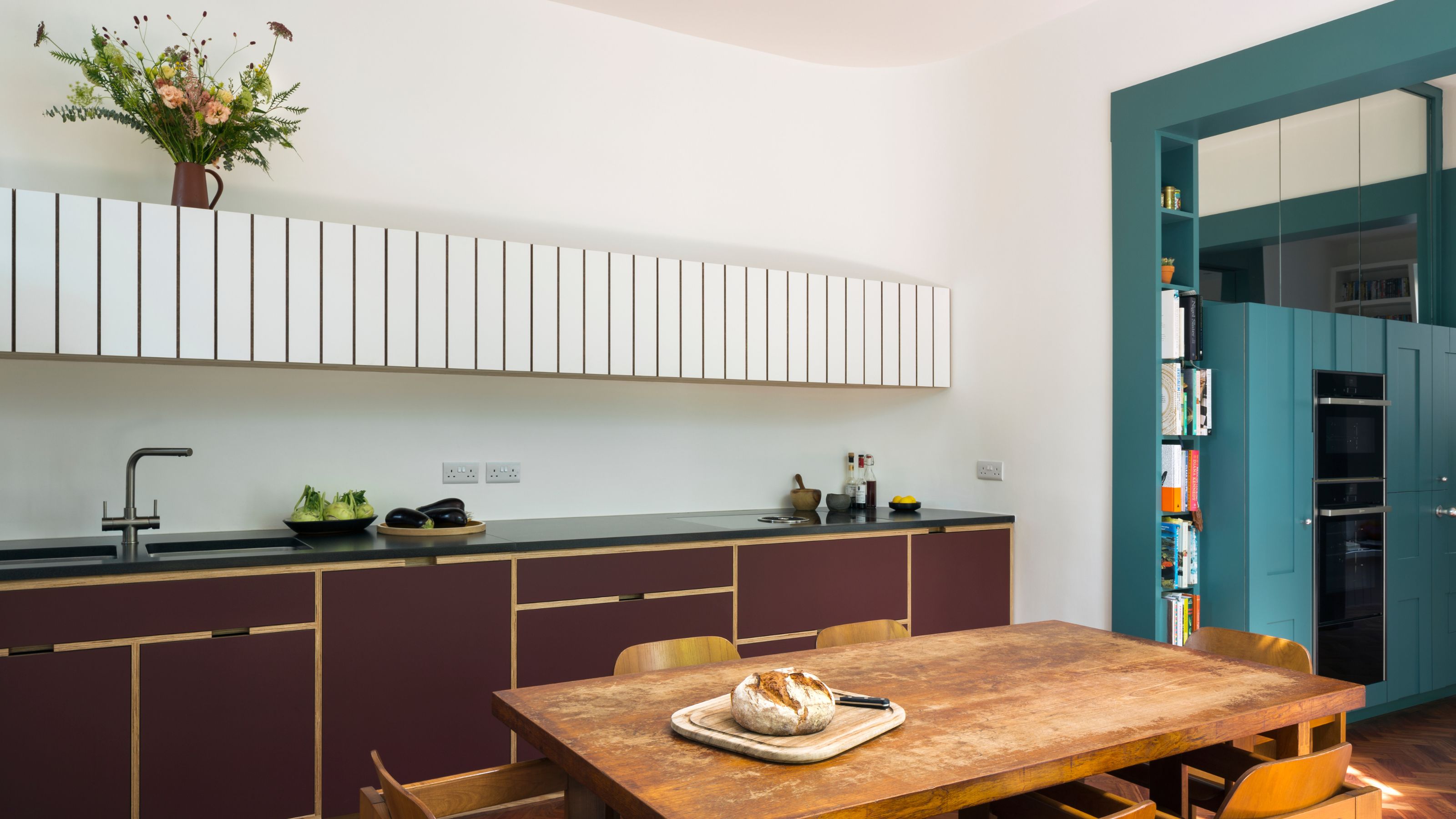
A deep, brambly plum and a clear, greenish-blue are held together in this kitchen by Naked Kitchens, with walls washed in a neutral hue with olive green undertones.
The most simplistic examples of triadic color schemes are Red-Yellow-Blue and Orange-Violet-Green. However, given we’re talking interiors, we can afford to be slightly more evocative with our language when referring to the different shades.
So, for the other two triadic schemes within the color wheel, you have:
- Red-Orange, Yellow-Green, Blue-Violet… think 'Tomato’, ‘Soft Lime’ and ‘Indigo’…. or in real-world terms, ‘Bamboozle’ by Farrow and Ball, ‘Churlish Green’ by Farrow and Ball, and ‘Pale Lupin’ by Little Greene.
- And Yellow-Orange, Blue-Green, Red-Violet might be easier understood as ‘Raspberry’, ‘Amber’, and ‘Aqua’. These could be brought to life with ‘Rhubarb’ by Paint and Paper Library, ‘Trumpington’ by Edward Bulmer, and ‘Theresa’s Green’ by Farrow and Ball.
What makes triadic color schemes so useful is their innate sense of balance. Each hue is evenly spaced, offering harmony and contrast in equal measure. The result feels lively and expressive, yet grounded.
Playing With Saturation in Triadic Color Schemes
While the theory behind triadic color schemes is clean and geometric, real homes are anything but. Fortunately, when thinking about decorating with colors in our interiors, you don’t have to stick with these triadic colors in their clearest, brightest, and most saturated forms.
The Livingetc newsletters are your inside source for what’s shaping interiors now - and what’s next. Discover trend forecasts, smart style ideas, and curated shopping inspiration that brings design to life. Subscribe today and stay ahead of the curve.
And (in my color-obsessed opinion!) this is where it starts to get exciting. The color wheel in interior design is essentially infinite, and you can add white (a tint) or black (a shade) to these colors, and they can still work in these schemes as muted or deeper versions.
Take, for example, the classic red, yellow, blue trio. In theory, that might be scarlet, sunflower, and cobalt. But in a home? You’re more likely to see terracotta, ochre, and an inky blue. The relationship stays triadic, but the mood becomes more layered and more gentle.
With this in mind, while digital design tools offer neat, saturated wheels, I often encourage clients to explore older interpretations, like those created by Phillip Otto Runge. These early color systems, developed long before backlit screens and CMYK printers, reflect a more intuitive and natural relationship to color.
What’s so useful about these older color models is how undigital they feel. Their soft transitions and hand-blended shades mirror how color behaves in the real world. And when you’re designing for interiors, this kind of color thinking can be much more relevant than the high-chroma, sharp wheels we see in graphic design software.
How to Use Triadic Colour Schemes in Interiors

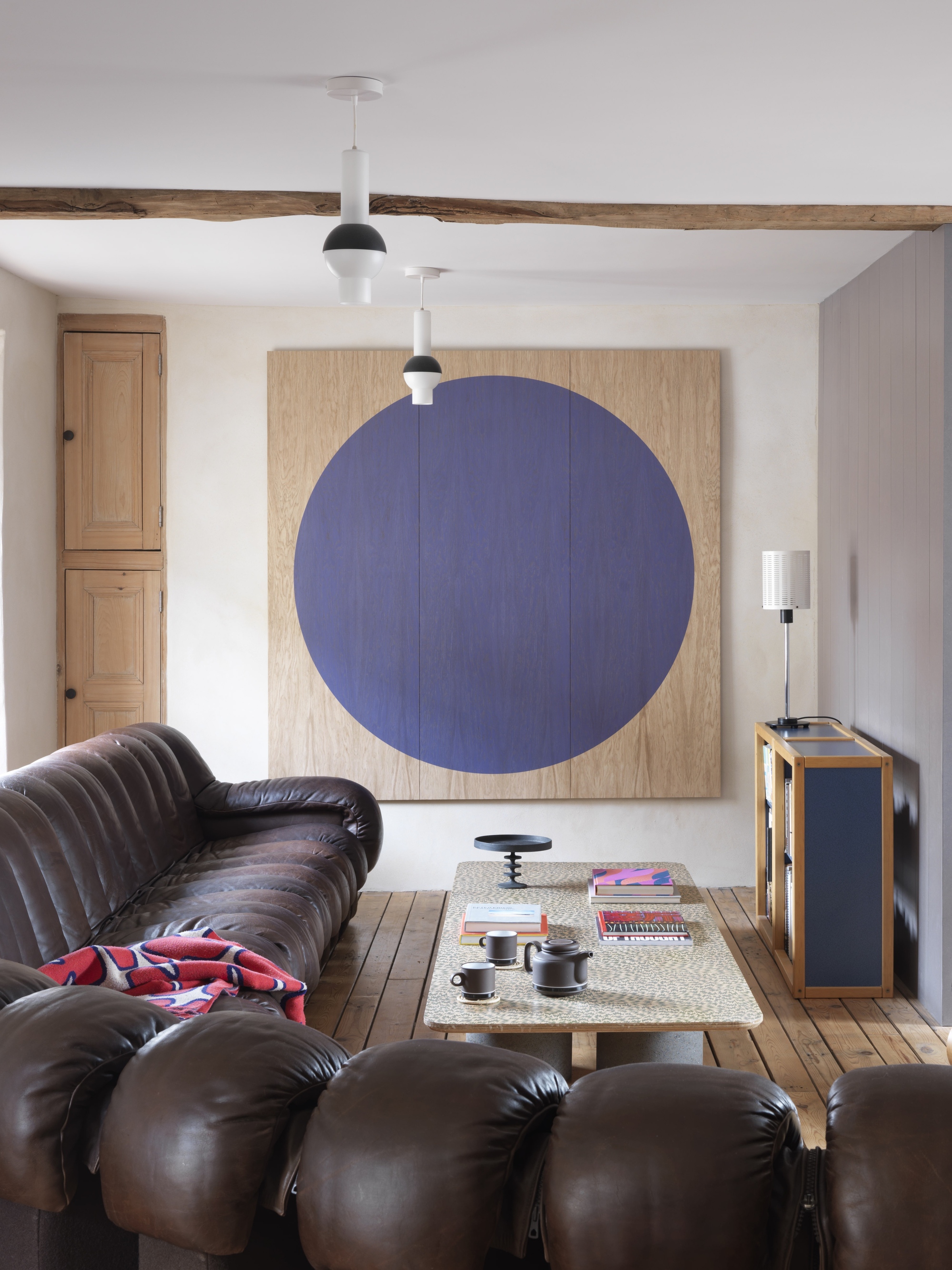
A subtle use of the triadic colour scheme of Red, Blue and Yellow, played out through artwork, timber detailing and red-hued leather furnishings.
1. Start Slowly
Firstly, don’t feel you have to paint the room three different colors. If you want to stick with neutral walls, you can still play with the triadic color schemes. For example, an Orange-Violet-Green palette could play out with a terracotta floor, green marble elements, and a piece of artwork with touches of violet — all grounded by off-white walls.
2. Let One Color Take the Lead
One of the most helpful tools I share with my clients is the 60-30-10 rule. It’s not a hard and fast one, but it's a really useful way to think about proportion and balance when you’re working with more than one color.
Here’s how it breaks down:
- 60% of your space is your main color (usually something like a wall, sofa, or large rug)
- 30% is your supporting color (curtains, joinery, or an armchair)
- 10% is your accent color (cushions, lamps, or artwork)
So even if you want to go for a bolder look, say with the primary Red-Yellow-Blue triadic color scheme, you could opt for dusty blue walls such as ‘Kittiwake’ by Farrow and Ball, set off by woodwork painted in a rich red such as ‘Bronze Red’ by Little Greene and let the yellow tones comes through a lamp base or tray, perhaps ’Parasol’ by Paint and Paper Library.
3. Natural Materials Can Stand in For Color
Paint and textiles aren’t the only way to use color. Timber, rattan, marble, metals, and stone all carry color in a subtler, more organic way.
For instance, terracotta tiles or red-toned hardwoods, such as Iroko, echo red tones; rattan, seagrass, sisal, and brass bring warmth and yellowish notes; green-veined marble, an indoor plant, or simply a view of the garden can represent green in an interior; and steel, mirrors, silver details, nickel or chrome hardware, and cool-toned concrete can add a cool, almost blue-ish hue to a room.
4. Go Dusty, Muted, or De-Saturated
A triadic color palette doesn’t have to be loud. Some of the most beautiful rooms use desaturated, softened iterations of each hue instead.
Some muted paint shades to think about:
A dusty trio made up of muted denim played out with ‘Bone China Blue - Mid’ by Little Greene, alongside a warm chocolatey tone such as ‘London Brown’ by Edward Bulmer, set off with a soft olive with ‘Lichen’ by Farrow and Ball.
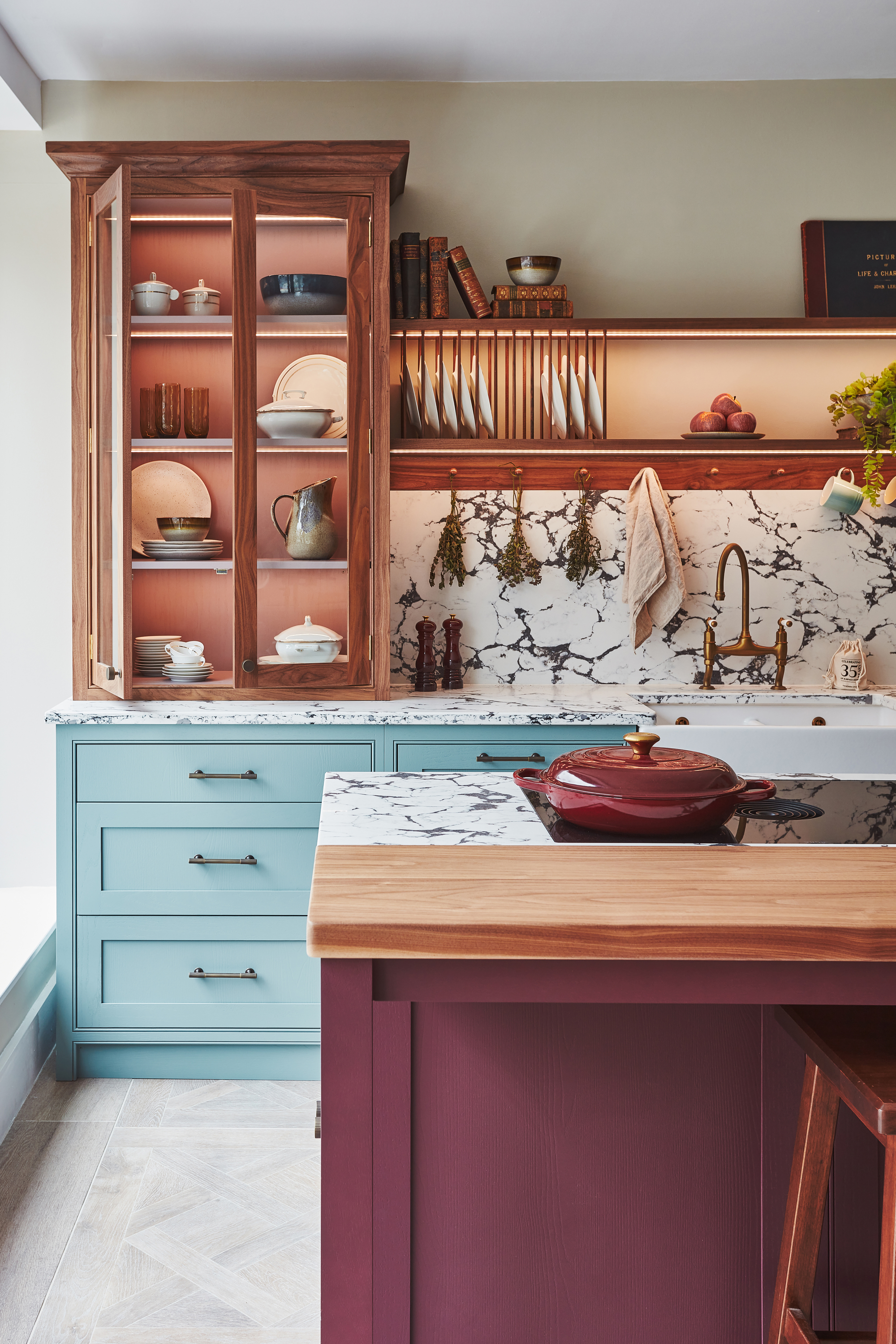
Alternatively, an earthy palette featuring three colors from the new Beata Heuman range by Mylands to include: an oxidised red ‘Henna’, a moody blue ‘Thunder’, and a toasted, straw yellow in ‘Wheatsheaf.
Both these palettes feel soft but have just enough structure to hold the room together.
But of course, rules are made to be broken, and there are times when it's best not to use color theory in your interiors.
If you really want to mix a very muted version of one of the colors like a creamy white acting as a yellow on the walls, with a bold, saturated version of blue seen in a cobalt sofa, set off with deep, dark reddish browns as your ‘red’ in tiny touches, then do it!


