A Space Filled With "Energy, Tension, and Hardcore Impact" — Here's How This Geometric Masterpiece of Color Works
Our resident color expert explores the clever use of color and contrast in this modern living space

Design journalist and author Amy Moorea Wong is an expert on color in interior design. To help decode the secrets behind a successful palette, she picks her favorite schemes and breaks them down, from the wow moments to the hidden details, and everything in between.
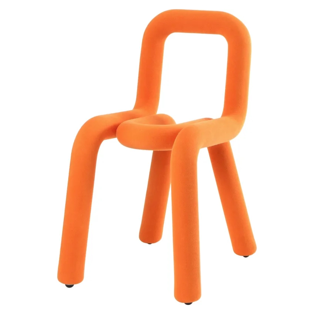
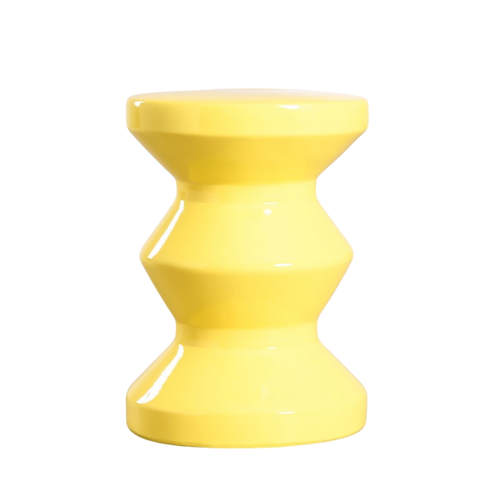
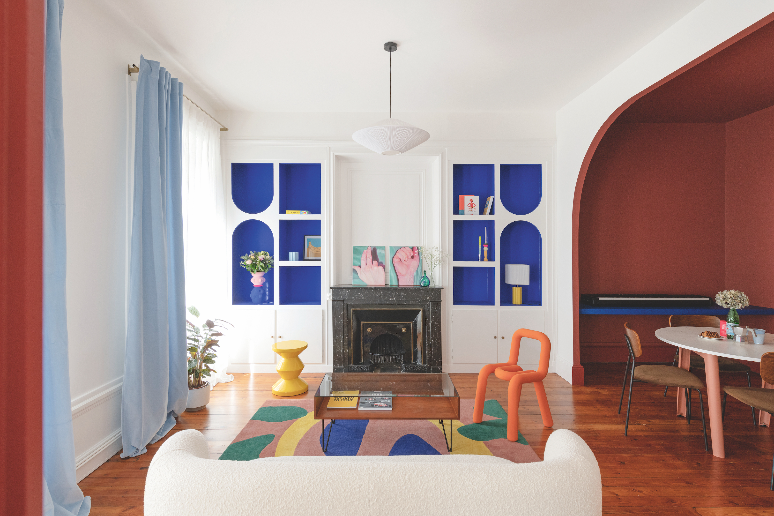
Color in interiors is rarely so neatly presented, yet here we are being handed precise, geometric cut-outs of it on a platter. Decorating with color has never looked so good. A piece of cobalt, anyone? A slice of burgundy? Paired with such a bright, almost forceful white, the hues seem similarly stark, the highly defined edges in the curves of the electric orange chair, the lines of the yellow stool (see it?) and the segmented colorful sections of the rug, as well as the painted surfaces making them seem like elements of the room that could be taken away, swapped in or out like pieces of a puzzle, at a moment’s notice.
The whiteness and the pigmented portions seem like separate entities, as they almost don’t interact. They are like yin and yang, working together as a whole, but not really friends, not hanging out once the whistle is blown or someone yells ‘cut’. You can imagine them standing at opposite sides of the dance floor at a disco, the walls, sofa, and light shooting furtive glances at the dining area, storage alcoves, seating, and rug. Contrast is this room’s middle name, and that bolder-than-bold point of difference infuses the space with energy, tension, and hardcore impact.
Article continues below 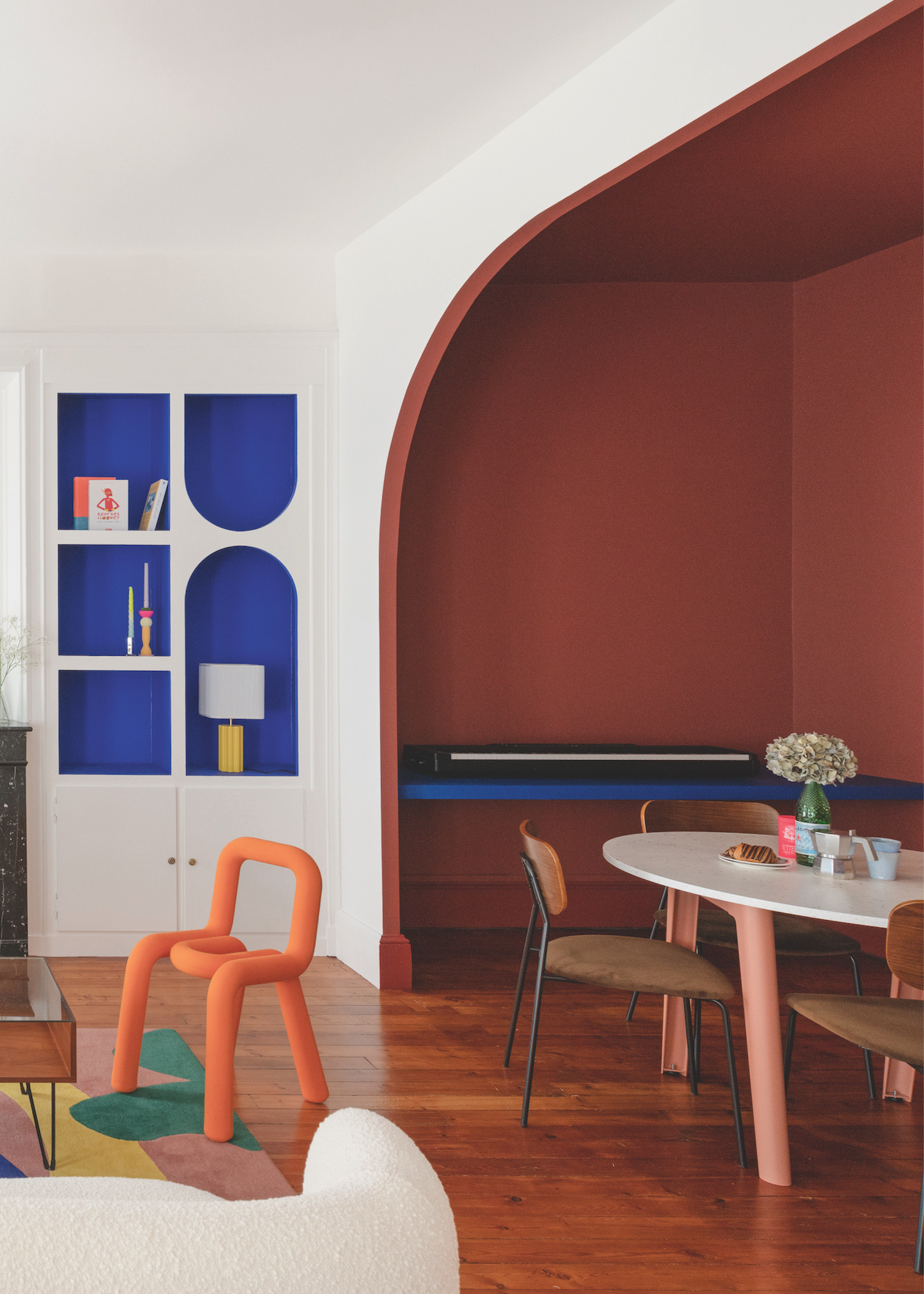
This space nails contrast in interior design.
Who would have thought that in a room filled with such rich colors, it would be the white that most intrigues me? It’s just so vivid. The shade — All White by Farrow & Ball — feels like perfect nothingness, like how you’d imagine the tone in a dream. "The white makes the bolder colors appear crisper and more saturated, and enhances natural light," explains Celia Reubrecht, founder and art director of Lyon-based interior design and architecture firm Craie Craie.
"It creates a gallery-like effect, allowing the furniture, decor, and artwork to stand out, as well as acting as a visual rest between the bursts of color." Its museum-esque quality makes exhibitions out of the colors, each held aloft, presented individually to be examined and appreciated before you move on to look at the next. And as such, the hues stand alone, not needing to interact, and each with its own personality, from the warmth of the burgundy (RAL 030 40 40) to the intensity of the blue (Yves Klein by Ressources) to the sculptural chair (the Bold Chair by Moustache).
The colored areas are the opposite of the abject flatness of the white, creating depth and dimensionality in their nooks, cubbies, and shapely forms. "The palette is unified through high contrast and playfulness, the combination of bright primary colors and rich, warm tones preventing the space from feeling cold," says Celia. "The strong colors make the room feel lively and energetic, creating a sense of movement, injecting energy and personality into the space, and making the space feel artistic, curated, and dynamic.’

This stunning, terracotta red paint creates a warm feeling in the dining area in this room, ideal for color drenching.
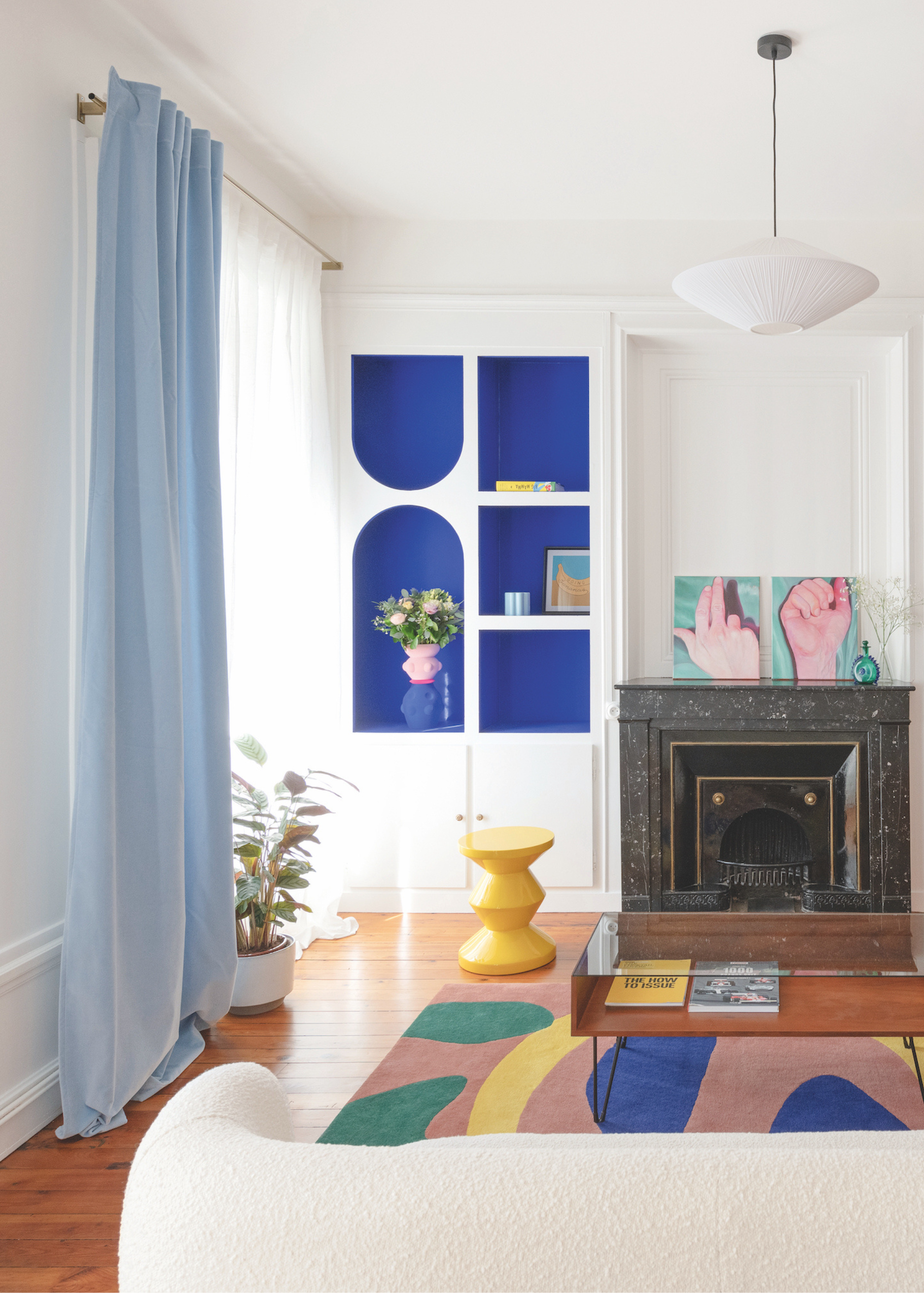
Alcove shelving of dreams...
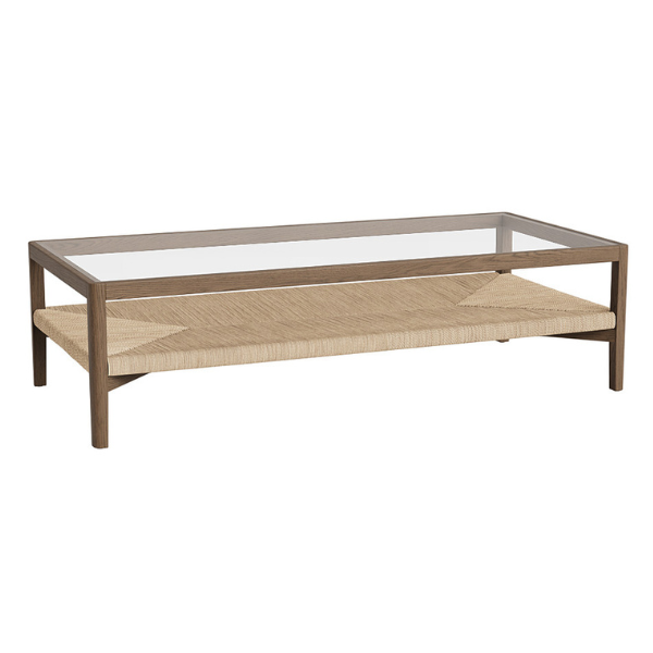
The dashes of natural materials bring a sense of realness and remind you that you’re in the world rather than some kind of simulation. The wooden floor, coffee table, and chair seat, plus the stone fire surround (and, at some point, its flames) are grounding, and they invite you to walk on in, pull up a seat, try a book, and soak up the heat.
The Livingetc newsletters are your inside source for what’s shaping interiors now - and what’s next. Discover trend forecasts, smart style ideas, and curated shopping inspiration that brings design to life. Subscribe today and stay ahead of the curve.
In true yin/yang fashion, this space is a story of light set against dark — the bright, energetic modern living room, set against the inviting shadows of the adjoining dining space. One is a flood of radiance and vibrancy, while the other feels like being swathed in wrap-around cosiness and intimacy. Crossing from one into the other must feel a bit like stepping through the Looking Glass, entering Narnia, or waking up in Oz — so different is one from the other. I can say, hand on heart, I truly believe there'll be a temperature difference, at the very least, as you step over the threshold.

This stunning, bright blue paint color from Mylands brings the atmosphere of the YSL gardens into this living room.
For more inspiration on using color and contrast in your space, I also explain how to use the color wheel in interior design so you can "unlock the unexpected" in your next design project.
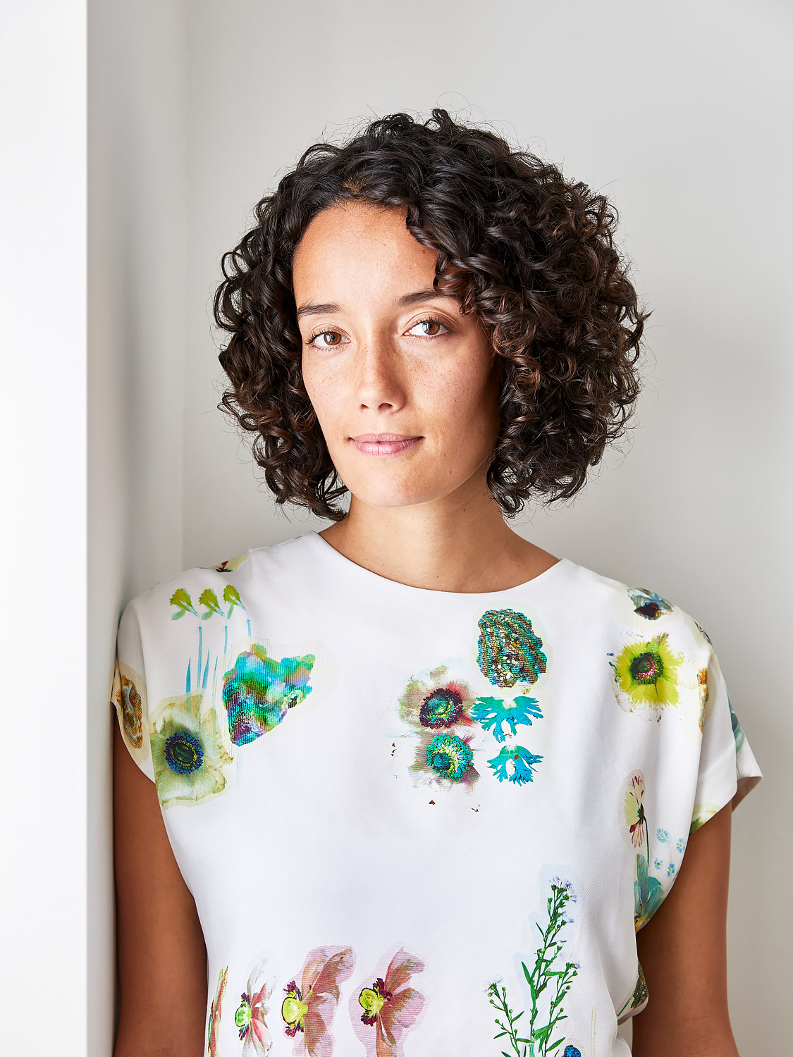
Amy Moorea Wong is a color authority and contemporary interior design writer who has specialized in all things decorating for over a decade. Amy is Livingetc magazine’s Colour Expert, Interiors Editor at The Glossary magazine and a Contributing Editor at Homes & Gardens magazine, and she frequently contributes to an array of global publications to share her insights on interior design zeitgeist. Her book Kaleidoscope: Modern Homes in Every Colour explores a collection of cool colorful homes fizzing with creativity, surprises, and inspiration.
