Is This the Happiest Kitchen Ever? In This London Home, Bright Colors Take Center Stage
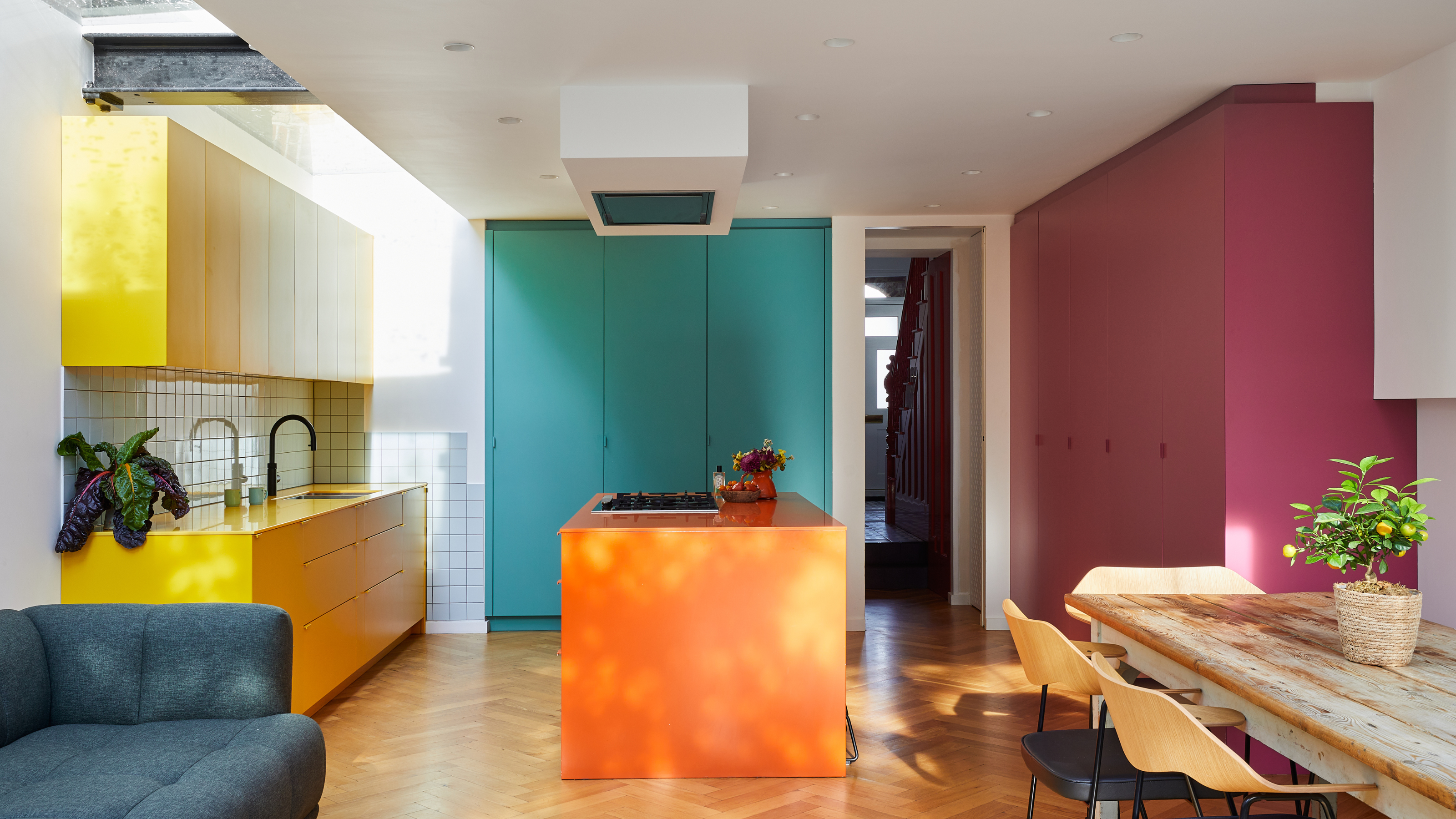
Filled with bright colors, clean lines, and natural light, this colorful, modern kitchen by CATO Creative is like a modern artwork brought to life.

The Livingetc newsletters are your inside source for what’s shaping interiors now - and what’s next. Discover trend forecasts, smart style ideas, and curated shopping inspiration that brings design to life. Subscribe today and stay ahead of the curve.
You are now subscribed
Your newsletter sign-up was successful
"From the outset, our clients envisioned their kitchen as the vibrant heart of their home — it needed to be highly functional for daily family life, yet also joyful and bold in style," says designer Mark Barratt of CATO Creative.
And this vision was certainly realized. Just one look at this Putney home's bright and colorful kitchen design is like an instant dopamine hit. With sunny yellow cabinets illuminated by a vast overhead skylight, this is one of those spaces in which it's impossible not to feel happy in.
But it isn't all form over function. This kitchen was thoughtfully designed to support the family's busy lifestyle. Every surface has been utilized to achieve a kitchen that feels sleek and minimalistic while offering as much storage as possible.
Article continues belowThe true feat of this project, though, is in CATO Creative's ability to create a space bursting with color while maintaining a refined, calm feel. "The basis of the whole design is the use of blocks of vibrant color, graphic prints, and textures on a white canvas," Mark explains.
If Mondrian were to design a kitchen, this would be it.
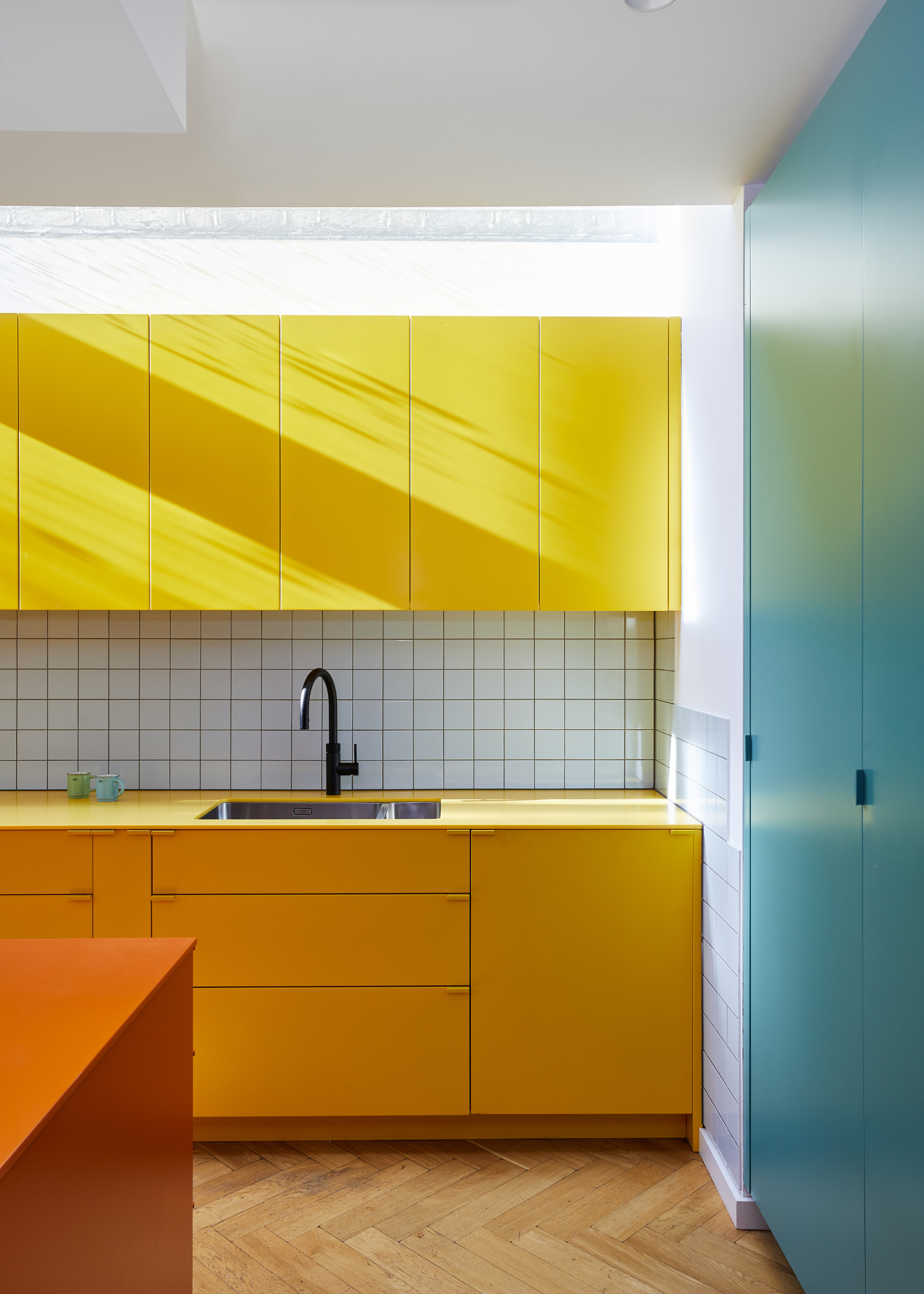
"We chose a very pale sky-blue tile for the splashback to break up the warmth of the yellow cabinetry and introduce a subtle contrast. Blue seemed the obvious color both to work with the yellow and provide a retro feel. The basic squares and dark grout lines both contrast with the homogeneity of the cabinets and reinforce the linear boxiness," says Mark.
The Inspiration
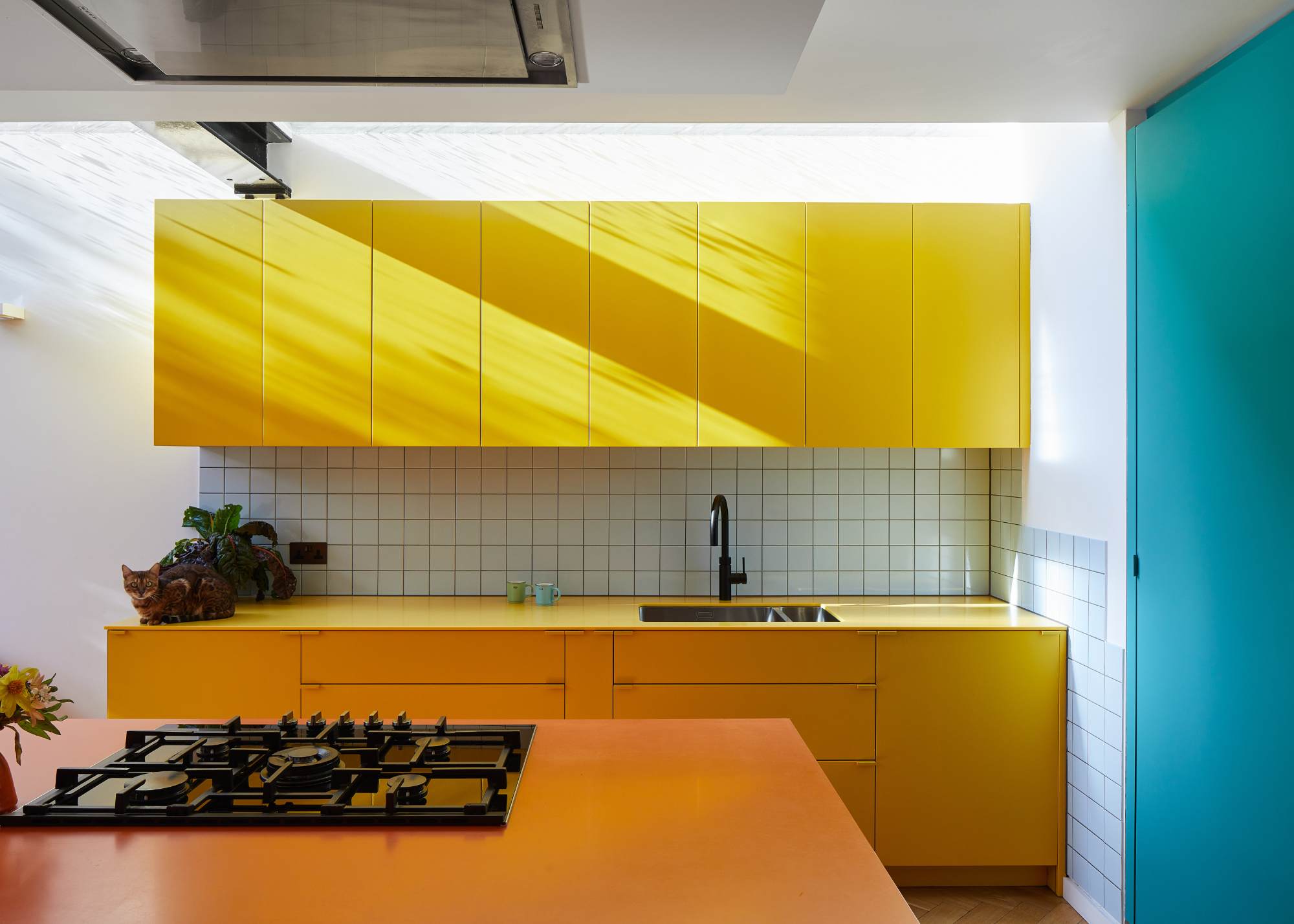
"The yellow was easily most at home under the glazed roof, while the orange island provided a centerpiece," Mark says.
"The color-block design was inspired by a mix of minimal design, mid-century modern influences, bold graphic art and, most importantly, our clients’ vibrant personalities," explains Mark.
This mashup of inspirations feels uniquely represented in this design: the bright colors and sharp lines of graphic art, the clean forms of mid-century modern design, and plenty of vibrant personality mixed in throughout.
The Livingetc newsletters are your inside source for what’s shaping interiors now - and what’s next. Discover trend forecasts, smart style ideas, and curated shopping inspiration that brings design to life. Subscribe today and stay ahead of the curve.
"The clients have a clear love of color, so we leaned into that energy, creating large, confident blocks of solid color with minimal detailing, as everything, including the ovens, is hidden or takes on a simple form, almost like painted boxes," Mark says.
This idea of 'painted boxes' is exactly what gives this kitchen such a graphic, modern feel, like something found lining the walls of the MoMA. "We drew from a reference library of graphic interiors and artworks, favouring simple forms and flawless color application," Mark says.
"The final palette came directly from the homeowners’ favorite colors," Mark continues. "With an aquamarine tone chosen to contrast the warmer reds, yellows, and oranges. These vivid, geometric elements not only express the clients' individuality but also define zones, frame views, and bring a playful rhythm to the space, turning functional elements into focal points."
The Design
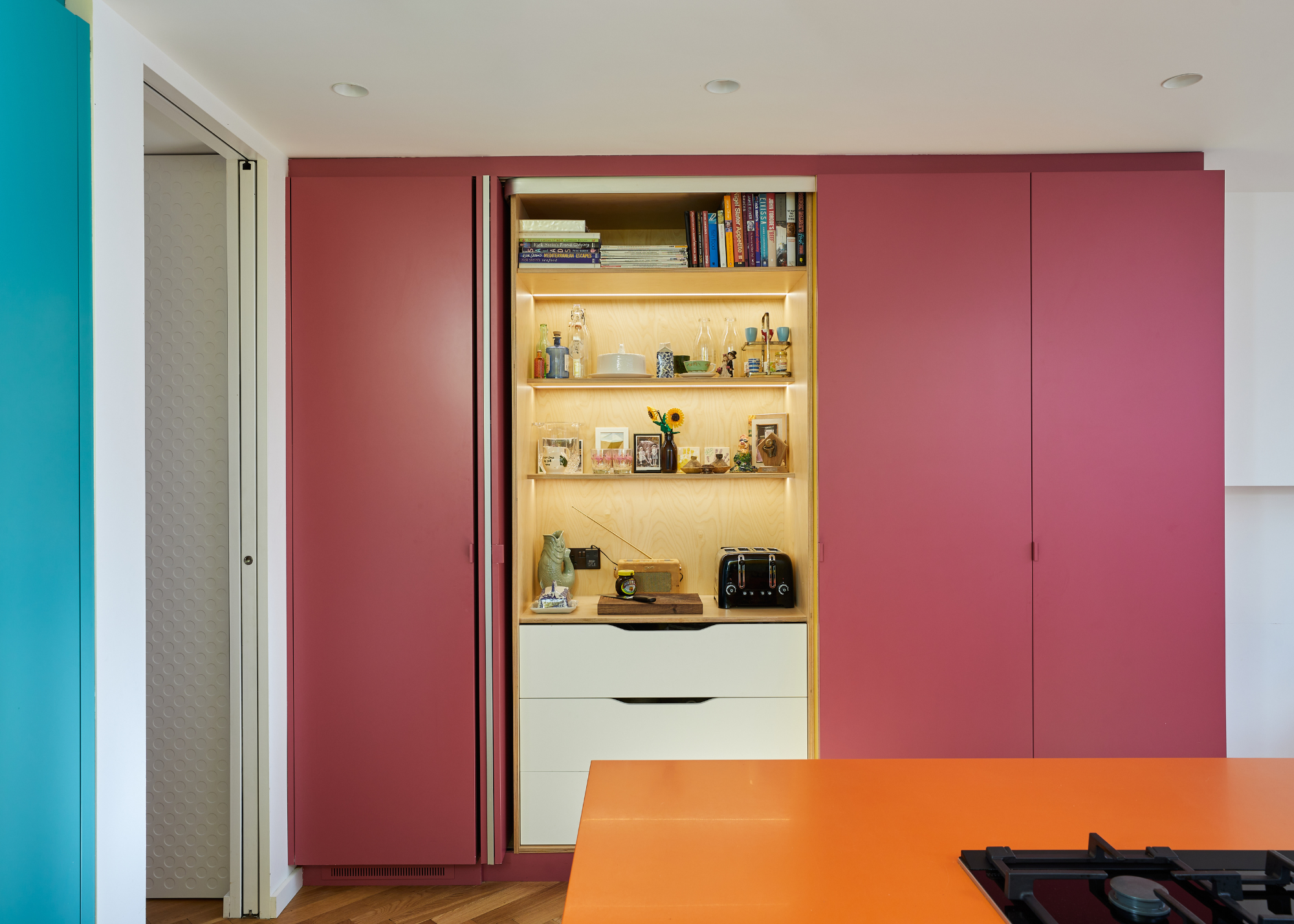
A pocket door breakfast bar allows for kitchen appliances to be discretely tucked away.
"We tackled functionality first," Mark explains. "The layout is organized into discrete zones for cooking, prep, storage, and entertaining so that activities don’t collide."
In open-plan kitchens, zoning is an important tool for creating a sense of separation while maintaining a cohesive design.
"For example, we created a wall of tall cabinets that house the pantry, fridge, and even a hidden bar, freeing up the rest of the room for cooking, movement, and socializing," Mark continues. "By dividing the kitchen into four distinct blocks, each with a specific function, everything has its place and purpose. This makes the workflow intuitive; you know exactly where to go for each task, and multiple people can use the space without bottlenecks."
Designing with a proposed workflow in mind is key for creating a kitchen that you'll actually enjoy using. Ensuring there's a logical flow to the space will introduce more ease and relaxation to your kitchen experience, making it a more welcoming space to host guests or entertain the family.
"Generous HIMACS countertop space on the island and along the perimeter means there is plenty of space for the family to work together at the same time. We also ensured that there’s plenty of built-in storage at all levels, ranging from the deep drawers for pots and pans to the dumping cupboard for personal items and bits n’ bobs, helping the kitchen remain supremely practical and free of clutter," he explains. "Flow-wise, the kitchen opens directly to a dining area and out to the garden, which was great for both everyday convenience and entertaining. The clients wanted that open, inclusive atmosphere where cooking, dining, and lounging happen seamlessly in one connected area."
This seamless movement of space and function, from the kitchen, directly onto the dining area, and continuing through to their outdoor area, invites a relaxed, free-flowing living style. This, coupled with the bright color scheme, makes for an unabashedly joyful home design, a true example of dopamine decor.
While this kitchen's color palette is undeniably bold, with rich, vibrant tones and shades, the rest of the kitchen is relatively understated, with crisp, clean lines and minimal clutter. The result is a perfectly balanced space that feels uplifting rather than overwhelming.
"We achieved balance by grounding the vibrant palette in combination with the use of natural light, simple lines, and repetition," Mark explains.
"In this project, the use of structural glazing was key as it floods the interior with natural light, to allow the bold colors to feel uplifting rather than overpowering," Mark tells me. "We echoed key tones across different elements, like cabinetry, soft furnishings, and some structural elements, to create a sense of continuity throughout the space. Pairing vibrant hues with warm timber, bold structural statements, and clean architectural lines helped to anchor the design, while careful attention to light and proportion ensured the scheme felt cohesive, not chaotic. The result is a home full of character, fun, and joy that still feels relaxed, calm, and balanced."
The Materials
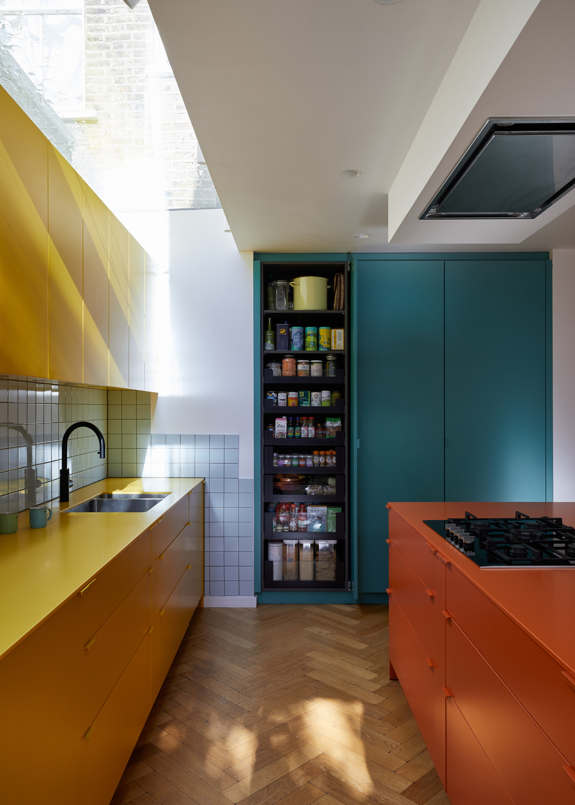
CATO Creative uses HIMAC throughout the design of this home.
At the core of this design, and central to its success, was the unique material they used throughout.
"We selected HIMACS early in the design process because it offered the ideal combination of aesthetic impact and practical performance," Mark explains.
HIMACS is a surface material with the ability to bend and curve to any shape, while maintaining durability. However, the standout feature of HIMAC is the unmatched variety of colors and finishes available. Recreate the luxury look of a marble kitchen, or achieve the appearance of a Mediterranean style terrazzo, or, as expertly showcased in this kitchen, explore the vibrant shade range of their solid collection.
"The clients were keen on bold, confident colors, and the HIMACS solid surface range gave us access to exactly the right tones — especially the vibrant “Banana” yellow and “Orange” we used for the kitchen," Mark says, "These colors paired perfectly with the lacquered cabinetry finishes, helping us to achieve the clean, monolithic look central to our color-blocking concept."
Not just limited to its aesthetic properties, though, the decision to feature HIMAC throughout the design was equally based on the material's strength and durability.
"HIMACS also met our technical and functional requirements," explains Mark. "Its seamless joins allowed us to form large, sculptural surfaces, like the island and worktops, without visible lines, giving the space a smooth, uninterrupted feel."
Choosing a low-maintenance kitchen cabinet and work surface is of central importance when designing a functional, family home. Whether you like it or not, mess is an inevitable part of family life, so a kitchen that can handle some extra spills and splashes is always a good idea.
Mark says, "From a performance point of view, HIMACS is non-porous, hygienic and incredibly durable — ideal for busy family life. There are no grout lines to maintain, and it stands up well to spills and wear, making it as practical as it is striking."
CATO Creative's love and passion for this material are at the soul of this kitchen design, and can be felt in the crisp, seamless, and vibrant final product.
Mark adds, "In the end, HIMACS allowed us to realize the boldness of our design with a material that performs as beautifully as it looks. It became a unifying feature across the project — visually impactful, technically reliable, and full of creative potential."
How to Design With Color
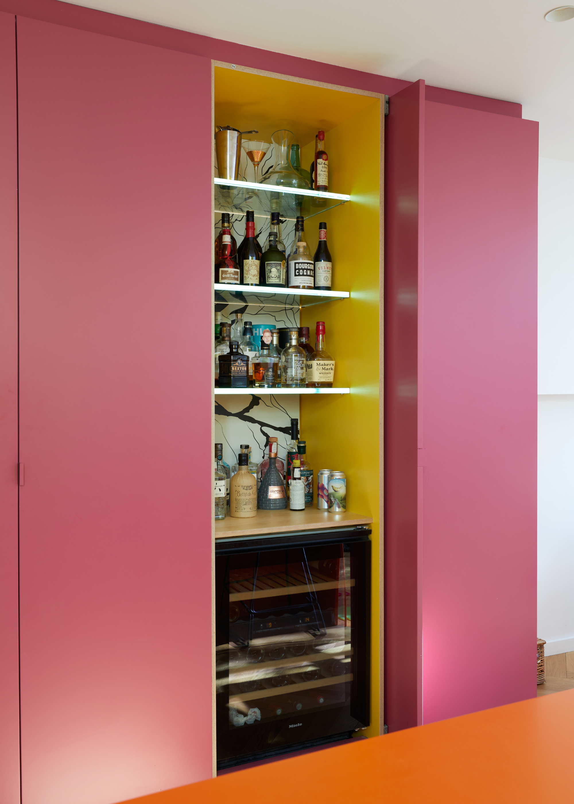
Creative details, like the contrasting color used within the cabinets adds another level of complexity to this design.
If this kitchen has inspired you to bring more color to your own home, here's Mark's guide to creating a balanced, nuanced, colorful kitchen design.
Be Intentional
"Bold colors work best when used with purpose. Assign them to specific elements—like a cabinet, wall, or furniture piece—rather than scattering them randomly. This creates impact without chaos. In our Deodar project, each vibrant tone defined a function or zone, keeping the overall look cohesive and balanced.
Balance with Neutrals, Texture, and Light
Strong colors need calm surroundings. Natural textures like timber, stone, or neutral tiles help ground a palette and give the eye space to rest. Just as important is light — both natural and artificial. Daylight softens bold tones and makes them feel fresh, while thoughtful lighting design ensures colors look good at all times of day. We used structural glazing and other pale surfaces to reflect light and keep the space feeling open, bright, and balanced.
Repeat Key Colors
Repetition creates connection. Echo a color from one space in another—through surfaces, joinery, or accessories—to make the palette feel intentional and unified. It helps a bold color become part of a narrative rather than a one-off statement.
Stay True to What You Love
Avoid chasing trends. Choose colors that mean something to you, not what’s fashionable right now. Be brave, but make it personal. If you genuinely love a color, it will always feel right in your home. That emotional connection is what makes bold color timeless and liveable.
In Summary:
Designing with daring colors is about being bold but considered. Make your own statement, avoid fads, use light to your advantage, and build a palette that reflects who you are. When used thoughtfully, bright colors don’t just stand out—they make your home feel vibrant, balanced, and truly yours."
If this home has kick-started a new obsession with colorful kitchens, don't worry, you're not alone. These yellow kitchens have been on our mind for months now, but if you're after a more calming feel in your home, you can't go wrong with these color pairings that are just right for tranquil looking kitchens.

Maya Glantz is a Design Writer at Livingetc, covering all things bathrooms and kitchens. Her background in Art History informed her love of the aesthetic world, and she believes in the importance of finding beauty in the everyday. She recently graduated from City University with a Masters Degree in Magazine Journalism, during which she gained experience writing for various publications, including the Evening Standard. A lover of mid-century style, she can be found endlessly adding to her dream home Pinterest board.
