Color blocking walls - 10 ways top designers use to easily transform your home decor
Master the art of color blocking with these uber cool ideas that shout confidence

The Livingetc newsletters are your inside source for what’s shaping interiors now - and what’s next. Discover trend forecasts, smart style ideas, and curated shopping inspiration that brings design to life. Subscribe today and stay ahead of the curve.
You are now subscribed
Your newsletter sign-up was successful
Color blocking is a great way of expressing yourself and making a bold statement. But figuring out the right palette, and the ways and styles to pair hues it is not easy. This is where our experts come in.
'There are endless ways to be creative with color blocking, from using paint to create the impression of architectural details where they are lacking, to using paint to create areas of design interest more akin to modern art than a decoration scheme,' says Andy Greenall, head of design at Paint & Paper Library. 'In fact, color blocking is a fantastic way to bring a contemporary feel to a period property.'
If you are ready for a dynamic change in your interiors, then these color blocking ideas that rely heavily on color theory can introduce you to a bolder lifestyle.
Article continues below10 color block techniques and ideas for a striking interior
Essentially, color blocking is a design technique that involves using no more than three solid, contrasting colors in one space. To create a palette, it's best to look at the color wheel to find complementary tones that look great together. Using interesting blocks of colors will refresh your home, bringing energy and positivism.
1. Pair three complementary colors in varying proportions
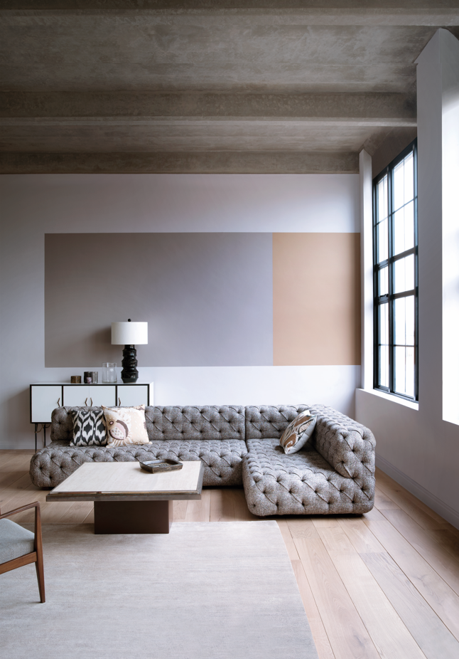
One of the greatest things about color blocking is that there are no stringent color rules to the number of hues you can use in the space. You can implement as many or as few colors as you want, although many designers and color experts suggest keeping it limited to three.
'Classic color blocking, creating different proportions of complementary colors of varying strengths, creates a real design feature in any space, particularly when used in combination with a light neutral,' says Andy Greenall of Paint & Paper Library. 'Here color blocking in ‘Yesterday’s Flower’ and ‘Caddie’ alongside ‘Marble I’ provides a focus within the room whilst acting as a steady background for artwork or accessories.’
Another important thing to keep in mind is the strength of the hues you're working with. 'Perhaps the bravest color blocking approach is combining contrasting colors, by using color blocks of contrasting mid-strength colors to create a dynamic and bold scheme, whereas a tonal color combination, perhaps using a deeper shade of the same color or a complementary color will create a softer, more harmonious interior,' says Andy.
The Livingetc newsletters are your inside source for what’s shaping interiors now - and what’s next. Discover trend forecasts, smart style ideas, and curated shopping inspiration that brings design to life. Subscribe today and stay ahead of the curve.
2. Consider a two-tone wall with a color highlight
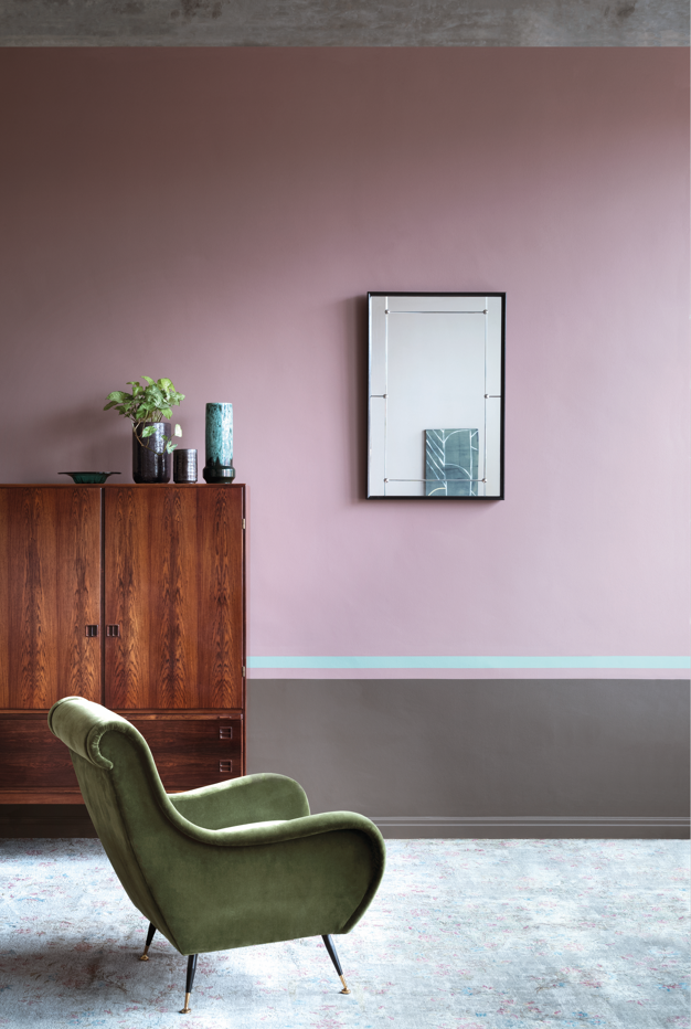
For two color combinations in the living rooms or bedrooms, refer to the color wheel to see which hues sit opposite each other. These create high contrast and high impact look, and when paired together appear brighter and more prominent. If you want to add another layer of interest, paint a single line of a color highlight to add a touch of a third hue.
Keep in mind to pair colors of similar intensity. If your primary color is bold, ensure all the other colors are just as bold. If your primary color is pastel, make sure all the other colors are also pastel.
'Here the illusion of architectural features has been created using ‘Bronze' on the lower wall to ground the scheme and a larger expanse of ‘Rouge II’, whilst a surprising stripe of ‘Deep Water Green’ has been used for a color highlight,’ says Andy.
3. Create a color block with wallpaper
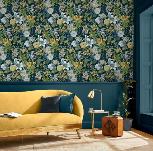
Color blocking doesn't only mean paints. You could create an interesting wall color combination with paint and wallpaper; perhaps a solid hue with large motifs to create dynamism.
You could also consider color block with just accessories. Try grouping vases or framed pictures in color blocks for a less permanent pop, subtly livening up a bland room.
'Colour blocking can be particularly effective when paired with wallpaper,' says James Greenwood, brand and interior expert at Graham & Brown. 'We’ve used our classic Glasshouse Flora design with perfectly partnered Majestic paint for an effortlessly put-together scheme. Drenching the entire room in the deep blue shade allows the wallpaper to pop against it. The paneling on the lower half of the wall also adds to the framing effect, creating a work of art in your home.'
4. Utilize panelling
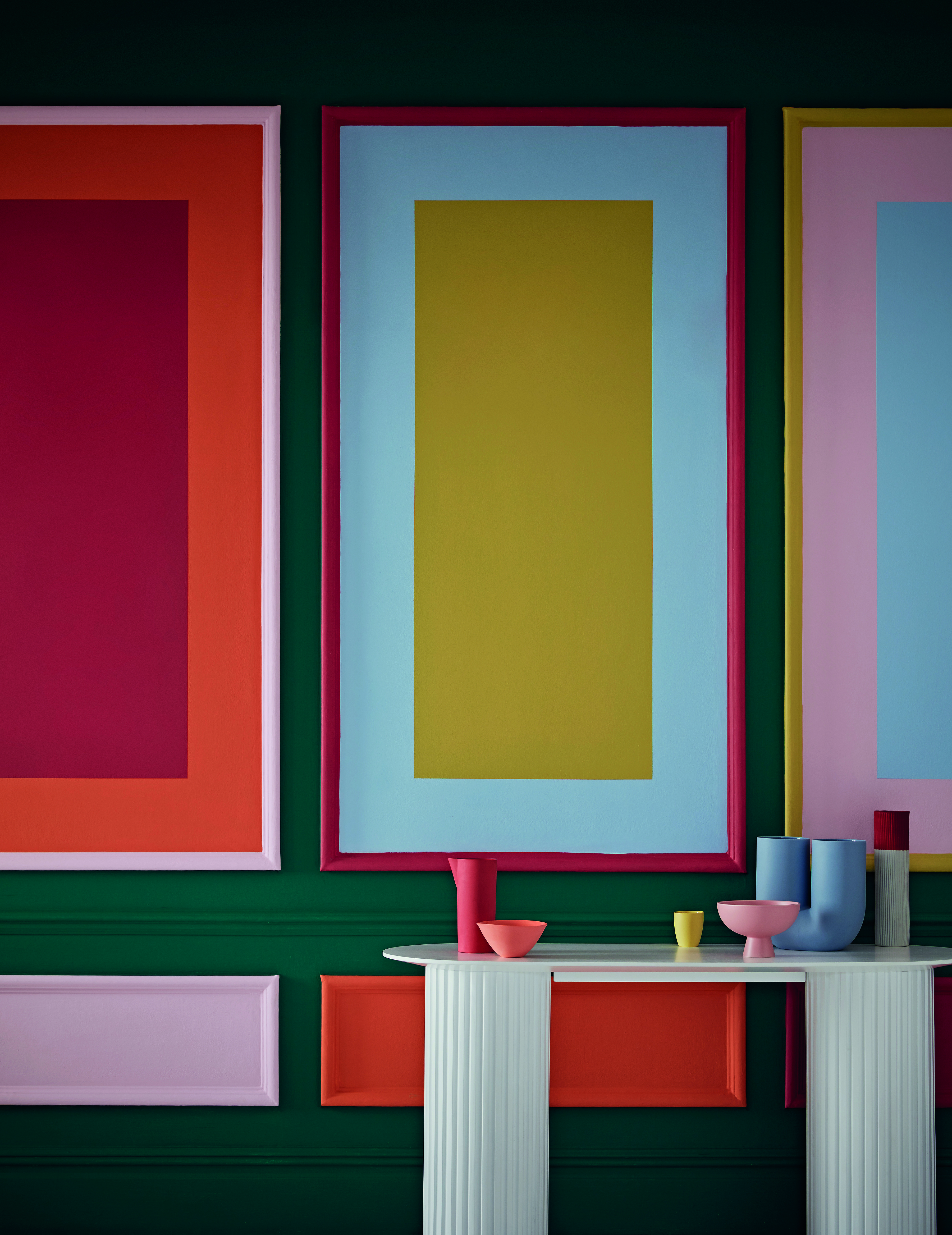
Get creative with your color block ideas and move away from flat paints; instead, think of bright hues infused on wall panelling. This idea has many benefits. Not only will the color enhance this architectural feature, but it will also make the paneling seem like a decorative element, almost like an artwork in the home.
Bright colors tend to lift flat surfaces, and in this case, the paneling will look even more prominent and interesting.
'Combining paneling and bold hues with texture in the furniture adds depth and creativity,' says Justyna Korczynska of paint brand Crown. 'Use similarly strong shades and rich patterns to add another layer of color to your room for a strong bold look. Or if you prefer simplicity, make the hues on your panels the heroes and use minimal and neutral-colored furniture and accessories.'
5. Allow the color block theme to flow through spaces
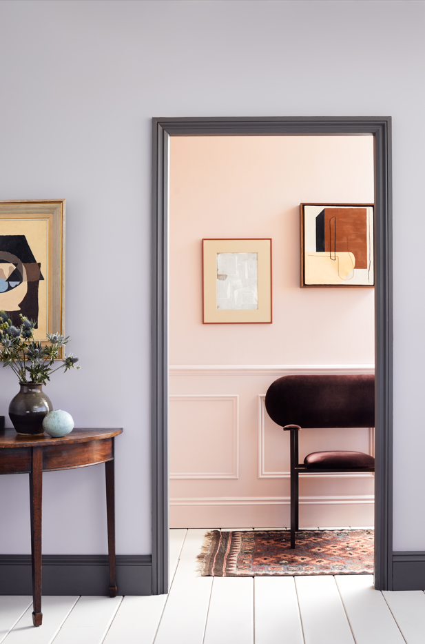
Interestingly, color block doesn't need to be restricted to one room only. Allow the palette to flow across rooms that share sightlines, thereby creating a scheme that is fluid yet dramatic.
'In terms of color combinations, consider pairing Lavender Garden™ No.30 with Pale Lilac™ No.246, for a neutral yet graphic and playful background,' says Dominic Myland, CEO of Mylands. 'Pairing a bright shade with a deeper pigment, such as Mylands’ vivid mustard Haymarket™ No.47 with the deep crimson red Huguenot™ No.49, creating a bold and intriguing scheme.'

'We like most hues of green and sometimes, a deep chocolate when creating a palette,' says Melissa Lee, founder & principal at Bespoke Only. 'The traditional blue and cream combo in this colonial home mixed with a touch of Nordic influence results in a spectrum of subdued, hazy hues that reflect softly by the panoramic natural exposure.'
6. The perfect contrast can be created with natural materials too
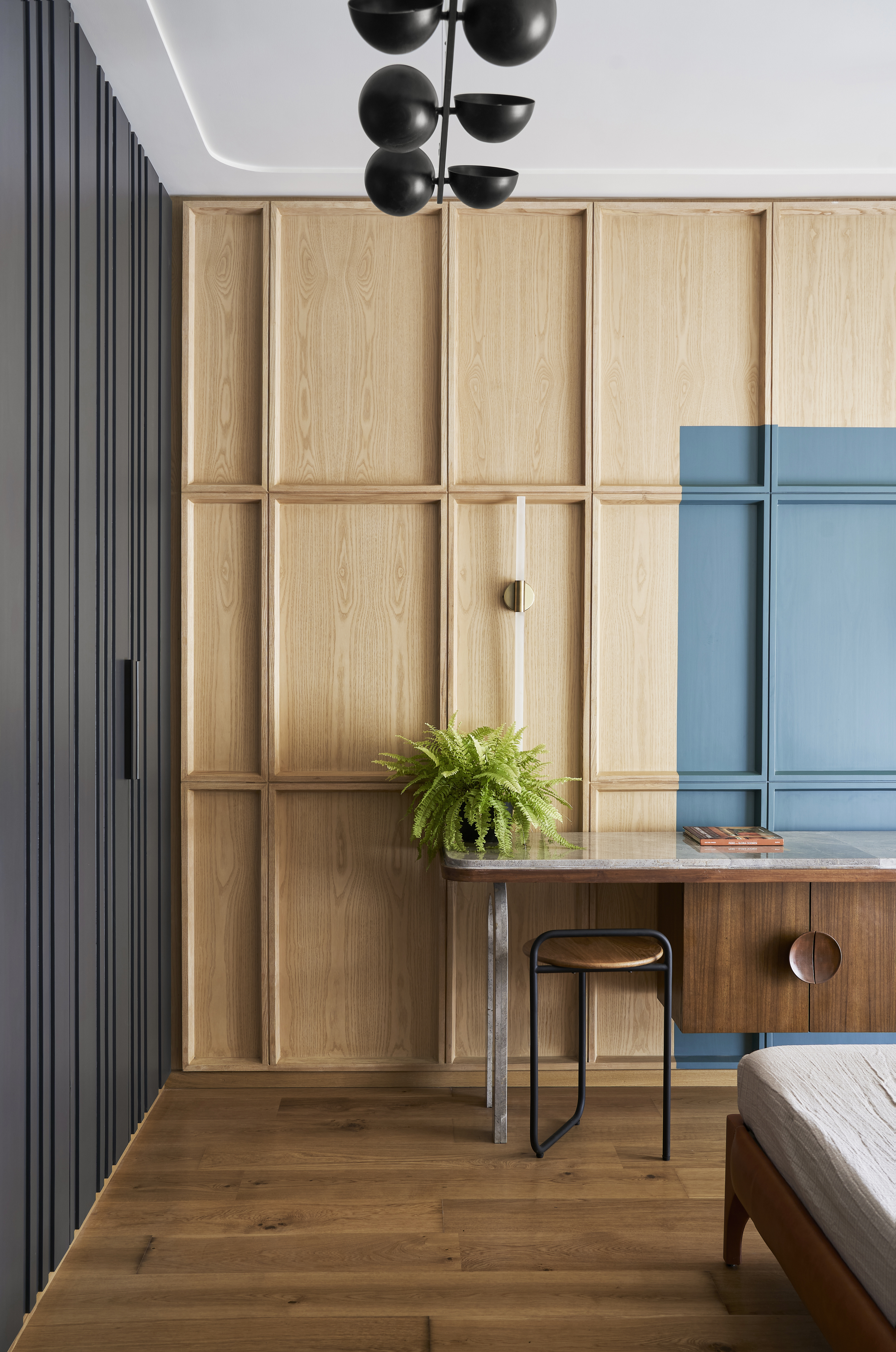
If you're wondering how to create a color palette and are unsure of how many hues you should work within a small space, consider the lovely visuals created with natural materials.
Wood has an inherent charm, and warmth to it, a natural brown that is hard to get right in paint. Use this as an opportunity to create a soothing color block, where wood both offsets and provides a canvas to lift other colors.
'An expanse of dark grey cupboards adjacent to a paneled wall in light ash wood and blue marks a contrast and continuity of tones in the son’s bedroom,' says architect Shiraz Jamali.
Another great way of color blocking is with monochromatic hues. This essentially means using one color in varying degrees of tone, shade, tint, and value. Introduce a variety of textures and materials in the room to help create interest.
7. Consider color block with furniture
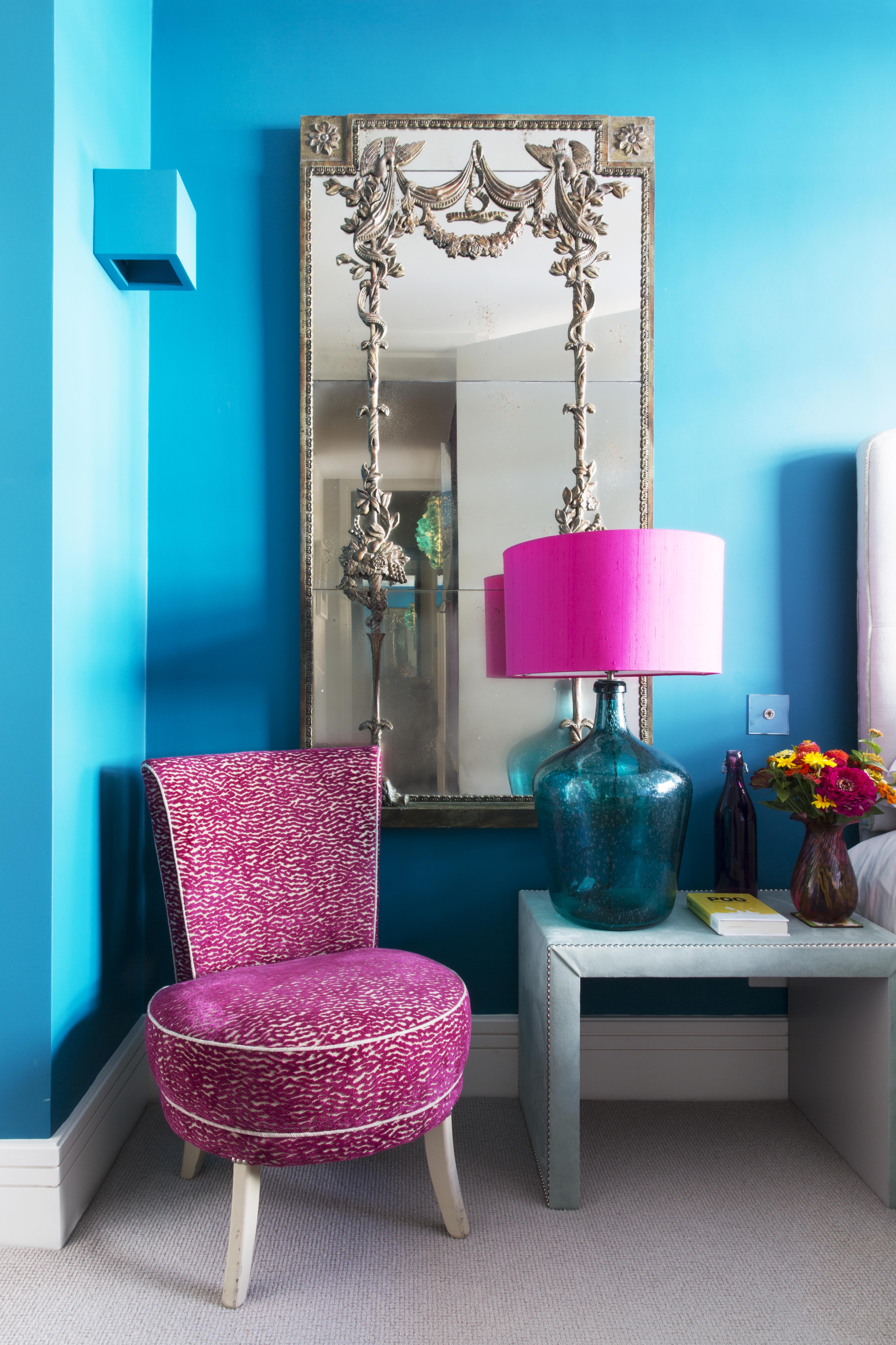
Don't allow the colors to go solo on the walls; include your furniture too in creating an unforgettable palette. If you're looking for colorful bedroom ideas, then this color block technique could give the space a unique look.
'The brief for this bedroom design was to introduce bold color, pattern, and personality to the space, similar to the rest of the home,' says Emma Deterding, founder and creative director at Kelling Designs. 'The room itself was bland and neutral, so I wanted to bring it to life. As well as incorporating plenty of storage to make the best use of the space, I wanted to make sure the space felt bright, light, and airy. More often than not, people opt for neutrals and pastels for the bedroom as they feel that these are the most calming, but bold and bright colors can be just as restful.'
'We opted for a bold blue for the walls to add that impact and kept the headboard, bed, and key furniture pieces more neutral to keep the space balanced,' says Emma. 'The occasional chair was finished in a beautiful, patterned fabric in a vivid fuchsia shade to add eye-catching detail, and we coordinated the accessories throughout in shades of blue and pink to keep the look cohesive, making a statement whilst not overwhelming the senses.'
8. Give the space dimension with stripes
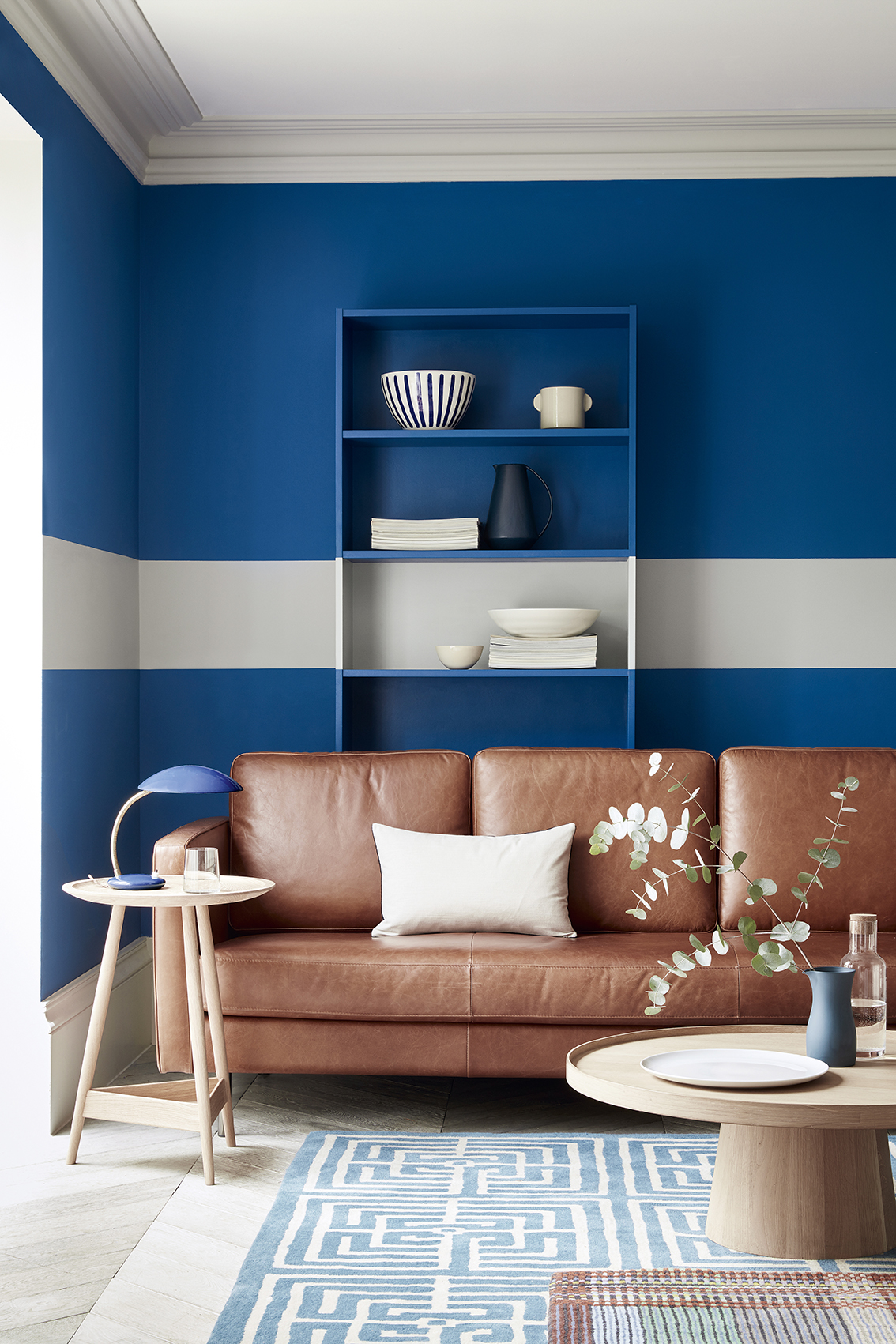
Whether they’re horizontal or vertical, knowing how to paint stripes on a wall is one trend that hasn't gone out of style in a long time. This versatile motif adds visual interest and can help showcase a room’s fine points and de-emphasize flaws.
Largely, vertical stripes in a room with low ceilings can create the illusion of height; horizontal stripes in a room with high ceilings ground the space. Plus, they allow for the most convenient, subtle color block, allowing you to use two opposing hues with ease. Tone-on-tone stripes of equal size create a subdued and relaxed environment, while bright, contrasting stripes varying in size create a more modern and graphic impact.
‘Use color to add personality and character to your living space and create a space to welcome guests and entertain but also to relax in,' says Ruth Mottershead, creative director at Little Greene. 'Create focal points that highlight different areas within the room by using color blocking to provide a zoning effect. This is especially useful for rooms that have multiple functions. Adding a broad band of color in a contrasting color across the wall or woodwork will draw the eye and create interest in spaces that may be lacking architectural features.'
9. Look to nature for palette inspiration
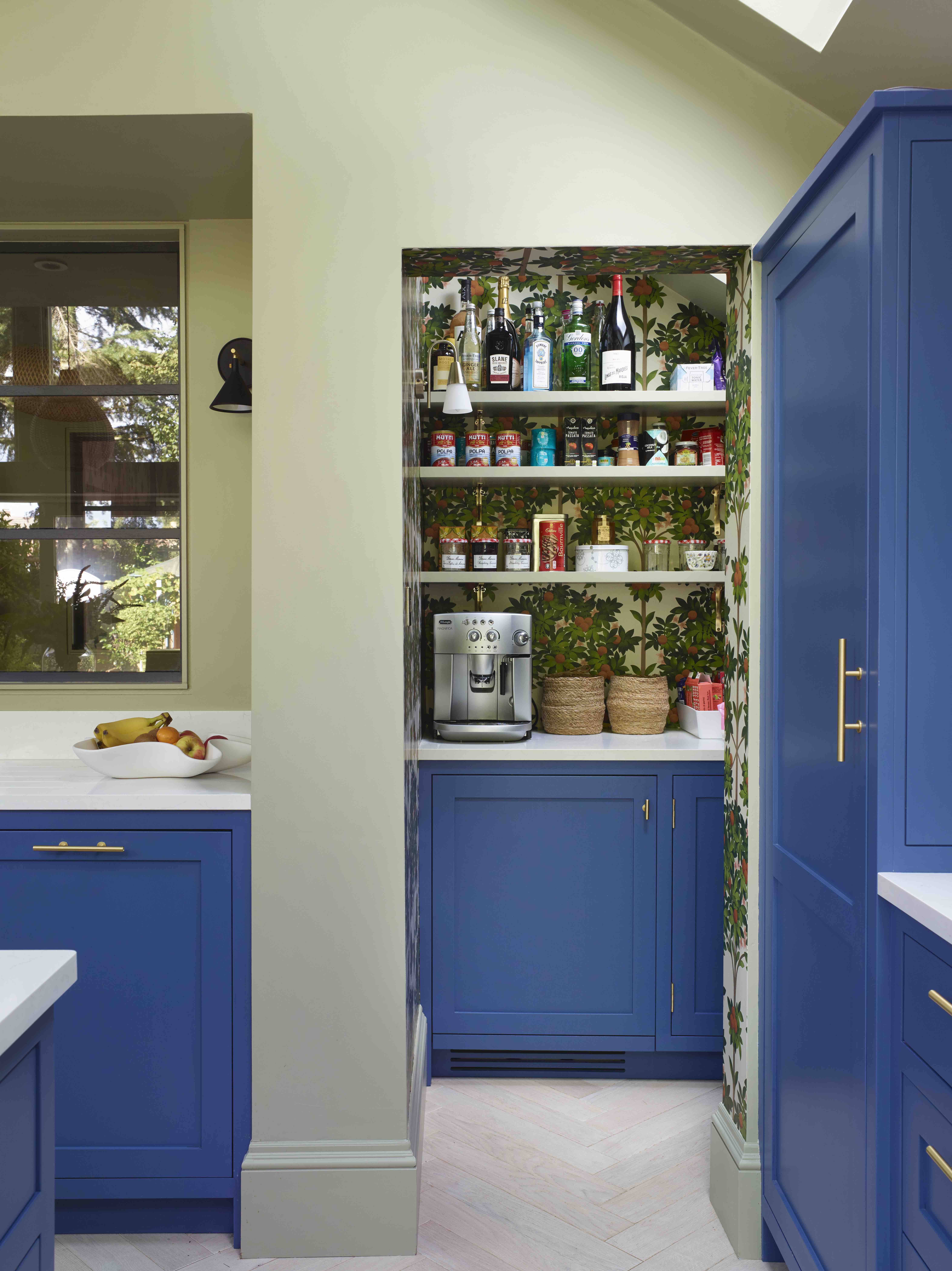
If you take a walk in the outdoors and truly observe, you'll see how different hues exist in harmony. This is a great way to understand how colors pair and look when next to each other. Green and blue, for instance, is a classic combo, that will never go out of fashion.
Similarly, yellow and green too make for a striking contrast, easily uplifting a space. You could also refer to the color wheel to see what colors are next to each other (analogous), to produce a smooth and soothing interior.
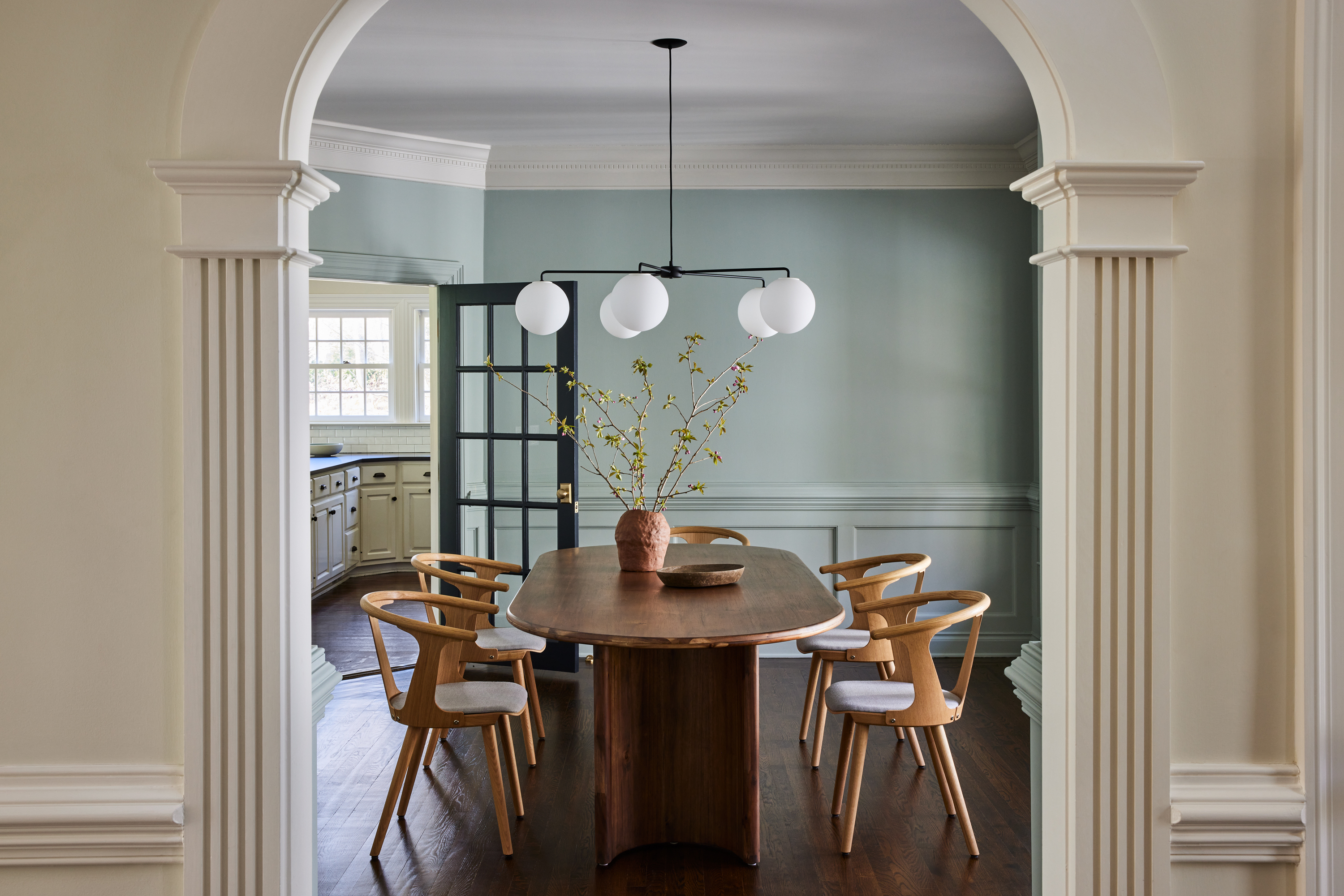
In this kitchen, notice how the green walls harmonize perfectly with the blue cabinets. You can add a third hue too within this palette. Keep in mind to pick one color as the primary color and use two others for elements that pop. Also, it's best to consider the 60-30-10 rule when balancing hues.
'For a striking statement don’t be constrained by ‘painting within the lines’,' says Andy. 'Rather than letting architectural features guide you, simply zone a space by taking your color block across a door, paneling, or window frame.'
10. If you're unsure, the classic black and white color block is timeless
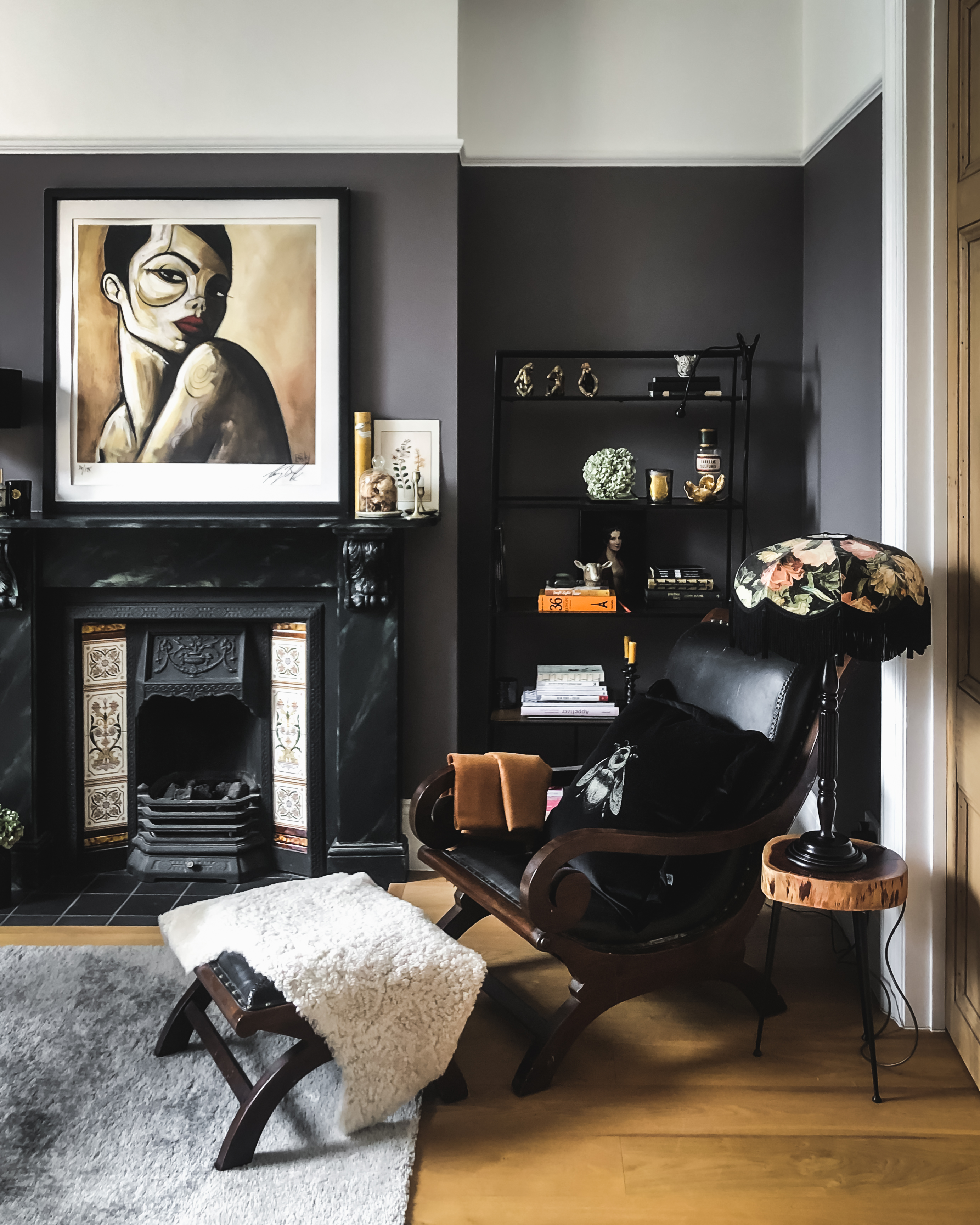
White and black are generally classified as neutrals, yet their huge contrast creates a stunning color block. This thoroughly modern, clean, and sophisticated living room uses this palette to the best effect.
When working in a black and white living room, consider adding one other solid color with accessories or appliances to give the room a visual spike.
What is the purpose of color blocking?
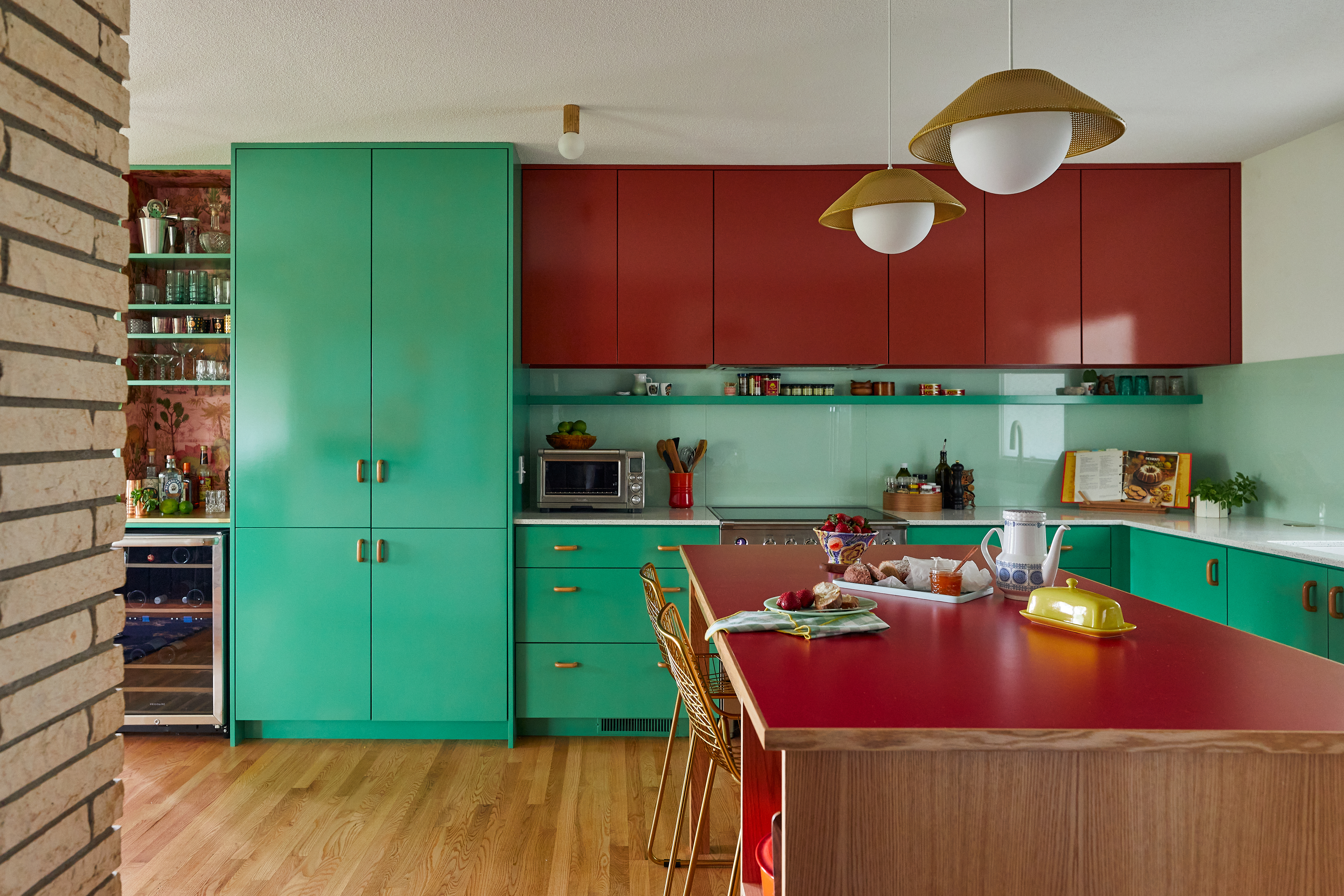
Color-blocking is a color and interior design trend of using two or more complementary colors and pairing them together to make a dramatic statement. While color blocking originated first in fashion, its inspiration came from the artworks of the Dutch painter, Piet Mondrian.
The technique not only adds a personality to space, but also helps lift important architectural aspects of a room, filling it up with light, and in some instances, even create the illusion of height or depth. Color blocking allows one to get experimental with paints; which are generally used as flat colors on walls.

Aditi Sharma Maheshwari started her career at The Address (The Times of India), a tabloid on interiors and art. She wrote profiles of Indian artists, designers, and architects, and covered inspiring houses and commercial properties. After four years, she moved to ELLE DECOR as a senior features writer, where she contributed to the magazine and website, and also worked alongside the events team on India Design ID — the brand’s 10-day, annual design show. She wrote across topics: from designer interviews, and house tours, to new product launches, shopping pages, and reviews. After three years, she was hired as the senior editor at Houzz. The website content focused on practical advice on decorating the home and making design feel more approachable. She created fresh series on budget buys, design hacks, and DIYs, all backed with expert advice. Equipped with sizable knowledge of the industry and with a good network, she moved to Architectural Digest (Conde Nast) as the digital editor. The publication's focus was on high-end design, and her content highlighted A-listers, starchitects, and high-concept products, all customized for an audience that loves and invests in luxury. After a two-year stint, she moved to the UK and was hired at Livingetc as a design editor. She now freelances for a variety of interiors publications.