When It Comes to Creating 'Color Harmony' in Your Home, These 8 Rules Will Ensure You Get It Right Every Time
Turning to the rules of color harmony ensures your home feels balanced and cohesive, even with the boldest and brightest of hues

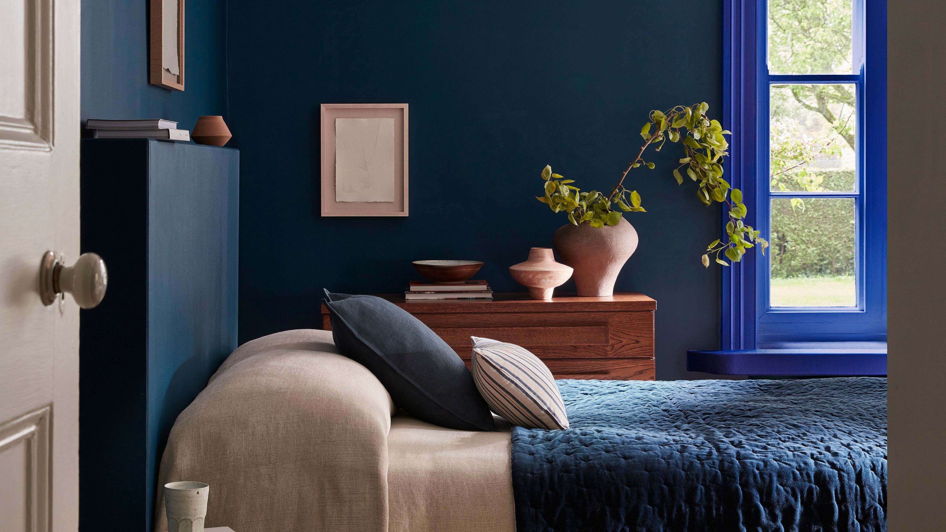
Using color in interiors successfully is not just about choosing those you feel most drawn to. While this is, of course, important, the more scientific rules of color harmony teach us which pairings and groupings will always work well together.
"Color harmony is all about creating a space where the colors feel like they belong together, where the visual effect is cohesive, restful, or energizing (depending on your intention), rather than chaotic or flat," explains color consultant Harriet Slaughter. "When a room has good color harmony, it just feels right, even if you can’t quite explain why."
But what exactly is color harmony, and how can you apply this color theory to your own home to ensure effective schemes, no matter how bold? Here's what the experts have to say on the matter.
Article continues belowWhat is Color Harmony in Interiors?
While color theory is the wider study of colors, color harmony specifically offers practical guidance on choosing a color palette that will work for your interiors.
"Based on the color wheel in interior design, a tool developed from the physics of light and how we perceive it, color harmony explores the relationships between hues: opposites, neighbours, and subtly similar hues that help create visual balance," color expert Harriet Slaughter explains.
While the idea of using specific color harmonies to guide your scheme may sound like a headache, it can be key to creating a well-balanced space. "It takes the guesswork out of choosing colors," Milan-based color consultant Charlotte Cropper shares.
"Whether you’re designing a calm space or a bold, energizing one, color harmony helps ensure the colors feel cohesive and balanced," she adds. "It also makes color more accessible, giving both professionals and homeowners the confidence to create schemes that really work."
The Livingetc newsletters are your inside source for what’s shaping interiors now - and what’s next. Discover trend forecasts, smart style ideas, and curated shopping inspiration that brings design to life. Subscribe today and stay ahead of the curve.

Charlotte Cropper is a leading color consultant based in Milan, celebrated for her instinctive use of color and form. With a deep understanding of color psychology, her work explores how color shapes the way we feel, interact, and connect to the spaces we call home. Charlotte runs her own independent color studio and collaborates with Bauwerk Colour, specializing in natural limewash finishes.
Below, we've rounded up the eight color harmonies you need to know about. From complementary color pairings to tetradic schemes, which include four different hues, these color harmonies give you the confidence to decorate with color in your home.
1. Achromatic
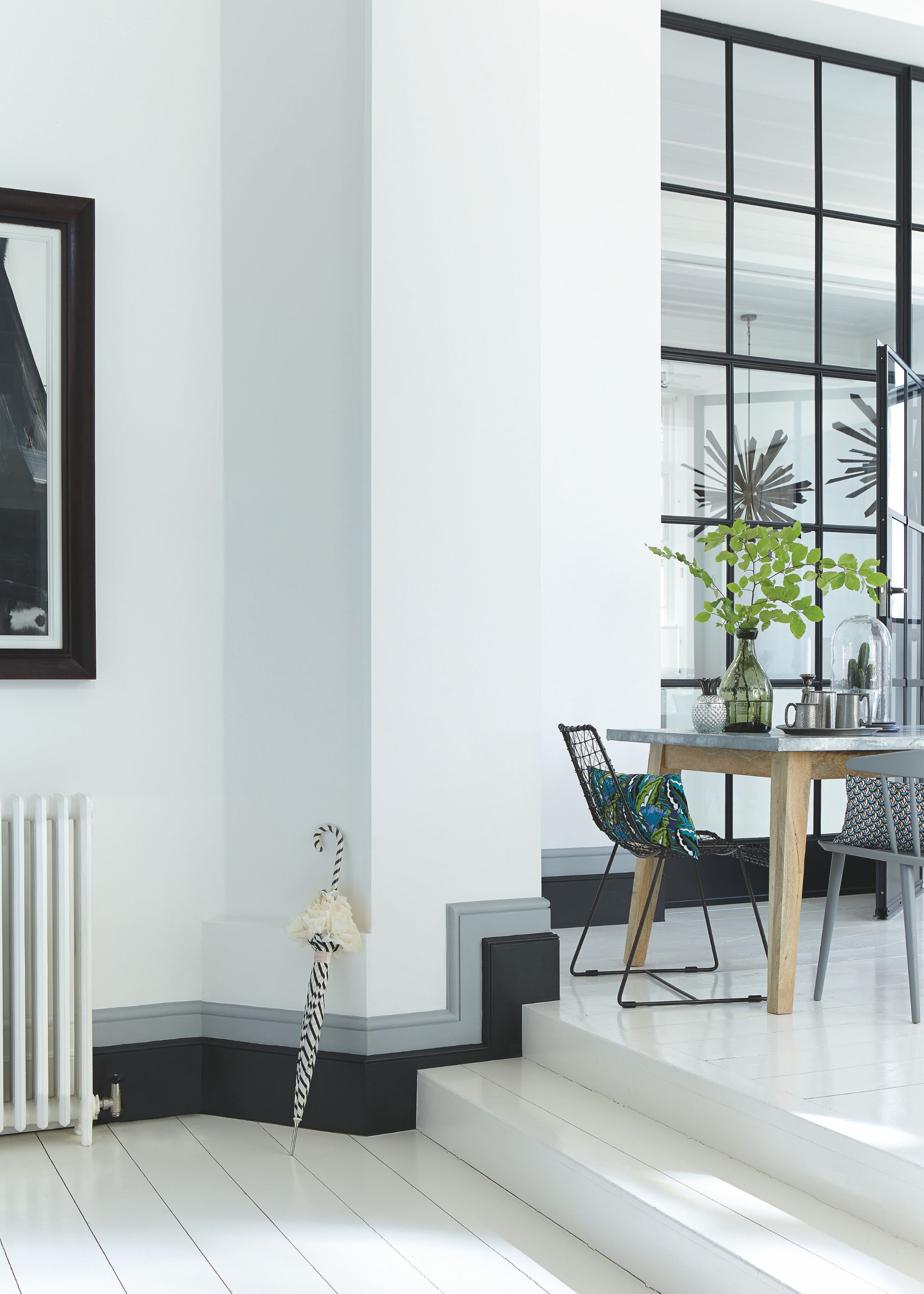
Achromatic schemes are those without any colors and instead use black, white, and gray.
Starting with the least colorful color harmony, achromatic schemes "just use black, white, and shades in between," explains Florence Sherwood, color consultant at Georgie Wykeham Designs.
"This color harmony creates a very minimal, sophisticated, and low-key interior, and whilst this can work well in certain spaces, a true achromatic scheme can be pretty unforgiving," she adds.
That's why Florence prefers to use what she refers to as "colored grays," that is, "a gray with an undertone of another color to it, rather than a true black and white mix."
Achromatic schemes are often associated with more modern, sleek, and minimalist interior design. "White schemes can be beautiful if some added soft undertones alter the warmth and depth between different rooms as needed," Florence adds.
2. Monochromatic
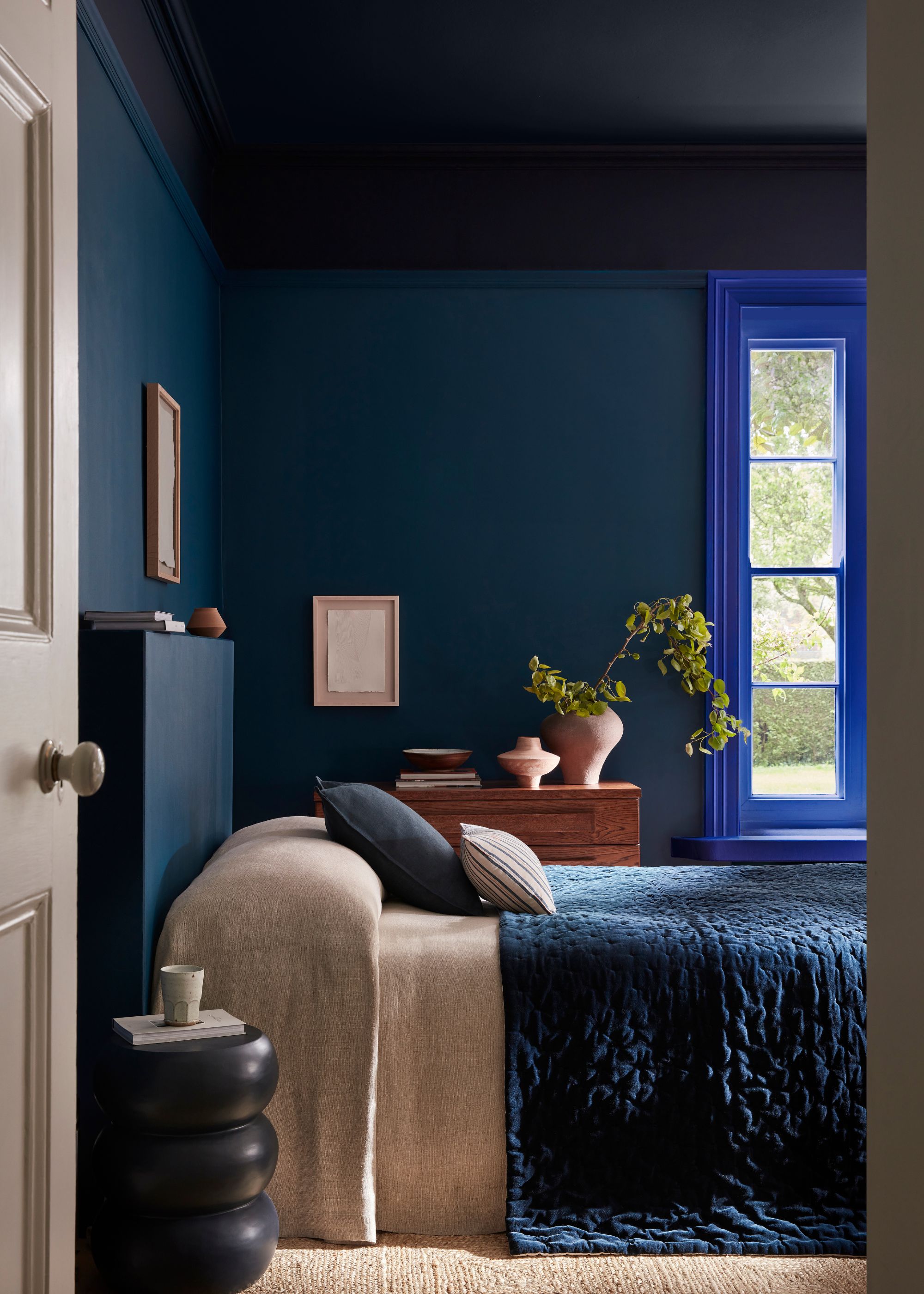
Take inspiration from this bedroom and create an interesting monochromatic scheme with layered shades of blue.
Monochromatic color schemes are an effective way to create a colorful yet cohesive interior, where various tints, tones, and shades of one color are used throughout a space.
"Tints are the lighter versions of a hue (think color mixed with white), shades are the darker ones (mixed with black), and tones are the muted, slightly grayer cousins, all adding subtle depth so it’s never flat or boring," explains Harriet Slaughter.
"White is also a bit of a secret hero here, as it can play a role in any monochromatic scheme, because the lightest version of any color edges closer to white," she adds. "It’s brilliant for keeping a room feeling fresh."
For a specific example, Harriet describes a blue room, "walls painted in Farrow & Ball’s Parma Gray, a fresh, slightly grayed blue that’s crisp without being icy." Then she recommends you layer in soft furnishings in "deeper, smoky, slatey blues to add richness and contrast." For the white element, think of bedding or upholstery, and to prevent the room from feeling too one-note, "bring in a blue-black like Farrow & Ball’s Railings on furniture or frames, just enough to ground the scheme."
3. Analogous
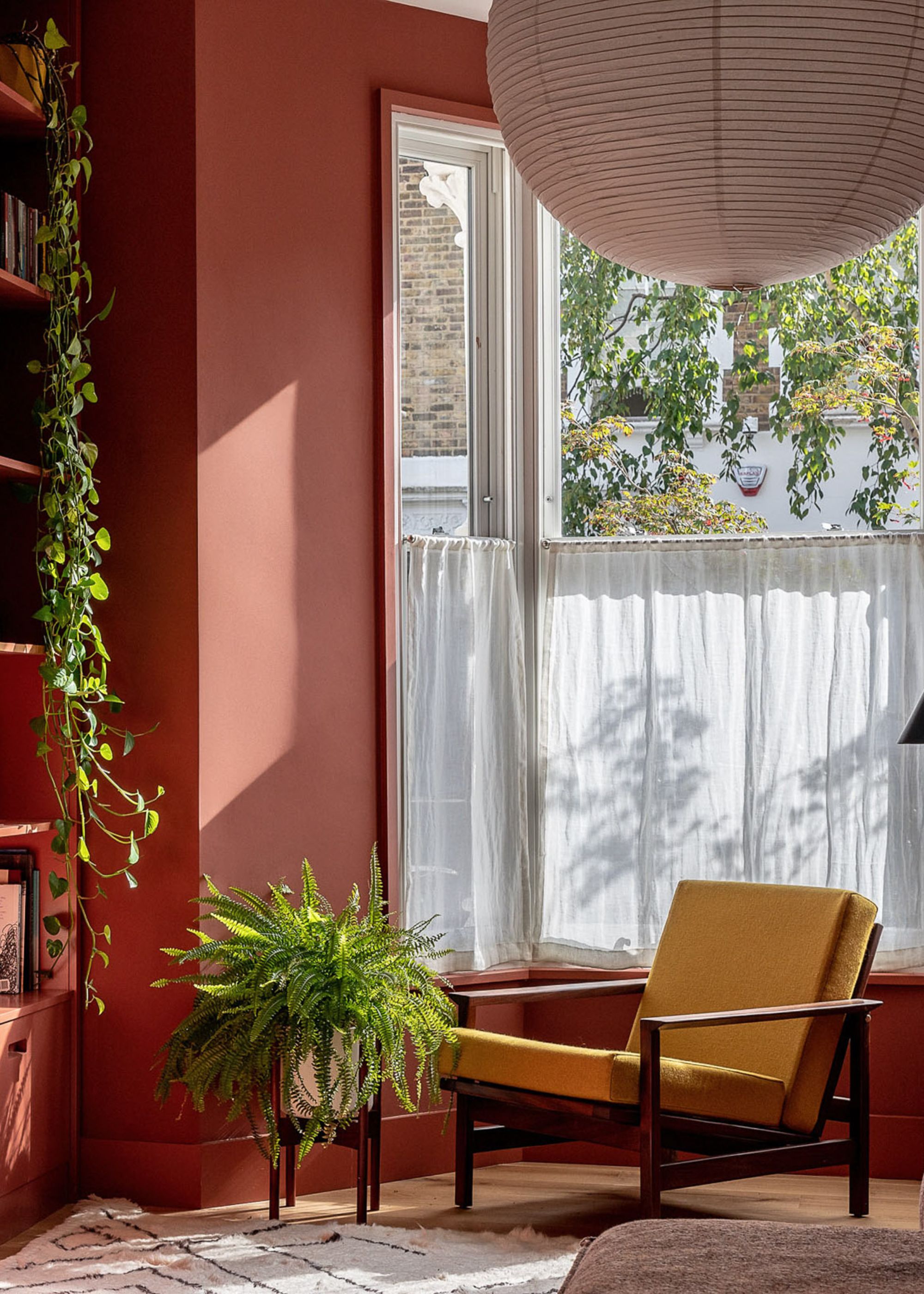
Shades of red and orange together are examples of analogous colors: those that sit next to each other on the color wheel.
To create an analogous color scheme, you need to reference the color wheel. "Analogous colors are essentially best mates on the color wheel — they sit side by side, like blue and green or pink and red," explains color expert Tash Bradley, director of interior design at Lick.
"Because they’re so closely related, they naturally work in harmony, creating a calm, considered feel that’s really easy to live with," she adds. "Since the colors don’t fight for attention, you can actually go a bit bolder than you might usually dare — those richer tones still sit softly together, without overwhelming the space."
Tash recommends using this color harmony across the whole home. "We’ll often start with lighter tones on the ground floor and gradually deepen the shades as we move upstairs," she says.
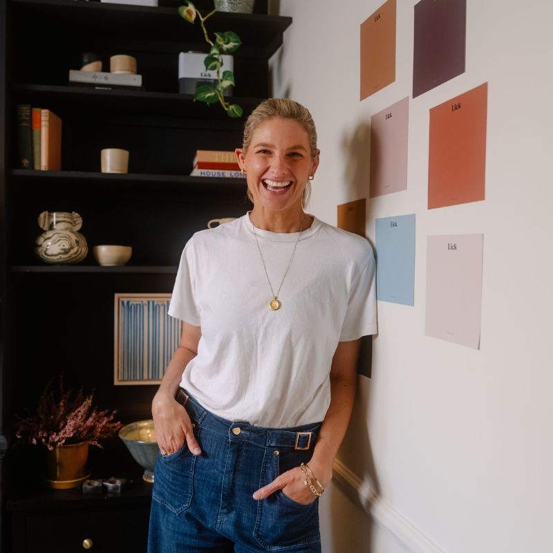
Tash Bradley is the curator of Lick’s collection of 100 pigment-rich paint colors and has given color consultations on over 6,000 projects across the UK, EU, and US, giving homeowners the color confidence they need to transform their homes. Leveraging her expertise in color psychology and theory, Tash helps people find the colors that will positively impact not only their personal spaces but also their lifestyle and well-being, and has also authored a book, Master the Art of Colour.
4. Complementary
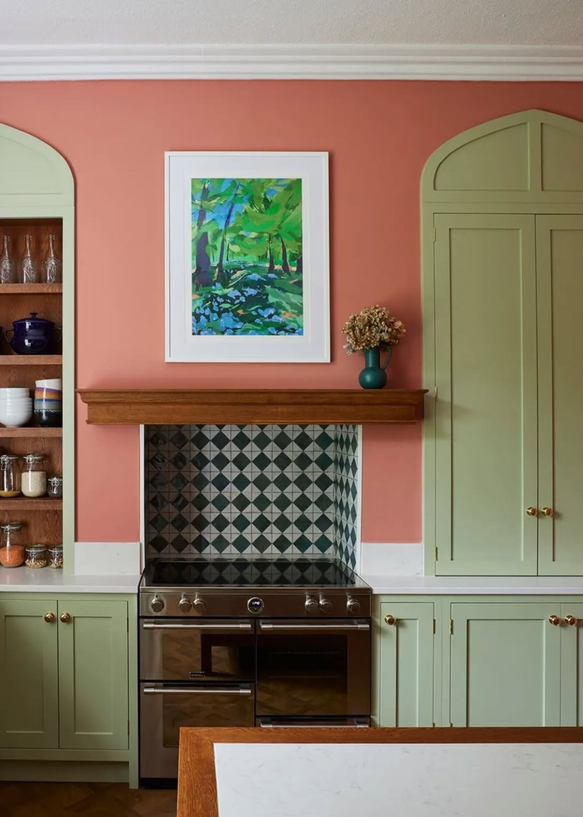
This kitchen features the complementary colors of pink and green for a playful look.
Unlike analogous schemes, which use closely related colors, complementary colors are those that sit directly opposite one another on the color wheel.
"It’s such a simple but powerful way to create impact without it feeling overwhelming," says Tash Bradley. "Because of that contrast, they naturally balance each other out. They bring energy and interest, but they never clash — they actually sit in harmony."
A good way to style complementary colors is using the 60-30-10 rule. "I might drench the room in a soft pink like Pink 01, using it across the walls, ceiling, and woodwork (that’s your 60%)," says Tash. "Then I’d bring in a complementary green, maybe as a bold stripe on the headboard or in upholstery, for that 30%. And finally, I’d add a deeper tone, like burgundy, as the 10% accent through cushions, artwork, or a statement chair. That’s how you get a space that feels balanced but still has a bit of personality and punch."
5. Split Complementary
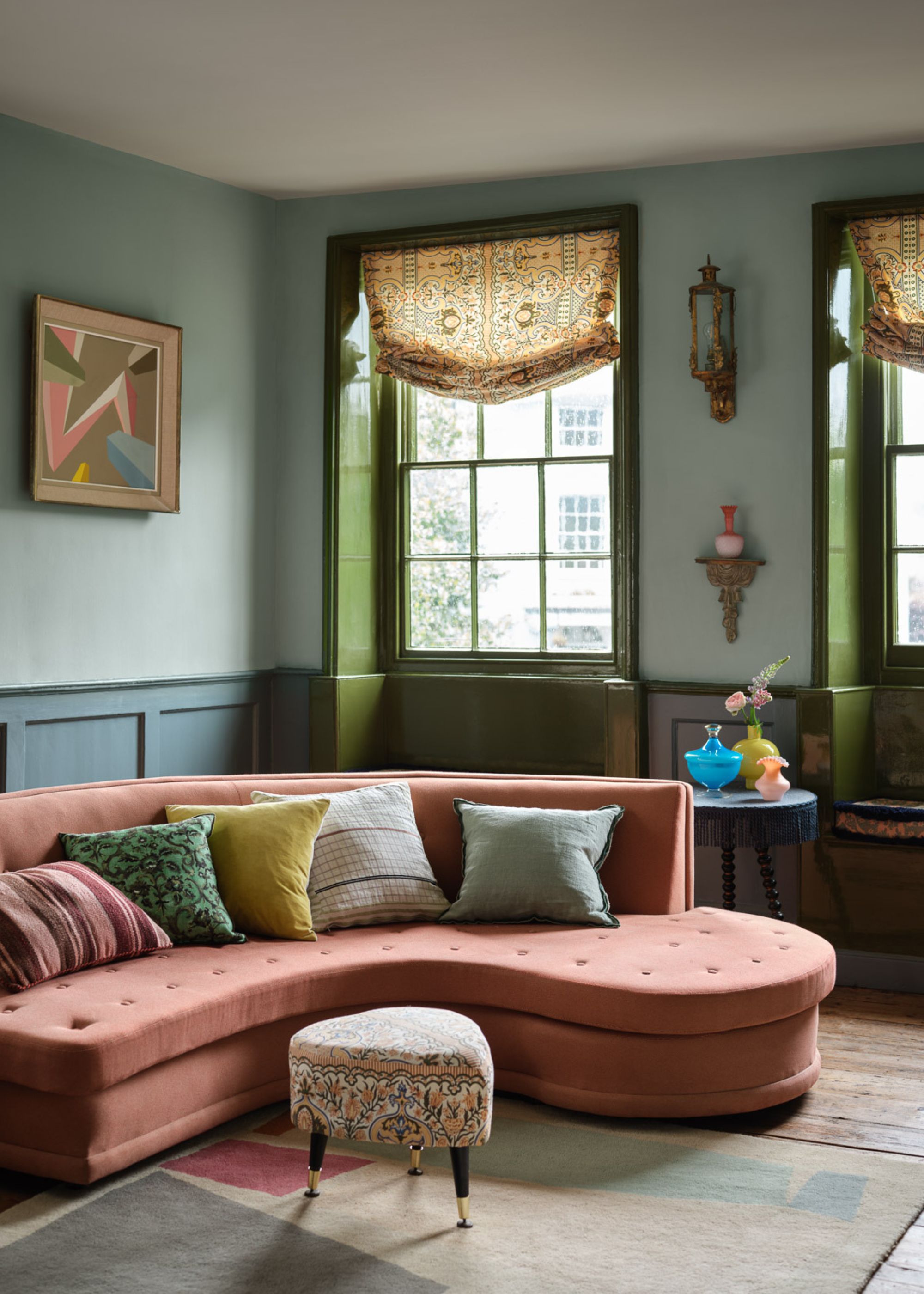
For a colorful yet not-too-bold scheme, reference the color wheel to find split complementary colors.
"A split-complementary scheme takes one base color and pairs it with the two shades on either side of its direct opposite on the color wheel," Tash Bradley continues. "It’s a three-color palette that gives you contrast and energy, but in a softer, more layered way than a classic complementary pairing."
It's colorful, but not jarring. "Because the colors aren’t exact opposites, they avoid that harsh contrast and instead offer a lovely balance of tones," says Tash. "You get the personality and interest, but it’s much easier to live with."
Split complementary colors don't need to feel too bold or intense. Take inspiration from the colorful living room above that maintains a calm feel through its harmonious split complementary colors of terracotta with blue-green and yellow-green.
6. Triadic
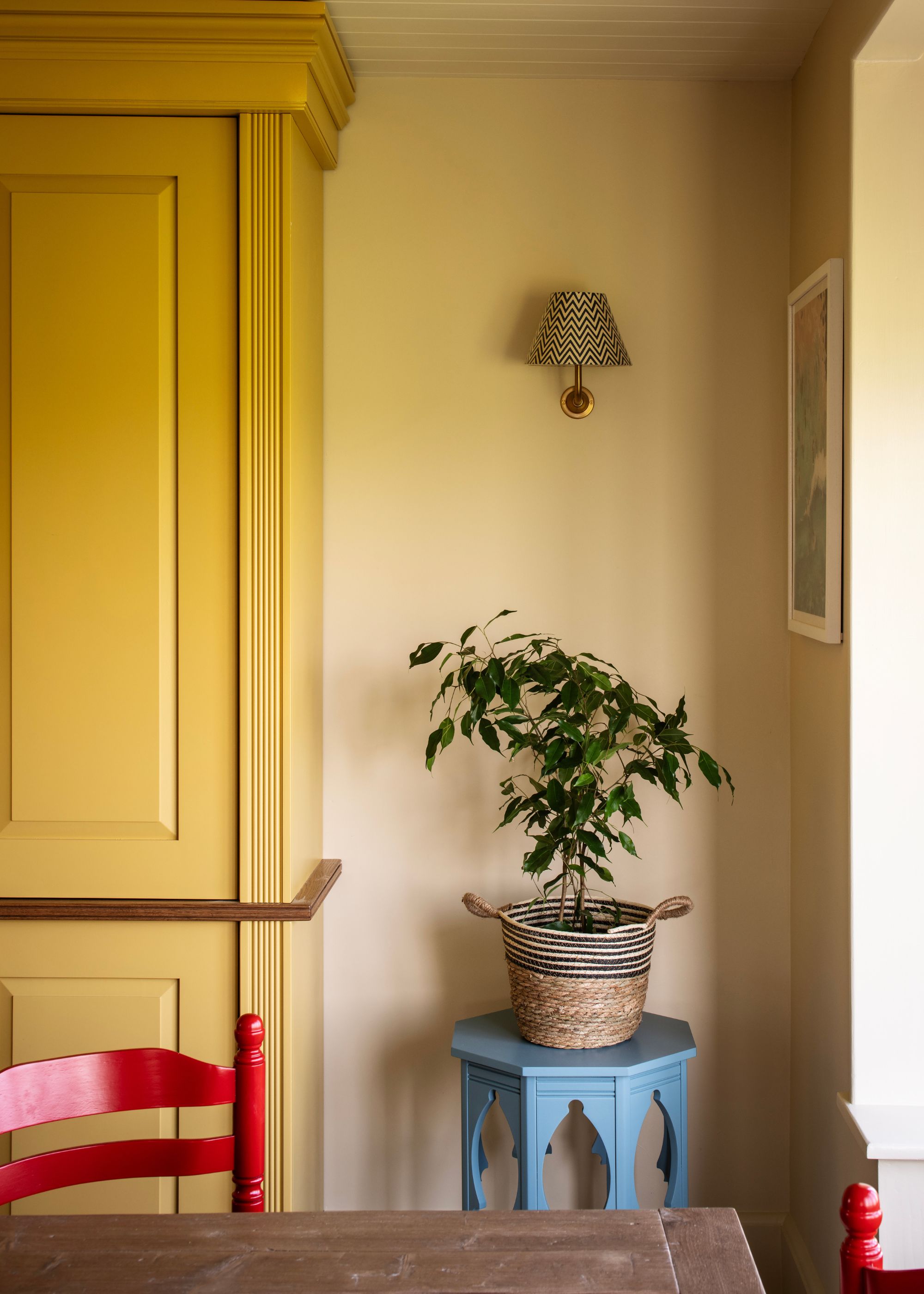
If you want to make a statement with your colors, create a triadic scheme with colors such as blue, red, and yellow.
"A triadic color scheme is where you use three evenly spaced colors from the color wheel to create your scheme," Florence Sherwood explains. If you want to create an undoubtedly colorful and playful room, then this color harmony, which forms the shape of a triangle on the color wheel, can be an effective choice.
"For example, orange, green, and purple or blue, red, and yellow," Florence adds. "These can be useful if you want a bright poppy scheme for a child's bedroom, perhaps, as the colors are less harmonious, so they make for fun clashes."
That said, you can tone down this color harmony for a softer look, according to Charlotte Cropper. "The color wheel shows us colors in their pure, saturated state, but that doesn't mean we want to lift them straight into our interiors," she explains. "Instead, look to softened versions of each hue to create a more liveable, layered effect. Take the classic combo of red, yellow, and blue: shift down the spectrum to explore tints, tones, and shades, and suddenly you're working with wine red, butter yellow, and dusty blue. It’s still a triadic scheme, just with more warmth and depth."
7. Tetradic
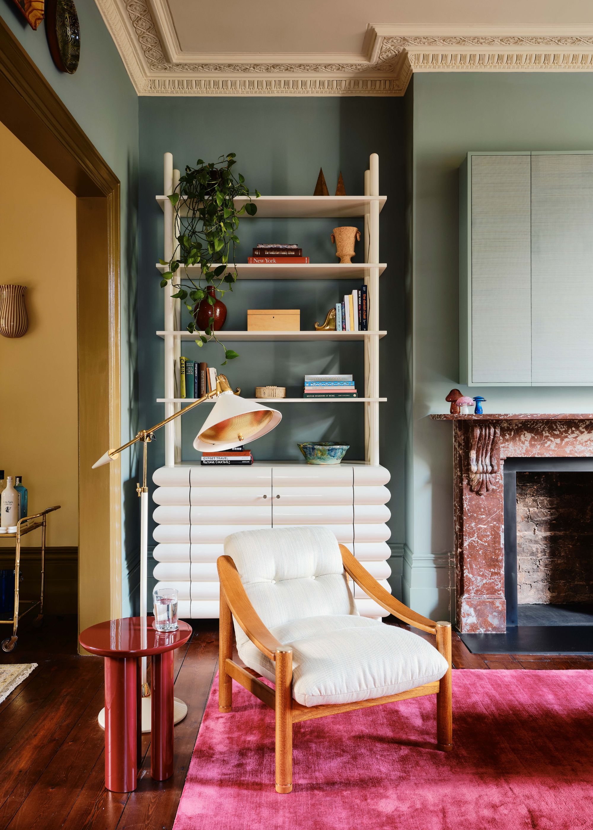
Comprising two sets of complementary colors, tetradic schemes are colorful, but still livable.
"A tetradic color scheme is made up of four colors, essentially two sets of complementary pairs," explains Charlotte Cropper. "That’s why it’s sometimes called a double complementary scheme."
An example is red and green paired with blue and orange. "Because the colors span across the color wheel, this scheme is naturally bold and full of contrast," adds Charlotte.
Since tetradic schemes are innately vibrant, Charlotte says it's important to focus on balance in the interior design. "Choose one color as the protagonist, which will set the overall mood and cover the largest area. This might be your wall color, kitchen cabinetry, or a statement sofa," she says. "The next two colors should play supporting roles, introduced through elements like textiles, painted woodwork, or an armchair. The final color brings in the accents, such as artwork, cushions, or decorative touches, bringing the whole space together."
8. Square Color Harmony
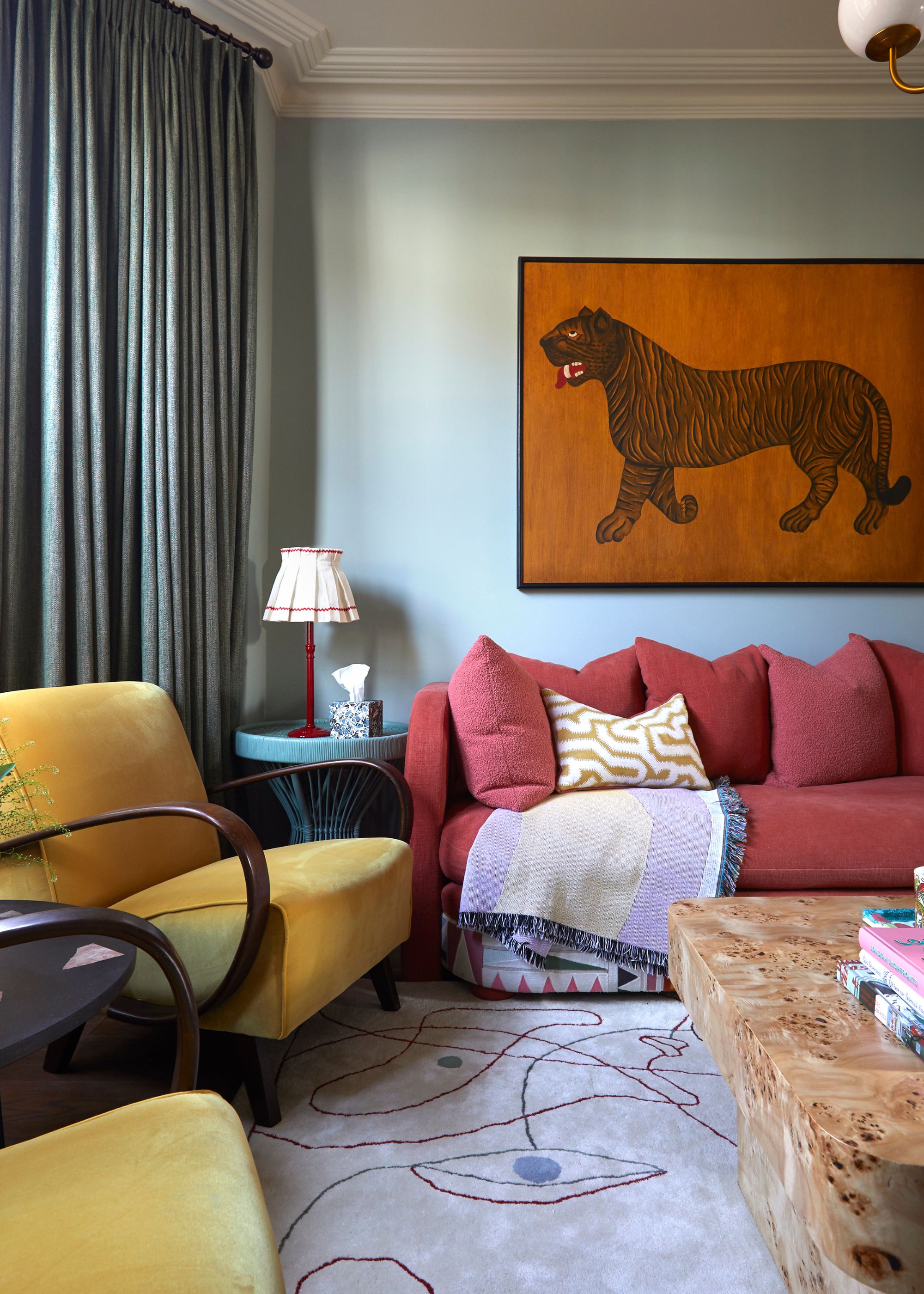
Opt for muted variations of colors to create a calming take on square color harmony.
Lastly, square color harmony, as the name suggests, comprises colors that form the shape of a square on the color wheel.
"Because of the even spacing, square schemes are naturally balanced, but they can also be bold, as they often draw on both primary and secondary colors," Charlotte Cropper explains. "That means you're working with a lot of strong personalities in one palette, which can feel intimidating at first."
"You don’t need to use every color at full volume. Instead, try softening the palette," she continues. "Imagine a pale sage green paired with blush pink, muted blue-violet, and a warm blend of yellow and orange. Suddenly, it’s not loud, but layered and beautiful. Let one or two colors take the spotlight, and allow the others to support in smaller, quieter moments. Square color schemes are wonderfully versatile; they just need a little breathing room to shine."
Understanding color harmony is a crucial step to curated color schemes in your home, and it will give you confidence when decorating. Whether you go for muted shades for a more pared-back look or make a statement with vibrant primary colors, these harmonies ensure cohesion and balance.
When making your original color selections, thinking about color psychology in interior design will help to further guide the mood you want to create in the space.

Emily is a freelance interior design writer based in Scotland. Prior to going freelance in the spring of 2025, Emily was Homes & Gardens’ paint and color editor, covering all things color across interiors and home decor for the Homes & Gardens website. Having gained specific expertise in this area, Emily is well-versed in writing about the latest color trends and is passionate about helping homeowners understand the importance of color psychology in home design. Her own interior design style reflects the simplicity of mid-century design and she loves sourcing vintage furniture finds for her tenement flat.