10 rules to achieve balance in interior design - the secret style sauce which brings schemes together
For calm interiors with visual stability, balance is the go-to design principle for perfect harmony in good measure
The Livingetc newsletters are your inside source for what’s shaping interiors now - and what’s next. Discover trend forecasts, smart style ideas, and curated shopping inspiration that brings design to life. Subscribe today and stay ahead of the curve.
You are now subscribed
Your newsletter sign-up was successful
Just like standing up straight, a great decor scheme requires good balance in its interior design. After all, achieving equilibrium is tantamount to giving your scheme a solid base – one that brings calm stability to various design elements with varying visual weights.
“In simple terms, balance in interior design refers to the visual stability of a space,” says New York-based interior designer Karen Asprea. “Meaning that there is compositional harmony, such as the basic idea of creating symmetry using a straight sofa with a club chair on either side.”
Yes, symmetry is the backbone of balanced interiors. It’s why we often buy living room furniture in pairs, or tuck small tables on either side of our beds. “Never underestimate the power of symmetry in interior design,” says Houston-based interior designer Marie Flanigan. “This essential design element binds various facets of a structure into a single, unified whole. It creates a sense of rational order and calm logic.”
But you can dabble in other types of symmetry — like asymmetry and radial symmetry — while also playing up modern proportions of color, texture, decor and furnishing. To get a handle on balance in interior design, we spoke to experts to get some level-headed advice on this essential principle.
10 rules to achieve balance in interior design
1. Balance starts with symmetry
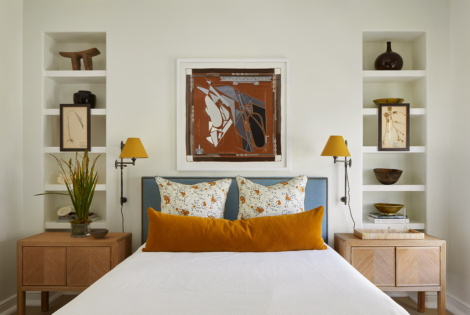
Although classic examples are less popular in modern interior design, symmetry is no doubt the building block of balance. The simple formula creates a mirror image, reflecting design elements (furniture, decor, architecture) on either side of a focal point (like matching lamps on either side of a sofa). And while today’s designers insist true symmetry in interior design can be formulaic and dated, it still has a home in spaces that benefit from a sense of calm, clean comfort.
One traditional setting for symmetry is in bedroom design, like the guest room above designed by New York’s David Frazier. “The architecture of the space really set us up for a symmetrical layout that is a very classic approach to bedroom design,” explains Frazier. “We filled the shelves with interesting objects that give the shelves dimensions and hung antique french botanicals on the outside to give the room and shelving more depth.”
Doubling down on symmetry, Frazier repeated identical bedside tables and dabbled in matching colors. “We also had the custom lamp shades lacquered in the ochre color that shows up throughout the room to unify the bedroom lighting with our color palette,” he says.
The Livingetc newsletters are your inside source for what’s shaping interiors now - and what’s next. Discover trend forecasts, smart style ideas, and curated shopping inspiration that brings design to life. Subscribe today and stay ahead of the curve.
Talise wall sconce, Lulu and Georgia
The simple elegance of this wall light is easy to imagine twice in a room, either side of the bed. Slim and arched prettily like a wilting flower it will be a shorthand to balanced decor.
2. Play with asymmetry
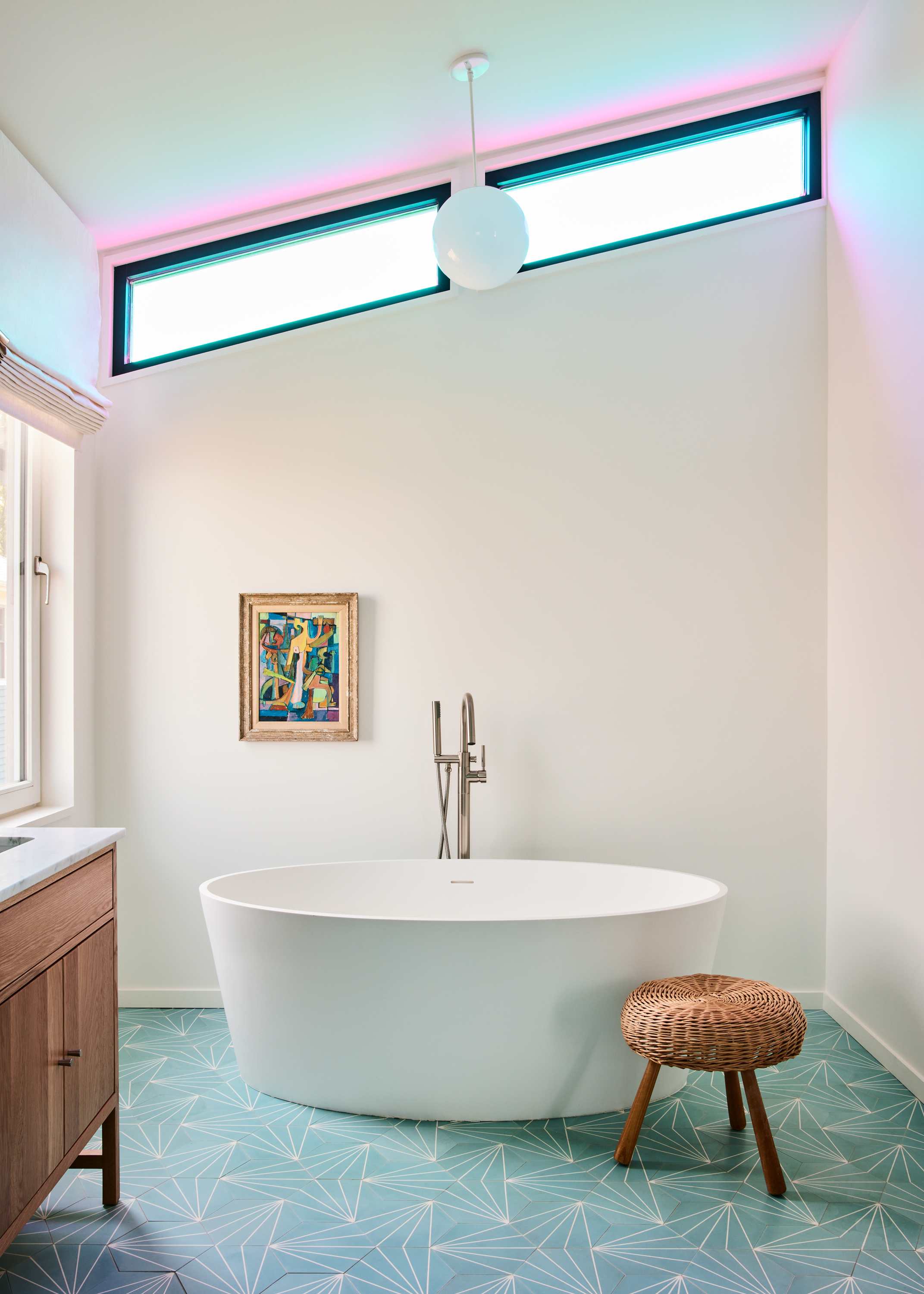
Given that symmetry can feel formal and predictable, you’ll see plenty of asymmetry in modern interior design. With asymmetrical layouts, designers distribute furniture and decor with varying heights and visual weights on either side of a room’s center point or axis; although items don’t need to match, they are equally weighted to create balance.
You’ll find a precise example of asymmetry above, where Miami’s Bunsa Studio used visual weight to keep the modern bathroom in check. “In this bathroom I think the balance is achieved in an asymmetrical way,” says interior designer Jennifer Bunsa. “The painting is off center and the stool is as well – these elements serve to balance each other around the tub.”
This cute little stool could be all you need to help you achieve a balanced look. Pair with an off center painting and away you go.
3. Round out your space with radial symmetry
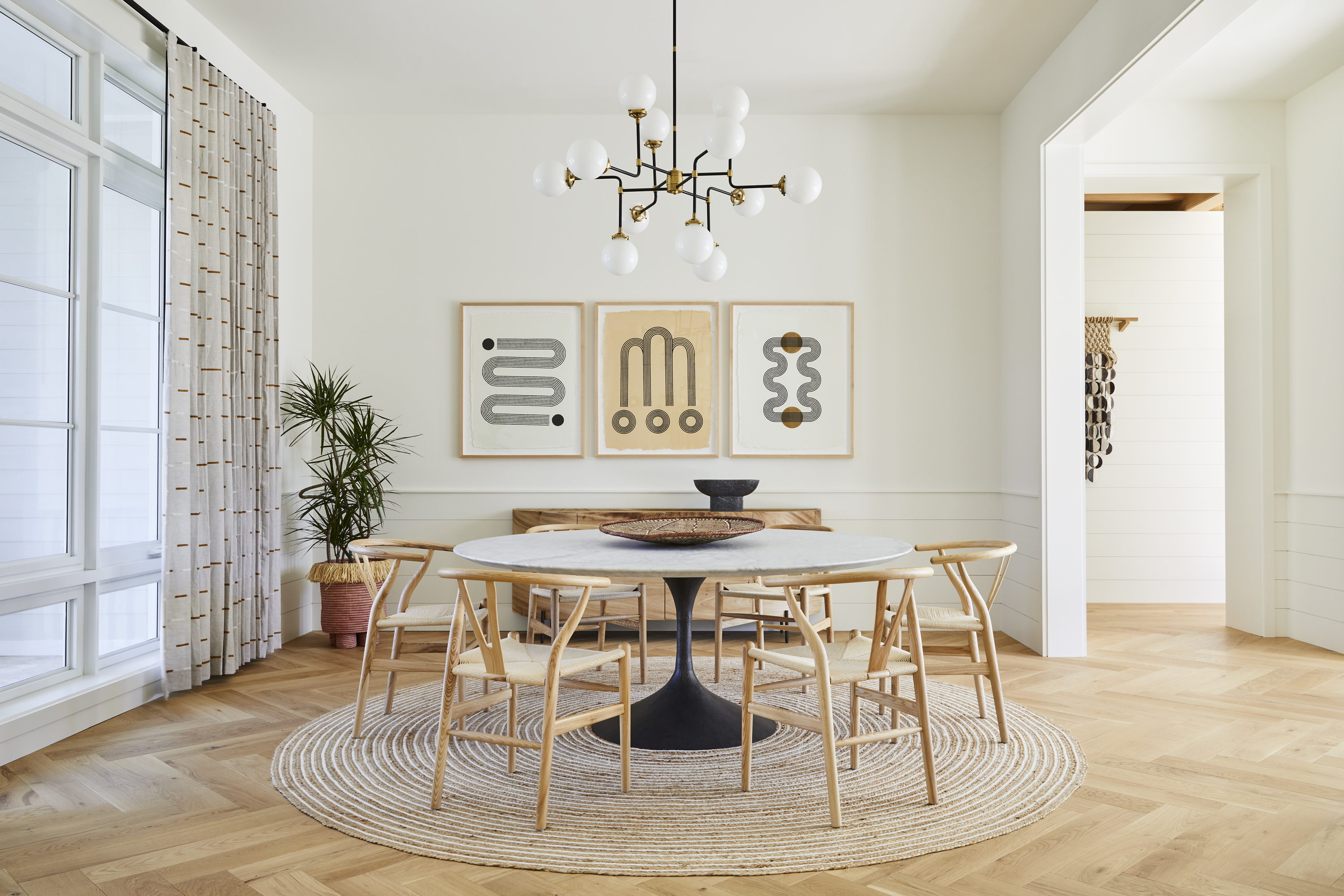
Borrowing a principle from rhythm in interior design, radial symmetry achieves balance by way of a central focal point (such as a chandelier), while other objects “radiate” from the center to create a circular layout or pattern. Like classic symmetry, radial symmetry can lend a formal feel, but can also bring a rather social layout to your space.
In the dining room above, Bunsa Studio leaned into radial symmetry with rounded fixtures and decor surrounding a circular dining table and rug. “We wanted this room to read in a more formal way, as it is part of the wing of the house for entertaining,” says Jennifer Bunsa. “We created the enfilade to the side for circulation and that made the space of the dining room square. The circular table works really well in the square room; this radial symmetry reinforces that formality.”
4. For a cozier feel, aim for modern symmetry
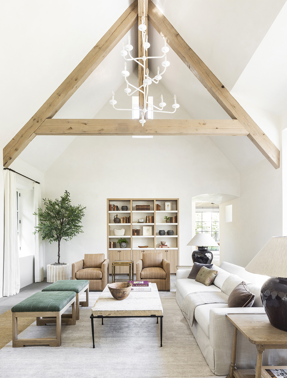
While textbook symmetry looks like a formal mirror image, everyone gets a hall pass when it comes to modern and relaxed symmetry. You can still achieve symmetry even if the elements on either side of your axis aren’t exactly the same – it comes down to balancing varying objects of equal weight, playing with repetition, and using appropriately scaled pieces.
In the soaring and - just about - symmetrical living room above, the softer side of symmetry comes through with ease. “This formal living space is a great way to show and achieve balance without being obvious,” says interior designer Marie Flanigan. “The vaulted ceiling and built-in bookshelves are the main architectural details that set the tone for added symmetry in the soft finishes.” And while the room is not strictly symmetrical, everything else falls into place. “The armchairs, stools and lamps create the necessary effect for the eye to interpret the room as balanced. Lastly, rugs are one of the most foolproof ways to achieve symmetry and balance as they give you a visible area to work within while anchoring a space.”
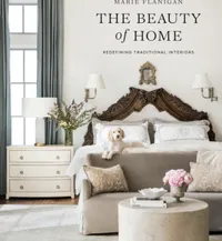
The Beauty of Home: Redefining Traditional Interiors by Marie Flanigan
Quoted above - and very regularly across Livingetc - designer Marie Flanigan knows exactly just how to put a room together. This beautiful coffee table book is full of inspiration and information, a perfect place to start when redecorating a scheme.
5. Give your interior levels
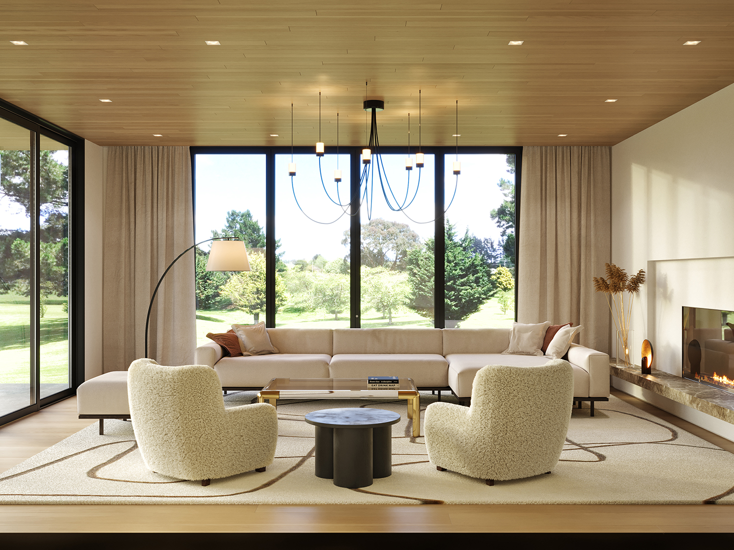
When you think of a balanced scale, you likely picture a leveled object – but interiors have multiple levels to consider when creating top-to-bottom balance. In other words, picking and arranging furniture and decor with varying heights helps evenly distribute visual weight throughout open space.
You’ll see this concept in practice in the above family living room, where New York’s Karen Asprea Studio chose fixtures and furniture (a metal chandelier, a bronze floor lamp, and a circular table) with complimentary silhouettes and materials to create visual interest from floor to ceiling.
“These three elements were purposely placed at the highest point in the room, the midpoint and the accent table at the lowest point,” explains interior designer Karen Asprea. “Each of these darker elements create contrast against the cream tones, and a bit of playfulness with their organic shapes, all grounded by the area rug which ties the elements of the room together.’
6. Balance your colors
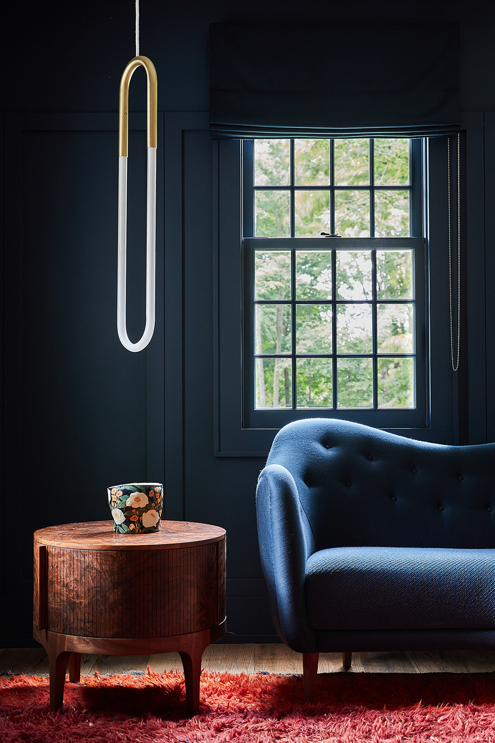
When it comes to creating balance, a touch of color theory goes a long way. And even if you don’t have an eye for color, there’s an easy way to measure your proportions: the 60-30-10 rule is a go-to trick for balanced colored schemes. The formula recommends that your space be 60 percent one color (like your walls), 30 percent complementary color (large items like chairs, rugs, and sofas), and 10 percent accent color (small items like artwork and accessories).
And while rules are made to be broken (especially if monochromatic color schemes have anything to say about it), you’ll find this golden rule in action above, where a handsome sitting area is in perfect harmony. “We love to play with color in our practice,” says interior designer Jennifer Bunsa. “Here we have the blue sofa and room balanced by the brown burl wood of the side table and the reddish brown rug on the floor.”
7. Think of negative space like visual weight
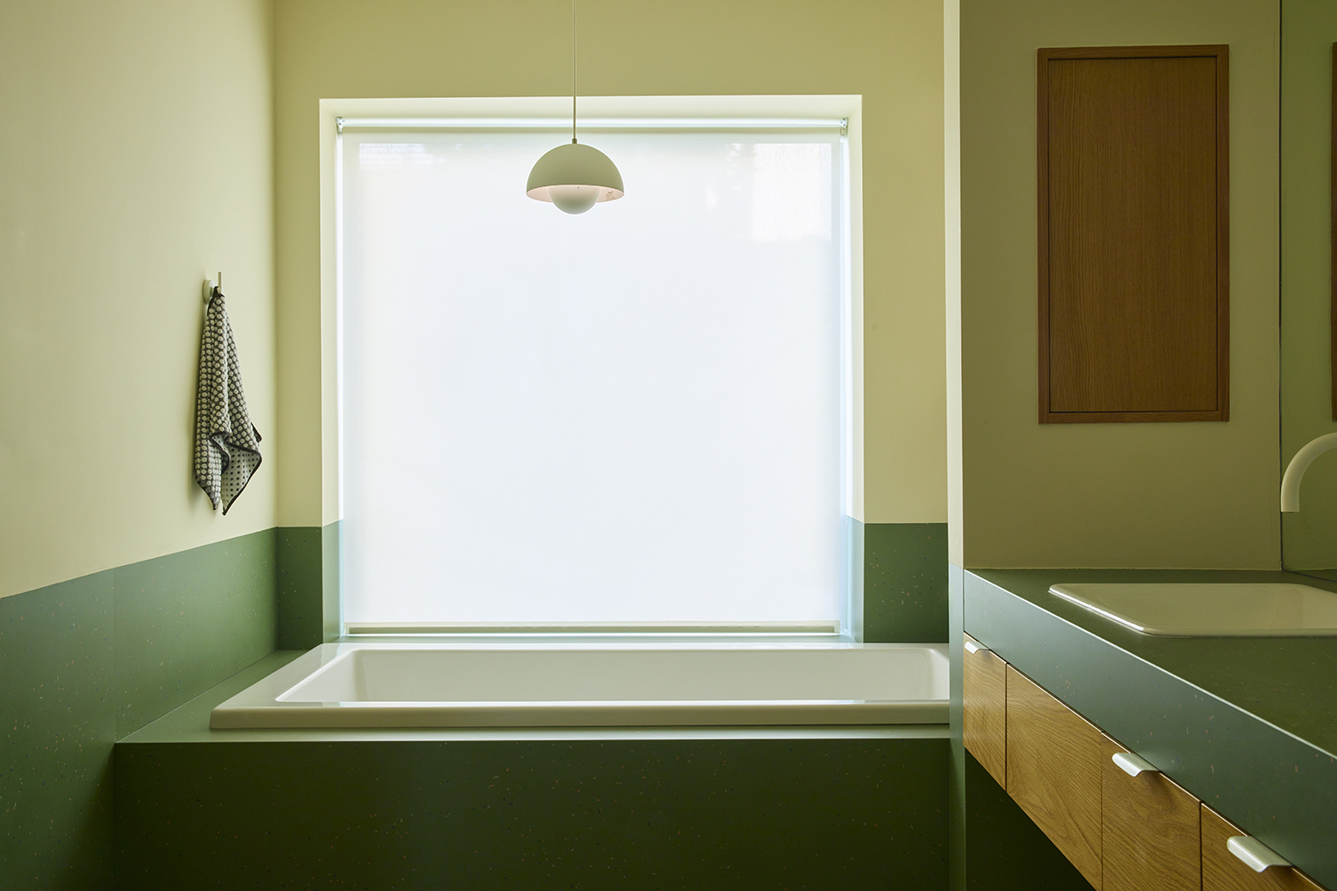
With so much talk of using visual weight to create balance, incorporating weightlessness is just as important. Negative space can help balance out areas with more visual weight and decor, creating harmony between heavy and light areas of your design – think of it like breathing room, a place for your eye to take a break.
In the bathroom above, And And And Studio anchored the lower part of the room in large format green tile that reads like modern wainscoting, while the remainder is full of negative space. “That space is really about having one clear and legible idea – for this space it is that the bottom half of the room is almost ‘dipped’ in a different material,” says Daniel Rabin. “In terms of using negative space, it really is about balancing all of the elements in the space, those that are functional, those that are beautiful, and those that are necessary so that it all works together to allow the idea to be legible.”
8. Balance old and new
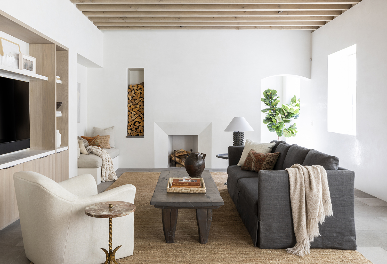
Another way to achieve balance is to combine different styles; from eclectic style to transitional style, the goal is to balance both old and new furniture and decor. “I always think it’s important for a room to feel as if its contents were collected over time,” says interior designer Marie Flanigan. “The best way to achieve this aesthetic is to include both new and antique pieces in your space.” Of course, this doesn’t mean you have carte blanche to fill your space with clutter – combining two different styles is all about careful curation.
In this transitional-style living room, a neutral palette and contemporary furniture gets balanced out with more classic silhouettes and timeworn textures. “I often know that my soft furnishings will be new or custom pieces,” says Flanigan. “With that in mind, I can determine what else will be in the room and what antique elements would contribute to the space.” To that end, Flanigan recommends peppering your space with antique accents (think rugs, pillows, lamps, mirrors, and more)
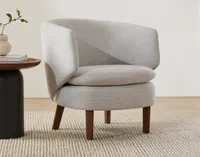
Crescent lounge chair, West Elm
With its generous proportion and modern rounded shape, this simple lounge chair captures the look of Marie's living room perfectly. It's contemporary, it's organic, it's soothing, it's...balanced.
9. Use texture to smooth out layered interiors
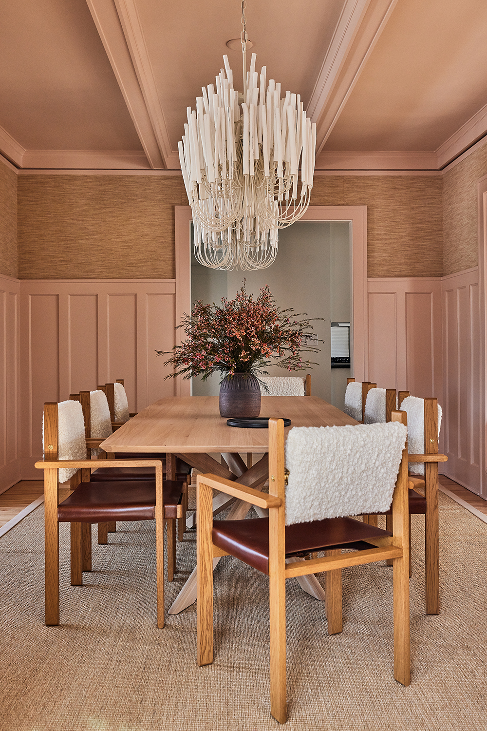
Another way to create balance happens to be superficial: creating a layered look that doesn't fall flat often requires a range of textures, fabrics, and finishes. So, if you have a room that’s dominated by smooth and soft surfaces, consider adding contrasting visual textures (like a coarse jute rug or a textured wallpaper) to inject depth and variation into your space.
In the above dining room, designer Anne McDonald paired hard architectural details (like wraparound wainscoting and beamed ceilings) with soft textures to strike the perfect balance. “The base of the table relates back to the lines of the lighting, but with the balance of that seat back fabric, along with the paint color and then the really soft, almost fabric-like linen texture that we chose for the wallpaper, you have something that just feels like a hug,” says McDonald.
10. Mix shapes and silhouettes
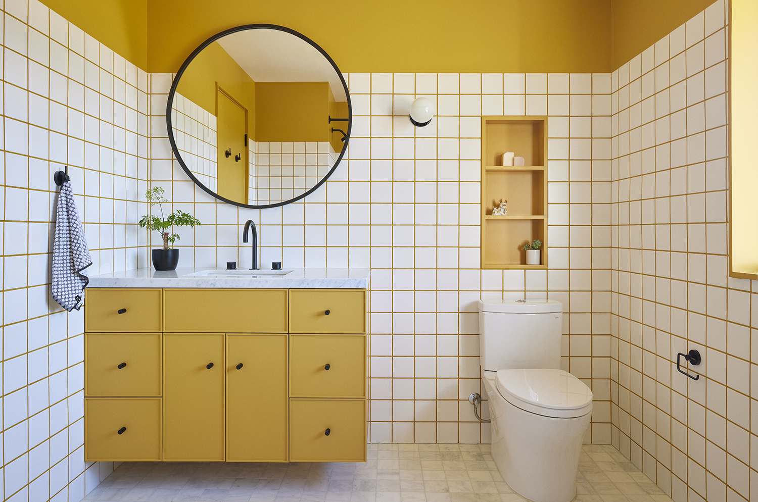
This may be one of the few times that a square peg fits perfectly well with a round hole, but you can achieve balance in interior design by playing with different shapes in one space. The idea goes back to contrast: if your interior is dominated by right angles and straight lines, rounder shapes and silhouettes can help balance it out. Like the mirror next to the blocky bathroom tiles and cabinetry.
According to Daniel Rabin, a principal at And And And Studio who helped design the bathroom above, there are a variety of ways to use shapes. “Spatially, like a round room, can be very subtle,” explains Rabin. “Graphically, like in the image [above], we tend to try and limit the number of elements within the space in order for the graphic nature to read.”
It also helps, according to Rabin, to limit the number of elements in the room to help graphic shapes pop. “The limited elements allow that pattern to be read clearly and not lost in a sea of competition,” he says.
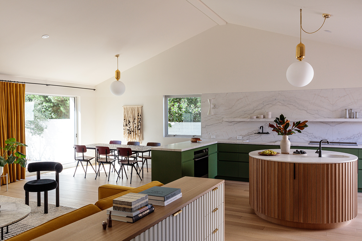
11. Tackle balance in open spaces with zoning

While creating balance in one confined room is complicated enough, what about interiors without walls? Open spaces require additional planning to balance a variety of design elements, and perhaps the easiest way to create order is through zoning. “It is important when working on an open floor plan that all the different programmatic elements retain their own space,” says Daniel Rabin, a principal at And And And Studio. “You may not have physical walls, but different spaces can be defined by lighting, furniture, and even just good layout.”
In the open plan kitchen above, several living spaces balance each other out with clever zoning, applying tricks like zoning with color while repeating shapes and textures to tie each space together. “While everything may be open to one another, there are clearly felt areas between living room, dining room, kitchen and whatever else may be in the space,” says Rabin. “In terms of palette and overall atmosphere, things should just work together – whether by materials, tones, or color.”
Keith Flanagan is a New York based journalist specialising in design, food and travel. He has been an editor at Time Out New York, and has written for such publications as Architectural Digest, Conde Nast Traveller, Food 52 and USA Today. He regularly contributes to Livingetc, reporting on design trends and offering insight from the biggest names in the US. His intelligent approach to interiors also sees him as an expert in explaining the different disciplines in design.


