This Is When It's a Mistake to Use Color Theory to Decorate Your Home — "It Can Quickly Become a Distraction"
While it's a good idea to take inspiration from, is navigating the complex rules of theory around color more trouble than it's worth?

The Livingetc newsletters are your inside source for what’s shaping interiors now - and what’s next. Discover trend forecasts, smart style ideas, and curated shopping inspiration that brings design to life. Subscribe today and stay ahead of the curve.
You are now subscribed
Your newsletter sign-up was successful
Most selections you make for your home involve a color choice. The right paint for your walls, fabric for your sofa, even a detail as small as your cabinet pulls. And when you're starting from a blank canvas, those choices involved can be overwhelming.
That's why we use things like the color wheel in interior design, right? Well, maybe wrong. When speaking with interior designer and color expert, Maria Killam, recently, she shared that she actually avoids strict theory like that when choosing colors for her interior projects.
"Looking at the conventional color wheel to begin creating a room is like trying to look into a crystal ball," she explains. Instead, she "approaches creating a room from a much more practical process."
Article continues belowAnd while my fine arts degree shuddered at the thought, my curiosity certainly piqued. Could color theory be holding us back? Is there, like most things, a certain time and place? I asked color experts — here's what they said.
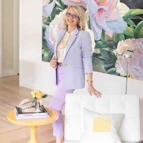
Maria Killam helps homeowners and designers create beautifully decorated spaces, by learning how to use color, the right way. Decorator, stylist and educator on all things color, Maria is also the creator of the 'Killam Color System' and what she calls the 'Neutral Color Wheel'.
When Should You Avoid the Theory Around Color In Interiors
So, are we to believe that the same rules designed to help guide us, could also be leading us astray? "While traditional color theory names a range of color relationships that can be created, the truth is, these labels, like 'complementary', 'split complementary triad', and so on, become easier to identify and label after a room has been created," says Maria Killam.
What she means by this, is that when you're in the initial stages of designing a space, sticking to strict 'designated' color combinations may really just restrict you. At the end of the day, it may be better to choose a paint color or a shade of rug because you want to, not because a rule says you should.
Livingetc's color expert, Amy Moorea Wong, helps clarify the concept for me, explaining that the theory "is helpful, but it can quickly become a distraction." It's often when you break the rules that something truly magic happens. In saying that, "I do think it’s absolutely worth glancing back at when you need a starting point or nudge forward," notes Amy.
The Livingetc newsletters are your inside source for what’s shaping interiors now - and what’s next. Discover trend forecasts, smart style ideas, and curated shopping inspiration that brings design to life. Subscribe today and stay ahead of the curve.
Below, Amy and Maria share the times it may be best to abandon the rules.
When You Want Your Decor to Do the Talking
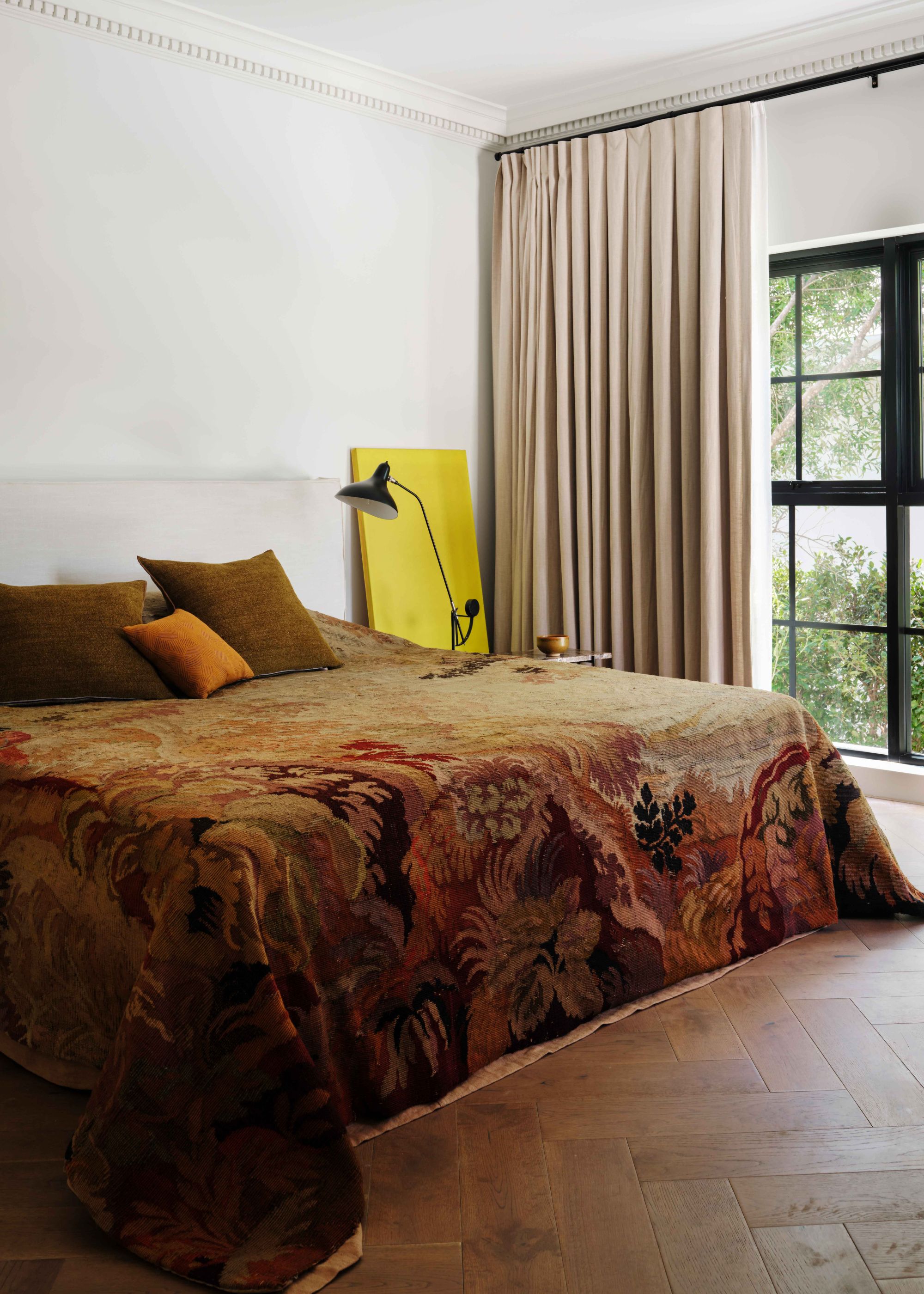
The centerpiece of this bedroom is the bedspread. Then the accent pillows, artwork, and curtain color are all colors pulled from the pattern.
"Decorating a home is so much about the people within it, how they use the space, how they feel in the space, and their personalities and preferences," says Amy. It would be a shame, then, to discount someone's favorite rug or beloved patterned sofa simply because it doesn't work with the color palette.
Instead, build your space's story around these pieces. "I may not even acknowledge the color wheel if I’m working in a space filled with beloved treasures and personal expression," admits Amy.
So, if not with theory, where should you start when designing a space? "I bounce off existing pieces the person owns, be it art, rugs, what’s in their wardrobe, or other spaces they like to be in," says Amy. "This is where the palette tends to begin."
As for Maria's method: "Start by choosing a fabric or patterned area rug that relates to the color constraints of your room. An ideal starting point is a fabric that pulls in the colors of those décor pieces that you love, along with another color or two to use as accents," she says. Then, incorporate other moments that repeat those colors.

Amy Moorea Wong is a color authority and contemporary interior design writer who has specialized in all things decorating for over a decade. Alongside being Livingetc’s Color Expert, she also regularly contributes to an array of global publications to share her insights on the interior design zeitgeist. Amy has a book Kaleidoscope: Modern Homes in Every Colour, that explores a collection of cool, colorful homes fizzing with creativity, surprises, and inspiration, from the bold and bright to the delicate and demure.
In Neutral-Based Rooms
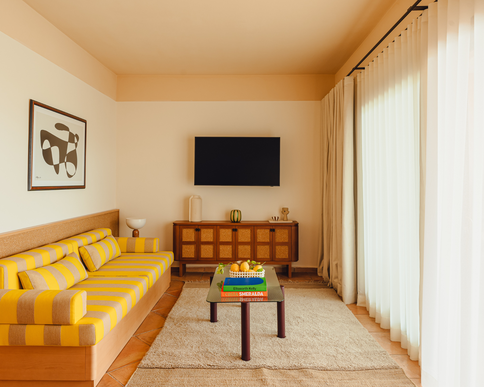
This living room is mostly decorated with a warm neutral base. The yellow in the sofa elevates that warmth and the deep blue coffee table book pops.
"A major flaw with basic color theory is that the primary color wheel tells you nothing about how to work with complex neutrals or the nuances of whites," explains Maria. "And neutrals and whites are what make up the majority of color selections in most homes."
It's true. When you look at a primary color wheel, you are confronted with bright, saturated hues that may not accurately reflect the exact shades of your space. If your home is made up of a predominantly neutral color scheme, is it really worth getting caught up in these bold, energetic colors? Perhaps not.
Instead, Maria prefers to hone in on neutrals specifically to weed out all the unnecessary fluff. "My system is based on identifying the nine most useful undertones of neutrals and the four most useful types of whites to dramatically simplify color choices in a simple, practical way," she says.
With a curated and categorized list of how to choose neutral paint, you don’t have to consider every color in the deck to pull your room together. So, rather than getting lost in theory, if your style leans more minimalist, try focusing instead on the warm and cool undertones of neutral paint colors first. Small pops of color, if any, can come later.
To truly master color, it takes creativity, the willingness to push the boundaries, and ultimately, a joy for what you’re doing. It also takes time.
"Dig into what you want and how you feel, really examine the space, get to know the light, research rooms that reflect some of your ideas, test paint colors and materials, and pull it all together," says Amy.
And importantly, remember that navigating color trends doesn’t need to be complicated, abstract, and mysterious. It can be quite simple when you know how to use the right approach, whatever that may be for you.

Olivia Wolfe is a Design Writer at Livingetc. She recently graduated from University of the Arts London, London College of Communication with a Masters Degree in Arts and Lifestyle Journalism. In her previous experience, she has worked with multiple multimedia publications in both London and the United States covering a range of culture-related topics, with an expertise in art and design. At the weekends she can be found working on her oil paintings, reading, or antique shopping at one of London's many vintage markets.