Wall color combinations – 8 ideas for mixing hues that will flatter your home
Try these wall color combinations, from the unexpected fusions to the classical pairings, for paint, wallpaper and paneling

The Livingetc newsletters are your inside source for what’s shaping interiors now - and what’s next. Discover trend forecasts, smart style ideas, and curated shopping inspiration that brings design to life. Subscribe today and stay ahead of the curve.
You are now subscribed
Your newsletter sign-up was successful
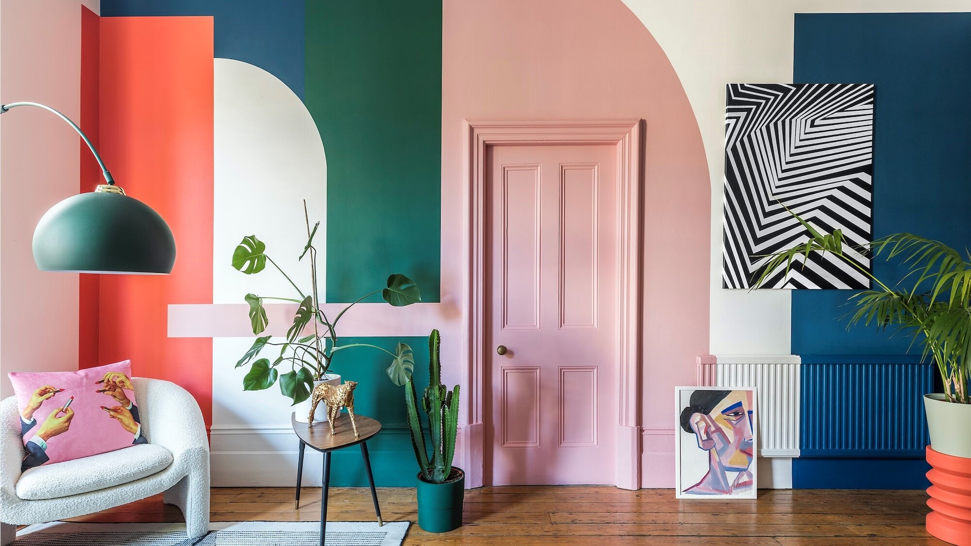
There are infinite possibilities when it comes to wall color combinations. From traditional schemes and classic combos, to the outright zany, your walls are there to put your stamp on and your home is a place where you can be inventive and think creatively.
‘We typically think of walls as a blank canvas - you need to do something with it and sometimes a white wall is not always the answer,’ says Frederick Tang of the Brooklyn-based architecture and design studio.
Color also feeds into the mood of a room and using color proudly and playfully can enhance the feeling a room evokes. Emma Bestley, creative director at Yes Colours has noted joyous bold hues trending in paint color ideas, and puts it down to the Wes Anderson effect. 'Consumers using peaches and pinks alongside olive greens, verdant aquas and plummy pinks. Contrasts and expressive combinations lend themselves to rooms of pure delight.'
Article continues belowIf you want your space to provide a feeling of tranquillity, choose less intimidating color groupings from the same family. 'Pair neutral warmer creams alongside yellow and pinks for a nurturing, comforting palette, or move towards cooler green colors and greys, making a soothing, cocooning palette.' Whatever mood you're looking to create with your color scheme, these are the color combination to help you achieve it.
Wall color combinations to experiment with in your home
Also consider how to implement these colors into your scheme. Feature walls can work well for a bold and impactful look, ceilings are an interesting place to add color, or go monochromatic. 'Color blocking is still the coolest way to paint a wall,' says Annie Sloan, founder of paint brand Annie Sloan.
'Limit yourself to one color group and work with three or four closely related shades from that group. Use them together in well-defined geometric shapes; repeat squares or circles and don’t blend colors. For me, this works best with spicy shades.' However you want to experiment, these are the color combinations to try.
1. White and green
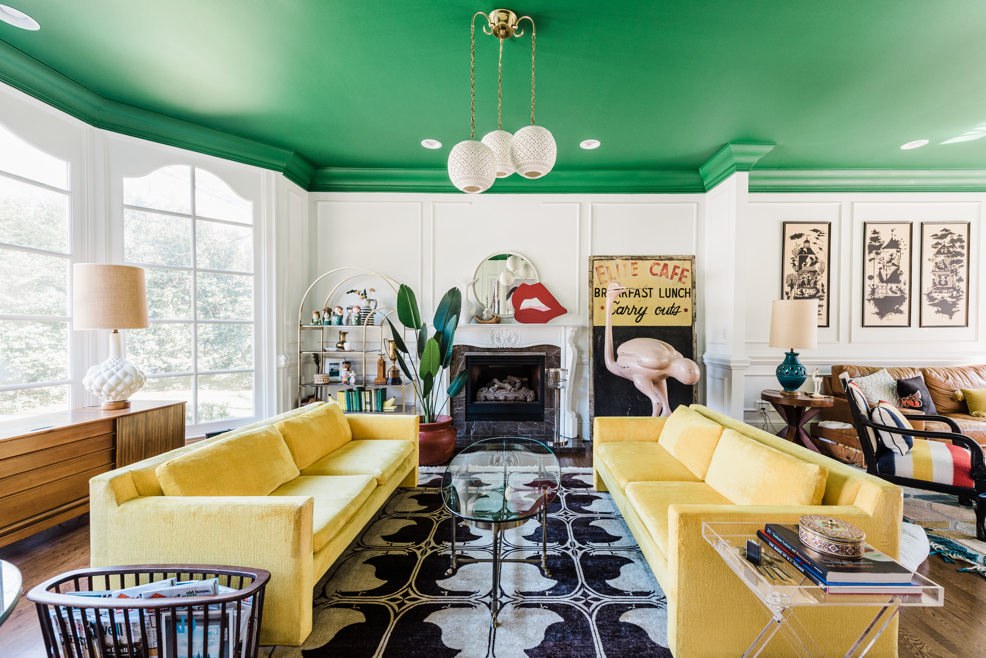
For a vibrant yet soothing effect, white is the perfect color that goes with green. Natalie Papier of interior design company, Home EC opted for this choice in her own home, choosing to paint the ceiling in color and keeping the walls pared back. 'I am a color-lover but to keep the open flow of our home from becoming too overwhelming, I chose to incorporate bold color on the ceilings downstairs.
The Livingetc newsletters are your inside source for what’s shaping interiors now - and what’s next. Discover trend forecasts, smart style ideas, and curated shopping inspiration that brings design to life. Subscribe today and stay ahead of the curve.
'This keeps the walls cohesively fresh and white throughout the main public spaces. By keeping the walls white throughout, the painted ceilings add an element of drama and fun to the formal architecture.
'This space in our home is used as a lounge. Sometimes we turn on our records, have a drink and relax and other times we enjoy our morning coffee in front of the fire. The white walls help keep the room fresh and calm as a space to unwind but the addition of the bold green ceiling evokes a powerful energy to recharge and inspire creativity.'
When using white to make the secondary color really pop, be wary not to use a stark white. 'I never pair brilliant white with other colors,' says Francesca Wezel, founder of Francesca's Paints. 'I find it is too harsh and cold. If I use white, I always add a subtle addition of my favorite pigments like raw and burnt umber or yellow ochre to achieve warmth and depth and ultimately to add more visual interest.'
2. Blue and pink
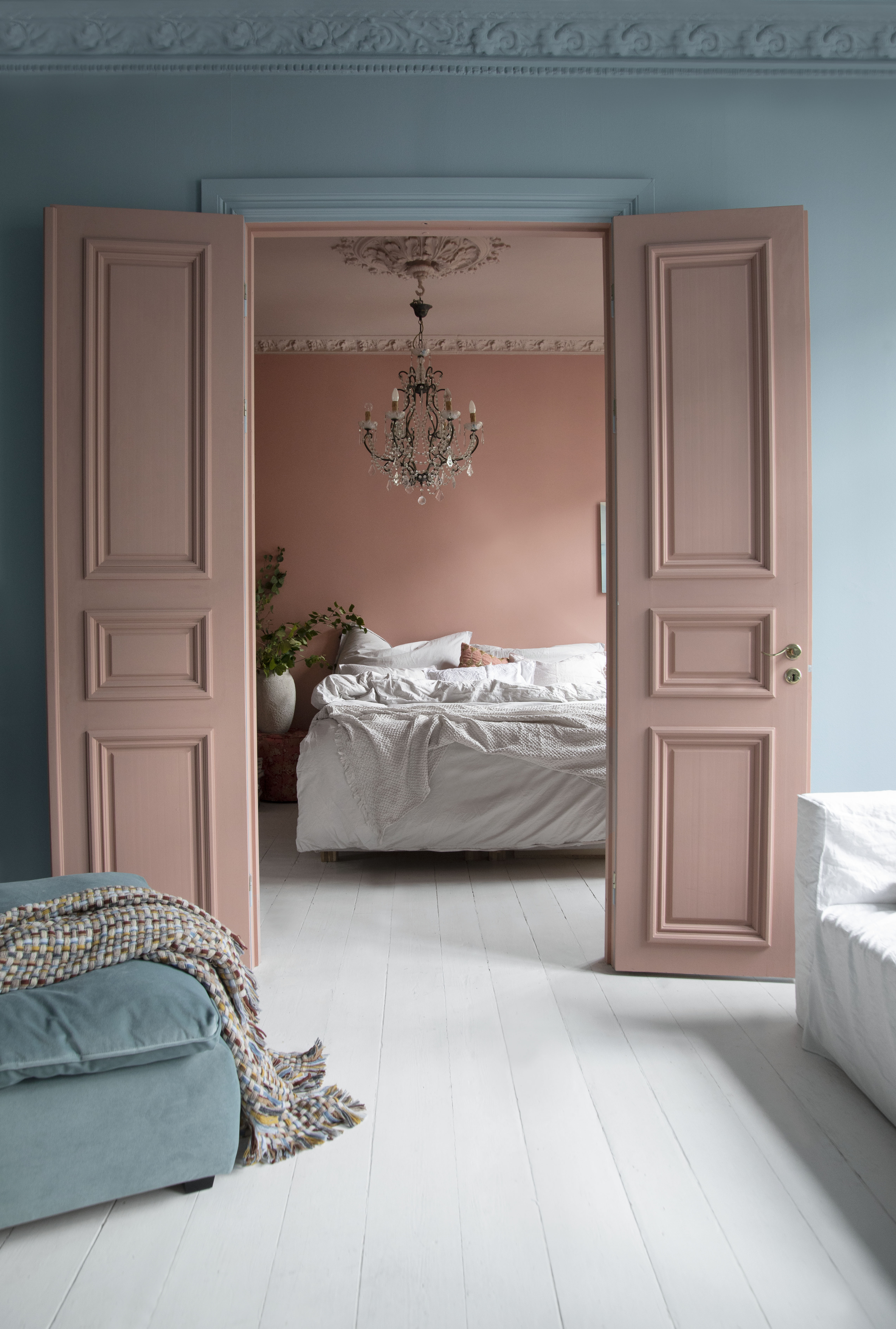
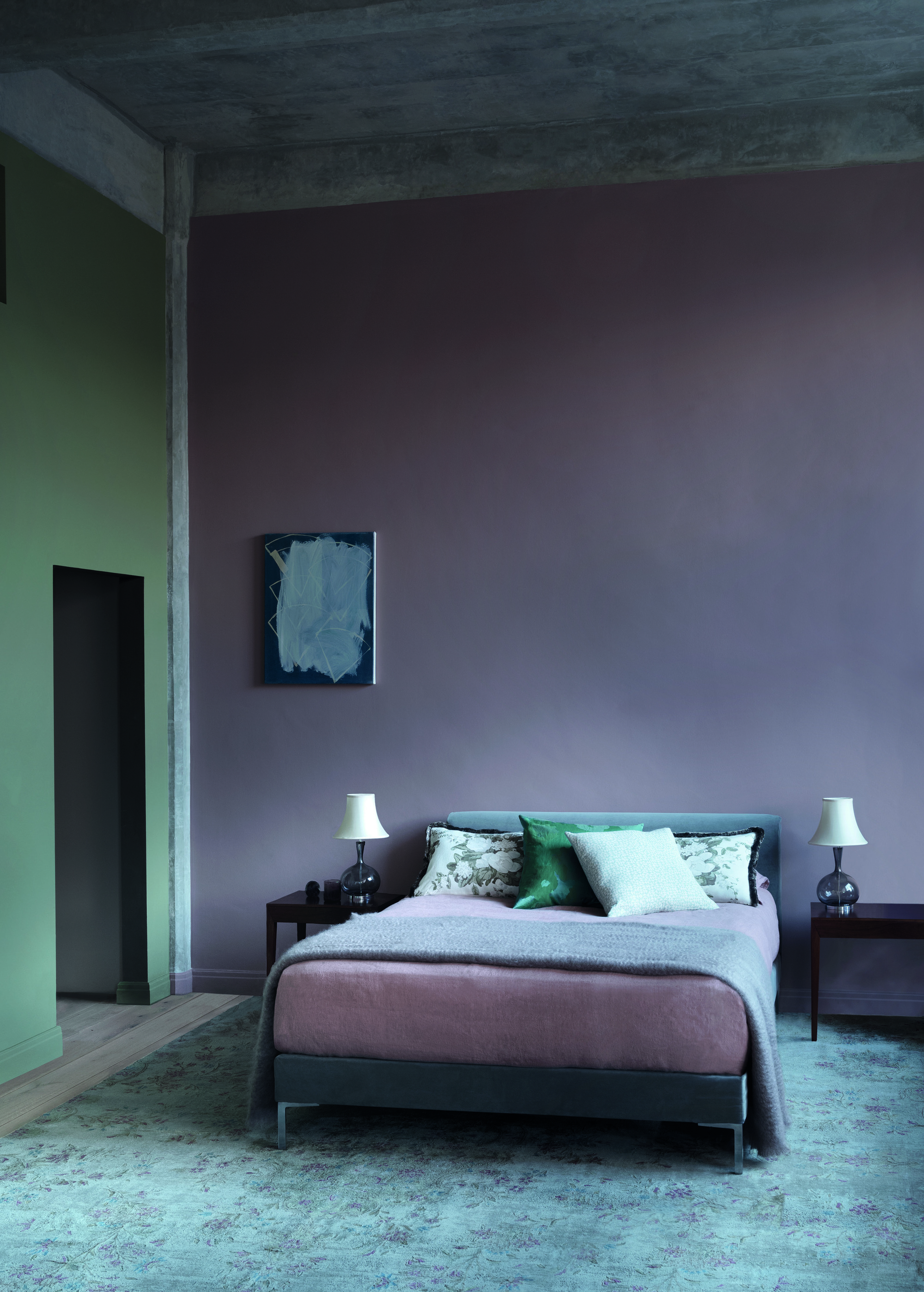
If you're looking to choose a cool color combination for your home, a simple and soothing pink and blue scheme works when the colors are in their muted forms. In this instance, by interior architect and designer Tone Kroken, a pale blue wall and doorway give way to the dusky pink sanctuary-like bedroom.
The color combination forges a calm and peaceful feel for the bedroom and the pink of the onward room beckons with the bed at the center of the space. These pastel tones are polar blue and skin powder, both from Pure&Original.
3. Orange and pink
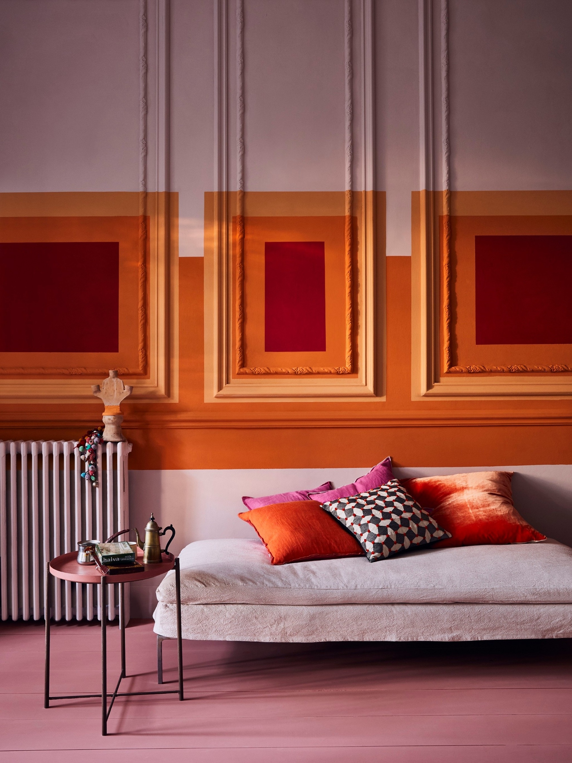
For an energetic look, pink is an unexpected color that goes with orange that can work wonders for adding interest to your scheme. Use a vibrant yet earthy hot orange as the main focal point in a scheme and embrace the energy of the hue. 'Splash around with other spicy shades for a fiesta of color,' encourages Annie Sloan.
'I love pairing Barcelona Orange with my rich, wine-red Burgundy and earthy Scandinavian Pink for a delectable, salacious, mouth-watering hit of colour,' she adds.
4. Purple and beige
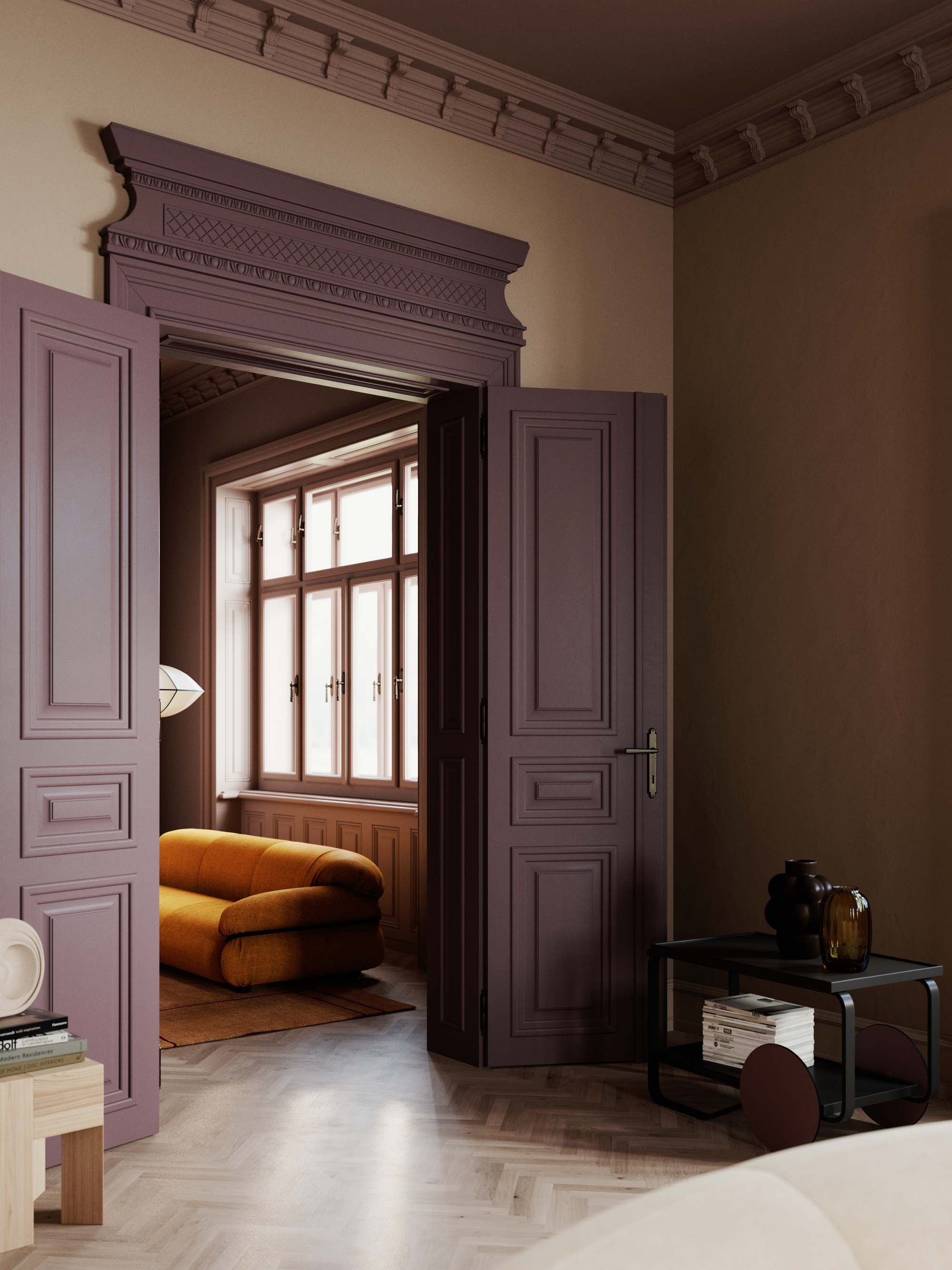
In this room painted in shades from Notes of Colour - the Scandinavian paint brand - the shade Berry Moment is painted on the door, highlighting the architectural features.
See You Cigar used on the walls, and has a sandy tone that lets the dark purple of the door really stand out.
'Berry Moment and See You Cigar work perfectly together to create a warm and intimate room. Darker colors are the perfect choice in bigger rooms, as it gives the shadow room to play which will make a playful and delicate color combination any time of the day, says Stefani Arsovi of Notes of Colour.
5. Black and white
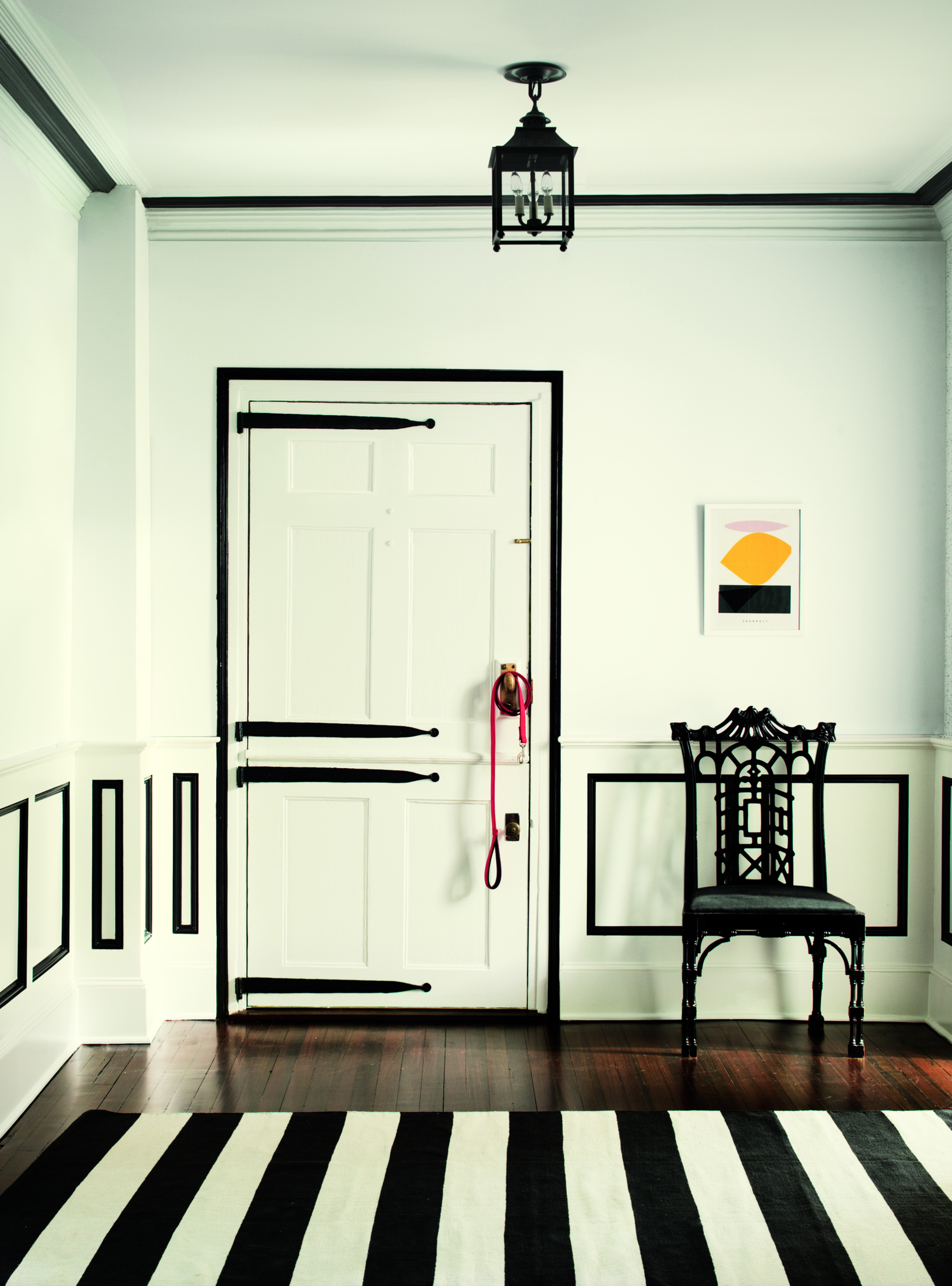
For a classic monochrome look, try black and white together on your walls, creating the ultimate in contrast. Embracing a monochrome scheme is a fantastic way of creating a chic, minimalist base to a room that can act as a versatile foundation for eclectic, colourful accessories and furniture.
'A monochromatic scheme can be used to create an impactful style,' says Helen Shaw of Benjamin Moore. 'Black and white used in tandem is the most straight-forward, eye-catching effect. Black paint used in excess can dwarf a small space but is a fantastic choice for tying together a large open space and creating a cosy look.'
In this black and white living room, the trim has been painted to provide a dramatic accent on the walls. 'If working in a small room, embrace a clean white colour scheme to open up the space, then use accents of black on panelling, skirting boards or as a linear divide to the room to make a real statement.'
6. Yellow and white
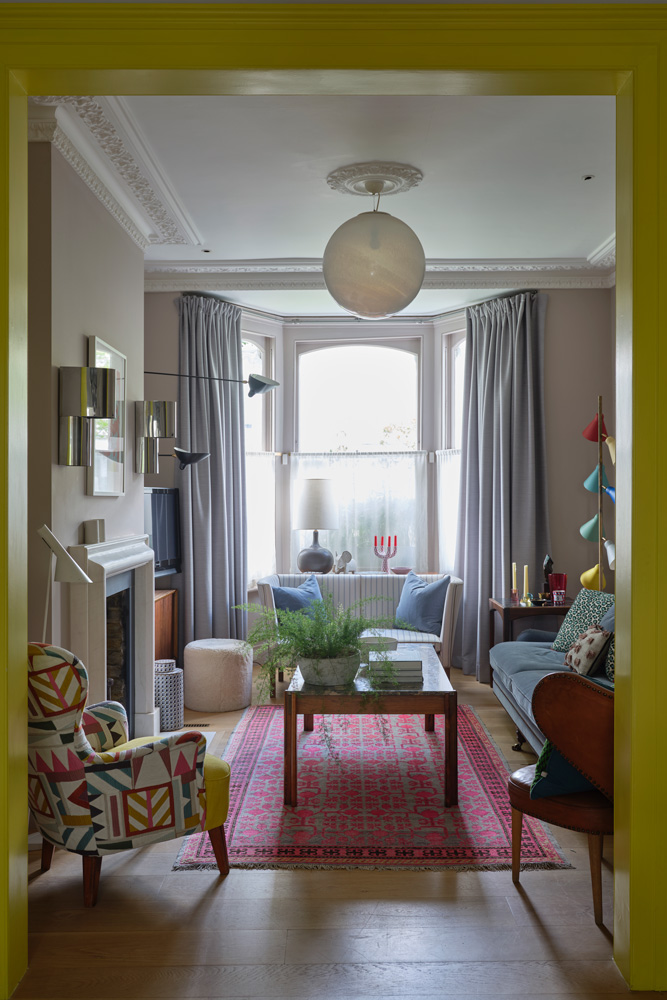
A bright yellow and white scheme make for an uplifting and joyous combination in this example from designer Suzy Hoodless. The idea was to bring some excitement with a flash of colour dividing the area in a home with low level natural light. 'It’s uplifting and uncompromising, but also neutral. I think spaces need to be pushed – to have a rhythm and pace to them – and that’s what this yellow is about,' Suzy explains.
Suzy’s eclectic, yet simply curated living room also includes a 20th century Chinese rug purchased at Talisman Showroom, sitting next to the modern geometric patterns of the La Maison Pierre Frey fabric on the chairs. Pulling it all together is the bold yellow architrave in Trumpet yellow by Little Greene - a playful doorway leading you into the room.
7. Red and blue
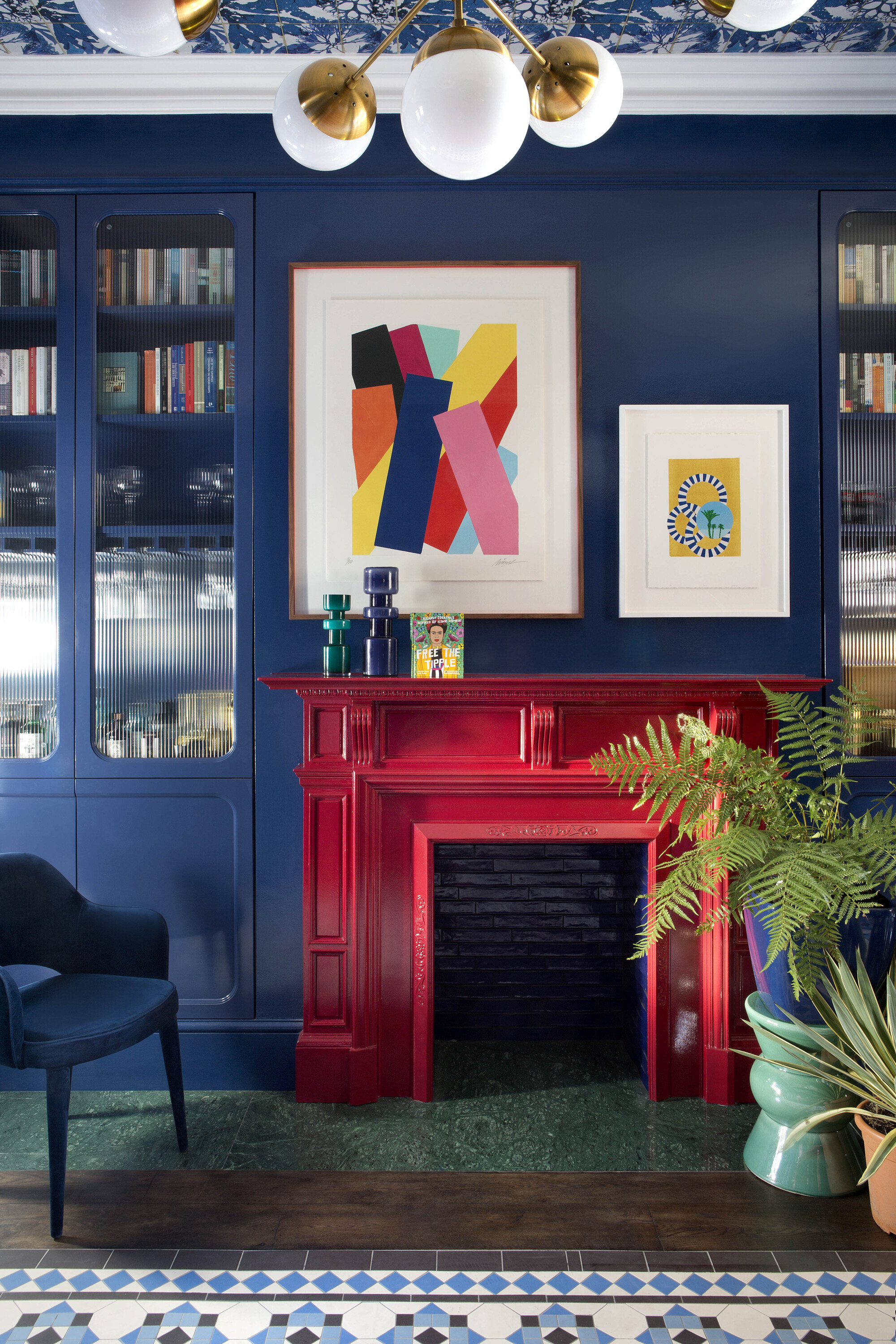
A deep blue and a bold red are two colors that work well together. In this example, designed by Kingston Laffery Design, award-winning interior design house based in Dublin, the brief was for the dining room to really create wow-factor and the designer delivered with this vibrant fireplace idea. 'The client loves to entertain and wanted to have a space that was vibrant and energetic and really felt like you were stepping into something special.'
'The primary colours deliberately clash with the red fireplace set against the blue chimney breast and storage. These bold colours are grounded by the rich timber tone of the floor and the green marble hearth with the colour from the artwork and the patterned wallpapered ceiling giving that extra injection of colour.'
8. Pink and green
Pink and green is a much-loved combination that has been popular for some while. Here, Paint and Paper Library have painted two contrasting walls in shades named Rouge II and The Botanist. 'By introducing a different color to one wall in your space you can create a sophisticated, balanced focal point that will expand your room's color palette,' says Andy Greenall, head of design at Paint & Paper Library.
'Bring extra depth to your scheme and make it easier to coordinate fabrics and furnishings. Despite being from opposing ends of the color spectrum, a soft warm pink such as this works beautifully with the green - an elegant and natural shade with a dash of red that makes it a tranquil partner to warm neutrals, soft pinks and rich browns.'
How to use paint on your walls in a bold way
There is a great move towards using paint and colour in more unusual combinations, so get clever with your scheme and create combinations in fun and interesting ways. 'Checks used on floors and walls are very popular, particularly red and white combinations. Strong colours will be used on the bottom halves of walls with a white above to open up spaces and have an old school feel,' says Joa Studholme of Farrow & Ball.
'Lots of colour will be used on woodwork alongside white walls to create charming rooms that feel very friendly. For instant impact use lively yellow Babouche on windows and their reveals so the light reflected back into the room has a sunny hue! Doors to the exterior work fantastically when painted in cheerful Breakfast Room Green, a botanic shade that simply invites you into the garden before you have even got there. And of course, colour will be taken onto the ceiling to create really cohesive schemes and to mimic the modest homes of days gone by.'
Alternatively, paint the skirting and doors in a different color from the wall to create definition. 'For example, where there is a dado line, I like to put a strong colour on top and a neutral tone on the bottom, to balance it out. It makes the space look softer and can often increase the illusion of height within a room,' says Francesca Wezel of Francesca's Paints.

Former content editor at Livingetc.com, Oonagh is an expert at spotting the interior trends that are making waves in the design world. She has written a mix of everything from home tours to news, long-form features to design idea pieces, as well as having frequently been featured in the monthly print magazine. She is the go-to for design advice in the home. Previously, she worked on a London property title, producing long-read interiors features, style pages and conducting interviews with a range of famous faces from the UK interiors scene, from Kit Kemp to Robert Kime. In doing so, she has developed a keen interest in London's historical architecture and the city's distinct tastemakers paving the way in the world of interiors.