How Does Lighting Affect What Your Paint Colors Look Like? Here's What You Need to Know to Strip Out the Guesswork
Understanding undertones and sampling with paint swatches is the easiest way to work out exactly how a paint will look in your space

The Livingetc newsletters are your inside source for what’s shaping interiors now - and what’s next. Discover trend forecasts, smart style ideas, and curated shopping inspiration that brings design to life. Subscribe today and stay ahead of the curve.
You are now subscribed
Your newsletter sign-up was successful
When it comes to choosing paint colors for your home, one of the biggest things people overlook is lighting. Whether it’s a bright south-facing kitchen or a shadowy north-facing bedroom, the way light hits a space has a huge impact on how a color actually looks in the space.
You might fall in love with a soft sage green or warm beige on a paint sample, but once it’s on your wall at home? It could look totally different, and that’s all down to the lighting in the space — natural or artificial.
Below, I, Tash Bradley, a paint color expert and co-founder of Lick Paint, have broken down how lighting and color work together, and what you need to know in order to pick the right shade for all your paint ideas.
Article continues belowLight and Color Perception
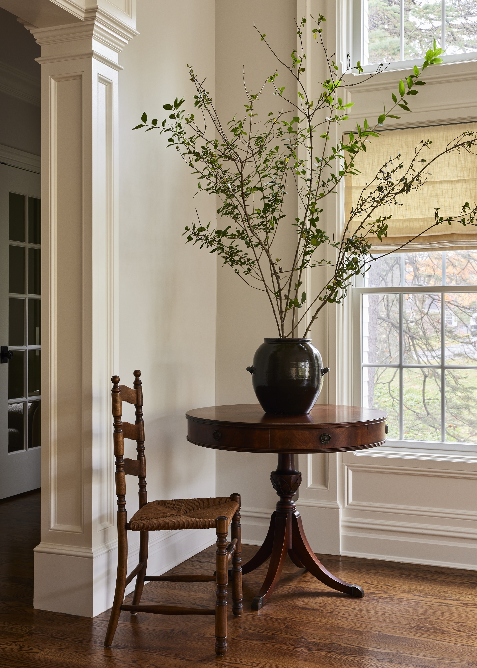
Firstly, light changes how we perceive color. When light hits a surface, it bounces back into our eyes, but the temperature, intensity, and direction of that light all shape what we actually see.
Warm light (like from the setting sun or incandescent bulbs) enhances reds, oranges, and yellows, but can dull cooler tones.
Cool light (like morning daylight or cool-toned LEDs) brings out blues and greens but can make warm shades feel a bit flat or grayed out.
So when a paint shade feels 'off,' it’s usually not the color; it’s the lighting that’s affecting it.
The Livingetc newsletters are your inside source for what’s shaping interiors now - and what’s next. Discover trend forecasts, smart style ideas, and curated shopping inspiration that brings design to life. Subscribe today and stay ahead of the curve.
Types of Light and How They Change Color
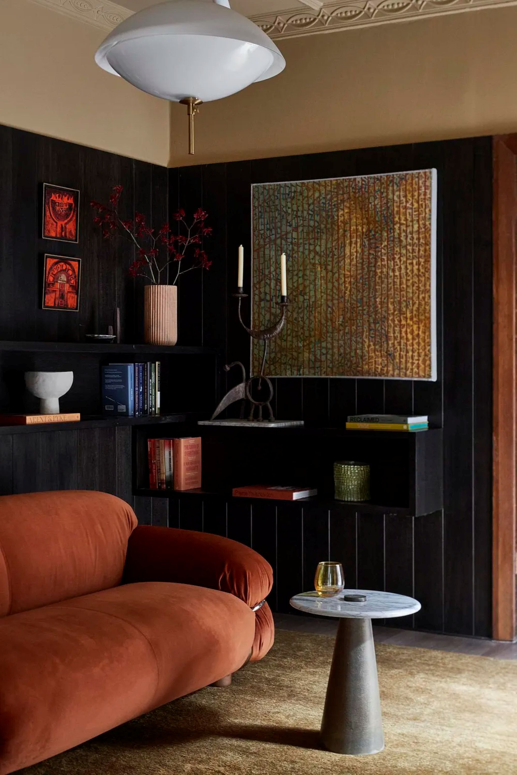
Natural Light
Natural light varies throughout the day, and the direction your room faces makes a big difference. North-facing rooms get cooler, flatter light. Warm tones such as Lick's Beige 02 or Pink 02 help balance that and keep things feeling cozy.
South-facing rooms are bathed in warm light all day, which can make colors appear more intense. Cool tones like Blue 01 or Green 02 work beautifully here without feeling cold.
East-facing rooms start with a cool light and brighten as the day goes on. Versatile neutrals like Greige 01 adapt well.
West-facing rooms are dull in the morning and warm in the afternoon. Try shades like Yellow 01 or White 03, which have yellow undertones to brighten and balance.
Top tip: It's always worth using a paint sample to test paint (such as Lick's Peel & Stick samples) to see how the color changes throughout the day in your space before committing.
Artificial Light
Once the sun sets, the mood of your room is then determined by the artificial light you add to the space. Incandescent and halogen bulbs emit warm, yellow-toned light, which can make cooler colors feel muted.
LEDs vary by temperature. Warm LEDs (around 2700K) are cozy and flattering, while cool LEDs (4000K+) suit more functional areas, but can feel harsh.
Smart bulbs are great for flexibility, but remember that changing the bulb’s tone changes the color of your walls, too.
Colors Most Affected by Light

All paint colors are influenced by lighting, but some are more sensitive than others.
Blues
This is the color my clients are most nervous to use in their homes, at the risk of it making the space feel cold and clinical. But this is where undertones come into their own; you just need to consider the amount of natural lighting your room has.
If you have a north-facing room, choose a blue with warm, yellow undertones like Blue 03, whereas for south-facing rooms, go for cooler undertones, like Blue 01, which has a gray undertone.
Pinks and Peaches
Pinks are one of the most popular colors that I recommend as they can go in any room; it's down to your taste and room direction.
For north-facing rooms, pink with warm undertones are best (like Pink 02 or Pink 13), and for west-facing rooms, you could opt for a pink with a dusky gray undertone that has a natural plaster earth tone when the evening light hits it (like Pink 07 or Pink 08).
Whites
Choosing the best white paint shade is one of my most asked questions — it's like the secret sauce that links all of the rooms together in your home.
If you want a crisp, fresh feel to your room, White 02 is a client favorite, but over the last two years or so, tastes are shifting towards whites with warm undertones, like White 03 and White 05, which both have yellow undertones and can go in any room direction.
Alternatively, if you don't want a yellow undertone, White 06 has a soft pink undertone and will still feel warm.
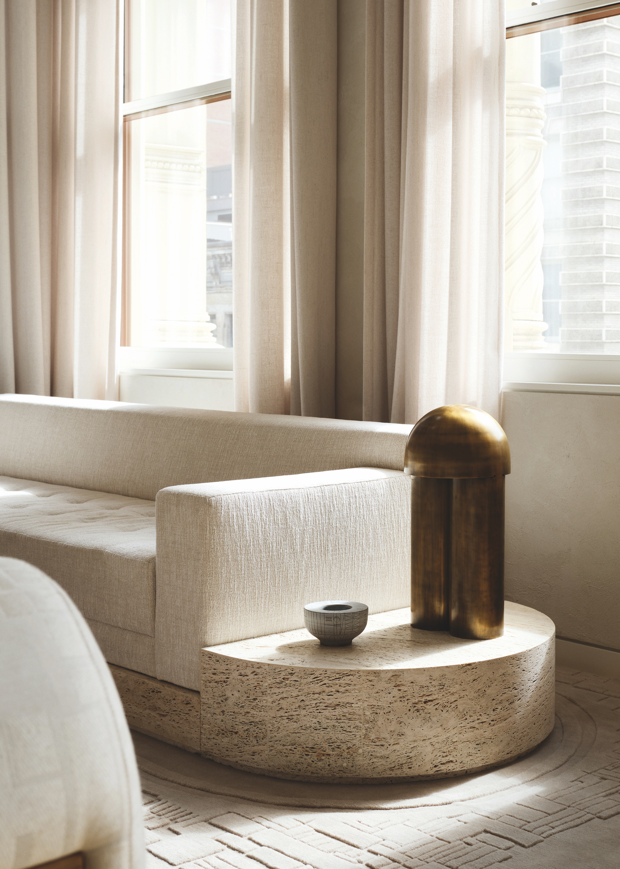
Lighting and paint color are constantly interacting. If you want a color to look its best, you need to consider how it’ll behave in the light in your space.
My biggest tips are to learn the undertones of the paint you're using, and to test it under the actual light it's going to be in. On the back of Lick's Peel & Stick samples, you'll find details of the undertone of each color, so you can find the best one for your room.
Also, make sure you view them in different parts of the room and at different times of day. Test with the actual lightbulbs you plan to use, especially if you rely on artificial light in the evenings.
In short: there’s no “wrong” color, just the wrong light for it. Understand how light works in your space, and you’ll be able to choose color with total confidence.

Tash Bradley is the co-founder and director of interior design at Lick. She's spent her entire career in the creative industry, first as a professional artist, followed by working alongside her mother in property development and home decoration, as well as studying interior design at the University of Arts London. She has a unique understanding of color, our emotional reaction to it, and how it impacts the way we live. In her current position, Tash oversees color consultancy, product development, and content creation, hosting Q&As and webinars, as well as filming how-to videos and color theory lessons. She's chief curator of the Lick color palette and wallpaper collection, and has conducted over 1000 color consultancies across the UK, Europe, and US.