How to Choose White Paint — Our Expert Guide to Selecting the Perfect Shade for Your Space
The only thing more challenging than picking a new paint color is picking a white paint color. But our guide will take you every step of the way


Choosing the right paint color is, in my opinion, one of the most tedious things a person can do. And it's even harder to get it right with white, your home's most important neutral. The shade of white in your home, whether an accent or the main color, is either versatile or cumbersome, modern or traditional — it's the canvas on top of which you build everything else, or, if you choose wrong, the constant thorn in your side. You want to choose your best white paint carefully; a white wall is a powerful tool.
"White paint can do more to transform a room than simply change the color on the walls," explains Will Thompson, Valspar’s Head of Product. "Different tones can accentuate a room’s individual shape and, when selected carefully, can alter the perception of its size."
Luckily, you don't have to make this choice alone. We've built out the following guide to help you along in your search, highlighting all possible considerations that go into selecting a white paint. We'll highlight:
Styles of White Paint — Warm or cool? True white or greige? What are your options.
Choosing White Paint for Small Rooms — What to remember in the case of a tiny canvas.
Choosing White Paint for Large Rooms — And what to know in the event of a big one.
Matching Your Paint with the Light — Your paint will look different in every kind of light, especially natural light.
How to Choose a Finish for White Paint — The final frontier. Will you choose glossy, satin/eggshell, or matte?
So let's tackle this ever-present problem, shall we? Your new favorite white paint is just a scroll away.
Styles of White Paint

For starters, let's go over the various styles of white paint and their undertones. Understanding the differences between these hues is vital for selecting the right shade for your space. You don't want to ask for the wrong thing!
The mood of a white paint stems from its base color, which can be split into warm and cool shades. "It’s a common mistake to think that white is just a one tone color or not even a color at all," says interior designer Martyn Lawrence Bullard. "White is in fact one of the most important and most variable colors in a decorator’s palette, and there are so many white tones, from crisp, to mellow, to bold, to warm, each providing a subtly different atmosphere and evoking a distinctive style, period and flavor."
Neutral White Paints
A brilliant white is the simplest style of white paint, with a tone that lacks any kind of nuance at all — bright, sharp, and defined by its absence of color. True white paint will work in small rooms that have a good source of natural light (to warm things up a bit), and will bounce that sun throughout the space.
Brilliant white is the paint to choose if you’re after a slick, gallery-like feel, or want to highlight other delicate white tones in the room. "True neutral whites such as Annie Sloan's Pure chalk paint work fabulously as a blank canvas, but you'll need to bring color and interest into the room to avoid the space feeling flat or characterless," says Annie Sloan. Such tones "work best on doors, skirtings and ceilings to give a real crispness (particularly in small areas) while a white with a little more personality adorns your walls."

Price: $5.99/sample

Price: $3.95/peel-and-stick sample

Price: $8.50/sample
Cool White Paints
Whites with hints of green and blue fall under the 'cool white' category, and work best in south-facing rooms where they offset the space’s warm sunlight. "Cooler whites such as Farrow & Ball’s Blackened or Wevet pack more of a punch than the warmer tones," explains Joa Studholme of Farrow & Ball.
Wondering how you should use a cool white paint? "Pair blueish whites with other colors and materials that match its cooler tone," advises designer Kelly Wearstler. "Cool whites create a crisp and clean look, so [they] are a great choice for contemporary, minimalist spaces or in combination with green, gray, or blue accessories," adds Benjamin Moore’s Helen Shaw. That said, "cool-toned white paints can be cold or clinical," so you should try to "counterbalance this effect by introducing texture," warns Annie Sloan.

Price: $5.99/sample

Price: $5/sample

Price: $8.50/sample
Gray White Paints
White paints with a hint of gray create a crisp finish that is warm and gentle, alluding to the contemporary without being overly harsh or distracting. A warm gray paint works great in a natural light-filled north-facing room, while a cooler gray would do well in a south-facing position.
"Muted whites with a subtle gray undertone such as Benjamin Moore’s Decorator’s White give a softer, more modern feel," Helen explains. "Try muted whites on woodwork and ceilings in bright spaces to give a light and airy feel."

Price: $5.99/sample

Price: $3.95/peel-and-stick sample

Price: $5/sample
Warm Whites
A warm white and an off-white — something with a cozy undertone — is great for those of us who prefer a "softer, more inviting atmosphere," says Jackie Johnson of Jackie Johnson Design. It would also work if the room itself is darker, or if you have "warm-toned wood (oak, walnut) or brass fixtures" and want to complement those. Finally, these shades also offer "a more traditional or timeless look, as off-whites tend to feel more classic and less stark than true whites."

Price: $5.99/sample

Price: $8.50/sample

Price: $3.95/peel-and-stick sample
Choosing a White Paint — High Level
We'll parse this out further below, but Bailey Todd, owner and principal interior designer of White Cliff Studio, had some incredible macro-level advice about choosing a white paint. If you want a quick answer, or just some loose guidelines, here they are:
"First, decide on the kind of white you are wanting to go for. Are you wanting something clean and modern, warm and creamy, more of an off-white with a certain undertone?" Bailey says.
"Once you have decided, I always suggest doing a bit of research to see what colors are popular in the style of white you are looking for. Then you can take that list of colors into the store and look at the color chips in person. Work with someone at your local paint shop to select colors based on the style you are wanting to achieve, the colors you have researched, and see if there are any additional colors you see in store that you are drawn to. I always suggest getting anywhere between 3-6 options."
"Once you have a good range of colors to choose from, get samples and take them home. Knowing how to use paint samples on many different areas of your home is crucial to understanding what the paint will look like as it will vary depending on light sources, surroundings, as well as any other paint selections in the room. Leave the samples up for a few days and go back to look at them at different times of the day."
Of course, if you need something more granular, I have that advice for you, too. Keep reading.
Choosing a White Paint for Small Rooms

The white particles in pale paint reflect light, which means small rooms are the perfect opportunity to use a pure, brilliant tone. For instance, something like Annie Sloan’s Pure chalk paint is completely devoid of pigment and reflects nearly all of the light that hits it, reducing shadows and thus making a space feel larger. That said, it won't add much character — that will be drawn from what goes into the room.
"Opt for a blue-toned white like Annie Sloan's Old White wall paint to create the illusion of more space — blue particles draw the eye and make a space feel bigger," advises Annie Sloan. "Smaller rooms are less likely to feel clinical and sparse in the way that a larger space could if it were painted with a cold white."
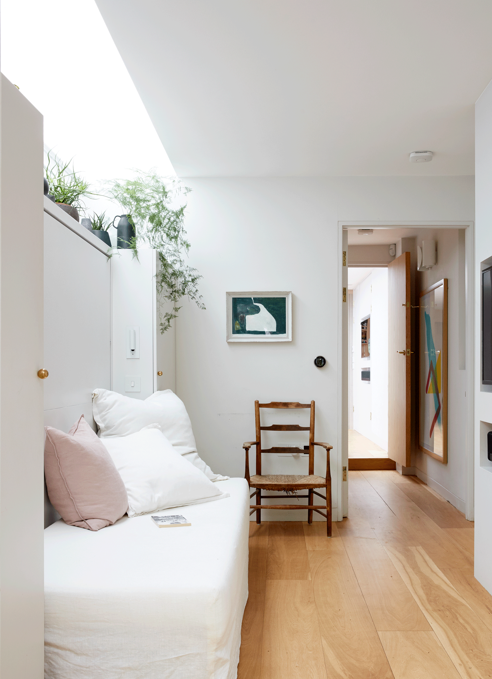
Choosing a White Paint for Large Rooms

Natura Flat Pink Damask, Benjamin Moore
Larger spaces can accommodate whites with more pigment and personality, as these rooms are generally more light-filled.
"I always choose a warmer white for a large room, a slightly off tone that makes a big space more inviting and approachable," explains interior designer Martyn Lawrence Bullard.
"To create a cozy, light-colored room, select whites with warmer undertones such as Valspar’s Anything Goes or Coronation Gown and pair them with deeper hues or dusky pastels," adds Valspar's Will Thompson. "Mixing whites with creams can also help create tonal variation and bring additional warmth, making a white room feel cozier."
For the largest of rooms, you can go even bolder with your whites. "Larger rooms with extra space will accommodate deeper colors such as Little Greene's Rolling Fog emulsion, which will act as a white," adds Little Greene’s Ruth Mottershead.
Matching White Paint to Natural Light

Cloud White by Benjamin Moore
If this already wasn't enough to make your head spin, it's worth it to say you should also try and consider the amount of light the room in question receives when choosing your white paint.
Just ask interior designer Athena Calderone: "Not only does the size of your windows affect how the color is experienced," she says, "but it’s also the direction of the natural light streaming inward, and what sits outside those windows, too." To decipher which white is therefore best for you, "get a small sample and try painting a 2’ x 2’ section of your walls first. And not just one wall — a few different walls that get sunlight from varied directions is ideal."
You should also consider the type of light in the room. "If a room is too bright, choose a softer white, as a sharper modern hue can make the room feel too gallery-like," advises interior designer Tara Bernerd. "For a room with lower light levels, I would specify a crisper shade of white."
And be sure to "check how [these colors] feel in electric light," notes Farrow & Ball’s Joa Studholme. "Understated colors can appear bland if they don’t have the right contrast."
How to Choose a Finish for White Paint

Farrow and Ball's Blackened
Now, for the last consideration: the paint finish. Also described as the "sheen," a paint's finish refers to the amount of light that reflect off its surface. This can affect a paint's durability, how easy it is to clean, and more, so you definitely want to think this one over.
"The paint finish should be determined by the look you desire for a space," whether that's a "period style or a more modern experience," says Martyn Lawrence Bullard. "The sheen on paint also helps either attract or soften light, and should be studied before application in that space, looking at how the sunlight changes over the day and into the evening."
First, let's review the various types of finishes:
Matte: Matte paint formulas don't reflect as much light as a glossy finish. The resulting look is quite velvety. This is a great option for uneven walls, "as it will hide any imperfections that you’re keen to conceal or detract attention from," notes Valspar’s Will Thompson. From a design perspective, "a flat matte finish allows architectural details like molding to pop. and creates a modern, gallery-like vibe," says designer Jonathan Adler.
Satin/Silk/Eggshell: Satin, silk, and eggshell paint finishes have a mid-level shine; glossier than matte, but not as sheen-y as a glossy finish. With white paint in particular, a satin or eggshell finish proves more durable than their matte counterparts, and can usually be easily cleaned. A great option in high-impact areas like walls and kitchens. Just note that a shinier finish can highlight imperfections.
Gloss: And finally, we have the glossy finish, traditionally used on woodwork such as window frames and skirting boards. It's a great way to add drama, contrast, and glamour to a space. A glossy white paint is highly reflective, bouncing light from one surface to another.
When choosing the right white paint finish for your space, consider what exactly you'll be painting as well as the traffic in the area.
"For hallways and busy living spaces, opt for a durable finish which is tough and completely washable," advises Little Greene’s Ruth Mottershead.
And don't be afraid to mix textures — if you go matte for your walls, maybe do something else for the trim. "Mixing textures is a great way to add interest and depth, so pair a matt paint with a more textural finish," Tara, an interior designer, says.
There is nothing more convenient or fresh-feeling than decorating with white — and now you have the perfect place to start. For your next order or business, start learning what colors go with white... because (spoiler alert) not all of them actually do.
