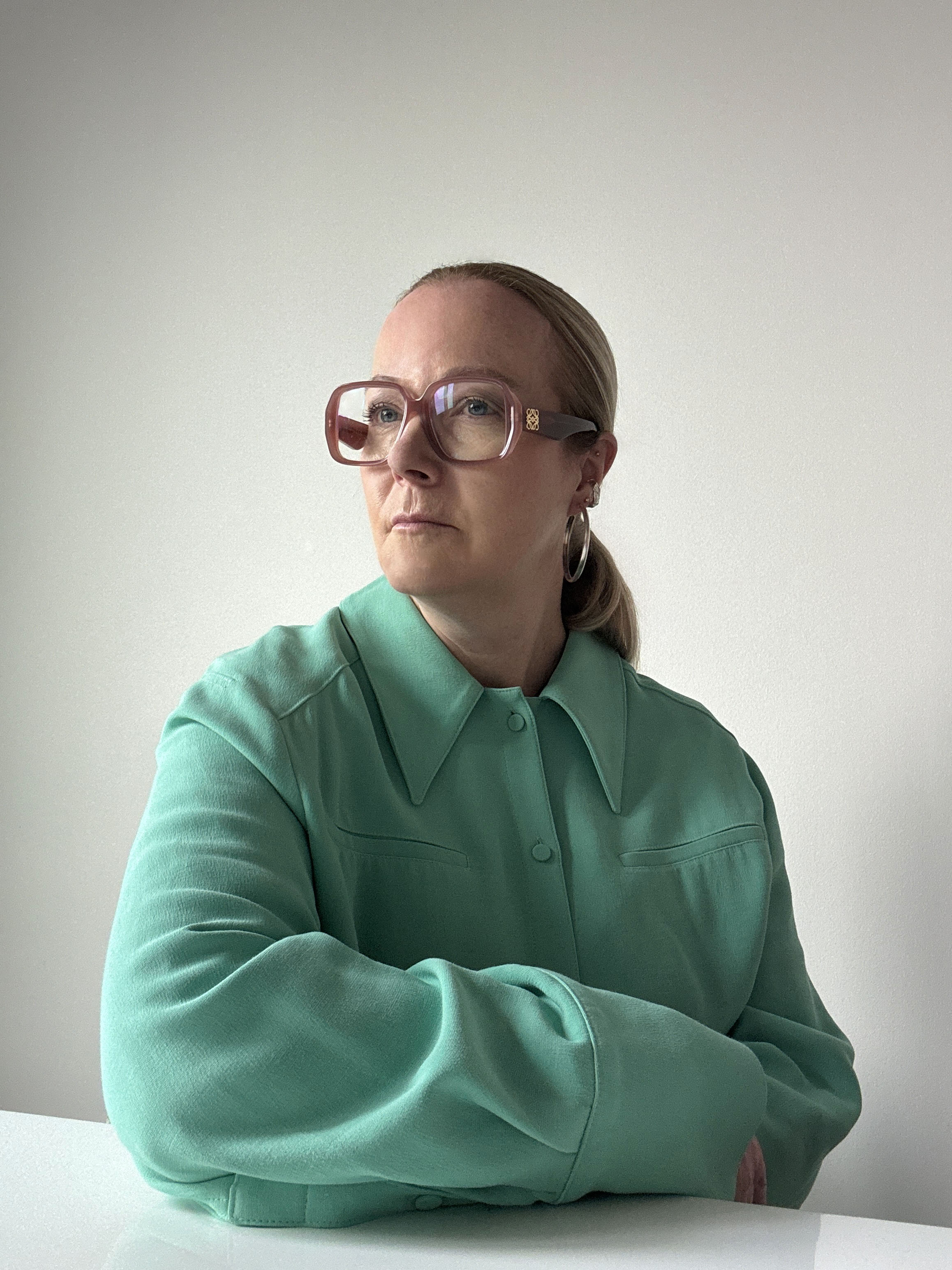
I'm a 'Color Forecaster', Here's What That Actually Means, and How I Predict the Future of How You'll Decorate Your Home
Working with Pantone and WGSN, Jane Boddy has helped divine the trends in color that end up as the wall colors we paint with, the sofas we sit on, and more. Here's how

The Livingetc newsletters are your inside source for what’s shaping interiors now - and what’s next. Discover trend forecasts, smart style ideas, and curated shopping inspiration that brings design to life. Subscribe today and stay ahead of the curve.
You are now subscribed
Your newsletter sign-up was successful
In our Design Insider series, we talk to the people shaping interiors that you might not even know exist — uncovering what it is they do, how they carved out their niches, and how they've changed the course of the design world in the process. This time, Jane Boddy, a 'color forecaster' who has worked with WGSN and Pantone, explains to us how it's possible to predict what colors are going in and out of fashion.
It all started with a huge curiosity for culture. Growing up in the suburbs of London in the 1980s, access to culture felt limited. But I was hungry for it. I remember poring over copies of i-D magazine as a teenager in my local Spar shop—the makeup, the clothes, the club scene, the photographers, the styling, and the people behind it all—it felt like a window into another world that I was excited by.
I went on to become a fashion designer, but in truth, it was the culture that I was obsessed with. That fascination shaped everything.
Article continues belowI started my career working across a diverse range of brands From YSL to Champion sportswear. What I loved most about designing collections wasn’t just the garments themselves, but building the stories around them. I was drawn to the narrative—how it shaped the materials, and most importantly, the color palette. Color became an essential thread in the whole concept.
I’d come across trend books by View Publications and was fascinated by what WGSN was doing at the time. I also became curious about Pantone’s Color of the Year, which had just launched in the late 90s/early 2000s. I dug in, did loads of research, reached out to people — and eventually landed an initial contract with Stylesight, which had a trend office in Paris. That’s where I began covering predicting color trends.
From there, I became Head of Trend Forecasting at Stylesight and later Head of Color at WGSN. While at WGSN, I started developing my own approach to color forecasting, which I’ve continued to evolve over the last five years working independently.
When it comes to building a career in this field, I think industry experience is key. To forecast effectively for clients, you need to understand how color works in real-world product development — its applications, challenges, and potential. Agencies are far more likely to value your perspective if you’ve been on the inside.
The Livingetc newsletters are your inside source for what’s shaping interiors now - and what’s next. Discover trend forecasts, smart style ideas, and curated shopping inspiration that brings design to life. Subscribe today and stay ahead of the curve.
And above all, you need to stay endlessly curious. I started in fashion, but now I work across everything from interiors and beauty to product marketing. I never stop researching, observing, and looking for what’s next. If you’re loaded with insights and full to the brim with knowledge, that energy naturally radiates from you — it fuels conversations, inspires others, and elevates everything you’re involved in. It’s not just good for your work — it’s good for your whole creative ecosystem.

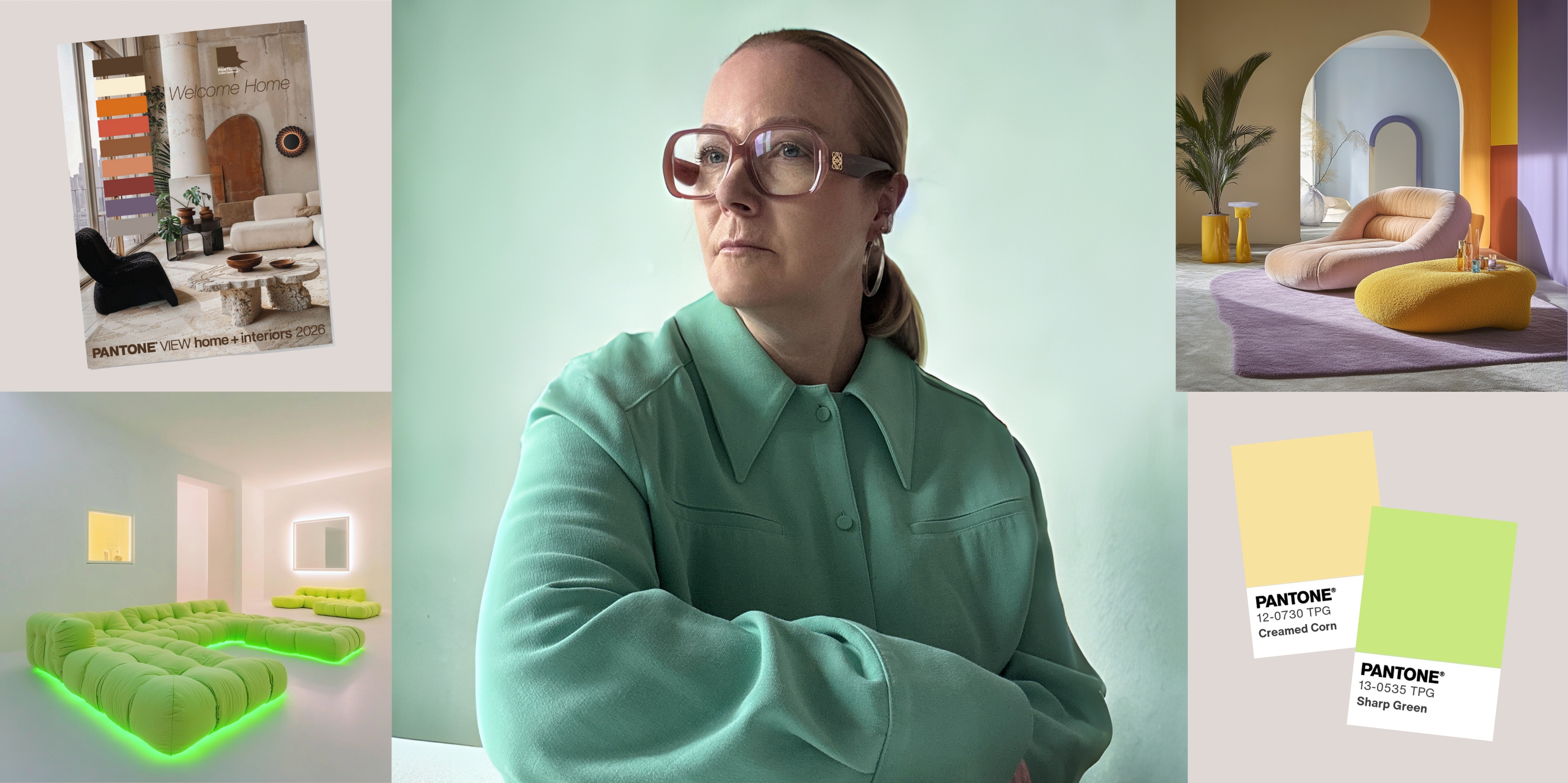
A pivotal figure at the Pantone Colour Institute, Jane contributes to trend publications and serves as the European Creative Director for Pantone’s Interiors annual trends publication, Pantone View Home and Interiors. Her approach to forecasting color focuses on observing current events and cultural trends to understand how perceptions of color are evolving.
What Does Color Forecasting Actually Entail?
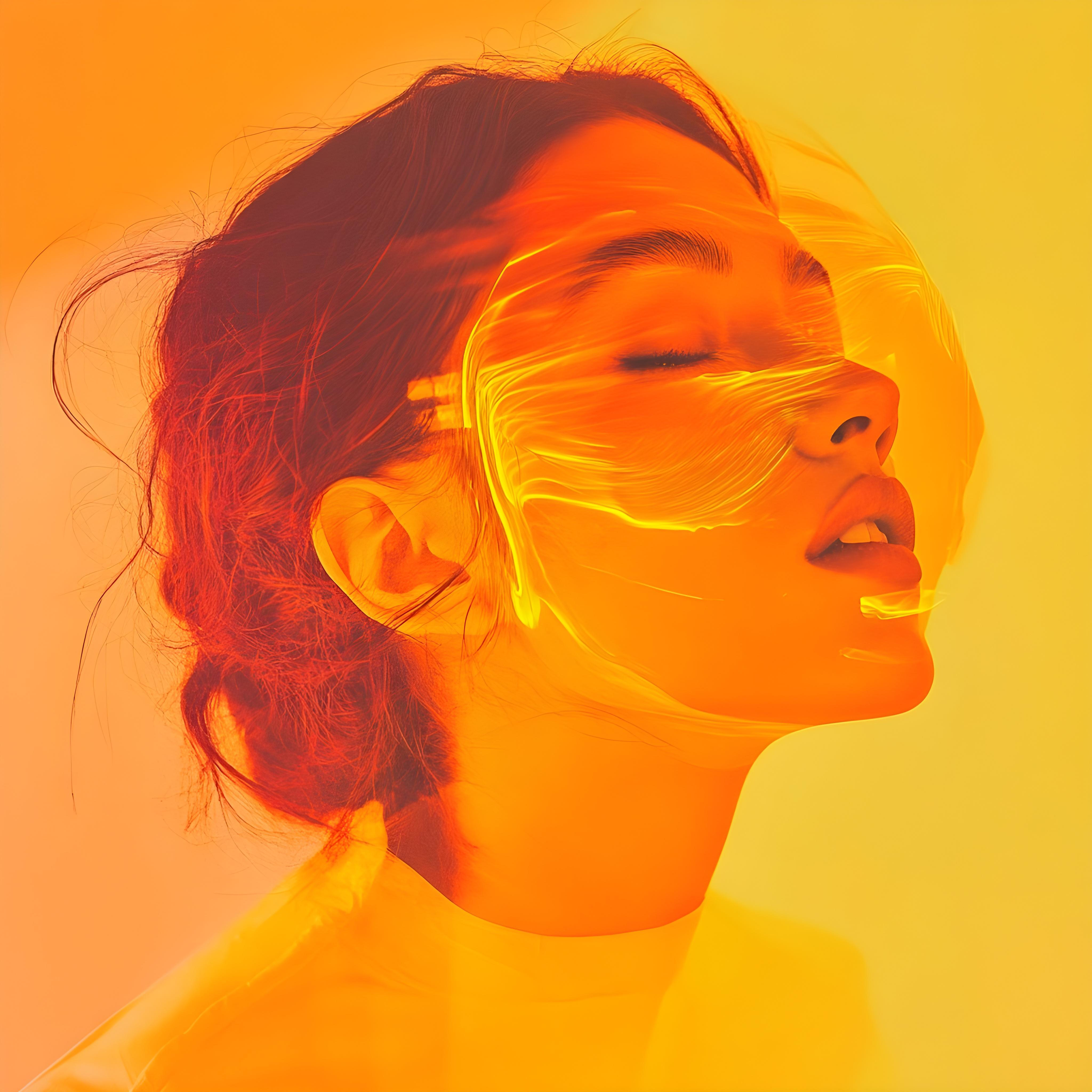
Creating 'mood' images through AI helps Jane bring the feeling of colors to life.
My practice always starts with research. I explore what feels relevant in the moment, and that focus can shift depending on what’s happening culturally, socially, or creatively. I make a point of researching not just online, but out in the real world — at physical events, exhibitions, and spaces. That immersive layer is critical.
A big part of my work is also collaborative. For the Pantone View Home + Interiors Trends book, I work closely with the senior team at Pantone to develop the stories, select the colors, and shape the layout of the publication. It’s a process full of sharing, discussion, and constant refinement. That collaborative approach is key — it allows the stories to deepen and the perspectives to broaden.
Once I’ve established that foundational layer of research, I begin to explore what feels relevant in terms of color. I look at the nuances — saturation levels, depth, and overall mood. Are the colors vibrant and immersive, or soft and muted? Are we seeing a resurgence of bold, bright hues, like during the dopamine decor brights trend, or a shift towards more neutral, grounded palettes that echo the mood of quiet luxury?
I pay close attention to what’s happening now, but I'm always thinking about what lies ahead. Even the faintest glimpse of something fresh or unexpected will spark something in me — it might start as a tiny detail, but it often becomes the most important point in the story. I’m a bit obsessed with newness. I see so much every day that when something genuinely new cuts through, it’s really exciting.
How Far Ahead Does Color Forecasting Take Place?
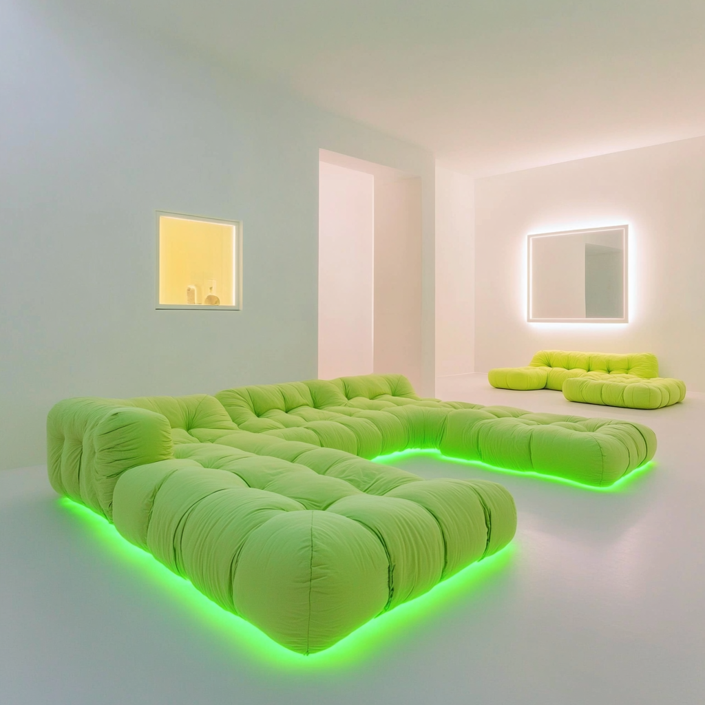
Jane predicts this 'sour lime' shade as one of the stand out color trends of 2025.
In predicting color, I work across different timeframes — anywhere from five years out to just three months before a color needs to be market-ready. The timeline really depends on the client and the context. Some need future-focused, long-term insights, while others are moving fast and responding to short-term shifts.
When forecasting further ahead, I look beyond the surface. I dig into developments in science, architecture, technology, and material innovation. These areas reveal how people might live, feel, and behave in the future — and that ultimately influences the colors we’ll connect with. I’m especially interested in how things are made, what’s emerging, and how that might ripple through into design, culture, and everyday life.
If I’m working with clients who need near-term direction, I shift gears — analyzing what’s happening on social media, identifying standout brands, and observing what’s starting to feel relevant. There’s so much inspiration in the quick-turn world, too — it’s about tuning in to where the energy is.
Trends that are forecast early often start as subtle signals and build slowly toward mainstream visibility. Take decorating with brown tones, for example. I created a color story around the rise of brown for Pantone.com back in 2021. At the time, it was more of a conceptual shift — now, it's a major trend forecasted for 2026.
How Do You Choose a Color of the Year?
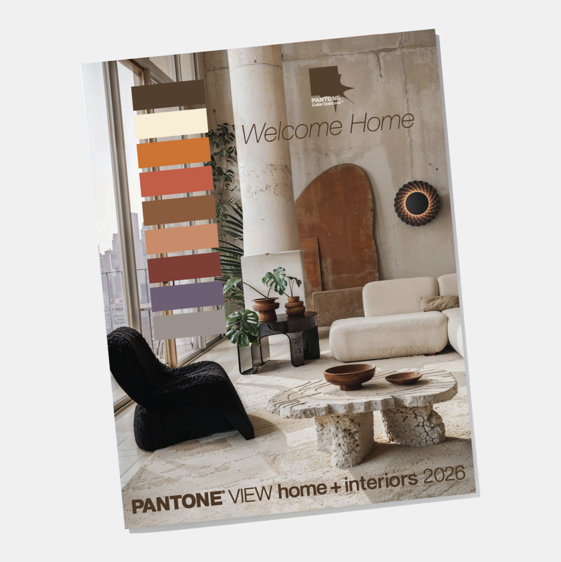
Jane helps curated Pantone's trends for the home.
Pantone is the global leader when it comes to setting the Color of the Year. The success of that color lies in how carefully it captures the mood, energy, and emotional undercurrent of the year ahead. While it’s grounded in solid research and analysis, it’s the emotional resonance of color that plays a leading role in the decision — it’s about reflecting what people are feeling, often before they even know it themselves.
Alongside this emotional connection, commercial relevance is equally essential. The chosen color has to relate to product development and align with broader color stories and trends relevant across industries. The final selection is always multi-faceted — a balance between cultural feeling, emotional impact, and real-world application.
How Does Someone Become a Color Forecaster?
Obsess over culture. This work is rooted in having deep cultural knowledge and a genuine curiosity. Combine it with an in-depth grasp of color — its subtleties, its behavior, its emotional range. Spend time really looking at color. Get to know it. Learn to recognize, for example, how one shade of orange can feel electric while another feels flat.
In short: being a bit of a nerd is actually really helpful.
