6 Dark and Glamorous Paint Colors That Designers Are Choosing to Decorate With Right Now — Exact Brands and Shades to Copy in Your Home
Turns out, dark colors are the shortcut to glam interiors (without the glitz)

The Livingetc newsletters are your inside source for what’s shaping interiors now - and what’s next. Discover trend forecasts, smart style ideas, and curated shopping inspiration that brings design to life. Subscribe today and stay ahead of the curve.
You are now subscribed
Your newsletter sign-up was successful
When making over a room, it's not often we reach straight for dark colors. But, while the idea of dark walls and ceilings can summon images of cave-like teenage bedrooms and spaces steeped in gloom, in reality, dark paint can have the opposite effect on a home, making it feel rather glamorous, as well as cozy, warm, and welcoming.
Several dark tones are predicted to be big color trends in 2026. Why? Because they have an intimate, wrap-around-you-like-a-hug effect. They make a room feel moody, infusing it with charge and drama. They ground an interior, creating visual weight, stability, and emanating a profound sense of calmness. They speak of indulgence and luxury, imparting a muted refinement and opulence. They are texture-enhancers, making timber, fabric, metals, and more stand out against their duskiness. And, as a bonus, they helpfully hide small imperfections on walls, making flaws, dents, or imperfections less obvious.
It can be easy to foster a blind spot for the shadowy end of the paint color spectrum — but now’s the moment to fully open your decorative eyes. I spoke to six interior designers and creatives on the deep, expressive tones they turn to when they want to bring out an intriguing, intense dark glamour. Here are the exact dark colors they use.
Article continues below1. Farrow & Ball's Mahogany
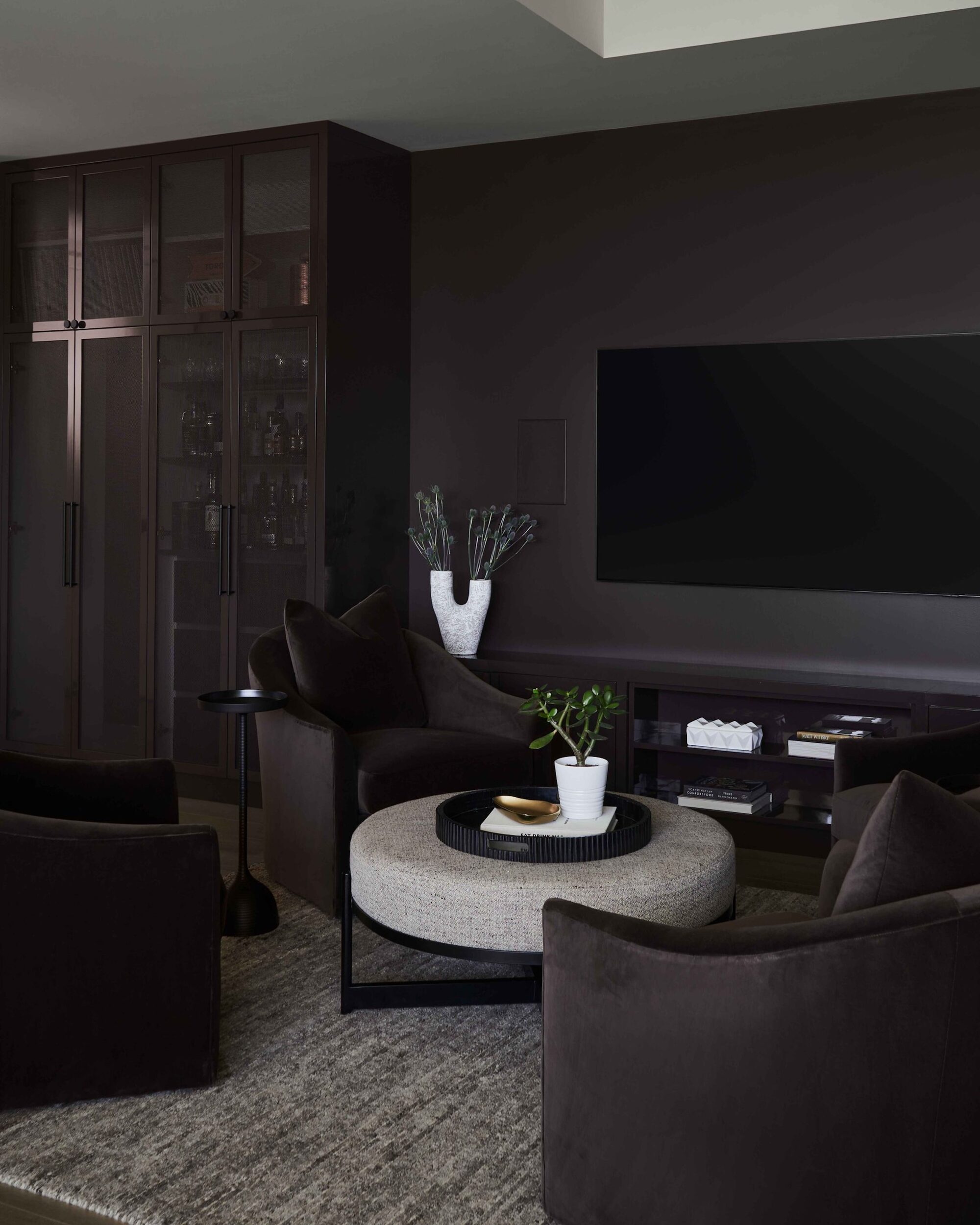
A dark color so close to black might seem intimidating, but get it right, and it's magic.
An intense, dark brown, almost edging on black (especially in hidden corners), Farrow & Ball’s Mahogany takes its name, as you may have guessed, from the red-tinted wood we associate with heritage, craft, and luxury. It has a comforting, organic edge that’s familiar, as well as bold.
"The deep, nuanced brown of Mahogany feels rich and enveloping, the dark tone softening the atmosphere like a velvet filter over everything — it strikes a beautiful balance between classic and unexpected," explains Olivia Botrie, creative director at Toronto-based interior design firm Dart Studio, who recently used it in a project’s living room.
"It feels calm, inviting, and quietly glamorous due to its depth and contrast," she adds. "We used a high-gloss finish on the millwork and a flat finish on the walls to create a subtle shift in texture, which makes the space feel layered and intentional. It absorbs and reflects light to add dimension, and its warm undertone stops it from feeling flat."
2. Little Greene's Ganache
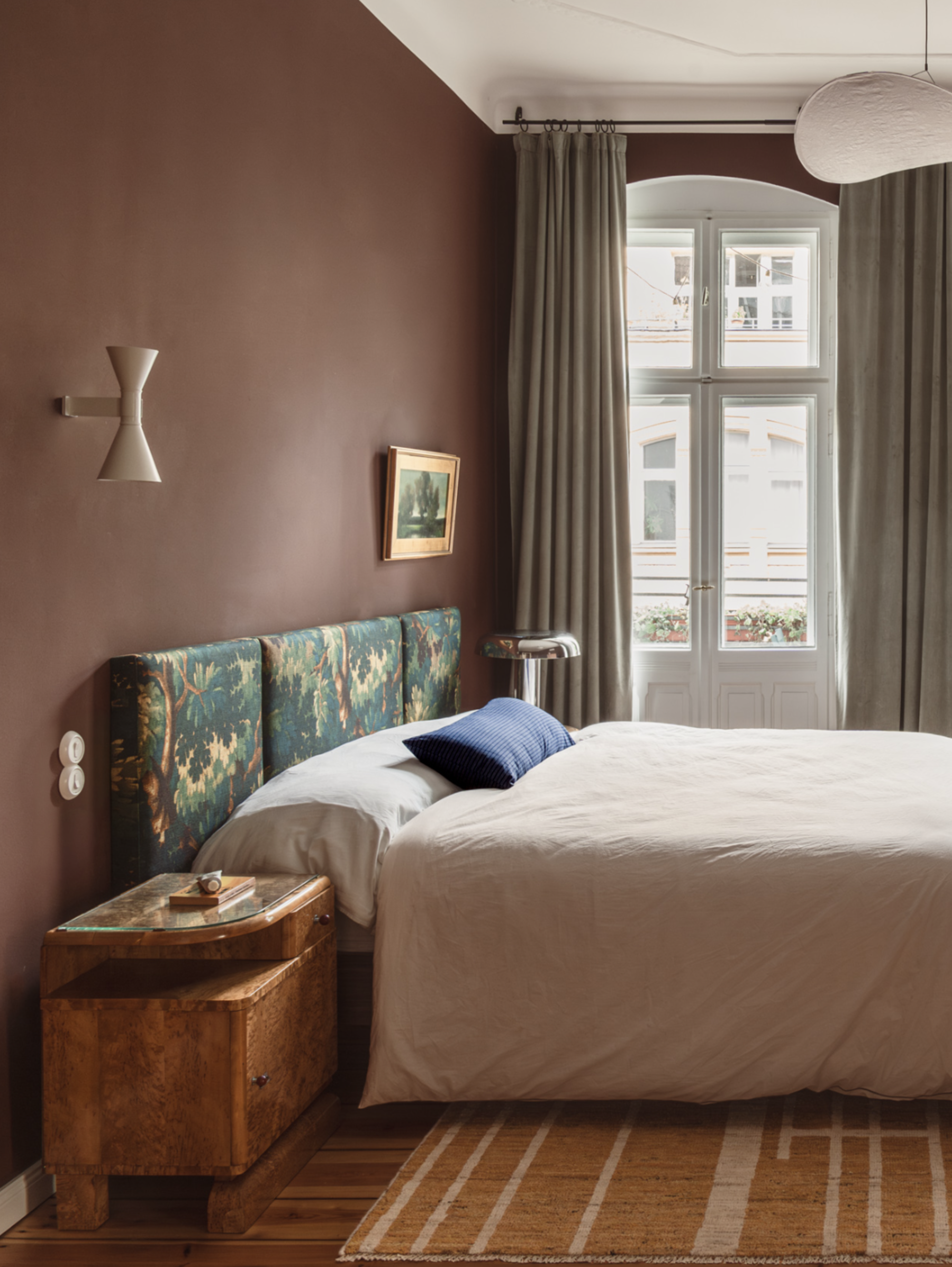
A warm, nutty shade of brown that looks good enough to eat is always going to leave you in a good mood.
The most Bruce Bogtrotter-y of shades, Little Greene’s Ganache is a blend of chocolate and cream, and as such is indulgent and deliciously tempting.
"Ganache is so sumptuous and luxurious, and has a lot of depth — it feels like a warm hug," says Kasia Kronberger, founder and principal designer of Berlin interior practice Studio Bosko. "It has a striking depth, the matte surface creating a modern, sophisticated feel, and combining it with the white ceiling brings a contemporary crispness."
German Interior Designer Kasia Kronberger enjoys creating tension between colors so they spark and develop a sense of storytelling. "I always consider color in dialogue with others," she says. As founder and principal of Berlin’s Studio Bosko, Kasia’s projects balance high design with lived-in ease, and she layers art, culture, and craft for homes that are personality-driven, confident, curated, and boldly individual.
3. Little Greene's Invisible Green
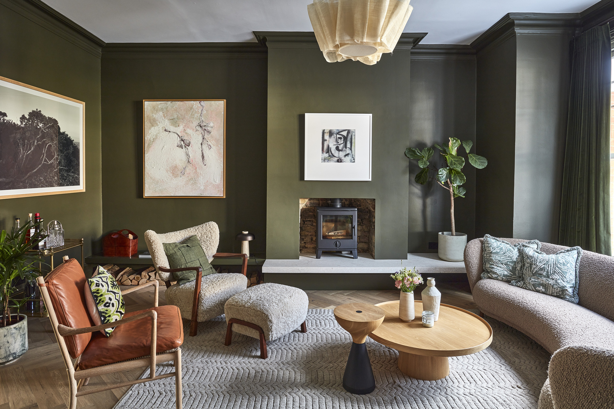
Three's something so natural soothing and calming about a dark shade of green.
A shade popularized in Georgian times to use in gardens to blend in with the vegetation, Little Greene's Invisible Green is now anything but; its shady, verdant hue makes indoor walls commanding and statement-making.
"Invisible Green is enveloping, natural, and earthy, and adds depth and tone to the room," says Sophie Chapman, associate and interior designer at London architecture and interior design studio The Vawdrey House, which painted it onto the walls of a recent Victorian-era living room.
"The cocooning color is a contemporary twist in the traditional space, smart yet cozy and inviting, and it ties in beautifully with the natural materials," she adds. "It feels like an unusual and surprising color to use, and it’s a real example of grown-up glamour, without the glitz."
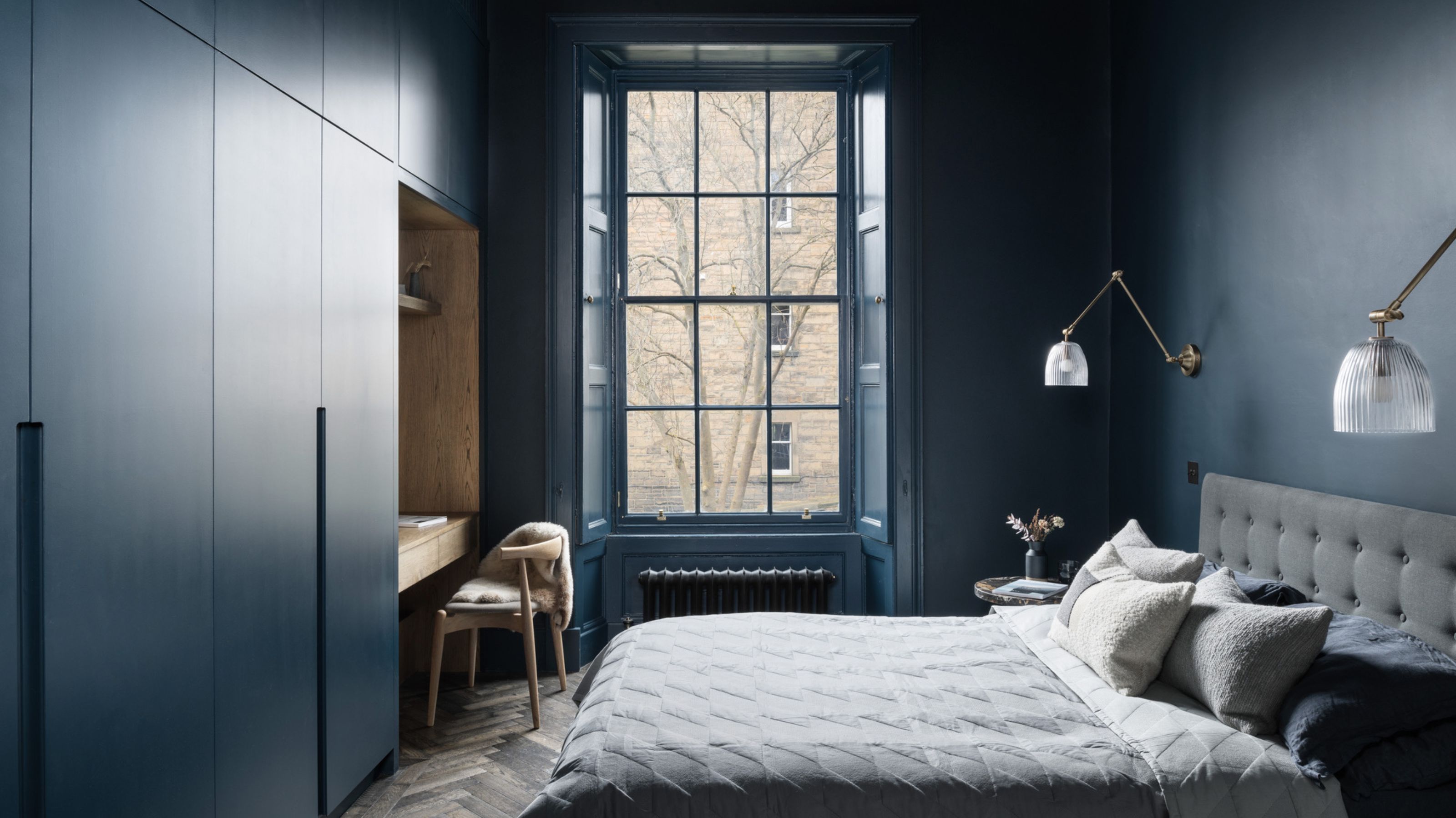
4. Farrow & Ball's Hague Blue
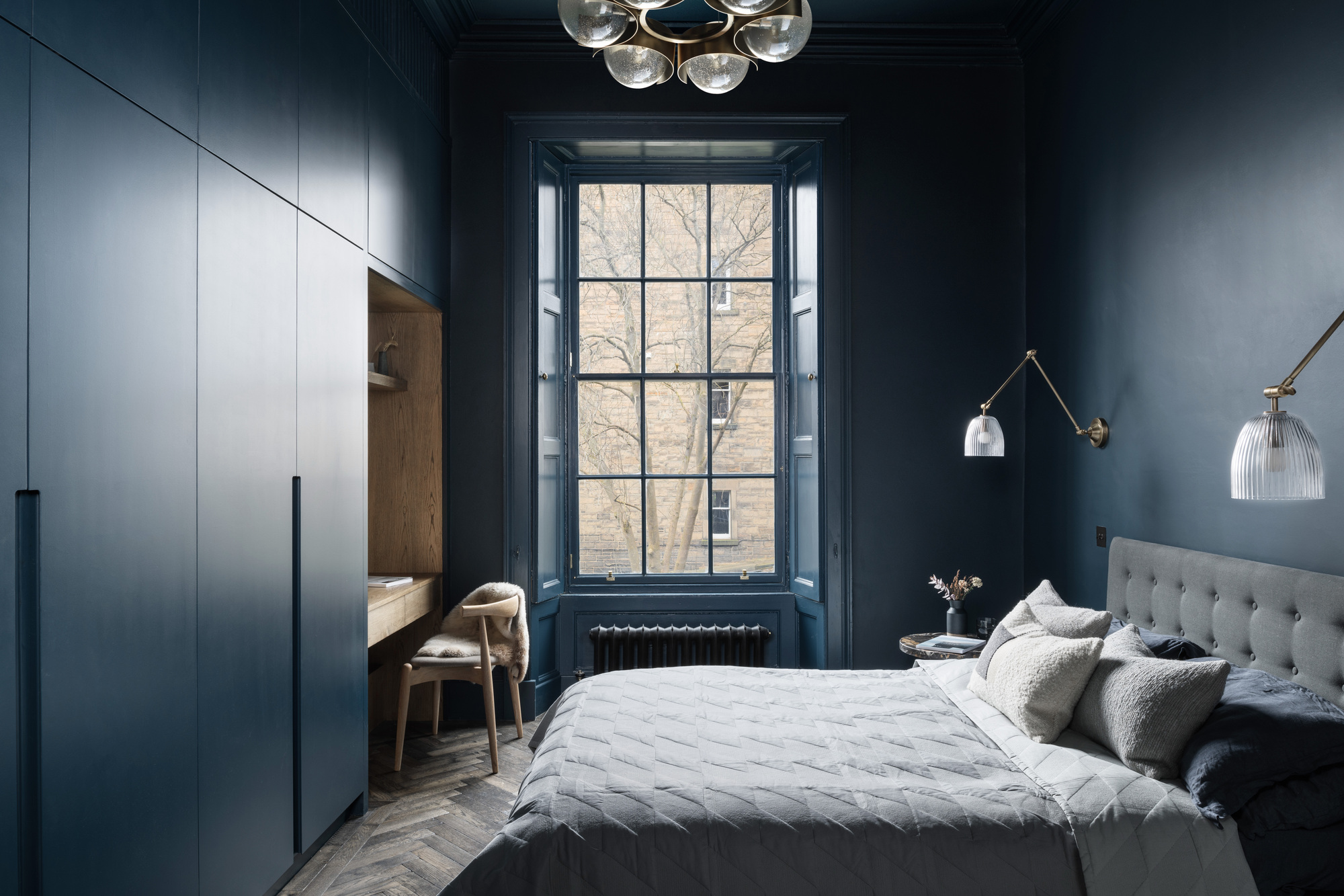
A cult classic, you can do no wrong when it comes to Hauge Blue.
Taking its gloriously strong hue from colored Dutch woodwork, Farrow and Ball’s Hague Blue has a powerful siren call that pulls you into its inky depths.
"We wanted a color which would be a striking feature for the main bedroom but also one which was livable on a daily basis — Hague Blue is subtle, has a good level of depth to it and acts as a canvas for the natural light and shadow to set different moods," explains Ben MacFarlane, associate at Edinburgh firm Pend Architects, which recently used the shade in an 18th century bedroom.
"It’s sophisticated and unexpectedly juxtaposes the usual ‘bright’ Georgian space," he adds. "The color drench pushes any ornamentation into the background and allows moments of light and darkness to become the focal point."
5. Benjamin Moore's Black Beauty
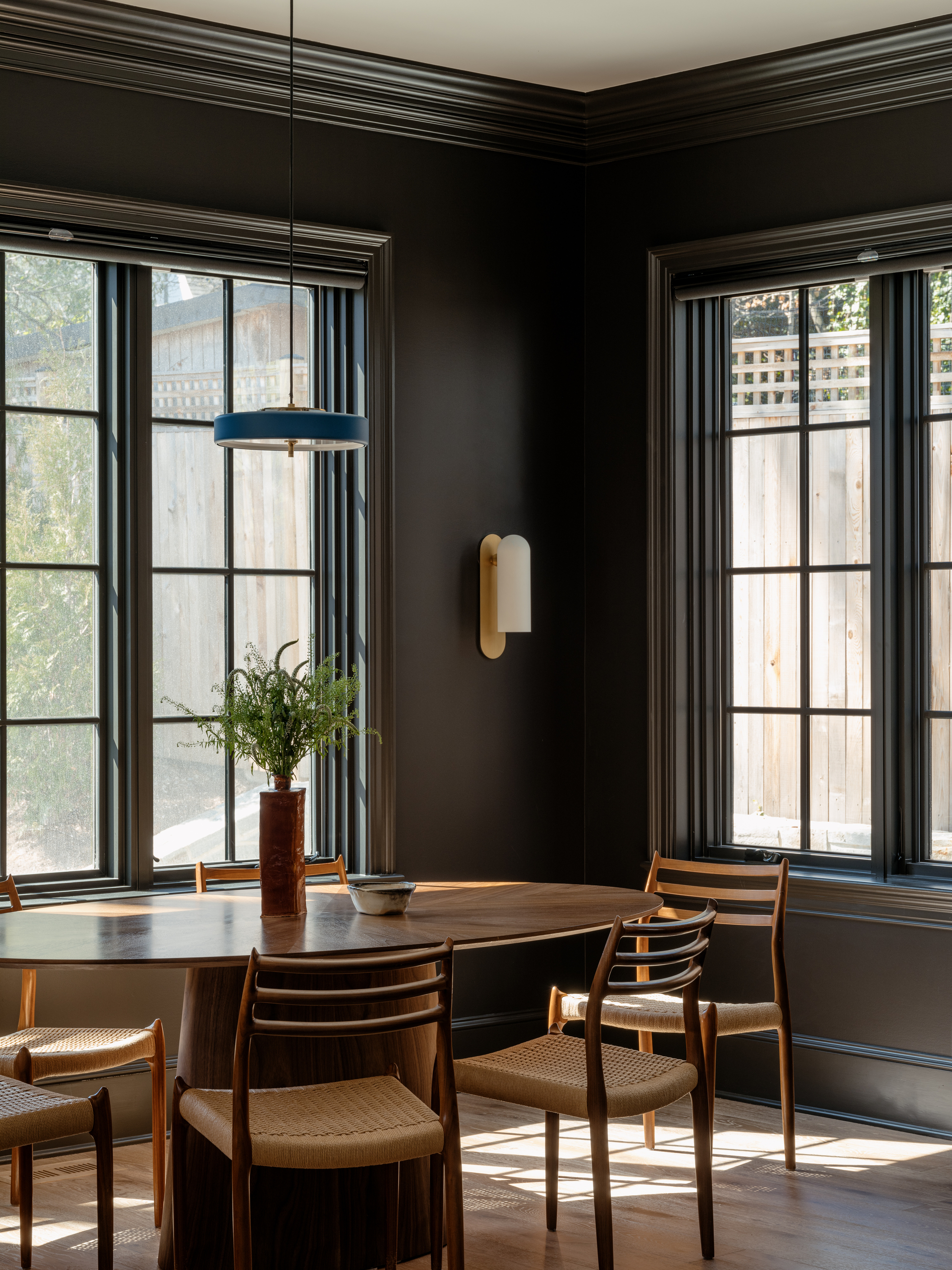
Moody, glamorous, and totally captivating — this space is proof that dark colors do it all.
A pure black, Benjamin Moore's Black Beauty is high on impact and classic contrast —this is a tone that’s truly timeless.
"Black Beauty is a true, neutral black that’s remarkably versatile — because it doesn’t lean warm or cool, it plays beautifully with any undertone, making it both grounding and liberating to design around," says interior Designer Zoë Feldman, who has an eponymous studio in Washington, D.C, which just used the shade in a light-filled dining room.
"It’s unapologetically dark but never heavy," she adds. "It creates a sense of intimacy and quiet sophistication, absorbing just enough light to feel cocooning yet still allowing the warmth of wood and the glow of brass to shine."
Thinking of color as the emotional pulse of a room, Zoë Feldman’s designs reflect how you want to feel in the space, not just how you want it to look. Founder and principal of her Washington, D.C interior design brand Zoë Feldman Design, her signature is a clean-lined fusion of modern and classic, drawing on her love of the practical, the playful, and the deeply personal to create interiors that are as welcoming and soulful as they are sophisticated.
6. Sherwin-Williams' Fabulous Grape
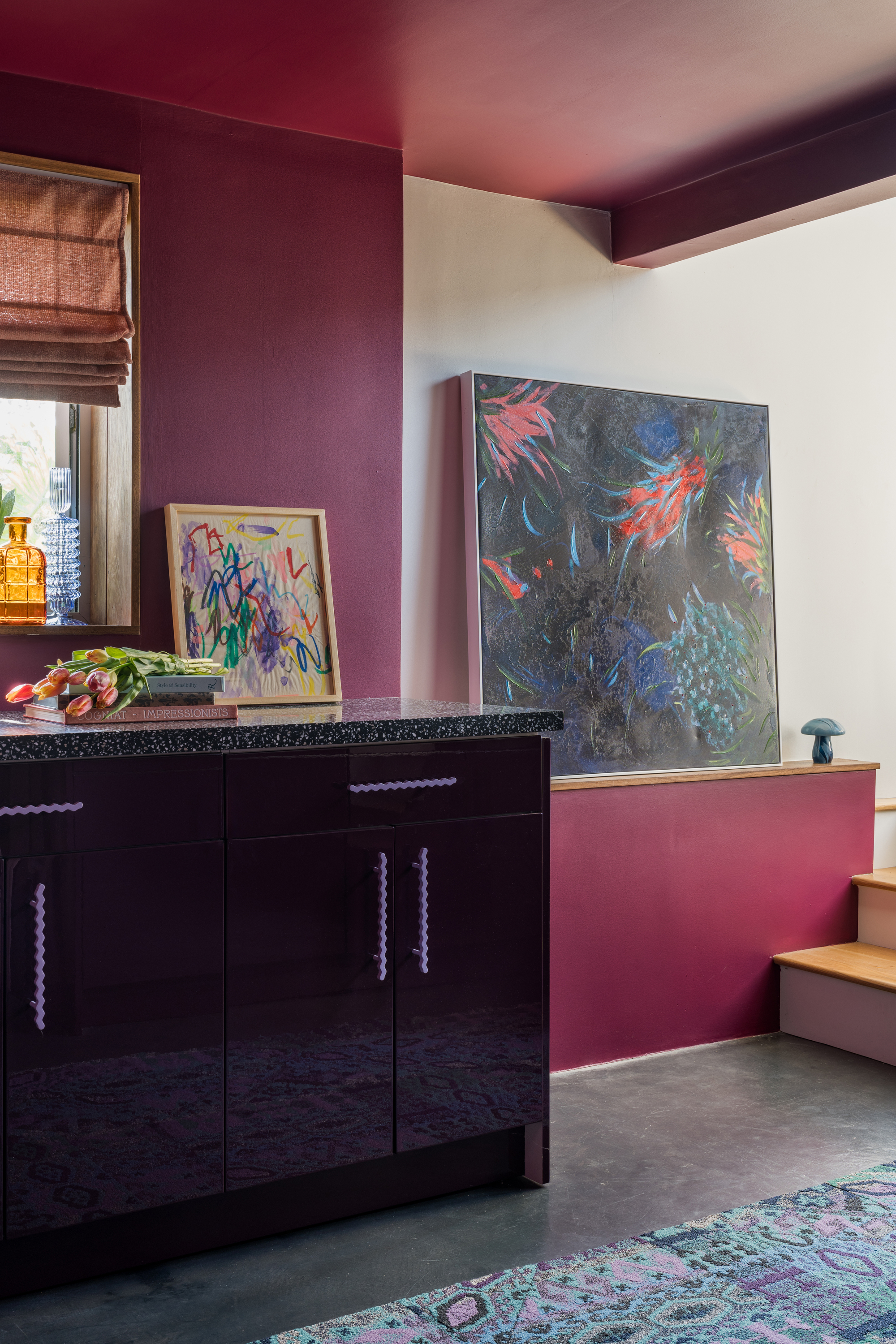
If trends are anything to go by, we're going to be seeing a lot more purple in the near future, and this dark color is a good place to start.
Sherwin-Williams’s Fabulous Grape does indeed live up to its name, the red-purple tone prompting playful memories of brimming wine glasses and effervescent late-night laughter.
"I haven’t always been a fan of purple undertones, but Fabulous Grape completely changed my mind — it carries so many different tones and depths," says Kristin “Kiki” Hector, founder and principal designer of Los Angeles-based interior design brand Kiki Design Studio.
"It can feel richer when the light hits it, or shift into a very mature, moody plum in the shade. It is the perfect entry point into decorating with purple," she adds. "It's like your favorite piece of jewelry that works with every outfit, the color just pulls the whole vision together and elevates everything around it. Even though it’s bold, it never overwhelms — it enhances the interior, making it inviting while not too serious."
Once again, as Sherwin-Williams is not readily available in the UK, try Benjamin Moore's Dark Burgundy instead.
To Kiki, color means fun. Her Los Angeles-based brand, Kiki Design Studio, is known for its California-eclectic approach of weaving warmth and artful personality into spaces, and her motto is "as long as all our colors are heading to the same party, we’re doing it right."
From decorating with navy, smoky aubergine, soft charcoal, or velvety black, dark paint colors are imbued with a sense of glamour and elegance that paler shades just can’t quite compete with. Wrapping in room in warmth as well as wow, they bring intimacy, atmosphere, and a grounded take on grandeur.
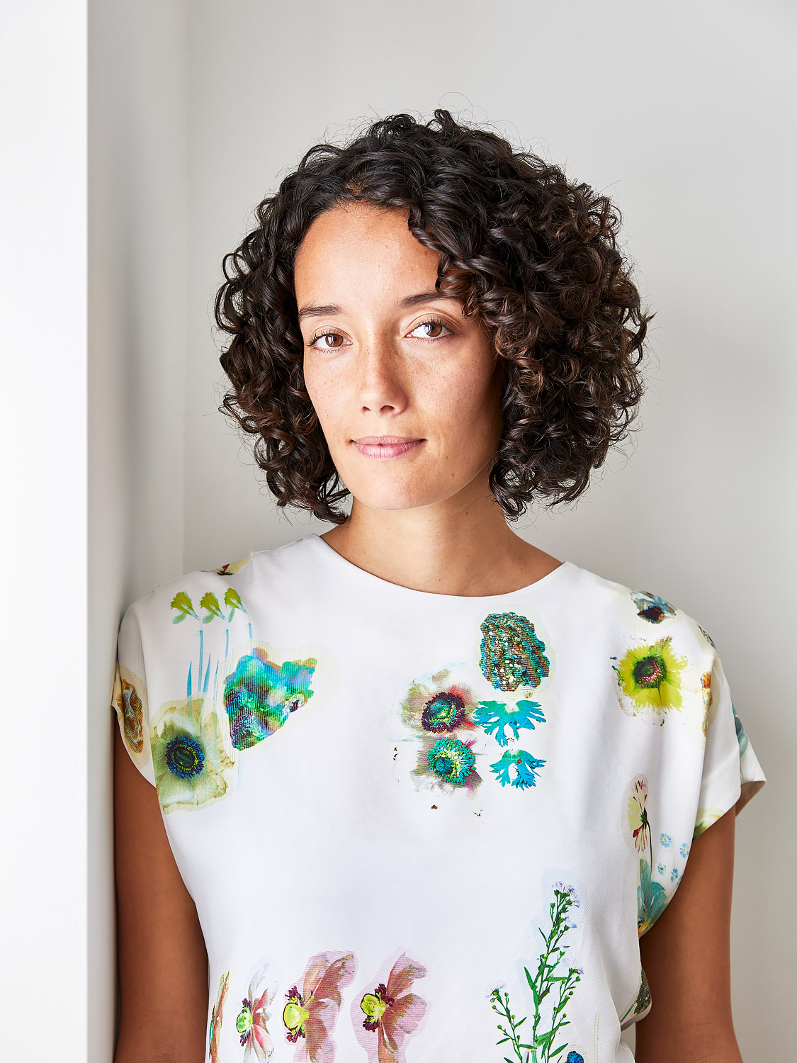
Amy Moorea Wong is a color authority and contemporary interior design writer who has specialized in all things decorating for over a decade. Amy is Livingetc magazine’s Colour Expert, Interiors Editor at The Glossary magazine and a Contributing Editor at Homes & Gardens magazine, and she frequently contributes to an array of global publications to share her insights on interior design zeitgeist. Her book Kaleidoscope: Modern Homes in Every Colour explores a collection of cool colorful homes fizzing with creativity, surprises, and inspiration.


