So, 'Traditional' Colors Are Trending? Designers Explain Which Ones Work for the Modern Heritage Look
These palettes blend traditional colors with contemporary style — the perfect base for any space

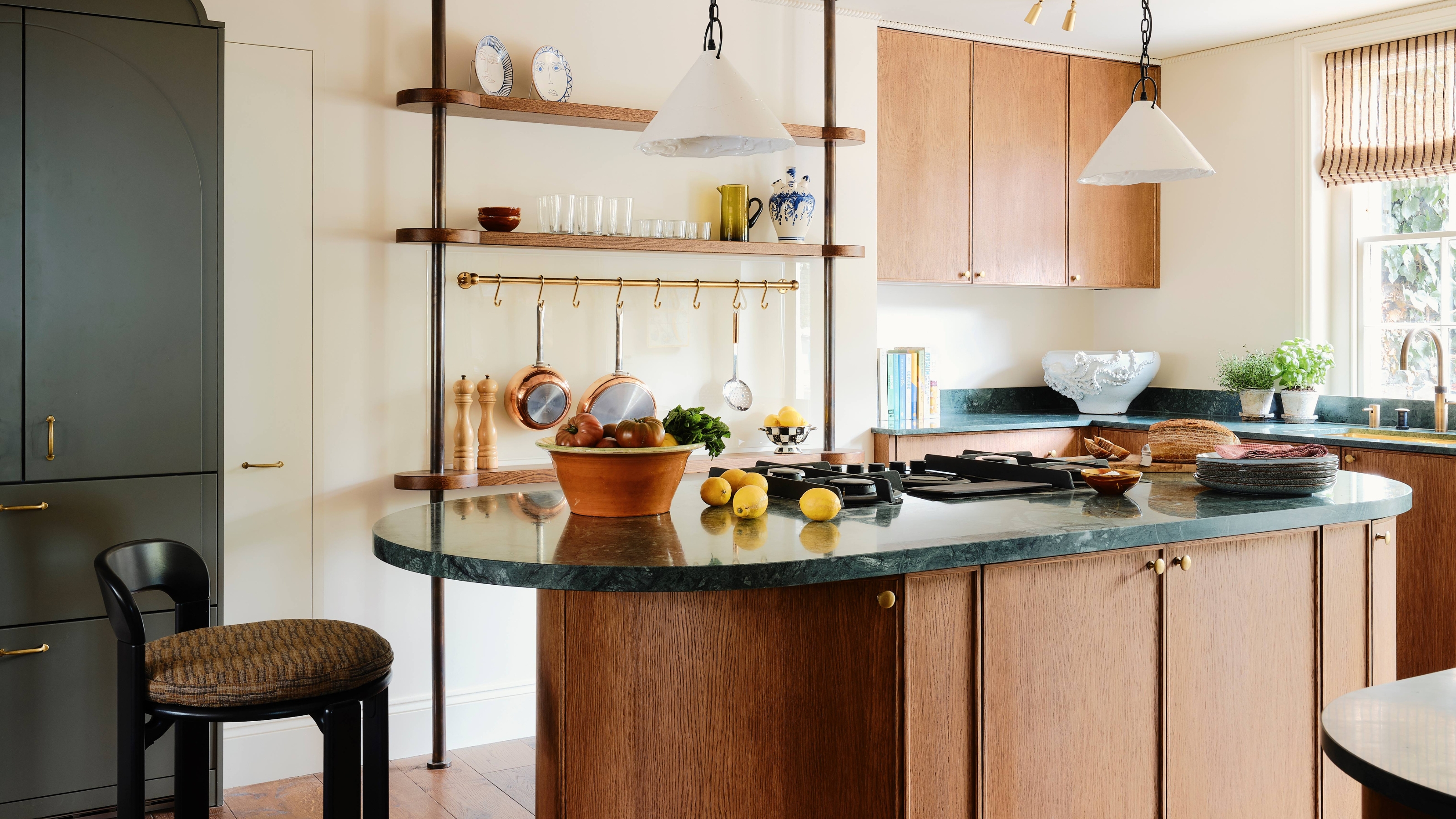
Traditional and familiar design is regaining popularity in contemporary trend cycles (as if it really ever left). However, rather than bringing tired colors into your home that feel dated, embracing a modern heritage palette will bring that desired blend of traditional elegance and contemporary comfort.
So, what is a modern heritage color palette? Well, it relies on classic colors like cream, navy, and earth tones as its foundation, but elevates the scheme further by layering contemporary color trends, such as deep espresso browns, oxbloods, and camel tones.
"A modern heritage color palette is rooted in classic design yet reimagined for modern living," says Iona Graham, color expert at Graham and Brown. "This balance of old and new adds depth, warmth, and a sense of considered style to every space." In short, it's the secret formula for a space that feels timeless, yet still now. Thinking this could be the answer to your color scheme plans? Here's everything you need to know.
Article continues belowHow to Define a Modern Heritage Palette
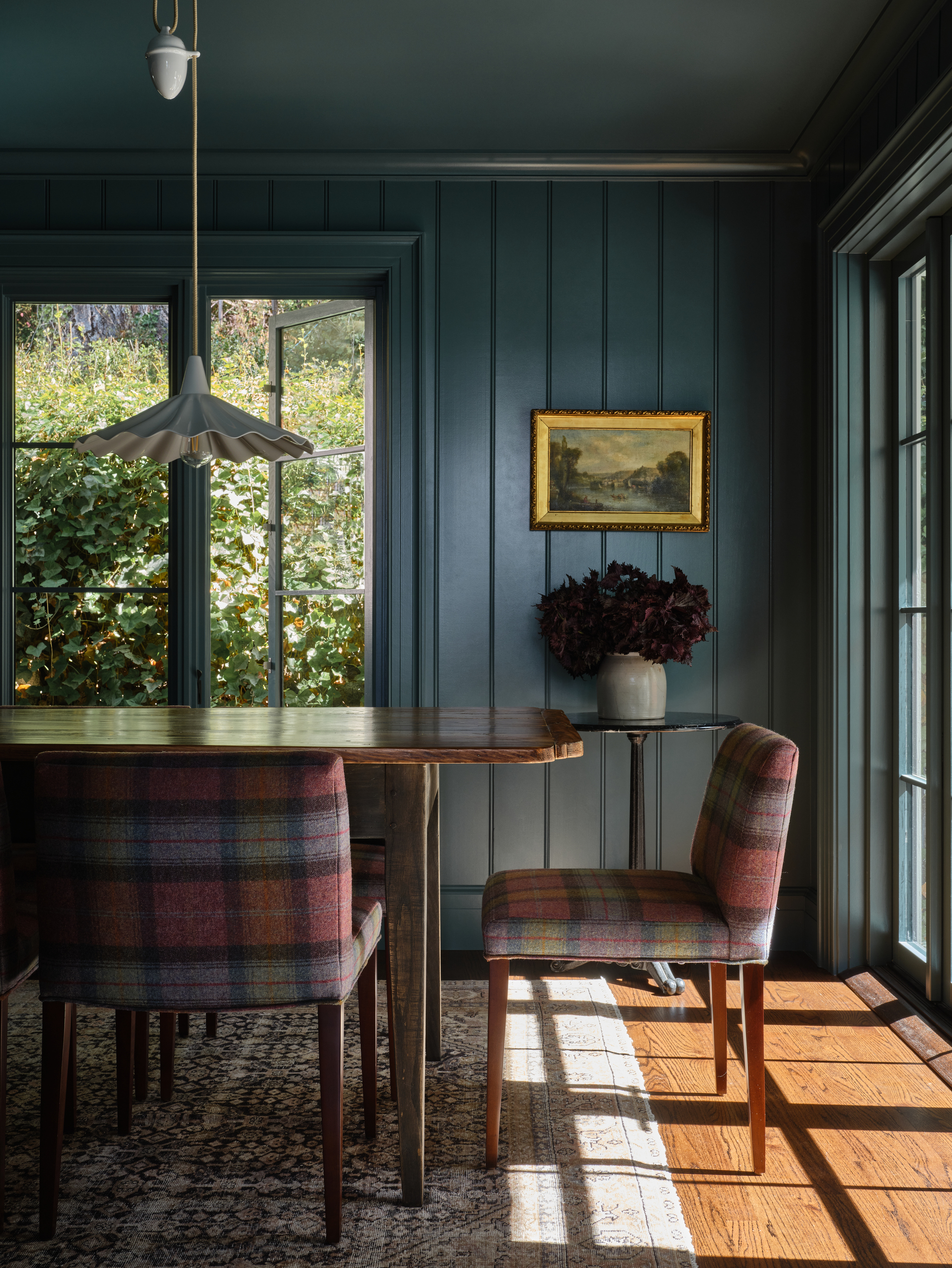
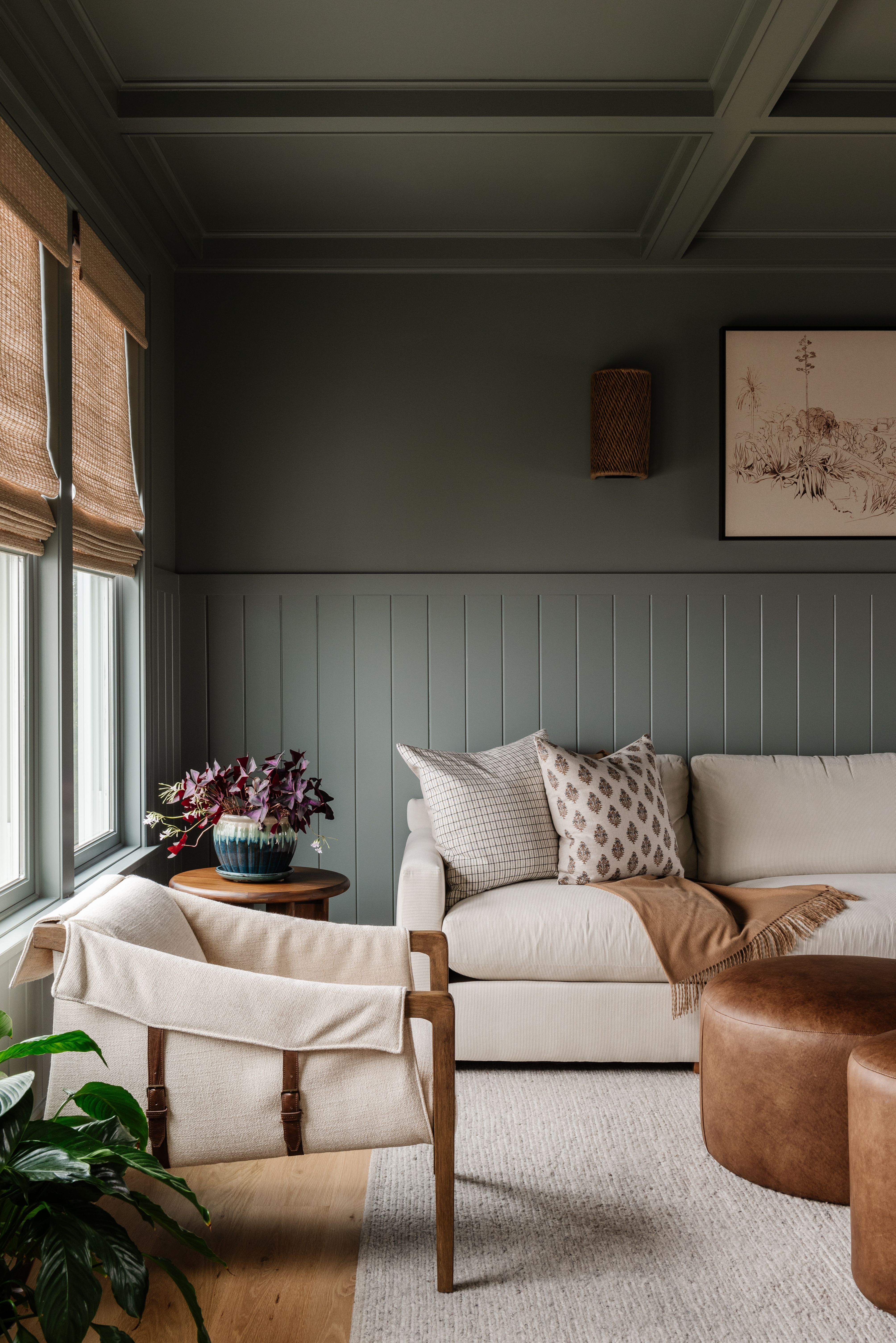
This dark green/teal color on the walls feels modern, while the decor elements ground the room in tradition.
To understand the colors that work with a modern heritage palette, it's worth considering how this term can actually be defined. We know that modern heritage palettes bring together timeless, characterful shades with fresh, contemporary accents to create interiors that feel effortlessly elegant and beautifully current.
Iona Graham goes a little deeper, though, explaining that, "This color scheme will be built upon muted, timeless tones and rich colors that draw inspiration from historic interiors and the natural beauty of earthy pigments." Think dark greens, navy blues, rich charcoal grays and blacks, and oxblood reds.
"I would then add modern neutrals, like espresso browns, camels, and creams, to the mix," she adds. "These shades create the balance in the design, resulting in a palette that is grounded, refined, and effortlessly contemporary."
It's classic hues reimagined through a contemporary lens, says Erica Davis, principal designer at Florida-based design studio Eralyn Interiors. "Yes, they feel rooted but more familiar than some dated hues," she adds. "Think depth, warmth, and classic rather than trendy or overly contrasting."
The Livingetc newsletters are your inside source for what’s shaping interiors now - and what’s next. Discover trend forecasts, smart style ideas, and curated shopping inspiration that brings design to life. Subscribe today and stay ahead of the curve.
Iona Graham is the brand and marketing manager and a color expert at Graham & Brown Paint. Iona studied International Business at Loughborough University, focusing on marketing strategy and planning and global brand management. As a 4th-generation Graham family member, she has lived and breathed the Graham & Brown brand since she was young.
What Colors Work in a Modern Heritage Palette?
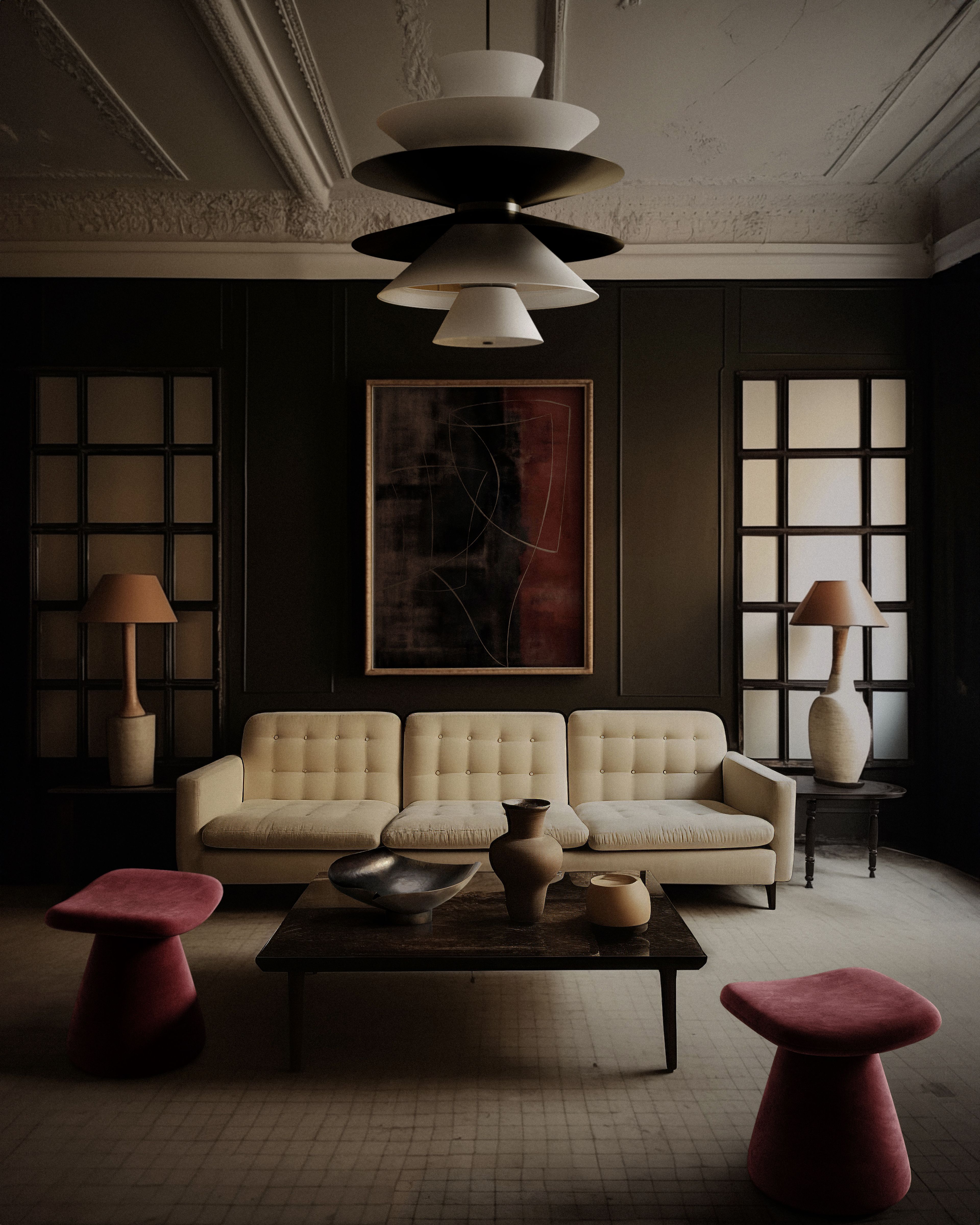
This living room blends a modern heritage color palette with modern furniture and curves to create a more dynamic look.
Image credit: LEMIEUX ET CIE
This space feels more classic and traditional, but the color-drenched wood panelling elevates the style.
Image credit: Salt Design Company
So, what are a few of the specific shades to look out for when building a modern heritage color palette? As explained, the colors that most notably fit into this scheme are warm white, creams, tobacco, camel, olive, traditional navy, oxblood, and deep browns.
"They are colors that have lived in architecture and interiors for generations," explains Erica; let them be your bread and butter when decorating in this design style.
"Some of my favorites are Benjamin Moore Swiss Coffee, Benjamin Moore Pale Oak OC-20, Farrow & Ball Vert de Terre, Benjamin Moore Hale Navy, Farrow & Ball Liquorice, and Color Atelier Espresso," addsEmily. All of these shades represent the more expected or classic side of the modern heritage palette, while adding in the deeper, more unexpected colors is what will make this style feel more contemporary.
Speaking specifically, Iona adds, "Deep greens like Graham & Brown's Glasshouse or State Room, sophisticated burgundies like our Color of the Year Divine Damson, rich blues like Rhapsody or Brave, and Charcoal grays like Tattoo."
Some other colors you may not think of that fit wonderfully into this palette are muted plum, aubergine, and ochre. While purple and deep reds have made a recent resurgence in interiors (purple dining rooms are my most recent obsession), they will always be classic.
When sourcing the best neutral paint colors or shades that will feel timeless, it's easy to get pinned down to a certain safety net of colors. However, 'timeless' palettes can also exist in stylish, contemporary spaces, and the modern heritage color palette is a recipe for success.

Olivia Wolfe is a Design Writer at Livingetc. She recently graduated from University of the Arts London, London College of Communication with a Masters Degree in Arts and Lifestyle Journalism. In her previous experience, she has worked with multiple multimedia publications in both London and the United States covering a range of culture-related topics, with an expertise in art and design. At the weekends she can be found working on her oil paintings, reading, or antique shopping at one of London's many vintage markets.


