I Wasn't Expecting This Blue to Be the Big Trend in Kitchen Colors for 2026 — But Surprisingly, It Works for Both Timeless and Trend-Led Designs
A love letter to saturated blue, the cabinet color you might have never considered, but might just be the secret sauce your kitchen design is missing

The Livingetc newsletters are your inside source for what’s shaping interiors now - and what’s next. Discover trend forecasts, smart style ideas, and curated shopping inspiration that brings design to life. Subscribe today and stay ahead of the curve.
You are now subscribed
Your newsletter sign-up was successful
If there’s one design move that instantly lifts a space and injects it with personality, it’s color. And in kitchens, choosing the right shade can transform this utilitarian zone into one that feels thoughtful, stylish, and aligned with the home’s overall aesthetic.
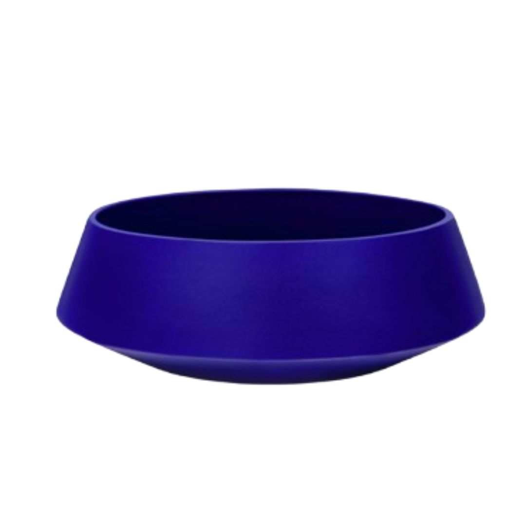
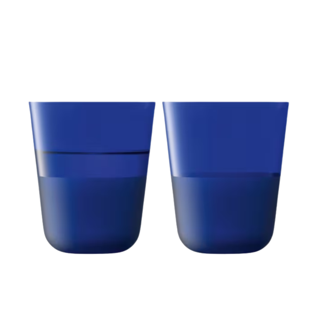
When it comes to kitchen colors, one trend is impossible to miss: richer, more saturated tones, especially saturated blue. It has long been a familiar favorite in this room, but its bolder, more electric versions are everywhere right now, splashing across cabinets, islands, backsplashes, and even flooring. Designers and homeowners are embracing it with surprising enthusiasm.
Beyond its big personality, saturated blue acts as both a camouflage and a mood booster. It brightens even the dullest kitchens and cleverly disguises tired appliances or old surfaces with a single, confident coat of paint. With its rising popularity this year, it begs the question: Does this shade have real staying power? And why are so many people suddenly obsessed with it?
Article continues belowWe asked design experts to help us understand the surge in this saturated blue kitchen trend, and here’s what they had to say.
Why Is Electric Blue a Trend in Kitchens?
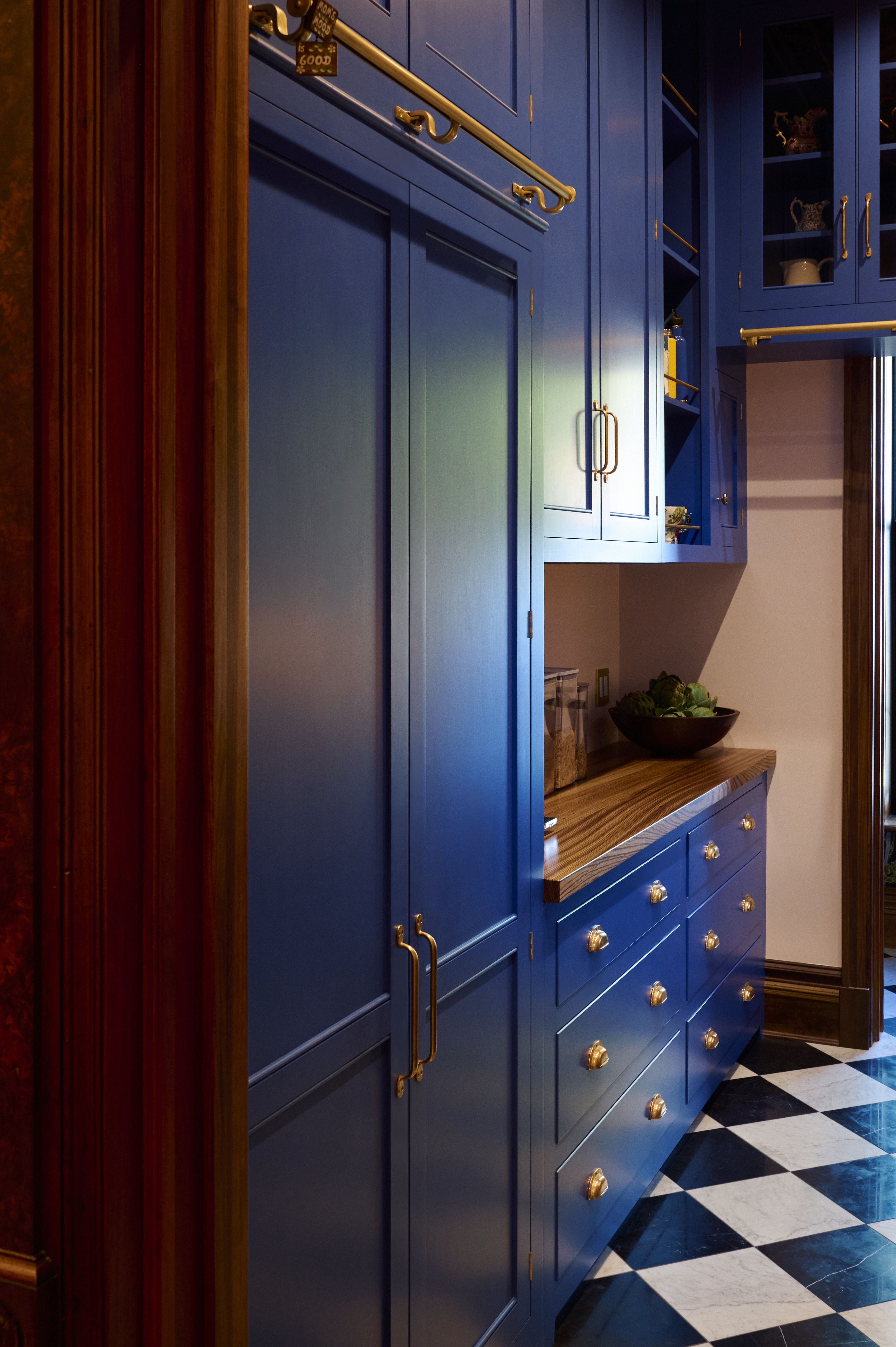
Not just for modern spaces, this more classic style looks great in bright blue, too.
Image credit: deVOL
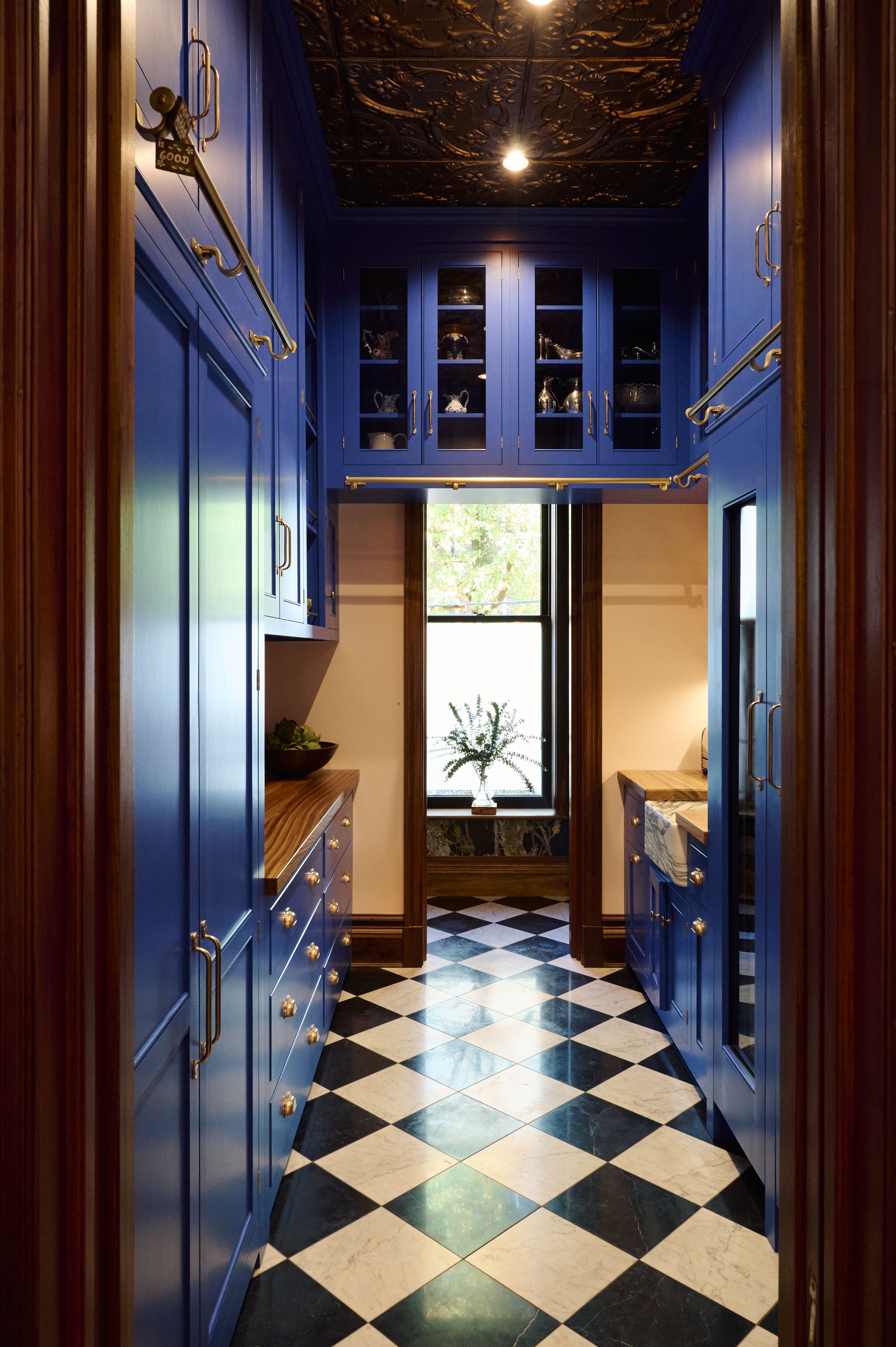
Choose brass hardware for the best contrast with blue.
Image credit: deVOL
Blue kitchens in softer or more traditional tones have been around for years, but a saturated blue, especially a cobalt or electric blue, has a presence that refuses to be forgotten. “The hue is fashionable, but it’s really quite different and original,” says Helen Parker, creative director at deVOL. “I haven’t seen many kitchens in this color, so I don’t think you’re in danger of it going out of fashion. In one tiny room, it makes that room really special.”
Electric blue is a high-energy hue, and it’s especially powerful in small kitchens, where the color does so much visual lifting that square footage becomes almost irrelevant. It looks striking on kitchen cabinets, a kitchen island, or even on the floors, and it pairs beautifully with warm woods or brass hardware; an instant way to create contrast and depth.
Interestingly, as Alan Drumm, co-founder of Uncommon Projects, points out, this isn’t a sudden infatuation or a random trend; it has deep cultural roots. “There is always a creative history behind any color, and blue carries a particularly rich one. Yves Klein captured it with extraordinary intensity. Terence Conran helped popularize deep, saturated blues in the UK. The traditional French ‘bleu de travail’ chore jacket has returned to fashion, and publisher Fitzcarraldo Editions has built a recognizable identity around this same color. So while blue may look ‘of the moment,’ its appeal is rooted in decades of use and meaning.”
The Livingetc newsletters are your inside source for what’s shaping interiors now - and what’s next. Discover trend forecasts, smart style ideas, and curated shopping inspiration that brings design to life. Subscribe today and stay ahead of the curve.
While navy remains a trusted classic, electric blue reflects a shift toward unapologetic expression — homes filled with personality, quirks, and confidence. Practically speaking, the deeper shade hides stains and scuffs better than many lighter tones, and since so many colors go with blue, it’s also one of the easiest hues to design around.
Helen Parker is deVOL’s Creative Director. She joined in 2004 as a kitchen designer and by 2011 she had become responsible for deVOL’s style, creating one-of-a-kind showrooms, sourcing antiques and gifts, and designing new pieces of furniture and accessories.
Architect Alan Drumm co-founded the London-based studio, combining expertise in interior architecture, design, and fabrication with a modernist sensibility and a deep appreciation for plywood’s material potential.
What Makes it Stand Out From Other Colors?
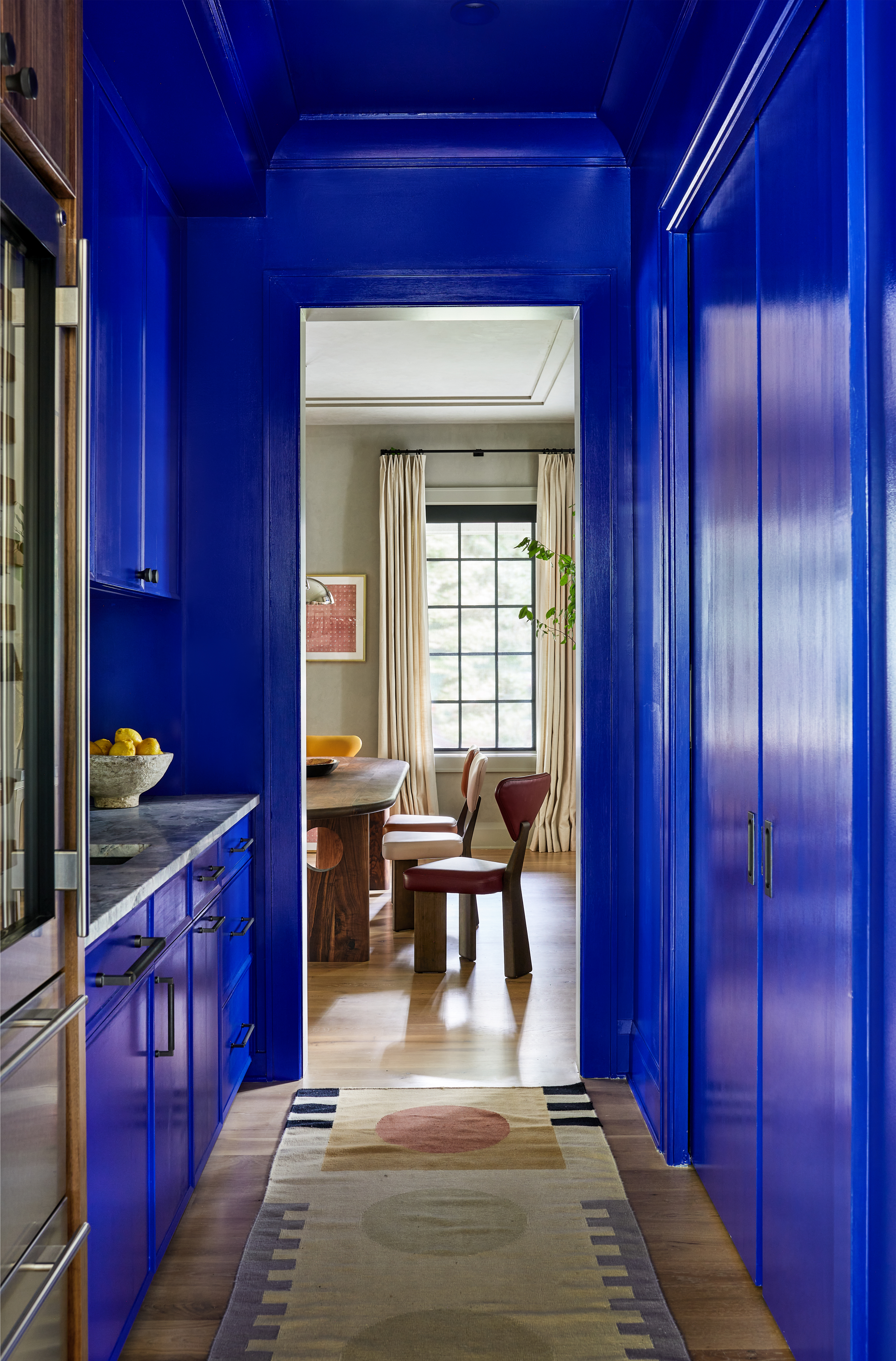
Choose a gloss paint finish to make the kitchen sing.
Unlike other colorful kitchens, an electric blue kitchen immediately signals that the homeowner has an unapologetic eye for design and a fearless approach to color. Softer, more calming blues have long been popular, but electric blue operates differently: it’s energetic, sculptural, and instantly becomes the focal point of the design. In many cases, you can build the entire room’s identity around this single shade.
Saturated blue thrives on larger elements, such as cabinets or an island, helping you shape what might be the most modern kitchen in the house. It’s a tone that doesn’t whisper; it declares.
It may feel like a color that falls firmly into 'trend' category, but for something so vibrant, some designers would argue it's actually a timeless classic. “I’m not convinced that blue is more relevant today than it has been in the past,” says Alan. “Since we founded the studio in 2011, both light and dark blues have been consistently popular. I think that’s because blue is a classic. It has more character than paler whites or grays, yet it rarely dates. The key is choosing the right shade. Deeper blues tend to feel warmer. Colder, high-chroma tones can be beautiful, but they often need balancing with warm materials like oak or cork to keep the space inviting.”
What Are the Different Ways to Use This Color in the Kitchen?
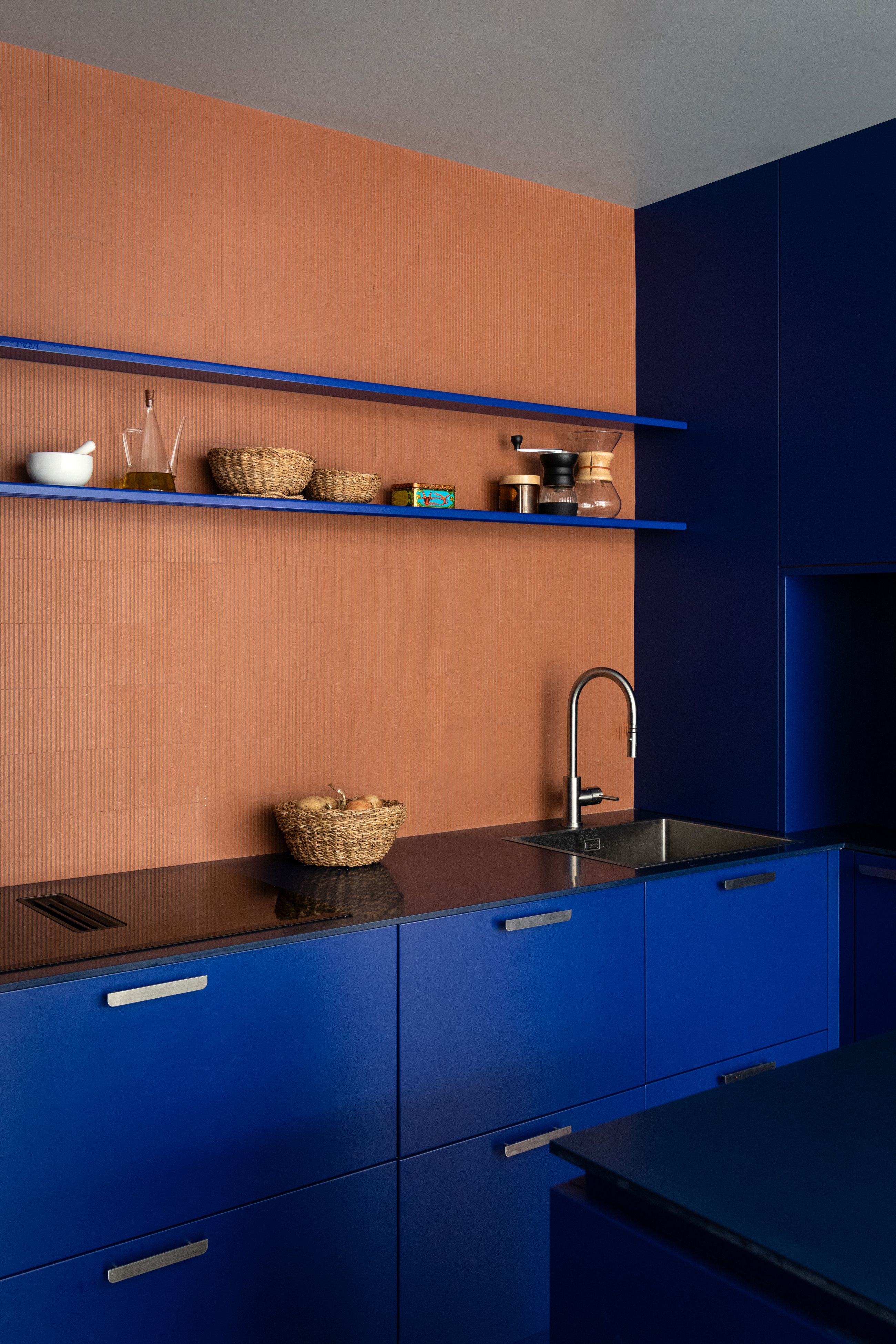
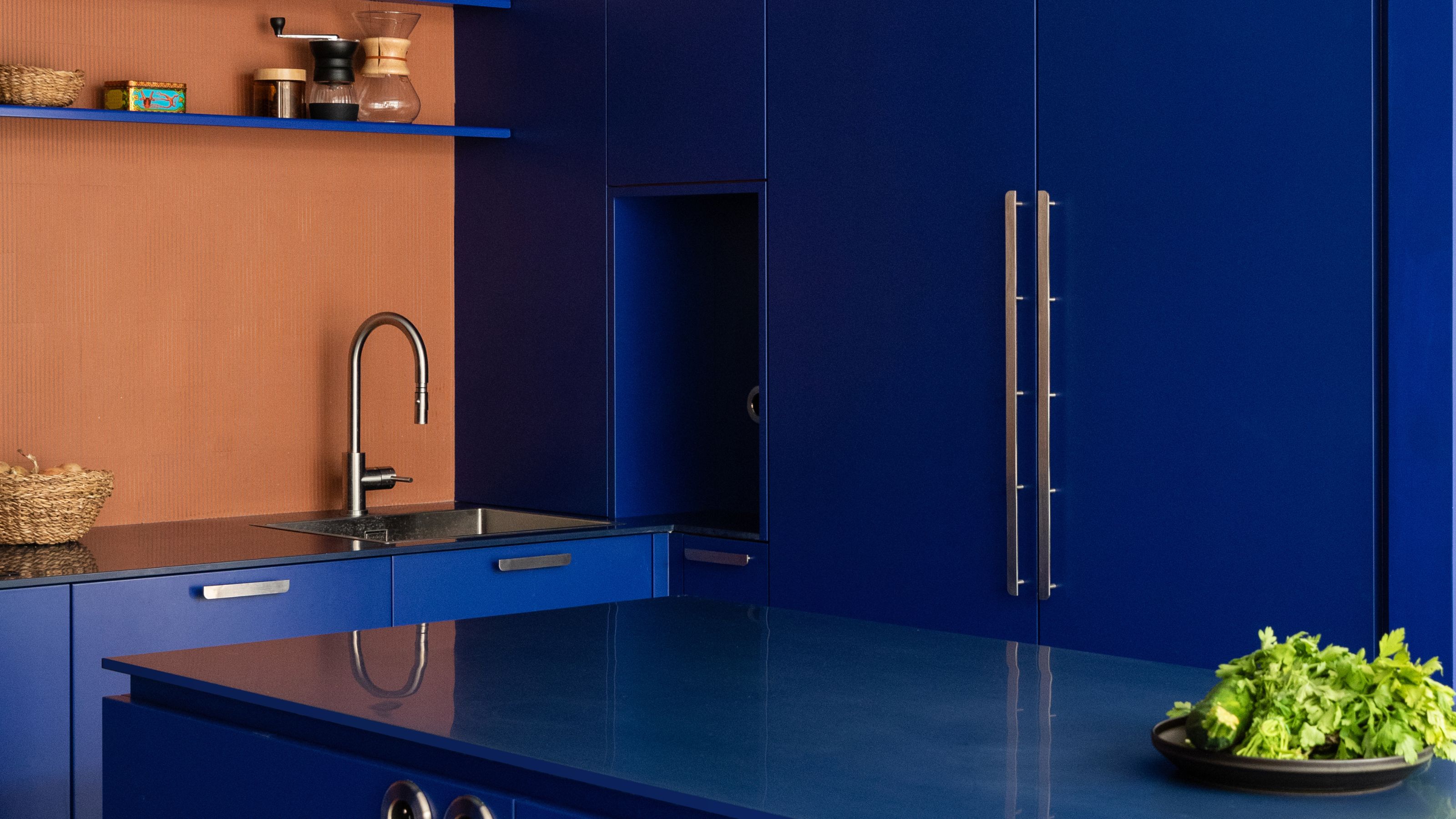
Choose cobalt blue for a great color block effect.
Image credit: OUI Architecture
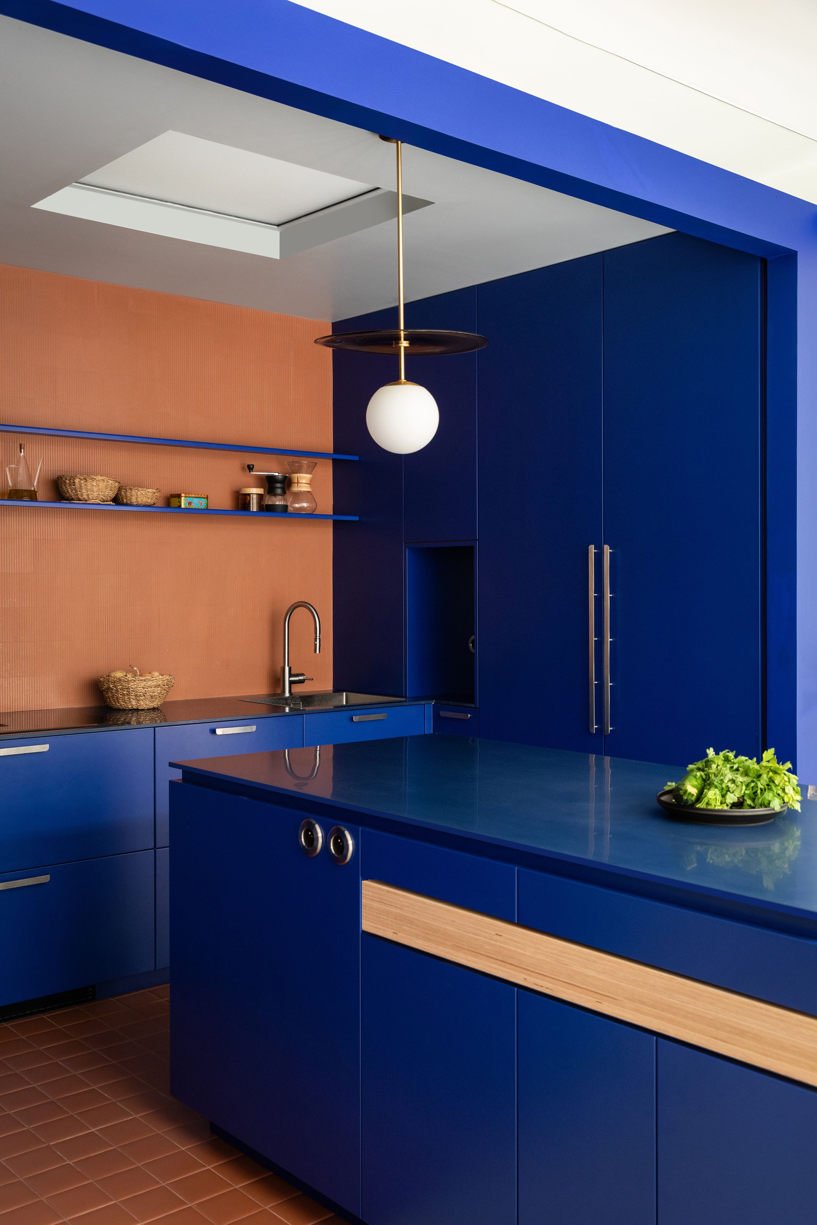
Choose an effective kitchen light to ensure the space doesn't feel too dark with the blues.
Image credit: OUI Architecture
A striking example of this approach comes from a project by Noa Peer of OUI | Office for Urban Innovation. “The starting point for this kitchen was the clients’ desire to introduce an electric blue into the space,” he explains. Because the kitchen sits in a nook with no natural light, the team leaned into the intensity of the hue: “The darker tones enhance the specificity of the space and give it a unique atmosphere.”
The complementary terracotta used elsewhere in the home appears again in the kitchen backsplash — a textured, three-dimensional tile that adds warmth and contrast. When decorating with cobalt, terracotta’s earthy undertones create a beautiful counterbalance. “The mirrors surrounding the kitchen help reflect and amplify the light within this enclosed nook,” Noa adds. “We even designed a ‘fake roof window’ to create a sense of natural light and make the space feel brighter.”
Beyond built-ins, designers also recommend introducing this bold tone through easily changeable accents, bar stools, art, flowers, or kitchen pendant lights. “Deeper shades settle beautifully in darker spaces,” Alan adds. “We tend to use ultra-matte laminate on plywood doors because matte surfaces make blue feel gentler and more tactile. High-gloss finishes can shift the color toward something colder and less personal. Pairing blue with warm timber always keeps the space grounded and inviting.”
OUI’s work follows a circular, non-linear ethos, constantly pursuing innovative, ecological solutions across architecture and urbanism, from concept to construction.
Will the Saturated Blue Trend Continue in 2026?
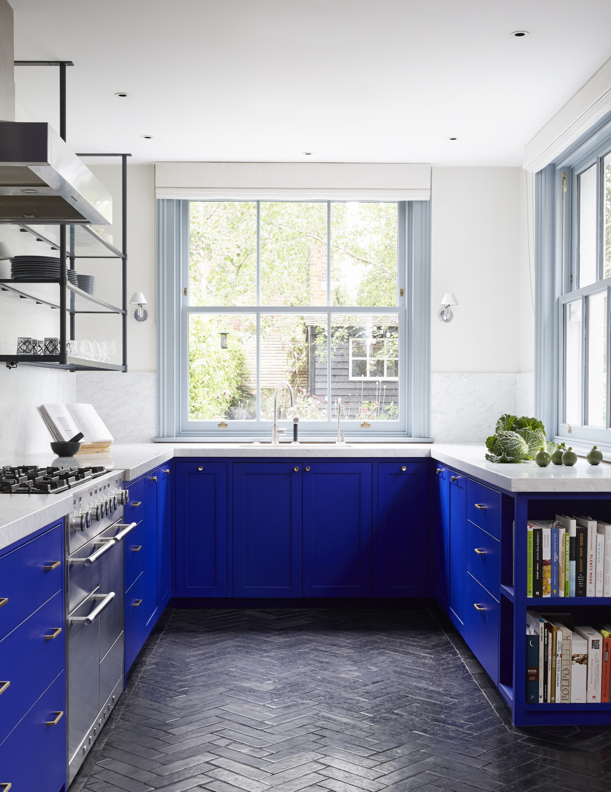
Balance the effect of saturated blue with neutral walls.
As designers have pointed out, this "non-trend/trend" tone will continue well into 2026, since its appeal isn’t rooted fleetingly but in the shade’s strong creative lineage and its ability to feel both modern and timeless. So if you're remodeling a kitchen, you might want to give saturated blue a chance!
Unlike trending pastels or seasonal neutrals, saturated blues have depth and personality to anchor a room while still being versatile. What's better is that it works with a large spectrum of materials, from warm woods, polished metals, to stone, and textured finishes. Homeowners are also increasingly drawn to bold, expressive palettes that reflect individuality, and saturated blue delivers that confidence in spades. So, this vibrant hue isn’t going anywhere in 2026.
Electric blue kitchens signal confidence, creativity, and modernity, proving bold, saturated color can redefine everyday spaces with longevity and style.
Aditi Sharma Maheshwari started her career at The Address (The Times of India), a tabloid on interiors and art. She wrote profiles of Indian artists, designers, and architects, and covered inspiring houses and commercial properties. After four years, she moved to ELLE DECOR as a senior features writer, where she contributed to the magazine and website, and also worked alongside the events team on India Design ID — the brand’s 10-day, annual design show. She wrote across topics: from designer interviews, and house tours, to new product launches, shopping pages, and reviews. After three years, she was hired as the senior editor at Houzz. The website content focused on practical advice on decorating the home and making design feel more approachable. She created fresh series on budget buys, design hacks, and DIYs, all backed with expert advice. Equipped with sizable knowledge of the industry and with a good network, she moved to Architectural Digest (Conde Nast) as the digital editor. The publication's focus was on high-end design, and her content highlighted A-listers, starchitects, and high-concept products, all customized for an audience that loves and invests in luxury. After a two-year stint, she moved to the UK and was hired at Livingetc as a design editor. She now freelances for a variety of interiors publications.
