Forget One-Color Kitchens, The 'Tri-Color' Kitchen Rule Is the Way People Are Choosing Sophisticated Schemes for Their 2026 Projects
Monochrome no more, say hello to the coolest (and most colorful) kitchen trend of the moment — prepare to be obsessed

The Livingetc newsletters are your inside source for what’s shaping interiors now - and what’s next. Discover trend forecasts, smart style ideas, and curated shopping inspiration that brings design to life. Subscribe today and stay ahead of the curve.
You are now subscribed
Your newsletter sign-up was successful
If the sight of an all-white, monochromatic kitchen causes you a mini heartbreak, I think I've got a trend you're going to like.
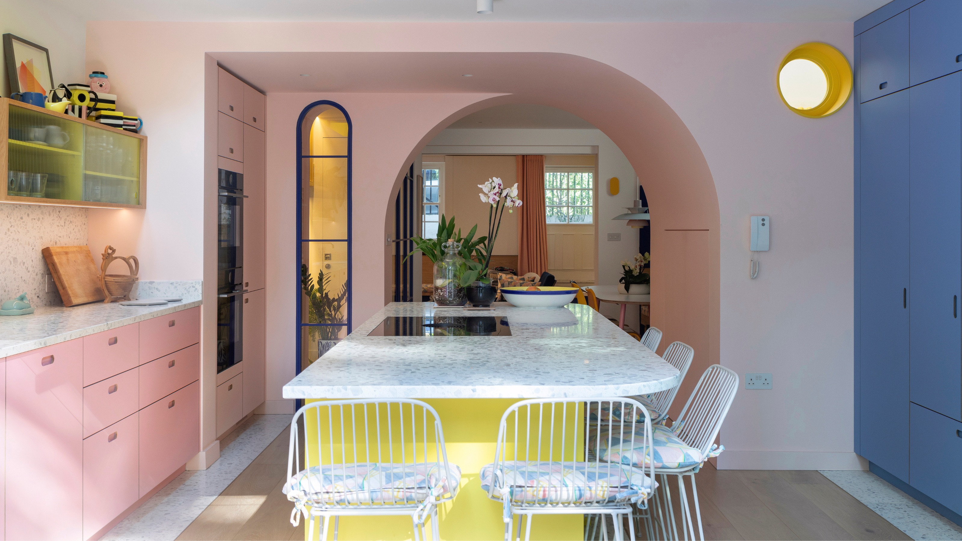
The antithesis to the boring kitchens of the 2010s, the tri-color kitchen goes all in on color maximalism. That's right, goodbye color-drenching and two-tone kitchens, this new modern kitchen look is all about embracing a full color palette, with plenty of variety and contrast included. But that doesn't mean your kitchen has to look like a full rainbow explosion; this style is just as suited to subtle, earth-toned shades as it is vibrant hues. It's an endlessly customizable trend, with plenty of room for you to bring your own character and personality into the style.
Personally, I love any space that feels rich and complex, something multi-layered and visually stimulating, and this style delivers that with ease. And I'm not the only one who's been obsessed, I've asked the experts to explain what they love about the trend, too, so hopefully you can join our team.
Article continues belowWhat Is a Tri-Color Kitchen?
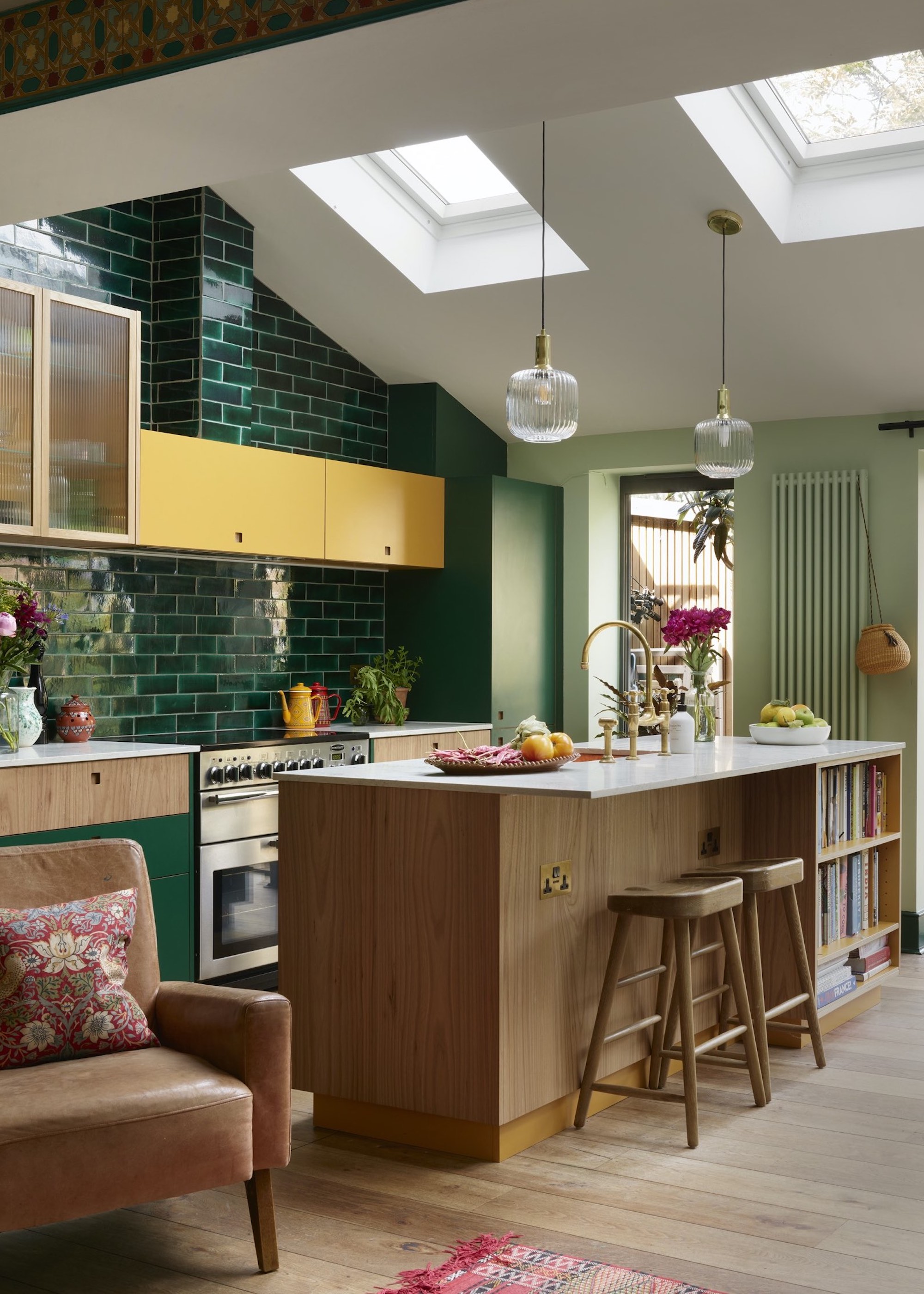
Generally, tri-color kitchens use a different color on the cabinets, walls, and island.
First of all, let's start with the basics — what exactly is a tri-color kitchen?
Offering an explanation, Fiona Ginnett from HØLTE says, "A tri-color kitchen is basically one where you play with three different colors across cabinets, walls, and accents to give the space a bit of personality and energy."
Similarly, Tom Howley, founder of the eponymous kitchen brand, says, "A tri-color kitchen uses three complementary shades across cabinetry, island, walls, or accents to create depth and character."
Beyond this distinction between the kitchen island and the accents, most definitions broadly agree that this kitchen style hinges on the inclusion of three individual kitchen colors used throughout the space.
The Livingetc newsletters are your inside source for what’s shaping interiors now - and what’s next. Discover trend forecasts, smart style ideas, and curated shopping inspiration that brings design to life. Subscribe today and stay ahead of the curve.
There are some other intricacies to the trend, though. As kitchen expert Leila Touwen from Pluck explains, "Rather than there being one main color with smaller accents, the three hues are used broadly equally. Also, to be pedantic, a tri-color scheme does not mean three shades of the same color, for example, a lighter, mid, and darker green, as that is a color drench, focusing on one color."
No matter which elements you choose to highlight through color, though, the result remains largely the same. As Tom says, "Using three colors allows you to define different zones, add contrast, and highlight key features without overwhelming the space."
This design style adds more depth and definition to the space. "This look feels considered and instantly elevates the overall look and feel," comments Al Bruce from Olive & Barr.
At its best, this is a look that can introduce character and personality, while also allowing for an element of continuity and seamless cohesion across the design.
With 20 years collective experience in architecture and fashion, designers Tom and Fiona founded Witlof, a bespoke design and build furniture company specialising in kitchens. A belief that good design and high quality materials should be available to everyone led them to establishing HØLTE in late 2017.
Why Does It Work?
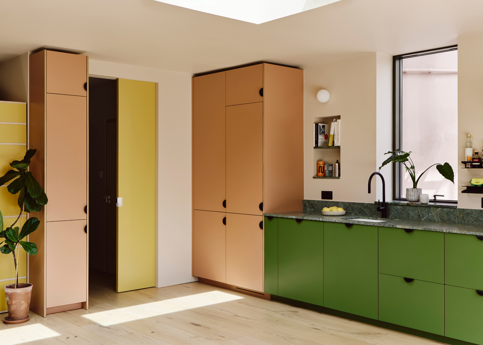
"Take our Park House Gardens project — the bold yellow doors at the kitchen entrance echo the home’s façade, while the playful accent wall storage keeps everything feeling balanced," says Fiona.
To those of us who lean more towards minimalist interior design styles, this many contrasting colors in one room may sound like a recipe for disaster. But, when done well, it can actually have the opposite effect.
"It works because the colors are placed thoughtfully to guide the eye and separate different zones," explains Fiona.
This means the style would work just as well in small kitchens as it would in huge, sprawling ones. The separation of areas by color gives the space more dimension, while also helping to zone the kitchen in a way that feels more natural.
Plus, it doesn't have to be done in shocking, bright tones; there's space to try this look with a whole range of color palettes, depending on what would best suit your space. "Tri-color kitchens bring depth, contrast, and texture to your space, working just as well with neutral tones as they do with bolder schemes," explains Massimo Buster Minale from Buster + Punch, "It’s less about following rules and more about creating a kitchen with real character - one that feels lived-in, layered, and designed to stand out."
Renowned London architect and industrial designer Massimo launched the Buster + Punch label in 2013. Following a career at Foster & Partners and Richard Rogers, Massimo decided to chase his passion.
The Best Color Combinations for Tri-Color Kitchens
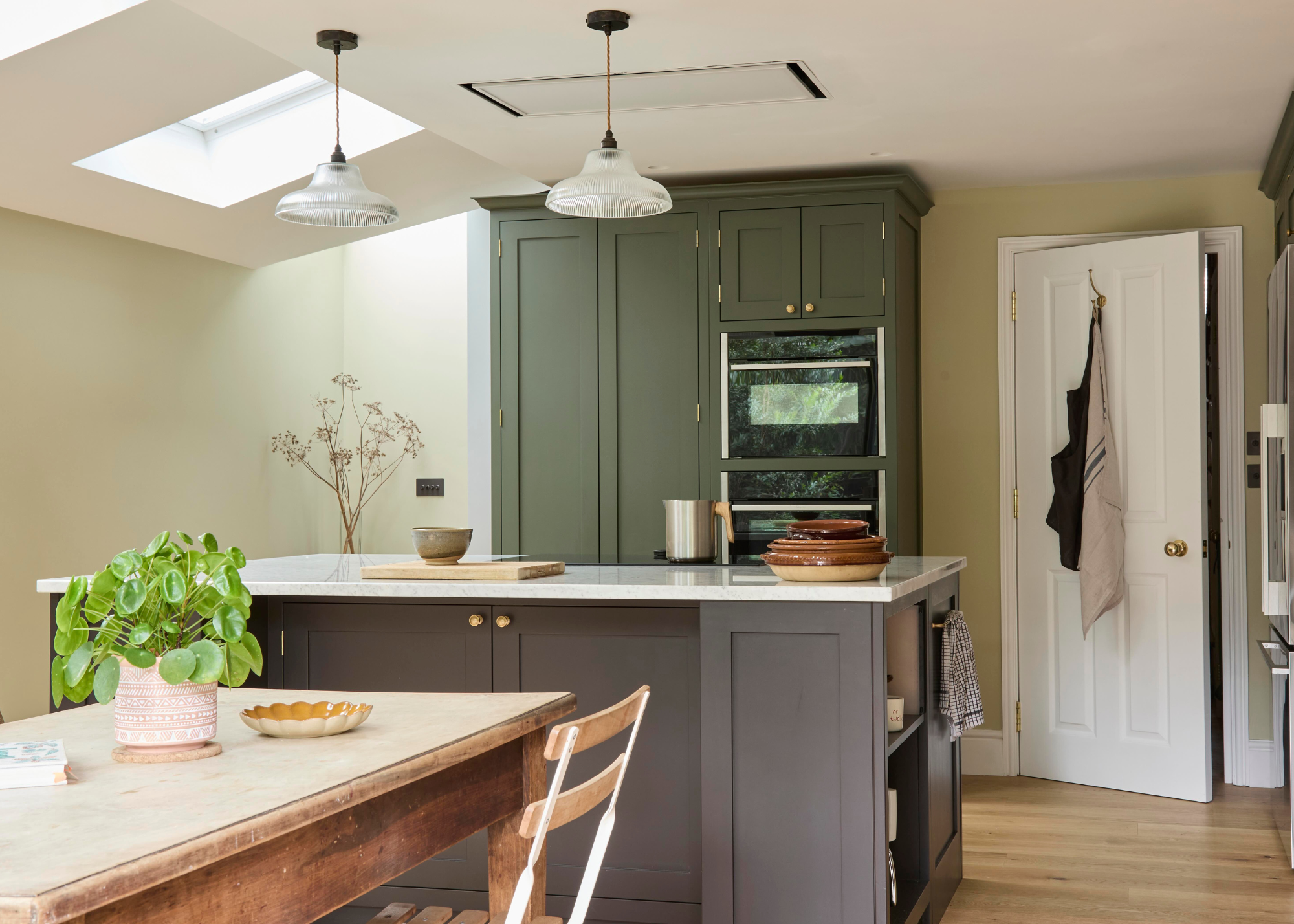
Muted, earth-toned colors are great for a more toned-down look.
When you first hear the term 'tri-color kitchen', the immediate image is one of three bright, contrasting colors used throughout the room. But this is just one type of tri-color kitchen, and subdued, earthy color palettes can work just as well in this context. The key is choosing colors that have at least some noticeable degree of difference between them.
"Personally, I love grounding schemes in something earthy, whether that’s deep olive, charcoal, inky blue, or a deep red," says Massimo. "They work great layered with a soft neutral and a natural material like oak or ash, as well as natural stone."
Choosing one standout color and pairing it with two more subtle shades can be a super effective way to build a tri-color kitchen that doesn't feel too overwhelming. It's an approach loved by Tom, too, who says, "I love pairing soft neutrals with a bold accent — for instance, chalky whites, soft greys and a deep navy or forest green. It creates a timeless palette that feels rich but never overpowering."
It's also a brilliant design choice for the indecisive, as you don't have to commit to just one shade. And it's not hard to find colors that look beautiful together, just look for inspiration in nature, or artwork, places where varying shades and hues come together to create a harmonious palette.
Or, for a more dramatic look, Graham Duke from Everhot says, "A great way to achieve a striking tri-color kitchen is to combine a bold hue on your island with more neutral surrounding cabinetry and a range cooker that introduces a playful pop of color." Introducing elements of color through kitchen appliances is a fun spin on the trend that we also love.
How to Style Your Tri-Color Kitchen
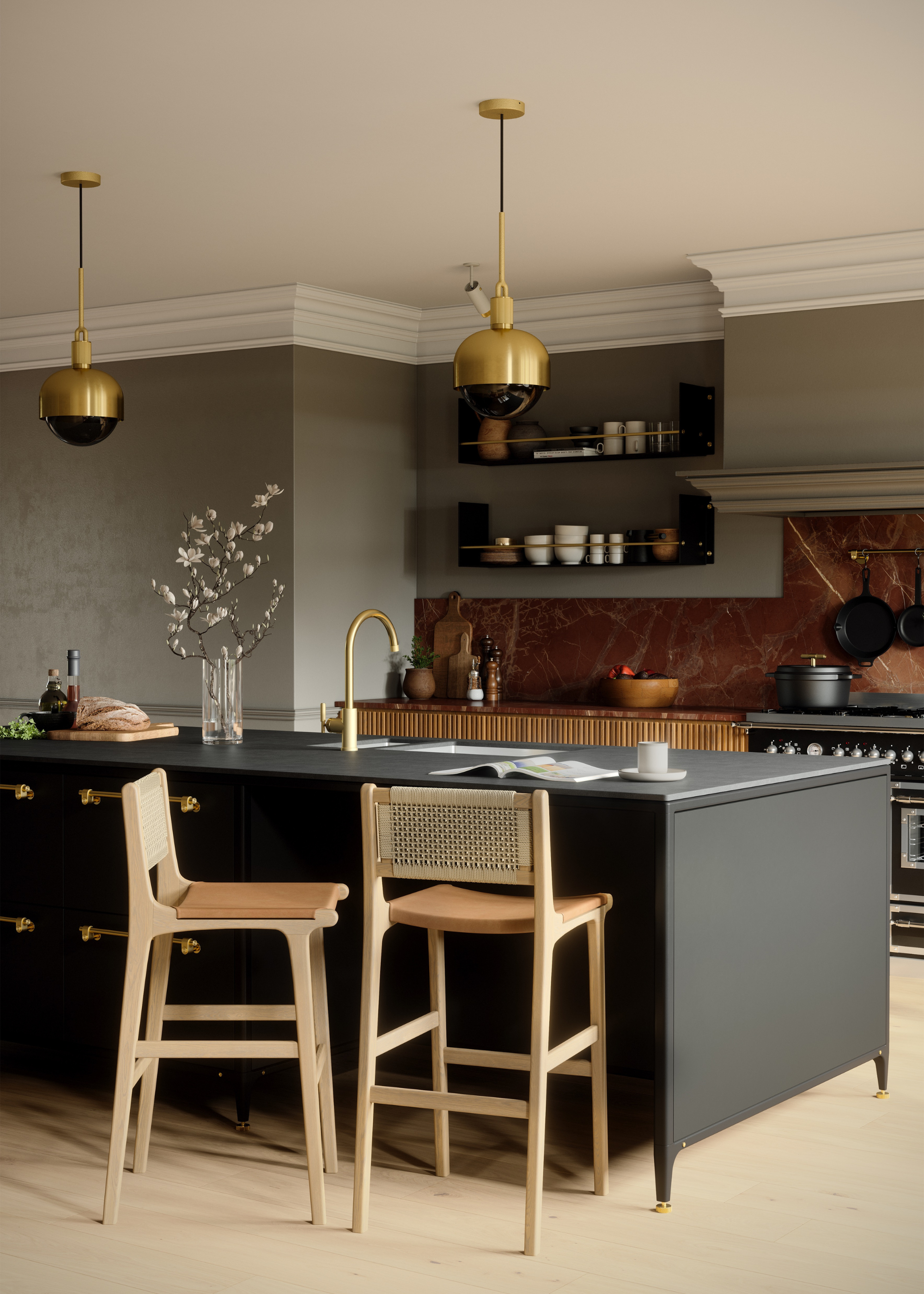
Bronze tapware and lights bring a touch of luxe to this tri-color kitchen.
While the design in itself will make a statement, the way you style it is what will really make or break this look.
"Pairing painted cabinetry with tactile worktops such as honed marble or quartz is a great starting point," says Al. "The finishing details, such as hardware and lighting, are key, whether that’s aged brass or chrome, to bring a sense of contrast. And I’d always suggest a touch of imperfection, whether that’s a hand-thrown vase, a timber stool, something that reminds you this is a space to live in, not just look at."
Bringing this balance between color and texture is what will make the space feel welcoming and lived-in, so antiqued finishes and natural materials will be your best friends here. This is also the approach Fiona adopts, as she explains, "Styling a tri-color kitchen is all about mixing colour with texture and tactility."
As Al mentions, your kitchen lighting can also have a major impact on the way the space feels. In fact, Massimo goes as far as to say, "Lighting is just as powerful as your palette in a tri-colour kitchen - it’s what brings the scheme to life."
He continues: "Use it to highlight the interplay between tones and textures, drawing out the richness of each colour and material. Over an island, statement pendants in a warm brass or cool steel finish can anchor the space while introducing another tactile layer."
Or, for a more customizable finish, he says, "Dimmable lighting lets you shift the mood from bright and functional to soft and intimate — bringing the perfect balance to a multi-tonal design."
If you're not quite ready to embrace this multi-toned look, there are plenty of monochromatic styles that are way more interesting than the tired all white look. I'm especially into the playful feel of a yellow kitchen.

Maya Glantz is a Design Writer at Livingetc, covering all things bathrooms and kitchens. Her background in Art History informed her love of the aesthetic world, and she believes in the importance of finding beauty in the everyday. She recently graduated from City University with a Masters Degree in Magazine Journalism, during which she gained experience writing for various publications, including the Evening Standard. A lover of mid-century style, she can be found endlessly adding to her dream home Pinterest board.
