This Color-Filled Polish Apartment Turns Architectural Quirks Into Design Highlights
Surprising color combinations and plenty of artistic details bring character and life to this townhouse apartment
Located in the Nadodrze district of Wrocław, this townhouse apartment had plenty of architectural charm and character straight from the jump.
The challenge, however, was decorating an apartment that spoke to this, while simultaneously referencing the client's previous home in London. For many of us, our homes are a reflection of ourselves, of our upbringing, our culture, and our past. And for the couple behind this apartment, whose upbringing and past had been split across two countries, their home needed to capture this. "The clients dreamed of a home that would feel both London and Polish at heart," explains the architect behind the design, Luiza Anyszka.
The homeowners craved the theatricality and drama of British design, as well as the sensitivity and craftsmanship that are so vital to Polish visual culture. This was the dichotomy at the heart of this project, and was a challenge that the designer, Luiza, welcomed with open arms.
And, as Luiza goes on to describe, "It is a home that tells a story of living between two cultures — a home that does not choose a single identity, but creates its own."

Luiza started designing while studying at the Warsaw University of Technology, she then went on to work in architectural offices in Poland (Bed&Breakfast, HRA Architekci, COLOMBE Studio) and the UK (HÁM Interiors). For six years, she's specialized in interiors in pre-war tenement houses and historic homes. These bear the marks of history recorded over the years. When designing them with a contemporary touch, she prefers to dust them off rather than cover them with a fresh coat of paint.
The Brief
Shaped by both their years spent in London and their Polish heritage and upbringing, the couple who live in this apartment were searching for a home that reflected their personal identity through design. In practical terms, this looked like a space with a natural, welcoming atmosphere. "They wanted a warm, lived-in interior with classic proportions, real craftsmanship, color, and a sense of life," says Luiza, who meticulously designed the home to meet the couple's needs.
British interior design can be characterized in several, occasionally contradictory ways, with a strong brutalist history sitting alongside a more traditional, countryside, cottage style decor aesthetic. But, in the context of this property, it was the British tendency towards theatricality that most appealed. This, combined with the Polish appreciation for craftsmanship, formed the fundamental basis behind this design.
It was all about creating a space designed to be lived in. "They wanted comfortable, timeless spaces with practical storage, natural materials, and a gentle theatricality," says Luiza. "We combined elegance with everyday usability — a place to cook, to read, to host, to live."
The Livingetc newsletters are your inside source for what’s shaping interiors now - and what’s next. Discover trend forecasts, smart style ideas, and curated shopping inspiration that brings design to life. Subscribe today and stay ahead of the curve.
Working closely alongside her clients, the design was an essentially collaborative process. "They also came to me for ideas, and were wonderfully open and trusting," Luiza tells me. "Together we searched for a unique focal point for the home office, and they agreed on a small work of art on the wall: a hand-painted and embroidered wallpaper by De Gournay."
The Inspiration
"The inspiration came from the two worlds that shaped the clients’ lives: London and Poland," says Luiza.
Describing the influence each location had over the final design, Luiza says, "London gave us a love for decorative details, joinery, soft eclectic style, and color. Poland gave us a deep appreciation for craftsmanship and history."
These two identities merged in this property, creating a home with a rich sense of character and individual identity, not wholly British, nor entirely Polish, but a blend of the two. In this way, the home is much like the couple that lives within it, an idea that was not lost on Luiza. "I was inspired by the idea of returning home after years abroad — bringing memories, favorite objects, and habits from London, and weaving them into a historic Polish townhouse," she explains.
It was not just the culture as a whole that acted as a point of inspiration, though, "English designers were also a reference — the way they treat joinery as architecture, their fearless layering, their comfort with imperfection," adds Luiza. "But I always like to echo Polish roots: materials, folk motifs, colors, a bit of nostalgia. For me, the balance between the two is the story."
It was important, too, that the design did not feel like mimicry or a set. It may have looked to the past for inspiration, but the design itself is uniquely of this time. "This apartment does not imitate the past — it interprets it," says Luiza.
The Challenges
Although undeniably beautiful, a turn-of-the-century townhouse did bring some inevitable design challenges with it.
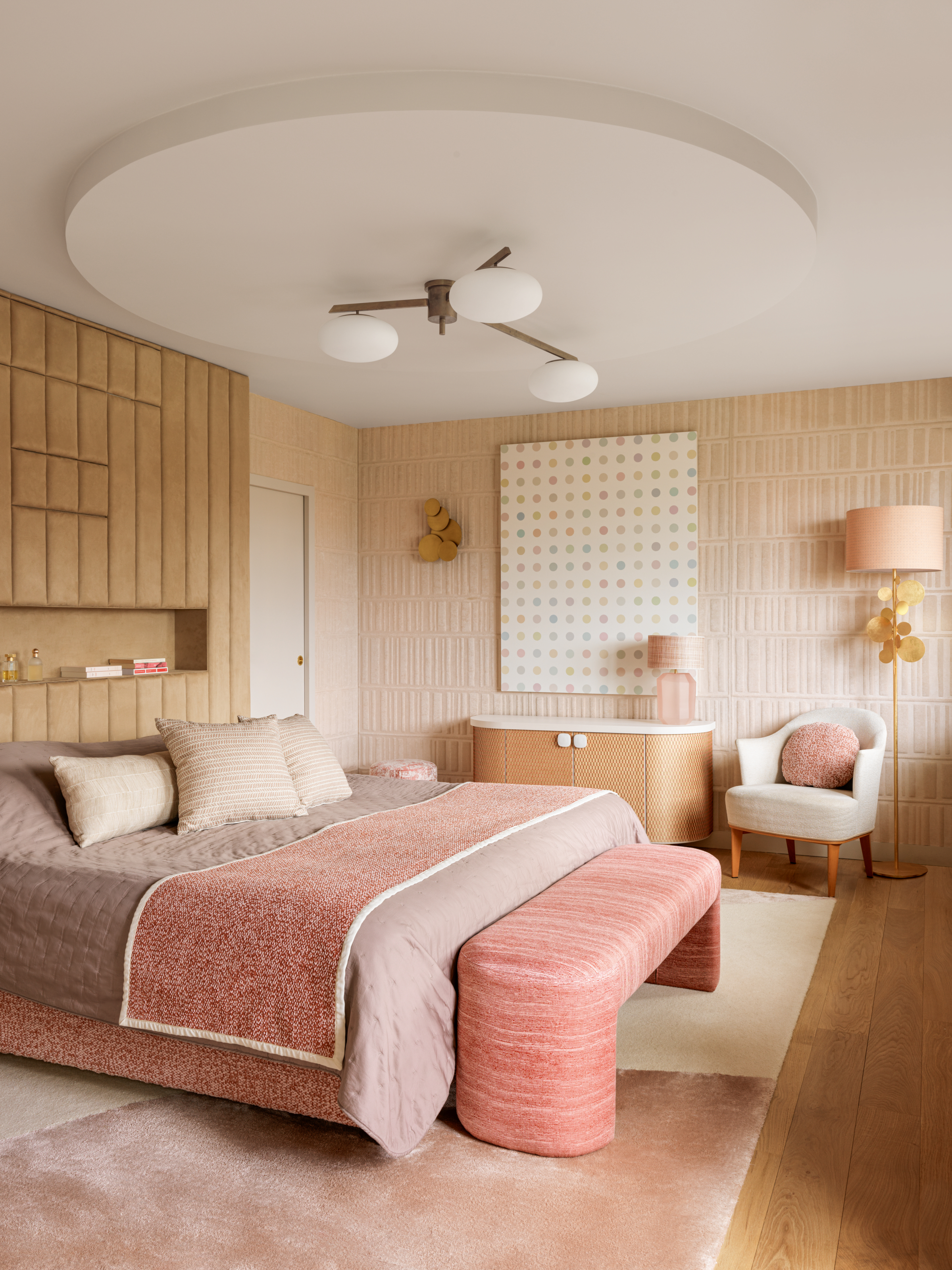
"One of the most unusual features was the layout," says Luiza. "You enter the principal bedroom through the kitchen. The clients loved this eccentricity, so we kept it — it creates a private, intimate wing away from the hallway and living areas."
Instead of working around these eccentricities and trying to mold them to fit a more conventional layout, they decided to embrace them, making the most of all that made the property so unique in the first place. "We embraced the high ceilings, kept wooden floors, original proportions, and the spirit of the townhouse. Every new element had to feel respectful to the building, never imposed," says Luiza.
This is not to say, however, that it was an easy process.
"Orientation was a challenge," explains Luiza. Understanding how the light would impact each room and designing around this was key to making the most of the space. "The living room and study face north, but we weren’t afraid of the light: the living room is brightened intentionally, the study is deliberately moody and atmospheric, embracing the northern quality. Meanwhile, the bedroom — facing south — could carry warm colour and sunlight, and the kitchen became the connector in between."
Trying to take a period house and make it modern will always come with difficulties, but in most cases, the beauty outweighs the challenge. "Working in an old tenement house is always demanding: uneven walls, surprises, layers of history. You have to keep your eyes open at all times, but this is also what gives soul."
The Design
In a flat so rich with color and character, it can be hard to pick one standout feature. However, it would be equally difficult to deny the appeal of the starry painted ceiling in the kitchen.
Explaining the inspiration behind this feature, Luiza says, "I have been obsessed with starry skies since childhood. There is a church in a small village, Złaków Kościelny, where I used to stare at a deep blue sky painted by students of Jan Matejko. I remember the calm, the magic — it always stayed with me."
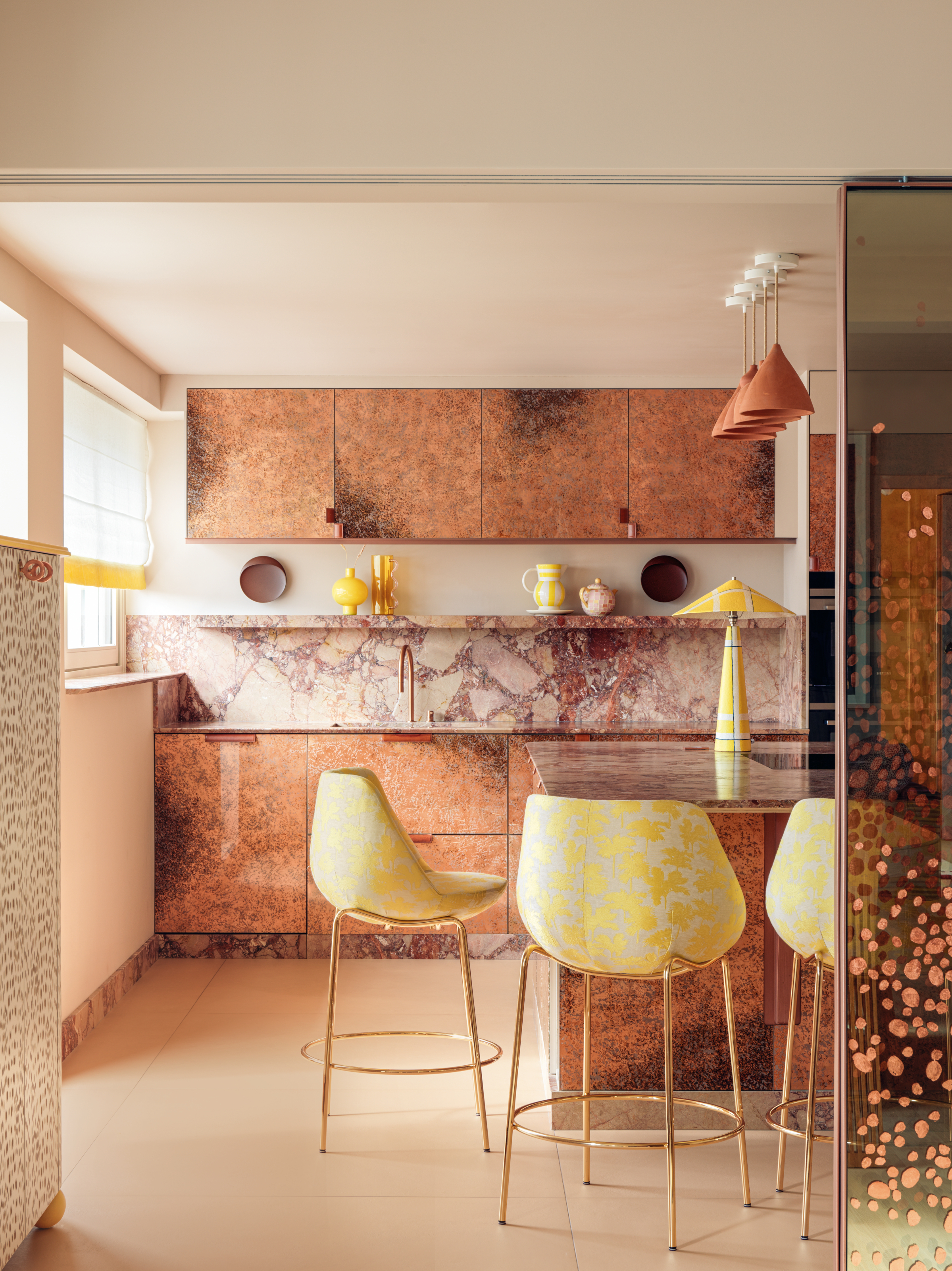
Bringing this same magic to this home, Luiza brought a touch of escapism to the narrow kitchen. By making the focus feature the ceiling, Luiza was able to bring personality to the room, without making it feel cramped or overwhelmed, which can easily happen in small kitchens. This dream-like design echoed the already dream-like quality of this room, which centres around the client's wish-list feature, the La Canche range oven.
"The kitchen already had so much happening visually that I wanted one single moment of poetry, something 'in the clouds.' Since the La Canche range was the client’s dream, the deep night-blue ceiling felt like the perfect counterpart," explains Luiza. "It anchors the space and adds a quiet, contemplative note."
While painting the ceiling was an easy way to lift the kitchen in terms of aesthetics, it didn't make planning a small kitchen any easier, and Luiza still had to navigate the challenges of creating a smooth workflow with limited space.
"The solution was to follow a classic, almost textbook flow," she tells me. "Pantry and kitchen storage first, then cleaning and prep, and finally cooking. This logic made everything work."
This work triangle approach is a tried-and-tested classic, and it works for a reason. However, in order to make the room still feel interesting and beautiful, Luiza brought in a few additional design touches.
"We also designed three distinct furniture elements, each with its own detail and function," says Luiza, "so the room feels rich and intentional rather than simply narrow. And adding a small kitchen island in an English style helped give structure and comfort."
From just one glance around the space, it's not hard to guess the designer's stance on color. Nonetheless, Luiza shares, "I simply love color. I love saturated spaces."
But, in this home, color is not obnoxious or perfunctory. It's meaningful and sentimental, creating a different emotional energy in each room.
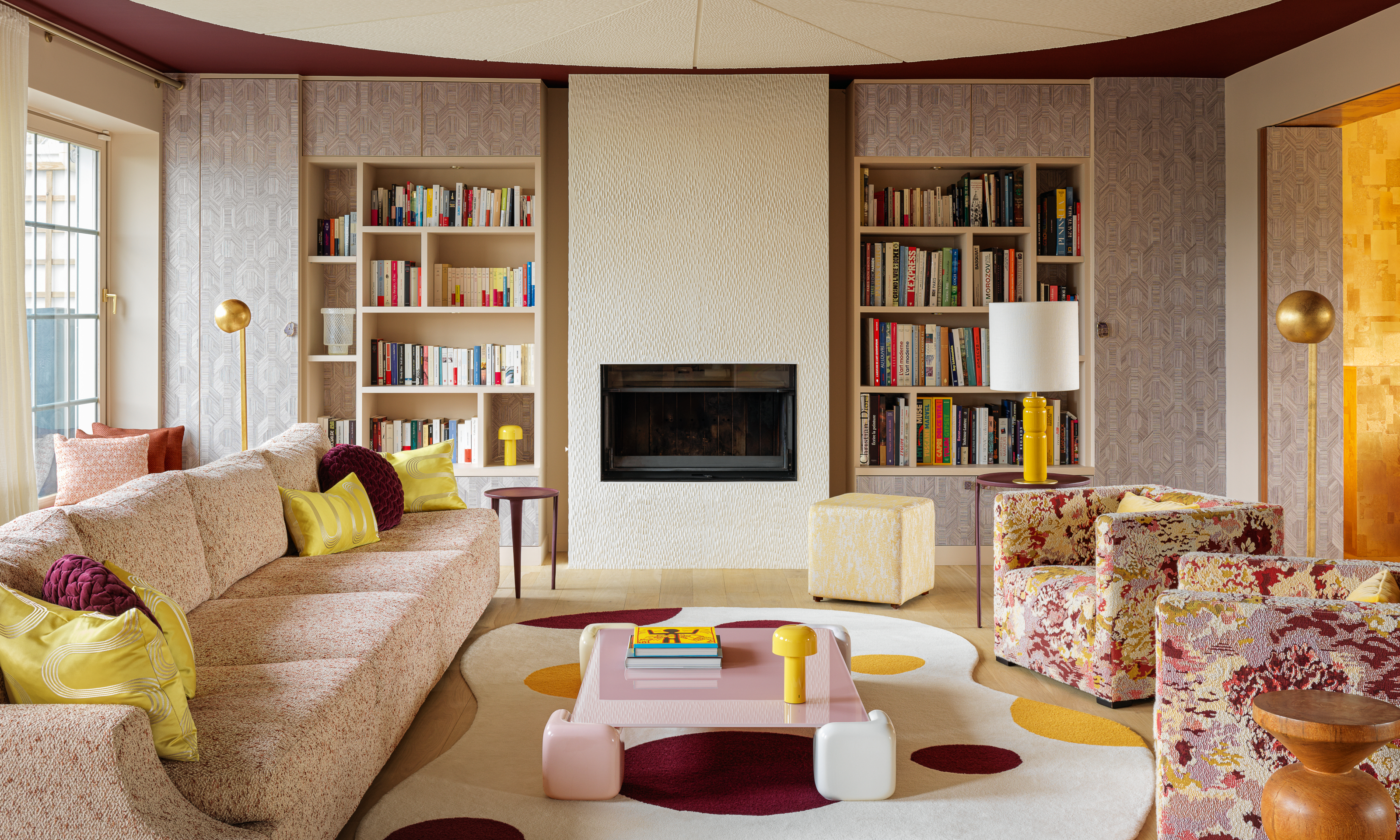
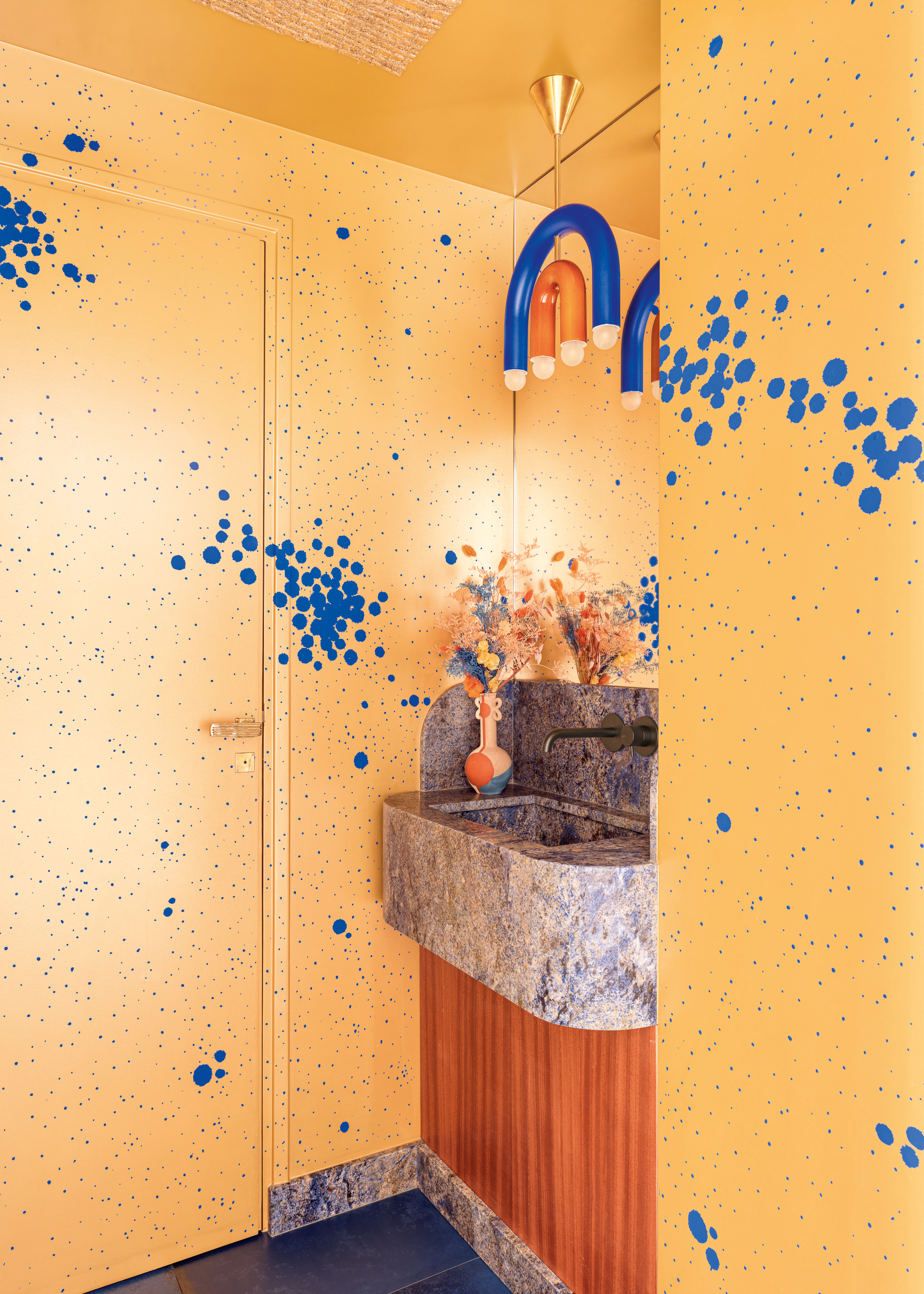
Describing these various atmospheres, Luiza tells me, "The living room is calm and bright. The kitchen is about function, so color becomes secondary. Hallways and transitional spaces are where you can be bold — wallpapers, darker tones, surprises."
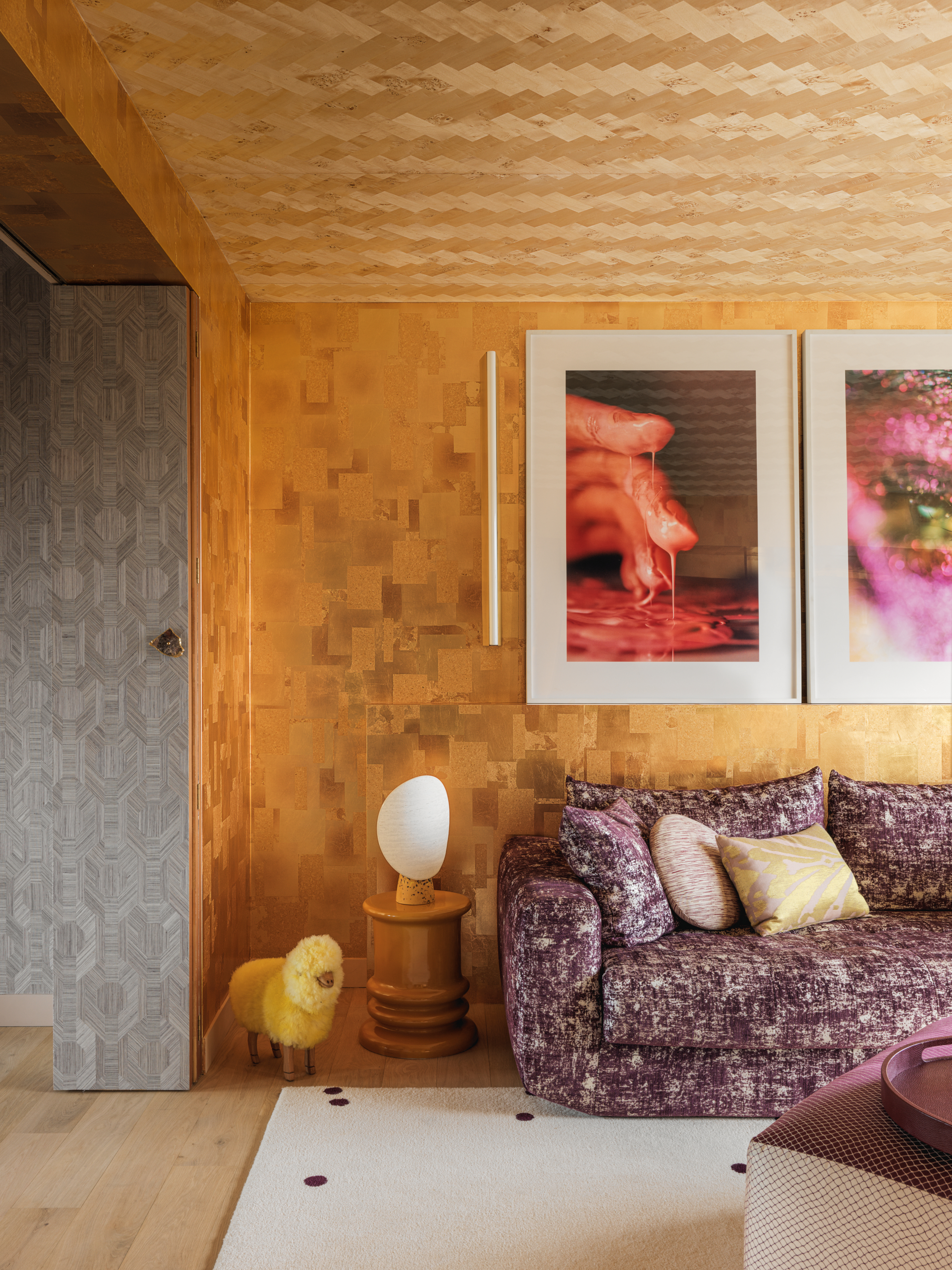
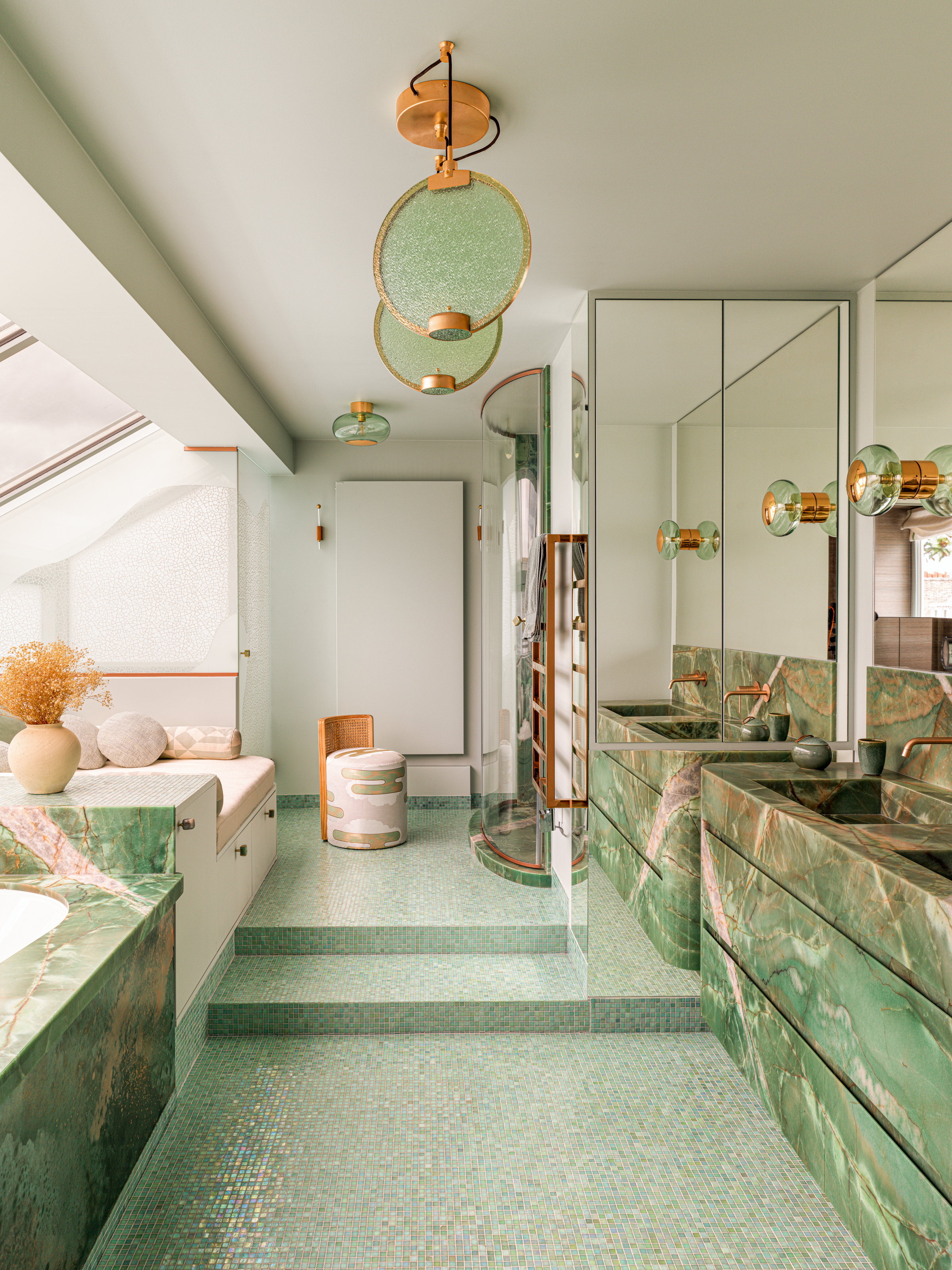
These colors don't act in a vacuum; they interact with the other shades they're paired with, offering surprising and unexpected color combinations. "I also adore unexpected pairings," says Luiza. "Sage green with rose, deep cherry with dusty neutrals. My favorite room, the study, was designed to feel like the heart of the home — a place to read, work, and curl up under a blanket. The Brinjal tone, paired with draped curtains in a Marie Antoinette spirit, creates a beautifully moody cocoon."
As well as through some excellent choices in paint colors, Luiza also relied heavily on art to bring more color and character to the home.
Reflecting on some of the highlights, Luiza draws attention to "Tęcza (Rainbow) mobile — designed by me with Dawid Stępień for our folk-art project KALINA, a graphic reinterpretation of a traditional Łowicz mobile." As well as "A drawing, 'The Boy on Horseback' by Natalia Kulka, inspired by Juliusz Kossak, hanging between windows on chains in a distinctly London way."
Combining these artworks with mid-century modern furniture and other vintage pieces was another way to build up more depth and visual interest in the home. "I’m a huge fan of flea markets, travel souvenirs, and small treasures that tell stories," Luiza says, "These objects are what make a house feel like a home."
This absolutely beautiful mural wallpaper is used in the hallway of this apartment, but would look equally beautiful in a small bathroom or bedroom. It has a delicate, elegant floral design, complete with exotic birds and butterflies.
There's a lot to love about this small apartment, but my favorite part has to be the color-drenched study, a moody delight in plum; it's gone straight to the top of my dream home mood board.

Maya Glantz is a Design Writer at Livingetc, covering all things bathrooms and kitchens. Her background in Art History informed her love of the aesthetic world, and she believes in the importance of finding beauty in the everyday. She recently graduated from City University with a Masters Degree in Magazine Journalism, during which she gained experience writing for various publications, including the Evening Standard. A lover of mid-century style, she can be found endlessly adding to her dream home Pinterest board.