They're Not Just White Walls — These 12 Neutral Color Schemes, Taken From Richly-Layered Real Spaces, Are Pure Inspiration for Pared-Back Palettes
From chocolate brown layered with ochre to plaster pink rooms, these are the neutral color palettes to try in 2026

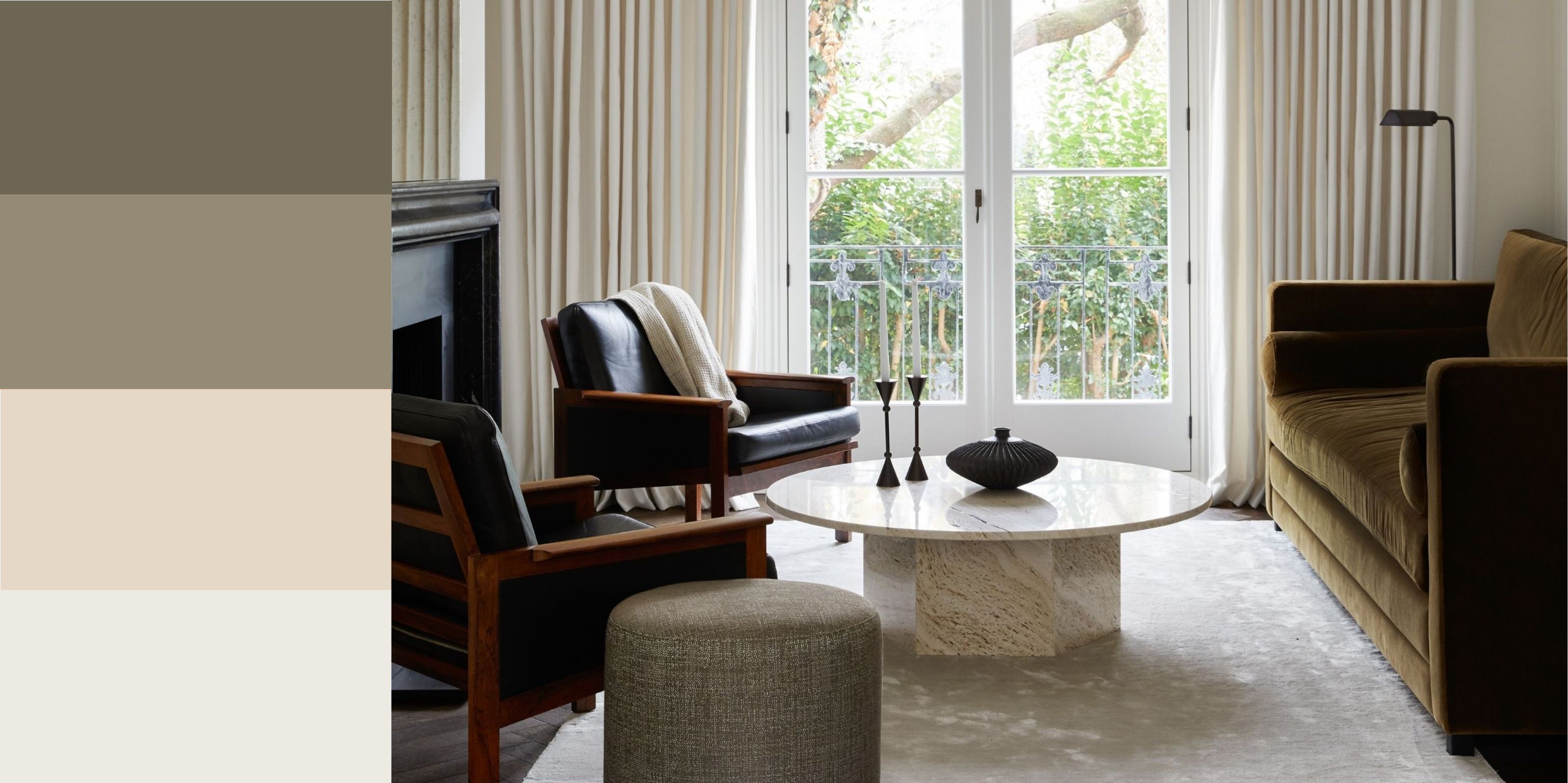
There was once a time when neutral color schemes consisted of white-washed walls and beige... well, just about everything: furniture, decor, rugs — you name it. But in 2026, neutral palettes are pushing the boundaries, and it's a lot less about 'sad beige' and more about earthy, muddy, and nuanced hues that offer movement and texture.
The beauty of decorating with neutral colors is that it sets a calming feel, offers longevity amid fast-moving trends, and is versatile enough to complement pretty much every design style: it's a timeless way of decorating that, when done well, results in a grown-up, modern-looking space. That said, neutral color schemes can quickly fall flat if texture and contrast are lacking.
So, how do you create a neutral color palette that feels interesting and layered rather than boring or basic? Below, designers share their tried-and-true neutral color pairings to give you some solid ideas.
Article continues below1. Putty, Warm White, and Oak
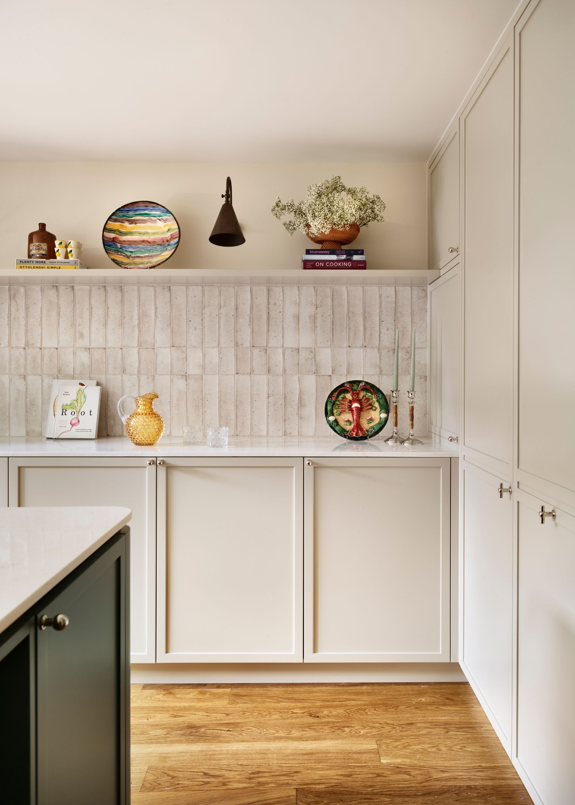
To keep your space feeling light, airy, and calming, a simple neutral color palette of warm white and wood tones is a failsafe choice.
A soft neutral teamed with the natural warmth of oak and warm white is a timeless combination, especially when it comes to kitchen color ideas. "The success of this kitchen lies in subtle layering rather than bold contrast," explains Alicia Meireles, creative director at OWN LONDON.
"The joinery is painted in Little Greene's Portland Stone, a warm, architectural neutral that grounds the space", she adds. "Walls in Little Greene's Whitening keep the room light and open, allowing the palette to breathe."
The key to the success of this restrained neutral color palette is texture. "Stained engineered oak flooring adds warmth and natural variation, while glossy white ceramic tiles in a classic brick format bring quiet movement and light play," says Alicia. "The balance of matte and satin finishes, wood and gloss, creates richness within restraint."
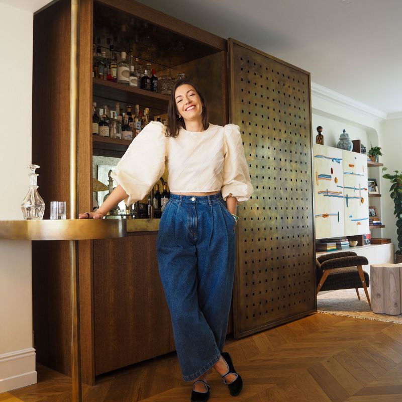
Alicia Meireles studied civil engineering before pivoting into a career in interior design, undertaking formal training at Chelsea College of Art & Design. Alicia brings a touch of eclecticism, skilled color combination, and a keen eye for detail to all of her projects. She has a passion for working with local craftspeople, championing new design techniques and materials, which she adapts to create beautiful and unique interiors.
2. Sand, Terracotta, and Moss Green
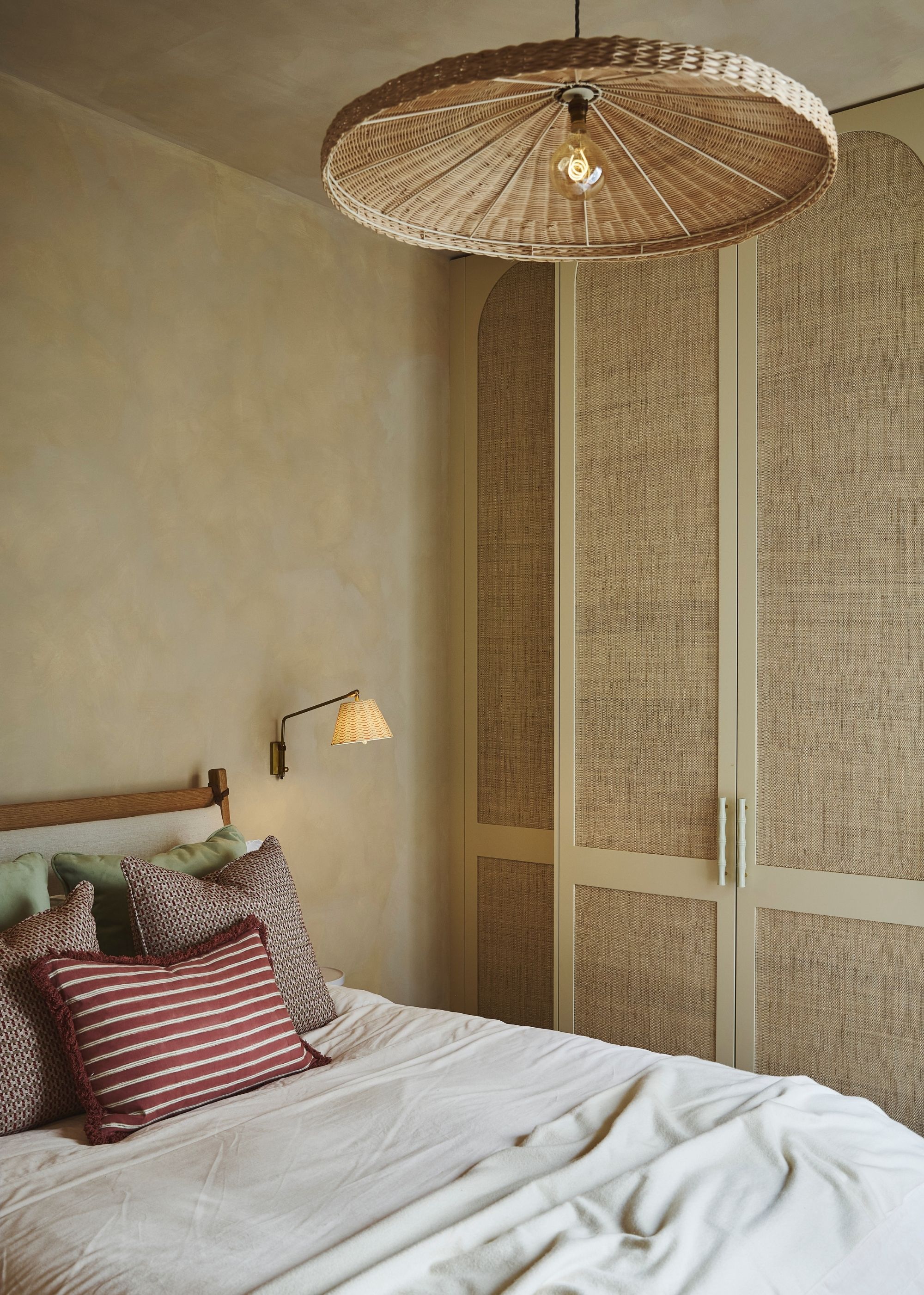
All-beige schemes can feel flat, so make sure to add pops of earthy colors, as seen here in this bedroom.
"This bedroom was designed around a neutral color palette to create a calm, restful atmosphere," says Marcelina Janiszewska, head of interior design at Project London. To achieve the look, the team used Bauwerk Color's limewash paint on the walls in the shade 'Sandstone'. Marcelina explains that it was "chosen for its warm undertones and subtle variation, which adds softness and depth without dominating the room."
The Livingetc newsletters are your inside source for what’s shaping interiors now - and what’s next. Discover trend forecasts, smart style ideas, and curated shopping inspiration that brings design to life. Subscribe today and stay ahead of the curve.
While the textured sand tones of the walls ground the scheme, color is added through smaller accents. "To add contrast and personality, the neutral base is balanced with deeper tones such as terracotta and moss green, alongside softer textures including velvet cushions and curtains," Marcelina explains. "The result is a space that feels calm, grounded, and easy to live with."
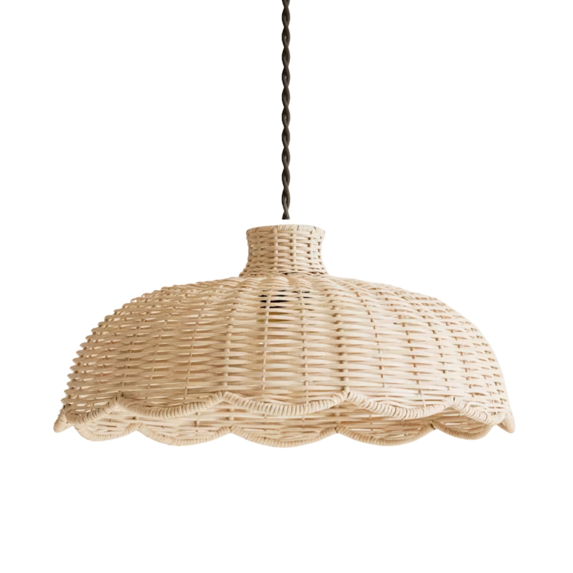
Texture is also important here. "The limewashed walls are paired with a linen headboard, oak bed frame, grasscloth wardrobe inserts, a rattan pendant light, and small details such as bamboo handles — all contributing to an organic, relaxed feel," the designer adds.
3. Chocolate Brown and Ochre
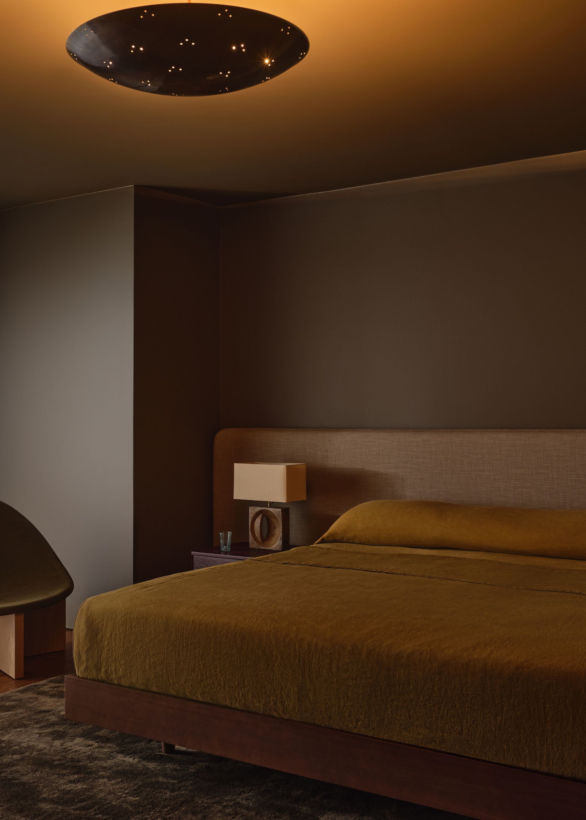
Going bold with dark neutrals is a wonderful way to make a statement. Add plenty of tactile elements to keep the space feeling warm and welcoming.
Don't rule out darker neutral color schemes, either. A cohesive palette of deep, warming tones feels every bit sophisticated, while offering a modern take on neutrals. When the whole room is decorated with richer colors, you avoid high levels of contrast, which can make the space feel cocooning and restful — perfectly fitting for bedroom color ideas.
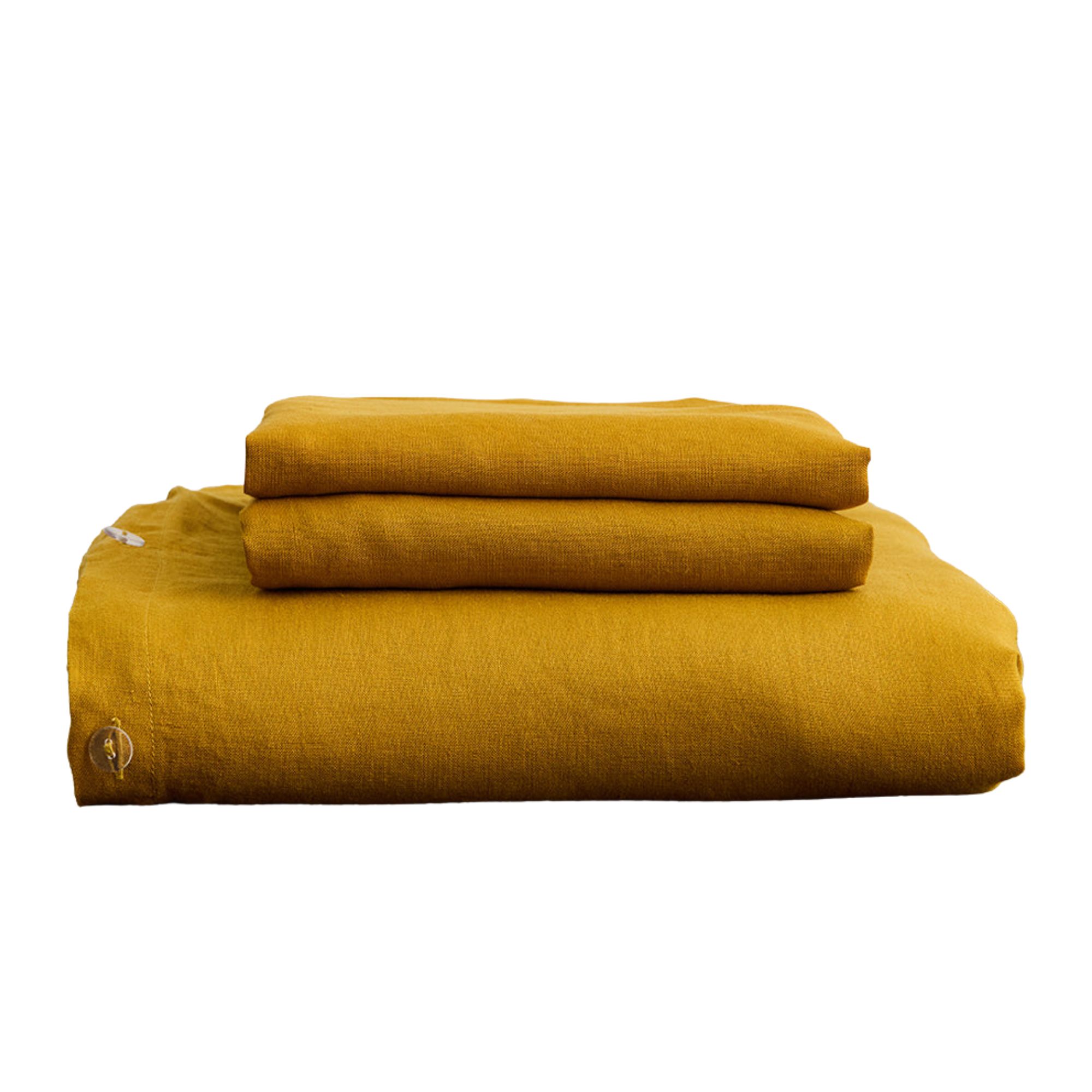
Designer Jessica Alpert opted for Farrow & Ball's Salon Drab on the walls of the guest bedroom pictured above, a rich chocolate brown, along with bed linens in a warming and on-trend ochre. "Our clients envisioned a guest room with the sophistication of a high-end New York hotel, so we focused on creating a moody atmosphere layered with rich earth tones," she says.
4. Soft Green and Warm Wood
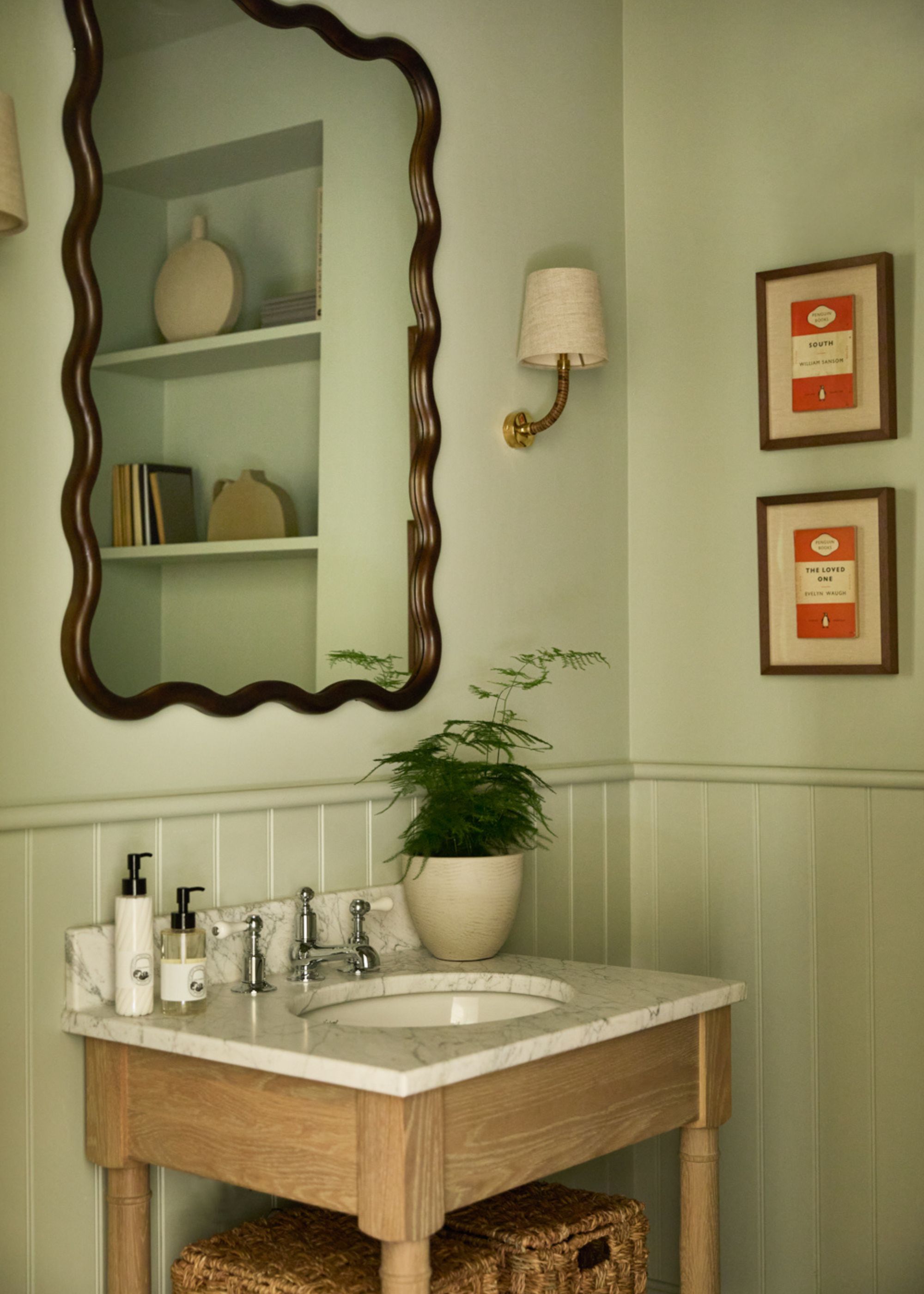
Designers often use green as a neutral color. Paired with wood tones, it feels natural and soothing, making a more interesting alternative to white or beige.
If you want to add more color to your space, go for a muted shade of green. Endlessly calming, the right shade of green behaves like more traditional neutral colors, while offering a design-led, modern look. To avoid it looking too colorful, pair soft green tones with natural wood.
"We often gravitate towards colors like this, called 'Mizzle' by Farrow & Ball," says designer Jack Simpson of Nomad. "This earthy tone strikes a thoughtful balance between calm and contrast, and when used in a color-drenching approach, creates visual depth without overwhelming the space."
In 2026, green is a 'new neutral'. "To us, this shade is just as neutral as any white," agrees Jack. "It pairs effortlessly with a wide range of materials and textures, translating seamlessly from one design style to the next."
5. Oaty White and Dark Brown
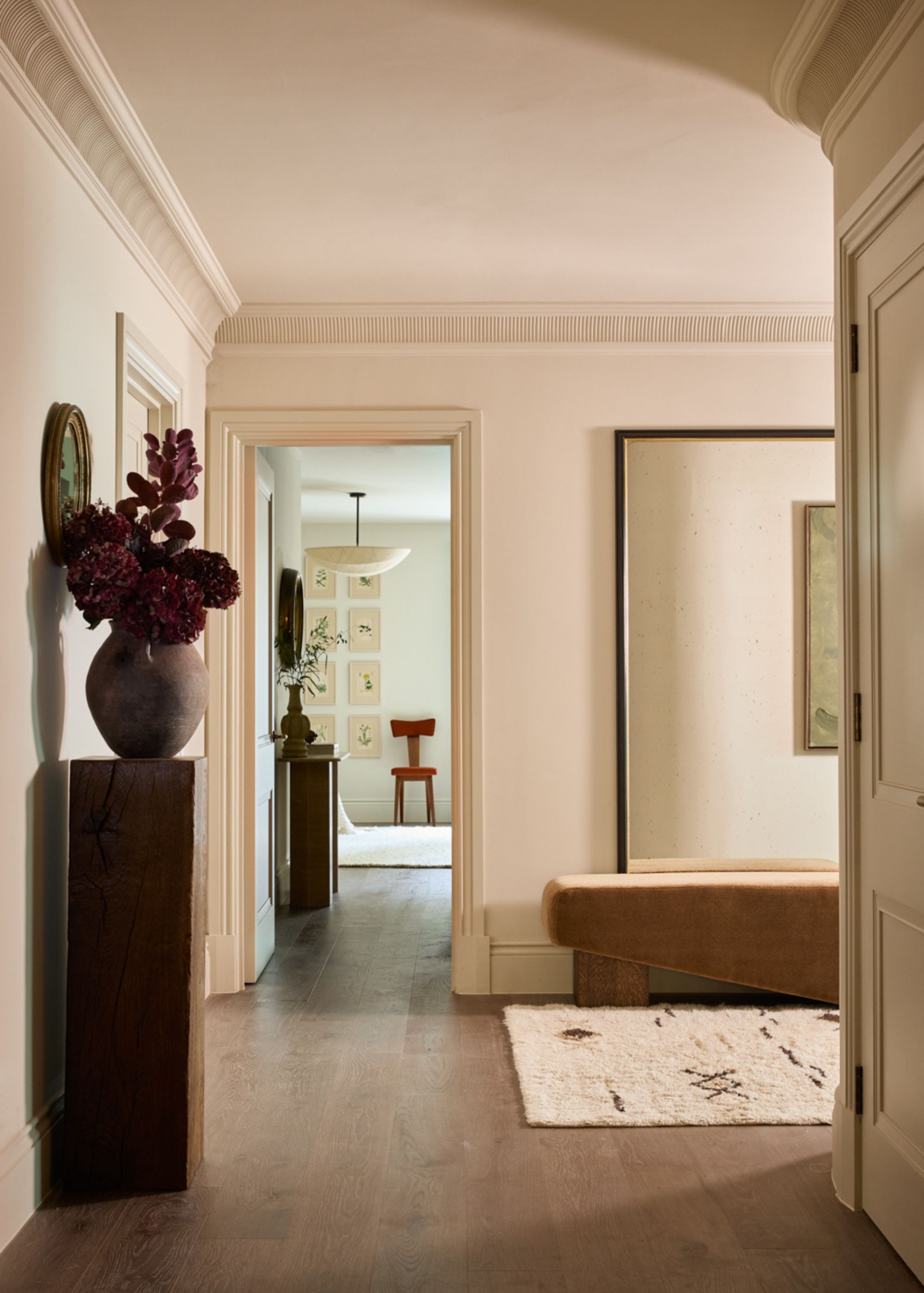
When soft neutral walls are teamed with the darker tones of vintage wood furniture, the contrast adds depth and interest.
Don't be afraid of contrast in interior design when working with a neutral color scheme. A light neutral on the walls, teamed with rich brown tones through furniture and decor, delivers elegance and impact. "For this project, we used Farrow & Ball’s Stirabout, a warm, oatmeal-colored neutral, which offers the perfect balance of grandeur and comfort for the space," explains Jack Simpson.
"This understated neutral evokes calm," adds Jack. "Its warm undertones introduce depth to the otherwise simple shade, allowing it to retain some character while keeping to the overall neutral palette of the project."
When using an understated paint shade like this one, you can easily layer texture and materials while maintaining balance. It "can be easily paired with tactile furnishings and vintage pieces," adds Jack.
6. Plaster Pink, Navy, and Green
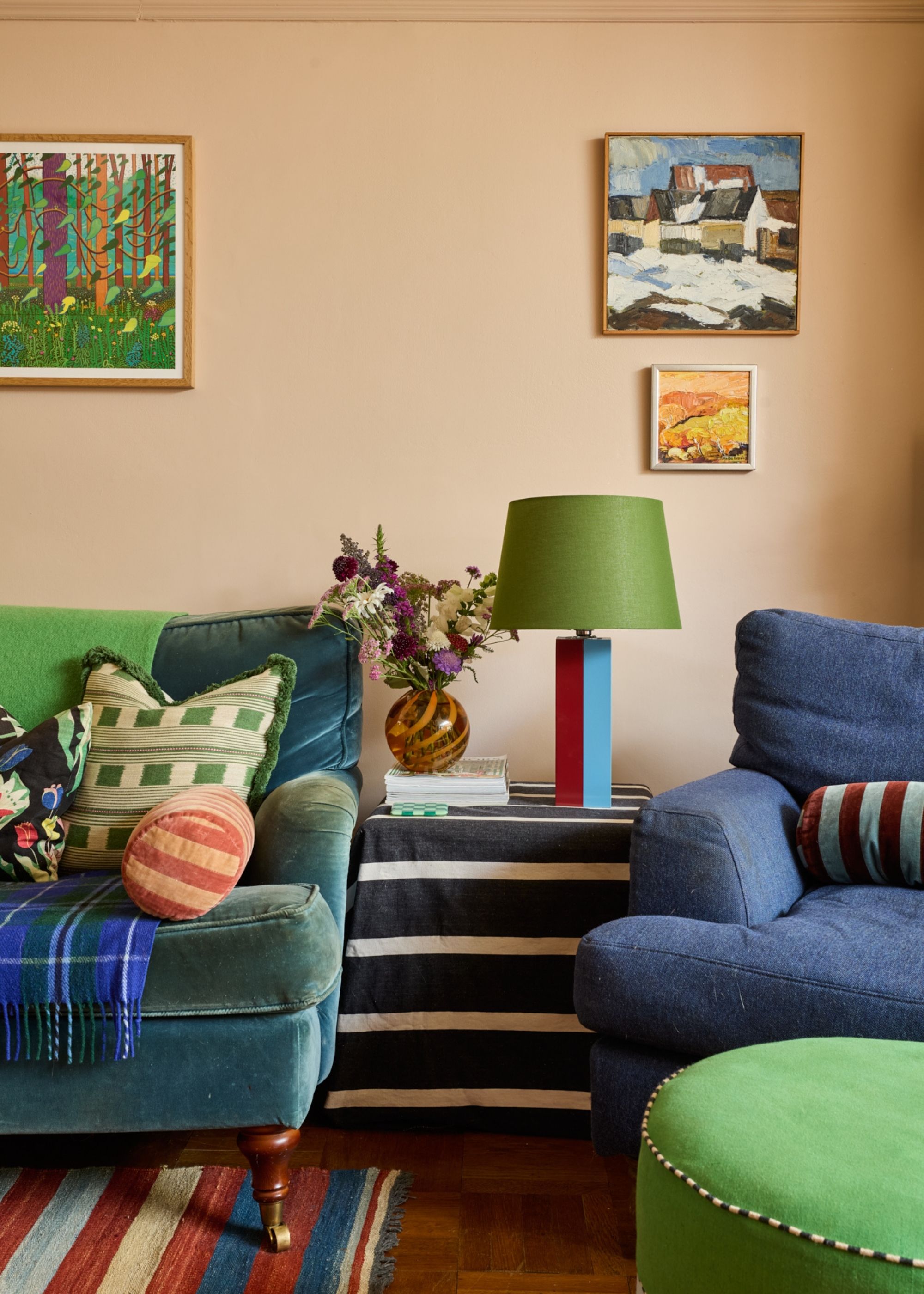
Plaster pink makes a wonderful starting point for a neutral color scheme, and can come across as subtle or bold, depending on your accent colors.
A neutral color scheme doesn't have to be warm whites and soft beige tones. Plaster pink is another option that adds more color and warmth to a room, while pretty much any color pairs well with pink. In this space pictured above, it is teamed with rich navy blue and verdant green.
"I chose the very subtle pink tones of Setting Plaster by Farrow & Ball for this family room to create a calm and cozy backdrop to balance pops of bolder colors that adorn the rest of the space," explains the designer Natasha Lyon. "It’s a very warming color when evening sets in with the glow of lamps and candles, and is paired with Farrow & Ball’s Wimborne White above the picture rail and on the ceiling, which then leads into the open plan kitchen."
7. Olive Green, Fresh White, and Chocolate
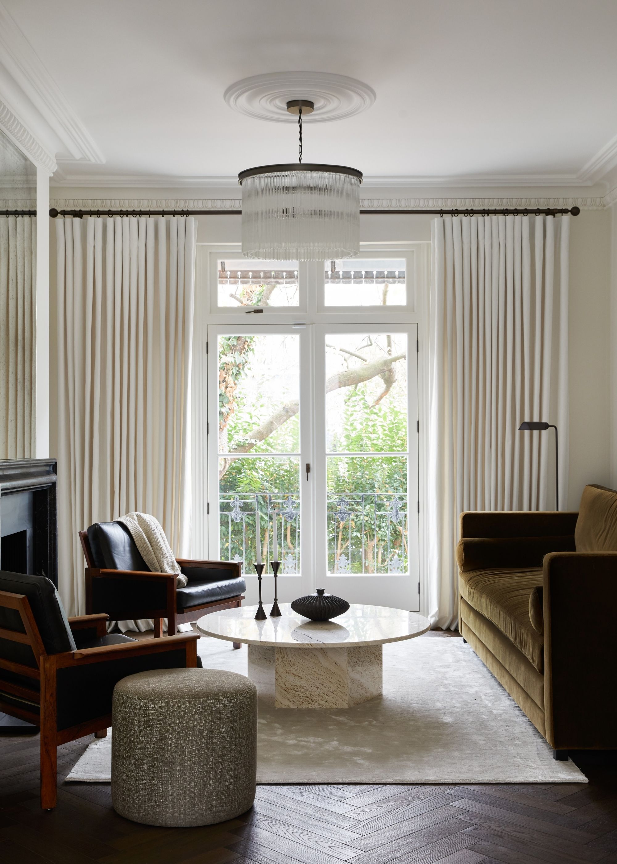
Olive green is a timeless color that adds warmth and depth to neutral color schemes.
When designing a pared-back room like this one, knowing how to choose the right white paint is key. "The whole space is grounded by the chocolate-toned herringbone floor, so it was important we select warm-toned neutral for the walls, which would feel fresh but not stark," explains designers Adele Lonergan and Maria Lindgren, founders of Covet Noir. "We landed on Mylands' Holland Park as its slight yellow undertone created the perfect base."
And while an all-white scheme can risk falling flat, olive green adds depth, warmth, and interest as an accent color. "The client's brief was for an elegant, formal, light room but with a luxe, members club feel," the design duo adds. "We chose the olive green velvet as it struck this balance so well. Velvet is a classically refined material, while the olive green tone feels more modern and cool."
8. Taupe, Blush, and Mustard
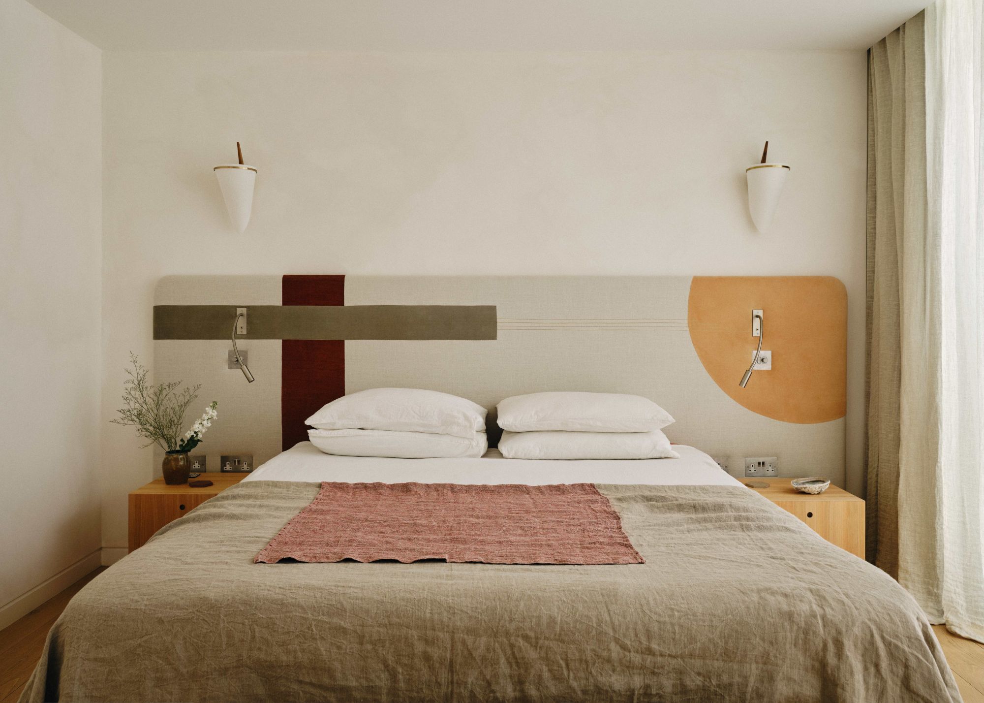
Limewash walls in the shade 'Stone' from Bauwerk Colour set a tranquil, soothing backdrop to this modern bedroom.
Colors like taupe offer an earthy look and are a great alternative to white. Here, it is teamed with muted pops of color on the headboard and bed linens — collectively creating a restful sleep space that still feels full of texture.
"The pops of color in this bedroom were chosen because they add warmth and visual interest, whilst remaining within a warm palette inspired by natural tones," says designer Lucy Currell of Studio Iro. "These colorful accents help to create a calm, inviting space and provide balance to the predominantly neutral elements throughout the room."

Studio Iro, founded by designer Lucy Currell, creates soulful, understated interiors that blend natural materials with contemporary design. Guided by the Japanese philosophy of wabi-sabi, Lucy crafts bespoke, sustainable spaces that reflect her clients’ stories, curating everything from antiques to bespoke joinery with a personal, considered touch — from design concept to completion.
9. Seafoam Green, White, and Brass
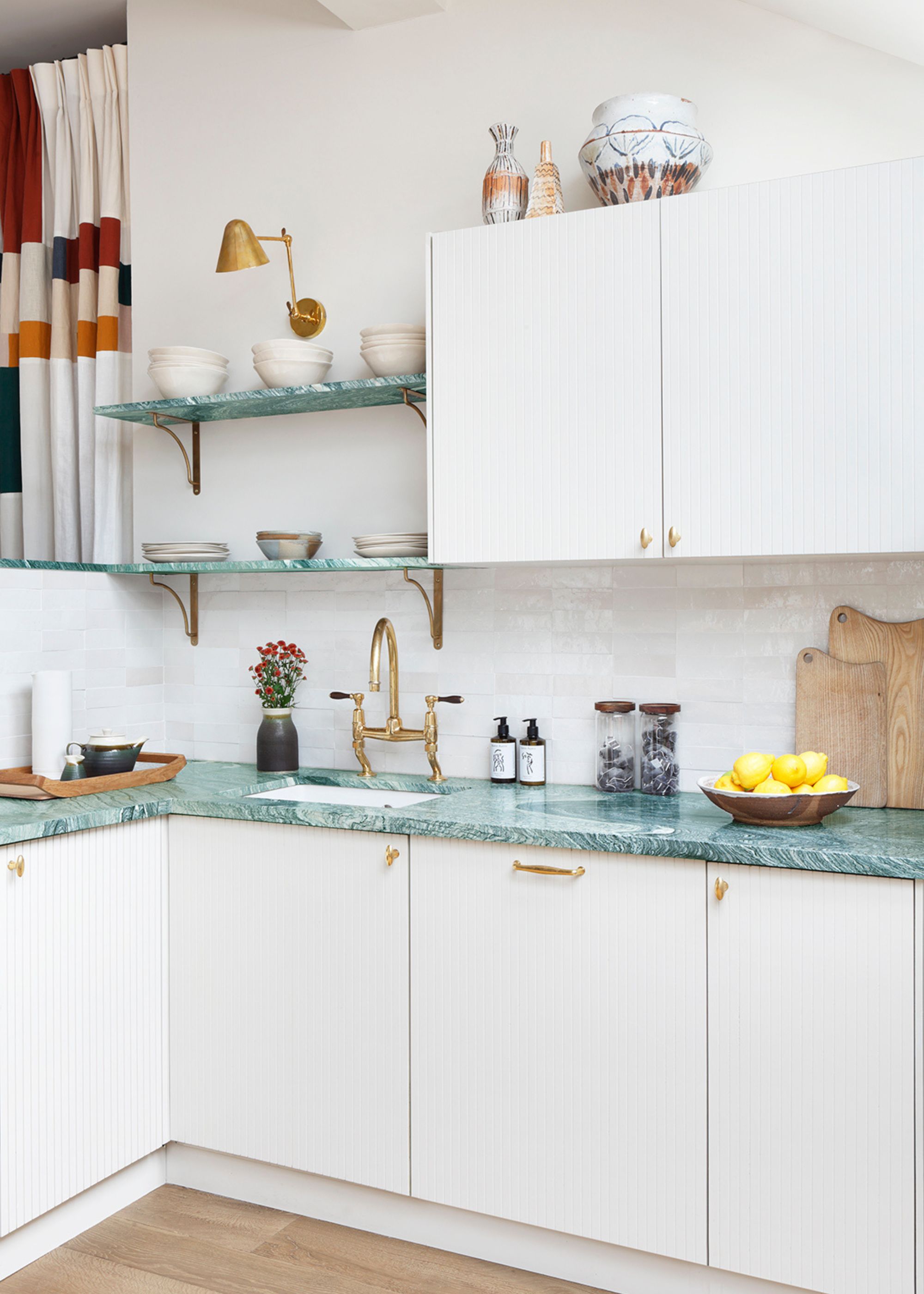
Here, the timeless white color scheme is elevated with blue-green counters and warming brass fixtures.
White kitchens are a classic option, but a more vibrant accent color can be a great way to elevate the look and achieve a more modern feel. Take inspiration from this kitchen that teams Verde Luana stone kitchen worktops in a playful blue-green hue with the white kitchen cabinets.
"The cabinetry is painted in Farrow & Ball’s Shaded White, which blends seamlessly with the walls and ceiling finished in School House White," says designer Sarah Peake of Studio Peake.
"The real show-stopper is the Verde Luana stone," she adds. "Its soft green tone lifts the space beautifully. Brass details, from the Waterworks tap to the lighting, handles, and brackets, add a subtle flash of sheen, bringing warmth and life to the kitchen without disrupting its quiet character."
10. Warm Limewash and Muted Terracotta
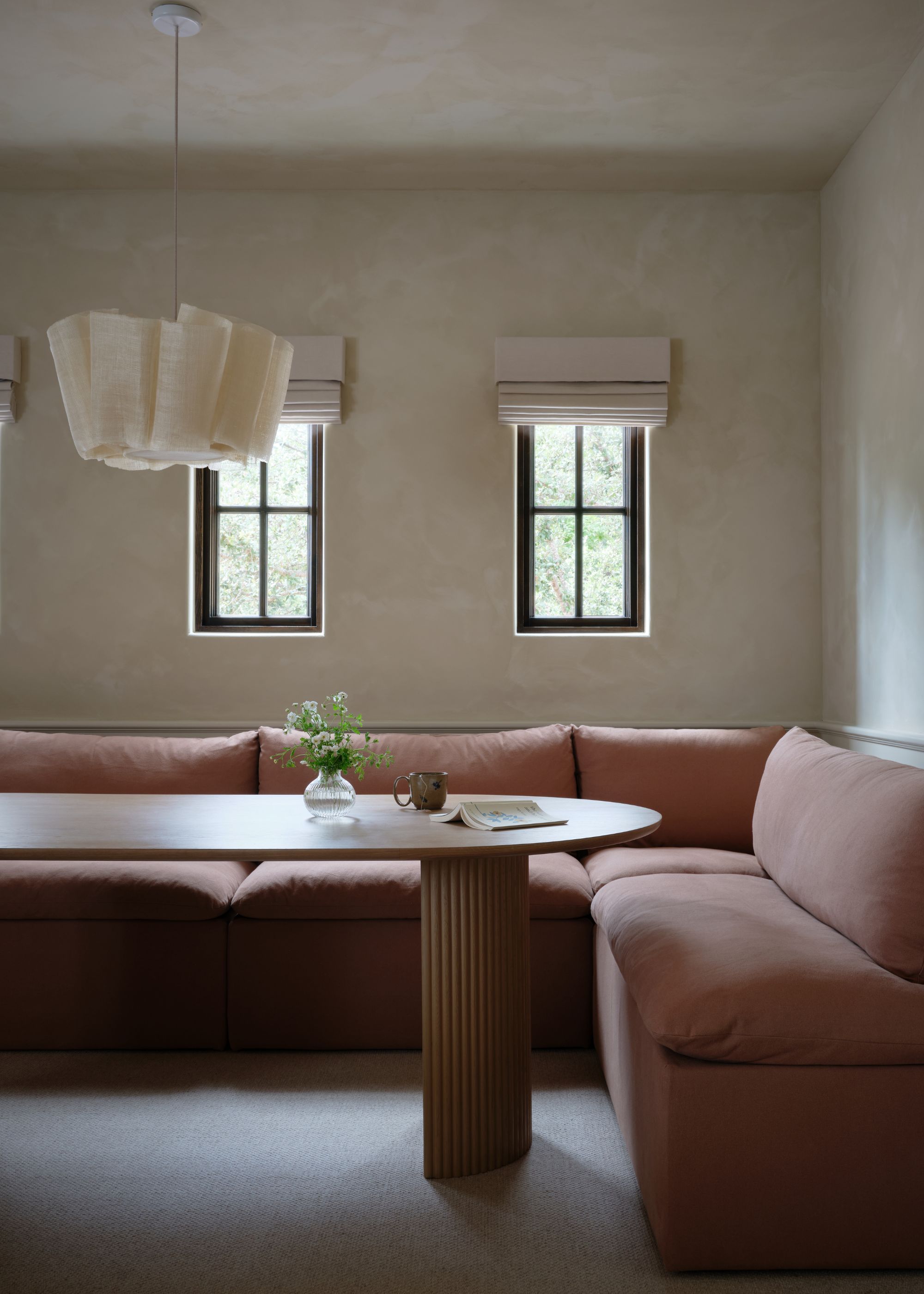
The limewash walls here are Color Atelier's Santos, a soft and relaxed neutral, which sets an earthy backdrop for the terracotta decor.
This family room pays homage to colors found in nature, resulting in a comfortable space that feels elevated through its considered textures. "We chose a warm, yellow-beige limewash and soft terracotta upholstery to create a palette that feels both cocooning and adaptable," explains the designer Emily Brown of House Franc.
"The warm, tonal palette allows the room to transition seamlessly from family space to home theater," Emily adds. "The tones deepen beautifully at night for a cinematic feel, while white oak accents and terracotta textiles keep the room calm and grounded during the day."
11. Gray-Brown, Warm Wood Tones, and White
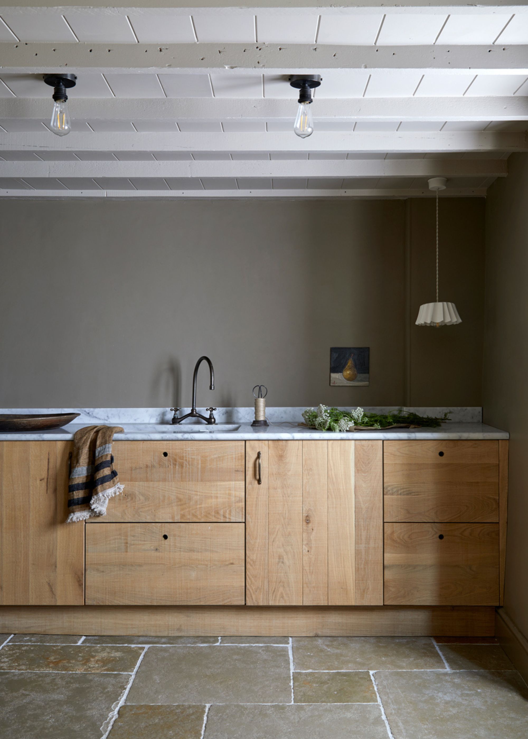
A darker neutral paint is a great way to add a cozy feel to your neutral color scheme, especially when teamed with natural materials.
In this boot-room, a muddy neutral paint on the walls adds a cozy richness. "The walls are painted in Farrow & Ball’s Mouse’s Back, a soft khaki that quietly echoes the browns and greens of the surrounding countryside, grounding the room in a sense of calm and connection to its setting," says Gemma Tucker of Balance Interior Design.
To ensure the dark neutral walls don't feel heavy — but warm and welcoming — the palette is complete with warm wood-toned cabinets and white marble countertops.
"Sawn-oak joinery and traditional flagstone floors introduce depth and character, while touches of aged brass lend a soft warmth — particularly important in a room with limited natural light," says Gemma. "A honed Carrara marble worktop lifts the palette, gently brightening the space and setting up a refined counterpoint to the expressive grain of the cabinetry, all while remaining true to the language of natural materials."
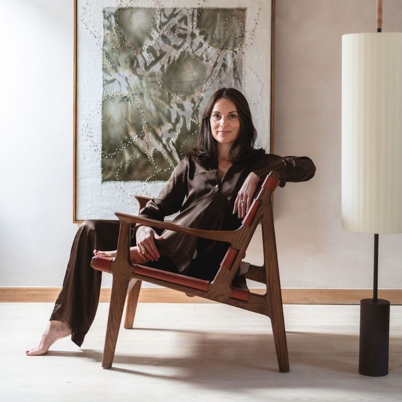
Established in 2018 by creative director Gemma Tucker, Balance Interior Design is an award-winning British interior design studio known for creating pared-back, serene spaces that are in harmony with the people who occupy them.
12. Light Gray, Forest Green, and Mustard
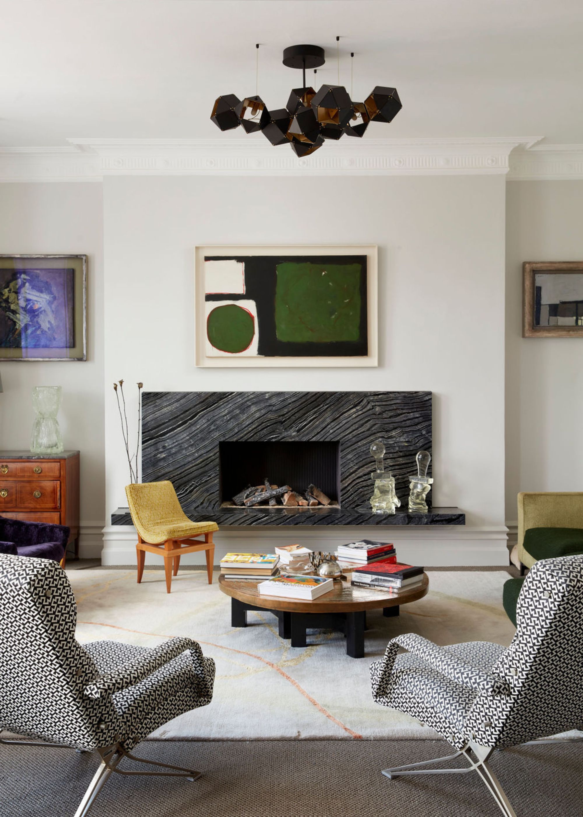
Little Greene's French Grey was used on the walls in this living room, providing a calming backdrop against the more colorful decor.
A light gray paint on the walls can create a softer look than bright white, and when teamed with pops of green, it feels warm and welcoming. This neutral color palette was carried into the living room, pictured above, where various shades of green provide interest and prevent the room from feeling overly formal.
"I always like neutrals to feel warm and alive rather than flat," says designer Cleme de Grivel. "The bolder pops of color, particularly the greens and mustard tones, were added to bring depth, rhythm, and personality to the space. Because they’re slightly muted and nature-inspired, they sit comfortably with both contemporary pops of green in the art and vintage elements like the mustard upholstered chair, creating a room that feels layered, timeless, and lived-in rather than overly designed.“
Whether you go for warming off-whites as the base of your scheme, teamed with pops of color, or embrace on-trend darker neutrals that lend a cozy feel, keep in mind the color rules for neutral rooms to ensure your palette doesn't fall flat.

Emily is a freelance interior design writer based in Scotland. Prior to going freelance in the spring of 2025, Emily was Homes & Gardens’ paint and color editor, covering all things color across interiors and home decor for the Homes & Gardens website. Having gained specific expertise in this area, Emily is well-versed in writing about the latest color trends and is passionate about helping homeowners understand the importance of color psychology in home design. Her own interior design style reflects the simplicity of mid-century design and she loves sourcing vintage furniture finds for her tenement flat.


