6 'New Neutral' Kitchen Colors Interior Designers Are Choosing for 2026 — They're Tones "That Feel Earth-Anchored, Sensorial and Quietly Elevated"
Neutral kitchens in 2026 couldn't be further away from the bright white kitchens of the past — now, more than ever, there is a desire for spaces that promote warmth and comfort
The Livingetc newsletters are your inside source for what’s shaping interiors now - and what’s next. Discover trend forecasts, smart style ideas, and curated shopping inspiration that brings design to life. Subscribe today and stay ahead of the curve.
You are now subscribed
Your newsletter sign-up was successful
Neutral kitchens will always be well-loved by interior designers — after all, neutral colors are classic, foolproof, and timeless, especially in the kitchen. But today’s neutrals are shifting, say the experts, with cool tones (think bright white and silvery gray) being replaced by a warmer and richer neutral palette.
“Looking ahead to 2026, we’re seeing neutrals shift warmer overall,” says Katerina Tchevytchalova, director of K’Arte Design. “The cooler grays that dominated for so long are giving way to mineral taupes, earthy off-whites, and gentle clay undertones. There’s a real desire for the home to feel welcoming and cocooning, and these tones pair beautifully with the richer wood finishes, like walnut, that we’re seeing more of.”
All the interior designers we spoke to agree. Neutral kitchens for 2026 are warmer — whether that’s soft stone woodwork, muted taupe cabinets, or plaster off-white walls. Using neutrals in this way results in a rich yet serene blank canvas that’s perfect for layering materials and textures. Why not try one of these six neutral kitchen color ideas that interior designers are choosing for their 2026 projects?
Article continues below1. Plaster Off-White
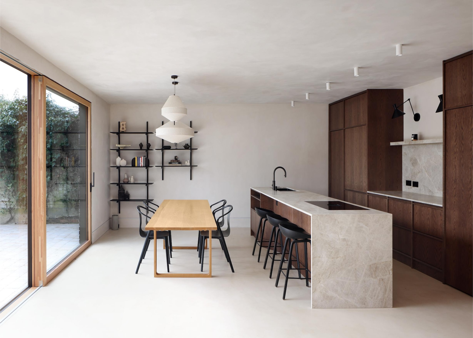
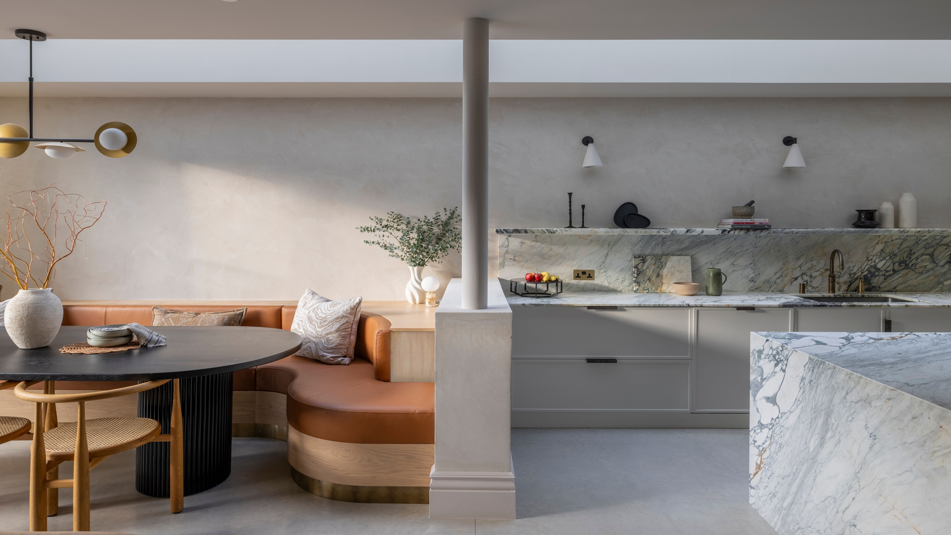
Textured neutrals create a feel-good kitchen — perfect for channelling the ‘soft kitchen’ trend.
If you still love a minimalist kitchen, there’s a new neutral that’s taking over from bright white — it’s called plaster off-white.
Described as a textural off-white, this neutral is not just great for kitchen cabinets, it’s spot on for walls, floors, and worktops too.
“Think tadelakt, limewash, and polished plaster,” says interior designer Kunal Trehan of Touched Interiors. “These whites feel handmade, lived-in, and quietly luxurious. They diffuse light beautifully and create a soft envelope for the rest of the kitchen palette.”
In this kitchen, lime plaster, microcement, Taj Mahal quartz, light and dark timber, aged brass, and soft natural fabrics create a calm, tactile mood.
The Livingetc newsletters are your inside source for what’s shaping interiors now - and what’s next. Discover trend forecasts, smart style ideas, and curated shopping inspiration that brings design to life. Subscribe today and stay ahead of the curve.
“We chose materials in their natural, honest state,” says Ran Ankory, founder of Scenario Architecture, “and the palette simply listens to what the materials have to say — and celebrates it.”

Kunal is a luxury interior designer and founder of Touched Interiors, a multi-award-winning design studio renowned for creating exceptional high-end, residential designs.
2. Dusty Pink
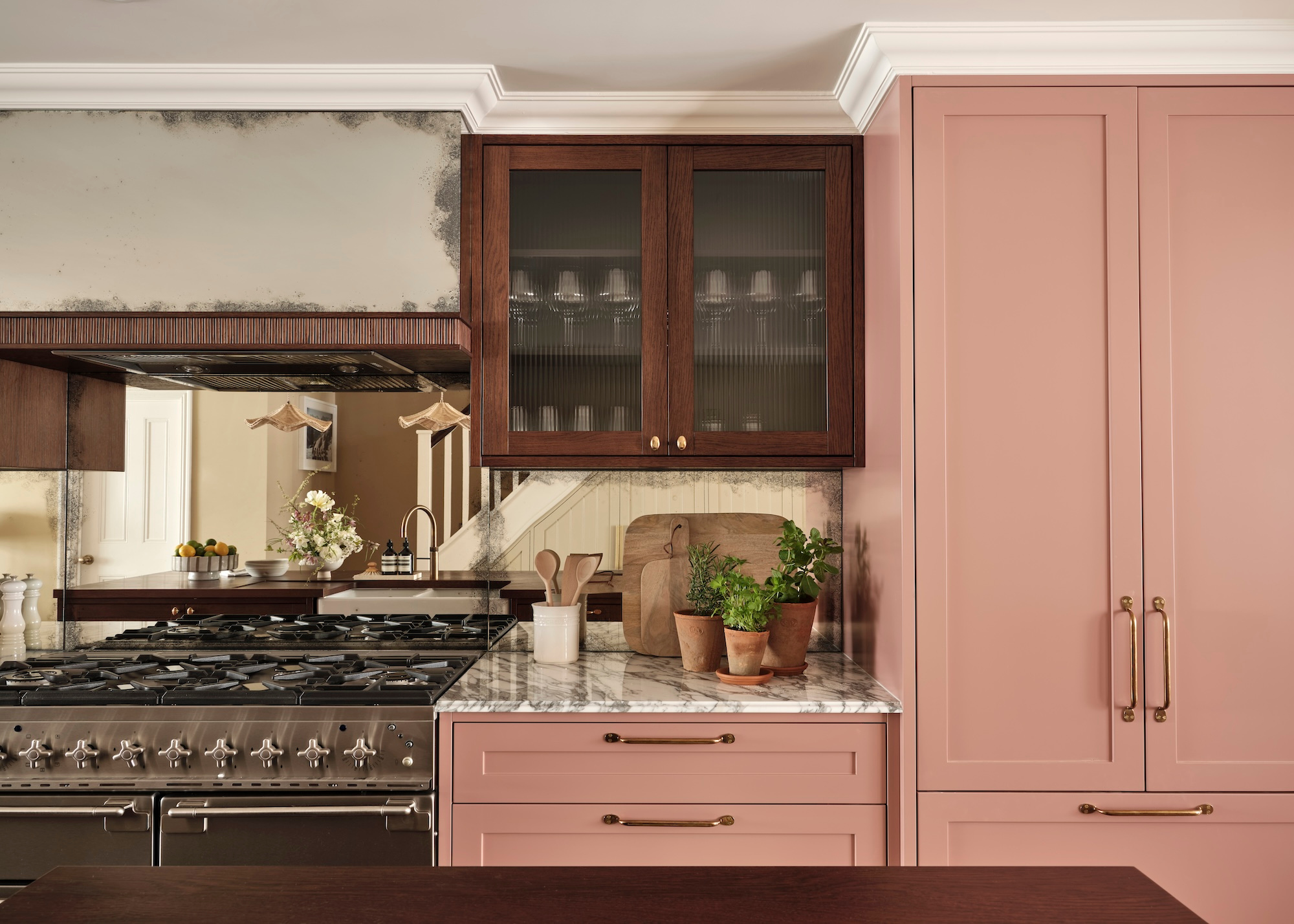
This soft pink kitchen is a blushing beauty — one of our favorite new neutral kitchen color ideas.
Dusty pink for kitchen cabinets might not be the most obvious neutral, but when done right, pink as a neutral can create the most unique and inviting kitchen space.
“Soft pinks are continuing to define modern interiors,” says Rebecca Hughes, founder and creative director of Rebecca Hughes Interiors. “But, in 2026, it’s all about a muted blush with earthy undertones — a hue that feels both grounded and optimistic. It’s gentle enough to act as a neutral but distinctive enough to bring personality to a space."
It's all down to choosing the right sort of pink, say the designers — and steering clear of pinks that are too sickly or cold. Rebecca is a big fan of Hammock by Little Greene, Plaster II by Paint & Paper Library, and Calamine by Farrow & Ball. For this kitchen, she used Edward Bulmer’s darker pink called Nicaragua.
“In kitchens, these shades work beautifully alongside natural textures,” she adds. “Think chocolately woods, warm brass, and creamy marbles with subtle veining. It brings a soft glow to the room, catching light in a way that feels inviting and lived in.”
Rebecca is the founder of Rebecca Hughes Interiors, a London-based, luxury design studio with a global portfolio of projects spanning country estates, contemporary townhouses and boutique hotels.
3. Milled Oat
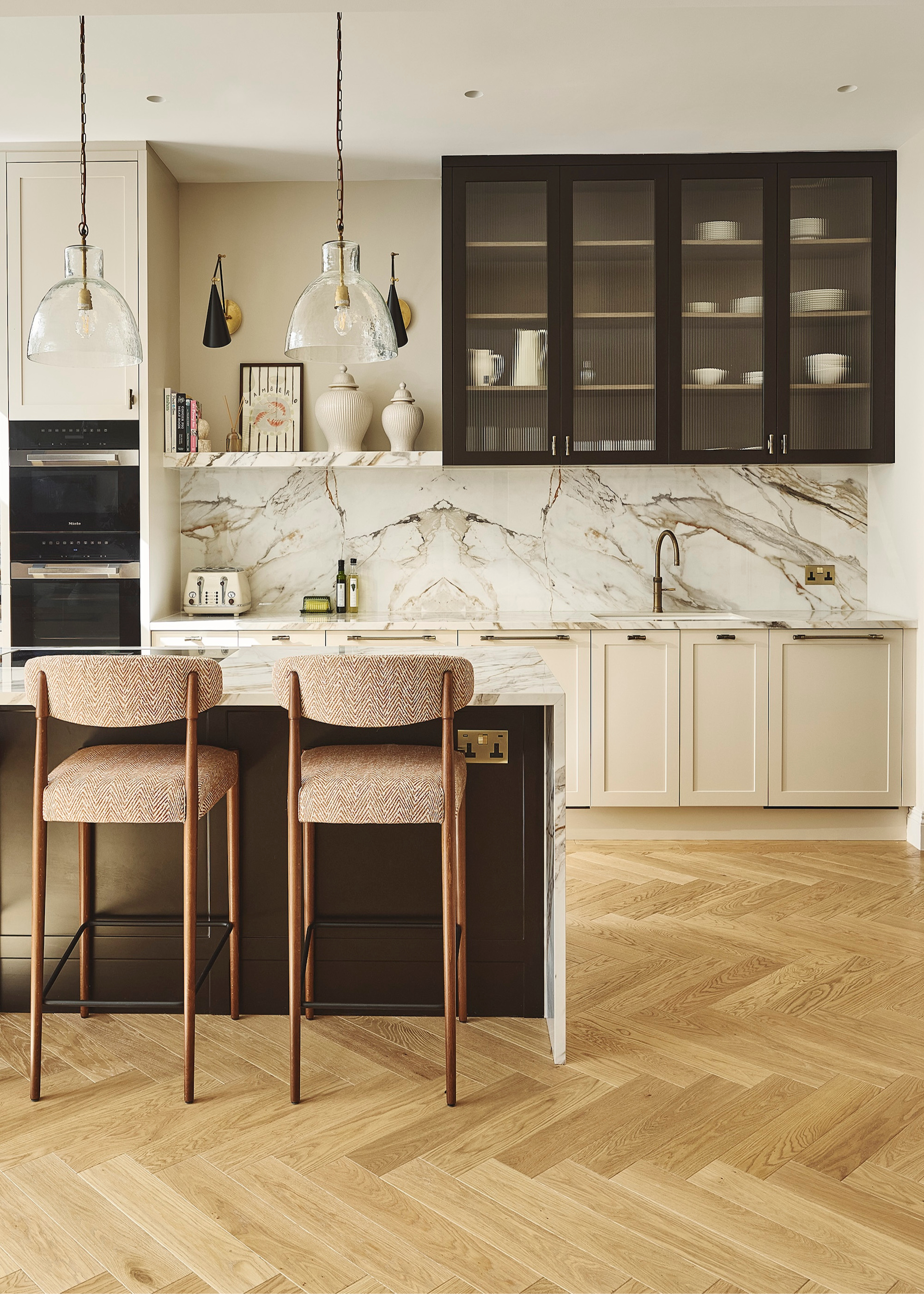
Pale, creamy beige kitchens are a dreamy neutral.
Bright whites are a no-no for the 2026 modern kitchen. Instead, milled oat is a pale creamy beige that creates a fresh yet gallery-quiet silhouette.
“It’s perfect if you want lightness but not starkness, and it pairs seamlessly with veined marble, porcelain slabs, and ultra-matte lacquered cabinetry,” says interior designer Kunal.
Selecting the right neutral paint colors for your space, and combining them with a layered design, using natural materials and textures, will create a neutral kitchen that feels genuinely lived-in and beautifully enduring.
“When these hues are paired with thoughtful layers of texture — from subtly profiled tiles to gently rippled glass and hand-finished splashbacks — the kitchen gains depth, dimension and a feeling of considered craftsmanship without ever appearing busy,” says Caroline Milns, head of interior design at Zulufish.
4. Earthy Green
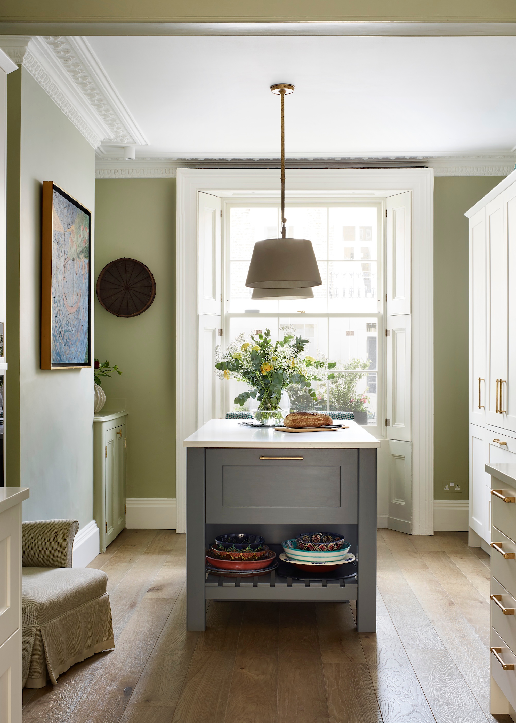
The trick is to pick nature-inspired, earthy greens like olive and sage.
You may not consider green a neutral color, but interior designers are choosing muted green kitchens as a restful and welcoming backdrop in 2026.
“Neutrals in 2026 are moving beyond pale whites and cool grays, towards colors with more character like soft brown, earthy green, and warm taupe,” says Rhian Barker, group design director at Accouter. “These tones echo natural materials like wood, stone, and metal, creating a calm, grounded foundation.”
“Choose [green] shades with subtle undertones; whispers of olive, clay, or mushroom,” adds Rhian. “We then balance with timber cabinetry, veined marble, or a textured island to create contrast and cohesion.”
5. Buttery Yellow
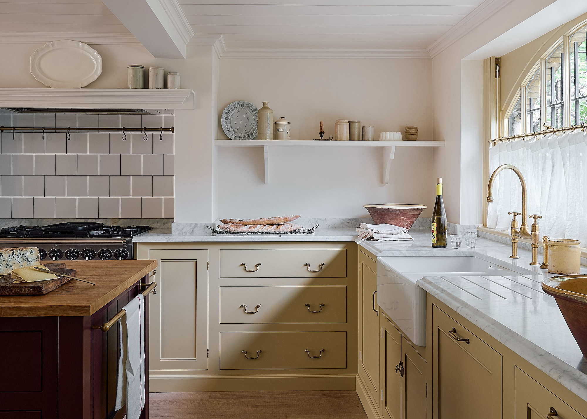
A yellow kitchen in a butter yellow tone, such as this, is an effortless way to decorate with a neutral color that adds softness and sophistication to your space.
Butter yellow is a warm, inviting neutral that interior designers love using throughout the home, but butter-yellow hits the spot as a new neutral kitchen color idea that’s both joyful and grounding.
“In 2026, consumers will continue to gravitate towards serene, earthy neutrals that act as a palette for modern-day living,” says Emma Griffiths, co-founder of Open Design Studio.
“Shades of mushroom, oat, soft stone, muted greens, buttery yellows, and warm whites (such as Pantone’s Color of the Year 2026, ‘Cloud Dancer’) are all timeless choices that will shift beautifully with light throughout the day.”
6. Chalky Mushroom
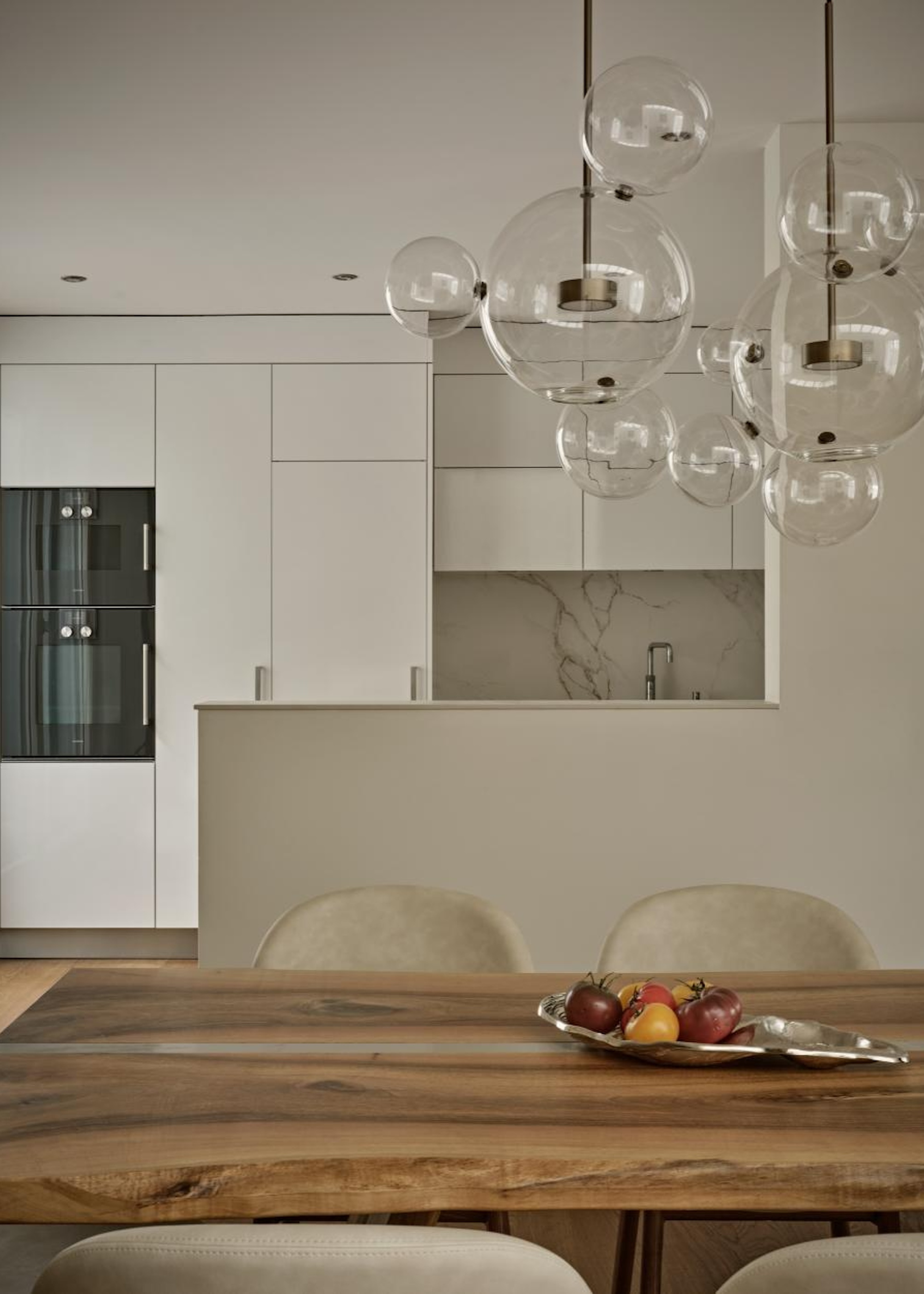
Is chalky mushroom the ultimate neutral kitchen color for 2026?
A hybrid between taupe, stone, and warm gray, chalky mushroom has been billed as the ‘ultimate neutral’ by one interior designer. It’s a lived-in color for sure, veering on the ‘dirty neutral’ trend that adds so much depth to a space.
“Chalky mushroom works beautifully on plaster walls, matte cabinetry, and micro-cement floors,” explains Kunal. “We designers favor it for its ability to sit gracefully with natural timber and brushed metals, especially aged gold, champagne brass, and muted pewter.”
As with all the other neutrals, the magic comes from mixing tones and textures to stop a scheme from feeling flat or sterile.
“I naturally gravitate towards warm neutrals because they bring a timeless, calming quality to a space, and they feel especially inviting during the colder winter months,” adds Katerina Tchevytchalova, director of K’Arte Design.
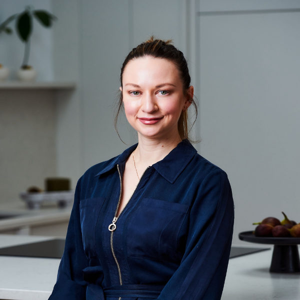
Katerina is the founder of K’Arte Design a luxury interior design and art consultancy. She spent five years at Kelly Hoppen Interiors and worked with several of London’s leading design studios before launching her own practice.
FAQ
What Main Color Are Designers Avoiding in Kitchens?
Designers are moving beyond stark whites and cool grays in the kitchen towards warmer neutrals with more character and depth. These warm neutral kitchen colors echo wood, stone, and metal, and pair beautifully with timber, textured stone, or warm metals for a tactile, comforting space.
“For 2026, neutrals are becoming far more nuanced, layered, and architectural,” says Kunal of Touched Interiors. “We’re moving away from the flat, one-note grays of the past decade and towards palettes that feel earth-anchored, sensorial and quietly elevated.”
You might have your heart set on one of these new neutral kitchen color ideas, but before you take the plunge, ensure you observe a sample of the color in different parts of the kitchen and at different times of the day. The level of natural light your kitchen receives, as well as your lighting scheme, will significantly impact how color behaves in the space.
If you're starting your kitchen reno from scratch, you might also want to know the kitchen countertop colors going out of style this year, for a timeless space that outgrows the trends.


