11 Happy Colors to Paint a Bedroom — The Uplifting Shades Interior Designers Recommend to Give Rooms a Dopamine Boost
Sunshine yellows, peachy pinks, and uplifting greens — these are the colors to paint your bedroom to bring joy to your sleep space

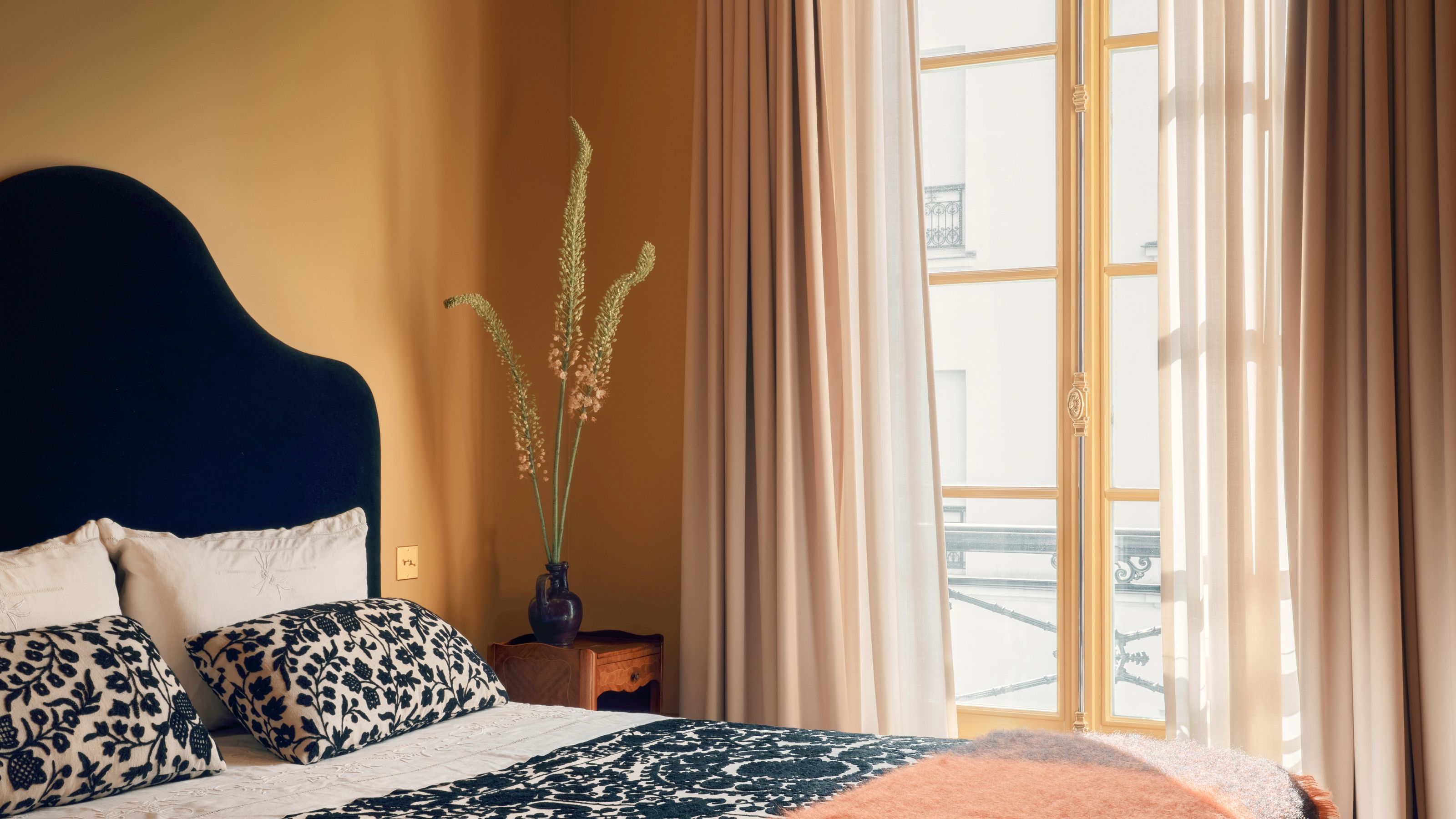
Adding color of any kind to the bedroom really comes into its own during the depths of winter. When the days are short and the weather drab, a happy color palette can do wonders to lift mood — and what better room than in a bedroom, the place where we start and end each day?
While you may find the idea of using the most energizing of shades on bedroom walls daunting — think sunshine yellow and vibrant green — there are slightly more restrained approaches that can uplift a bedroom with equal measure, giving it a positive feel. Think pink, green, and even blue.
And so, if you're on a mission to bring joyful colors to your bedroom this winter (or any time of the year, really), I asked designers for their favorite bedroom colors that bring joy, which I've shared below. These are the happy colors to paint a bedroom in.
1. Farrow & Ball's India Yellow
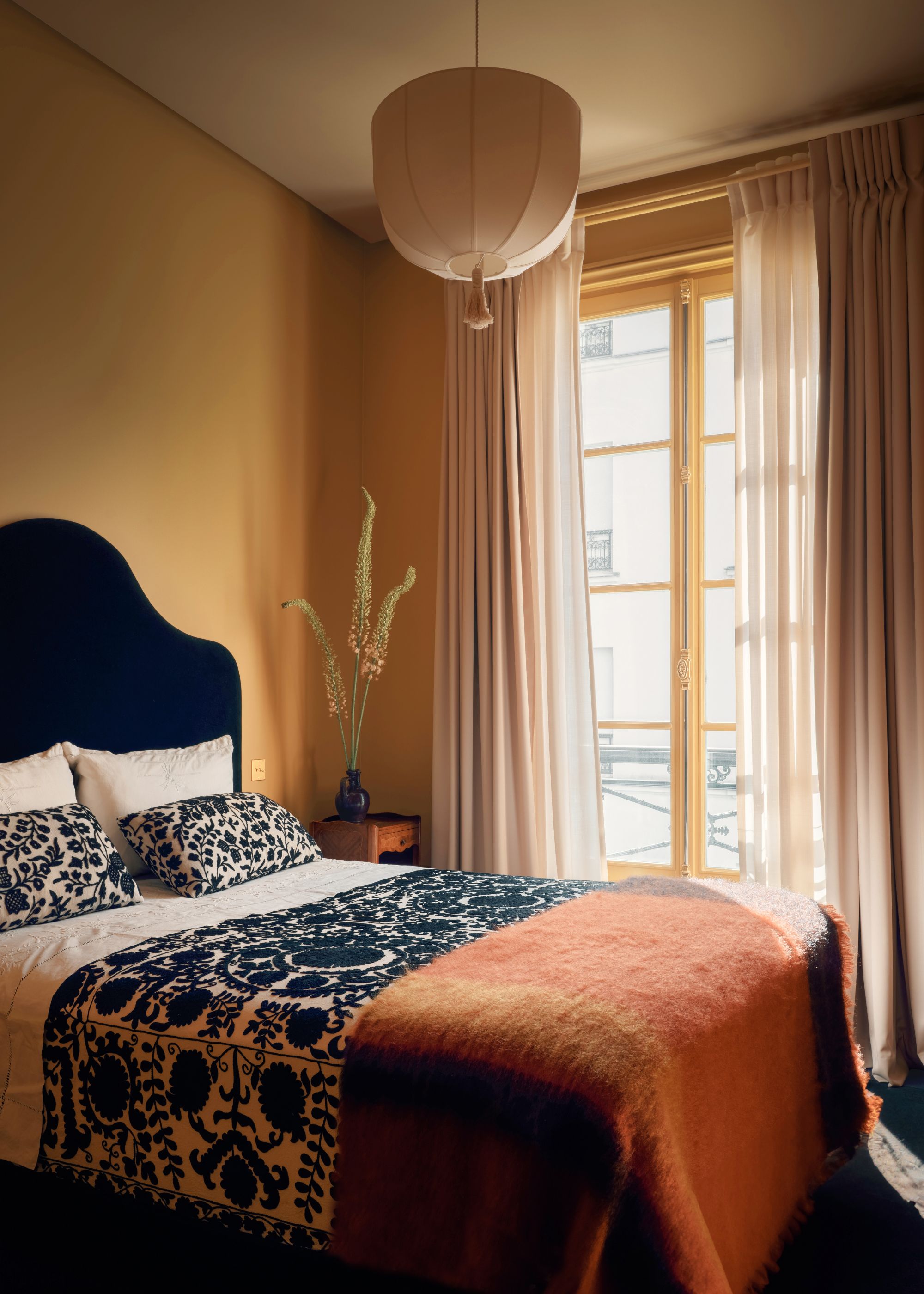
Yellow doesn't have to be overwhelming. Moody shades such as Farrow & Ball's India Yellow put a modern spin on this uplifting hue.
Starting with what's arguably the most 'happy' color of all — yellow. But more specifically, Farrow & Ball's India Yellow, a darkened yellow paint that brings warmth in a sophisticated, liveable way.
In this yellow bedroom, designed by Jessica Helgerson, the paint color was chosen to complement the wider warm color palette used in the space. Noting the other hues throughout the room of reds, yellows, and warm grays, Jessica explains, "There’s a bit of all of it in this room, which balances the yellow of the walls.”
2. Lick's Green 07
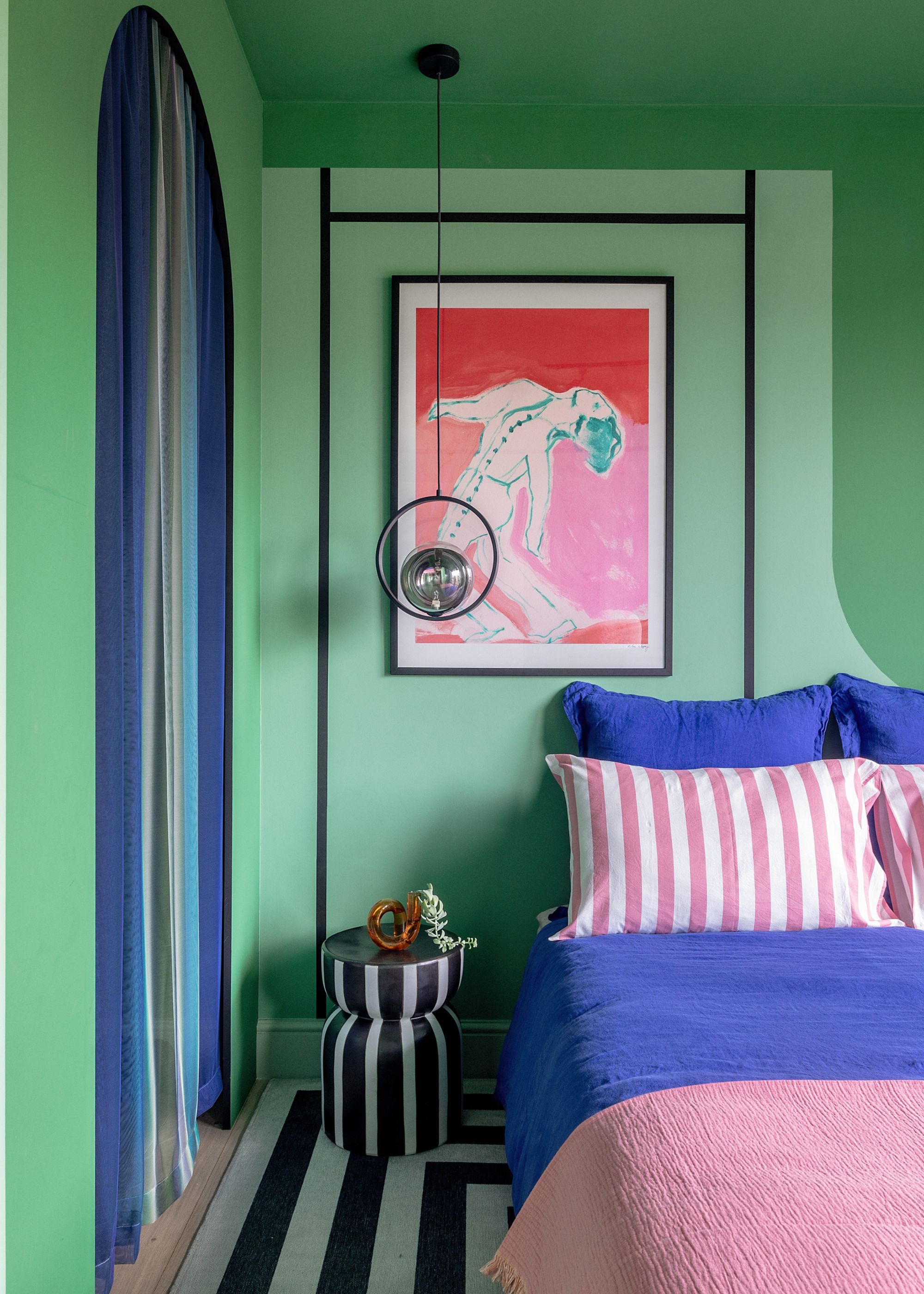
Dopamine decor leads the way in this happy green bedroom, filled with bold color.
This bedroom is a color-confident and happy space that goes bold with the tonal green walls and ceiling, enhanced with the electric blue and pink decor. The designers, Sabrina Panizza and Aude Lerin of PL Studio, used three shades of green paint from Lick to create the space: Green 13, Green 16 (discontinued), and Green 07.
"The goal of the color scheme was to create a bold space that feels connected to nature," the team explains. "We used color blocking with three different shades of green to celebrate the natural world and bring the outdoors in, while still maintaining a daring, contemporary design. The variation in tones adds depth and visual interest, and the black grid overlay was introduced to give structure and contrast."
The Livingetc newsletters are your inside source for what’s shaping interiors now - and what’s next. Discover trend forecasts, smart style ideas, and curated shopping inspiration that brings design to life. Subscribe today and stay ahead of the curve.
3. Little Greene’s Masquerade
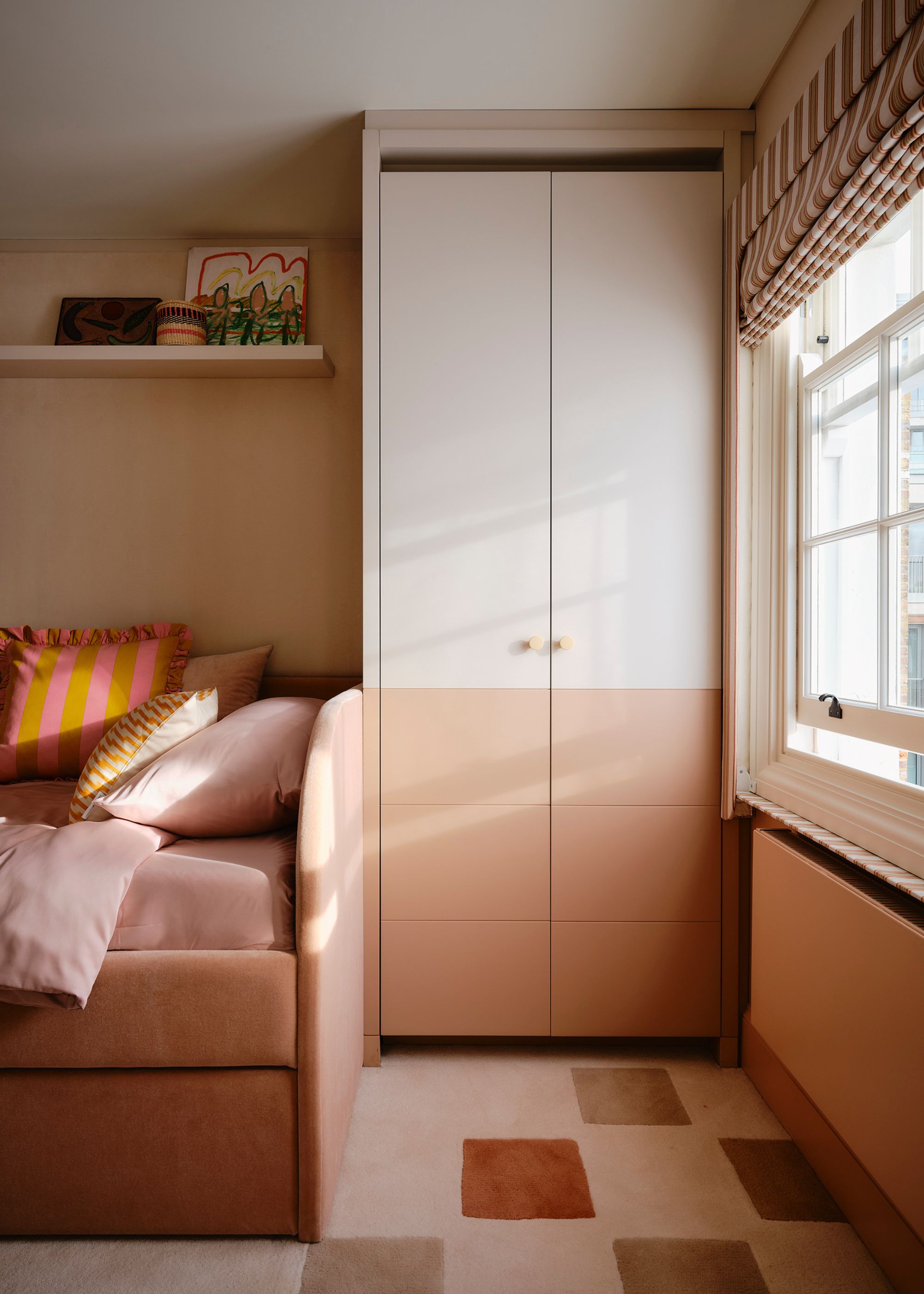
Pink is a warm, comfortable color — a great way to give your bedroom a happier feel over more traditional neutrals.
If you're used to decorating with neutrals and don't want to veer too far into the world of color, a plaster pink offers a cheery touch while maintaining calm. In this pink bedroom, pink paint was teamed with a warm white to create a truly timeless space.
"For the walls, we chose Little Greene’s Masquerade, a soft, dusty pink that feels warm and comforting without being saccharine, paired with Hollyhock, an off-white that brings lightness and balance," explains Alicia Meireles of OWN LONDON. "Together, the combination feels natural, calm, and enduring."
Alicia Meireles studied civil engineering before pivoting into a career in interior design, undertaking formal training at Chelsea College of Art & Design. Alicia brings a touch of eclecticism, skilled color combination, and a keen eye for detail to all of her projects. She has a passion for working with local craftspeople, championing new design techniques and materials, which she adapts to create beautiful and unique interiors.
4. Little Greene's Mister David
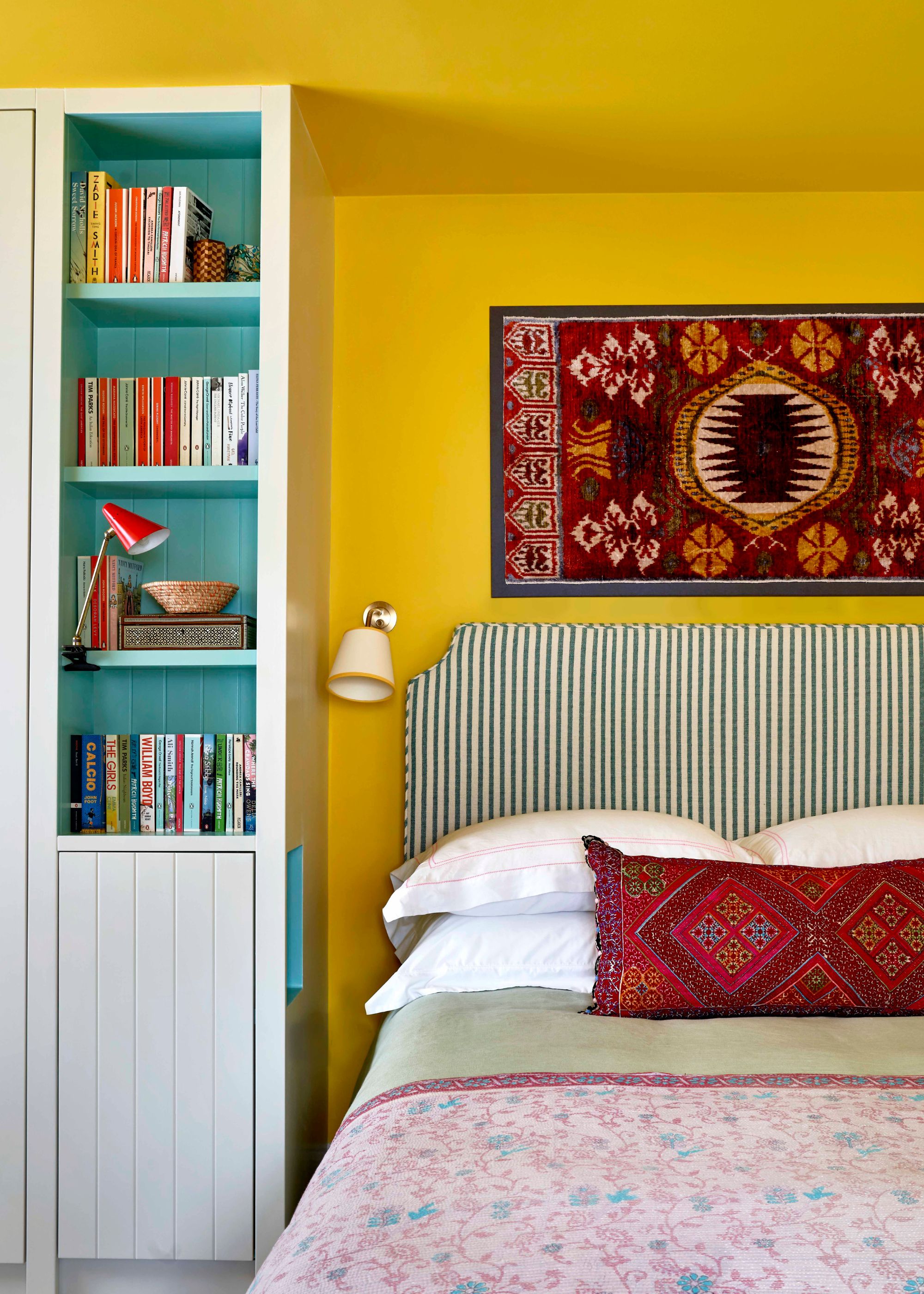
The bright yellow walls bring instant happiness to this bedroom, alongside rich shades of red and uplifting turquoise.
Little Greene's Mister David is the brightest of all its yellow paints. Conjuring summer days and sunshine, this energizing yellow is one for you if you're feeling bold.
This yellow bedroom, designed by Lonika Chande, used it on the walls, teamed with Farrow & Ball's School House White and Edward Bulmer's Turquoise on the built-in cabinets.
"The intention here was to create a space that felt joyful and uplifting but still grounding and restful," says Lonika. "Mister David has a depth and a warmth to it, and it works particularly well as a backdrop to textiles and patterned fabrics."
"We softened the space with textiles," she adds. "The kantha bedspread, antique cushion, and stretched textile counterbalance the color and make it feel lived in."
5. Little Greene's 'Smalt'
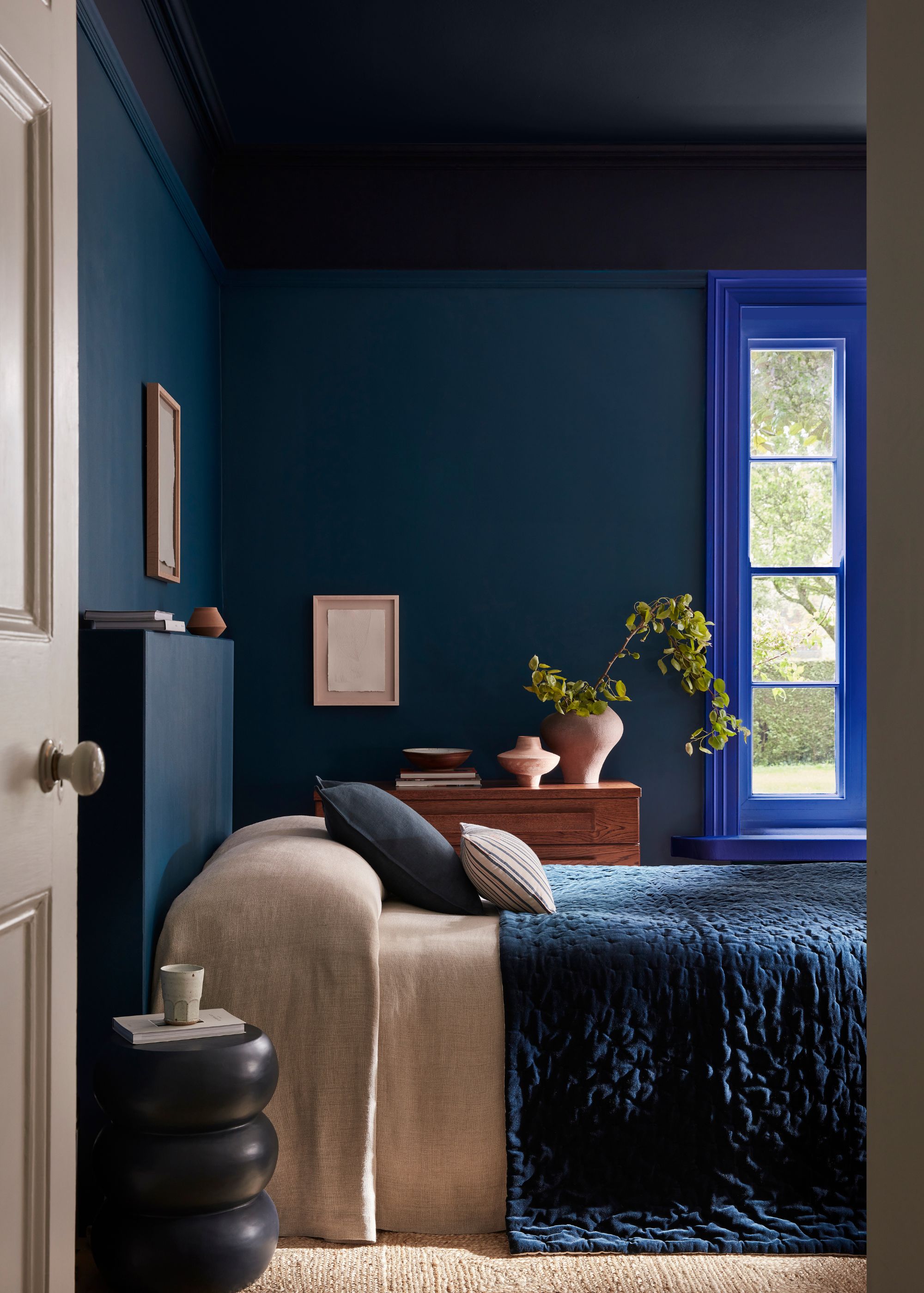
Bolder colors don't need to be used on all four walls — take inspiration from this space and use it as an accent color.
Little Greene's Smalt is a vibrant shade of blue which was used on the window casing in this blue bedroom, teamed with the darker Royal Navy and Dock Blue. "Smalt is a beautiful, vibrant, and versatile blue with a powerful effect," explains Ruth Mottershead of Little Greene.
Although a much more subtle use of an uplifting color, it gives the dark color scheme a vibrant twist without distracting from the room's cocooning feel. "Using different blue hues on various elements with a double drenching approach brings design interest to a bedroom, drawing the eye to architectural details whilst remaining calming and harmonious," says Ruth.
"Each shade complements the other, creating a balanced and serene environment conducive to relaxation and sleep, whilst retaining character and personality."
6. Pure & Original's 'Chalky Coral'
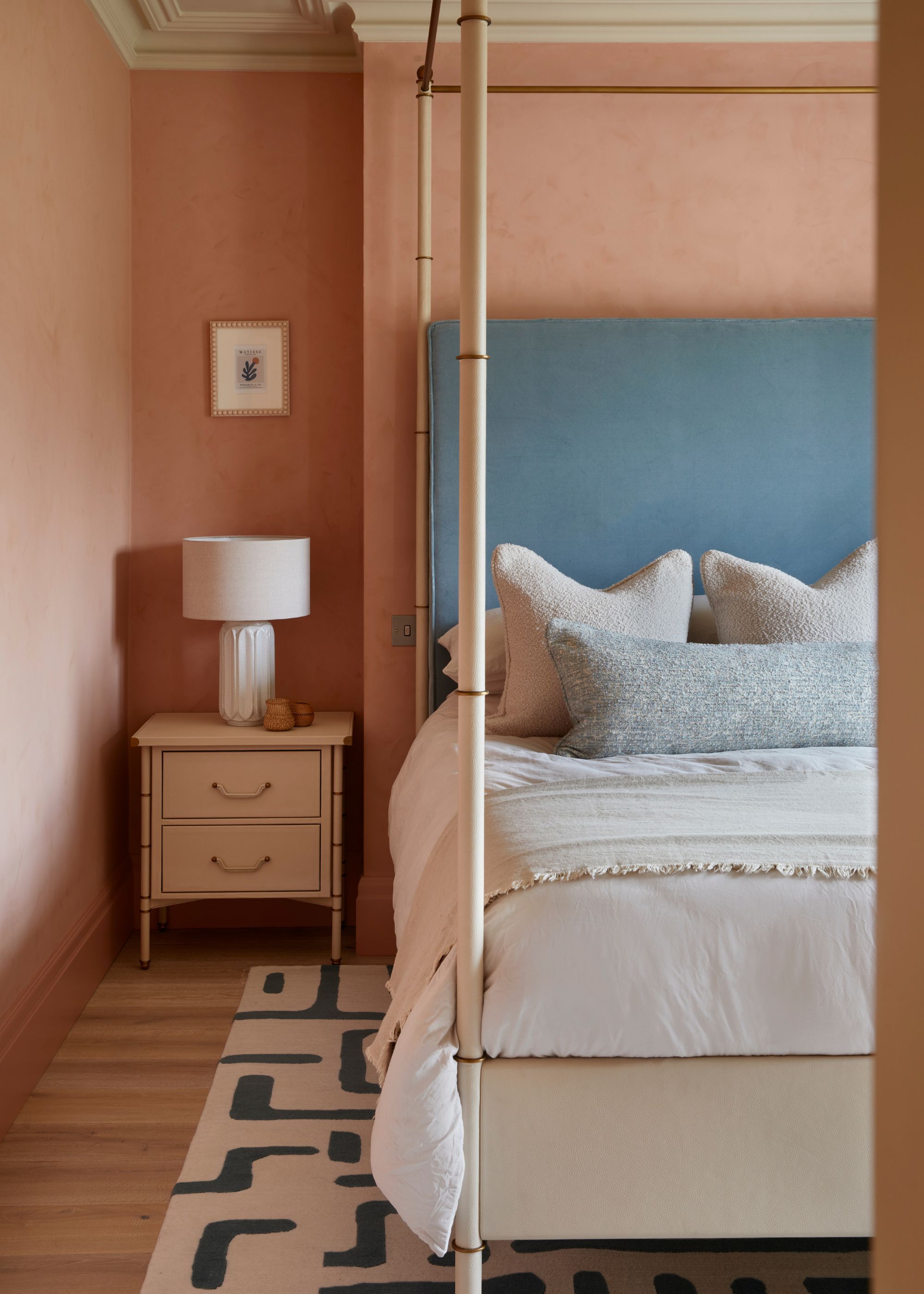
This bedroom nods to sunnier climates with its coral-washed walls.
"My clients are globetrotters, and I wanted their primary bedroom to take them to a happy place each morning," says designer Jenny Luck, who opted for Pure & Original's Chalky Coral on the walls, a summery, rosy hue.
"As the paint color is quite bright, I opted for a textured finish to create movement rather than a flat finish," she adds. "Having the movement makes it feel more authentic and more aligned with the finishes we see in warmer climates."
7. Benjamin Moore's 'Tea Light'
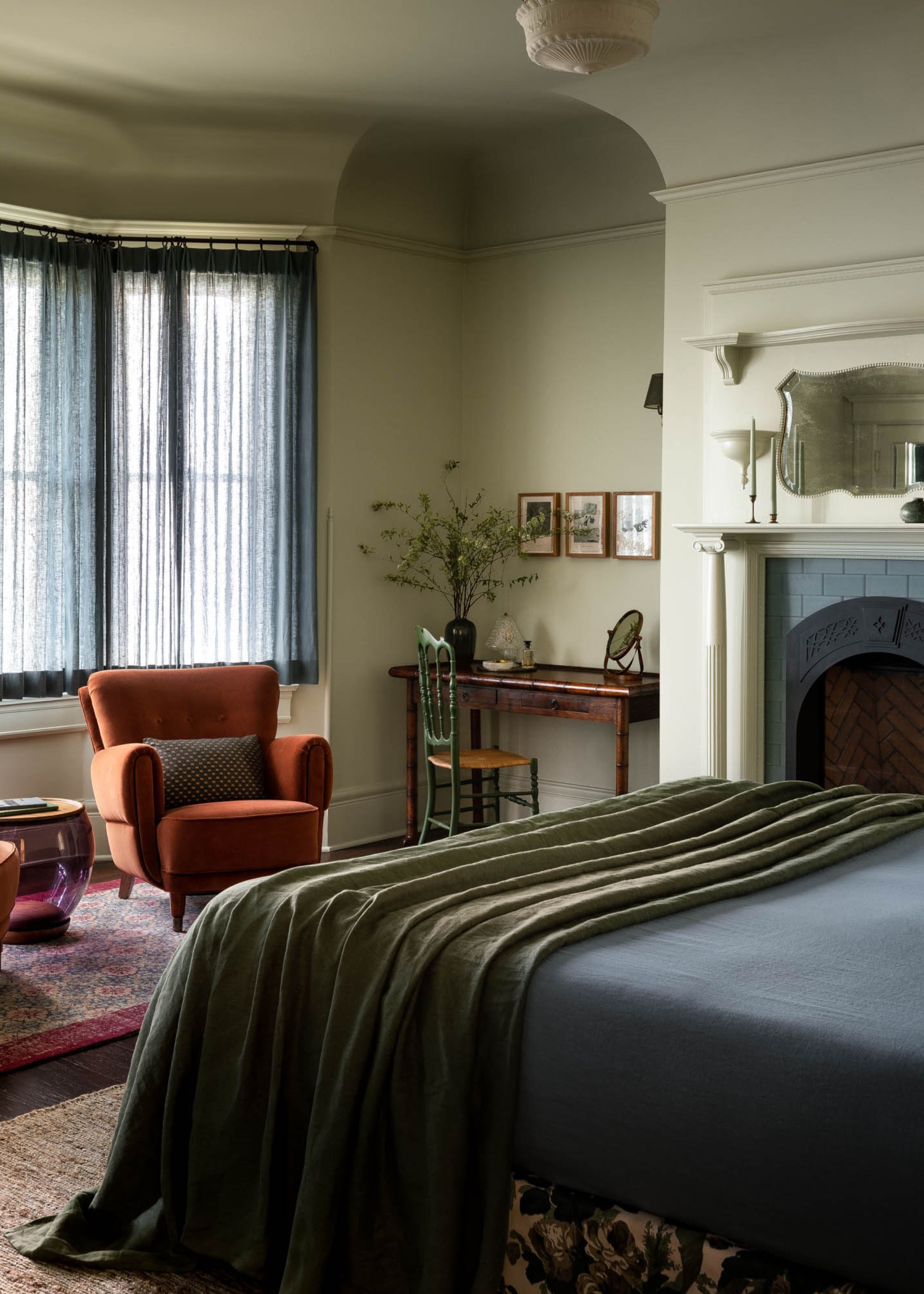
When teamed with warm-toned decor, a light green wall color provides the perfect backdrop for an uplifting bedroom.
This color-drenched bedroom is just a step away from neutrals with its light green walls, yet it manages to feel uplifting and happy with the warm-toned decor throughout. The paint color used by designer Ashley Lavonne was Benjamin Moore's Tea Light, a refreshing shade of green.
"While considered cool on the color spectrum, I think it lends itself to a perennial palette and has a lovely minty freshness that can energize anyone, even on the coldest days," she says.
8. Paint & Paper Library's 'Pollen II'
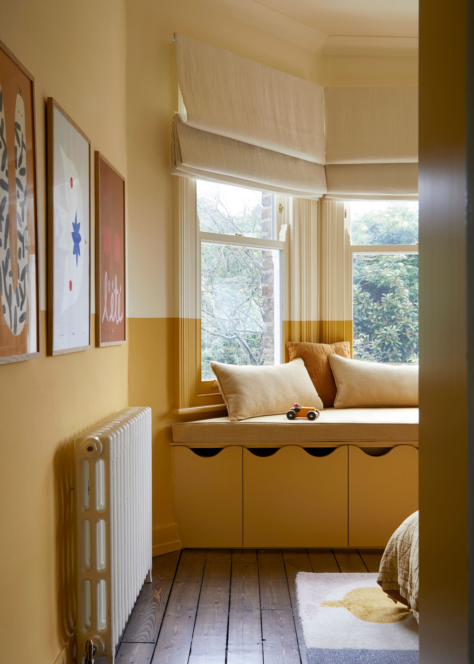
Pairing a bolder yellow like this one with a more restrained neutral on the upper portion of the walls gives this room balance.
"The goal with the bedroom color scheme was to create something that felt uplifting but still deeply restful," explains the designer of this bedroom, Andrew Griffiths of A New Day Design.
"We wanted the space to feel warm, optimistic, and gently cocooning, without tipping into anything overly sweet or overstated." To do so, he landed on Pollen II by Paint & Paper Library for the lower walls and Cashmere II by Paint & Paper Library on the upper part.
"It’s a joyous color, but not a shouty one — there’s an earthiness beneath the brightness that gives it a maturity," Andrew says of Pollen II. "It brings warmth and light, particularly on grayer days, and works beautifully with the natural light filtering through the trees outside."

Andrew Griffiths is the director of A New Day Interior Design Studio. The studio works on large-scale residential projects with a focus on design that balances creativity, functionality, and individuality. Working across a range of property styles from Grade II listed townhouses to modernist apartments, Andrew is adept at getting the most out of a kitchen design.
9. Little Greene's 'Bone China Blue'
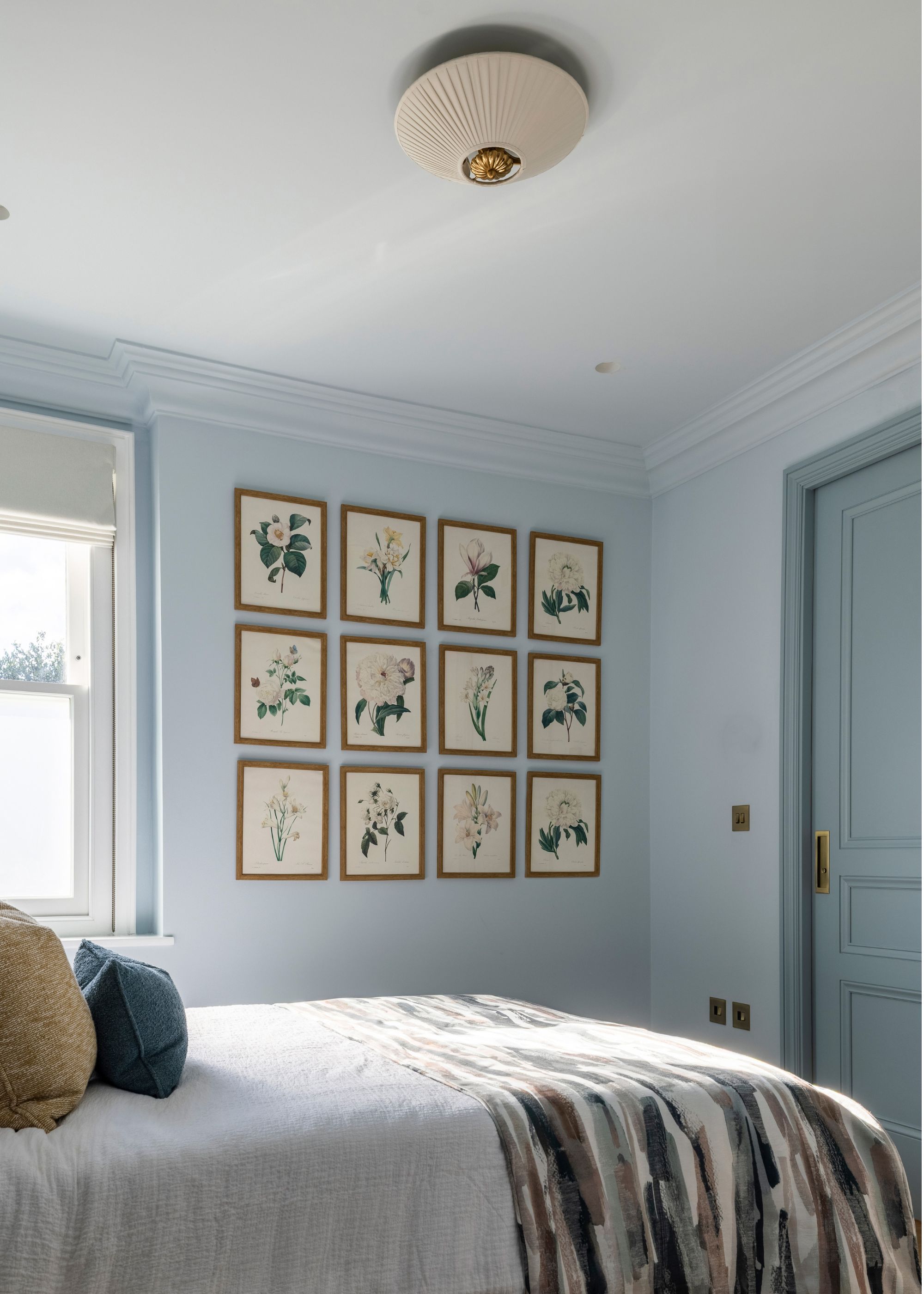
Painting bedroom walls blue can lend both a happy and tranquil feel.
Don't rule out cool color schemes when designing a happy bedroom. Blue paint used across the walls — especially when color-drenched — can create a playful yet soothing space, especially if neutrals are your usual go-to.
"We used Bone China Blue by Little Greene throughout the space, with the mid-tone applied to the walls, ceiling, and cornice, and a slightly deeper version on the skirting, architrave, wall paneling, and doors," says Gemma Luteijn, designer at Project London.
"The slightly darker woodwork adds depth and definition, while the softer mid-tone on the walls keeps the space light."
10. Mylands' 'Beehive Place'
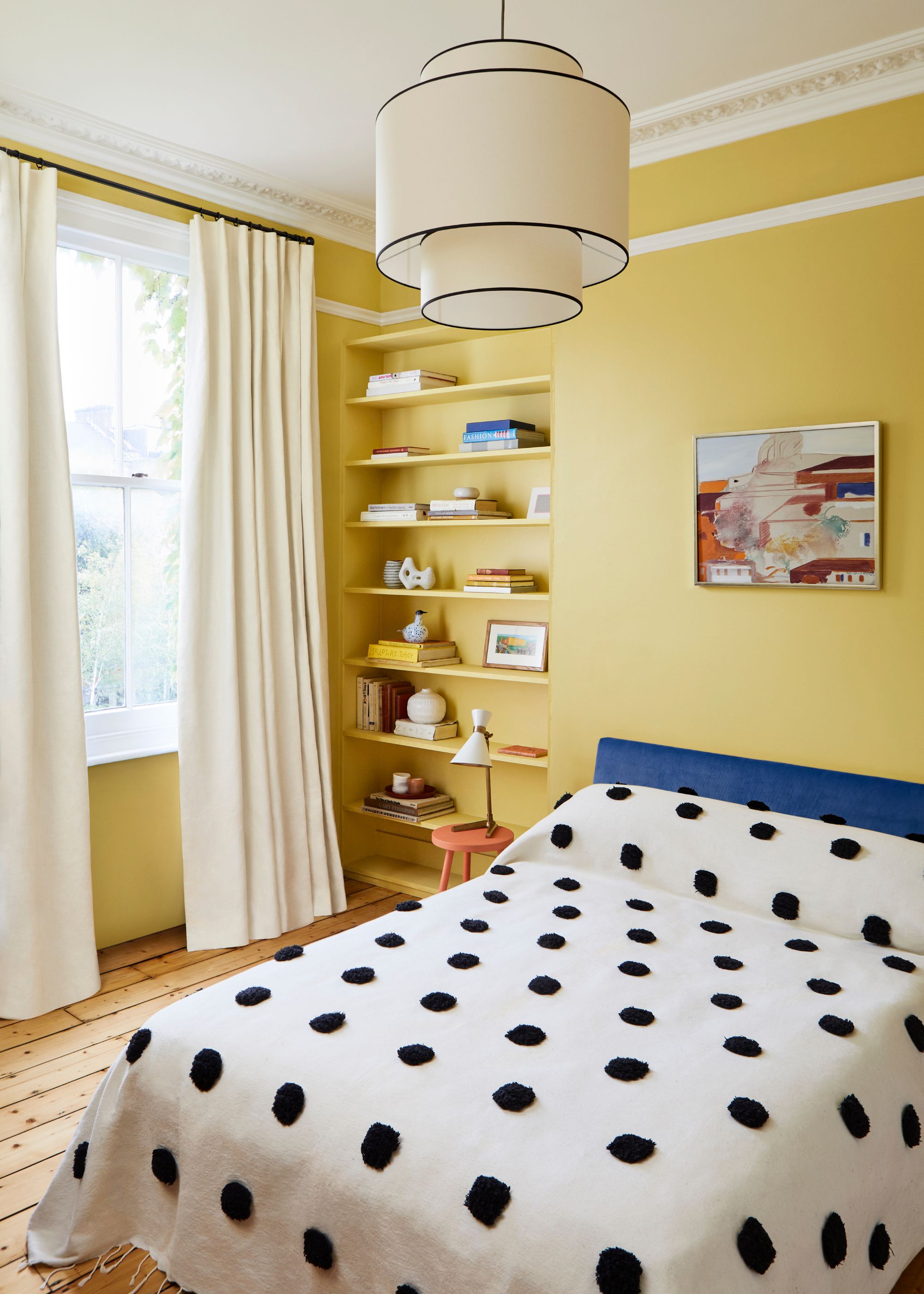
This happy bedroom teams sunshine yellow walls with a white ceiling and trim, along with neutral curtains which bring balance to the lively space.
This bedroom was decorated with Mylands' Beehive Place, a sunshine-inspired paint that brings a cheerful look to sleep spaces.
“Yellow is one of the most uplifting colors you can use in a home, bringing warmth and energy," explains Dominic Myland of Mylands. He describes Beehive Place as "a rich, sunny hue that always brightens a room," and adds that it "works well because its golden tone creates a welcoming, cheerful atmosphere that isn’t too bold, and it is versatile enough to pair with both neutrals and deeper tones.”

Dominic Myland, CEO at Mylands, is the fifth generation of the family to have run the London-based paint and wood polishes manufacturer, located in Lambeth. Working across all areas of the company from the factory to the boardroom, Dominic took over the company from his father in 1998 and continues the family tradition of perfection in paint.
11. Benjamin Moore's 'Aphrodite Pink'
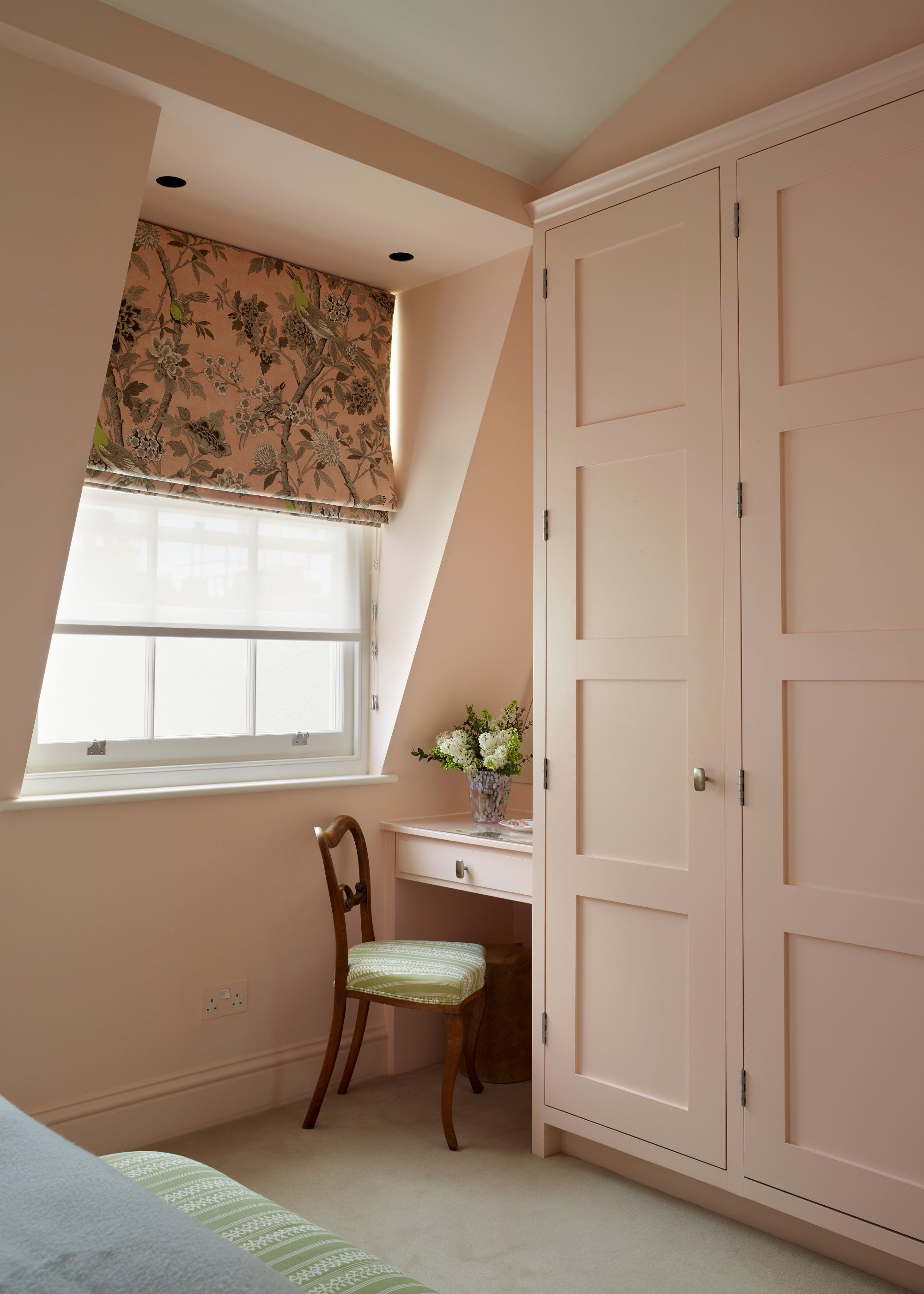
This peachy hue fills the room with an uplifting quality, without feeling too energizing for a sleep space.
This pink modern bedroom was decorated with a custom shade by Benjamin Moore, most similar to Aphrodite Pink, a soft yet happy shade.
“We wanted this bedroom color scheme to create a cozy, welcoming space that feels both uplifting and restful," says designer Liv Taylor of Yellow London. "The soft peachy hue introduces warmth, gently brightening the room and providing an inviting backdrop for bolder prints. It feels optimistic and balanced.”
Whether you want your bedroom to embrace the most energetic shades of yellow or are looking for something slightly more serene with peachy pinks, these hues bring happiness to bedroom walls, turning it into a color-confident space that breaks away from tradition.

Emily is a freelance interior design writer based in Scotland. Prior to going freelance in the spring of 2025, Emily was Homes & Gardens’ paint and color editor, covering all things color across interiors and home decor for the Homes & Gardens website. Having gained specific expertise in this area, Emily is well-versed in writing about the latest color trends and is passionate about helping homeowners understand the importance of color psychology in home design. Her own interior design style reflects the simplicity of mid-century design and she loves sourcing vintage furniture finds for her tenement flat.


