7 of the Best Yellow Paint Colors, According to Designers, That Will Brighten Even the Gloomiest Days
It might not be the first color you think of, but that's because it can be tricky to know which paint to pick. This list answers that

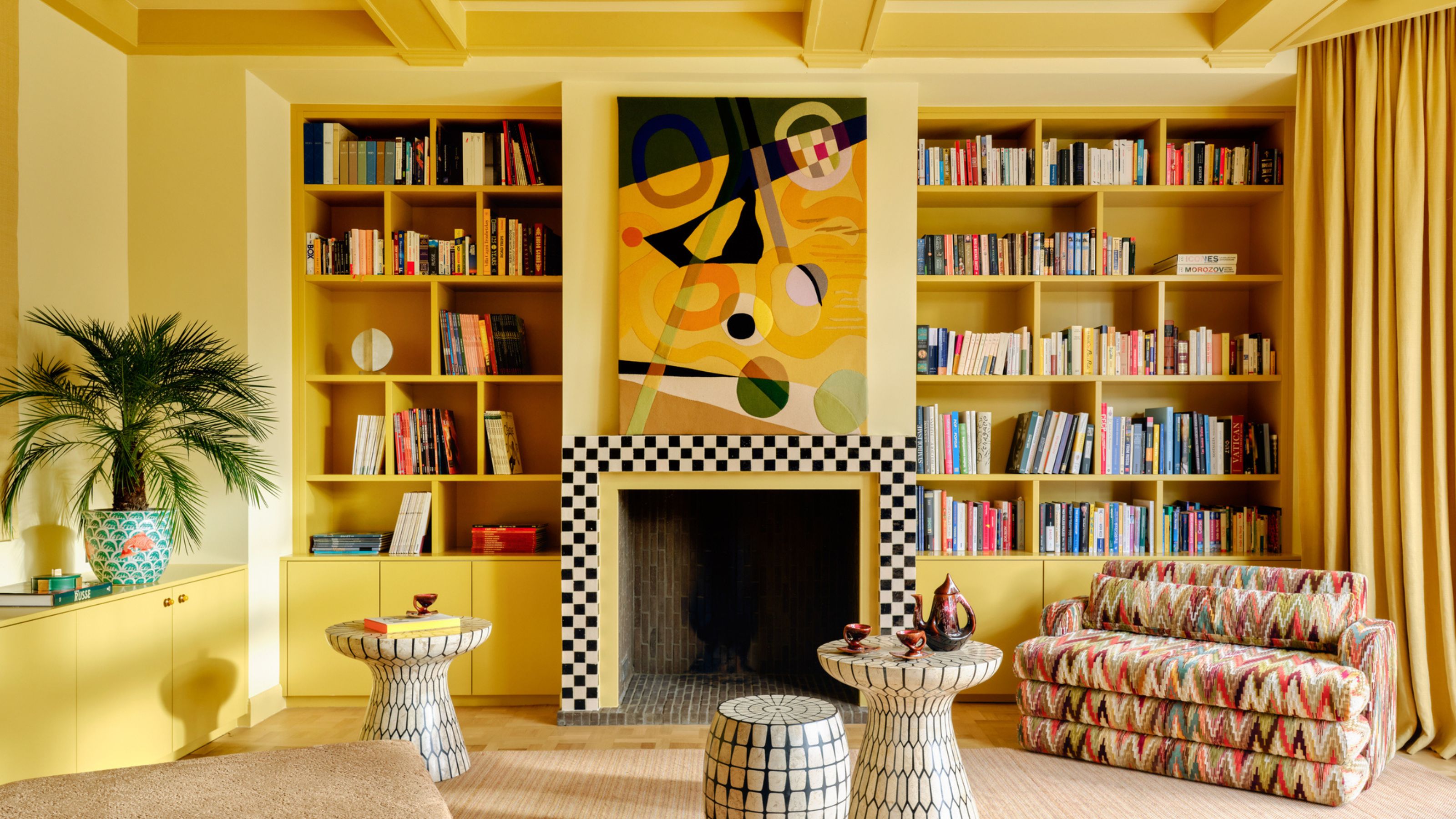
It’s difficult to be glum in a yellow space. The color simply radiates happiness, from the most delicate of lemons to beaming banana tones and the most muted of mustards. It’s the same way sunlight makes us feel. Yellow paint is intrinsically linked to light itself and comes with emotional resonance as well as a brightness level — yellow paint can’t help but evoke positivity and uplift our souls.
Stroll into a yellow space and you’re hit with very similar feelings to the first sunbeam of spring on your skin, heat hitting your face as your holiday begins, watching golden hour richness spreading across the landscape, or soaking in the heady afterglow of dusk. So, when decorating with yellow, before you find the best yellow paint color, the first thing to ponder is light. Which direction does the room face? Northern light cools; southern light adds gold. How much light does it get? Yellow fades in low light; in the sun, it sings. What about artificial lighting? Cool LEDs flatten it; warm bulbs will enrich. And when will you use the room? Morning freshness lifts; evening shade envelops.
I spoke to seven designers, architects, and interior creatives on the best yellow paint colors they reach for when the world seems a bit overcast, just in case you’re not overly keen for hundreds of yellow test patches speckled across your walls. Here are the yellow paint colors they choose when they want to capture warmth, lift mood, and bring brilliance.
Article continues below1. Paint & Paper Library's Caddie 452
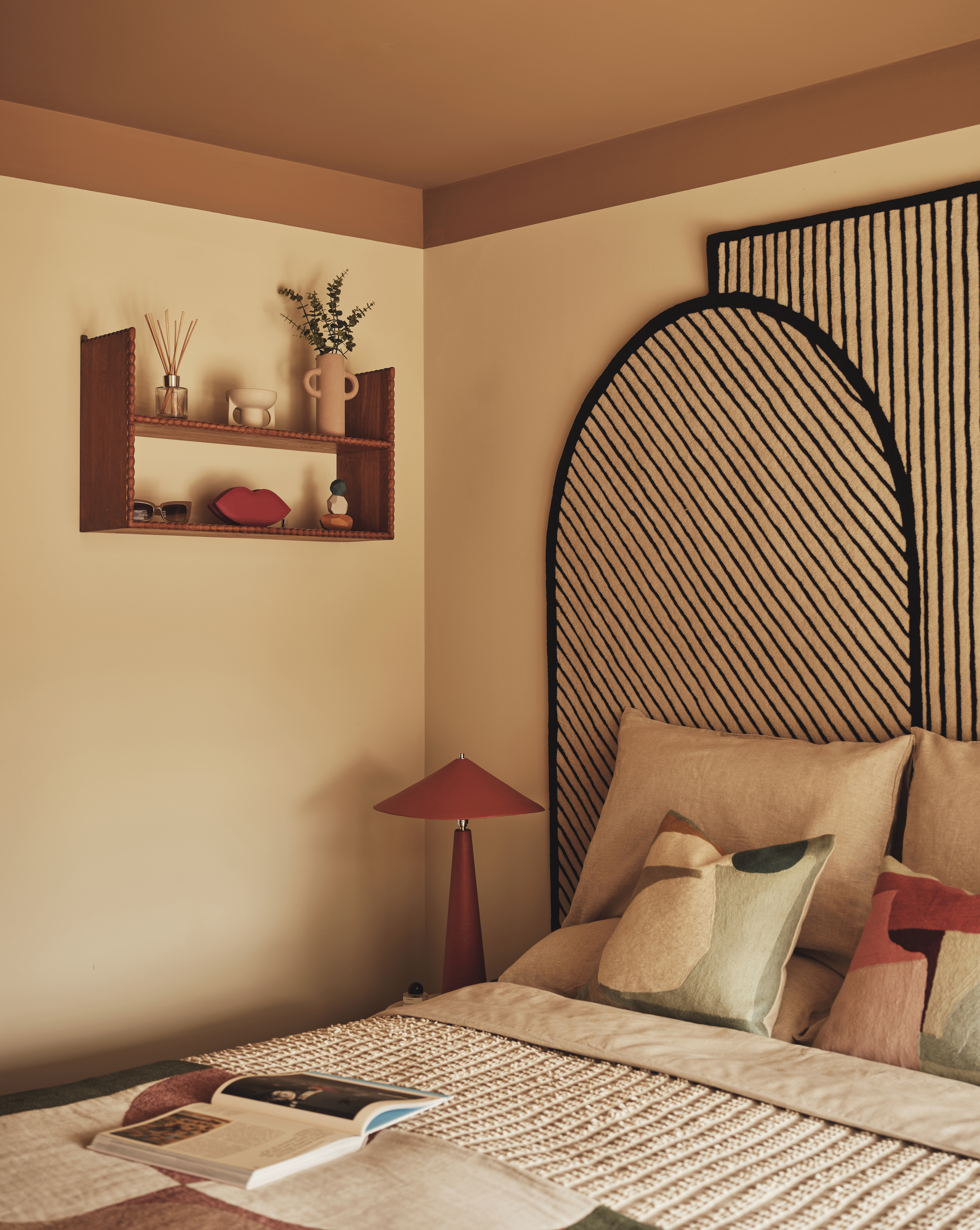
Yellow is an uplifting bedroom color idea — you'll always wake up on the right side of bed.
A brown-based yellow that flirts with the realm of neutral colors, Paint & Paper Library’s Caddie (452) is earthy as well as uplifting. The tone feels toasted, its yellowness subtle yet still powerful enough to keep temperatures up through winter.
"It anchors a space, the richness bringing a sense of quiet refinement and creates a grounded yet elevated atmosphere," says Tola Ojuolape, interior architect and founder of London design firm Tola Ojuolape Studio.
On what pulls her to Caddie 452, she says, "I love its earthy quality and the depth it brings. Even on dark, wintry days, this color brings a gentle warmth to the room. It catches the light softly, for a cocooning feel."
Multidisciplinary designer Tola, creative director of her eponymous architecture and interiors studio, is drawn to palettes that feel warm and grounded. Her work reflects a lifelong passion for the arts and the African continent. The spaces she creates are personal and invite ease and a sense of quiet comfort, with every detail considered, personal, and steeped in craft and narrative.
2. Farrow & Ball's Hay
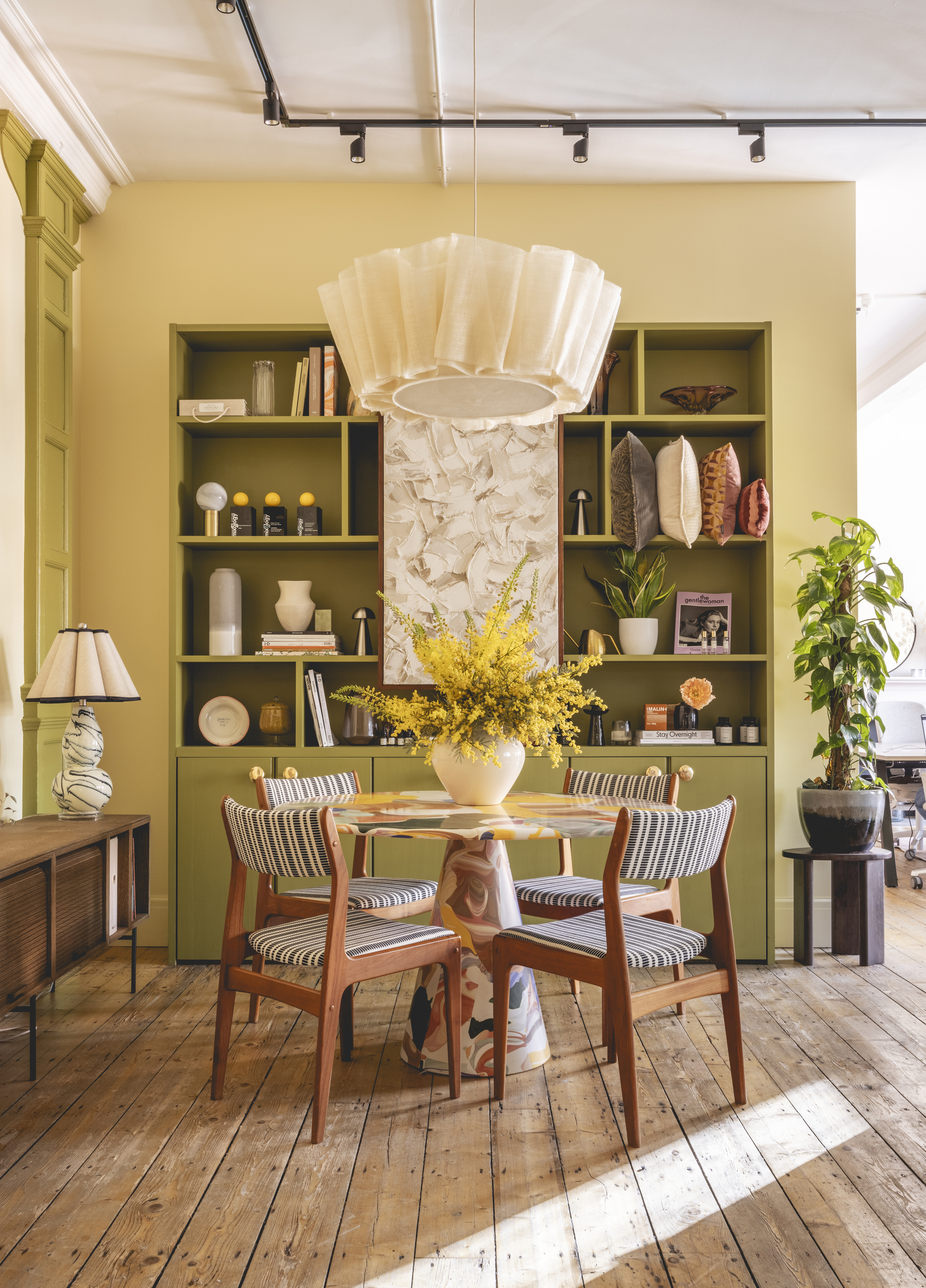
Light and bright, this yellow paint shade is a positive color and works great in communal spaces of the home.
A peaceful yellow named after the dried crop, Farrow & Ball’s Hay is imbued with warmth and a mellow dustiness, akin to hazy, lazy sunlight.
Franky Rousell, founder and ceo of Manchester and London-based interior design studio Jolie, sees Hay as "a soft and grounded shade, more honeyed than sunny. Its muted ochre and clay undertones offer an effortless comfort and a sense of calm — a quality you get from aged pigment or clay tones."
She continues, "I love how it feels lived-in and tactile. It’s not the kind of yellow that dominates a space; it supports it, adding warmth and light in a really subtle way reminiscent of natural light filtered through fabric. You don’t just see, you feel it — on gloomy days, it almost works like a built-in light source, giving the room a gentle glow that feels cozy and uplifting."
For Franky, founder and ceo of Jolie, color is deeply sensory, something felt as much as seen; emotional, spatial, and even tactile. As someone with profound hearing loss, she grew up learning to interpret the world differently, shaping an acute awareness of the power of sensory connection — an ethos that underpins her studio’s design philosophy. "Every hue carries an energy, and the goal is to choreograph those energies to create an atmosphere that feels balanced and alive," she says. "It’s about designing for what people sense."
3. Little Greene's Yellow-Pink (46)
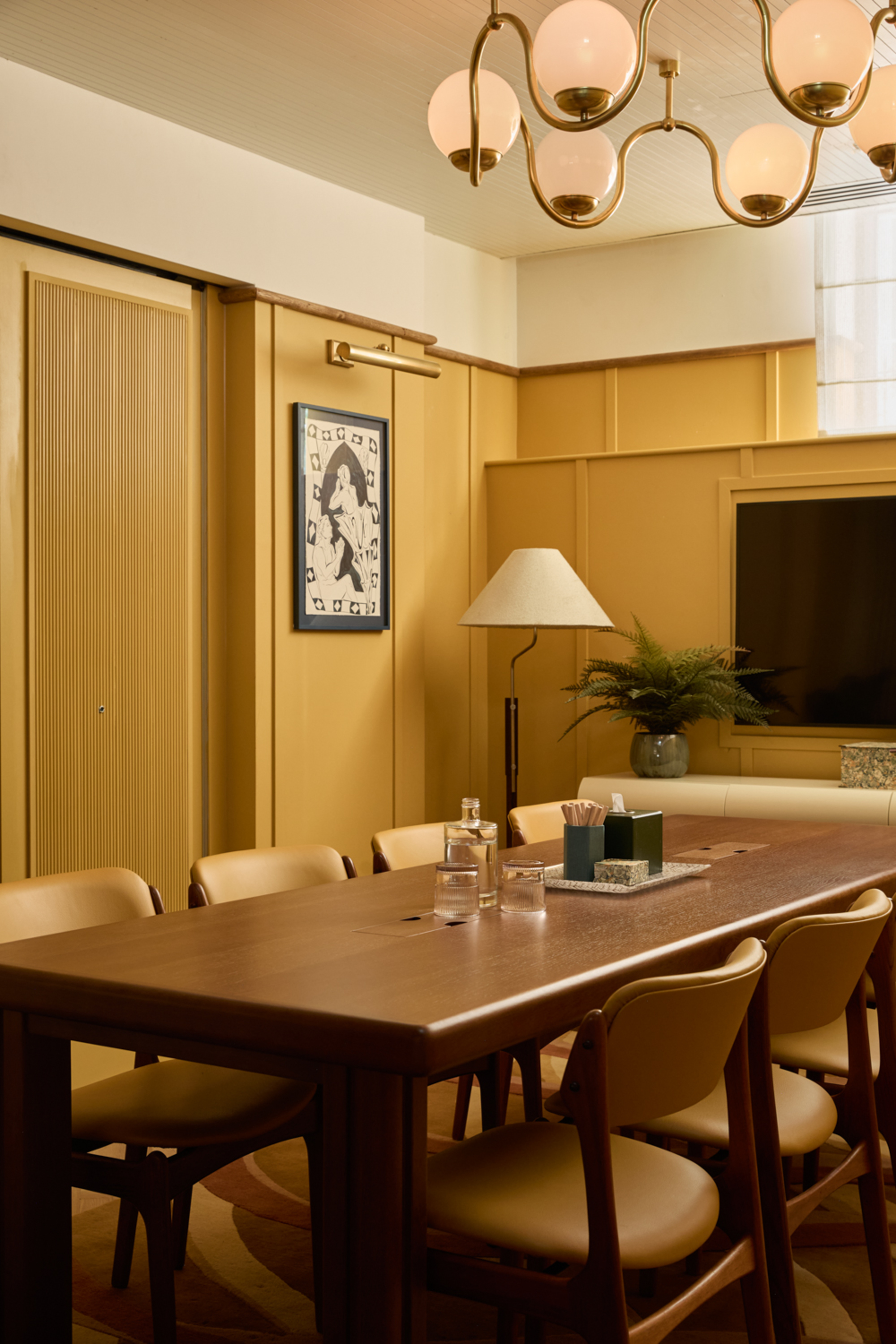
Don't let the name mislead you, this Yellow-Pink paint color is a deeply saturated and cocooning shade of yellow.
Little Greene’s Yellow Pink is based on ochre; the hue is so named because the word ‘pink’ was historically used to describe an earthy yellow-ish tone produced by the Woad plant — as you can probably tell, there’s no pink in it.
Andy Goodwin, co-founder and creative director at London- and Los Angeles-based interior architecture and design studio, Fettle, is drawn to Yellow Pink because the bold mustard "brings warmth, vibrancy and personality to a space."
The firm swathed the shade across the walls of a London project. Andy explains, "It’s one of the rooms with the smallest windows and without much of a view, so Yellow Pink’s strength, paired with warm lighting, helps create an inviting feel across all seasons."
4. Benjamin Moore's Cypress Grove (388)
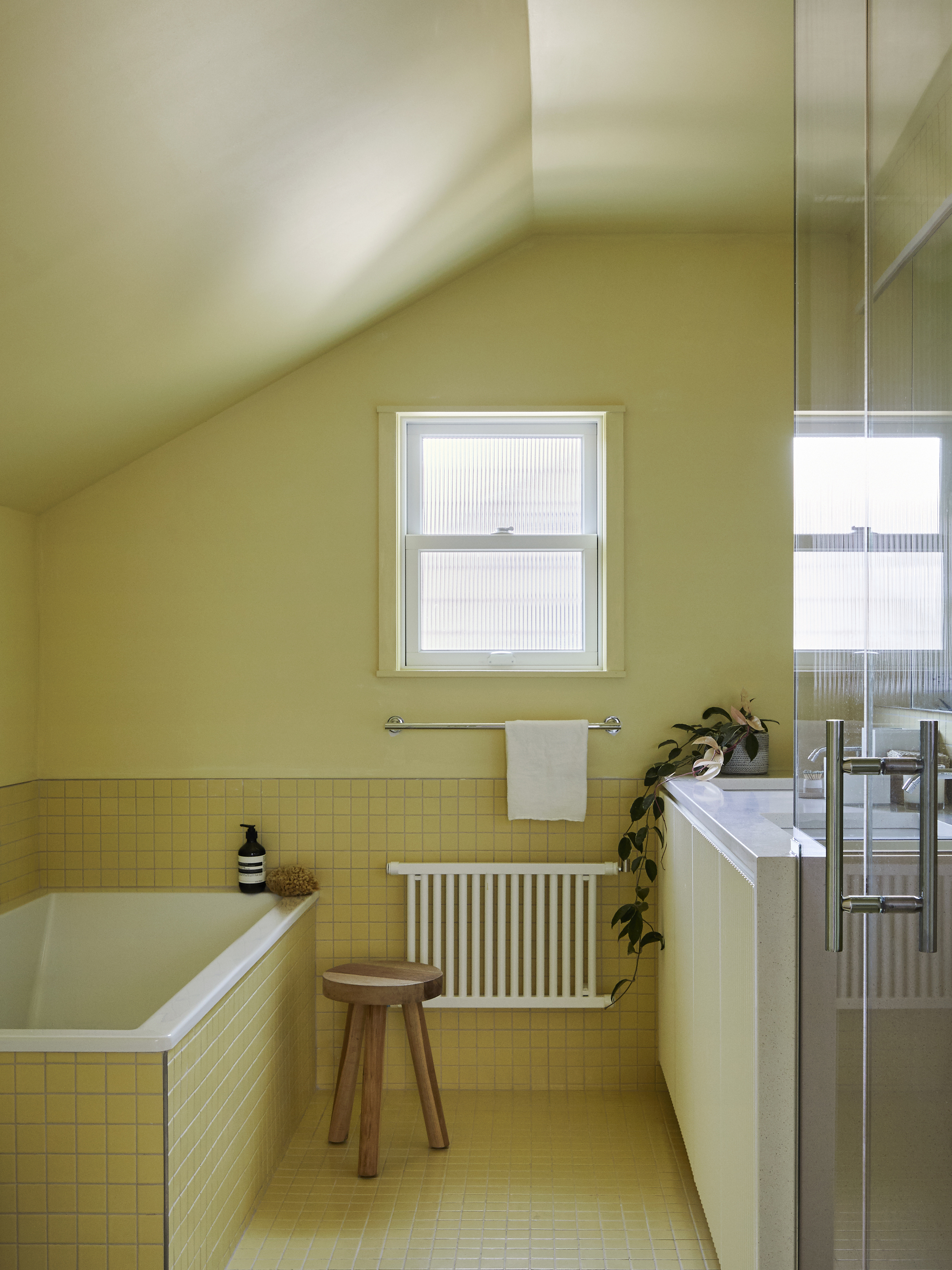
Fresh and energizing, yellow paint works perfectly as a bathroom color idea.
A pale-ish yellow paint that's given a hint of sharpness with a touch of green, Cypress Grove 388 by Benjamin Moore is fresh and sprightly.
"It’s like the perfect glass of lemonade on a hot day," says founding principal of New York-based architecture practice Mattaforma, Lindsey Wikstrom. "What's incredible is that the yellow takes in the cool tones of winter light and becomes a sharper, more invigorating bath of sunshine."
Mattaforma used the yellow paint color in a New York attic bathroom to bring joy every morning and every evening. Angela explains, "We wanted to cultivate a true revitalization, and the space changed from an unlit corner to the brightest spot in the home."
5. Little Greene's Indian Yellow
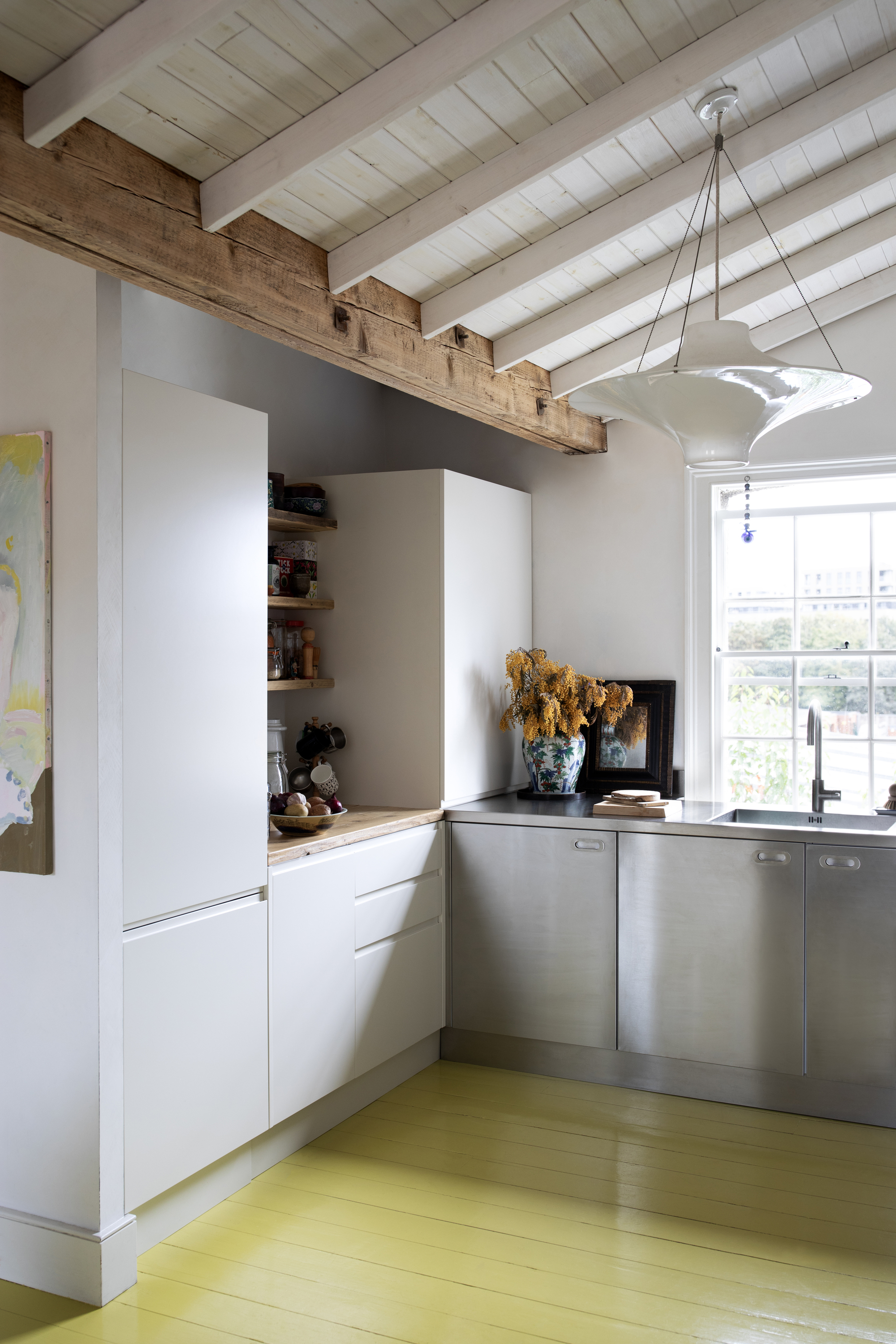
If you're not ready to commit to the full kitchen, why not focus on one feature, like the floor?
Referencing a pigment used in oil paintings between the 16th and 19th centuries, Little Greene's Indian Yellow is bright and expressive while remaining a little elusive.
"Slightly chalky and buttery, Indian Yellow is warm without being overly bright," explains Tom Rutt, director at London-based architecture and interiors practice TR Studio.
"We were drawn to the way it interacts with natural light — on grayer days, it reflects and amplifies whatever light there is; it feels almost like a source of light itself."
6. Paint & Paper Library's Imperial Chinese Yellow
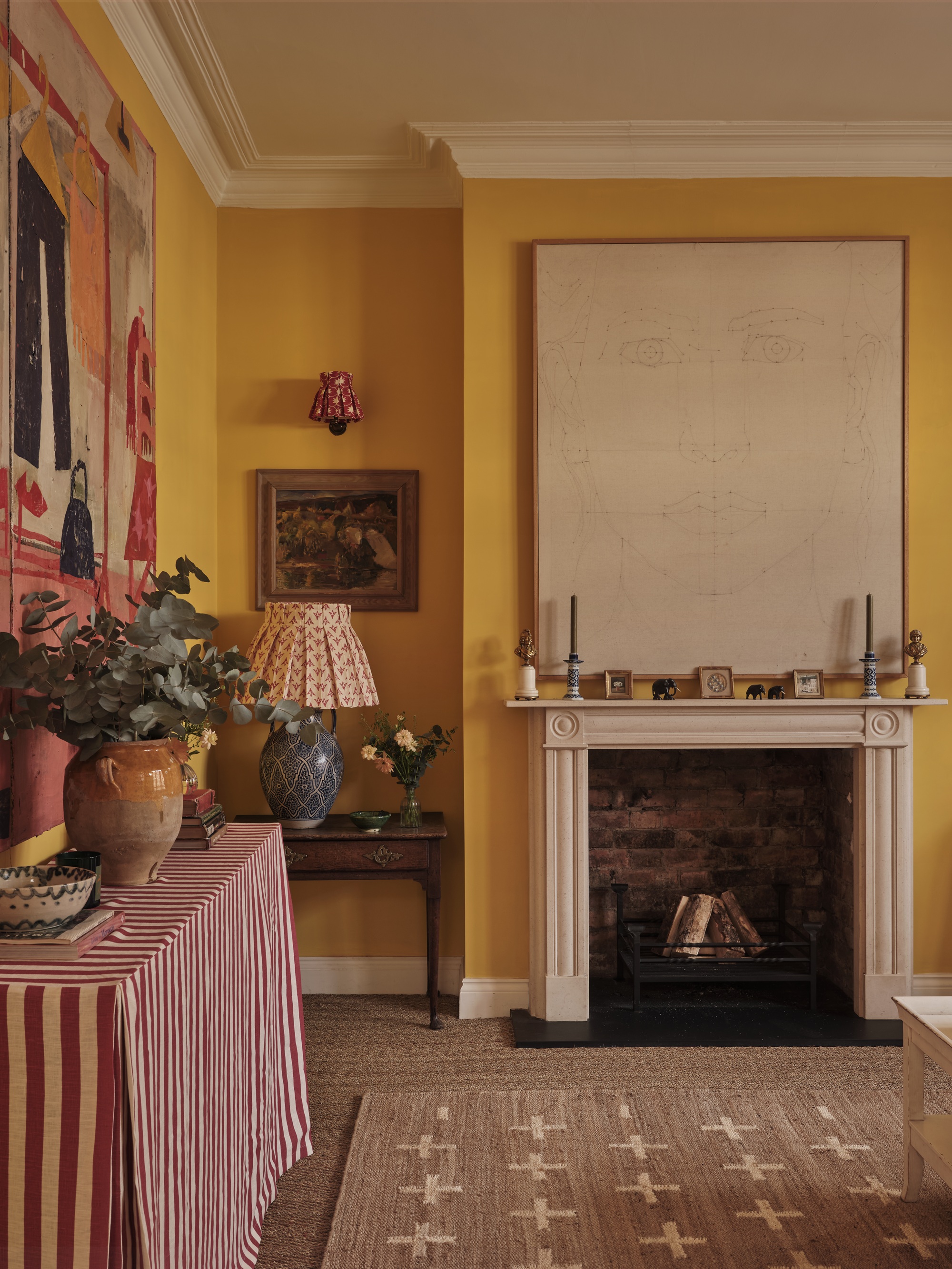
Rich and warm without overpowering, this yellow paint color ticks all the boxes.
Inspired by a tone from a 1934 book on color, Paint & Paper Library's Imperial Chinese Yellow is delightfully vivid, with subtle hints of sour chartreuse.
"Imperial Chinese Yellow is a bright but warm and rich yellow, sunny without being overpowering," says designer Alice Palmer, founder of London homeware brand Alice Palmer & Co, who used the shade in her own living room.
"It’s full and saturated, so even in my north-facing space it uplifts, making it feel cozy and inviting, especially in the evenings when the candles are lit and the fire is going," Alice adds. "It’s exactly the kind of yellow that transforms a space into a room you actually want to spend time in during the winter."
7. Ressource's Le Parchemin
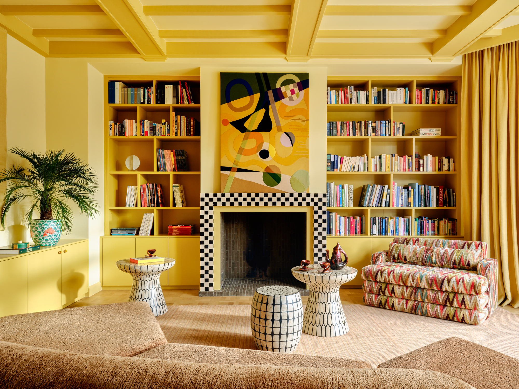
Yellow paint colors drenched all over a space have a happy vibrancy — it's not hard to see why it belongs in the list of joyful colors.
Energetic and vibrant, Ressource’s Le Parchemin yellow paint is as gleaming and glorious as a midsummer’s day.
"It’s luminous without being overly bright. Think of it as sunshine captured in paint form — soft enough to be enveloping rather than overwhelming," says Brussels-based interior architect and designer Victoria Maria Geyer, who used it on the beams of a Brussels living room.
"On gray days, the space transforms into a cocoon of warmth and light," she adds. "It genuinely feels like stepping into the sun. The color lifts the spirits and creates this cozy, embracing atmosphere that makes you want to curl up with a book by the fireplace. It's restorative in a way that few colors can be."
Victoria Maria paired Le Parchemin with Ressource’s paler La Madeleine on the walls to add depth and rhythm to the room’s architectural lines. "Yellow became the heart of the living room, radiating energy throughout the entire home," she adds.
From yellow bedrooms to yellow kitchens, the sunniest hue is unmatched in the home for being simultaneously optimistic and comforting, cheerful and soothing, and radiant as well as restful.
However you use yellow paint colors, softly or as a statement, it can fill any space with warmth, light, and joy — is there any better reason to reach for the paintbrush?
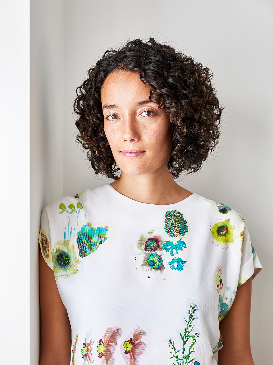
Amy Moorea Wong is a color authority and contemporary interior design writer who has specialized in all things decorating for over a decade. Amy is Livingetc magazine’s Colour Expert, Interiors Editor at The Glossary magazine and a Contributing Editor at Homes & Gardens magazine, and she frequently contributes to an array of global publications to share her insights on interior design zeitgeist. Her book Kaleidoscope: Modern Homes in Every Colour explores a collection of cool colorful homes fizzing with creativity, surprises, and inspiration.
