Pantone Just Announced Its Most Unexpected Color of the Year Yet — A Trend Forecaster From the Institute Explains Why 'Cloud Dancer' Is Right for 2026's Interiors
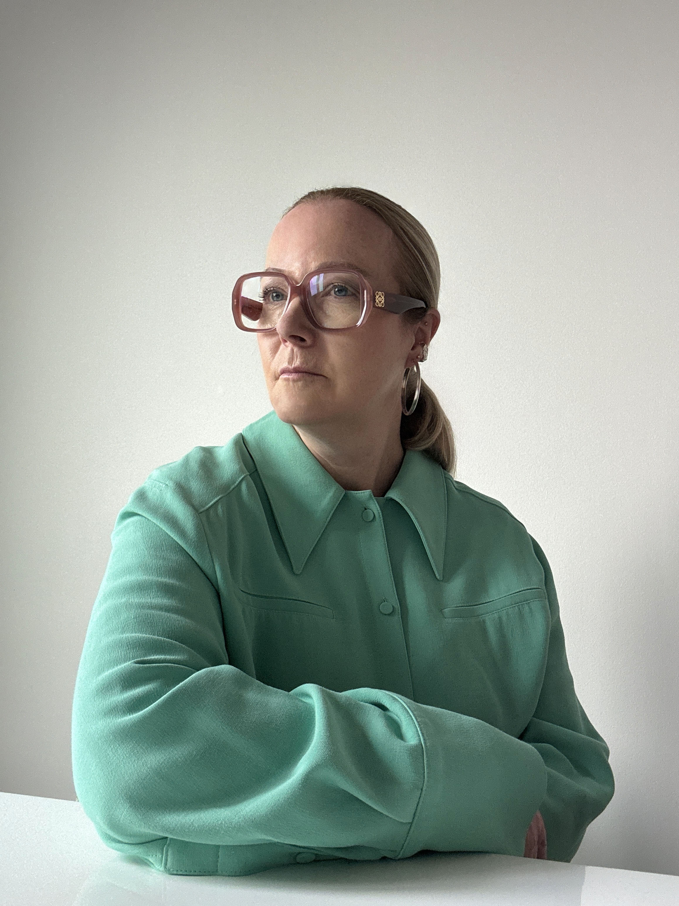
Trend forecaster Jane Boddy, European Creative Director for Pantone, offers Livingetc some exclusive insight on how Cloud Dancer reflects the year to come
The Livingetc newsletters are your inside source for what’s shaping interiors now - and what’s next. Discover trend forecasts, smart style ideas, and curated shopping inspiration that brings design to life. Subscribe today and stay ahead of the curve.
You are now subscribed
Your newsletter sign-up was successful
Today, the Pantone Color Institute Announced 'Cloud Dancer', a soft, dreamy, and warm off-white, as its Color of the Year. Below, color trend forecaster and member of the Institute, Jane Boddy, offers some reflection on how and why Pantone landed on this (perhaps) unexpected choice.
We are all feeling so tired right now from the nonstop bombardment of digital noise and the pace of the world in general. That sense of exhaustion shaped the decision to choose Cloud Dancer as a color trend that signals a reset, a moment to exhale and begin again.
As part of a global trend team that I often describe as 'color anthropologists', we look at the world through the lens of color, translating what we see at a macro level into meaningful color direction. There is a great deal of debate within the team, and we focus deeply on what is happening in the world. From this broad cultural picture, we then draw everything down into a single color, and from there into the fine details within that color. Every nuance is considered and tuned so that the final choice aligns fully with the emotional and cultural message for the year ahead. Our team spans multiple geographies and cultures, each with its own areas of specialization, adding richness and perspective to this process.
Article continues belowIn a world that is always moving, where screens glow nonstop, and tasks blend together, PANTONE 11-4201 Cloud Dancer offers something refreshing: a moment of calm. This soft, gently aerated white feels like a small breath of clarity in all the noise. Instead of demanding attention, it quietly invites us to slow down, center ourselves, and appreciate the beauty of simplicity, something many of us are craving today.

Image credit: The Pantone Color Institute
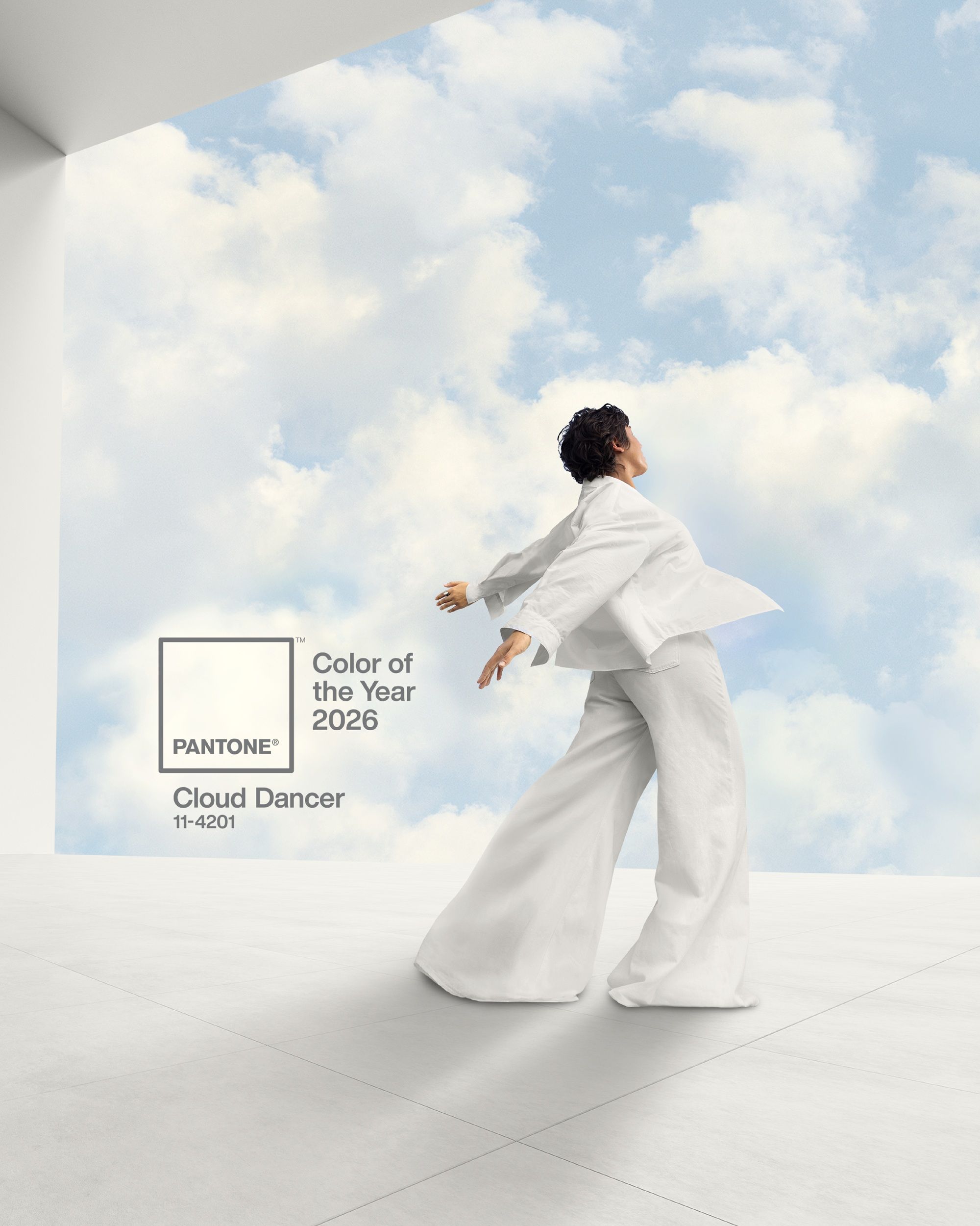
Image credit: The Pantone Color Institute
What is especially important about Cloud Dancer is that it is a gentle, soft white. It carries a quiet warmth that removes any sense of glare or coldness. This small shift from a harsh white to a softened one is one of the most important details, transforming the color from something clinical into something comforting, easy, and soothing. It shows how subtlety can completely change how a space or object feels.
Cloud Dancer suggests new beginnings and supports the rise of soft minimalism, a movement built around comfort, clarity, and pared-back spaces. Its gentle softness makes the shade endlessly versatile, creating room for ideas, objects, and emotions to breathe. At its core, Cloud Dancer reflects a desire for clarity and a gentle reset, reminding us that simplicity is not always about bareness and spaces being empty.

A pivotal figure at the Pantone Colour Institute, Jane contributes to trend publications and serves as the European Creative Director for Pantone’s Interiors annual trends publication, Pantone View Home and Interiors. Her approach to forecasting color focuses on observing current events and cultural trends to understand how perceptions of color are evolving.
How and Where to Decorate With It
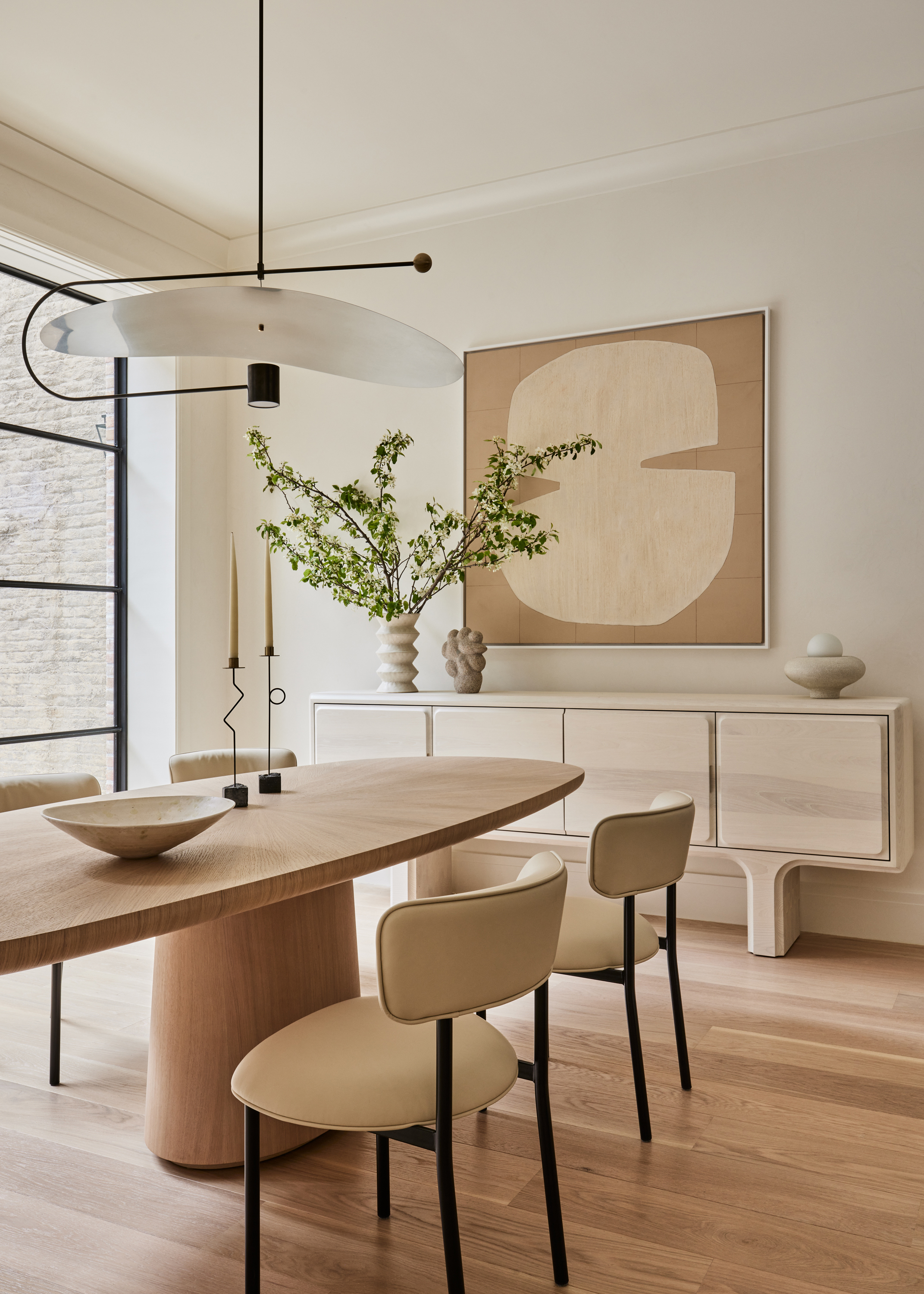
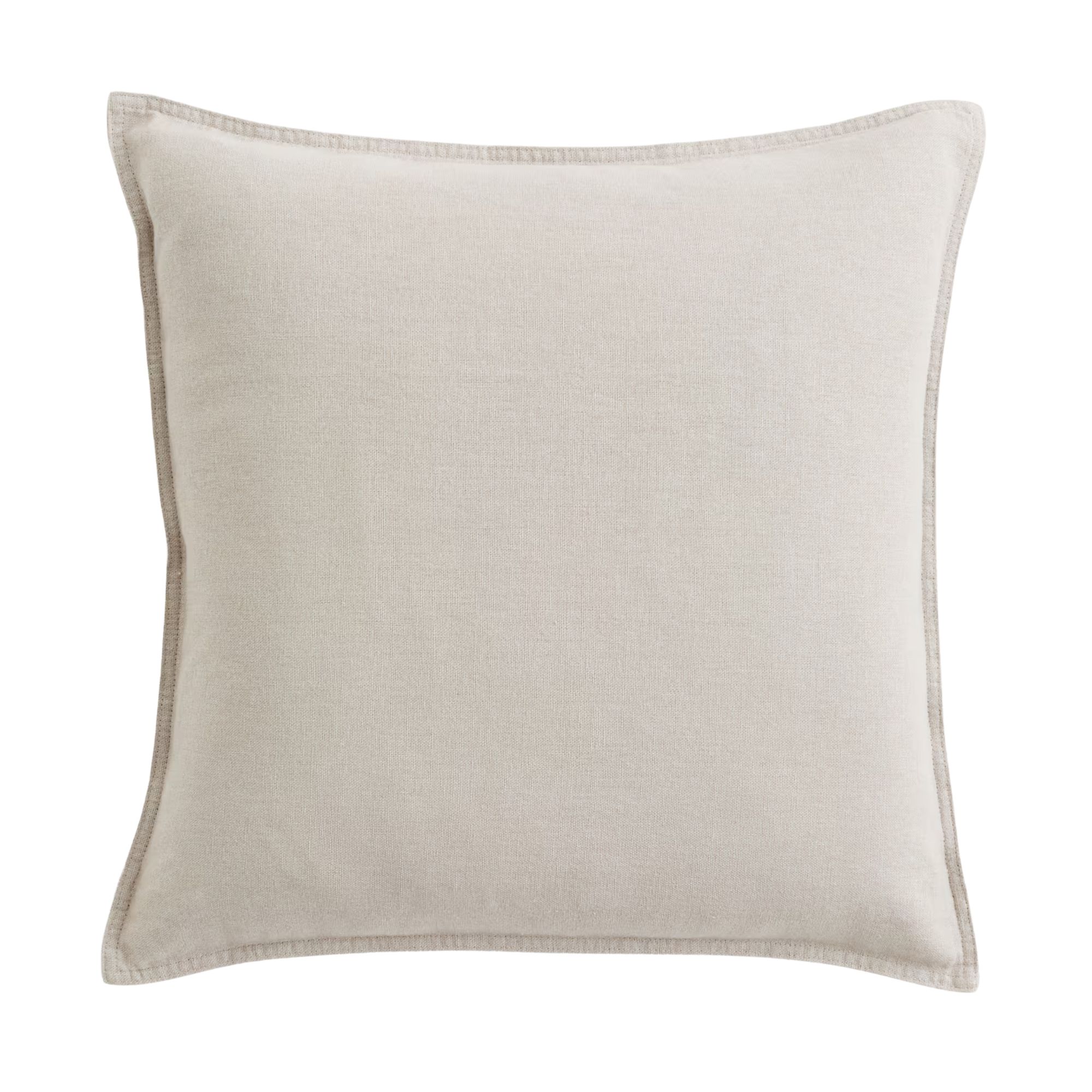
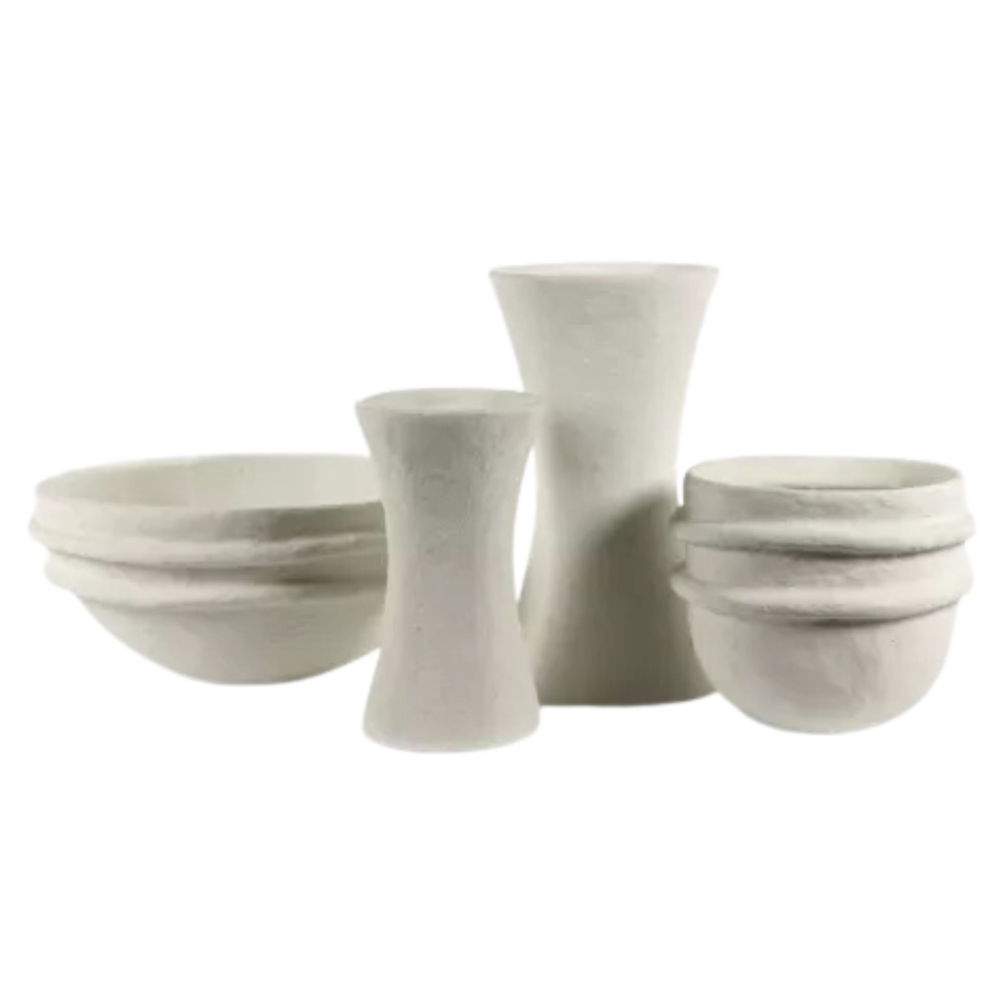
It's a color that lends itself, of course, to paint an entire room, but also works across smaller details.
This is a color that can create sanctuary-like spaces in the home, because at its core, it is all about a reset. Decorating with white like Cloud Dancer brings a sense of ease and quiet that can transform an entire room into a place to breathe.
The Livingetc newsletters are your inside source for what’s shaping interiors now - and what’s next. Discover trend forecasts, smart style ideas, and curated shopping inspiration that brings design to life. Subscribe today and stay ahead of the curve.
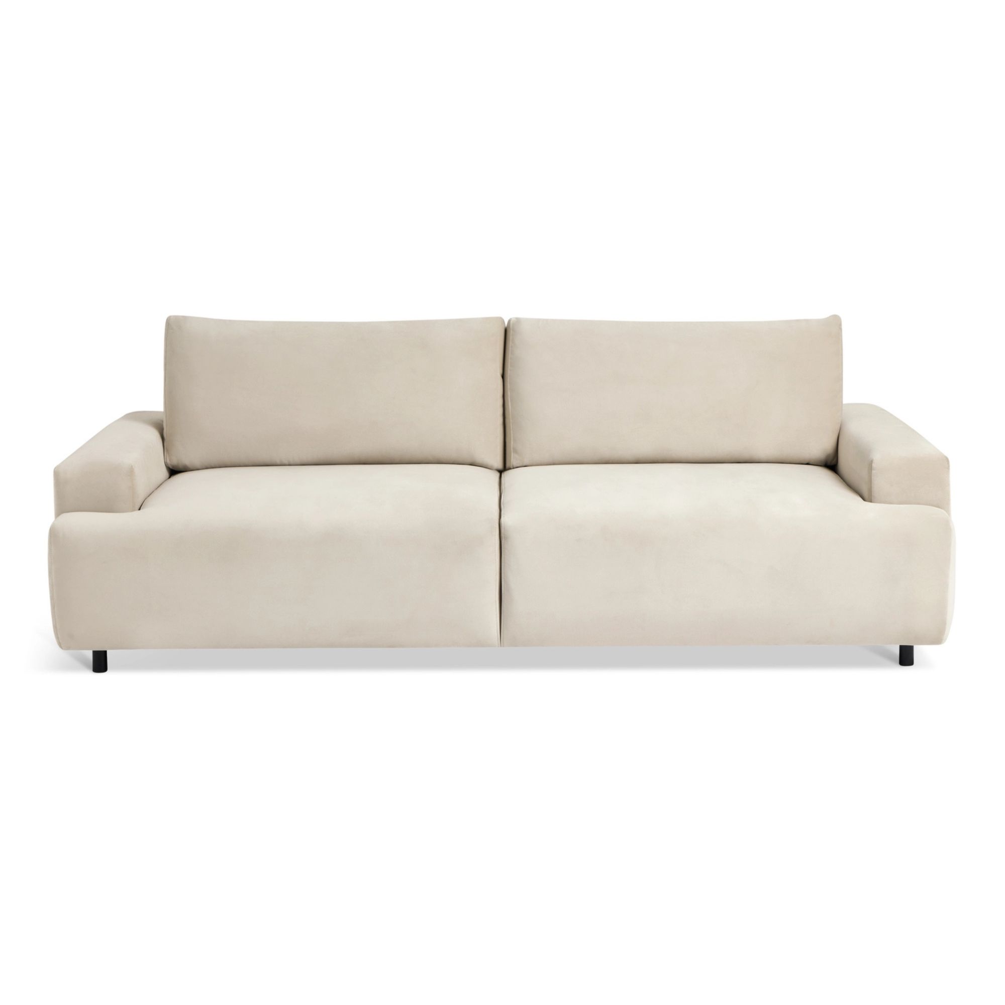
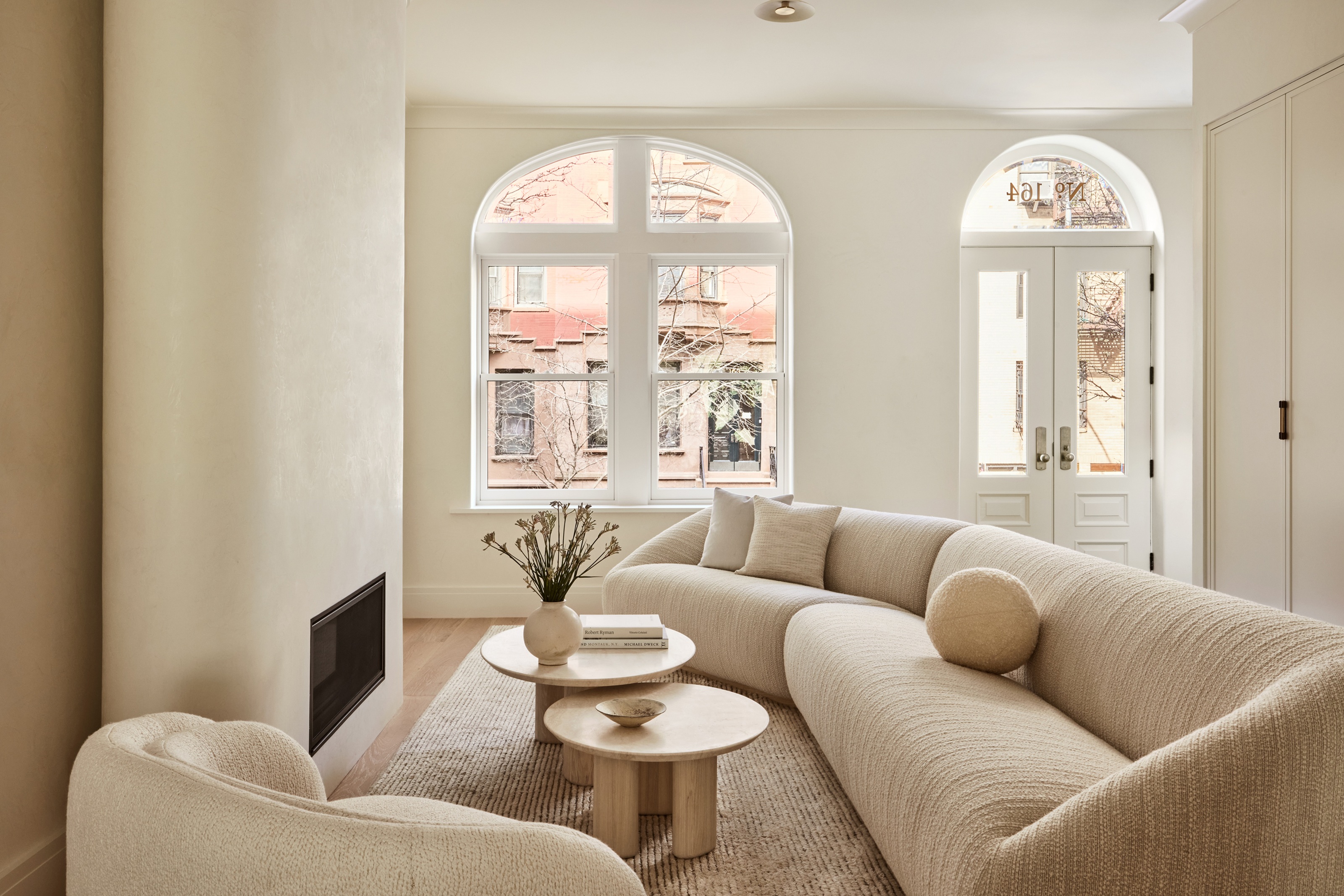
Yet, it also works just as powerfully in a single item. Imagine a giant, deeply comfortable sofa in this color, something you can sink into immediately. It would feel cocooning, soft, and soothing, offering the same sense of calm as a full room painted in Cloud Dancer. Whether color drenching across a whole space or expressed through one beautifully chosen piece, this gentle soft white brings a feeling of comfort and renewal that supports however you choose to decorate with it.
What Colors Should I Pair With Cloud Dancer?
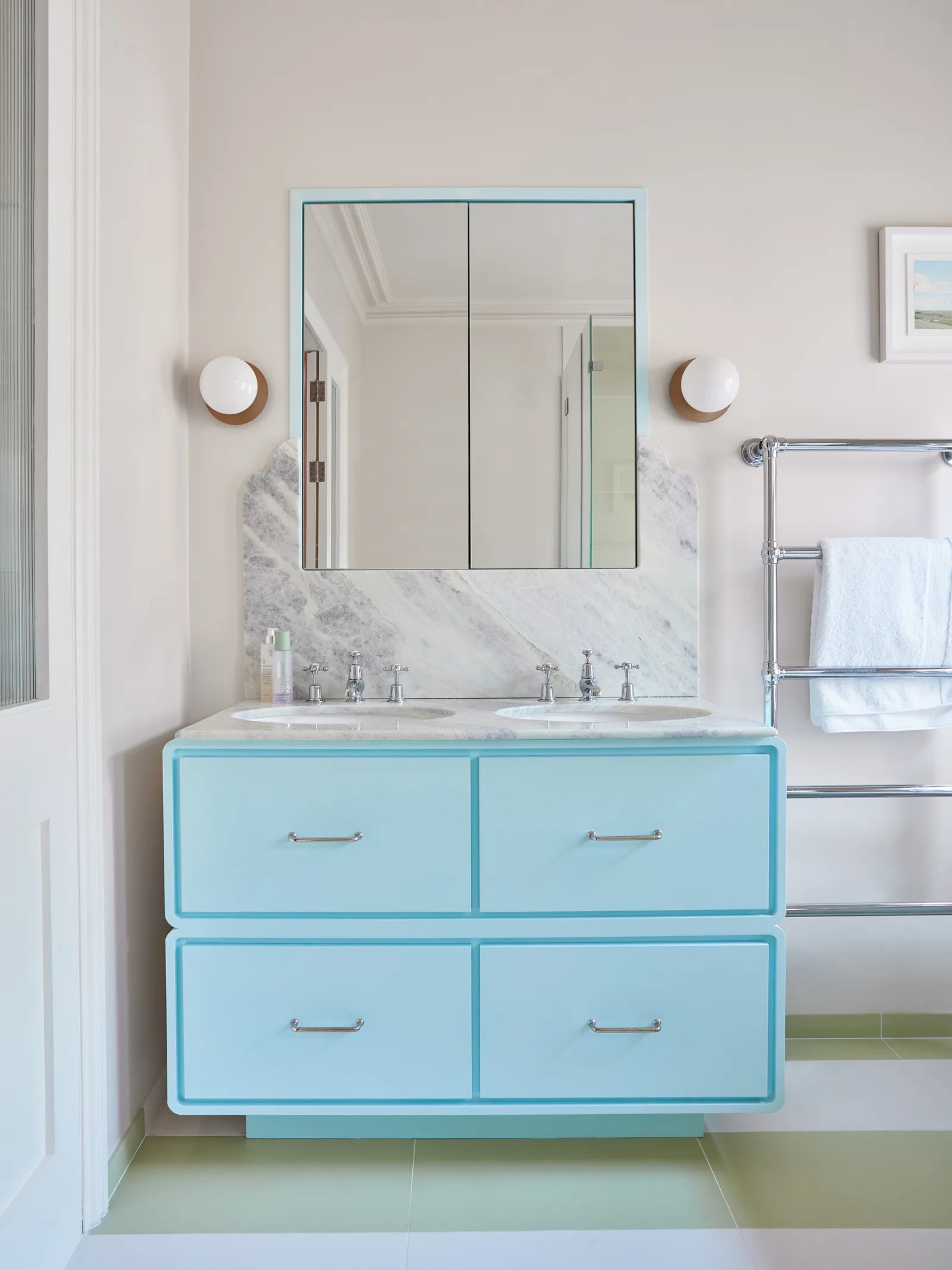
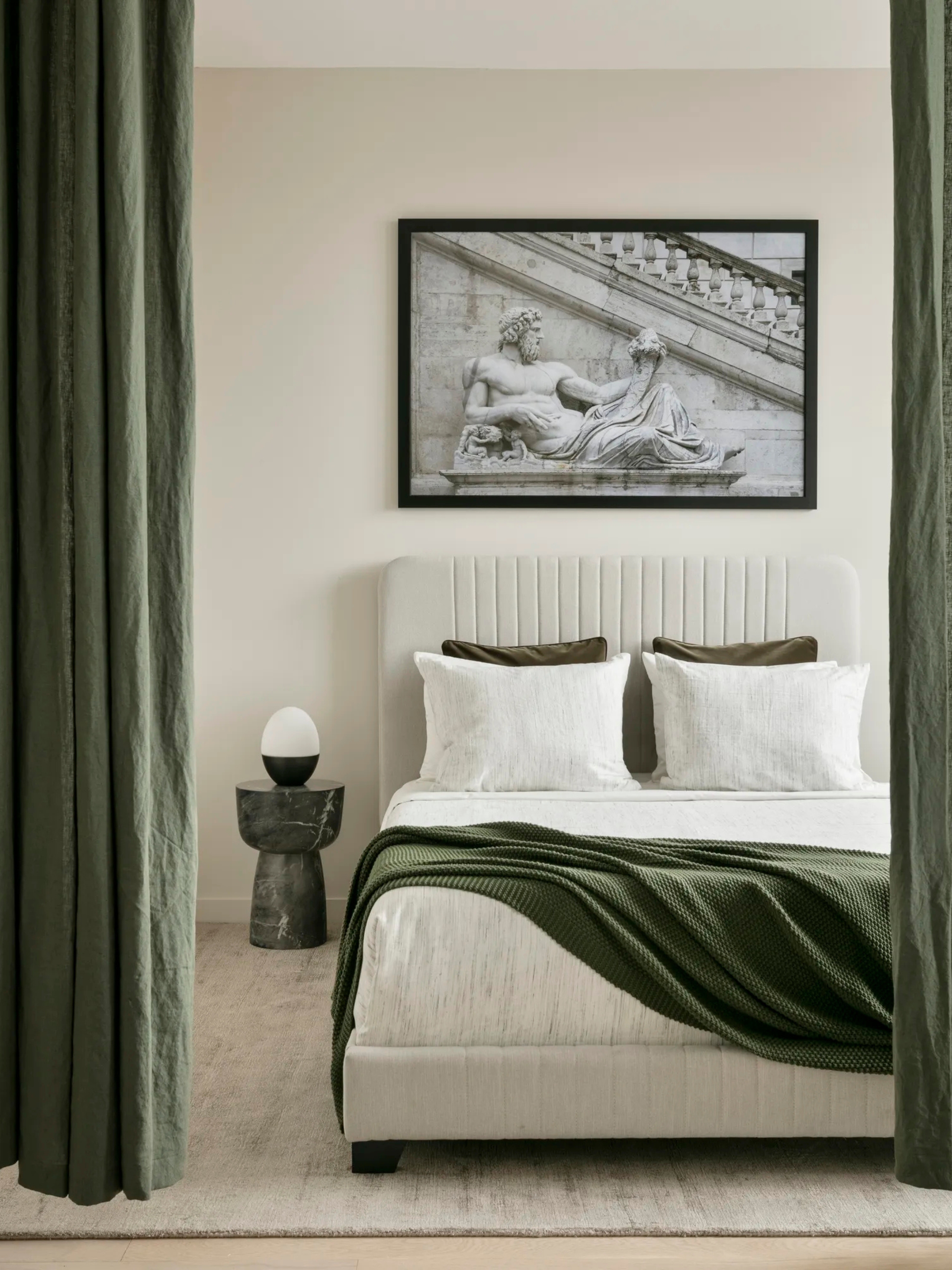
What is really special about this color is its incredible versatility. Cloud Dancer can stand entirely on its own as a singular statement. As a modern white, it speaks to today’s soft minimalism, offering a feeling that is calm, sensual, and gently grounding. At the same time, it also functions beautifully as a framework for other colors.
With bright tones, it brings a crispness that sharpens and amplifies their energy, making vivid hues feel more alive. With softened tones, pastels, and quiet neutrals, Cloud Dancer harmonizes effortlessly, sitting as a gentle backdrop that allows subtle colors to breathe. It can ground, amplify, sharpen, or diffuse depending on what the setting calls for.
This ability to shift and support different atmospheres is what makes Cloud Dancer so relevant for the year ahead, a color that adapts with intention while always retaining its quiet warmth.
Today, when we talk about color trends, we are no longer speaking about trends that appear and disappear in a heartbeat. Fast, seasonal trends do not make sense anymore. Instead, we are looking at color in a way that reflects life as it is lived right now.
Color stories today are rooted in what is happening in the world and how we are collectively feeling. Emotion plays a central role. When I work with Pantone, the emotional and psychological dimension of a color is just as critical as how it functions in design.
Both color psychology and story elements must align. We look carefully at how a color can hold meaning, offer support, or express a mood, while also considering how it lives within materials, spaces, and products. It is always a marriage of emotional resonance and design relevance, and this balance is what gives a color true longevity and purpose.
