Red and Green? Ehh, They've Been Seen — Here Are 5 Creative Color Palettes to Try on Your Christmas Table This Year, Instead
Five decorative experts share how to dress your Christmas table a little differently this year

The Livingetc newsletters are your inside source for what’s shaping interiors now - and what’s next. Discover trend forecasts, smart style ideas, and curated shopping inspiration that brings design to life. Subscribe today and stay ahead of the curve.
You are now subscribed
Your newsletter sign-up was successful
It's Christmassssss! Let the process of covering the entire house in red and green begin. Bring out those beloved burgundy and emerald tablecloths, decorations, and ceramics in preparation for the big meal. Unless…? Something a little more unexpected this year, anyone?
Some color combinations are synonymous with the festive season, and for good reason. Greens have been used throughout history in the darker months. The Ancient Romans, Celts, and Norse people brought evergreen plants inside during winter festivals to symbolize life, while holly, with its blood-red berries, became a winter symbol in medieval Christianity. The Victorians moved green and red into mass Christmas culture with printed cards and decorations, then, of course, modern-day Santa Claus — and Coca-Cola — came along, and the palette was cemented into the festive psyche.
Thus, Christmas tables everywhere came to be strewn with ivy, fir, and eucalyptus, red ribbons, fruits, and candles. But... What if we strayed away from the expected color combinations? On the hunt for something avant-garde, novel, and exhilarating, I spoke to five decorative experts who revealed their go-to festive tabletop palettes for 2026, each rule-breaking but with a dash of midwinter tradition. Here's what they shared.
Article continues below1. Pink, Red, and Champagne
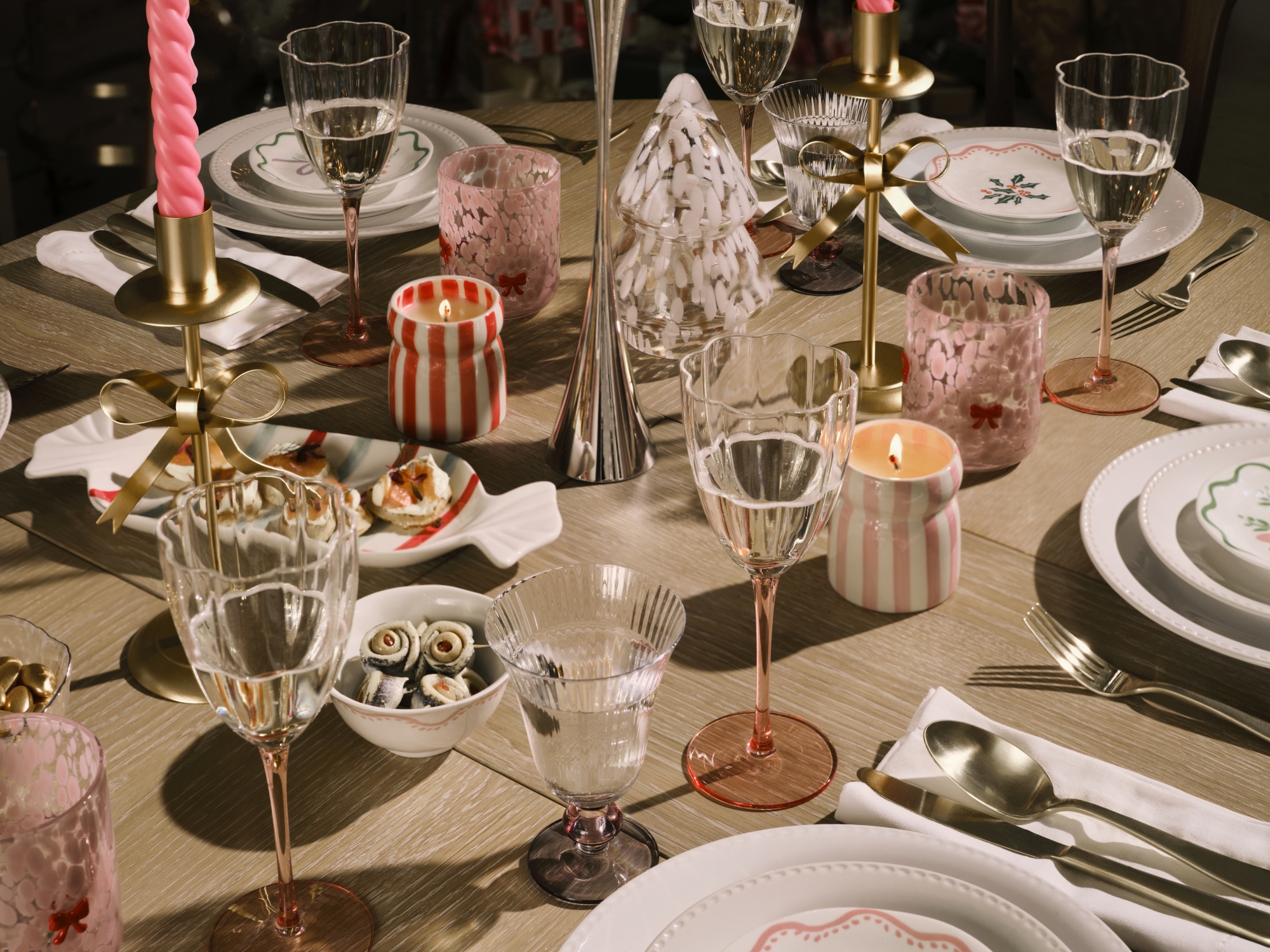
Champagne toasts, and champagne color palettes — how festive!
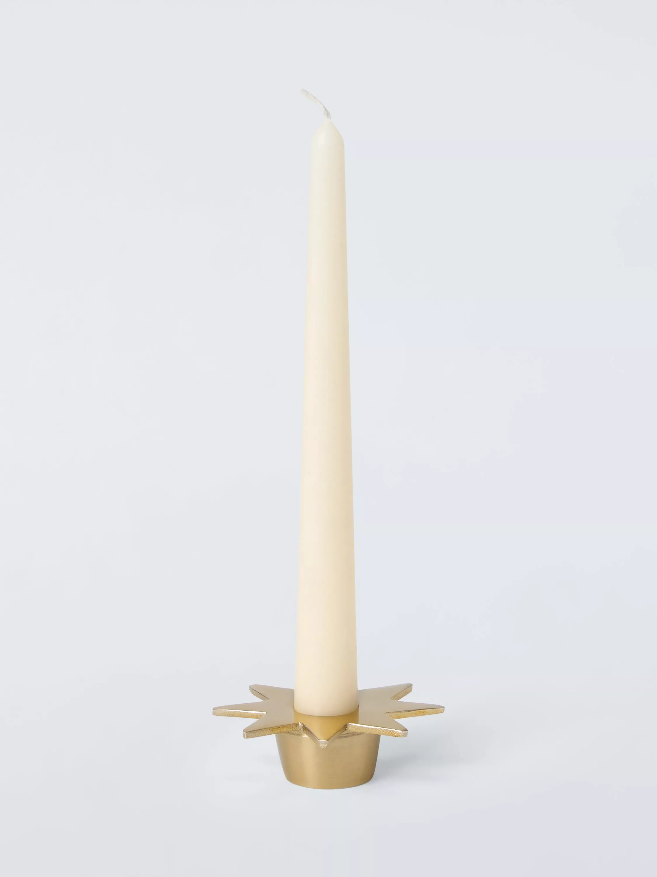
Oh, hello again, red — oh wait, you’re with… pink? What a difference that pretty tone makes, elevating red from classic ho ho ho to something more cheeky, playful and laid back. What solidifies this scheme as something festive and special is the metallics, the brushed champagne candlesticks and tableware, bringing opulence so subtly, it takes us a moment to notice it.
"The pastel pink gives the palette vintage warmth and a homespun aesthetic, turning it into a really fun alternative to the more traditional tones that we often see at this time of year — the red elements keep things feeling festive," explains Lisa Cherry, head of Christmas at John Lewis.
What keeps this could-be-bold palette calm, chic, and crisp are the lashings of white and textures — the bright shades come in alongside ceramics and glass, and mostly as patterns rather than solid blocks of color; their jaunty brightness discovered like small bonus gifts.
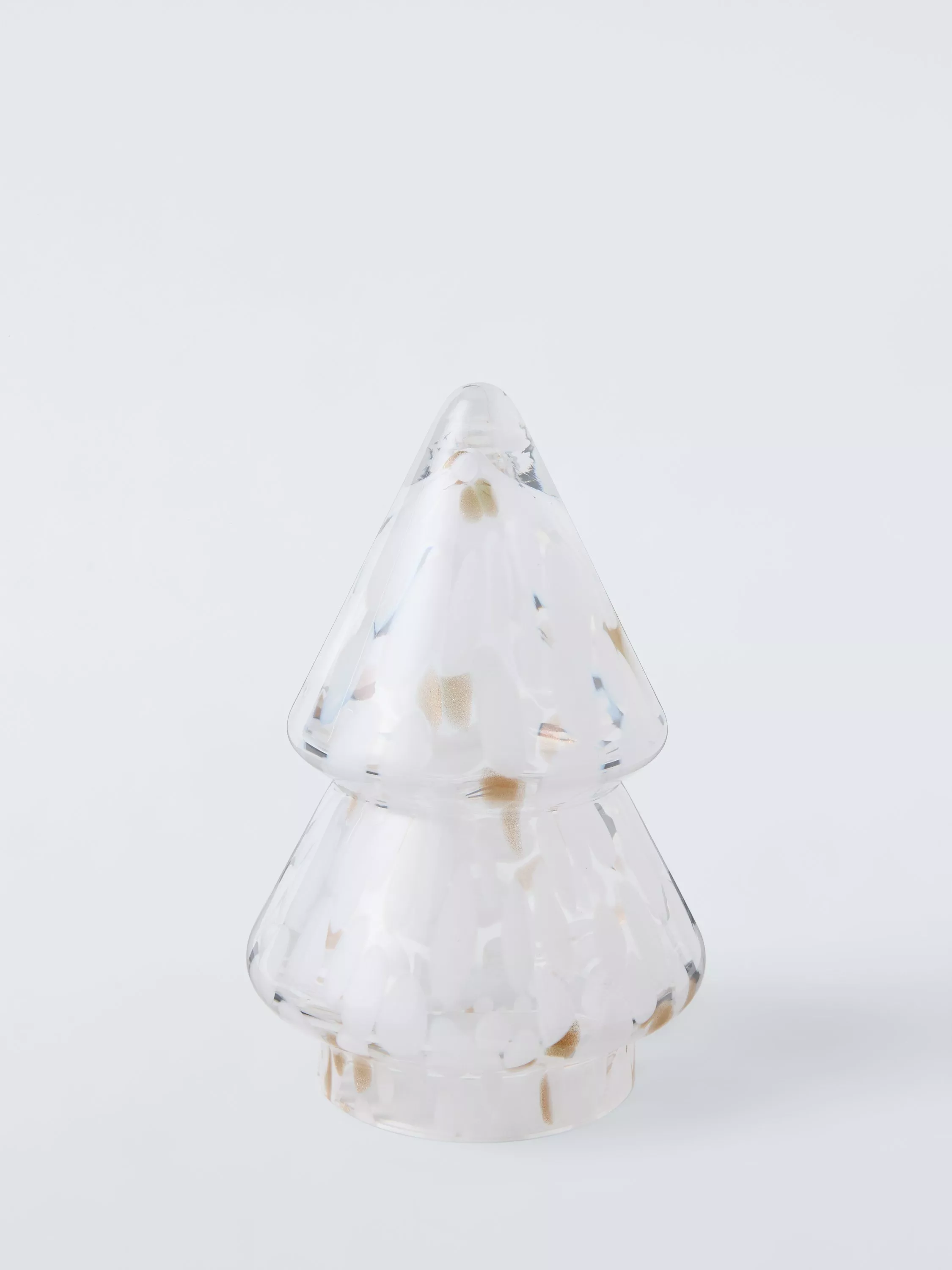
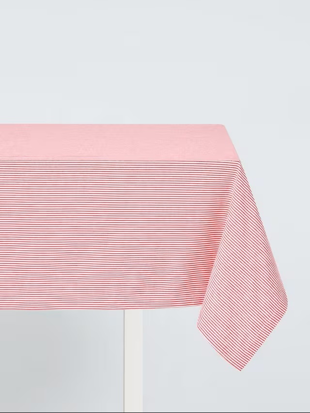
"To create this look, use colors in different designs and textures," says Lisa. "Pink and red stripes, as well as the confetti and bows, play a big role in adding to the cheerful atmosphere, with touches of pink glass and metals creating glamour and delicacy. The bright pink twisted table candles bring both height and set the tone with a hit of joy."
The Livingetc newsletters are your inside source for what’s shaping interiors now - and what’s next. Discover trend forecasts, smart style ideas, and curated shopping inspiration that brings design to life. Subscribe today and stay ahead of the curve.
2. Pale Brown, White, and Green
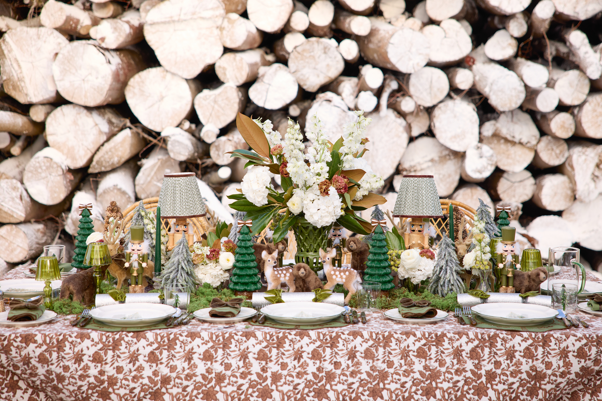
The easiest way to pull seasonal color inspiration is by looking outside.
And the main color for this year’s table top is… brown! Doesn’t inspire a whole lot of festive wonder, does it? Brown has never been denied a place on the Christmas table — think pinecones, walnuts, or cinnamon sticks — but to have the shade as the main event feels a little bit, well, flat.
It’s unusual to say the least. If there’s anyone who knows how to make it work, it’s Alice Naylor-Leyland, tablescaping connoisseur, founder, and creative director of homeware brand Mrs. Alice.
"The palette’s inspired by the soft, natural tones of the Swiss Alps — the pale browns of winter bark, deep alpine greens, and fresh snow whites," she explains. "It works because the tones speak the same natural language. Pale brown grounds the table, bringing warmth; green adds depth and freshness; and white lifts everything. They’re wonderfully calm, beautifully wintry and quietly luxurious, classic winter colors elevated to feel sophisticated and modern."
Making it all come together on the big day requires a few adept styling moves, as Alice tells us: "Embrace texture when working with a nature-inspired palette. Layer linens, mix fresh and seasonal greenery, and don’t be afraid to build height with flowers, miniature trees, and candlelight. Use soft browns through timber and woven pieces to keep the table warm, and weave in whites with flowers and napkins to add that snowy lightness."
Known for her artistically curated tablescapes, which fuse whimsy with elegance, Alice Naylor-Leyland founded her brand, Mrs Alice, to revolutionize the way we lay tables and introduce us to the concept of tablescaping. She takes inspiration from her love of fashion and English country-house life, her tables heavily featuring color alongside a dash of the unanticipated.
3. Cobalt, Green, and White
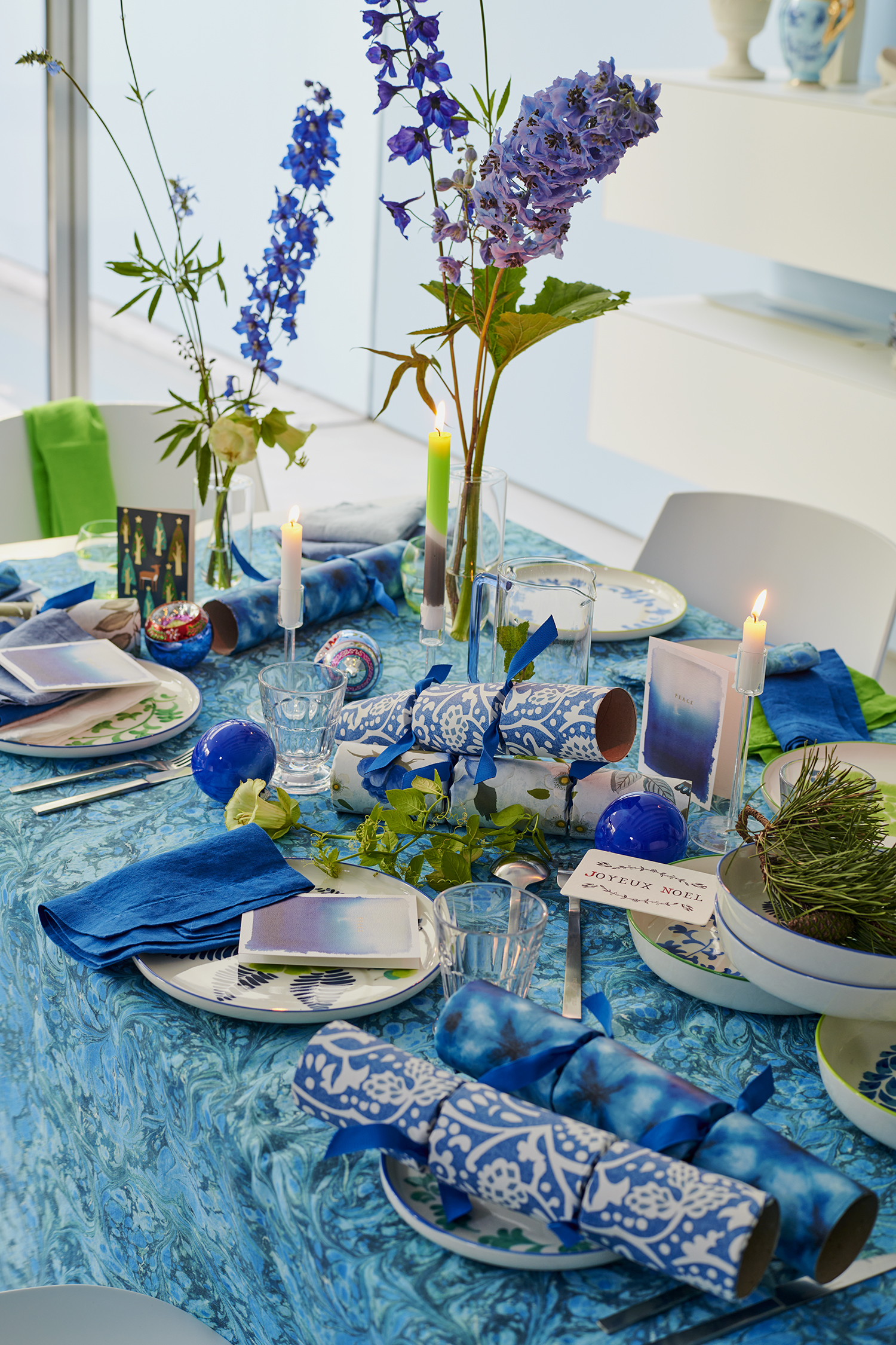
The easiest way to make a statement with color? Go unexpected.
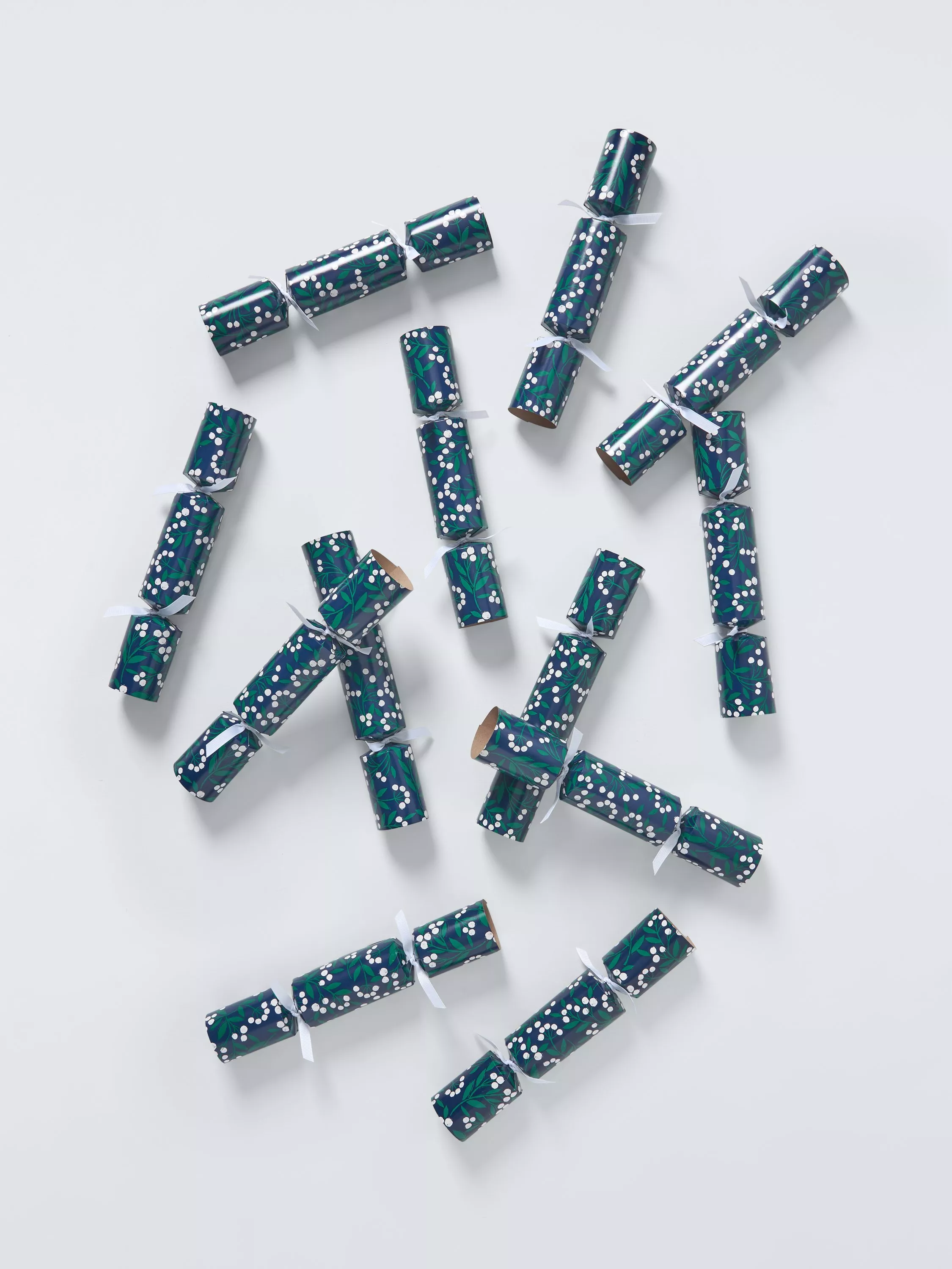
If you’re looking for the unexpected, it may have arrived. A cobalt blue Christmas table! This is a hue that needs fully embracing for maximum effect — a sprinkle here or there just won’t cut it. Dousing the tabletop in such a vivid alternative tone demands attention and will cement lunch as the day’s main event — mix in traditional decorative accoutrements to aesthetically point to the season.
"Swapping red and green for rich blues gives a space an artistic, contemporary twist — there shouldn’t be a restricted palette for Christmas!" enthuses Tricia Guild, founder and creative director of Designers Guild.
While the boldness of the cobalt brings the liveliness we need for the big day, there’s also a surprising calmness to the vibrant color mixes. "The palette is dynamic but harmonious," Tricia confirms. "Blue, green, and white appear together in nature, so the palette feels instinctively balanced and calming. Blue has an elegant, natural feel that makes it a core part of the most calm color palettes, creating a serene atmosphere, perfect for a table where you want people to linger."
Celebrated for her authoritative, nuanced use of color and pattern, founder and creative director of Designers Guild Tricia Guild takes inspiration from nature, art, and global craft tradition when building her palettes. Her expressive take on color is ever evolving, and she approaches designing spaces with a holistic, lifestyle-focused outlook.
4. Orange, Green, and Burgundy
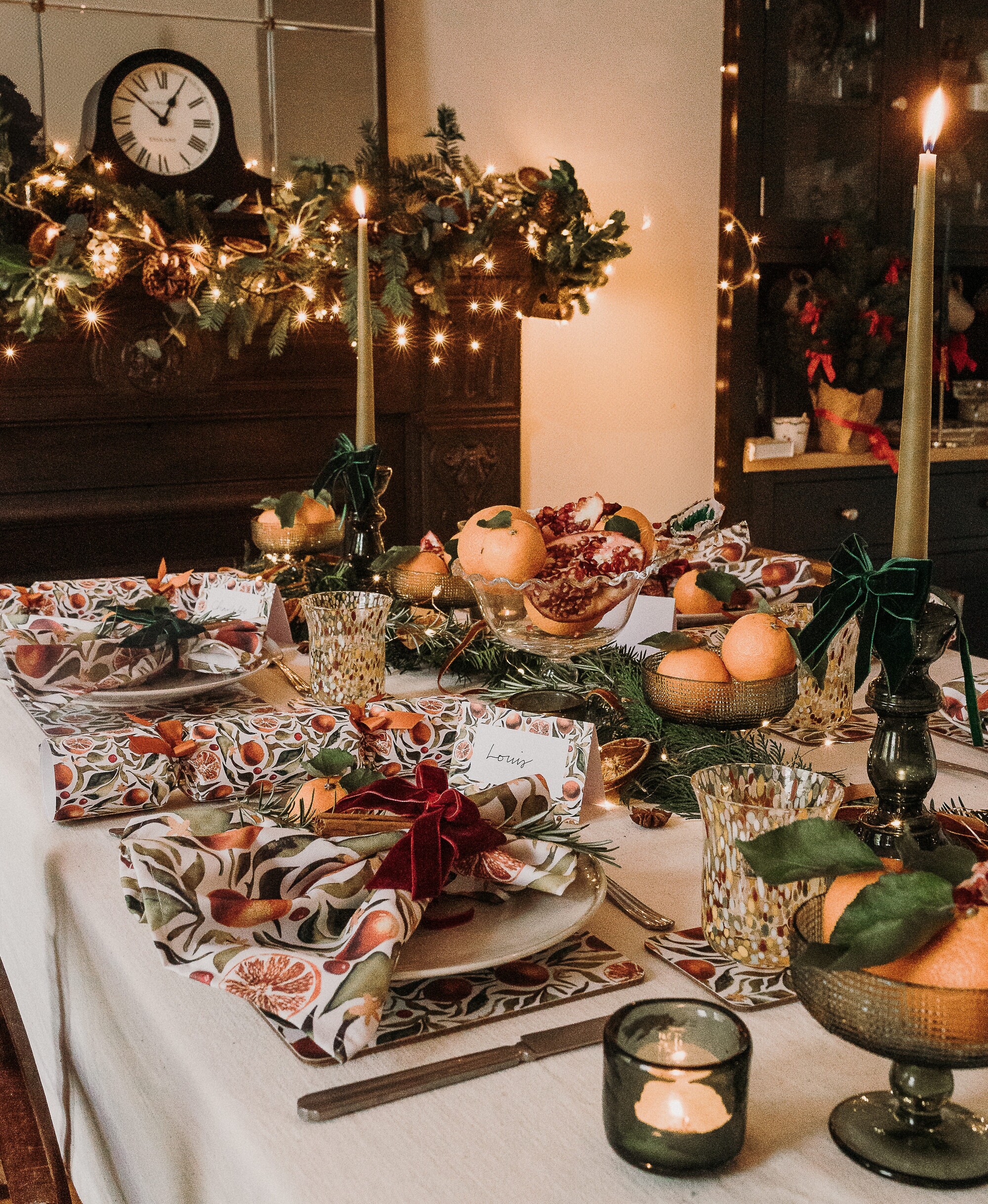
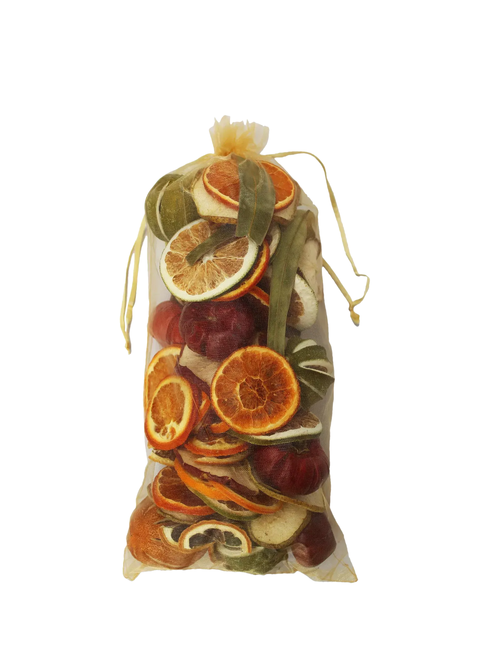
Dried citrus feels innately Christmassy, so why not make it the center of your palette.
It’s not hard to spot a dried orange slice (or half a chocolate orange) out of the corner of your eye amidst the merriment, but that’s usually where the color remains — in the background, it’s a hue easy to lose amidst a sea of red. Bring it forward and present it as a main event, and suddenly the palette feels invigorated and adventurous.
"Orange adds a fresh twist to the more traditional Christmas shades; it’s a great alternative to the iconic red," says Hannah Bidmead, founder of design brand Nancy & Betty Studio. "Foraged greenery, dried orange, and fresh clementines and pomegranates create a warm and cozy palette."
Full of life and bursting with color, orange makes the table feel glow-y and almost sunlit. Add texture to take decorating with color from simple to sumptuous. "It’s a natural look with luxury touches coming from velvet bows in forest green and burgundy. Include lots of foraged greenery — the more leaf shapes, the better — such as ivy, conifer, yew, and rosemary," advises Hannah. "If you can find clementines with the leaves still attached, this adds a lovely extra touch."
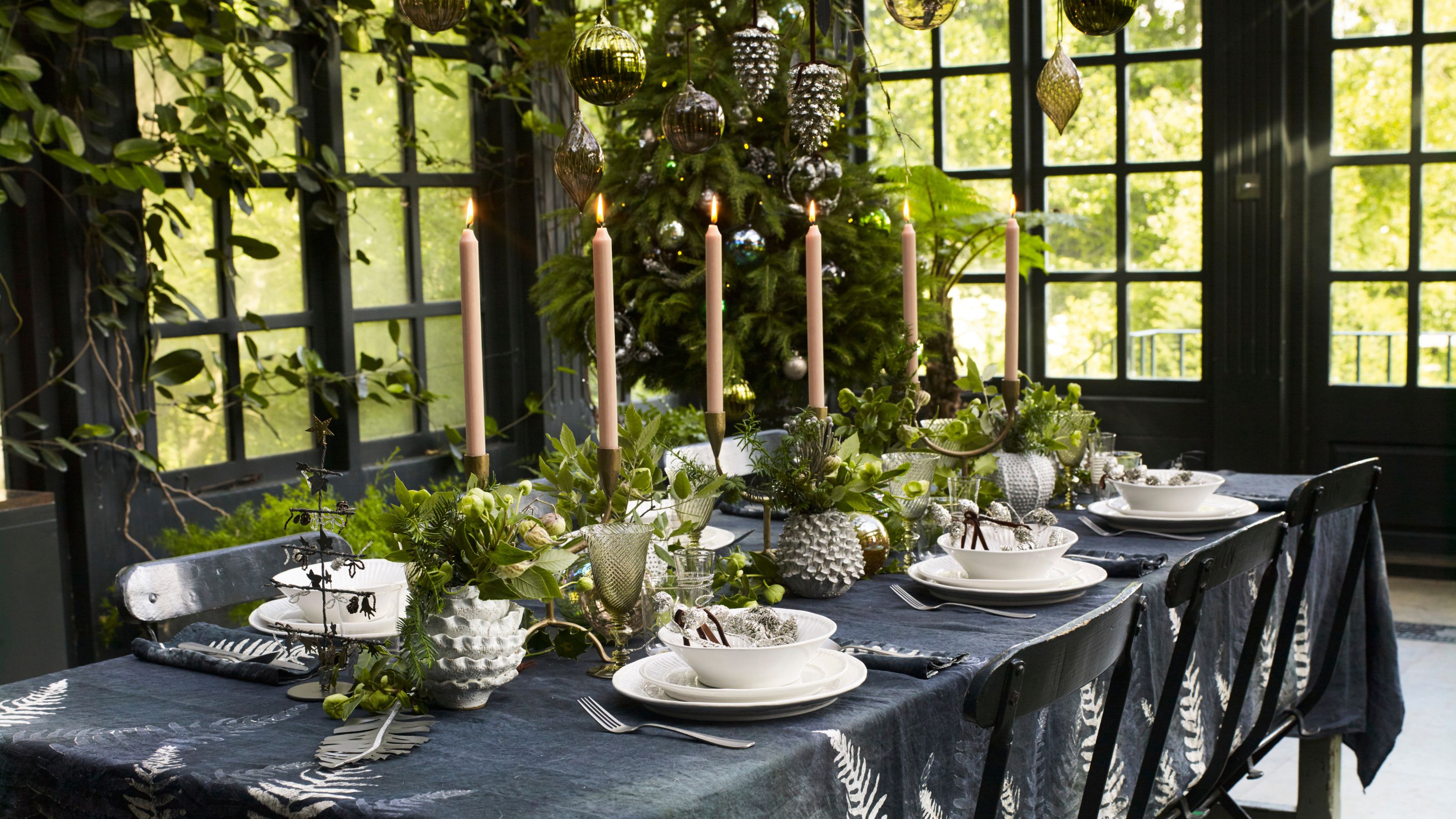
5. Black, White, and Green
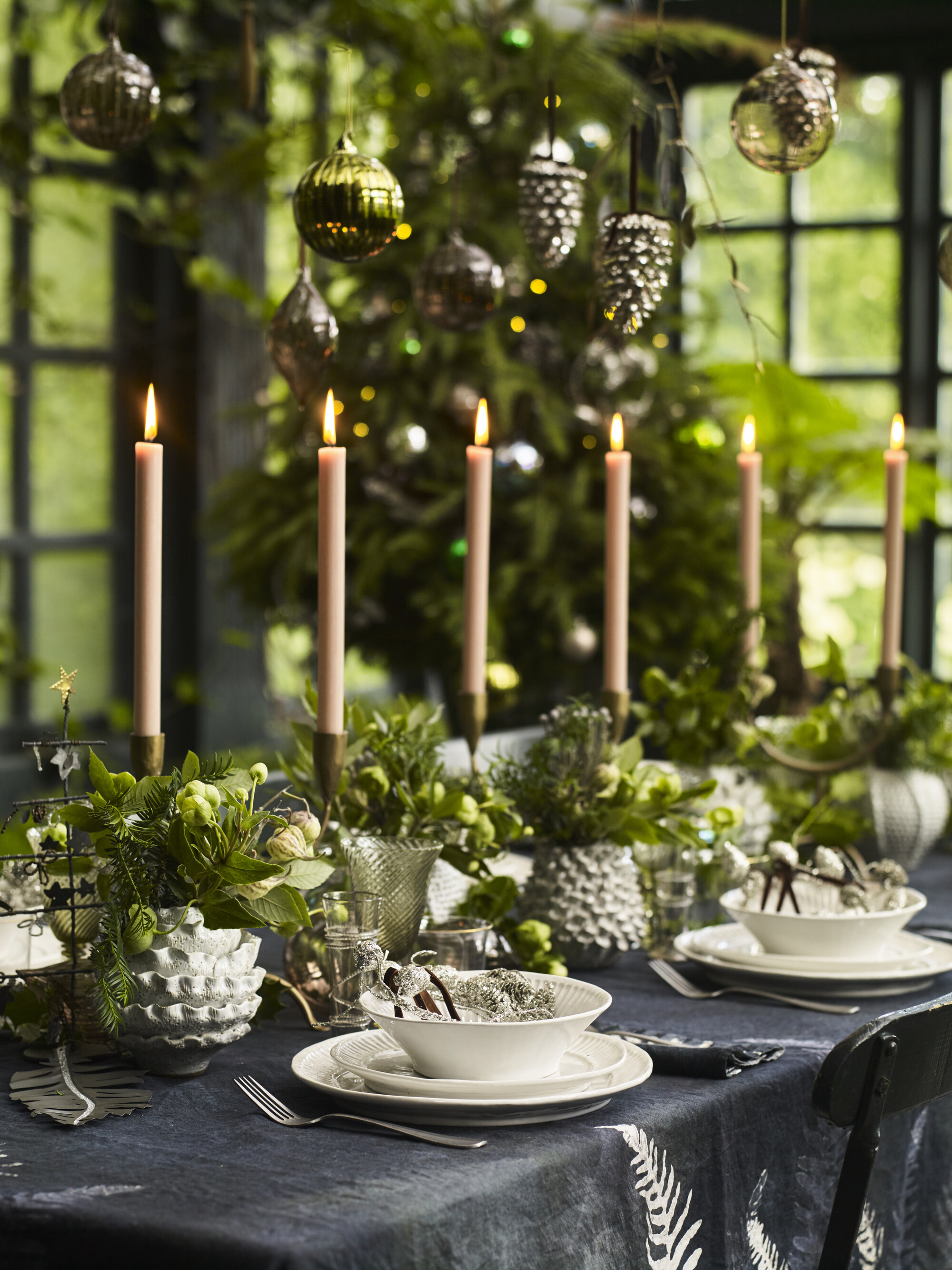
You can easily repurpose your Halloween decor at Christmas, while making it chic.
It’s dark, it's edgy, it could be called moody — introducing black as the star of the holiday table. It’s probably the last shade you’d think of when concocting your festive palette, but this is precisely why it makes for unforgettable Christmas table tops. It sounds challenging, but once a black base is covered in sharp whites and lashings of foliage, it speaks not of the spooky, but more of a sun-gone-down mystery and depth.
"A black-lead palette represents mid-winter, long dark nights — and elegance," explains Ronny De Koning, artistic director and head of global buyer at Petersham Nurseries. "Christmas is one of the shortest days, so let’s change up the expected and embrace the darkness with rich, dark linens… and then brighten everything with candles and atmospheric lighting.
If the heavy shade overwhelms you, picture it in nature, and soon the palette will take on a much more grounded and approachable personality, and feel easier to work with. "We only have to look to the garden to see why certain combinations work well. Think of Viburnum shrubs, for example, which have dark blue/black berries set against deep, intense green foliage," says Ronny. "Start with dark table linen, and play with decorations, fruits, and materials found in the garden."
FAQs
What Are the Best Christmas Colors for Table Settings?
We use red and green for a reason. They are a historic link to Christmases gone by, and are a guaranteed winner on a Christmas table for the nostalgia alone (as we rarely combine them other than at this time of year.
Other strong Christmas colors are hues that are bright, but are used alongside the greenery we’re so drawn to for Christmas, which tempers and calms them. Have fun exploring the palette — there is no wrong answer. Add in metallics here and there to bring sparkle and a sense of occasion.
What Are Some Unexpected Christmas Colors for the Table?
Any hues fit the grace of the Christmas table — you can have Christmas pinks, Christmas purples, Christmas yellows, and Christmas grays, if you particularly want them.
It’s about how Christmassy elements such as candlelight, sparkle, crackers, and seasonal natural finds (from fruit and nuts to plants and flowers) interact with the shades and link them specifically to winter.
Mix in tactility with different materials — linens, velvets, glass, ceramics — to make the setting feel luxurious and full of depth.
Whether you’re surrounding your Christmas table centerpiece with hues that are dark and glamorous, dazzling and vivid, or rooted in the organic, this year’s tables show that the festive color rules are there to be broken. So go ahead — experiment!
Amy Moorea Wong is a color authority and contemporary interior design writer who has specialized in all things decorating for over a decade. Amy is Livingetc magazine’s Colour Expert, Interiors Editor at The Glossary magazine and a Contributing Editor at Homes & Gardens magazine, and she frequently contributes to an array of global publications to share her insights on interior design zeitgeist. Her book Kaleidoscope: Modern Homes in Every Colour explores a collection of cool colorful homes fizzing with creativity, surprises, and inspiration.
