I Can't Believe I'm Saying This, but Is Color-Blocking About to Get Really Big in Interior Design Again?
"It’s no longer about gimmick or shock, and instead makes a smooth, layered statement"

The Livingetc newsletters are your inside source for what’s shaping interiors now - and what’s next. Discover trend forecasts, smart style ideas, and curated shopping inspiration that brings design to life. Subscribe today and stay ahead of the curve.
You are now subscribed
Your newsletter sign-up was successful
There are two key things I remember from being a preteen at the start of the 2010s: you could never have enough skinny jeans, and how badly I wanted to paint my bedroom in a bright teal and hot pink color block. Well, in 2026, jeans are rapidly slimming from wide-leg to straight, and as for color-blocking... could it too be making its comeback?
But Livingetc's color expert Amy Moorea Wong reassures me, "This won't be a rerun of the bright, clashing segments we remember from the color-blocked walls of the 2010s — this piece tangerine, an arc of teal here, and a chunk of bubblegum pink next to it." For 2026, thankfully, the trend will look a lot more considered.
I always find it interesting when interior design trends echo what's happening in fashion. And Balenciaga, Tory Burch, and Fendi — all of these brands had contemporary iterations of color-blocking on their S/S 2026 runways. So, with interiors starting to embrace this colorful trend, too, it looks like the era of quiet luxury is officially over.
Article continues belowWhat Does Color-Blocking Look Like for 2026?
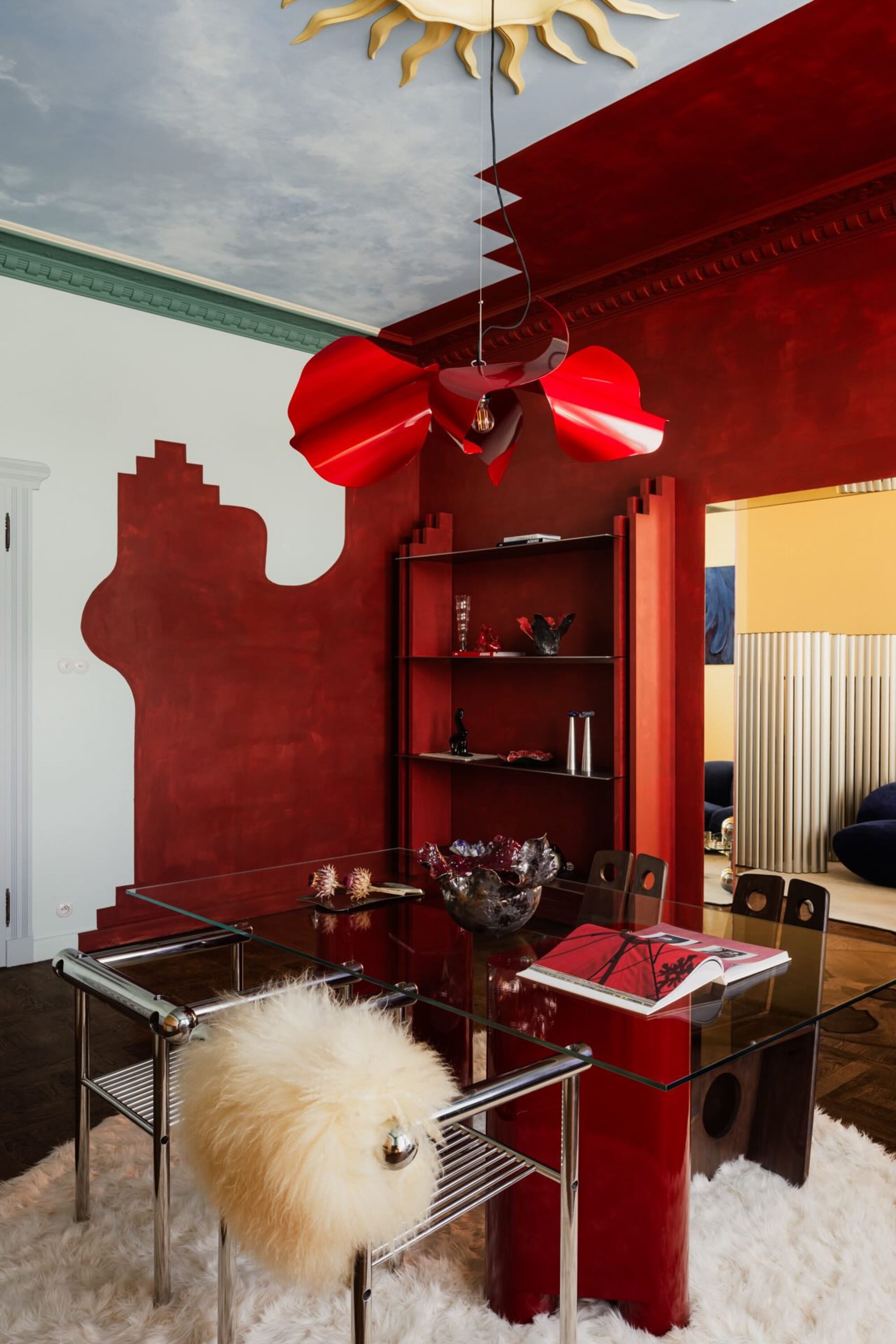
The color blocking in this modern dining room feels experimental yet familiar.
So, if not teal and tangerine, then what kind of color blocking are we looking for in 2026? Much of the modern interpretation of this color trend can be attributed to the avant-garde techniques that came before it.
Amy Moorea Wong explains, "Color drenching came first, helpfully getting us used to painting ceilings, doors, and all of the trimmings, leading us to be more creative with our color-covered spaces." These rooms often feature a single hue in a mix of finishes — think matte on the walls, gloss on the woodwork — this difference in texture is a very subtle hint towards further exploration in mixed layers.
And now we're seeing more modern color blocking approaches, more akin to the true 2010s style. Take color capping, for example. This paint technique is a varied version of drenching, where a second tone is applied to the higher portion of the room to 'cap' it.
"Color capping as a type of color blocking feels architectural as well as decorative, and it works beautifully with tonal shades rather than anything high contrast," says Amy.
The Livingetc newsletters are your inside source for what’s shaping interiors now - and what’s next. Discover trend forecasts, smart style ideas, and curated shopping inspiration that brings design to life. Subscribe today and stay ahead of the curve.
"Think clay with terracotta, deep teal with gentle moss, or ivory and tobacco," she continues. "A dark upper cap grounds the space, something lighter pulls the eyes upwards." It’s blocky, but subtle about it.
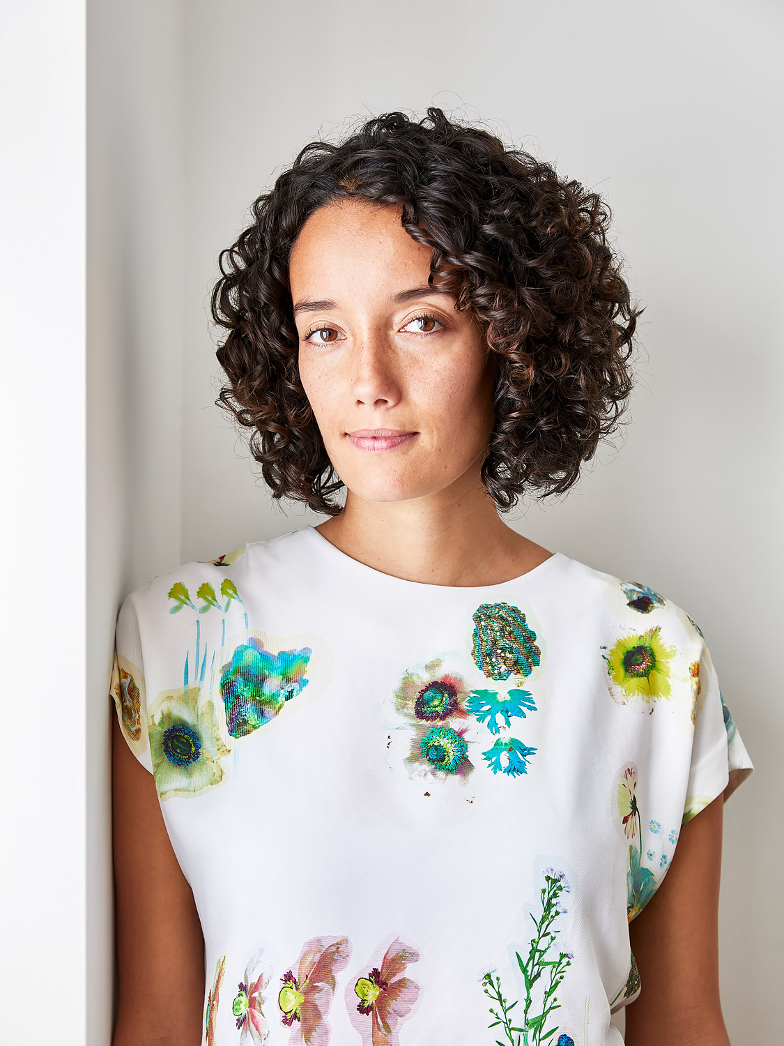
Amy Moorea Wong is a color authority and contemporary interior design writer who has specialized in all things decorating for over a decade. Alongside being Livingetc’s Color Expert, she also contributes to an array of global publications and has a book, Kaleidoscope: Modern Homes in Every Colour. Amy is an ardent believer in the power of color in a home and how creative design should never be intimidating.
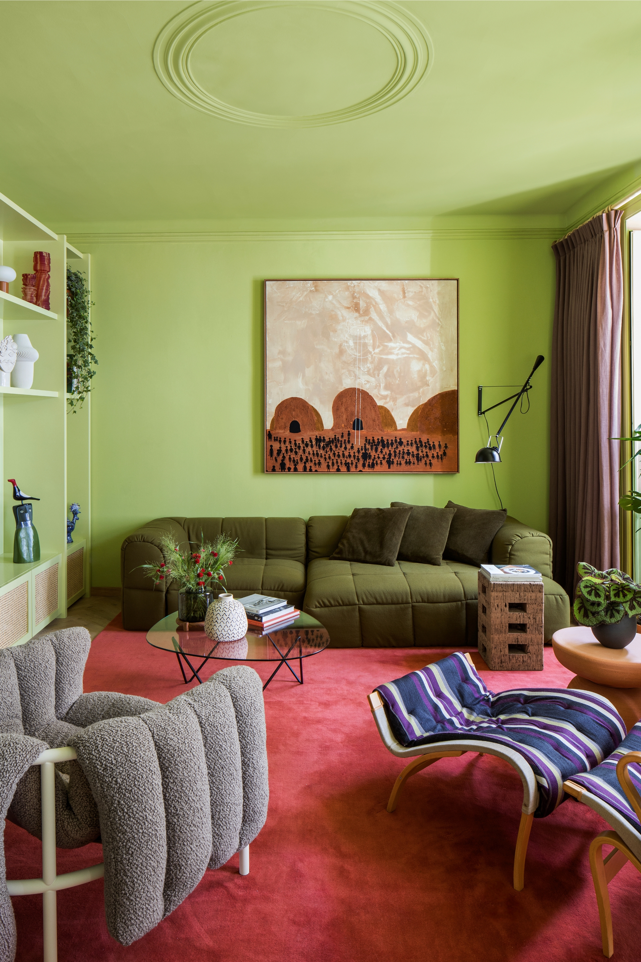
The red carpet against the green color drench is a twist on traditional color blocking.
Then there's the more avant-garde take on color blocking, chromatic tension, which I recently explored as a contemporary way to decorate with color. Chromatic tension feels the most similar to the way color blocking is presenting itself in today's interiors. This technique zeroes in on color contrast in design to keep the senses engaged.
"In blocking terms, it can translate as introducing a section of opposing color into a drenched or capped interior — a hue that stands out from the surface tones," explains Amy.
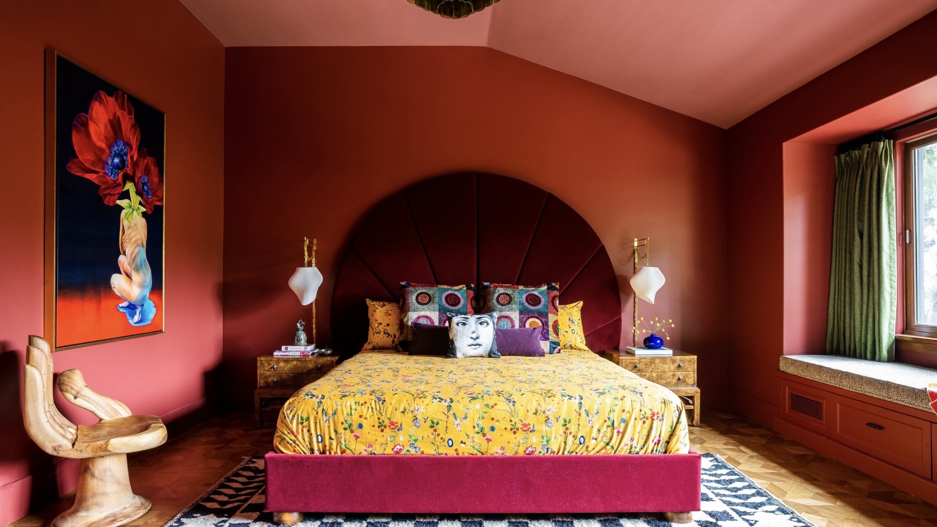
Perhaps a lacquered red table juxtaposed with chalky mushroom walls, an oversized headboard upholstered in playful lilac bouclé against stony olive walls, or an alcove painted in deep charcoal within a soft blush surface.
Overall, 2026 color blocking feels considered and calm, yet full of visual intrigue. "It’s no longer about gimmick or shock, and instead makes a smooth, layered statement," says Amy.
The Color Combinations That Make This Technique More Contemporary
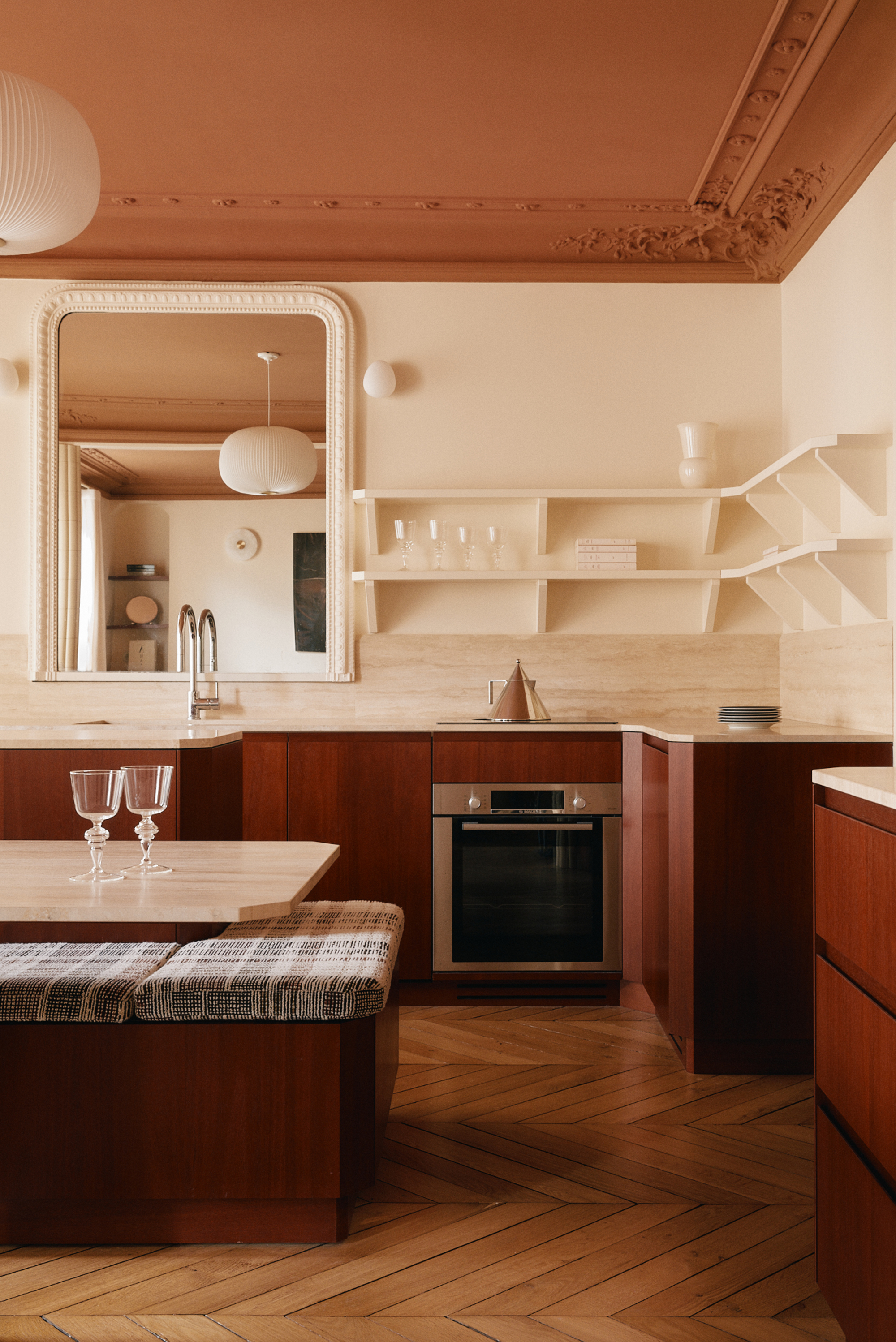
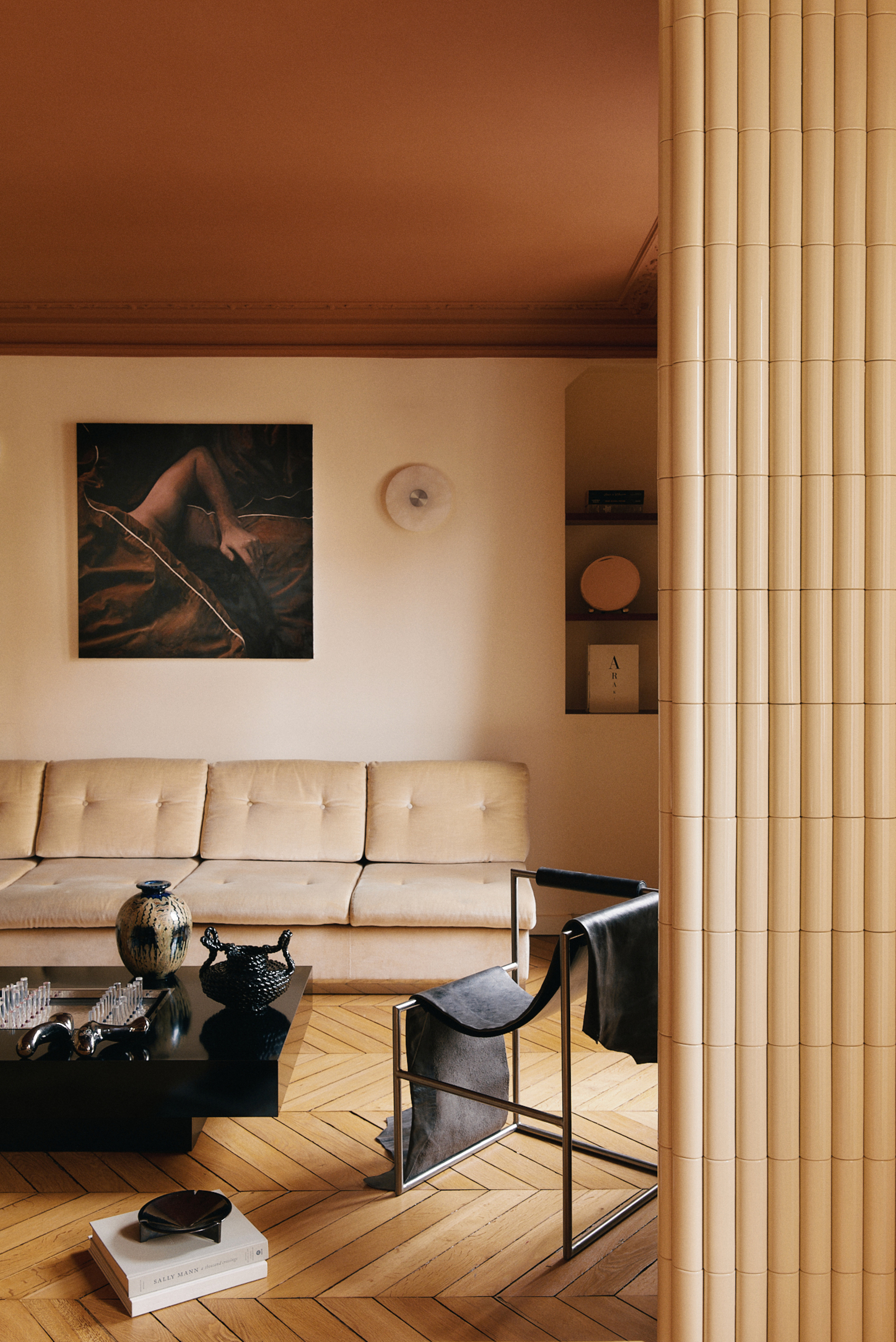
We're moving on from the retro, vibrant colors that spring to mind when we think of classic 'color blocking'. Instead, we’re entering an era of chic, considered tones.
"How about soft sand with burnt sienna, taupe with plum, latte with rust, or pale almond with rose?" suggests Amy. "These combinations are all about evoking a warm, nuanced atmosphere for rooms that feel inviting, balanced, and sophisticated — while being quietly engaging."
Interior designer Rose Hanson, co-founder of Penrose Tilbury, says, "Using color more imaginatively is when you can be creative with fabric pairings and use a vibrant print with a block colored fabric to create some that feels more modern and fresh."
Today, the lines are a little looser — color blocking can come from hand-painted details, large, solid furniture pieces, or wall and ceiling color combinations.
But in order to stay cohesive, Amy says, "Once you've chosen your core blocking tones, let the remaining surfaces, furniture, rugs, and textiles play a supporting role rather than compete."
Keep larger pieces either coordinating in the same shade or in a neutral that complements the tone, so the eye can rest and the color pairing becomes the room's main narrative.
"Bring in new textures, yes, but try to keep other tones to a minimum, aside from the odd area of tension," adds Amy. Smaller accents such as ceramics, artwork, or lighting can reference the other color-blocking shades to draw everything together and make the space feel curated.
This revival of color-blocking and maximalism is a sign that we are yearning for dopamine-boosting environments and dopamine anchoring in our spaces.
I think I've officially come around to the bold, bright colors of the 2010s making their return, especially when it translates this stylishly — are you ready to try this look?

Olivia Wolfe is a Design Writer at Livingetc. She recently graduated from University of the Arts London, London College of Communication with a Masters Degree in Arts and Lifestyle Journalism. In her previous experience, she has worked with multiple multimedia publications in both London and the United States covering a range of culture-related topics, with an expertise in art and design. At the weekends she can be found working on her oil paintings, reading, or antique shopping at one of London's many vintage markets.
