7 Kitchen Cabinet Colors Designers Predict Will Dominate Homes in 2026 and How They Will Elevate Your Upcoming Reno Projects
It's time to say goodbye to your sage green kitchen. These are all the cabinet colors experts are expecting to see in the year ahead, and why they're making a statement

The Livingetc newsletters are your inside source for what’s shaping interiors now - and what’s next. Discover trend forecasts, smart style ideas, and curated shopping inspiration that brings design to life. Subscribe today and stay ahead of the curve.
You are now subscribed
Your newsletter sign-up was successful
It's no secret that the kitchen is the heart of the home, so how you decorate it will play a major role in setting the tone for the general vibe of your house. No pressure.
And while the 2010s were dominated by the high-shine all-white kitchens, and the early 2020s by the trendy sage green hues, as we head into 2026, we're ready to embrace the hues of all things kitchen cabinet color trends.
Although 2026 isn't at our doorstep quite yet, I want to be prepared for when it does, and for me, that looks like being well ahead of the trends for the upcoming year. So, to help me in that endeavor, I turned to our trusted experts and implored them to use their powers for good and shine a light on the kitchen colors we should all be looking out for over the next few months. And let me just tell you, they did not disappoint.
Article continues belowWarm Neutrals
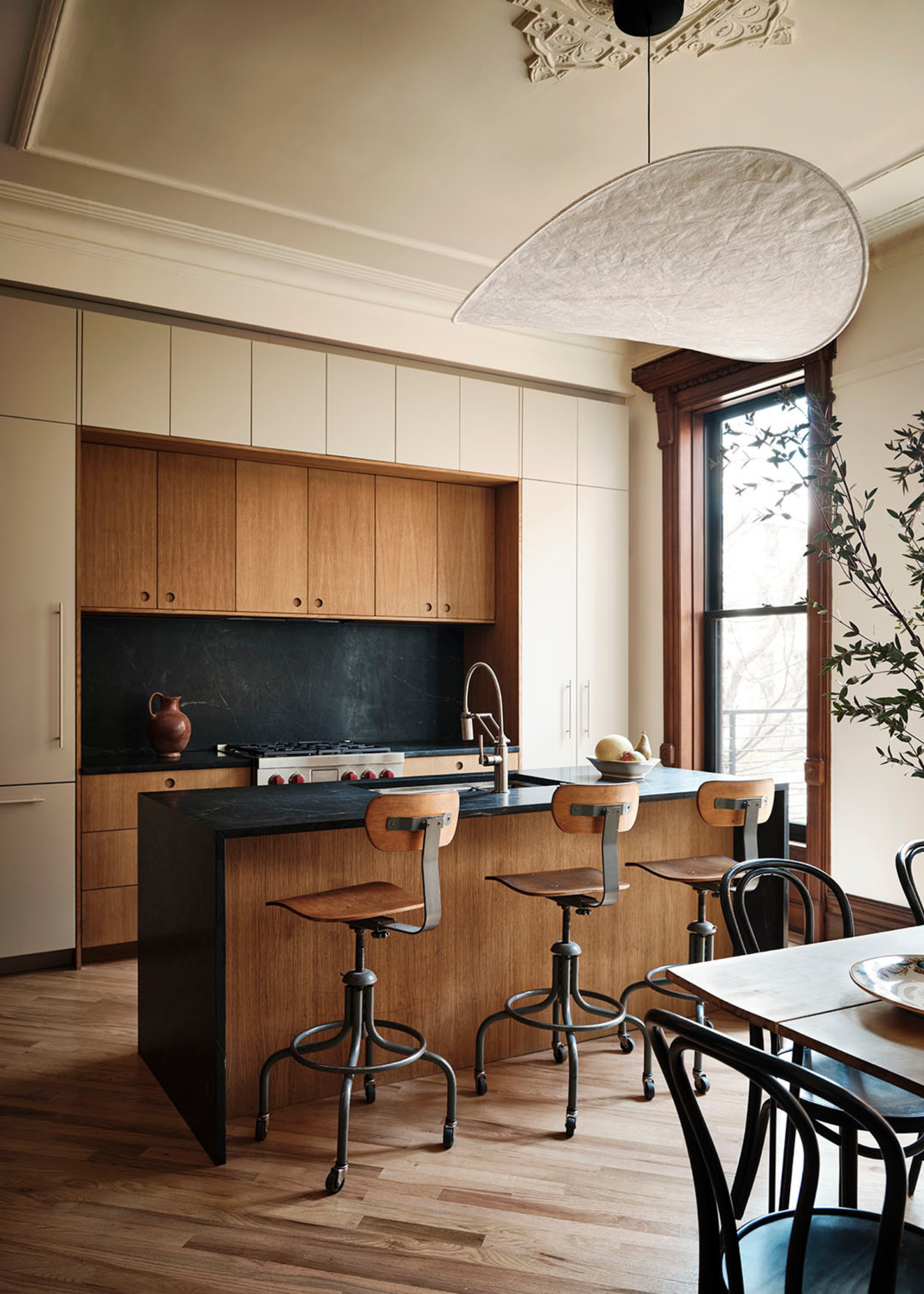
Pair your warm neutral cabinets with wooden detailing for a calming, sophisticated look.
The cold, white kitchen is out, that much we know, but what are the new neutrals the designers will be embracing in the new year when it comes to kitchen cabinet color trends?
According to Richard Davonport, from Davonport, 2026 is the year of the warm neutral. He explains, "Warm neutrals have become one of the most reassuring directions for kitchen cabinetry, and they are a palette we return to often."
Think warm taupes, moody mushrooms, and greige tones. These are the colors that embody the soft kitchen trend, and it's only picking up pace as we head into the new year.
It's a color family that the design duo, The Brownstone Boys, have also been embracing as of late. They tell me, "Our go-to cabinet color right now is Farrow & Ball’s Drop Cloth. It’s a warm, grounded neutral that brings softness without leaning too beige or gray. In historic homes, it creates a calm backdrop that lets architectural details shine, and it pairs beautifully with natural wood, aged brass, and stone with subtle movement."
The Livingetc newsletters are your inside source for what’s shaping interiors now - and what’s next. Discover trend forecasts, smart style ideas, and curated shopping inspiration that brings design to life. Subscribe today and stay ahead of the curve.
One of the best things about these shades is how naturally they pair with other materials. "When we design with warm neutrals, we style the kitchen in a way that brings out their depth," says Richard. "It might be the natural grain of oak on a pantry interior, the gentle movement in a veined quartz, or the way a curved corner or glazed dresser breaks up long runs of cabinetry. Warm metals also work beautifully here, especially when the aim is to create a gentle, lived-in elegance rather than push the kitchen into something overtly contemporary."
Whether you're working with a strikingly modern space or aiming to evoke a vintage farmhouse kitchen feel, you can't go wrong with a warm neutral cabinet color.
Shades of Red
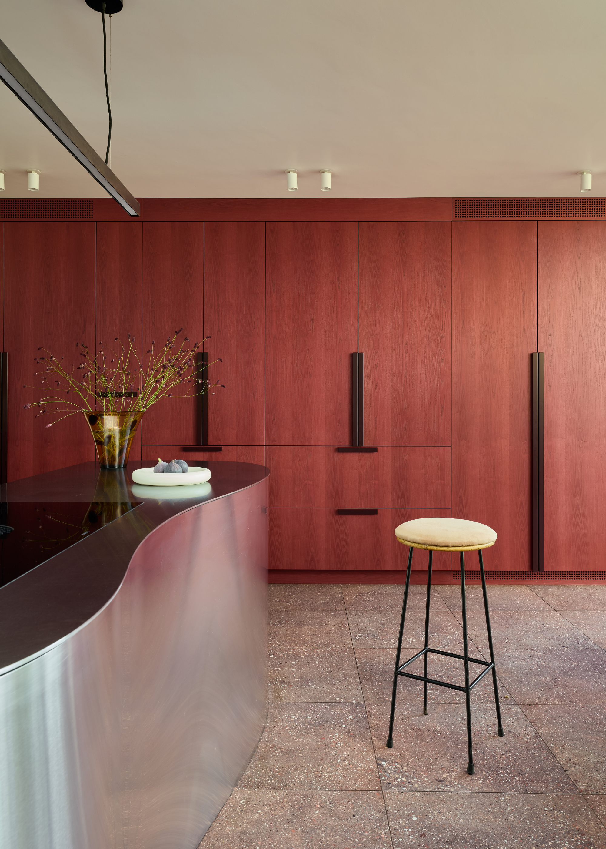
Red-stained wooden cabinets give an extra textural touch to this cool kitchen design.
If there's one shade that's been dominating both our wardrobes and our homes this year, it's that dark, moody burgundy. Sultry, comforting, and surprisingly versatile, it's a color we can feel sure will be going strong into 2026.
However, we expect the trend won't be limited to this specific shade for much longer, and we'll begin to see a bouquet of reds popping up everywhere we look.
For Lizzie Spinks, head of design at Makers, this is a chance to add a little bit more personality to the home. "I love all colorful kitchens," she says, "especially anything bold. Red cabinetry is great, as it can bring a real sense of warmth, joy, and sophistication to a space."
While many love the soft, neutral look, there's also a strong argument in favour of a bright and bold kitchen design, and for that task, a red kitchen is the winner. "If you go bold, I think you should really lean into that and don’t be shy," says Lizzie.
While Lizzie prefers the vibrant, juicy tone of a bold red paint, Fiona Ginnett, from HØLTE, leans more towards a deeper, burgundy tone, which she recommends pairing with "sapele detailing and a stainless-steel kitchen worktop to keep the richness feeling clean and contemporary."
Calming Blues
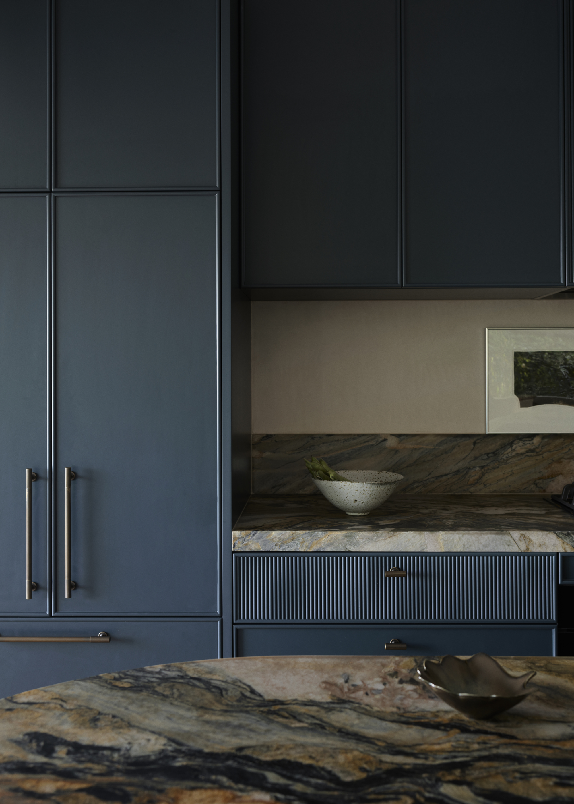
"It pairs beautifully with natural materials like oak and marble and works equally well in classic and contemporary settings," says Tom.
"Over the past year, we’ve seen a remarkable 147% increase in blue kitchen sales, making it our fastest-growing paint colour choice," shares kitchen designer, Tom Howley.
Perhaps a slightly surprising development, considering the overwhelming tendency towards warm, earthy tones in recent years, the recent boom in blue kitchens is a possible hint towards what the next year may bring for us in kitchen cabinet color trends. Plus, if Pantone's 2026 color of the year, Cloud Dancer, is anything to go off of, it seems we're ready to embrace cooler, brighter shades again.
It's not all icy cyans, though; there's more than enough space for all the shades to have their moment in the spotlight. "From deep navy tones that add drama and sophistication, to softer, chalky blues that bring a sense of calm and freshness, blue is an incredibly versatile choice for kitchen cabinetry," says Tom.
Olive Green
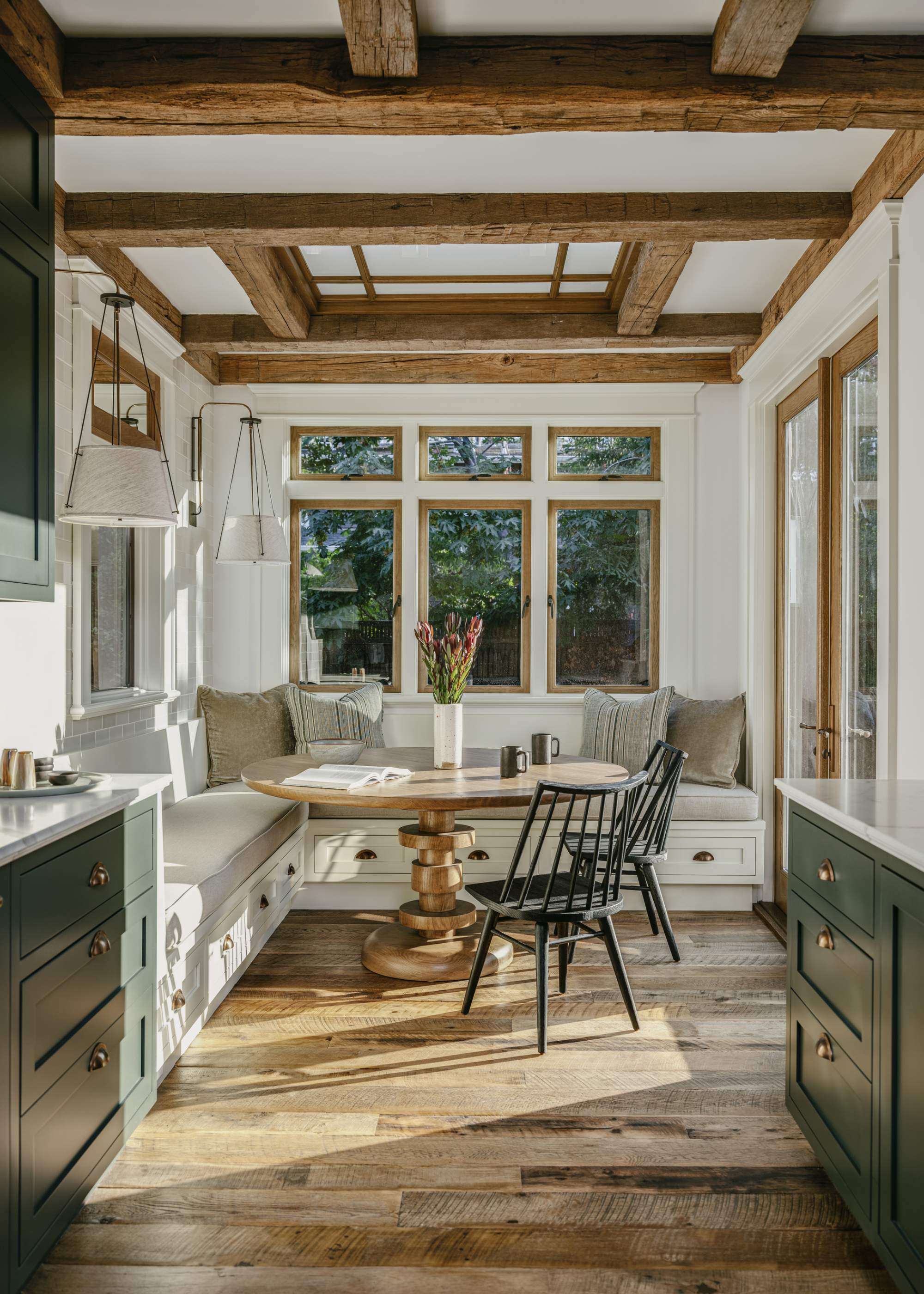
Olive green looks particularly beautiful when paired with natural materials.
Now, we may have said that green was the new millennial grey, but this is different; this isn't any old millennial green, this is olive green. And olive green is chic, always — especially when it comes to kitchen cabinet color trends.
While sage green kitchens certainly had their fair share of time in the limelight, we think it's time to welcome back an old favorite. Olive green feels slightly more grown-up than its more pastel-toned counterpart, and it pairs beautifully with warm, natural materials.
It's a favorite shade of HØLTE's Fiona, who suggests styling it with "oak accents to bring warmth and a natural softness." She also loves the look of an olive green cabinet with "terrazzo countertops and terracotta tiles for a grounded, tactile feel."
Cream
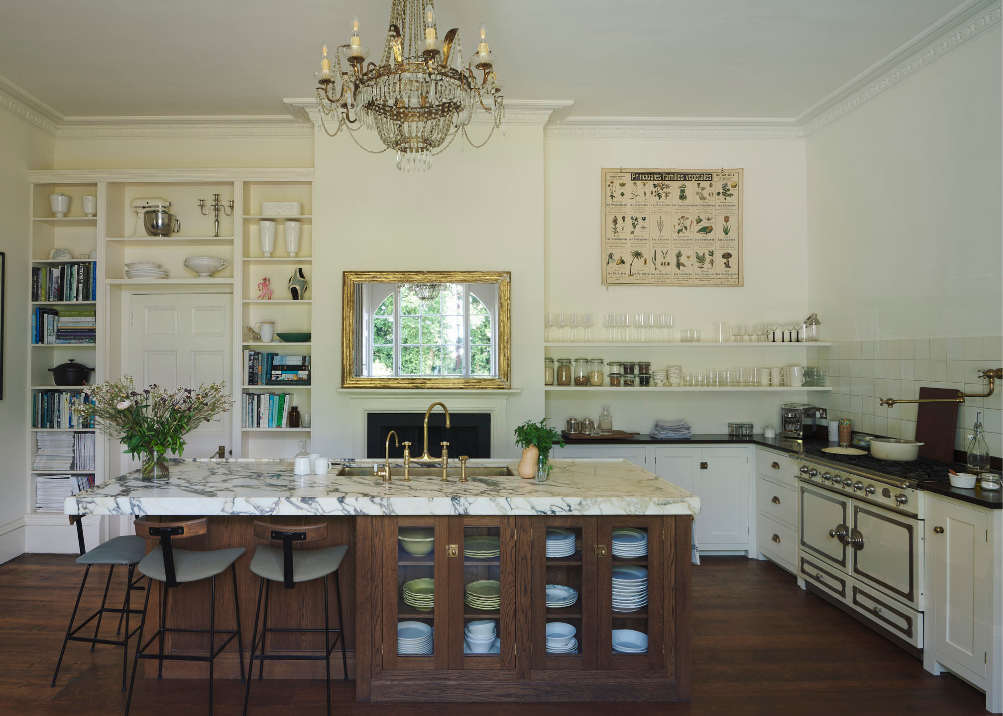
If you love the traditional, English kitchen look, cream is an excellent choice.
Butter yellow was, without a doubt, the shade of the summer. But how will this color translate into the upcoming year, and more importantly, how will it work in our kitchens? Well, the answer comes in the form of a different dairy-related shade: cream.
"We are installing cupboards in rich but pale creams, we think of it as a clotted cream, this works subtly alongside muted butter yellow tones, just a shade or two darker," shares deVOL's Helen Parker.
The warmer, more welcoming cousin of the white kitchen, cream offers a softer finish, while still retaining that desirable 'clean' aesthetic.
But, if you want to move away from the monochromatic look, Helen pairs the tone with some darker, earthier shades. "We then add an authentic, darker shade such as mossy green or greeny brown. These gentler, more earthy natural colors sit perfectly with wooden or honed Carrara marble kitchen worktops to give a warm, light, and airy feel to a room," she says.
Charcoal Grey
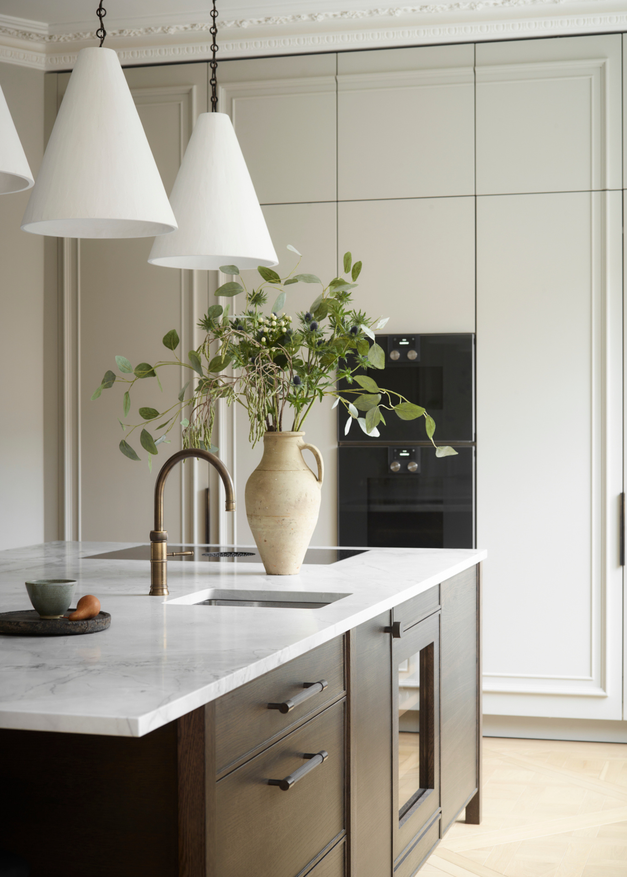
"This color brings depth without feeling heavy, and it creates the perfect canvas for the more organic, crafted look that homeowners are increasingly drawn to," says Allison.
"For 2026, I feel people are drawing more towards rich, earthy tones, and my top pick is a deep graphite-inspired charcoal," shares Allison Lynch, senior designer at Roundhouse.
Despite the bad reputation the term 'millennial grey' has given decorating with grey, there are definite exceptions to the rule, and charcoal is certainly one of them. None of the wishy-washiness of lighter grey tones, charcoal is deep, intense, and powerful.
"The color is still dark but shifts into off-blacks, graphite or charcoal — moving away from definite greys," Allison explains.
She continues, "It feels modern yet grounded, and it supports the big trends we’re seeing: warm timber details, expressive natural stone, and mixed materials with real texture and character."
Without the heaviness of black and the blandness of grey, charcoal and graphite create a moody, yet welcoming feel that encapsulates the spirit of kitchen trends today. Its neutral nature makes it a wonderful base for other materials to shine, too.
Earthy Tones
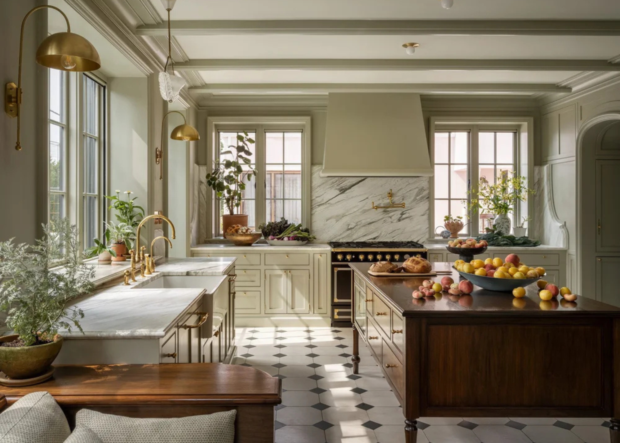
In this project, Farrow and Ball's French Grey made the perfect base for the kitchen.
Finally, for a timeless option that will look just as good a decade down the line, you can never go wrong with an earthy color palette.
"Our kitchen cabinet colors are generally soft, complex, and somewhat earthy. They’re colors that pair great with food and can handle the mess of a working kitchen," shares Mira Eng-Goetz, lead designer at Jessica Helgerson Interior Design
A classic, soft, earthy tone leaves you with endless room for exploration, pairing wonderfully with just about any material and finish.
Wanting some more paint inspiration for your kitchen refurb? Take a look through the designer's favorite Farrow and Ball kitchen colors for gorgeous, timeless tones.

Maya Glantz is a Design Writer at Livingetc, covering all things bathrooms and kitchens. Her background in Art History informed her love of the aesthetic world, and she believes in the importance of finding beauty in the everyday. She recently graduated from City University with a Masters Degree in Magazine Journalism, during which she gained experience writing for various publications, including the Evening Standard. A lover of mid-century style, she can be found endlessly adding to her dream home Pinterest board.


