Red kitchen ideas that show how this hue has become the unexpected color hero of the most stylish spaces
Introducing red to your kitchen can bring a jolt of life to your space, from subtle, decorative touches to statement licks of paint

The color red will always make a statement when used with confidence. With strong connotations of passion, love and fiery emotion (sentiments commonly experienced in the kitchen), incorporating this shade into your kitchen makes for a bold and beautiful design choice.
'Red is a bold and versatile color that can be used in many different ways, such as adding warmth, a splash of much-needed color or even to add a sense of grandeur to a room,' says Charu Gandhi, founder and director of interior design studio, Elicyon. 'We are seeing more pops of color appear in design schemes, and red is a great color for making a statement in space.'
Whatever tone you go for, or however you use red, it's a kitchen color idea that's making waves right now. Here's how designers are using it.
10 red kitchen ideas for bolder spaces
The color red can be introduced into a room in many different ways – from a marble backsplash with red tones such as calacatta viola, an island unit that takes pride in the center of a neutral kitchen, or through accessories such as a vase, a chair or even appliances like a retro toaster. There are options to tone it down with terracotta, brick shades, and deep wine reds too - it's not always got to be a vivid shade of red. 'There are many different tones of red that match different design aesthetics,' says Charu. 'So whether you want to use a warm rouge, a playful berry, or even a brighter shade.'
1. Make a statement with a red kitchen island
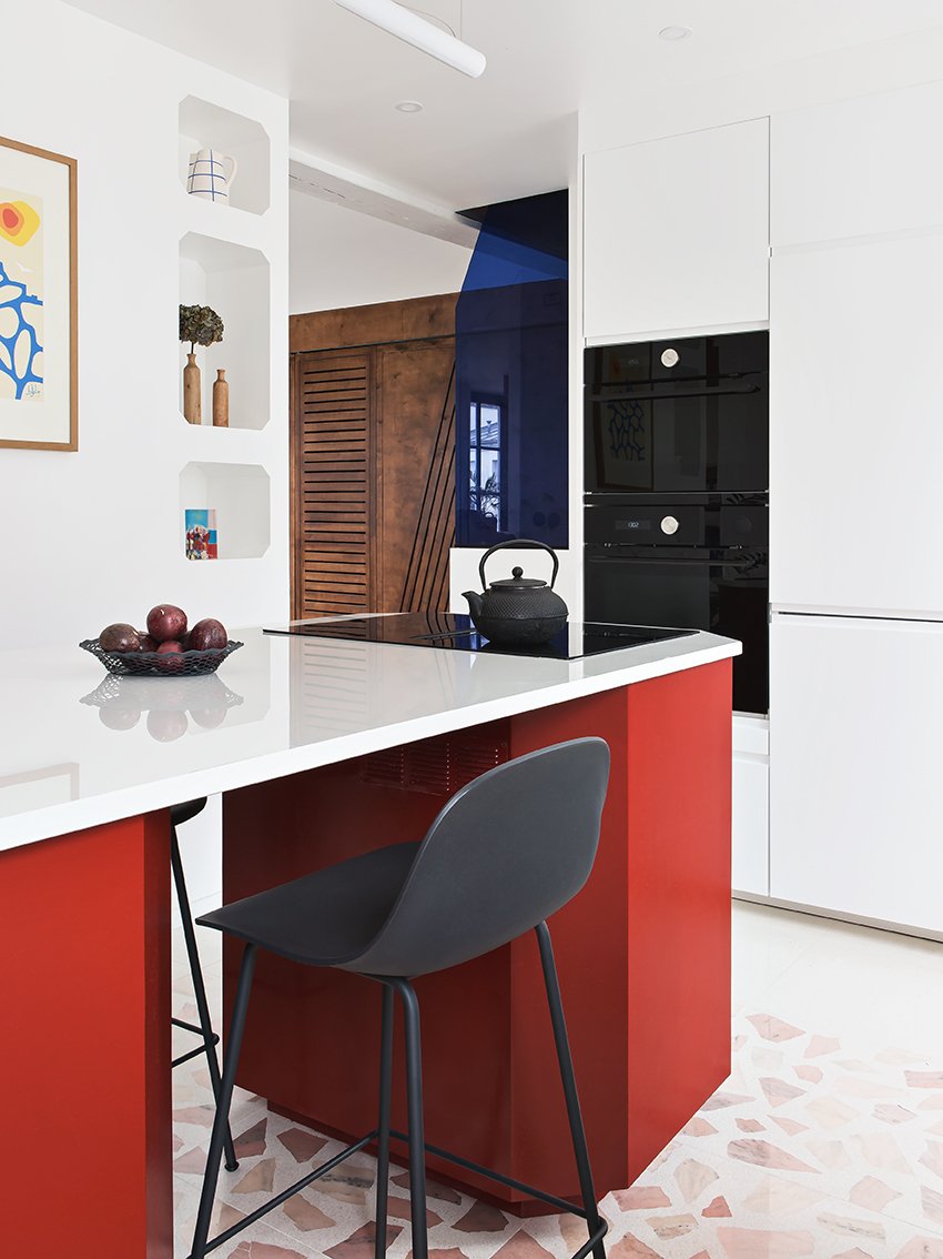
A red kitchen island can work in a stark, all-white kitchen, like this example from Space Factory which allows the island space to really steal the show. Here, the walls and countertops are a bright white, while the island itself is the standout piece.
'We wanted to create a blank canvas like in an art gallery in order to highlight the design pieces like works of art,' explains say Ophélie and Edouard from Space Factory. 'So we chose this color for the island because it's not a color we are used to see in a kitchen. The idea was to attract the eye on the island design.'
2. Use a rich wine color for a sophisticated look
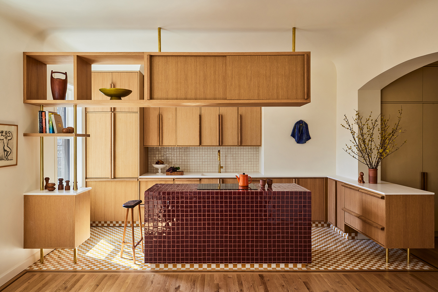
A bold pop of red might not be for everyone, and a calmer, more toned down shade like burgundy can deliver all the comforting warmth, with less of the high energy.
The Livingetc newsletters are your inside source for what’s shaping interiors now - and what’s next. Discover trend forecasts, smart style ideas, and curated shopping inspiration that brings design to life. Subscribe today and stay ahead of the curve.
For GRT Architects, it was the perfect color to clad their statement tiled kitchen island. 'We all liked the way the hand made, deep burgundy tile island contrasts the effortless simplicity of the composite countertops which meld into the walls whereas the island stands out as an abstract sculpture,' says Rustam Mehta, co-founder of GRT Architects.
The designers chose a near-tone color to go with burgundy to keep the color scheme feeling elevated. 'We enjoyed the slightly uncanny relationship between the tiled floor and the island and blending their colorways,' Rustam tells us.
3. Use it as an accent
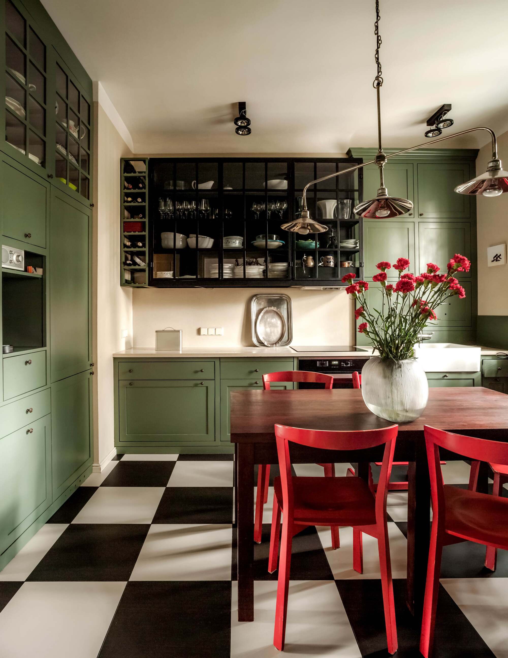
Bring red into your kitchen in smaller doses, adding energy to a calming space in a subtle way that isn't too overpowering. Red accent chairs pair well with the sage green cabinetry, opposites on the color wheel when it comes to color theory, in this kitchen to create a cohesive yet unexpected color scheme.
I like how the red is emphasized with the vase of bright red carnations on the dining table in this kitchen diner by Colombe Studio. If in doubt, the carnation cut flower trend is an easy way to bring a vivid red to your kitchen.
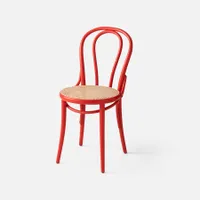
Bentwood caned chair, Schoolhouse
I love this elegant frame in vibrant red. It’s also available in cream if the red’s a little too bold for you. If you’re looking for a playful dining area, go for mix-and-match chairs.
4. Opt for red marble for a statement centerpiece
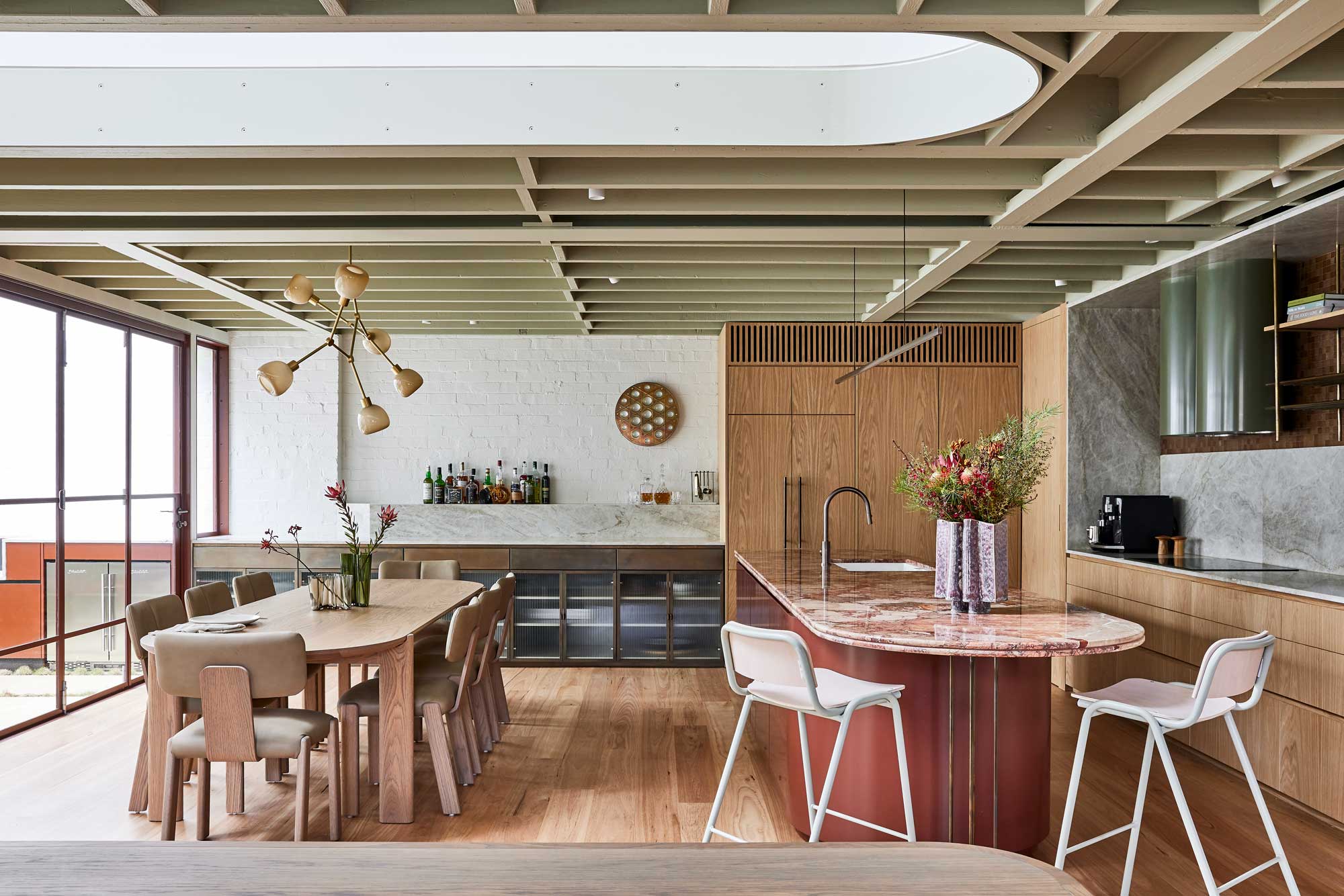
Marble in the kitchen is the epitome of luxury. With a splendid mix of tones, colors and veining, marble kitchen countertops bring a one-off look to your kitchen that gives it a unique stamp of luxury. As a natural material, it ages well, withstands the test of time, and is heat resistant.
Marble doesn't necessarily have associations with bold color, but exploring alternative kitchen color options can create a more striking kitchen centerpiece and an eye-catching focal point. Instead of traditional white - which can all too often feel cold and stark - a red marble countertop adds real wow-factor to your kitchen, lending a feeling of luxury and warmth.
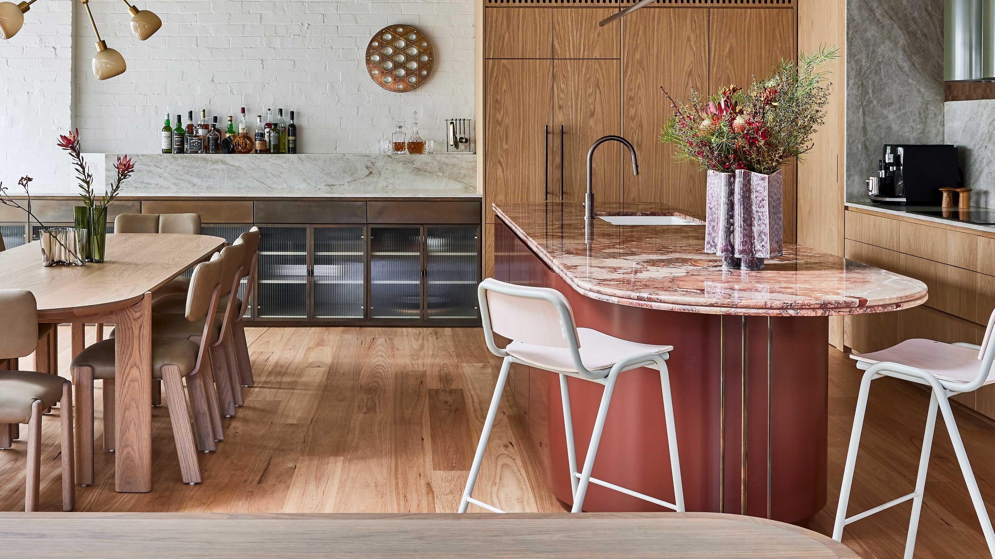
Burgundy and dusty pink Breccia Rosso marble makes a bold statement in this kitchen by Carter Williamson Architects. The rich, earthy tones pair delicately with the indoor greenery that provides the courtyard with its own sub-tropical canopy.
5. Be unapologetic with your use of color
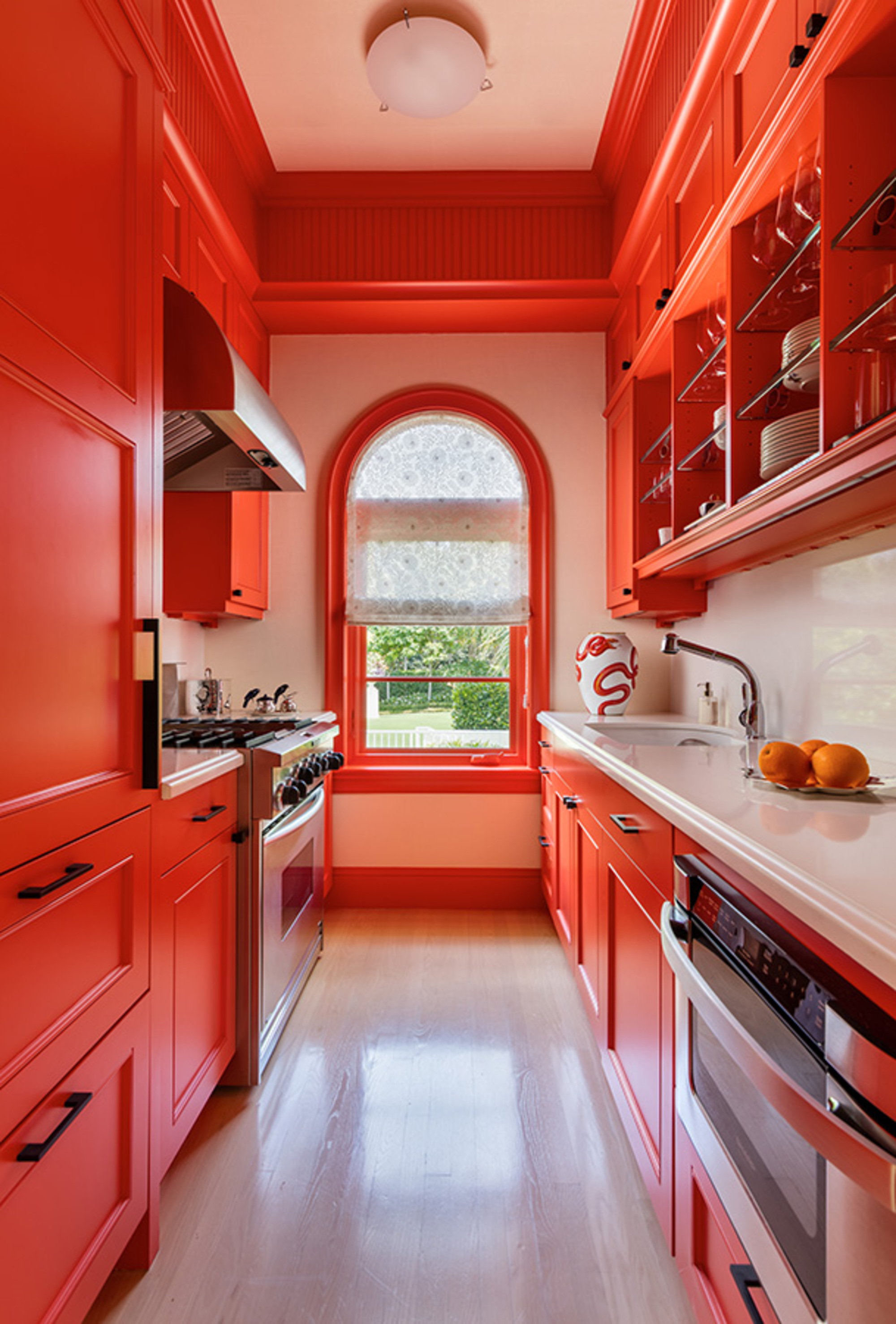
'The smallest spaces can be the most memorable if you keep the focus strong,' says says Matthew Boland, principal of MMB Studio. 'Here, the focus was the paint color and we used it with vigor.' It's the perfect foil for a small kitchen that can otherwise feel apologetic in size.
Painting your kitchen window treatment is another way to incorporate the color red without going overboard. In a small kitchen, going bold with the trim can help enlarge the space. In this space created by MMB Studio, embracing the narrow footprint of the kitchen grab your attention and allows your eye to travel the entire length and height, landing at the feature window at the end of the kitchen, and framing the view.
6. Blend the color into the floor tiling for a monochromatic look
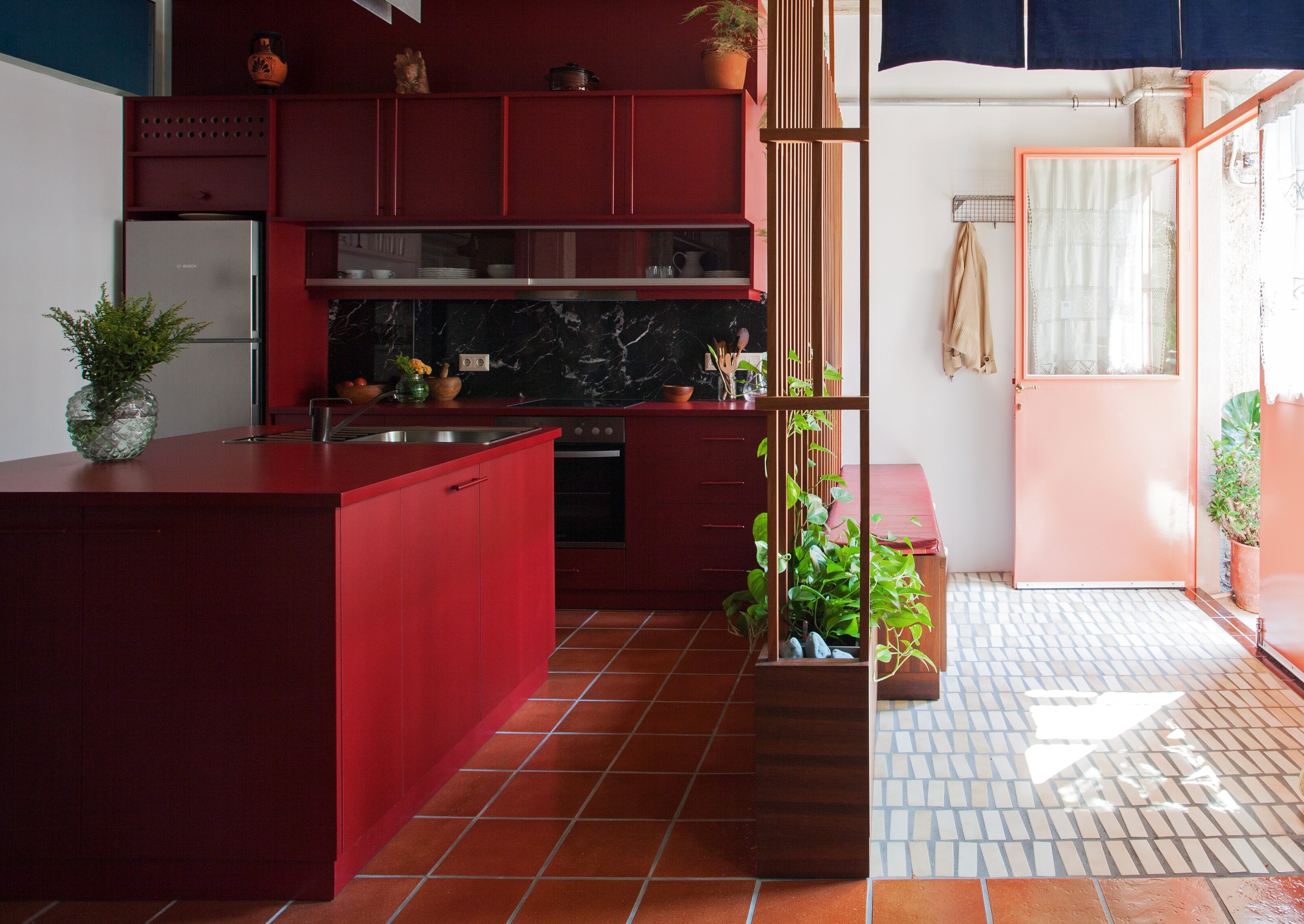
Go big and go bold with your use of red. This example from Point Supreme does just that by blending the color of the cabinetry into the flooring, creating a seamless, monochromatic color scheme. The result is cocooning and warming.
'With its raw concrete surfaces and light entering from one side only, the space felt like a marvellous warm cave, there was a certain magic to it,' says Marianna Rentzou and Konstantinos Pantazis, founder of design studio Point Supreme. 'The materials and colors used are mostly in warm hues that complement the 'natural' cave-like atmosphere.'
7. Bring pattern underfoot with a red rug
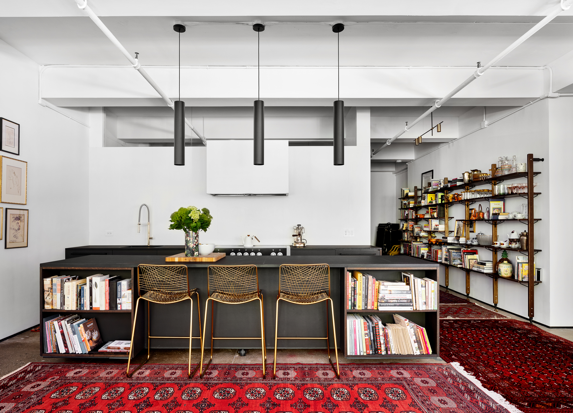
Texture all too often gets banished from the kitchen, favored instead for cold, hard surfaces like marble, tiling and wood. While sticking to the hard materials has its hygenic benefits, I'm partial to a bit of softness underfoot. Rugs can add that softness and homely feel when your stark kitchen is in need of a bit of coziness. If you're opting for a red rug, Persian rugs are a go-to.
With a timeless quality, the best Persian rugs have bags of historic charm and known for their luxe connotations. Pick a Persian rug runner with a rich red pattern for added wow-factor in your kitchen. This design from Kimberley Peck Architect cleverly adds red to a pared-back, monochrome scheme that is in need of a decorative touch.
8. Pair subtle red touches with natural material
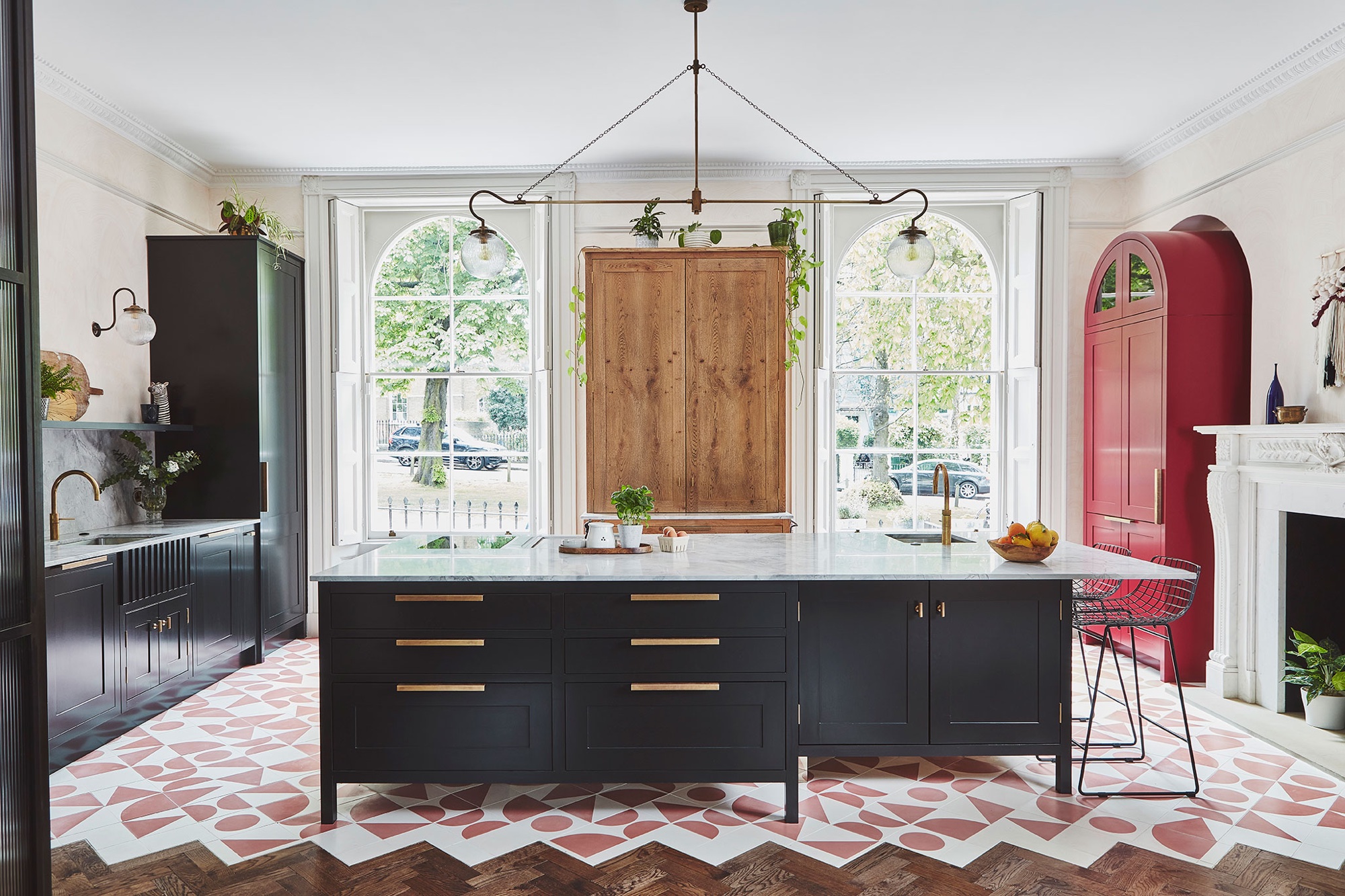
If you're struggling to pick colors that go with red, think about how natural materials bring color to a room and pair well with the shade. Introducing more natural tones and colors can be a way to gently incorporate the boldness of red to help balance out the richness.
9. Bring in red in small doses like backsplash
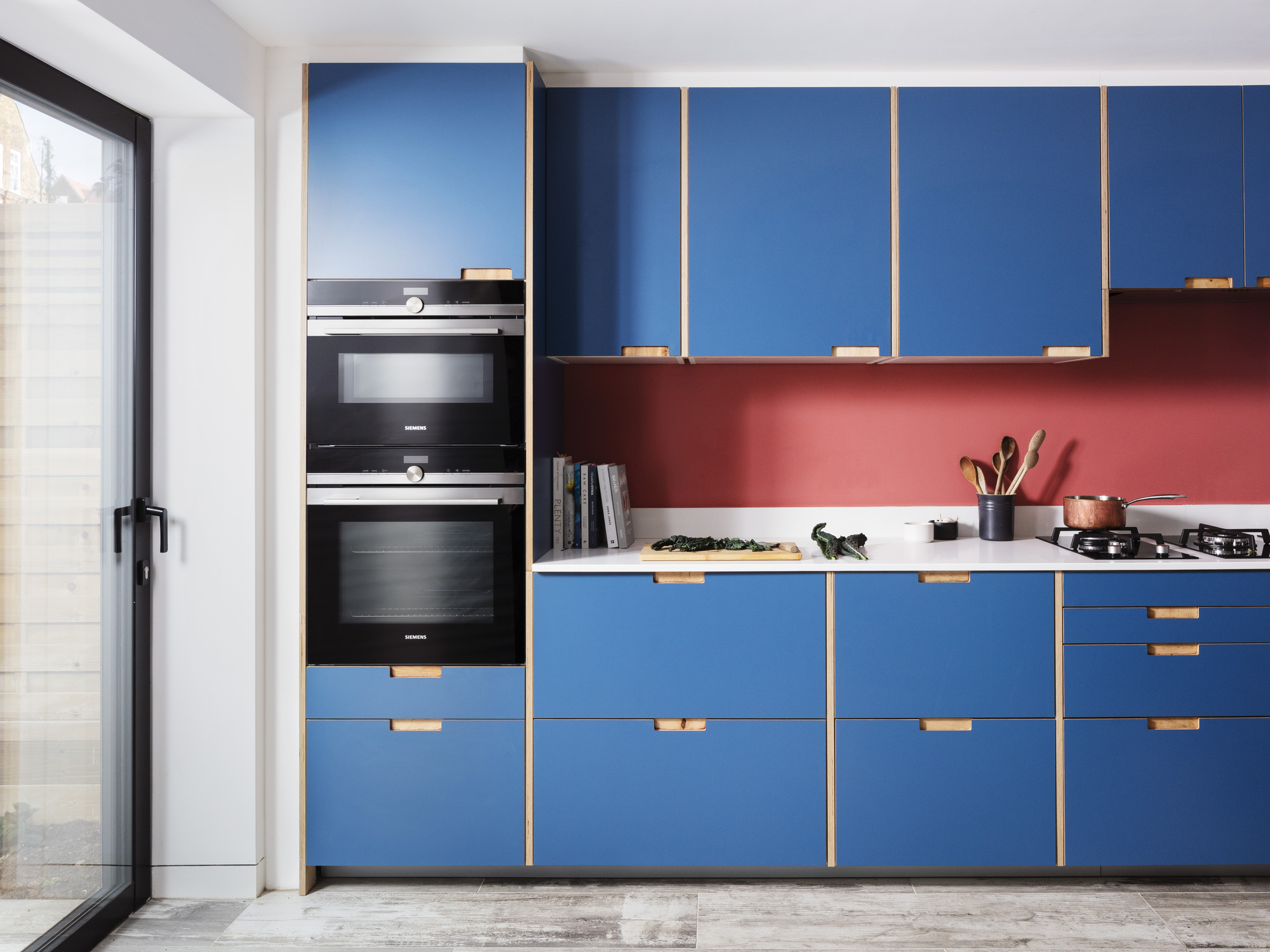
A kitchen backsplash is a clever way to introduce boldness and a dash of color in a more subtle way if you're not feeling as daring, explains Amos Goldreich of Amos Goldreich Architecture. 'Adding red to a kitchen can be a great way to spice up the space and give it a unique and eye-catching feel,' Amos says. 'If you’re not ready to go for red kitchen units, consider going for smaller items like backsplash, or bringing in functional and stylish pieces like bar stools or a table that can be painted or swapped out easily if you opt for another color palette in the future.'
Red also works as a smart backsplash choice in a place that often is exposed to spillages and general kitchen mess, owing to its proximity to the oven hobs.
Think carefully about what color you pair your backsplash with too. In this example, Formica fronted kitchen cabinets in a bold denim blue shade contrast sharply with this bright red backsplash. It's all about balance, says Amos. 'I think it's important to balance the use of bright colors like red in a kitchen,' says Amos. Look to the color theory for inspiration and pick colors opposite on the wheel. Sage green can counteract the energy of red and isn't too Christmassy, while a cream might look nice against a rich burgundy shade of red.

Former content editor at Livingetc.com, Oonagh is an expert at spotting the interior trends that are making waves in the design world. She has written a mix of everything from home tours to news, long-form features to design idea pieces, as well as having frequently been featured in the monthly print magazine. She is the go-to for design advice in the home. Previously, she worked on a London property title, producing long-read interiors features, style pages and conducting interviews with a range of famous faces from the UK interiors scene, from Kit Kemp to Robert Kime. In doing so, she has developed a keen interest in London's historical architecture and the city's distinct tastemakers paving the way in the world of interiors.
