6 'Anti-Winter' Paint Colors That Interior Designers Decorate With to Create Rooms That Beat the Seasonal Slump
In winter, our homes become all the more vital to lifting our moods out of the darkness

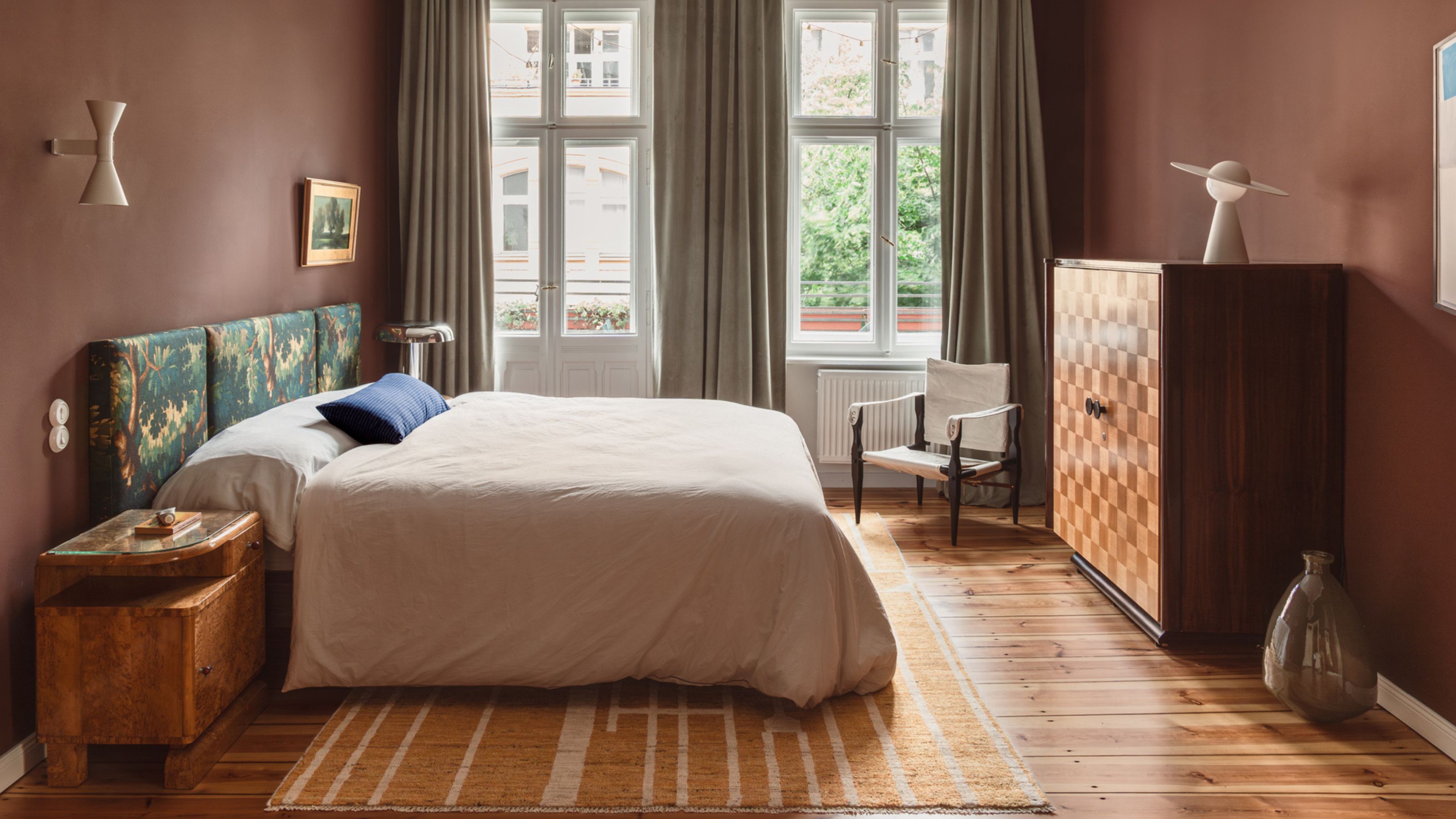
The power of decorative color is boosted in winter, with pigment able to tip us from chilly, tired, and cranky to toasty, enlivened, and cheery in a mere moment. But successfully painting a wall with an anti-winter color palette isn’t as easy as you might think, with the feel and temperature the shade gives off affected by undulating factors such as undertone, the way the light hits the room, and surrounding colors and textures.
Surrounding ourselves with joyful colors that banish the seasonal gloom is the visual equivalent of wrapping ourselves in a duvet, cranking up the thermostat, or cradling a mug of tea between both hands. Warmth needs to spread to the soul as well as the body, and interiors-wise, there’s no better way to do that than with color.
Classically, anti-winter hues typically hang around the fiery shades of reds, oranges, and yellows, but there’s a whole spectrum of colors to discover with the power to metamorphose your space from cold to cozy. While many of them lie in this inherently sun-touched scheme, many don’t. Here are the frost-fighting paint colors the designers opt for when in need of a decorative antidote to the cooler months of the year.
Article continues below1. Little Greene's Ganache
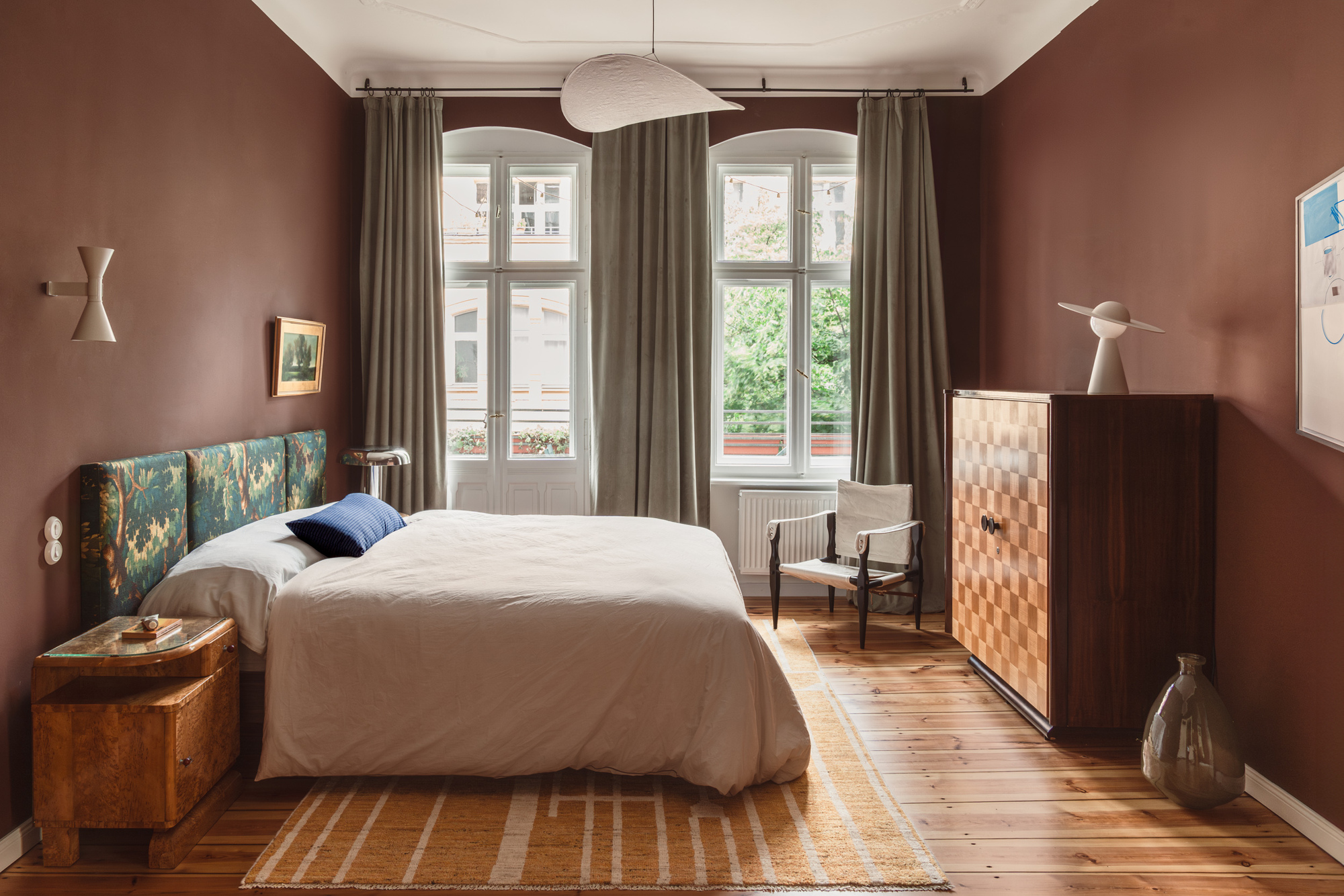
Cold? How about a warm-up with a dip in Willy Wonka’s chocolate river?
Creamy cocoa shades adorning the walls have an enriching effect on the home, creating cocoons that feel indulgent, as well as inviting, and wrap the room in a decadent, suede-like softness.
"Little Greene's Ganache is a deep tone of dark chocolate; it’s sumptuous and adds a lot of dimension to a space," says Kasia Kronberger, founder and principal designer at interiors firm Studio Bosko. "It’s very cozy, especially in a matte, almost velvety finish — like a comforting hug, with a luxurious twist."
"Its depth and warmth are what work so well in winter, and contrasting it against a sprinkling of snow (or a white ceiling) makes it seem crisp, contemporary, and paradoxically fresh," she continues.
Decorating with brown in this hue has a multidimensional quality, offering more than meets the eye as light plays across it. "The color’s warmth changes throughout the day," Kasia says. "With the move from low daylight to artificial indoor bulbs, it goes from crispy cacao to twilight-appropriate hot chocolate."
The Livingetc newsletters are your inside source for what’s shaping interiors now - and what’s next. Discover trend forecasts, smart style ideas, and curated shopping inspiration that brings design to life. Subscribe today and stay ahead of the curve.
2. Little Greene's Marine Blue
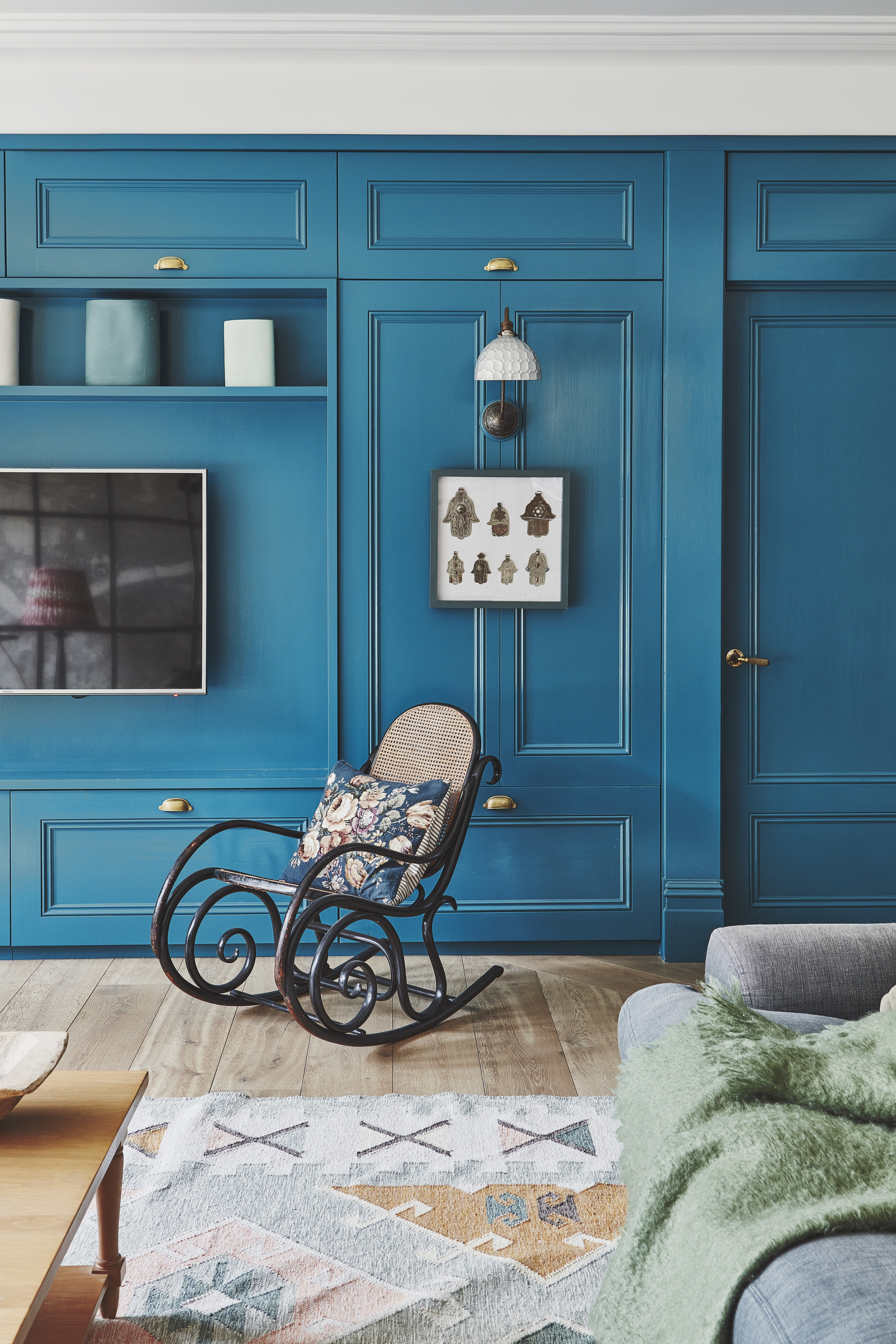
You might not turn to the blue when in search of a temperature spike, but don’t dismiss the family entirely.
Some blues, while inherently cool, are heavy, rich, and speak of days lounging by the Mediterranean. Enter a home cloaked in a full-bodied, teal-y blue, and you’ll practically feel the sun on your face.
"Little Greene's Marine Blue is bold, bright, and fresh, a grown-up deep-sea tone that lends itself to conversations of holiday and acts as a reminder of sea and water," says Sophie Chapman, associate and interior designer at The Vawdrey House. "It feels really cheerful."
When days are shorter, it’s even more vital to consider how the space is lit before settling on a shade. "It’s ideal in winter because it reflects light beautifully, and works especially well with a warm glow," Sophie explains. "In both low natural light and under evening lighting, it transforms into a moody soft hue, making it ideal for rooms used at multiple times of the day."
Marine Blue is a joyful, energizing shade that cuts through winter gloom with a clear, buoyant lift halfway between energy and ease. "During the darker months, it evokes a sense of happiness," she adds. "It’s refreshing and calming with a little invigoration — the perfect balance."
3. Coat Paints' Pan
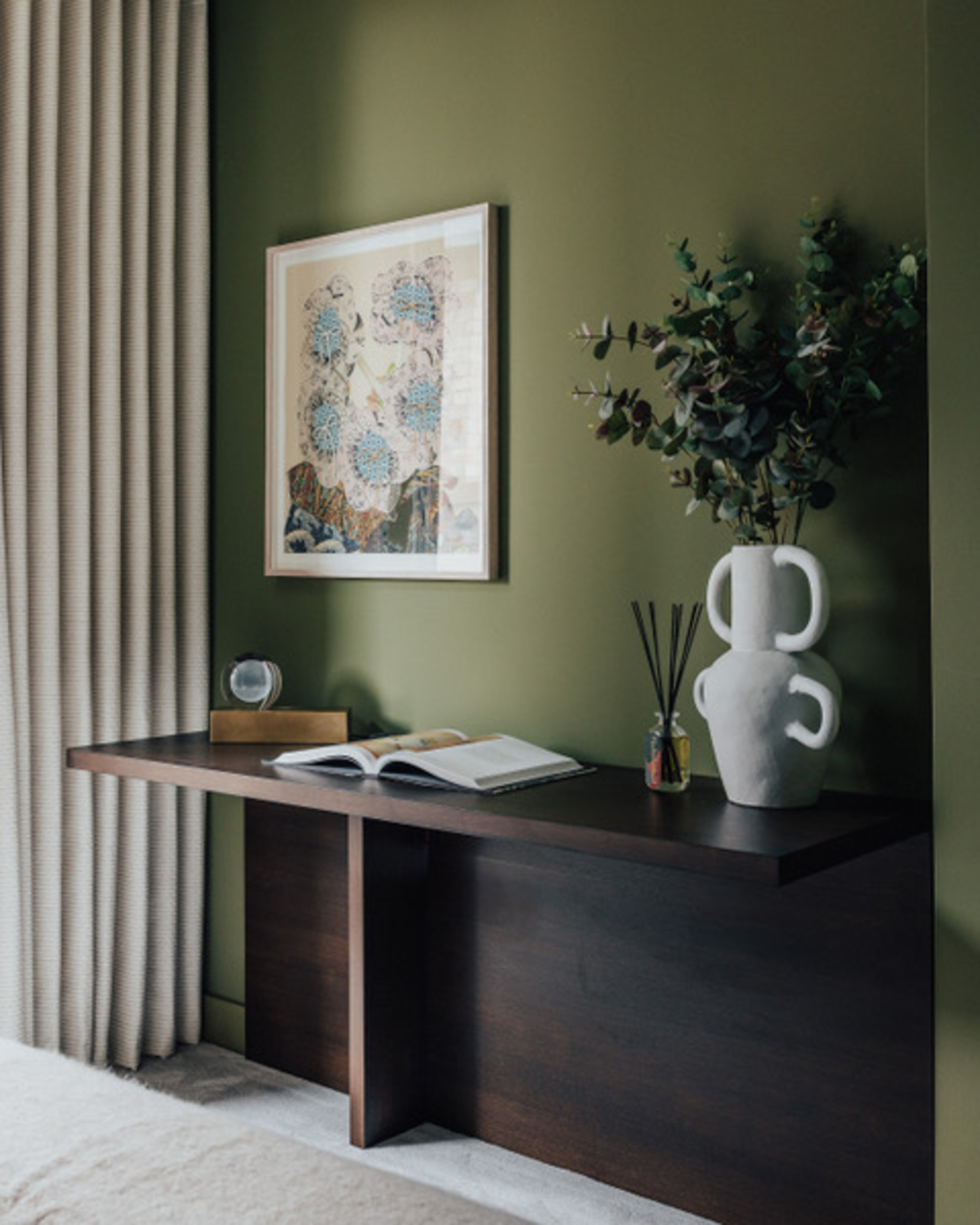
"The dark months tend to heighten Pans cocooning properties, so when you’re immersed in its viridescence, you feel safe and warm, like you’re wrapped in a favorite woolen throw," says Ed O'Donnell.
One of the worst things about winter? How many of the plants disappear, shrivel, and fade, taking away so much of the vitality and brilliance from the landscape. This is where paint can step in to trick the mind into reflecting upon another season, a less icy season, a season where color is abundant.
"A deep and enveloping olive with the layered intensity of a forest floor, Pan is an evergreen color that sits perfectly between light and dark green, so it feels balanced and serene," describes Ed O’Donnell, co-founder and creative director of interior architecture and design firm Angel O’Donnell.
Some green paints make the color come as alive inside as it does out in the wild, evolving as the light shifts and day unfolds. "It works subtle magic throughout the seasons, in winter and autumn providing warmth and coziness, while in spring and summer it takes on a life-affirming energy that’s fresh and burgeoning," Ed continues. "In bright light it’s lustrous like a newly unfurled leaf; in darker spaces it becomes a luxuriant midnight green."
Ed’s London interior architecture and design firm is drawn to hues that elicit strong, positive emotional responses. "You can’t go wrong with an ethos of ‘color me happy,’" he says.
4. Francesca’s Paint Sand II
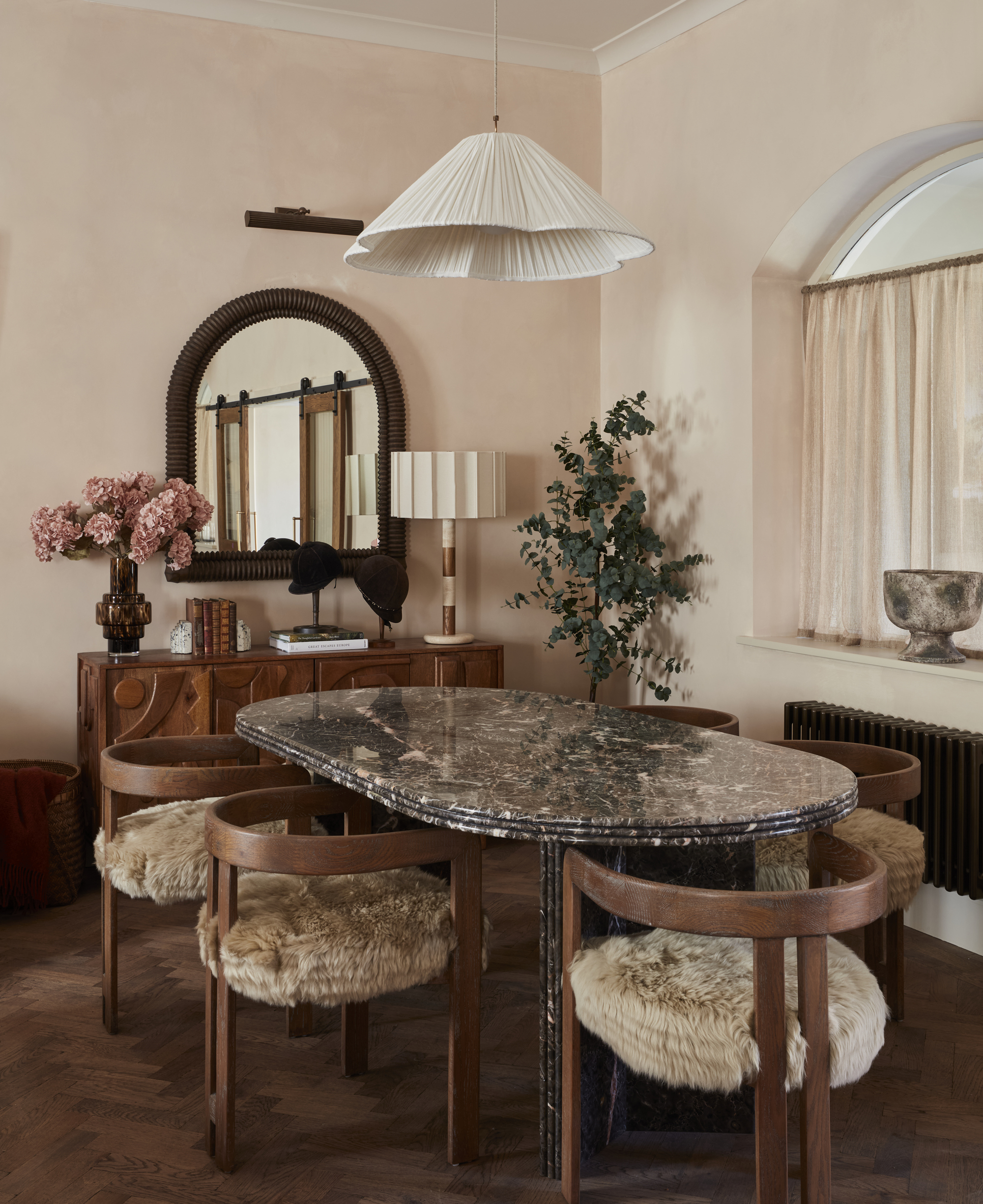
In these chilly months, when daylight is low and cool, this kind of tone gently lifts a space without shouting too loudly," says Anna Burles.
In winter, more than any other time, whites and ultra-pale shades can be tricky. They shape-shift after dusk, turning unexpectedly cool, flat, harsh, and moody, picking up on shadows that you didn’t sign up for and coming across as more like an absence than a style decision. This is when neutral, pale tones with a bit more pigment are your friend, as they can bring in a whisper of warmth that keeps rooms full of life.
"Francesca's Paint Sand II is a muted, chalky blush with warm stone undertones — somewhere between faded plaster and sun-kissed clay," describes Anna Burles, creative director of interiors creative studio Run For The Hills. "It carries heat without being heavy."
"It’s ultra-comforting and quietly optimistic. There’s a sense of calm and reassurance to it, and it makes a space seem really cared for and lived-in," she explains. "In these darker months, it’s designed to create a feeling of cozy retreat and intimacy rather than hiding away from the world hibernation."
Sand II has personality as well as a softness, which makes the room welcoming rather than stark. "In dimmed daylight, it reads even more warmly rather than feeling muddy, and in the evening, it comes alive under layered lighting," Anna continues. "Flickering candles, table lamps, and pendants really bring out its depth, making the walls glow rather than flatten."
5. Pure & Original's Old Ocre
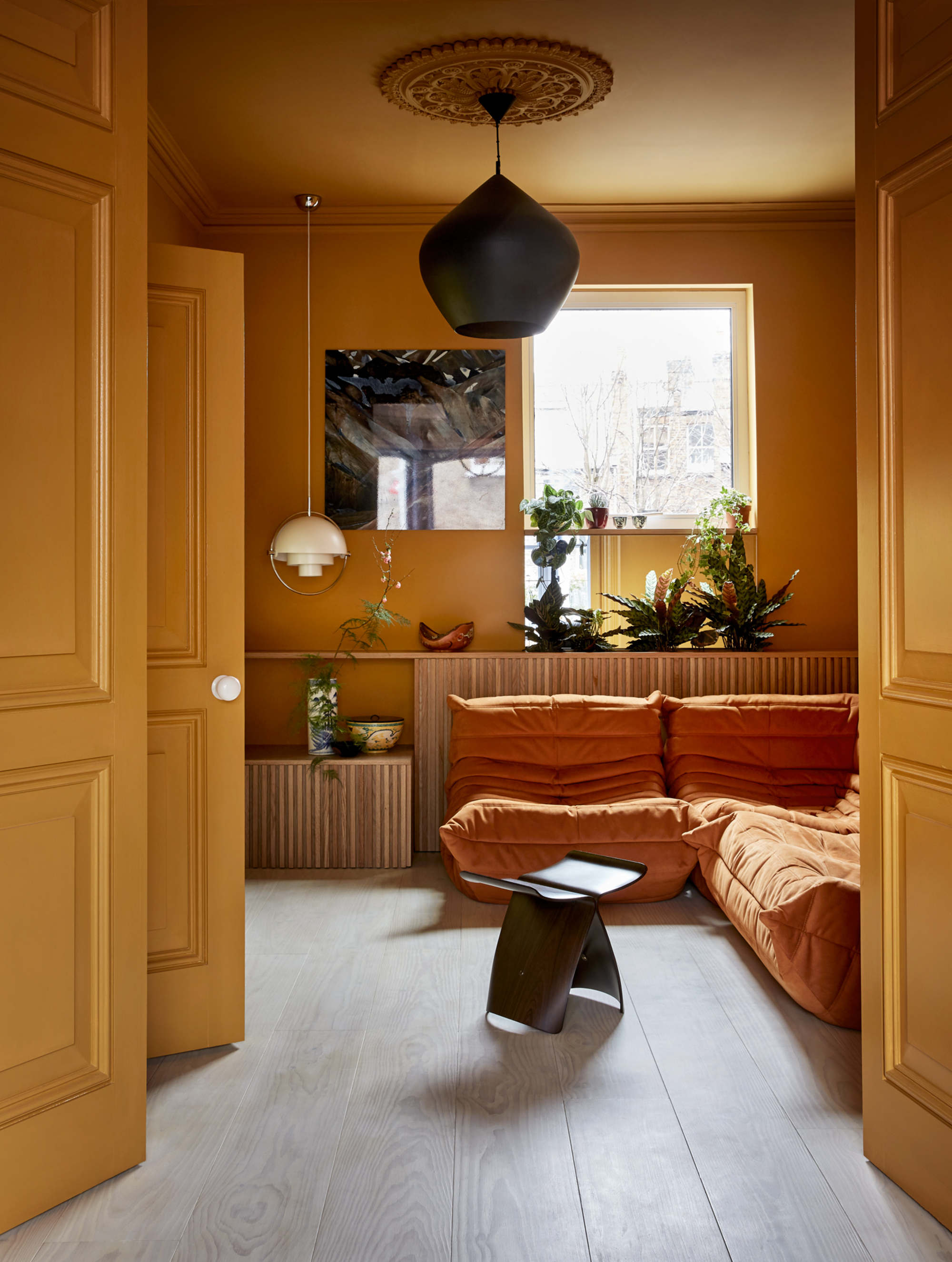
Surround yourself with the shade of the sun itself, and it’s not hard to work out how you — and your home — will come out feeling.
Golden yellows are the archetypal temperature-boosting colors, instantly heating an area from the first daub of paint like distilled beams.
"When the outdoors is gloomy and gray, and the daylight hours are very limited, the warmth and intensity of pigment in Old Ocre are both comforting and calm," enthuses architect and interior designer Siri Zaneli, founding partner of architecture and design studio Collective Works. "Dense and soothing like a reassuring hug at sunset, it has hints of a low-burning flame and is a reminder of balmier days."
"A warm ochre cave completely opposes the effects of winter, making a room energizing and optimistic," she continues. "It immediately brightens the mood."
Depending on the hour, Old Ocre makes the walls seem to glow differently, so the room feels endlessly alive, as Siri says: "It can move from amber honey to deep caramel throughout the day and seasons — it changes with nature."
Siri’s London-based architecture and design studio uses color as a considered tool in many of its projects, its palettes discussed alongside material selections and spatial design. "Living with color is fun!" she says.
6. Paint & Paper Library's Plaster V
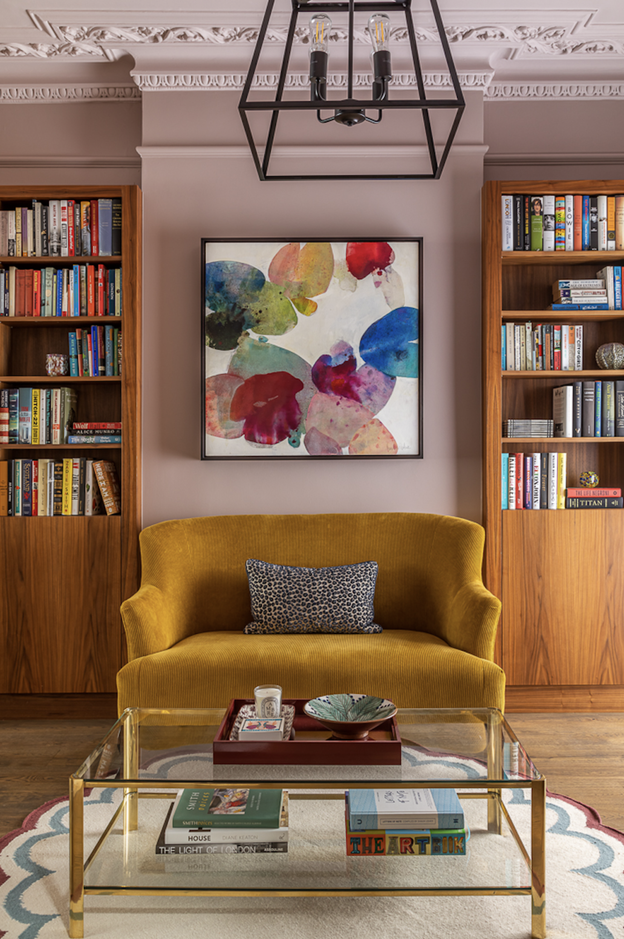
"During the darker months, it’s incredibly comforting, creating a feeling of calm and warmth," says Alexandra Keith.
Cold, shadowy times call for cheer, and no anti-winter palette summons a happy-go-lucky smile like decorating with pale pink. The bluer the shade (baby pink, bubblegum-esque shades), the cooler it will feel, so stick to the rosier end of the spectrum to bring in a playful patch of prettiness, as well as some understated charm.
"Plaster V is a warm, brownish pink with purple undertones, a calm and sophisticated color," explains Alexandra Keith, design director at interior design studio Otta Design. "It’s a shade that works well in winter because of the depth of color. It is incredibly cocooning — ideal to counter balance to the long gray days."
"The peachy brown undertones work well in a space with low levels of natural light as it holds its true color well, and it looks elegant in darker rooms with a lot of layered lighting," she adds.
With the right anti-winter palette, walls become more than a backdrop — they become the first layer of winter warmth. The architectural equivalent of a hot water bottle or extra-thick pair of gloves, let the wall lead the way when you’re building winter-banishing warm color palettes.
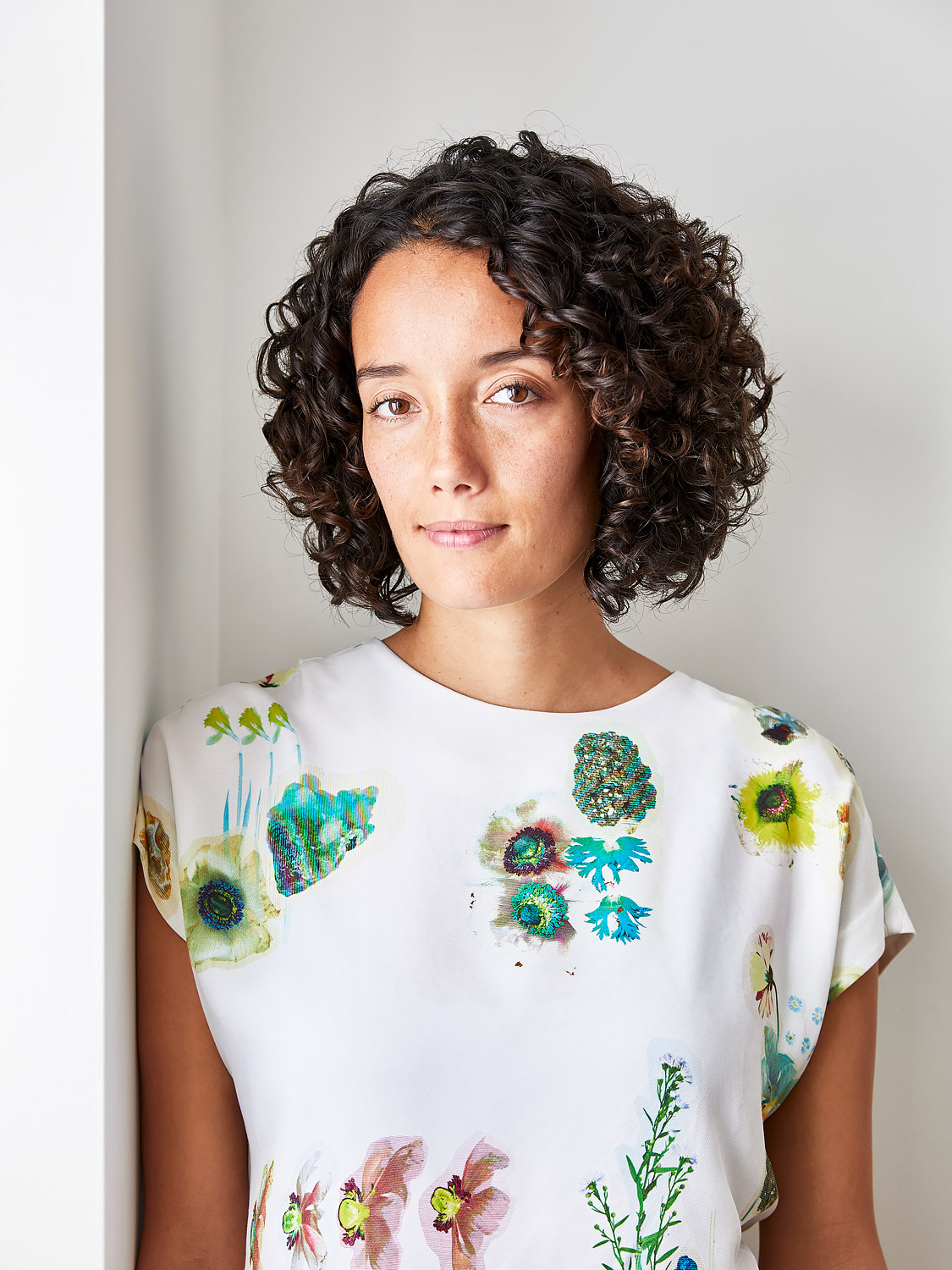
Amy Moorea Wong is a color authority and contemporary interior design writer who has specialized in all things decorating for over a decade. Amy is Livingetc magazine’s Colour Expert, Interiors Editor at The Glossary magazine and a Contributing Editor at Homes & Gardens magazine, and she frequently contributes to an array of global publications to share her insights on interior design zeitgeist. Her book Kaleidoscope: Modern Homes in Every Colour explores a collection of cool colorful homes fizzing with creativity, surprises, and inspiration.


