4 Warm Color Schemes to Decorate With That Bring the Heat (Even in the Middle of Winter)
From obvious reds and yellows to more nuanced shades, there are plenty of ways to add warmth to your space through color

The Livingetc newsletters are your inside source for what’s shaping interiors now - and what’s next. Discover trend forecasts, smart style ideas, and curated shopping inspiration that brings design to life. Subscribe today and stay ahead of the curve.
You are now subscribed
Your newsletter sign-up was successful
The winter blues have hit hard this year, further underlining the importance of crafting a space that you feel comfortable, warm, and cozy living in. No one wants to come home after a long day to reluctantly remove layers before diving under a blanket. The fastest way forward to a more inviting environment? Introduce a warm color scheme.
Decorating with color is a key way to shift the feel of a room, but with a warm color scheme, you can expect the space to feel comfortable and inviting, instantly. Something about reds, ambers, and deep oranges can be transformative when it comes to creating an ambient atmosphere. Jane Boddy, a color trend expert at Pantone, explains, "A warm color scheme helps people relax and feel grounded, connecting the room to natural, earthy elements."
However, warmth doesn't have to be bold or heavy — it can be gentle and layered, enhancing richness and a sense of intimacy without being overwhelming. Olive greens make a surprising addition, along with aubergine purples and mocha browns. Basically, there's room to be creative on the warm side of the color wheel, and a lot to gain stylistically. Here are a few warm color schemes to get you started.
Article continues below1. Reds and Yellows
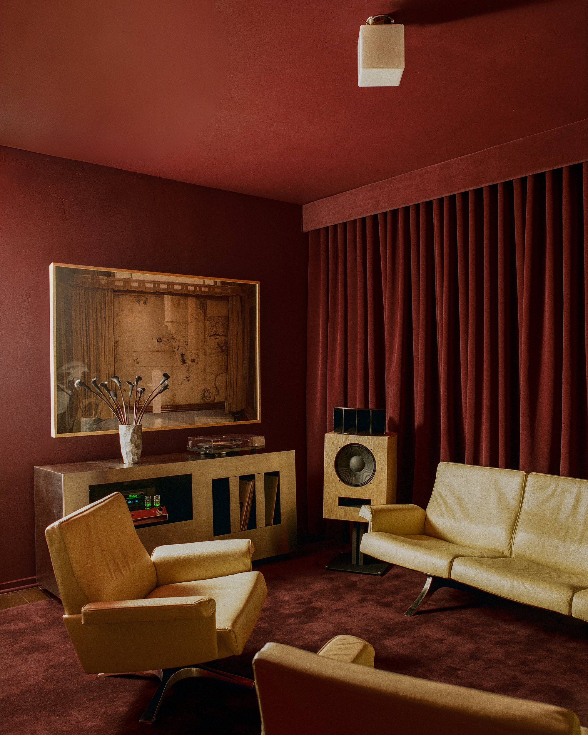
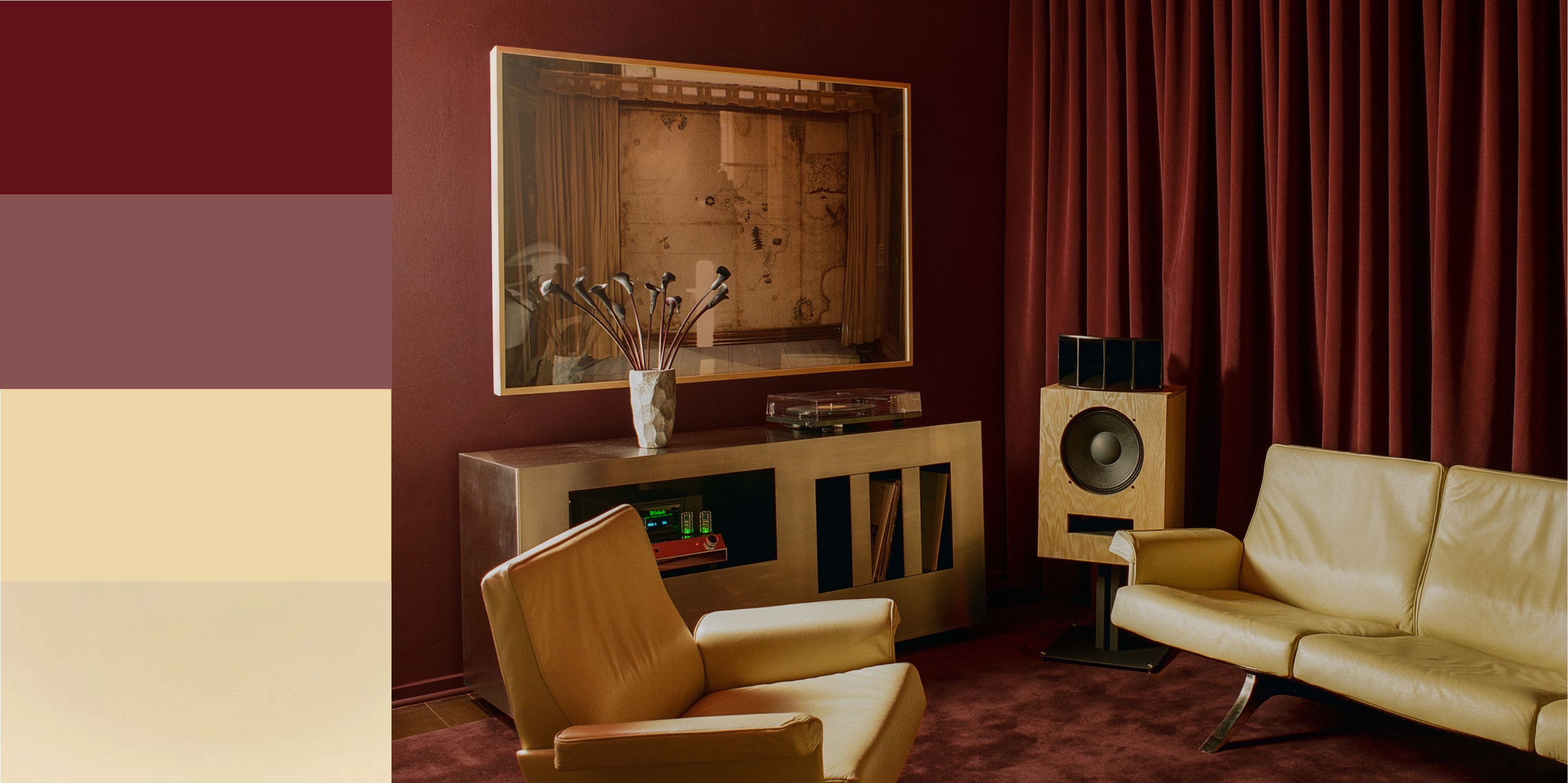
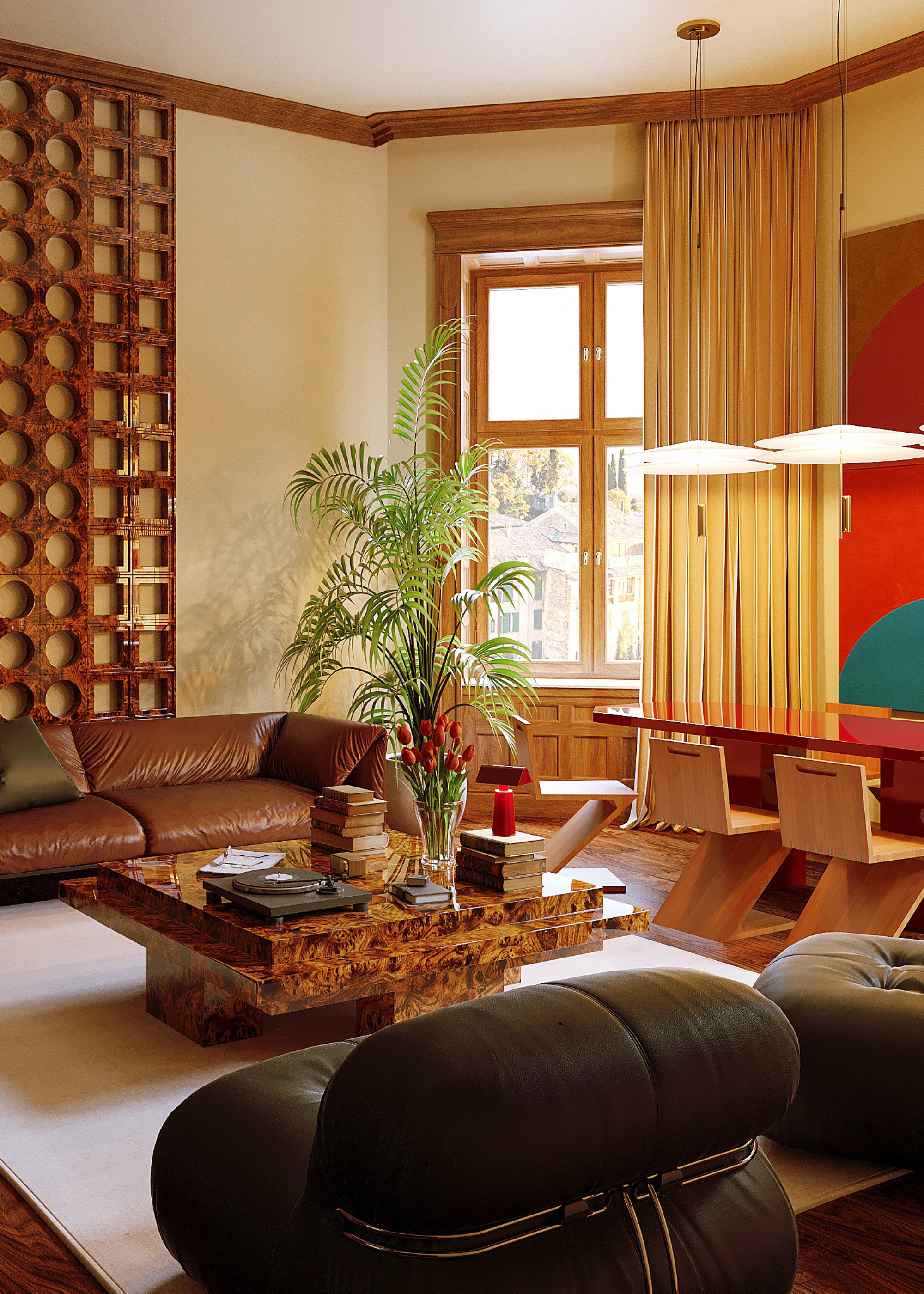
This living room uses a warm color palette to create drama while still feeling comfortable.
Pairing red and yellow together is one of those design choices that can lean either way. Will your space feel too elementary, or will it become a serendipitous scheme? With the right chroma balance, a red-and-yellow palette is one of the most design-forward warm color schemes.
"It's all color theory, really," interior designers Joelle Kutner and Jesse Rudolph from Ome Dezin tell me about mastering this primary pairing. "It's about getting the balance right; balance in tone and hue, as well as the placement of each color in the room."
For instance, a deep burgundy color-drenched room is an intense but rewarding base. An ochre-yellow that is dark and leans orange will create a cocooning, moody environment, while a crisp butter yellow will bring brightness and balance.
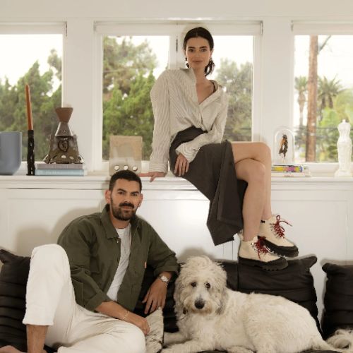
Joelle Kutner and Jesse Rudolph are the co-founders of Ome Dezin, a Los Angeles-based design studio established in 202. They specialize in restoring the character-driven homes of Los Angeles and design around a base of natural colors and materials, creating a unique character with timeless appeal.
2. Browns and Caramels
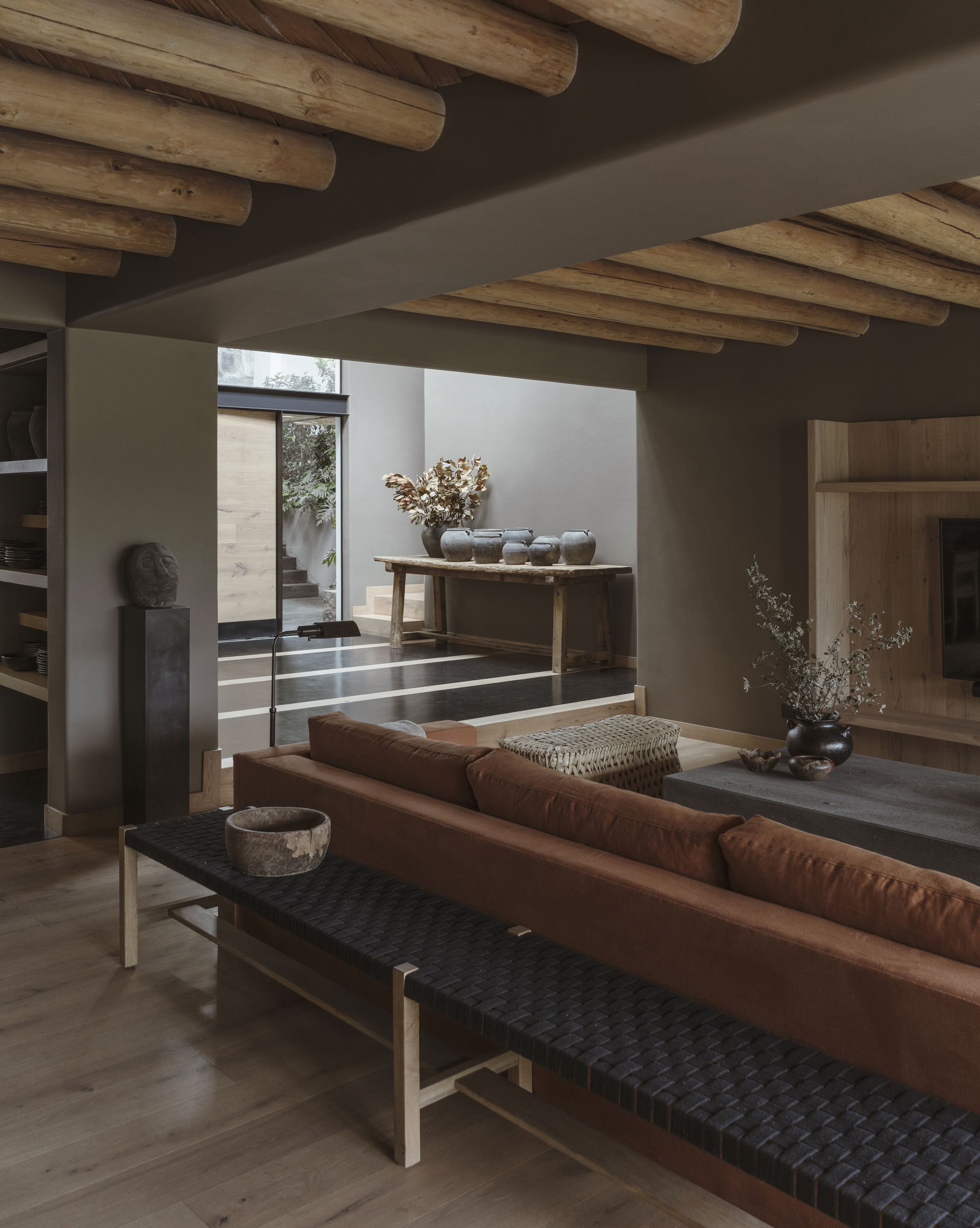
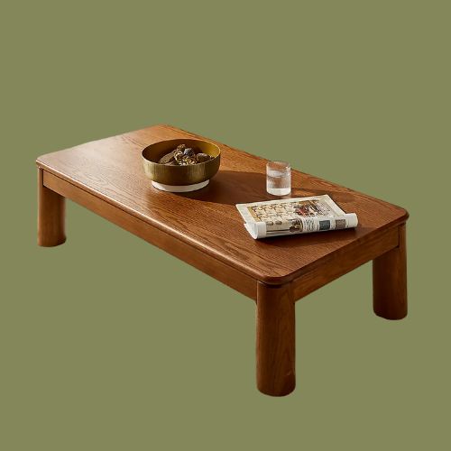
Brown doesn't have to feel dark and enclosed; natural colors with warm undertones help a space feel cozy rather than harsh.
If you've been loving the chocolate brown color trend, you're in luck. "For another warm color scheme idea, I recommend pairing browns, caramels, and soft oranges because they create a warm, earthy base that feels cozy," says Pantone's Jane Boddy.
The Livingetc newsletters are your inside source for what’s shaping interiors now - and what’s next. Discover trend forecasts, smart style ideas, and curated shopping inspiration that brings design to life. Subscribe today and stay ahead of the curve.
These natural, yet deep tones add coziness and a relaxed feel, with a lived-in energy. "Decorating with browns, caramels, and the occasional cream brings a sense of ease to a space," adds Joelle. "It softens edges, invites lingering, and creates an atmosphere that feels collected rather than overly styled."
To keep the palette modern and not too heavy, try adding warm grays and charcoals. "These help soften the colors and give the space a balanced, up-to-date feel," adds Jane.
As for where to bring in the browns, there's no wrong way to do it, but Jane says, "These types of warm color palettes are great for cozy living rooms where people gather and relax, giving the room a sense of friendliness and comfort."
A pivotal figure at the Pantone Colour Institute, Jane contributes to trend publications and serves as the European Creative Director for Pantone’s Interiors annual trends publication, Pantone View Home and Interiors. Her approach to forecasting color focuses on observing current events and cultural trends to understand how perceptions of color are evolving.
3. Off Whites and Warm Accents
Off-whites come to life in warm color schemes with plenty of light.
If you're after a palette with a little less intensity, then start with a warm, off-white base and build from there. "Off-whites are great for making a color scheme look sharper and clearer, helping the warm tones stay fresh and not too heavy," explains Jane. This can be especially helpful as a paint color choice for north-facing rooms, as it will effortlessly brighten the space.
"It's interesting to notice how these colors shift throughout the day," notes Jane. "In rooms with little natural light, warm colors can feel even richer, while brighter lighting makes them appear lighter." Make sure you have the right (and matching) undertones is essential when pulling off a stylish warm color scheme.
For a more modern touch, muted reds and soft yellows work well as accent colors. "They add gentle contrast and a bit of freshness, while still fitting nicely with the overall warm palette," says Jane.
Alternatively, you can always play it a little softer when choosing colors that go with cream, while still staying warm — yellow-based olive greens, warm aubergines, or camel tones work great here.
4. 70s-Inspired Shades
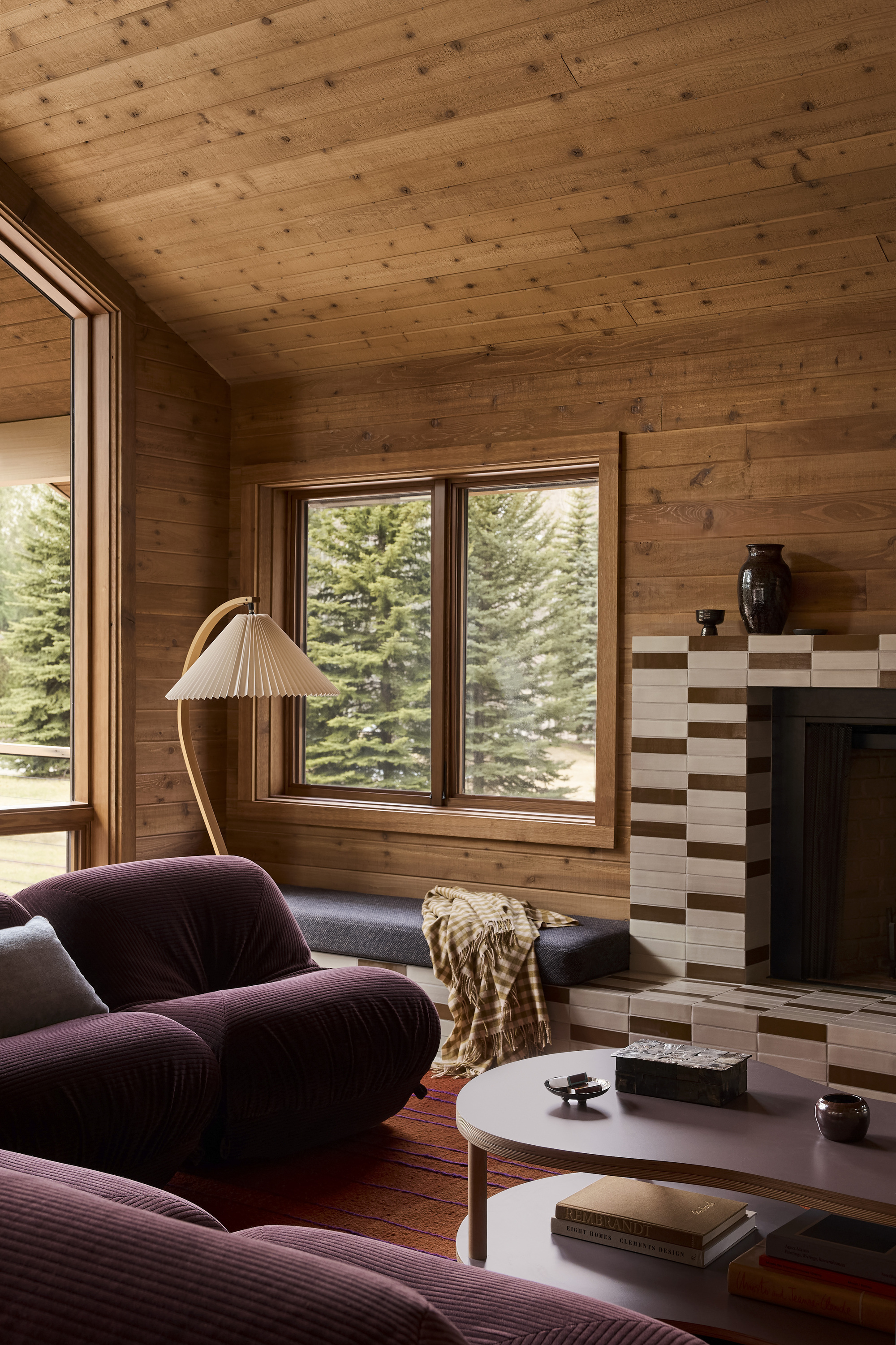
This living room has gone all-out 70s with deep purples and reds, next to warm woods and soft browns.
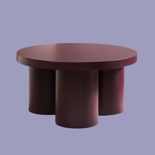
When in doubt, palettes inspired by the 70s always work well for warm color schemes. "70s color palettes often use rich, earthy tones that feel both nostalgic and modern," says Jane. Think olive greens, moody purples, butter yellows, and a pop of orange or red.
Nothing warms a space like a touch of nostalgia, and vintage-inspired colors will do just that. Plus, the groovy era has a dual nature that you can lean into for a design idea. Go full-on disco for a sexier atmosphere, while leaning into the outdoorsy side of the decade will bring a comforting, grounded element to your scheme.
"Choosing colors that connect to raw materials and bring warmth in texture and color," adds Jane. "And color schemes based on natural materials like stone, wood, clay, and ceramic always feel timeless and grounded."
"Warm tones have a way of feeling familiar, comforting, and human. They ground a room so it feels like a place meant to be inhabited, not just admired," says Joelle.
So while you're deciding whether you're a warm vs cool color kind of person, these palettes are a great jumping-off point for a comfort-forward space.

Olivia Wolfe is a Design Writer at Livingetc. She recently graduated from University of the Arts London, London College of Communication with a Masters Degree in Arts and Lifestyle Journalism. In her previous experience, she has worked with multiple multimedia publications in both London and the United States covering a range of culture-related topics, with an expertise in art and design. At the weekends she can be found working on her oil paintings, reading, or antique shopping at one of London's many vintage markets.


