6 Kitchen Colors That Interior Designers Are Quietly Moving Away From in 2026 — And What They're Backing Now, Instead
From teal-inflected blues to layered material grays, these are the kitchen colors stepping in

The Livingetc newsletters are your inside source for what’s shaping interiors now - and what’s next. Discover trend forecasts, smart style ideas, and curated shopping inspiration that brings design to life. Subscribe today and stay ahead of the curve.
You are now subscribed
Your newsletter sign-up was successful
If trends didn’t switch up every season or so, they wouldn’t be a trend at all. Sadly, color trends change faster than most of us can afford (or want) to change our kitchens, so it pays to stay ahead of the game. A quick scroll through the latest kitchen color trends makes it clear that the most popular palettes are shifting.
That doesn’t mean every shade you loved five years ago is suddenly awful; thankfully, kitchen palettes tend to evolve rather than disappear overnight. This year, designers are leaning away from high-drama saturation and retina-bursting neutrals toward tones with nuance, depth, and emotional range. It’s less about making a splash for the sake of your socials and more about atmosphere and how a space holds light, layers materials, and helps you relax in your home.
This feature isn’t about shaming past choices — we’ve all had our regrets — but more about identifying what’s slowly aging out and what’s stepping up on the longevity front. Consider it a reality check on outdated hues, and a guide to the colors shaping kitchen trends right now.
Article continues below1. JET BLACK
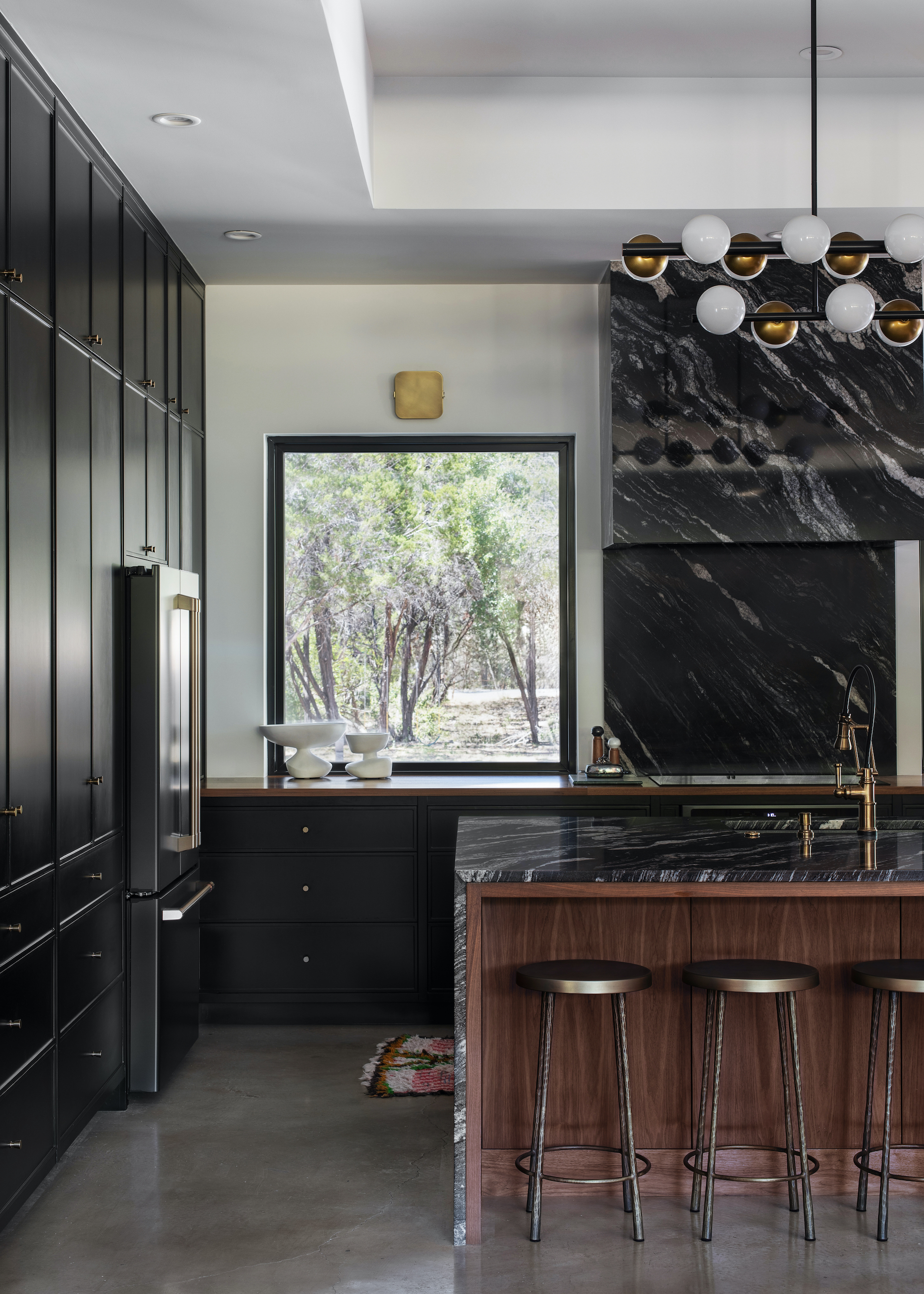
DO INSTEAD: Layer in warmth and tonal contrast so dark cabinetry anchors rather than dominates.
Jet black kitchens have long been shorthand for cool-kid confidence — sharp, architectural, perhaps a little imperious. But go too far, and the look starts to read dense rather than directional. In real homes (especially the light-starved, north-facing variety), uninterrupted black can flatten spatial depth, swallow daylight, and make even generous layouts feel cramped.
“Jet black kitchens remain striking and modern, but without thoughtful layering, they can start to feel heavy or flat. Black absorbs light and visual energy, so when it’s applied too uniformly, it risks overwhelming the space rather than defining it,” agrees Lindsie Davis, founder of Blueberry Jones Design.
The shift now is toward using black with intent, as a grounding device within a richer material composition rather than the headline act. The effect is softer, more dimensional, and a little less haughty.
“The key is balance. In this kitchen, black cabinetry acts as a quiet backdrop, allowing warmer materials to bring depth and livability while also letting the large windows take center stage," explains Lindsie. “The dark cabinetry visually recedes, framing the natural surroundings outside and emphasizing the connection to the landscape rather than competing with it.”
The Livingetc newsletters are your inside source for what’s shaping interiors now - and what’s next. Discover trend forecasts, smart style ideas, and curated shopping inspiration that brings design to life. Subscribe today and stay ahead of the curve.
Handled this way, black becomes less about stark contrast and more about atmosphere. “Material layering is what gives black kitchens longevity. Pairing black with richly grained wood, honed stone, and warm metals creates dimension while maintaining a clean, modern edge,” concludes Lindsie.
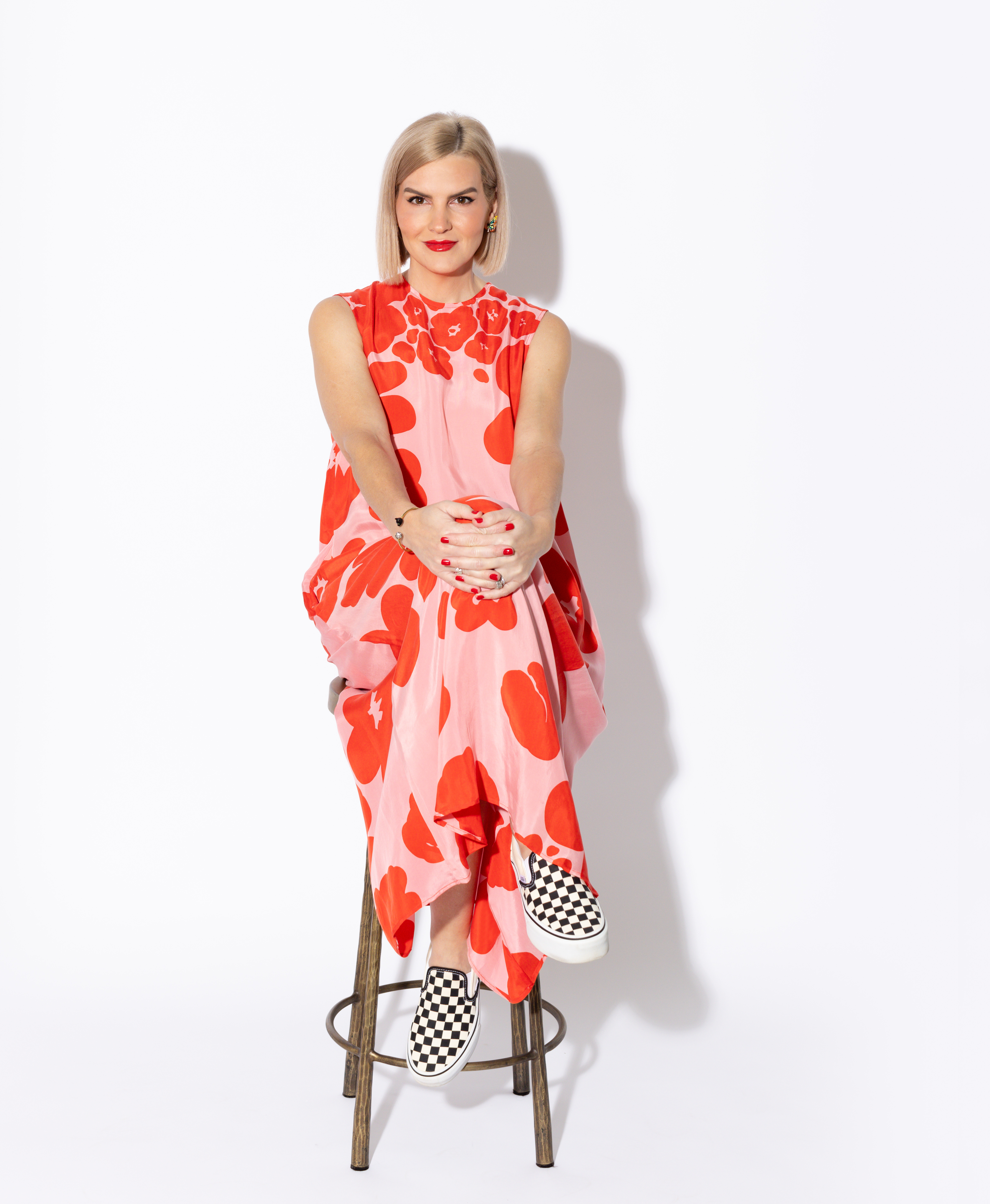
Lindsie Davis is founder and principal designer of Blueberry Jones Design, based in Texas, USA. With a degree in visual studies, specializing in printmaking, Lindsie embraces unexpected, playful moments and isn’t afraid of bold palettes, often treating pattern as a neutral foundation within her schemes.
2. NAVY BLUE
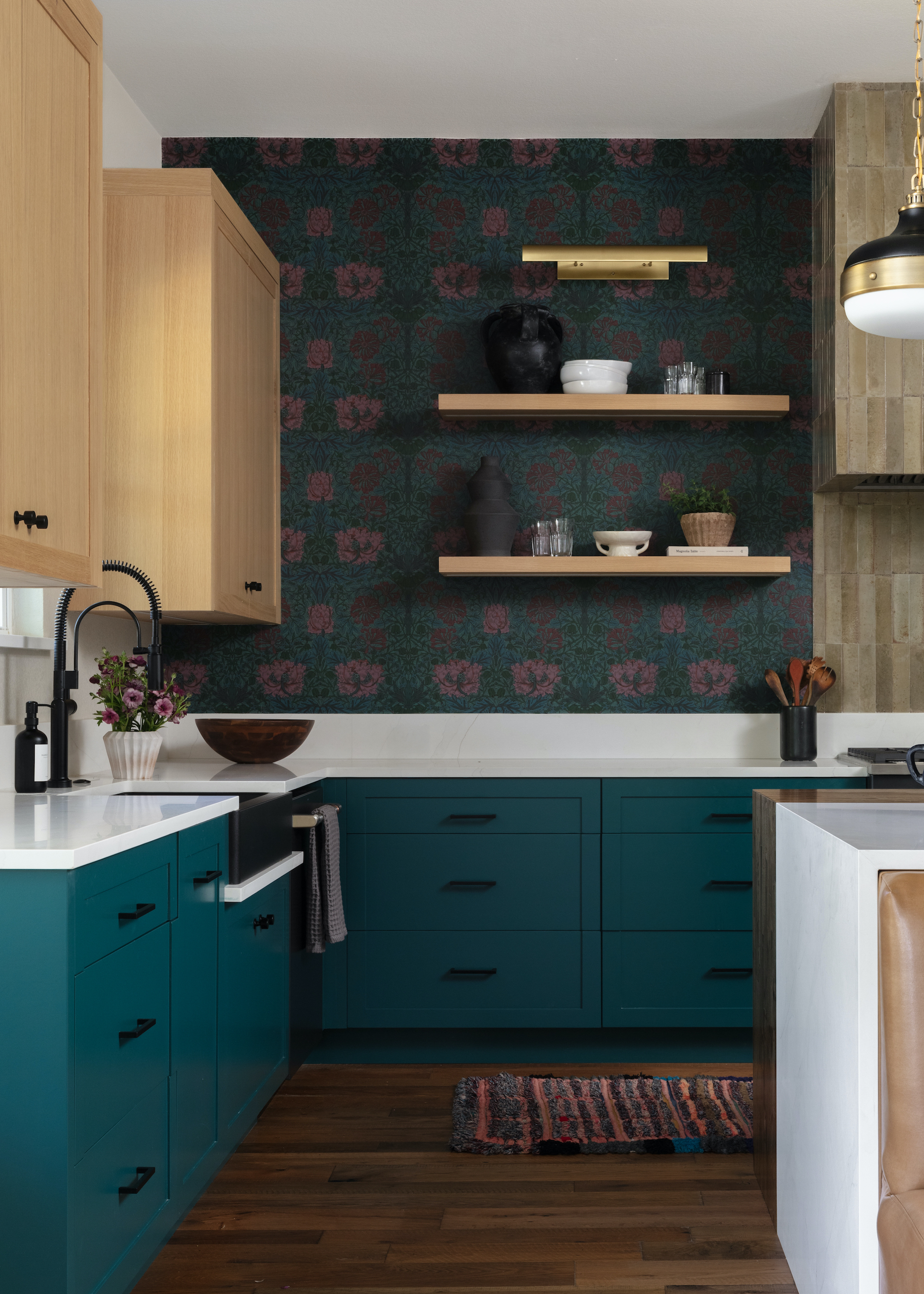
DO INSTEAD: Shift toward teal-leaning blues with tonal depth and material warmth.
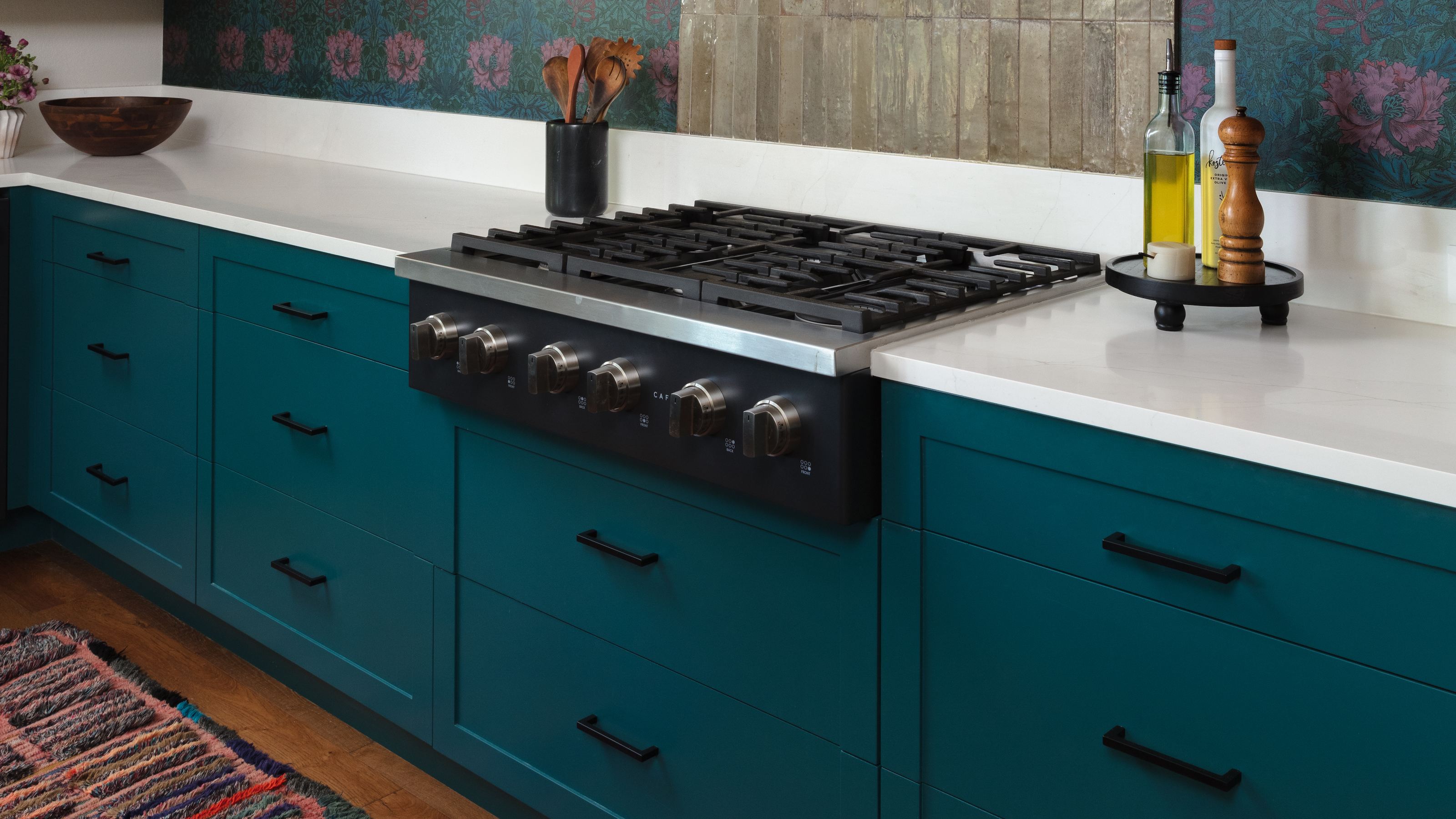
Navy has enjoyed a long reign in kitchens. Dependable, polished, and, for several years, landing as an adventurous choice. But familiarity has dulled its edge. Where it once signalled tailored sophistication, it’s now coming across as slightly snoozeville, particularly when used in flat slab expanses or paired with predictable marble-and-brass blah. Designers aren’t abandoning blue altogether for 2026; they’re simply nudging the spectrum toward something more nuanced.
Complex, teal-inflected blues are stepping in as the modern successor. These tones carry the same richness but behave differently in light, introducing movement and warmth that prevents cabinetry from feeling static or overly formal.
“We are now seeing gravitation towards bluer-green, teal-leaning tones, as these offer greater depth while still delivering richness,” agrees Lindsie Davis, of Blueberry Jones Design.
“What makes a teal-based blue feel fresher is its complexity. Unlike traditional navy, which can read flat or overly formal, these hues shift with the light revealing subtle warmth and variation throughout the day. That movement gives the color a softer, more contemporary presence that feels less rigid.”
To keep teal kitchens from feeling retro (and thus too trend-sensitive), material selection is key. “Pairing with warm woods, neutral/natural tones, warm metals, or even contrasting jewel tones will create contrast that feels elevated rather than nostalgic. Avoid pairing them with high gloss finishes or overly saturated companion colors, like red or harvest gold, as these can push the palette toward a mid-century or vintage read,” she says.
3. STARK WHITE
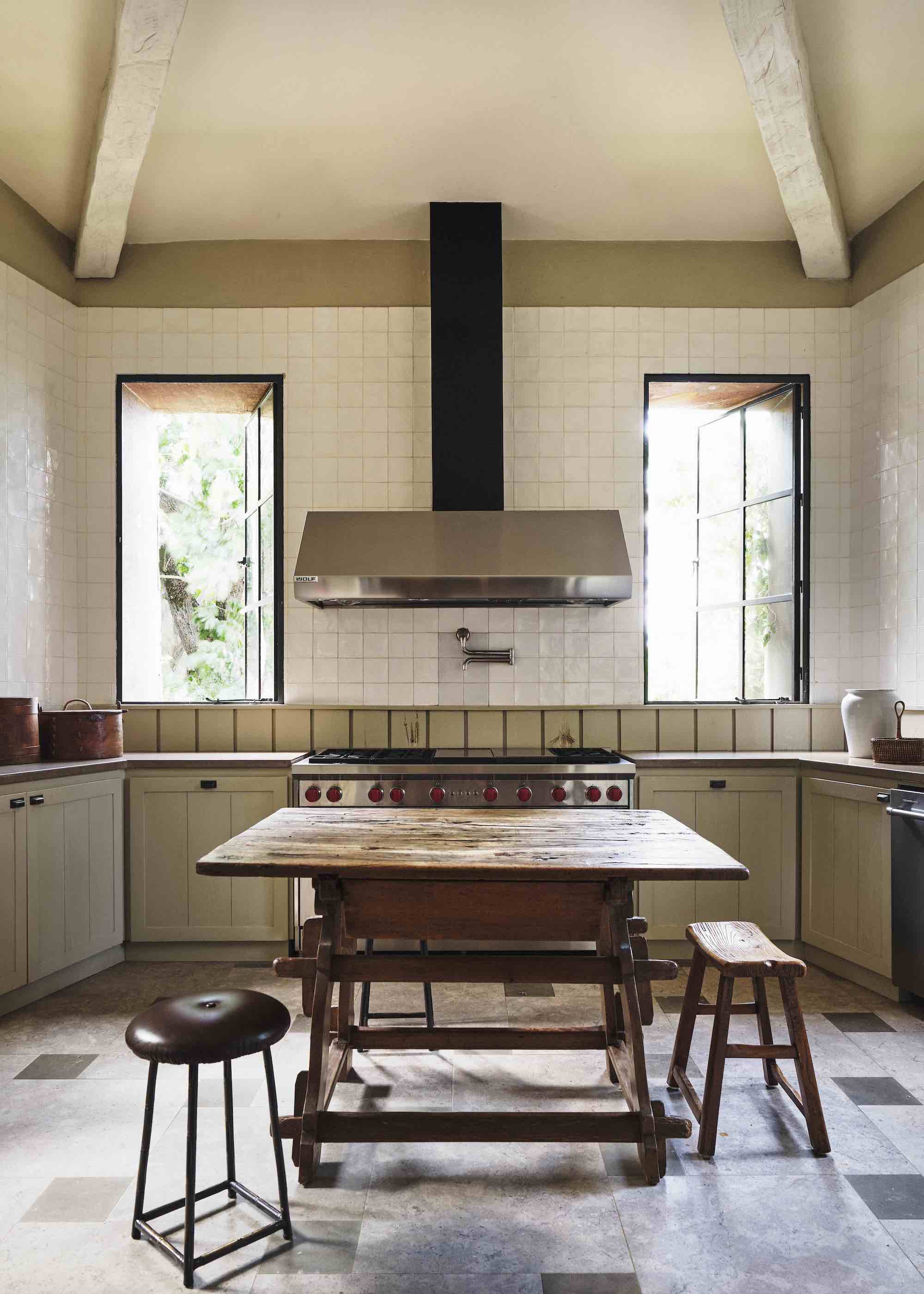
DO INSTEAD: Choose warmer off-whites that soften light and add depth.
For years, bright white kitchens have been nothing short of iconic. Fresh and clean, like a high-brow art gallery full of achingly trendy people, white kitchens screamed too-posh-for-dirt living. But reality bites, and the pendulum is swinging, with designers questioning whether such unrealistic levels of purity and hygiene deliver the comfort levels we now want from our homes (even those who never sully themselves with actual cooking).
“Pure white kitchens photograph beautifully, but in daily life they often read cold, glare under strong lighting, and show every mark. I think people are craving spaces with more warmth and texture. When everything is stark white, you lose that sense of grounding; the room stops feeling human and starts feeling clinical,” says architect Jeffrey Dungan.
The issue isn’t white itself, but its intensity. High-reflective finishes and cool undertones can amplify glare, flatten surfaces, and highlight wear in ways that quickly undermine the intended calm. Chalky ivories, creamy limestone whites, and subtly pigmented neutrals are the answer.
“A warmer off-white absorbs light rather than reflecting it harshly, so the kitchen feels softer from morning through evening. Under artificial lighting, especially, those undertones prevent the space from flattening out — you get shadow, depth, and richness,” explains Jeffrey. “Warm off-whites create a backdrop that supports natural materials, timber, and patina, allowing the kitchen to evolve gracefully instead of feeling lifeless and static.”

Jeffrey Dungan is an award-winning architect whose work across the United States blends clean modern thinking with traditional and classical vernaculars. A resonant Southern voice in architecture, he has received multiple AIA honours and the Palladio Award. His residential and boutique projects are widely published, and his book The Nature of Home was released by Rizzoli in 2018.
4. FLAT GRAY
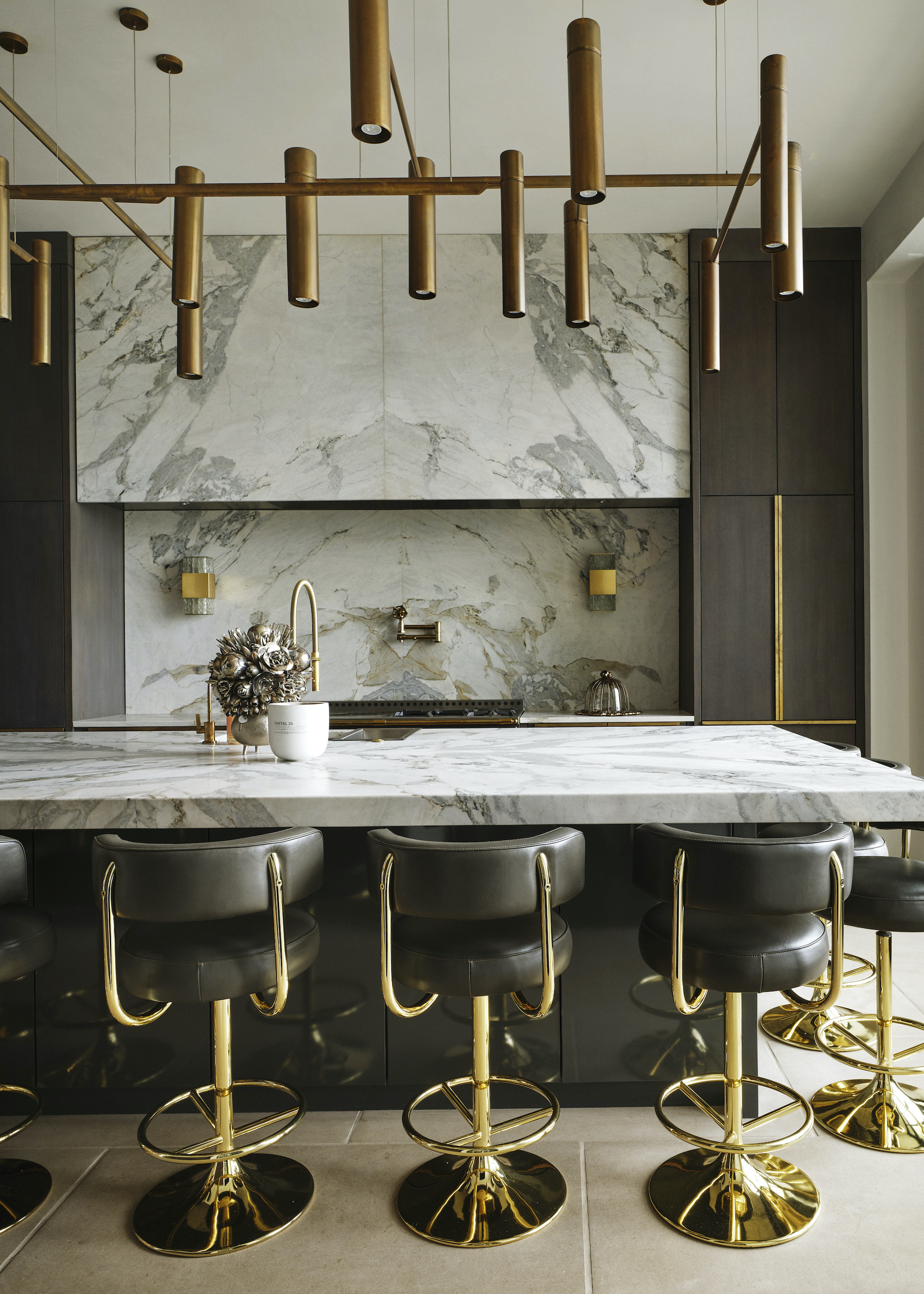
DO INSTEAD: Introduce depth through material-led grays with movement and texture.
Flat gray kitchens once carried a quiet authority, an elegant neutral that was broadly compatible with almost anything layered on top. But the tide is turning, and cool-toned grays are now seriously old news. This is a classic example of what happens when a color becomes too popular.
“Cool, flat grays were embraced because they felt safe and elegant, but they often lack emotional resonance. They have a tendency to feel inert — neither warm nor grounding — and that neutrality can tip into dullness. Today, there’s a stronger desire for palettes that carry material depth and warmth,” explains Jeffrey Dungan.
Rather than abandoning gray altogether (it remains valuable as a grounding tone), designers are reframing how it’s expressed. The focus is shifting away from paint swatches and toward materiality: surfaces where variation, grain, and veining introduce visual energy and tonal complexity.
“Gray becomes compelling when it’s treated as a material story rather than a paint color,” agrees Jeffrey. “Natural stone with gray veining is a great example, as it introduces movement and variation, while darker gray-stained timbers bring weight and contrast. When layered this way, gray stops being flat; it gains shadow, texture, and rhythm. The goal isn’t to eliminate gray, but to let it evolve through depth and craftsmanship.”
5. BRIGHT YELLOW
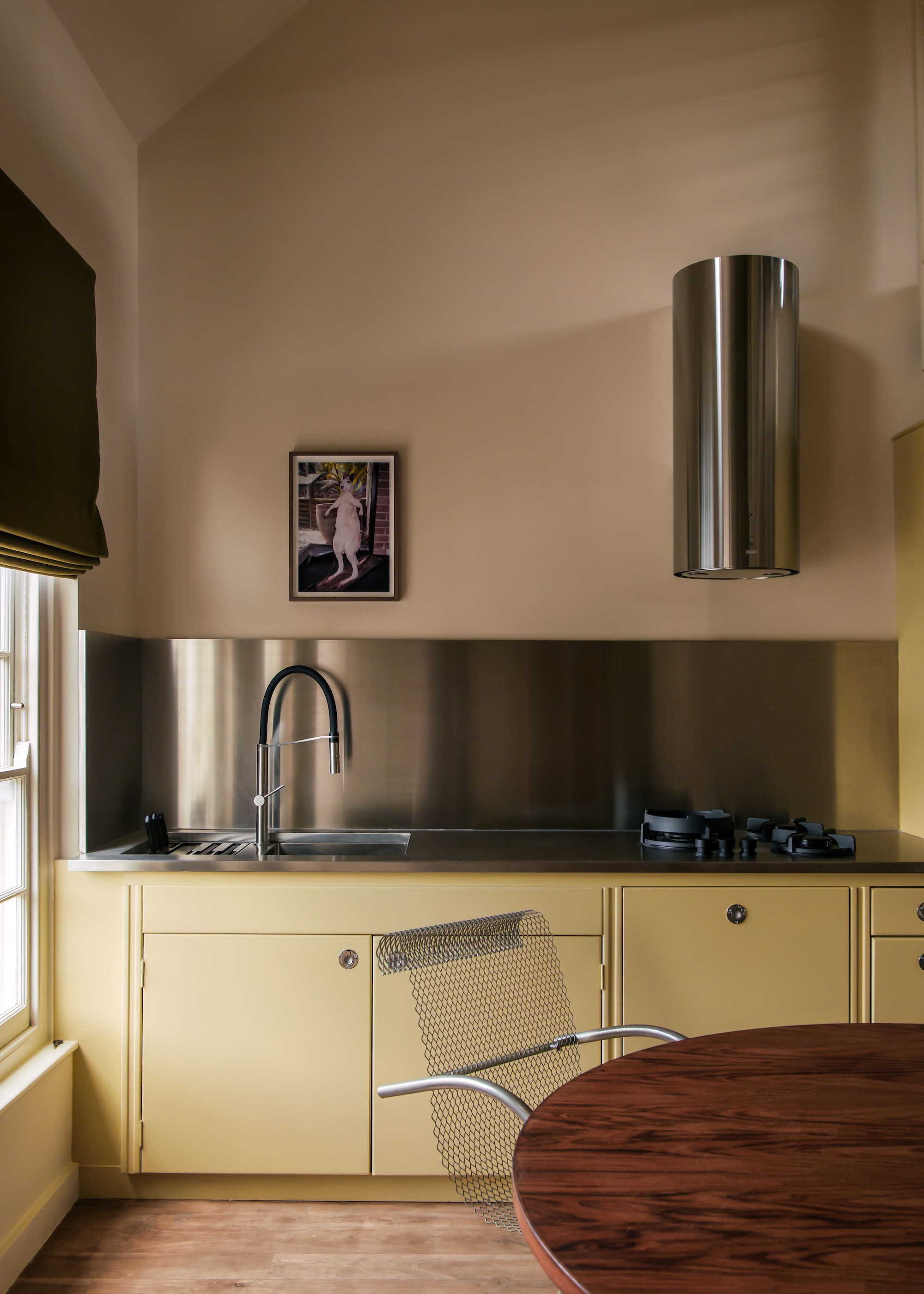
DO INSTEAD: Mellow soft yellows, sharpened with modern detailing.
Sunny-side-up yellows may well put a spring in your step, but they have a habit of dating kitchens all too quickly. While energizing, they can overwhelm cabinetry mass and quickly skew towards novelty if not handled with serious restraint. Best avoided.
The current shift isn’t away from optimism or warmth, but toward tones that feel cultivated and modern — yellows that glow softly rather than give you migraines. Think butter yellow, straw, and custard pigments grounded by architectural restraint and crisp contemporary materials.
In this Covent Garden apartment, interior designer Hollie Bowden demonstrates how to take classic soft yellow in a more contemporary direction. Applied across slab-front cabinetry, the hue feels contemporary, while the graphic clarity of the joinery and cut of the stainless-steel hood prevents the pastel from feeling too feminine.
“We chose this buttery yellow to enhance the neutral palette and add some lustre,” explains Hollie. “The yellow cabinetry paired with the stainless steel and doughy white walls lifts the space with an unexpected freshness.”
The take-home? High-voltage daffodil, egg-yolk, and lemon yellows are quietly exiting stage left. In their place come softer, mellowed options — chalked, creamy, sun-warmed tones that feel gentler on the eye and far easier to layer with timber, stone, and metal. Still heart-warming, but with more longevity baked in.
6. FIRE HYDRANT RED
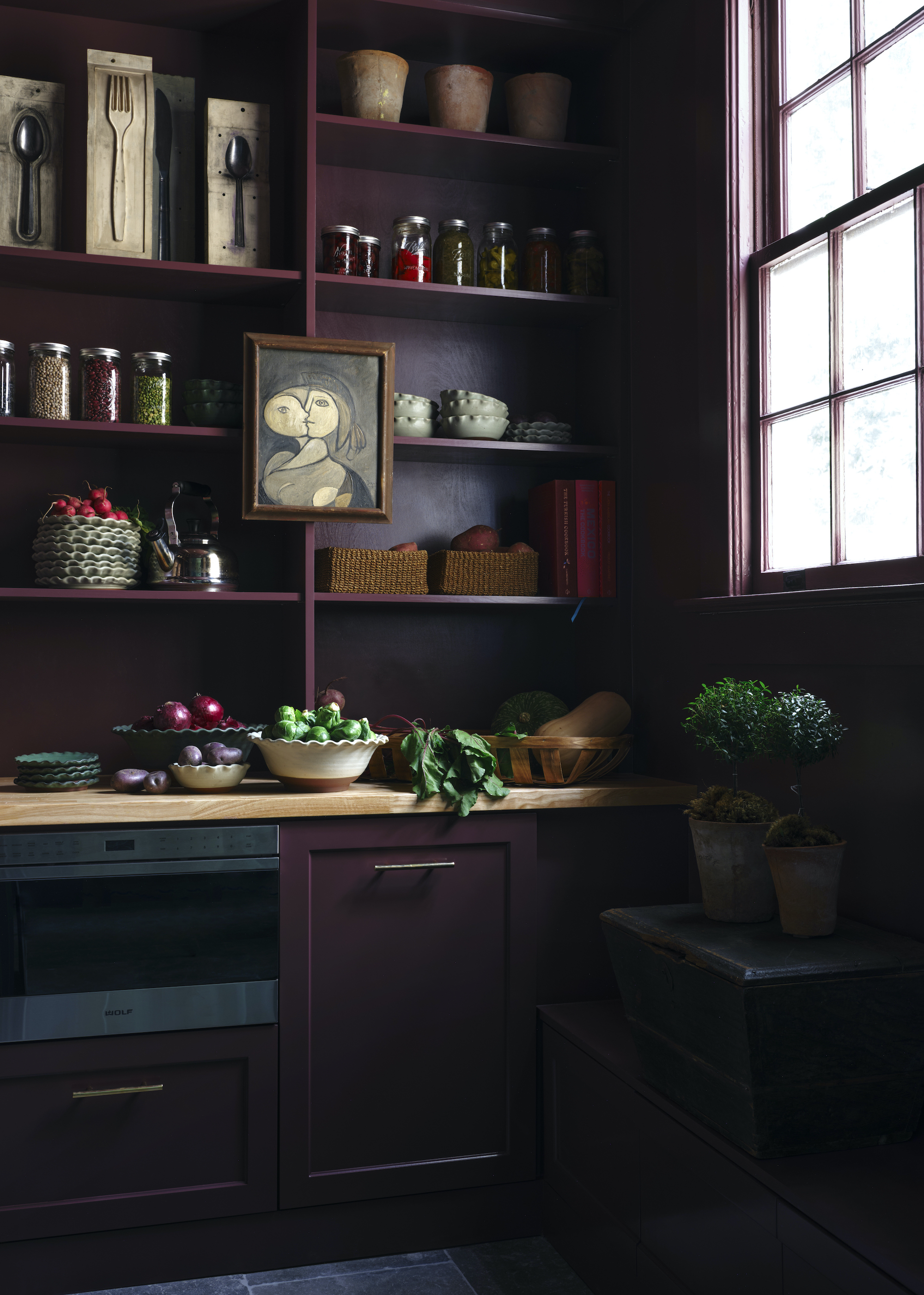
DO INSTEAD: Wine, plum, and aubergine tones that deliver drama with atmosphere and no roadside diner vibes.
High-saturation reds once delivered instant statement value in kitchens, but their traffic light brightness can prove hard to live with on the regs. Where bold red leans graphic and attention-seeking, in an 80s-roadside-diner way, deeper tonal reds and burgundies are emerging as the more sophisticated alternative. We’re talking about grown-up hues rooted in wine, oxblood, and plum that carry warmth while introducing shadow and atmosphere.
In this project by Bradley Odom, Farrow & Ball’s Brinjal demonstrates the move in action, proving how depth can transform red’s emotional register. “This deep, saturated color will envelop a kitchen in warmth, particularly when it flows seamlessly across cabinetry, shelving, and architectural trim,” explains Bradley, co-founder of Dixon Rye. “Here, the plum-toned cabinetry meets the buttery oak countertop to create a space that feels both practical and intimate.”
Crucially, these darker reds sidestep the visual associations that made their brighter predecessors feel so transient — the punchy, logo-ready tones once synonymous with pre-rebrand McDonalds and other commercial palettes. Today’s take on red is more nuanced, with colors that cocoon and are firmly residential, not retail.
Understanding the shift away from outdated color trends helps you make choices that feel current and stay that way longer. After all, the eco-responsible goal for any kitchen reno isn’t chasing trends, it’s creating a palette you’ll love until it’s genuinely time to upgrade.

Linda is a freelance journalist who has specialized in homes and interiors for more than two decades, and now writes full-time for titles like Homes & Gardens, Livingetc, Ideal Home, and Homebuilding & Renovating. She lives in Devon with her cabinetmaker husband, two daughters, and far too many pets, and is currently honing her DIY and decorating skills on their fourth (and hopefully final) major home renovation.


