6 Green Paint Colors to Avoid When Decorating — Including the 90s-Rave-Style-Fever-Dream Green on My Living Room Wall
So I guess it's true — it's not always easy being green

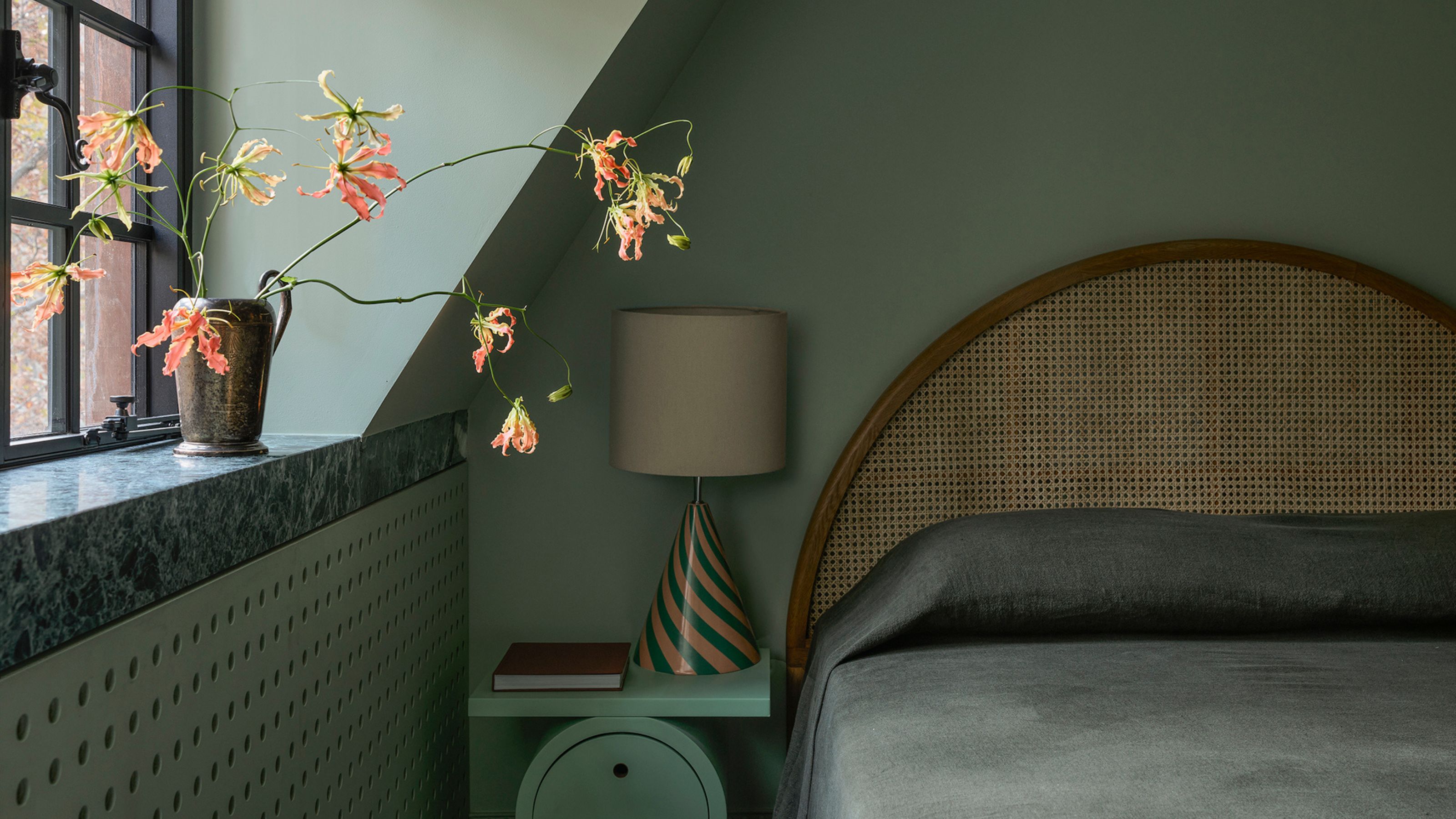
The Livingetc newsletters are your inside source for what’s shaping interiors now - and what’s next. Discover trend forecasts, smart style ideas, and curated shopping inspiration that brings design to life. Subscribe today and stay ahead of the curve.
You are now subscribed
Your newsletter sign-up was successful
As the color symbolizing the verdance and vitality of nature, green is timeless and complements many other colors, textures, and materials, but there are some green paints that designers would recommend avoiding.
Decorating with green brings nature inside. The right shade should be both grounding and rejuvenating, enlivening and soothing, and create an atmosphere that feels calm yet quietly alive. It should gently blur the boundary between the indoors and outdoors, creating its own landscape. Rather than seeming enclosed, it should feel open, breathable, and deeply connected to the world beyond the walls.
But green decorating mistakes happen. I know this firsthand — it’s a harrowing tale. Last week, my partner (very sweetly) decided to paint the living room green as a surprise for me. The hue he chose I can only describe as ‘Highlighter Pen Green’. I only just survived with my retinas intact. The green I swiftly covered it in is deep and rich with a hint of yellow that comes through beautifully in the daylight, like a contemporary, more forest-y take on olive. It makes the space feel easy, cocooning and curated, rather than a 90s rave-style fever dream.
Article continues belowTo save you from my fate, I spoke to six designers on the greens to avoid and the exact paints to choose instead. Here’s what they have to say.
1. Army Green
Earthy greens we are all for, but covering the walls in a green that looks like it’s been pulled from a bog is a step too far — which is why Army Green is on the no-no list. Muddy, dark, and dense, the color shrouds rooms in gloom, feeling flat and dull as well as utilitarian, and making spaces seem smaller and a tad downtrodden.
Use Instead: Hawthorn Limewash, Bauwerk
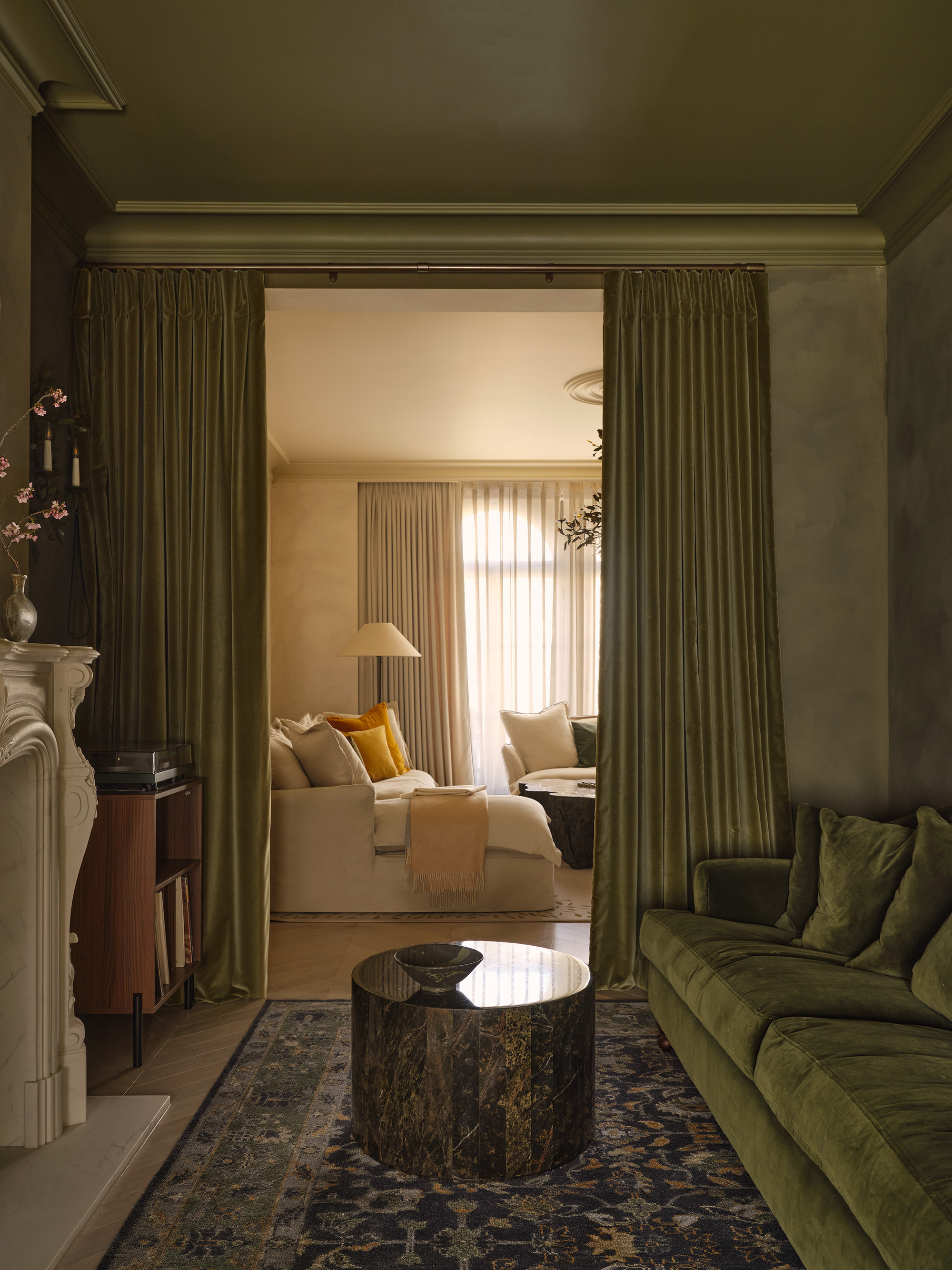
It brings balance to a space while adding warmth and tactility, which is key in interiors designed around wellbeing," says Eris Koutsoudakis.
Bauwerk's Hawthorn homes in on yellow-olive undertones rather than the brown-gray that dominates Army Green. Botanical rather than earthy, it feels gently sunlit, and is clear, lively, and rich, like it’s been growing in a breezy allotment rather than a military barracks.
"A warm, rustic olive green with a soft, mineral depth, Hawthorn feels calm, natural, and timeless," says Eris Koutsoudakis, co-founder of interior design firm Meraki Design. "Its muted, muddy quality makes it feel steadying and restful rather than decorative."
The Livingetc newsletters are your inside source for what’s shaping interiors now - and what’s next. Discover trend forecasts, smart style ideas, and curated shopping inspiration that brings design to life. Subscribe today and stay ahead of the curve.
"The color pairs beautifully with natural materials such as oak, walnut, marble, and linen," he tips. "Soft off whites, warm neutrals, clays, and deeper natural stones all complement it effortlessly, or envelop a room with it to create a cocooning, cozy atmosphere."
Believing that thoughtful design has the power to shape how we live, Eris, the co-founder of interior design firm Meraki Design, creates calm, timeless spaces shaped by architecture and materiality.
2. Icy Aqua
Aqua is a very blue-based green, perhaps the coolest, crispest take on green there is. In the home, it’s particularly happy in bathrooms where it brings a toothpaste-y take on cleanliness and sterility, but Icy Aqua pushes that extreme one step further — like a blast of arctic wind, this paint shade is pale, brutally cold, and clinical.
Use Instead: Aganthus Green, Benjamin Moore
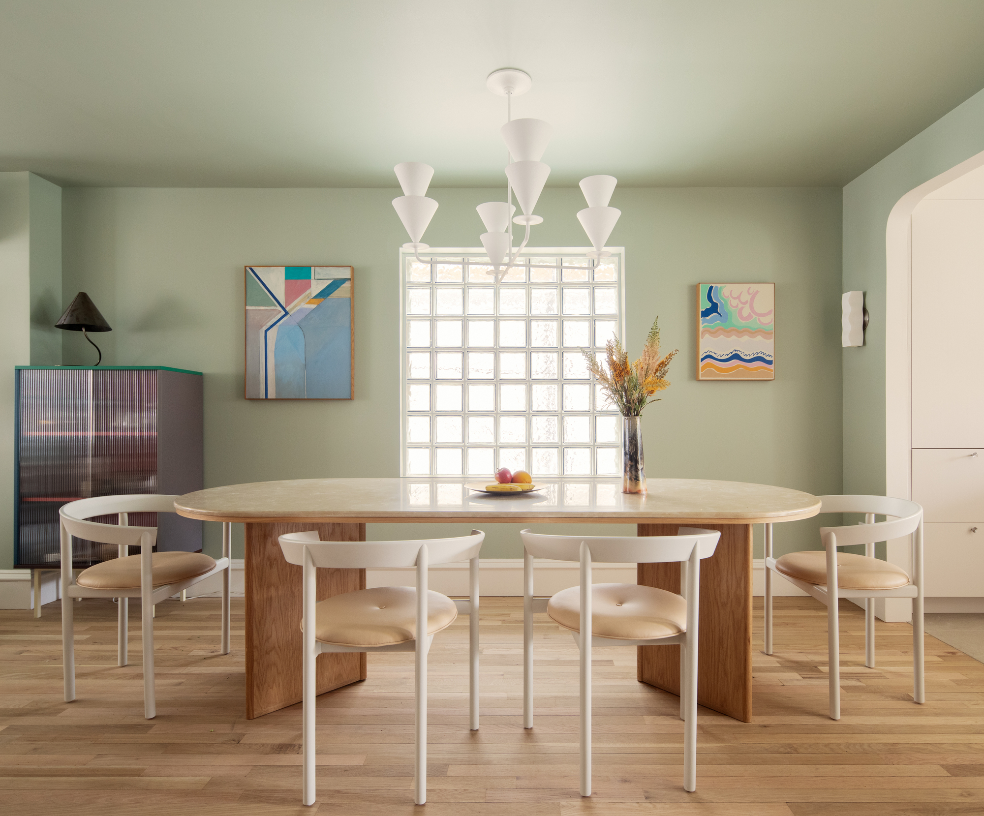
"Try styling it with sculptural furniture and expressive lighting to make it feel timeless rather than nostalgic," says Rachel Robinson.
A pale celadon, Benjamin Moore's Aganthus Green is fresh and clean — but it’s peacefully subdued with gray and earthy undertones, more like a garden under mist or frost than Icy Aqua’s piercing coldness.
"Aganthus Green is a soft, silvery green with a gentle gray undertone — calm, nuanced, and neutral," says Rachel Robinson, architect and founding partner at architecture and interior design studio Dunham Robinson. "It’s incredibly adaptable, shifting with the light without calling attention to itself."
"This calming, neutral green works well against light woods, warm off-whites, honed stone, ribbed or textured glass, and softer neutrals like cream or putty," she adds.
3. Neon Green
To confirm: Neon greens and walls should not be friends. Such lime-infused sharpness feels visually cutting and almost aggressive across a large surface, its yellow and fluorescent undertones making it acidic, brash, and intense as well as giving it an artificial, digital feel.
Use Instead: Meadow, Volvox Espressivo Clay Paint
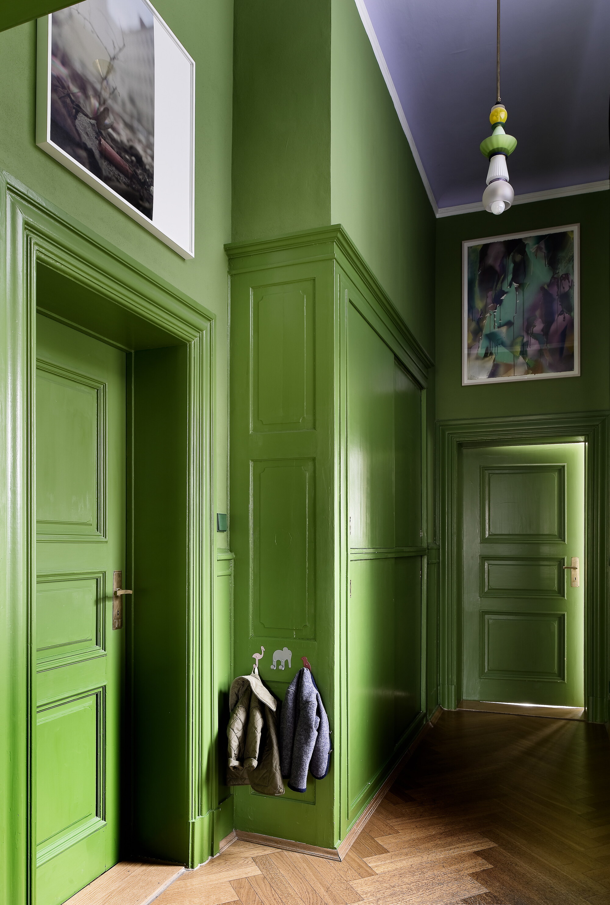
Volvox Espressivo Clay Paint's Meadow is natural with a hint of zestiness about it.
Meadow still creates impact, but with significantly less yellow in it than the neon alternative, it has a natural aura rather than a hue that’s fizzing with electricity. It’s newly opened, leaf-luminous in a lush, all-natural way.
"Meadow is a deep, vivid green with an organic density — neither nostalgic nor decorative," say Johanna and Friedrich Gräfling, founders of the design studio Gräfling. “The color feels centering, tactile, and quietly confident, rather than applied.”
"Meadow stabilizes rather than stimulates, reminding us of balance, regeneration, and harmony," they add. "It’s ageless with a sense of calm, framing everyday moments with ease and optimism."
4. Dark Moss
With brown and gray undertones, moss is an earthy, pared-back green with hints of yellow-y olive, and on a wall, it feels firm yet fresh. But Dark Moss leans much more brown than gray, making it absorb huge amounts of light so it feels heavy and oppressive (in low light, it practically suffocates).
Use Instead: Fitzwilliam Square by Róisín Lafferty, Prestige by Fleetwood
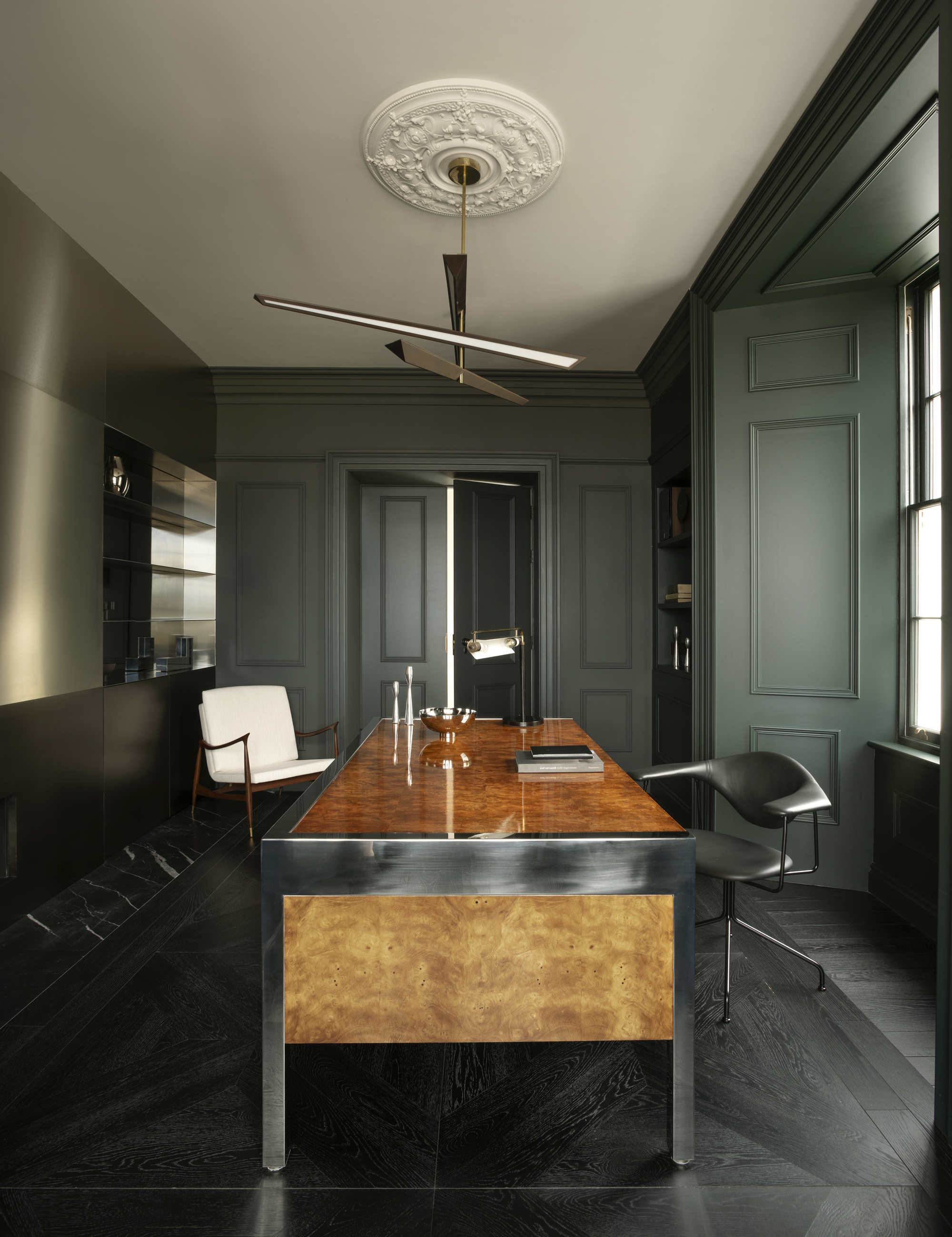
"It’s a deeply sophisticated green with a luxurious depth that feels grounding and tranquil," says Róisín Lafferty.
With a dash of brown that enhances rather than dominates the shade, Fitzwilliam Square has a similar deepness to Dark Moss, but with a little more green, making it feel grand and historic and like it has stories and character to the room rather than extracting light and energy.
"It’s a rich, elegant hue that harmoniously intertwines contemporary innovation with perennial charm," describes Róisín Lafferty, founder and creative director of interior architecture design studio Róisín Lafferty, who designed it as part of her Prestige collection with Irish paint brand Fleetwood.
"Inspired by the front door of our Georgian townhouse headquarters in Dublin, it’s an enduring color that lends itself to immersive, architectural use," Róisín explains. "Inside, we’ve used Fitzwilliam Square alongside masculine, tactile materials, layering rich burl maple, chrome, black leather seating, brushed muted brass, bronze accents, and dark timber."
Róisín, founder and creative director of interior architecture design studio Róisín Lafferty, has an affinity for grounded hues pulled from nature with emotional depth.
5. Grass Green
A primary-style shade that’s the type of green a child would use to draw plants with, Grass Green is striking, bright, and clear. In pictures on the fridge, it’s sprightly and vibrant, but scale things up to wall-painting level, and the shade quickly becomes cartoonish, overstimulating, and synthetic.
Use Instead: Herb Bouquet, Benjamin Moore
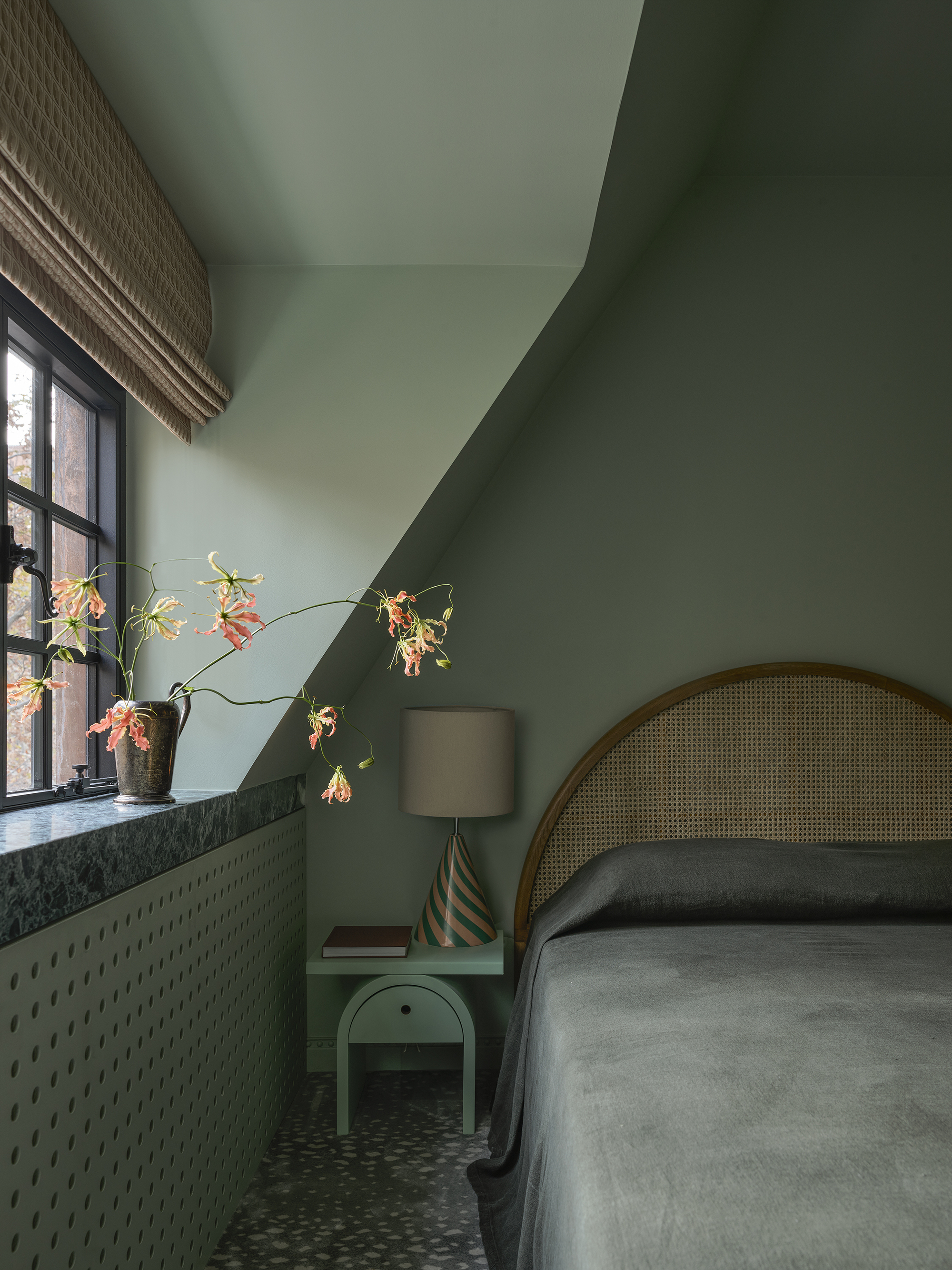
"It works so well in the home because of its restful, understated nature, creating a calm, enveloping ambiance without flattening the space," says Greg Natale.
From the same garden as Grass Green but filled with the gray-toned nuance it is so badly in need of, Benjamin Moore's Herb Bouquet is delicate, pushed back with gray to carry stillness and sophistication. A truly organic color, it’s duly flexible, able to shift between gentle backdrops to refined statements from space to space.
"Herb Bouquet is a subtle, desaturated green with cool gray undertones, giving it a dusty, mineral-like quality," explains Greg Natale, designer and director at interior design studio Greg Natale. "It sits at the quieter end of the green spectrum, feeling refined and atmospheric rather than overly decorative."
"Herb Bouquet lends itself beautifully to a layered, evocative approach and works best when anchored by warmth," he says. "Try styling it within a palette of terracotta, warm beige, and a deeper accent such as aubergine."
6. Sage
Decorating with sage green will go down in history as a color that defines the early 2020s, in much the same way that the mid-2000s was represented by gray and the late 2010s by millennial pink. At this point, we could all probably describe sage in our sleep — a faded green that hints at olive groves and sun-dappled herbs, it typifies balance, peace, and restoration. But aren’t we ready for a new take on gentle green?
Use Instead: Pompeian Grey, Little Greene
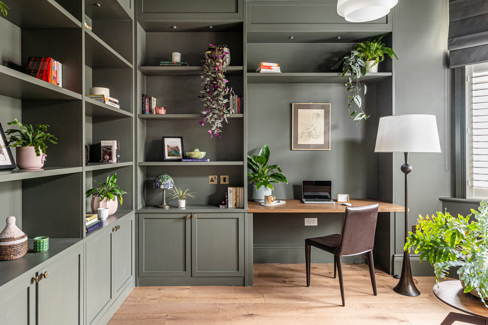
"It has a discreet confidence to it: rich enough to add depth, but restrained enough to feel timeless," says Jenna Forsdyke.
Little Greene's Pompeian Grey is more like a deep gray with traces of green, rather than a hue that feels alive and verdant. Cool, restrained, and enigmatic, it trumps sage’s olive hints with a density that’s both dramatic and delicate.
"A soft, muted olive green with a gray undertone, Pompeian Grey feels calm and enveloping rather than overtly bold, sitting somewhere between a traditional heritage green and a characterful, contemporary neutral," says Jenna Forsdyke, senior interior designer at design studio Pfeiffer Design.
"It creates a sense of focus and grounding, allowing architectural joinery and styling elements to stand out, while the color itself gently recedes, making a space feel composed rather than overpowering," she adds. "It works beautifully with warm timber tones, as well as brushed or antiqued metals such as aged brass and bronze, pairing effortlessly with soft neutrals such as warm whites, stone and putty tones, as well as deeper accents like inky browns, charcoal or terracotta."
There are some green room ideas that will always feel fresh, and similarly, there are some that really should be consigned to the decorative scrap heap. Choose complex greens that carry subtle mineral, gray, or earthy undertones that allow them to evolve with light, space, and materials. Evergreens, we call them.
Amy Moorea Wong is a color authority and contemporary interior design writer who has specialized in all things decorating for over a decade. Amy is Livingetc magazine’s Colour Expert, Interiors Editor at The Glossary magazine and a Contributing Editor at Homes & Gardens magazine, and she frequently contributes to an array of global publications to share her insights on interior design zeitgeist. Her book Kaleidoscope: Modern Homes in Every Colour explores a collection of cool colorful homes fizzing with creativity, surprises, and inspiration.


