10 Ways You Can Go Wrong When You're Decorating Your Home With Green — And What to Do to Get It Right
From failing to consider natural lighting to getting the balance or shade completely wrong, designers warn about working with green

The Livingetc newsletters are your inside source for what’s shaping interiors now - and what’s next. Discover trend forecasts, smart style ideas, and curated shopping inspiration that brings design to life. Subscribe today and stay ahead of the curve.
You are now subscribed
Your newsletter sign-up was successful
Green in all its hues is an enduringly popular shade in interiors. Whether it's a lick of paint, a 'pop' of decor, leafy houseplants, or luxuriously verdant soft furnishings, it's a color loved for its natural connotations and it works in pretty much every scheme — except when it doesn't.
Just because it's a commonly used, naturally-occurring, and easy-to-pair shade, doesn't mean decorating with green is always straightforward. If the balance isn't quite right, or the shade is wrong for your space, your home will end up feeling discordant and mismatched.
It's also crucial to think about how green interacts with light and the optimum colors that pair with it. So, if you're planning to use it in your interiors, below, we've shared the green decorating mistakes designers recommend avoiding at all cost. And, importantly, what to do instead.
Article continues below1. Only Considering It for Your Walls
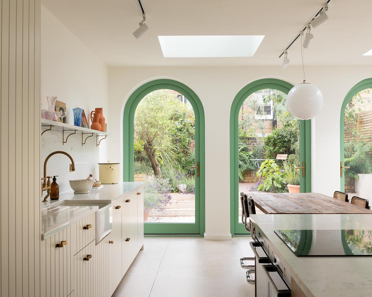
DO INSTEAD: Use green accents to give a space a bit of liveliness.
Playing it safe rather than doing something brave like embracing green accents, such as the playful trim color combo shown above, is a big mistake designers see people make. In the space above, the team at Turner Architects opted for bright green-painted trims that adds vibrancy to the kitchen, drawing attention to the calming curves, and encouraging guests to gaze out into the garden.
"The windows are attempting to frame green views of the garden and the green of the frames, Folly Green by Farrow and Ball, helps with this," explains designer, Paul Turner.
But the color choice goes deeper than just that. "The color has reference to Raphael's fresco, The School of Athens," adds Paul. "Through the design, we wanted to create a conversation pit of sorts, a place defined by a couple of steps down in which the family can gather, cook together, eat together, but most importantly talk, tell stories and share through conversation. We thought it was a good reference to steal a bit of color from."
2. Thinking There Can Be Too Much Green
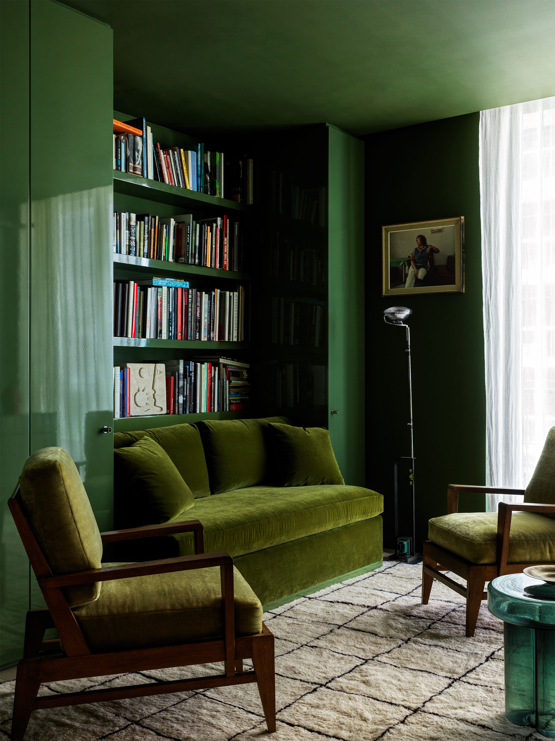
DO INSTEAD: Be bold, and color drench a space in green for maximum coziness.
Green on green can work to create an elegant, monochromatic color scheme that feels calming and creates a sanctuary-like feel, but many homeowners avoid doubling up on green for fear it will overwhelm the space.
The Livingetc newsletters are your inside source for what’s shaping interiors now - and what’s next. Discover trend forecasts, smart style ideas, and curated shopping inspiration that brings design to life. Subscribe today and stay ahead of the curve.
Above, designers at Charlap Hyman Herrer prove that there is no such thing as too much green. The study is coated in a deep mossy green (Alligator Alley by Benjamin Moore) from the high-gloss walls to the lacquered millwork, and through the furnishings, too.
"Using one color or material everywhere sublimates forms, blurring the edges of a room and the pieces of furniture within it," explains Adam Charlap Hyman. "The effect is something expansive, even infinite."
3. Believing Blue and Green Can Never Be Seen
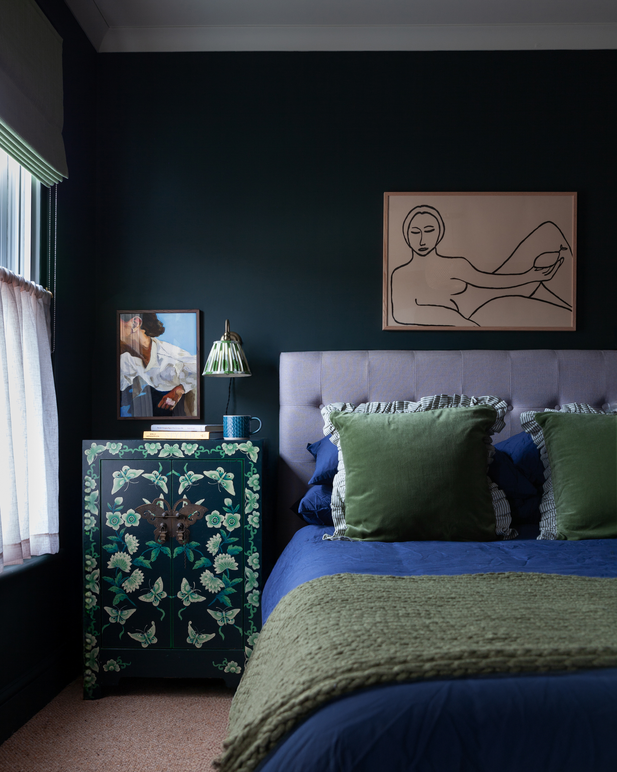
DO INSTEAD: Layer blue and green in a soothing, analogous color scheme.
Not knowing that blue and green work together is a common misconception when decorating, and so often homeowners make the mistake of removing any blue from a green scheme for fear the colors will clash.
But blue is, in fact, a color that goes with green — the shades layering harmoniously, as seen in this bedroom by Hello Flora.
"In this design I wanted to lift the moody dark green walls with pops of color," explains principal designer Tracy Cole. "I always take my inspiration from nature, think of a blue sky and green grass. A bright and zingy combination that just works! Don’t be afraid of using analogous hues together, the colors are complementary rather than jarring."
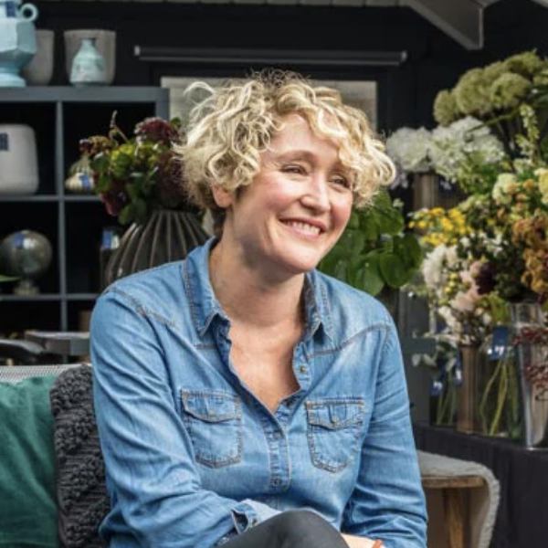
Hello Flora is led by Tracy Cole and the brand works with clients to create cozy modern interiors full of texture, layers, and luxury.
4. Getting the Balance Wrong
DO INSTEAD: Use color theory to work out how to successfully balance the use of green in an interior.
Some homeowners struggle to get the balance of color quite right, especially when it comes to using green. For a helpful guide, look to the 60-30-10 rule, which helps you successfully divide color within a room.
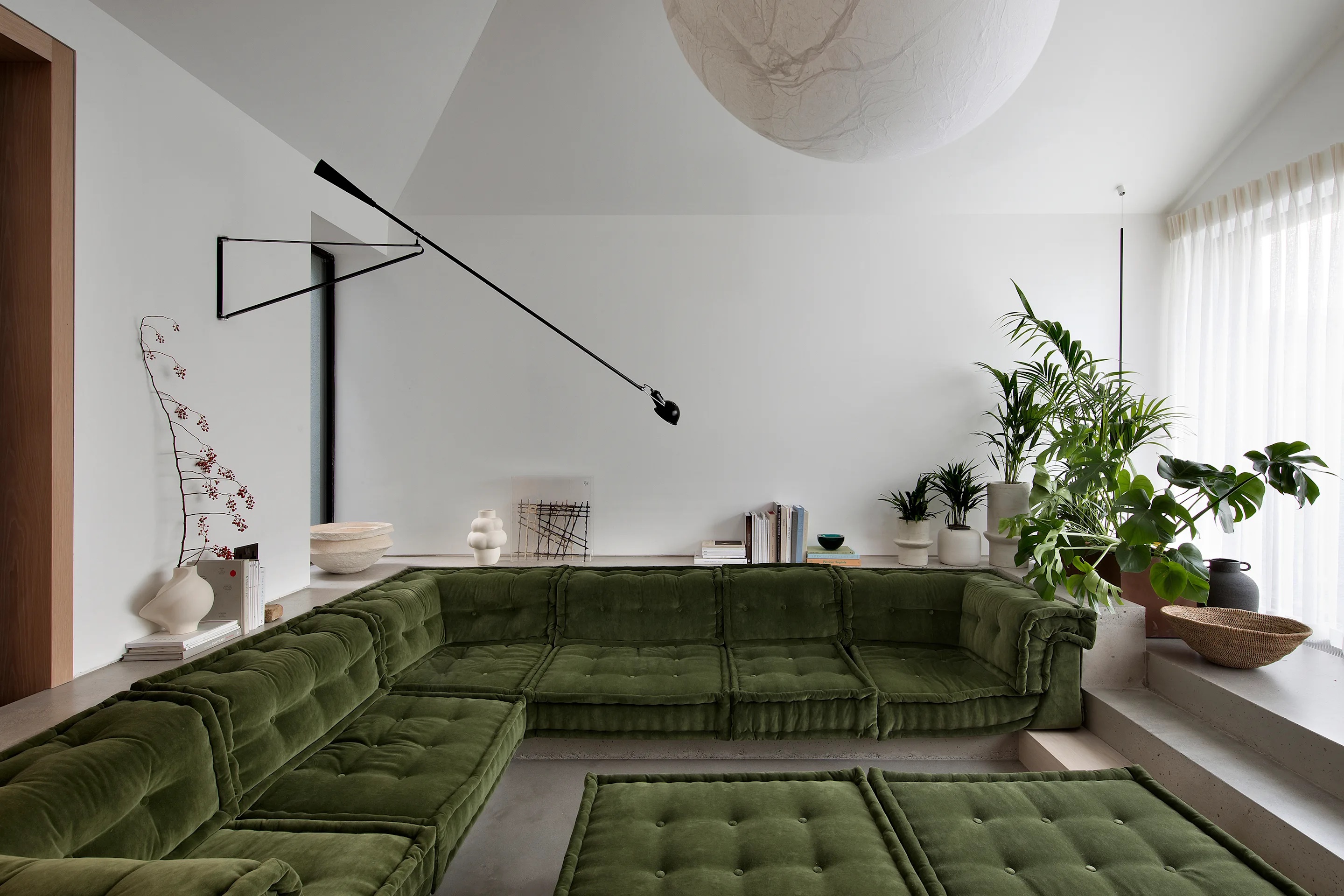
In this green living room by Róisín Lafferty, the sunken seating area is in a deep green hue, paired with white walls, and neutral touches throughout. The result it a calming zen-like space where the balance of color is just right.
"This sunken seating area is a hub for the family who live here, a space where they can all sit and hang out together," explains Becky Russell, CEO of Róisín Lafferty. "The line of vision when seated leads you directly to the garden, the thinking behind the color palette was linking to the natural greens and neutral tones of the garden while the soft velvet also brings a cozy warmth and tactility making it a very inviting place to sit. With many shades to choose from the fern green has the perfect balance for this period home bringing a richness to the new contemporary extension."
5. Forgetting to Consider Natural Light
DO INSTEAD: Make green walls feel warmer by incorporating warm and earthy natural elements.
Before deciding on how much or where to use it in your space, it's important to understand how light affects green paint. South-facing rooms typically get the most natural light, but a north-facing room is the one to be wary of. These spaces receive less sunlight, and therefore tend to feel cooler and bluer, contributing to a feeling of darkness.
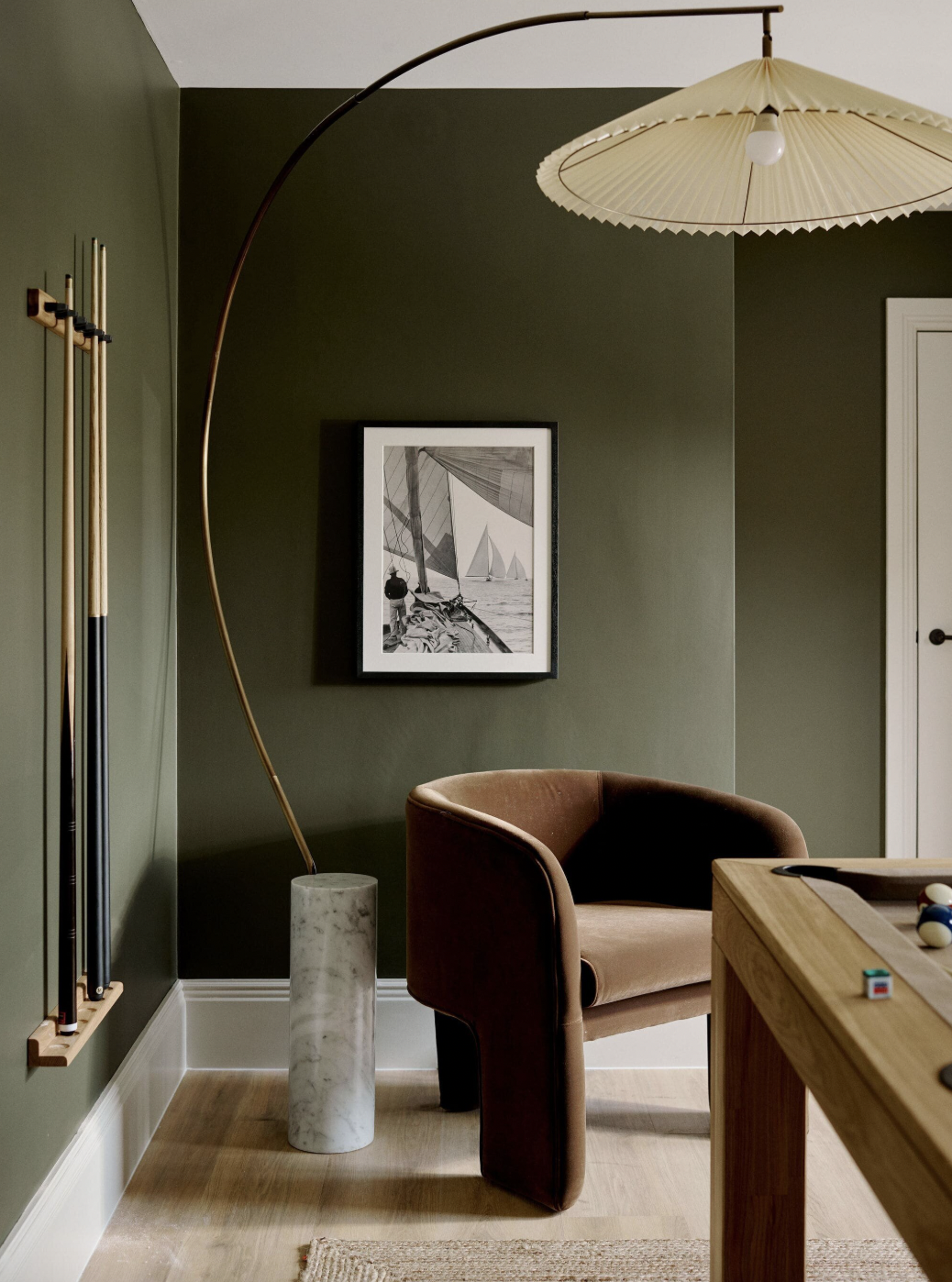
Above, interior designer Lauren Gilberthorpe used Invisible Green by Little Greene on the walls of the living room, paired with rattan, wood, and neutral hues, which helps to emphasize the green's link to nature.
"This green is a grounding base that works particularly well in north-facing rooms, where the natural light tends to be cooler and more diffused," explains Lauren. "In spaces like these, green brings a quiet richness and a sense of comfort, without overwhelming the room. It has an ease to it, rooted in the natural world, that pairs beautifully with tactile materials and warmer accents."

Lauren Gilberthorpe Interiors specialize in crafting soulful spaces that embody individual character and warmth. Lauren's work is deeply influenced by the Cotswolds and South Devon.
6. Not Being Brave With Bold Pairings
DO INSTEAD: Be bold with your pairings to create vibrant palettes that help energize you.
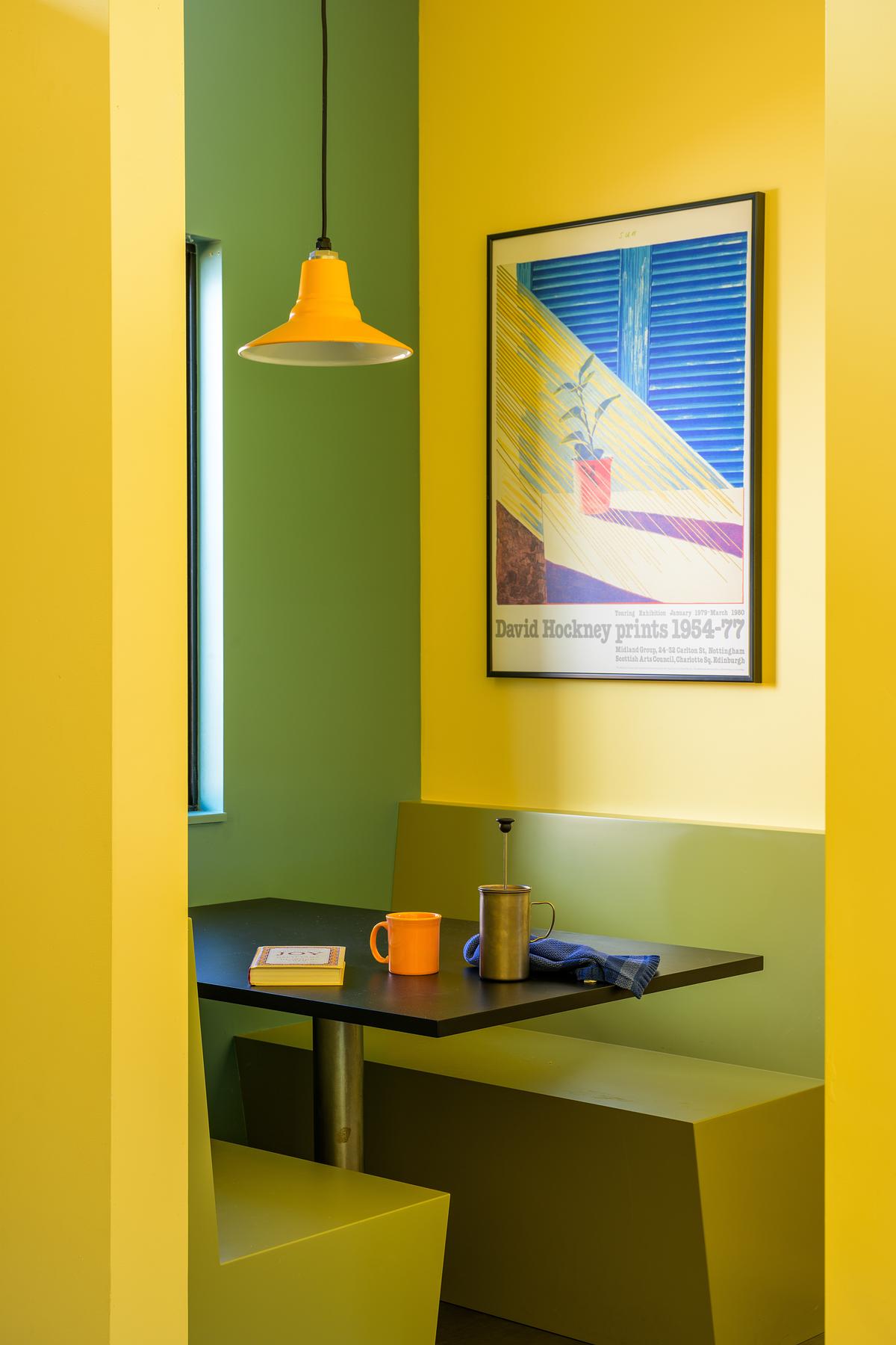
While a neutral color scheme works well with green, color pops can also make a statement. Yellow and green might not be the most obvious color pairing, but the two tones used here bring a joyful aesthetic to the space.
"All people respond to color in different ways and some do not like the experience of white only," explains Lori Ryker of studioryker, who designed the above space.
Lori was given a specific brief from the client who was highly sensitive to color, but wanted brighter colors to help boost his mood, "especially in the long, dark and cold Montana winters," she explains.
Yellow was used in the main spaces and transition areas of the house as a base. "Moving through the openness of the house, and dependent on time of day, the yellow becomes lighter or more brilliant," Lori explains. "In the stairwell the yellow makes the space feel a bit like a lantern. Green was brought in as a complement to the yellow, and a base color for the client's collection of brightly colored pottery."
7. Forgetting About Your Ceiling
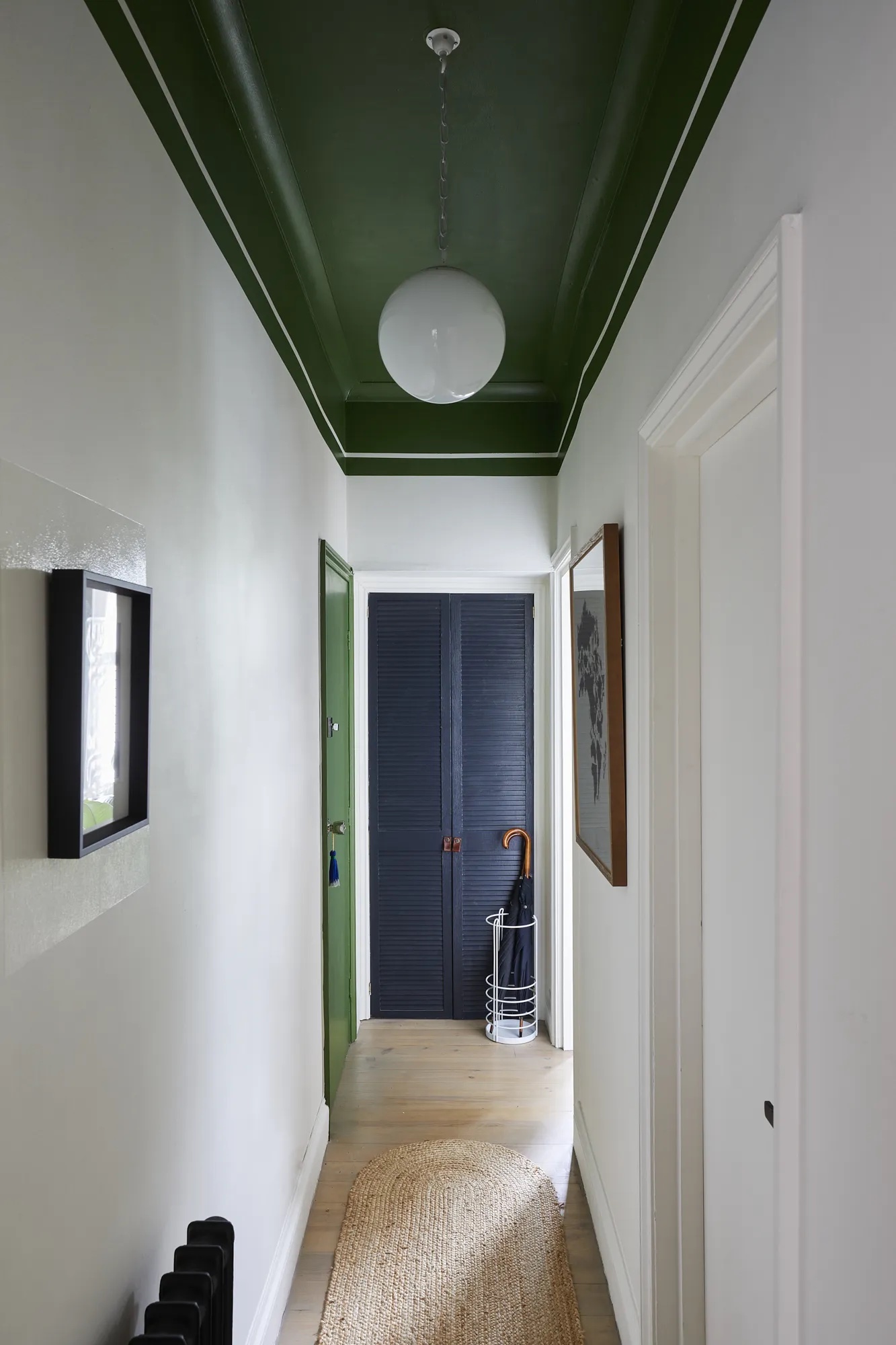
DO INSTEAD: Treat the ceiling as a fifth wall when it comes to decorating with any color.
Green paint isn't just for walls — it can work wonders in unexpected places, too. And just like when using it for window trims, green painted ceilings can help trick the eye to make a room feel larger or taller, drawing your eyes up as you walk underneath.
This entryway by design studio, A New Day, was given a new lease of life thanks to a deep forest green ceiling paired with white walls. This leads the visitor's eye down the hallway and draws the eye upwards.
8. Thinking Green Doesn't Work Alongside Pattern
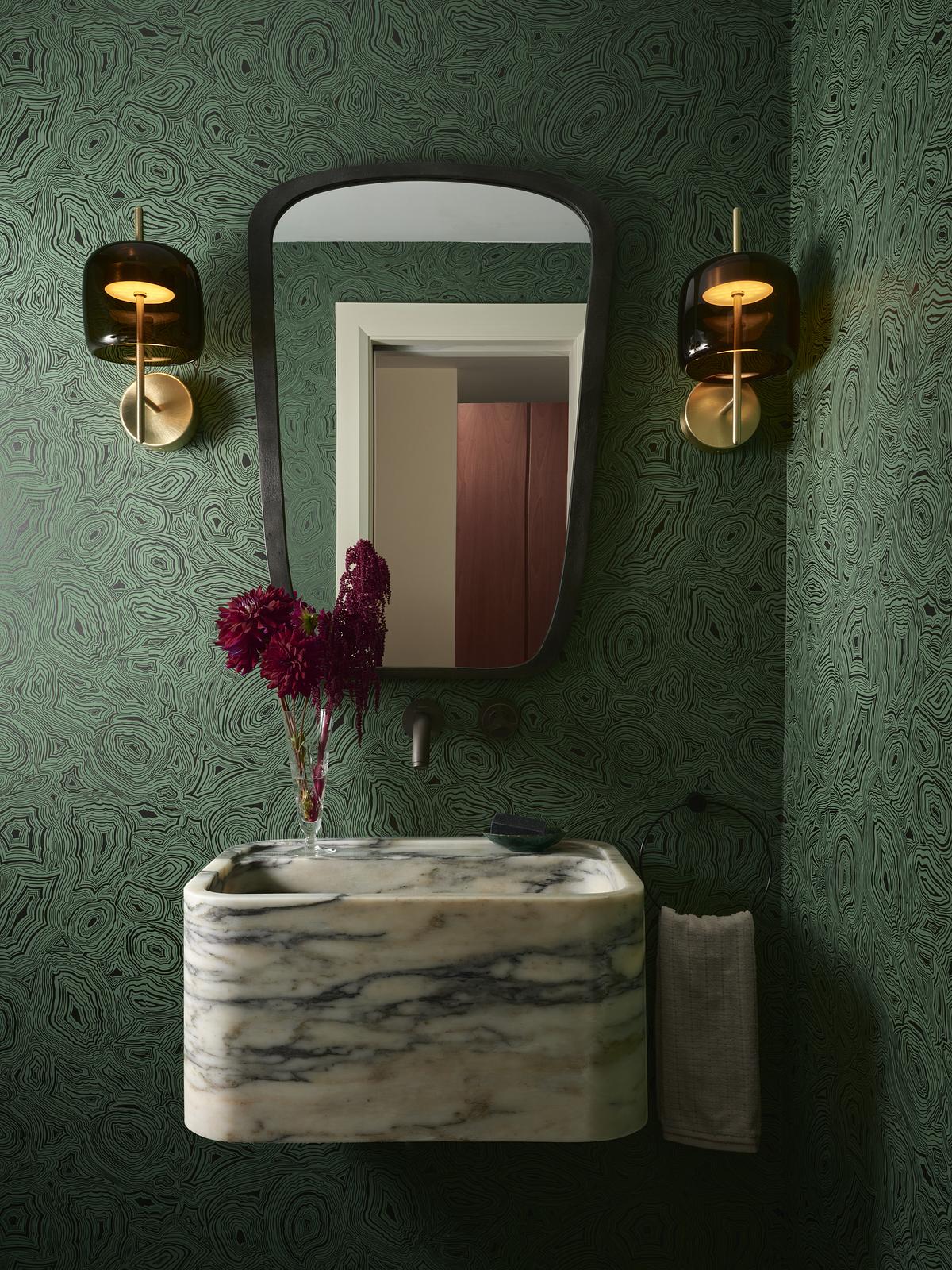
DO INSTEAD: Use green as a common thread to tie together different patterns in a space.
Pattern drenching with green is a great way to make a statement in any space. For the bathroom above, Toronto-based design team, Evan Saskin and Cameron Bird opted for a Cole & Son Wallpaper Malachite wallpaper that introduced a touch of drama when paired with a green marble sink, with dramatic veining.
"These items don't intuitively work together," says Evan. "I'm not sure exactly why they are so energetic and harmonious at the same time, but I think it's partly because they're so richly textured with three different stones and the textures are all at different scales."
There's a real heaviness to all of the items in this small room, from the dark metal frames, tinted glass sconces, and the natural stone, yet there is plenty of character and comfort in the mix of materials and patterns to balance it out, too.
9. Pairing Green Walls With Silver Hardware
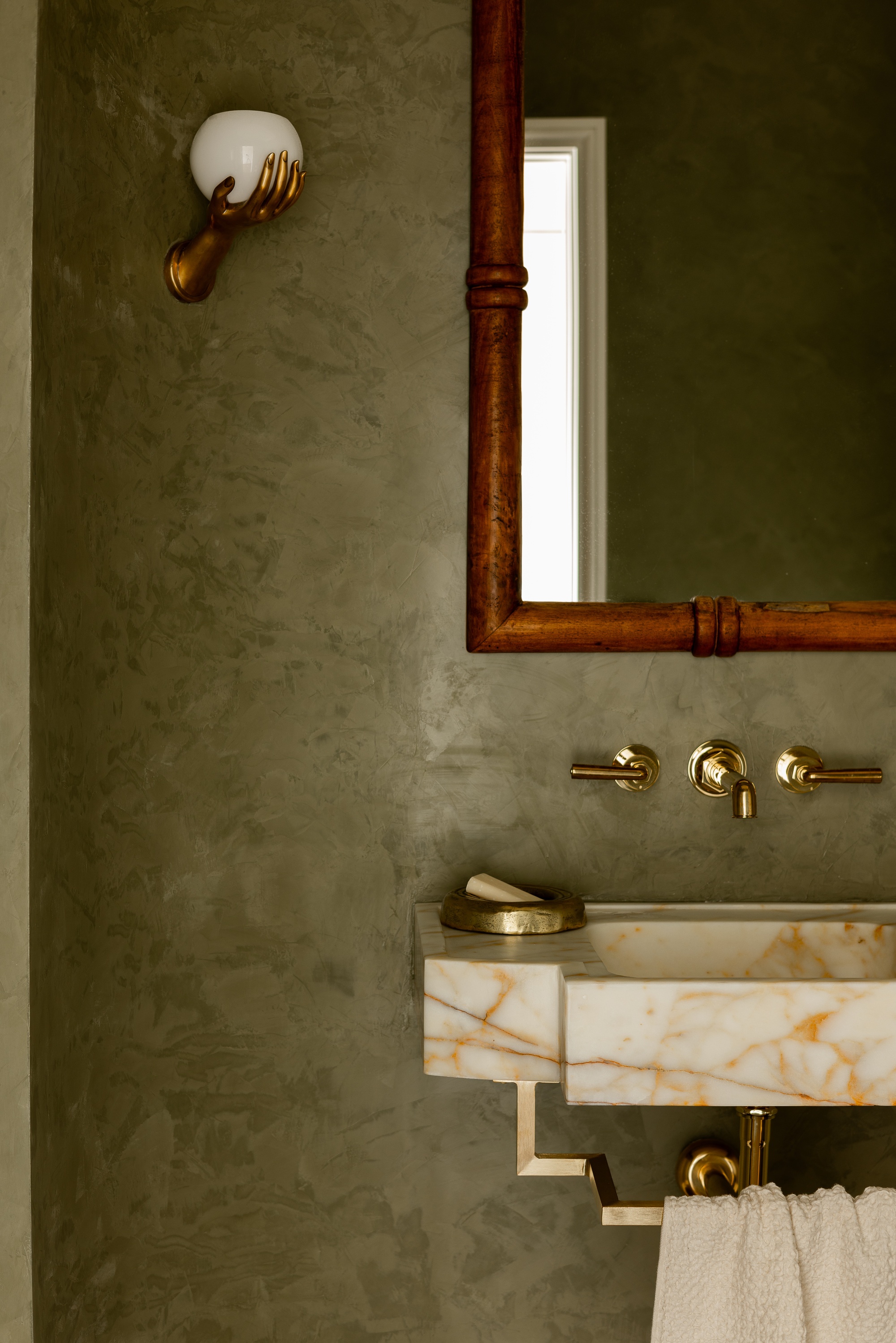
DO INSTEAD: Opt for warm finishes like bronze and brass against green backdrops.
Pairing the correct hardware is an important element when decorating with any color. For interior designer Michael Del Piero, brass hardware makes the best bathroom accessories for a harmonious green scheme that feels luxe.
"We prefer bronze and or brass hardware with warm shades of green plaster or paint in a space," he explains. "We find pairing the warmth of the metal with the warm undertones of many green paints brings a glow to the room which only occurs with layering warm upon warm."

Michael Del Piero is a designer known for her distinct style and fresh take on mixing modern with more classical styles. She established her design firm in Chicago back in 2007.
10. Forgetting About the Importance of Texture
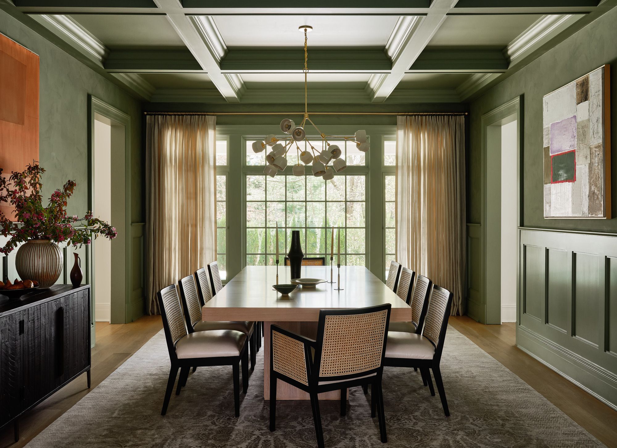
DO INSTEAD: Consider using a limewash paint or clay plaster to give green walls more depth and texture.
Adding texture to the walls is about bringing visual interest, depth, and a tactile feel to the space. All too often, matte paint can make a room feel one dimensional, but by exploring mixed textures on the walls alongside green paint, it can feel elevated instead.
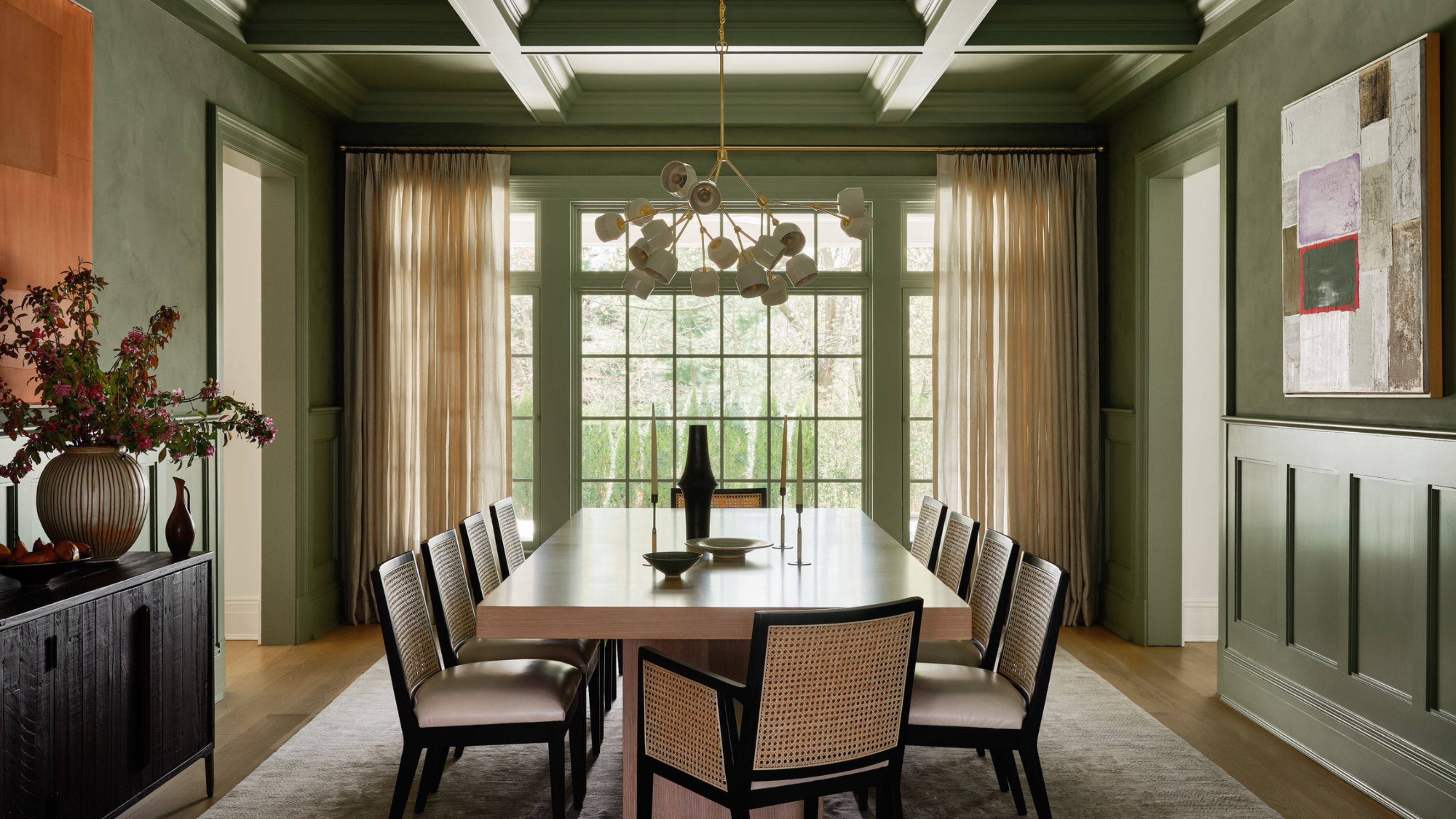
In this dining room designed by Chango, plaster and wooden panels introduce a delicate balance of light in the space.
"This green plaster from Portola Paints is timeless and has a beautiful, calming effect," explains Susana Simonpietri, the firm's creative director. "We added the coffered ceilings and wainscoting — and painted them in Benjamin Moore's Weekend Getaway to match. These details added even more texture and depth to the space, as it's key entertaining and more formal room for the clients."
There are plenty of ways you can go wrong with green, and various factors you might not have taken into consideration. From the hardware you select to complement the room, the natural lighting, to the wider color scheme and the balance of color, green, while generally selected for its ease of use, requires just as much thoughtful consideration as any other color.
Word on the street is that 'millennial green' has taken over gray, and it all comes down to how you decorate with it... so consider yourself warned.

Former content editor at Livingetc.com, Oonagh is an expert at spotting the interior trends that are making waves in the design world. She has written a mix of everything from home tours to news, long-form features to design idea pieces, as well as having frequently been featured in the monthly print magazine. She is the go-to for design advice in the home. Previously, she worked on a London property title, producing long-read interiors features, style pages and conducting interviews with a range of famous faces from the UK interiors scene, from Kit Kemp to Robert Kime. In doing so, she has developed a keen interest in London's historical architecture and the city's distinct tastemakers paving the way in the world of interiors.