Decorating with Mint Green Works for Way More Than Just Your Bathroom — Here's How to Use the "Spatial Palette Cleanser"
It's bright and zingy, but can also fade effortlessly into the background when it needs to. Here's how designers like to use it

The Livingetc newsletters are your inside source for what’s shaping interiors now - and what’s next. Discover trend forecasts, smart style ideas, and curated shopping inspiration that brings design to life. Subscribe today and stay ahead of the curve.
You are now subscribed
Your newsletter sign-up was successful
Mint. The mere mention of it somehow puts a smile on your face. It’s a zesty, zingy, zeal-filled shade, imbued with energy and playfulness as well as an innate sense of calm — a double act few hues have — and that's why decorating with mint green in the home both lifts the spirits and soothes the soul.
Strangely, mint is a color that feels like it belongs in one room of the house more than others: the bathroom. It’s a hue that seems clean, due to its connection with the herb of the same name, as well as its Colgate-y connotations, and you have to admit, the crisp, refreshing look decorating with this green somehow does feel like the cool, tingly, sharp tang of the plant. And so, the bathroom is where the taste and the tone of mint often remain.
Let’s break the cycle. It’s time to free mint from tiling and waterproofing and let it roam the house unencumbered — I’m calling for a decorative do-over for its invigorating brightness. Let me tell you why it’s a property palette power player.
Article continues below1. MEET MINT
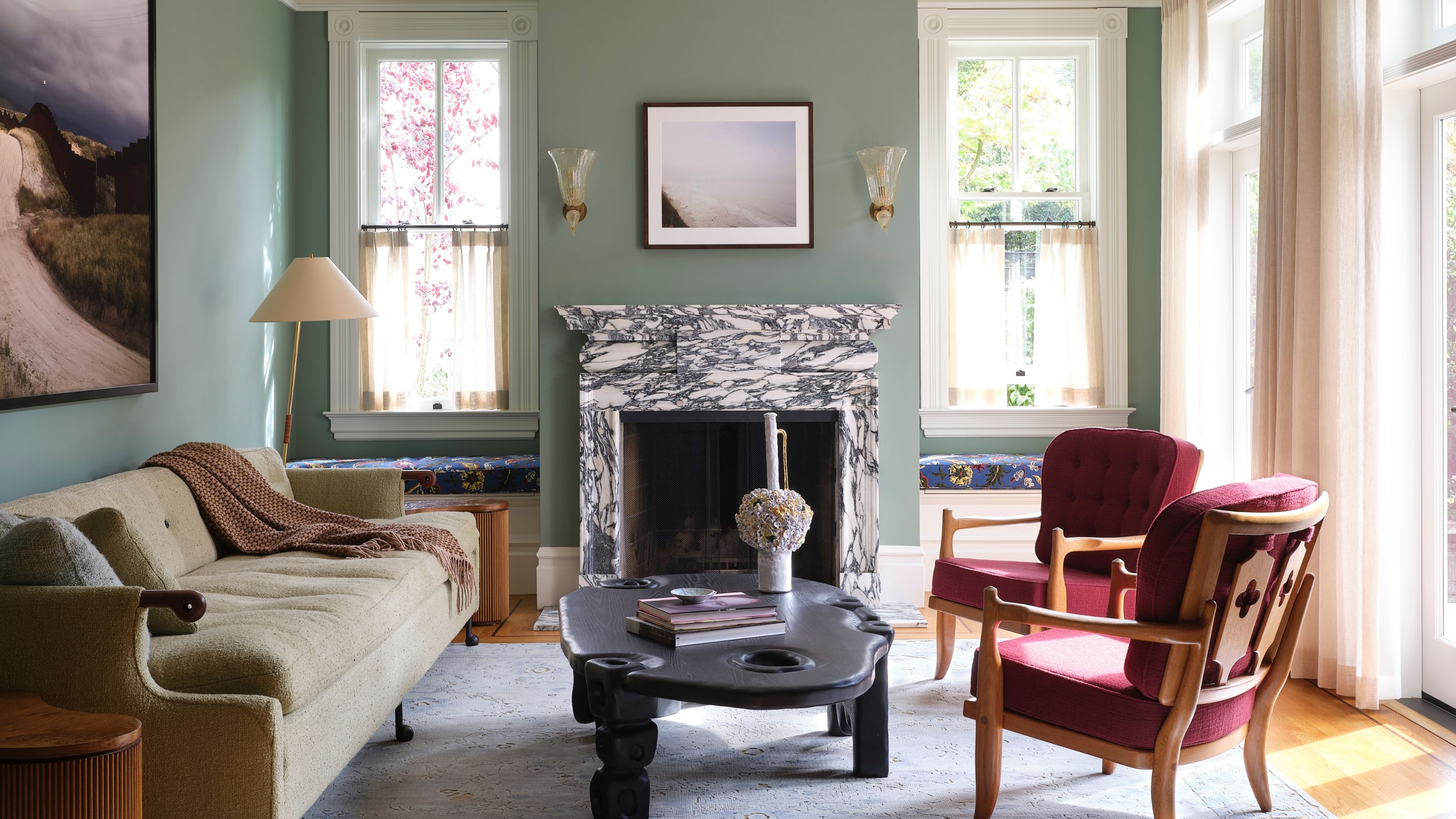
Mint green is a brings together the best of color — it can be bright, clean, saturated, and subtle.
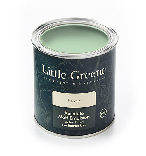
Mint is a green with a dash of blueness, with white added in for softness. Sometimes a spot of gray. It’s not sage, it’s not aqua, but it does live near them. While mint may seem like a fairly specific name and description, it can span from dark to light and vivid to chalky, giving it a wide range of impacts and effects.
The archetypical mint green lies between a pastel color and something punchier. It has pep and presence, but at the same time, it’s as if it’ll fade into the background at a moment’s notice, receding as the wind changes or a mood switches.
Then there are the more intense iterations of mint, which border on teals or turquoises, vibrant and undiluted and like the lively younger cousin of an electric shade. There’s dusty gray-mint, which feels like it might soon bump into olive or become completely desaturated. Icy mint is glacial and more blue-ish like its frozen water moniker; soft mint is apple-like or the gentle hue of a newly unfurled leaf, while dark mint is a shadowy, impactful green, nudging towards the depth of jade.
Mint’s strength lies in its herby cleansing and cool reputation — which is something to make the most of rather than shy away from when decorating with mint green. “Mint is a great choice for interior spaces because it can function as a refreshing and calming color,” say partners at Best Practice Architecture, Ian Butcher, Kailin Gregga, and Kip Katich. “It tends to lighten and brighten spaces, while playing up connections to nature and its restorative properties. Spearmint for the soul, if you will.”
The Livingetc newsletters are your inside source for what’s shaping interiors now - and what’s next. Discover trend forecasts, smart style ideas, and curated shopping inspiration that brings design to life. Subscribe today and stay ahead of the curve.
And don’t limit mint’s revitalizing power to something we visit only a few times a day, try releasing it into the home in areas one might not expect to see it. “Don’t be afraid to have fun with mint — it’s far more versatile than people often realize,” says Katerina Tchevytchalova, interior designer and founder of K’Arte Design. “Whether you go bold or just add subtle accents, it can bring personality and freshness to a space, and can really elevate the entire look and feel of a room.”
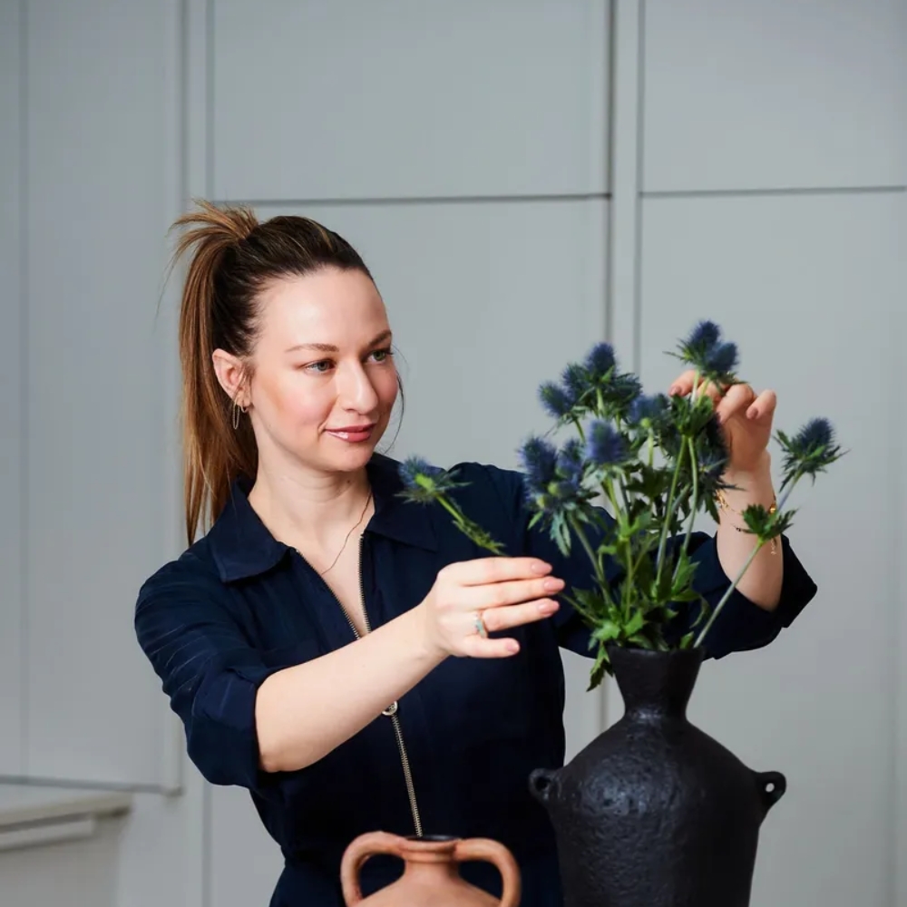
Katerina Tchevychalova founded London and Cyprus-based luxury design and art consultancy K'Arte Design after working at Kelly Hoppen Interiors for five years. Her approach to color is intuitive and thoughtful, spanning spectrums from bold accents to soft tonal palettes, and hues are designed to enhance the architectural flow and support the mood and function of her timelessly elegant spaces.
2. THE FRESHEST WAYS TO USE MINT
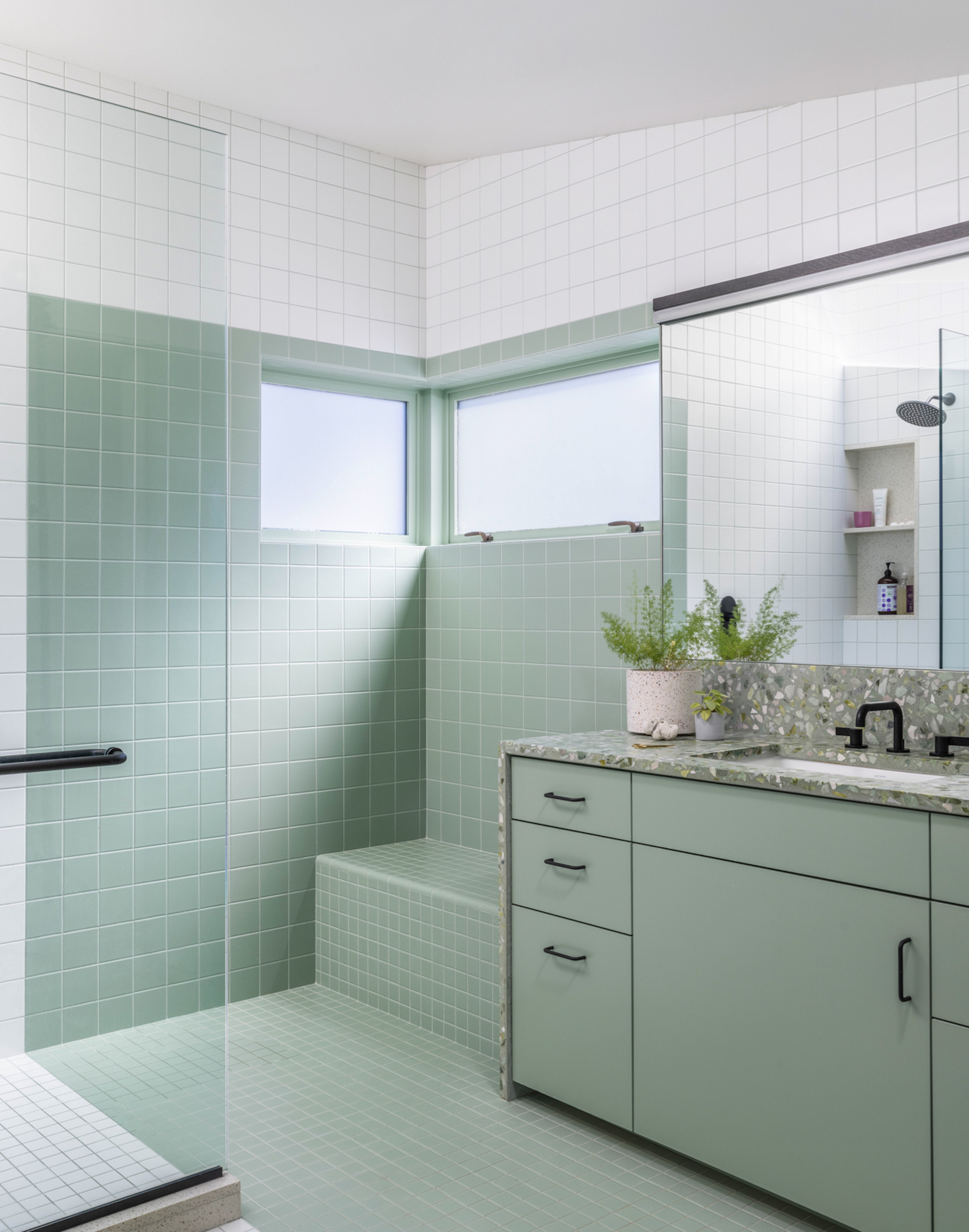
There is something innately cooling and refreshing about decorating with mint green.
We’ve had decades of seeing mint through our daily routines, so it’s no wonder our instincts may be to use it as a bathroom color. Its handholding with the hygienic makes it feel perpetually pristine — you can practically smell a hint of mint on the breeze.
And it does just seem to click with materials such as tiles, terrazzo, stone, ceramics, and glass, bouncing light around beautifully on surfaces that gleam and shine as so many quick-clean, waterproof materials do. It also comes across as sunny and airy, which is a boon in spaces that are often on the smaller, sometimes windowless side.
Its green-ish natural-ish tone is calming and nature-like while also being filled with enough blue-tinted get-up-and-go to give us a boost, and when we’re ready to wind down, it magically becomes grounding, spa-like, and therapeutic.
But let’s start thinking outside of the waterproof box when it comes to decorating with mint green. The effect of mint green is second to none — it can surprise you by popping up in unexpected places. But step beyond the obvious, and decorating with mint green begins to reveal a much wider potential.
Used as accents throughout an interior, it creates pockets of cool surprise, a sense of clarity, and charm. In larger items or surfaces, it resonates like a block of ice, a burst of breeziness, a wave of rejuvenation. It’s a color that feels both intentional and light-handed — fresh, but never forced.
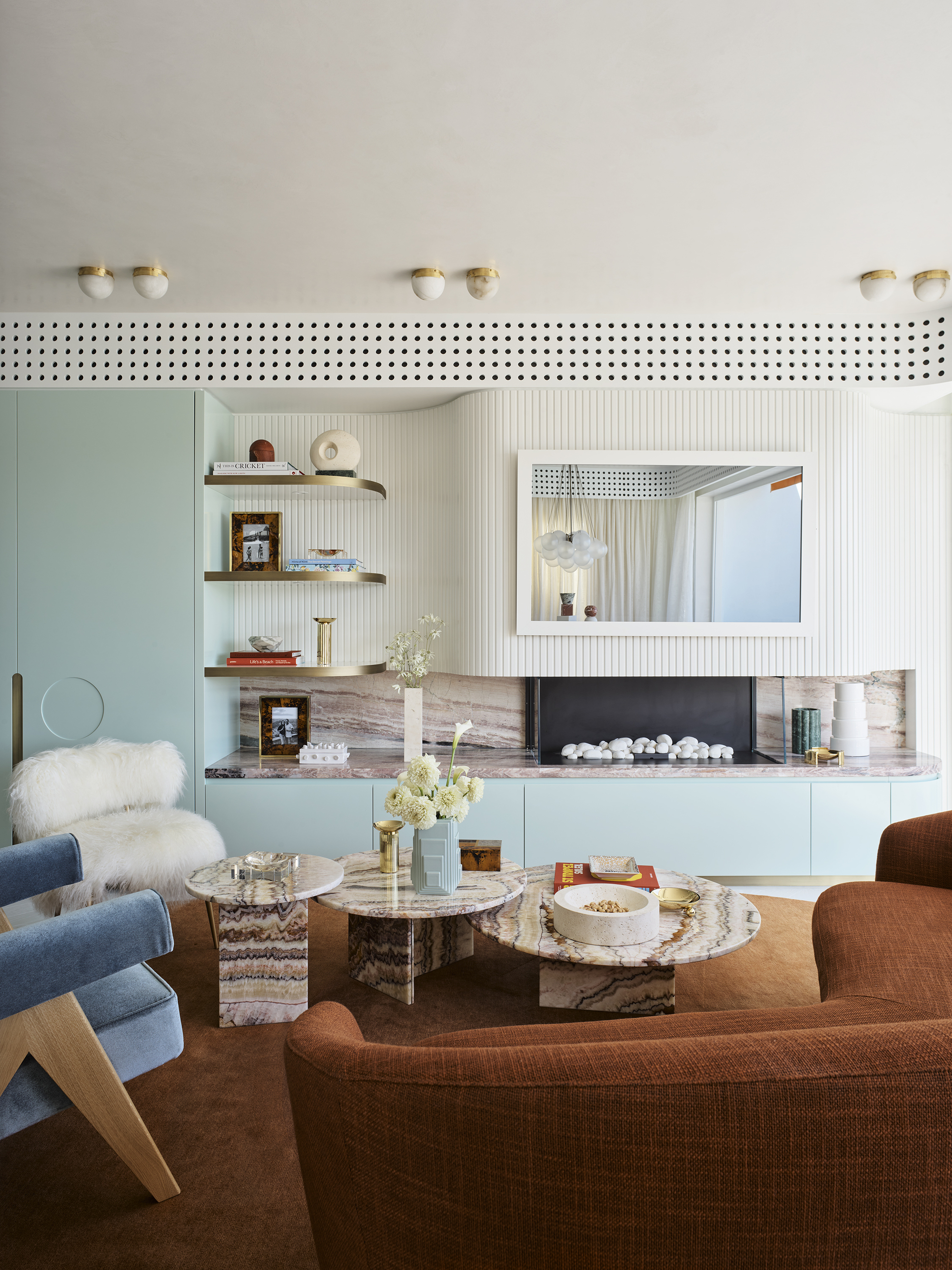
Decorating with mint green can provide an unexpected cool surprise in your interiors.
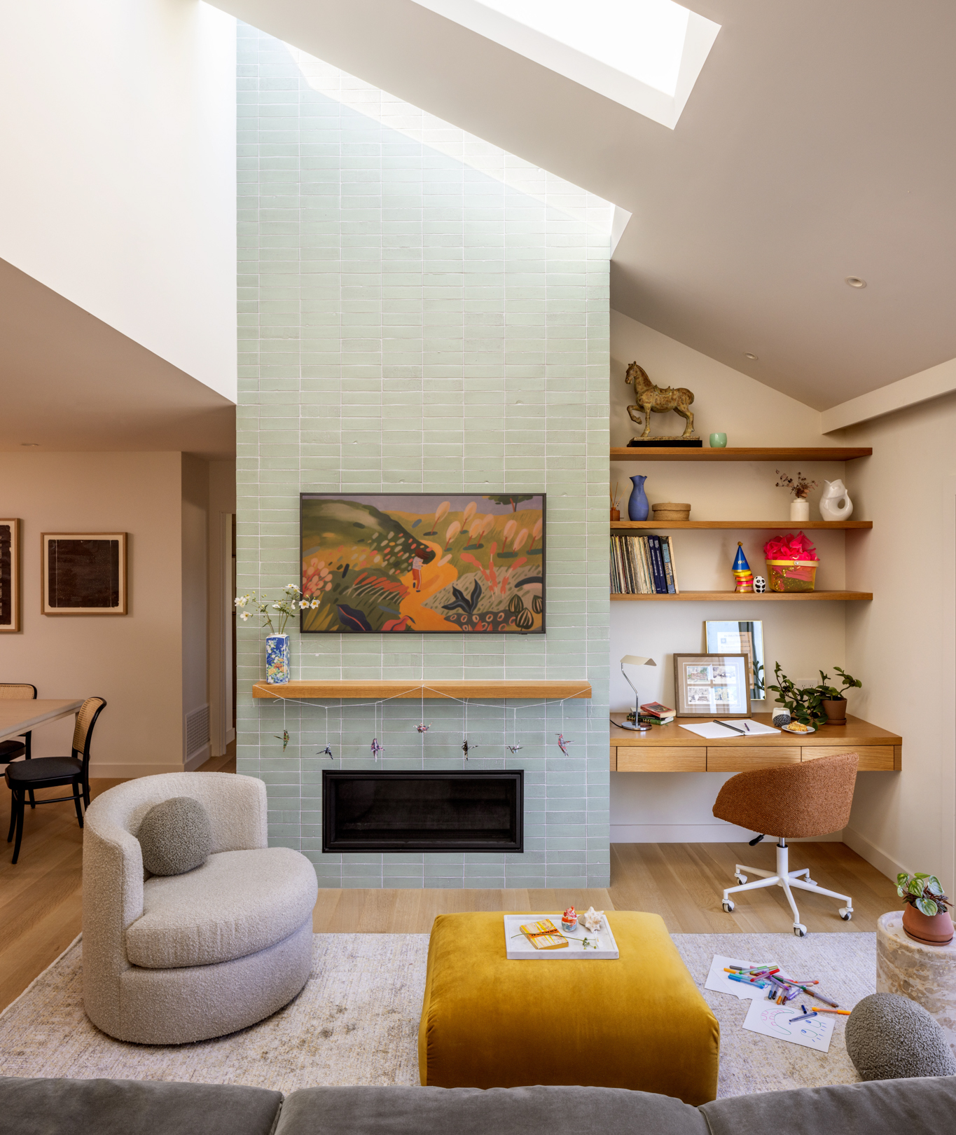
It's important to consider the many different shades when decorating with mint green. The colder shades like frosty mint and spearmint work well as a kitchen color (as well as bathrooms), thanks to their purifying associations, bringing lightness without too much sterility. Try it on cabinetry, tiling, or as a surface.
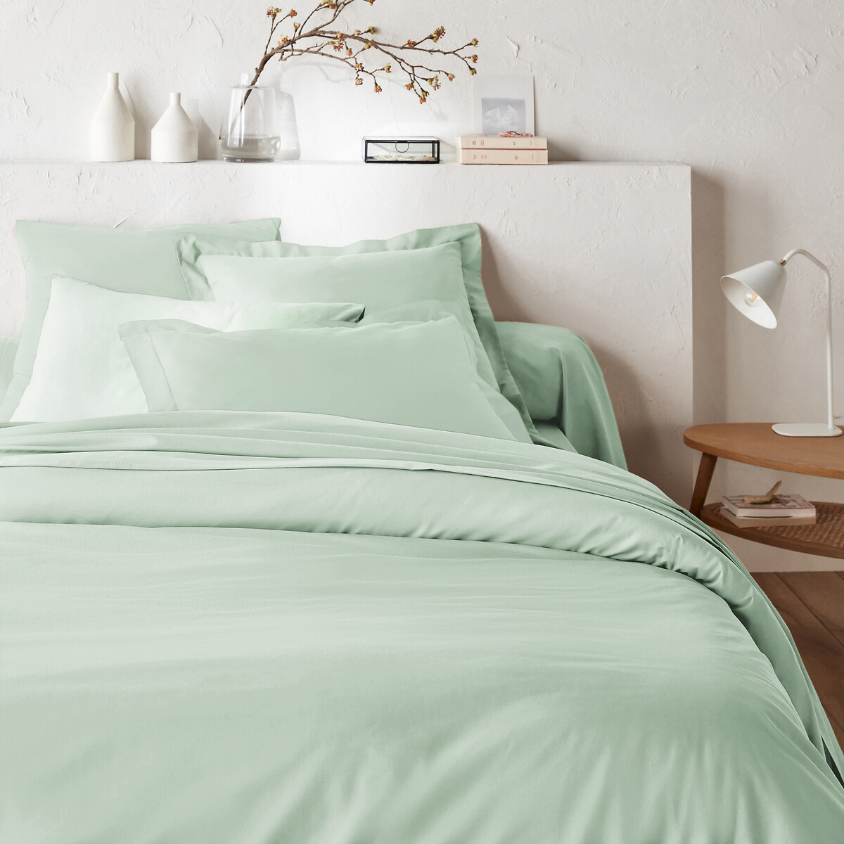
Try a cheerful classic mint as upholstery, paint, or smaller objects with its subtle perky personality. A herby, more green-tinted mint embraces the color’s calm side and works well in bedrooms or where it can team up with other natural materials for a grounded and tranquil atmosphere.
Then there’s the deeper teal-y end of the spectrum, which creates more of an enveloping, cocooning feel, so it ticks the boxes for color-drenching or moody, texture-rich spaces. Or why not combine a few of them? “Our favorite way to decorate with mint might be by pairing slightly different shades for a tone-on-tone approach, and a saturated color effect,’ says Ian Butcher.
And do remember mint’s weaker side — how its coolness can easily slide into coldness. But there are ways to work around that. “While mint is fresh and calming, it can come across as cold or overly pastel if not balanced with warmer elements — pair it with warm neutrals like taupe, or contrast it with richer shades like terracotta to create warmth and depth,” advises Katerina Tchevytchalova. “It shines in natural light, so it’s ideal for rooms with good levels of sun. The warmth of the light balances the tone and enhances its freshness to prevent it from looking dull or flat.”
3. THE MINTY MOOD
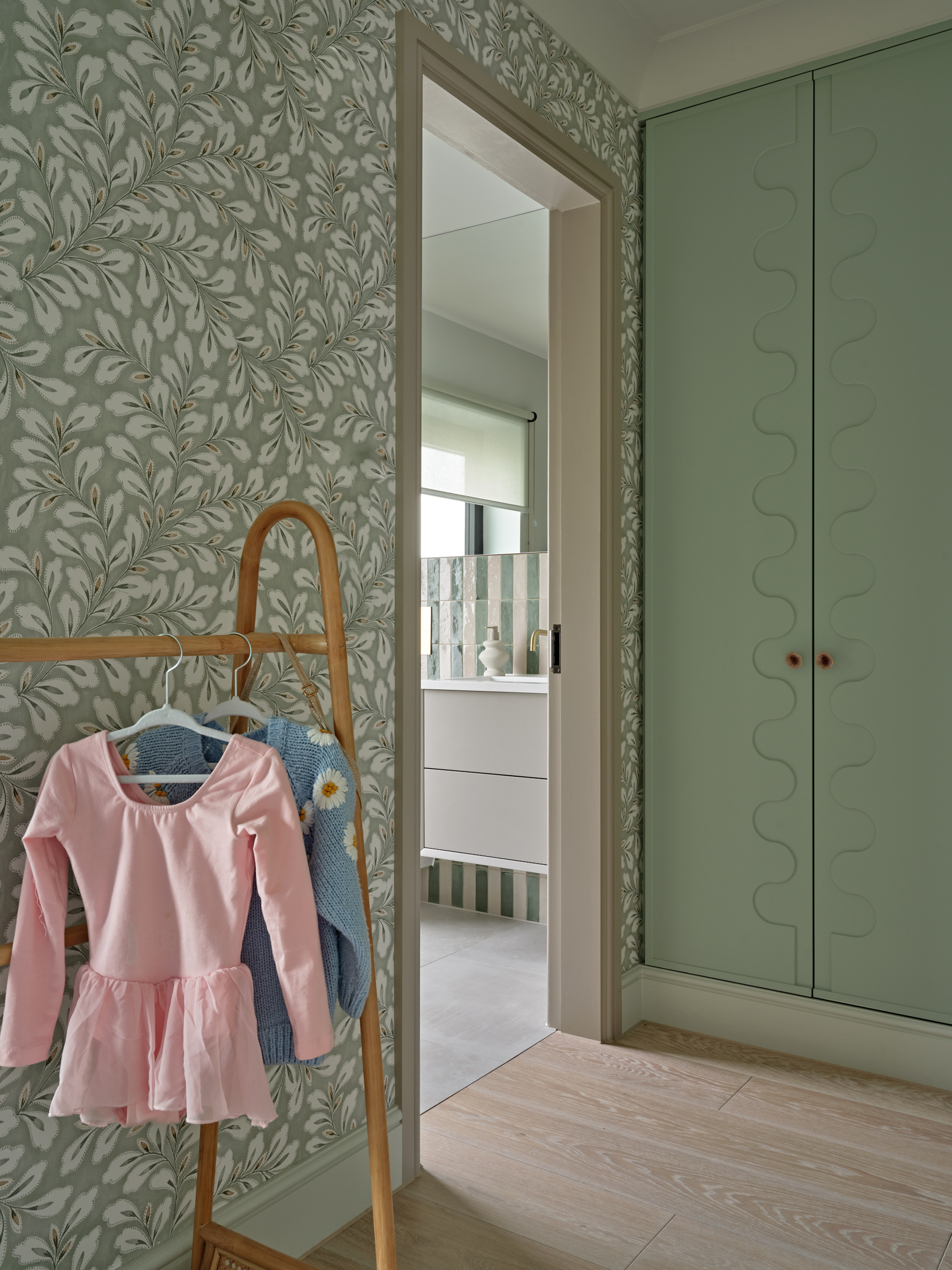
Decorating with mint green provides a subtle pop of energy, while still feeling calm and composed.
In the home, mint is friendly and familiar as well as zesty and fun. It’s a buzzy, enlivened hue that elevates the ambiance of an area. Classic mint tones are buoyant, full of hope and excitement for a new day ahead. “Mint is like a mood-lifter for your home,” agrees Katerina Tchevytchalova. “It brings a fresh, calming energy and keeps the space feeling cool and composed, all while adding a subtle layer of personality.”
It can also be soothing, serene, and soft, creating a gentle, spa-like atmosphere that evokes memories of peaceful, fragrant bath soaks. Decorating with mint green can engulf you in its Zen-imbued essence of calm, like a herbaceous mist gently taking over your senses until all that’s left is a dreamlike impression that you’ve awoken from a revitalizing sleep, or you’ve just emerged from a long massage.
According to color psychology in interior design, “Mint has the ability to combat stress,” adds Ian Butcher. “Minty greens are associated with peace and tranquility, and can help reduce anxiety. Spaces that incorporate minty colors almost feel like a kind of spatial palette cleanser (no pun intended) and can invigorate or refresh us.”
Then there’s its deeper, heavier side, the shadowy mint that’s quietly dramatic. Like a dark green, it’s grounding, composed, and refined, but its minty hint of blue gives it an edge. Dark mint has a coolness to it, a crisp, airy finish that lifts it. It still comes across as earthy and immersive, but with a refined take on freshness that appears like a surprising aftertaste.
4. MINT MEETS ITS MATCH
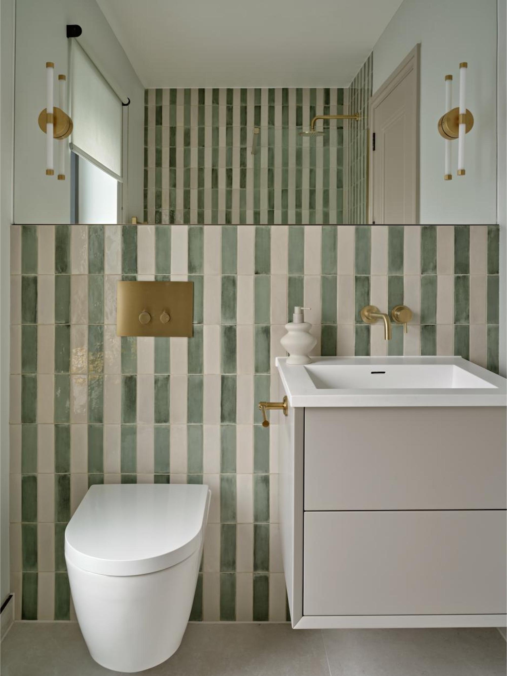
As an almost-neutral tone, there are so many shades you can decorate with mint.
As a natural-ish tone, there are a lot of colors that go with mint green. Bring a dash of mint into your interior and see how it sings and zings with practically any other shade. From big statement chunks to smaller sprinkled-around accents, decorating with mint green can create a variety of effects and feelings depending on the other tones it’s alongside.
“Mint is pretty versatile, and can team well with lots of different colors," says Kailin Gregga. "For a bold look, try a navy or darker blue; it’s refreshing and almost nautical. If the mint is intended to feel more like an accent, partner it with warmer neutral tones like taupes and beiges to bring out its more subtle characteristics."
"Mint pairs effortlessly with neutrals like white, gray, and beige, but also works well with richer tones such as dark brown, terracotta, and brass — these combinations feel fresh and full of character, while still being timeless and balanced,” adds Katerina Tchevytchalova.
To team with brighter hues, there’s power blue or hyacinth for a nostalgic hit of summery optimism, eucalyptus or sage to create a serene, organic sensation, chalky white or gray for a polished, clean (bathroom-ready) aura, and ink or petrol blue for some high-impact edginess.
Within a varied palette, it stands out as a soothing middle note, not leaping out for attention, but not fading away either.
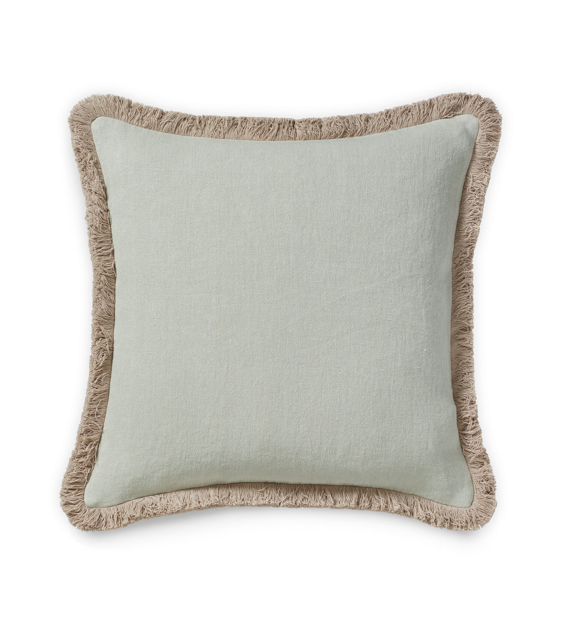
This linen cushion in a soft Eau-de-Nil and natural fringe shows just how well the softest shade pairs with other neutral tones.
Mint is a cool, calm, and collected, as well as a menthol hit of radiance, always on hand to give clarity, a flicker of a thrill, and a breath of ultra-pure air.
Looking for some more specific inspiration? There are plenty of spring color palettes that show how to decorate with mint in the home.
Amy Moorea Wong is a color authority and contemporary interior design writer who has specialized in all things decorating for over a decade. Amy is Livingetc magazine’s Colour Expert, Interiors Editor at The Glossary magazine and a Contributing Editor at Homes & Gardens magazine, and she frequently contributes to an array of global publications to share her insights on interior design zeitgeist. Her book Kaleidoscope: Modern Homes in Every Colour explores a collection of cool colorful homes fizzing with creativity, surprises, and inspiration.
