If a Color Could Capture an Era, 'Eau de Nil' Would be "Pure 1930s" — Meet the Soft Egypt-Inspired Shade You Need to Know
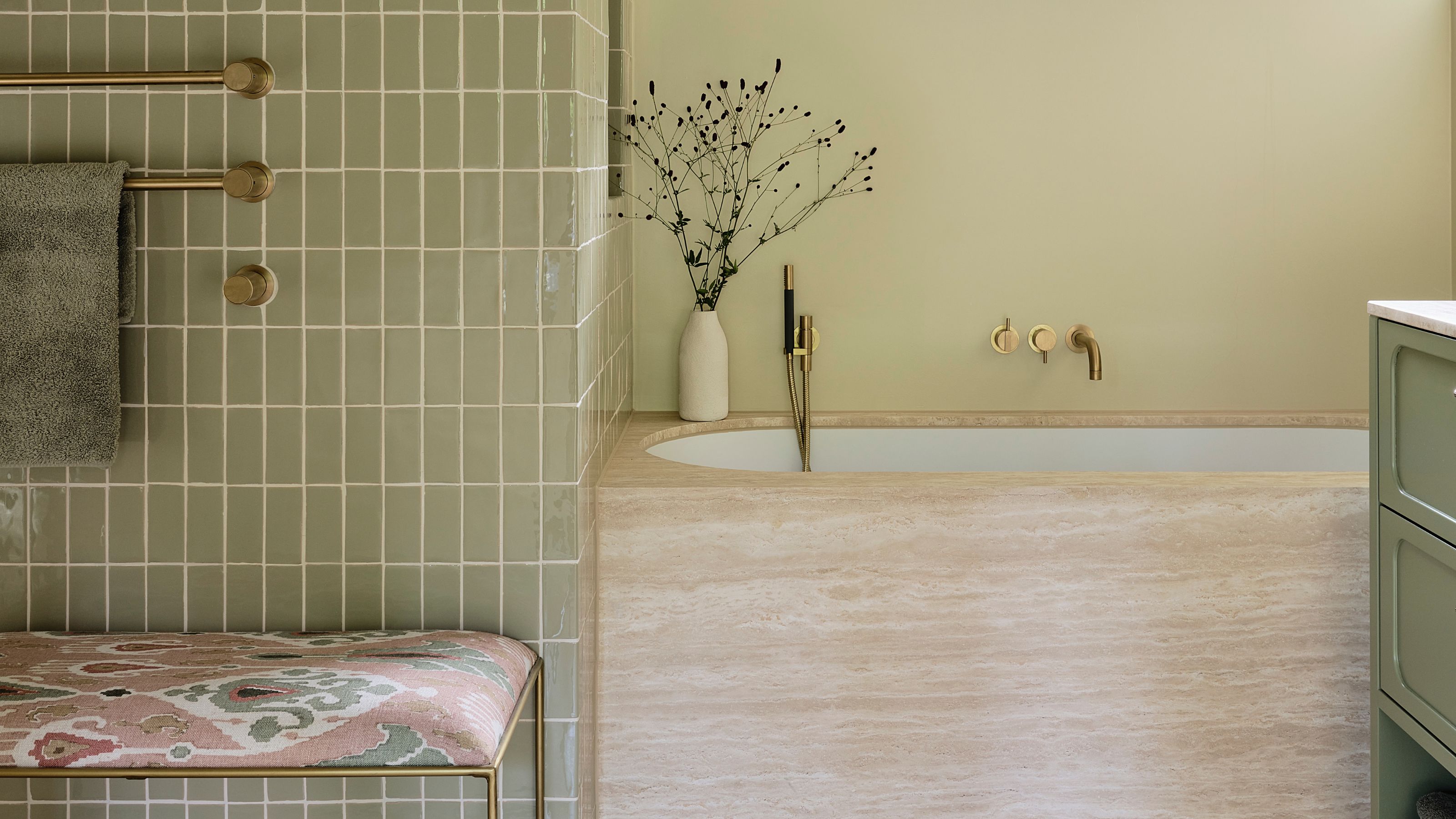
Slightly more dusty than a mint, not quite as silky as a celadon, it's a shade-shifting hue, perhaps not dissimilar to the river it's named after

The Livingetc newsletters are your inside source for what’s shaping interiors now - and what’s next. Discover trend forecasts, smart style ideas, and curated shopping inspiration that brings design to life. Subscribe today and stay ahead of the curve.
You are now subscribed
Your newsletter sign-up was successful
“When I see Eau de Nil,” writes Jonathan Adler in the introduction to his 2013 book, Life in Color, “I am transported to the lobby of Claridge’s Hotel in London with its signature Eau de Nil china, its melancholy glamour, its stirring portrait of Winston Churchill framed with an Eau de Nil border...”
In the 19th and 20th centuries, Egypt occupied a particular, storied place in the imaginations of the European bon vivants and the well-travelled gentry. From that emerged a new green color trend, a watery pale hue known as Eau de Nil, meaning ‘water of the Nile’ in French.
Though soft in saturation, Eau de Nil is a color rich in history. "It's a color that is instantly recognisable as pure 1930s," describes Ruth Mottershead, creative director of paint company, Little Greene. "During the Art Deco period, the trend for all things Egyptian continued with motifs and colors appearing in art, architecture, and design, and Eau de Nil has come to epitomize that era."
Article continues belowSlightly more dusty than a mint green, but not quite as silky as a celadon, it's a hard shade to pinpoint exactly... perhaps not dissimilar to the river it's named after.
It’s a color that exists in liminality: it stands at the precipice of green, almost yellow but not quite, more gray than blue. Like green turned cold, swirled with a dollop of silver, and laid over with fog.
Is that why Eau de Nil holds such allure? Is that why, in the modern day, designers are looking to it as a neutral-but-not hue, one that can stand on its own, but at the same time, work as a complement to bolder, more shouty shades?
“Some greens don’t require any blue or green pigments, and this is one of them," says Edward Bulmer, interior designer and founder of Edward Bulmer Natural Paints, who also created a color of the same name. "This is basically yellow ochre under the influence of black with a touch of chrome yellow.”
The Livingetc newsletters are your inside source for what’s shaping interiors now - and what’s next. Discover trend forecasts, smart style ideas, and curated shopping inspiration that brings design to life. Subscribe today and stay ahead of the curve.
Edward Bulmer is a British interior designer and architectural historian, recognised for his work in sustainable design and preservation. His background in art history and architecture propelled him into working on the restoration of some of Britain's most noted heritage properties. He is the founder of Edward Bulmer Natural Paints, which focuses on sustainable, naturally pigmented paints.
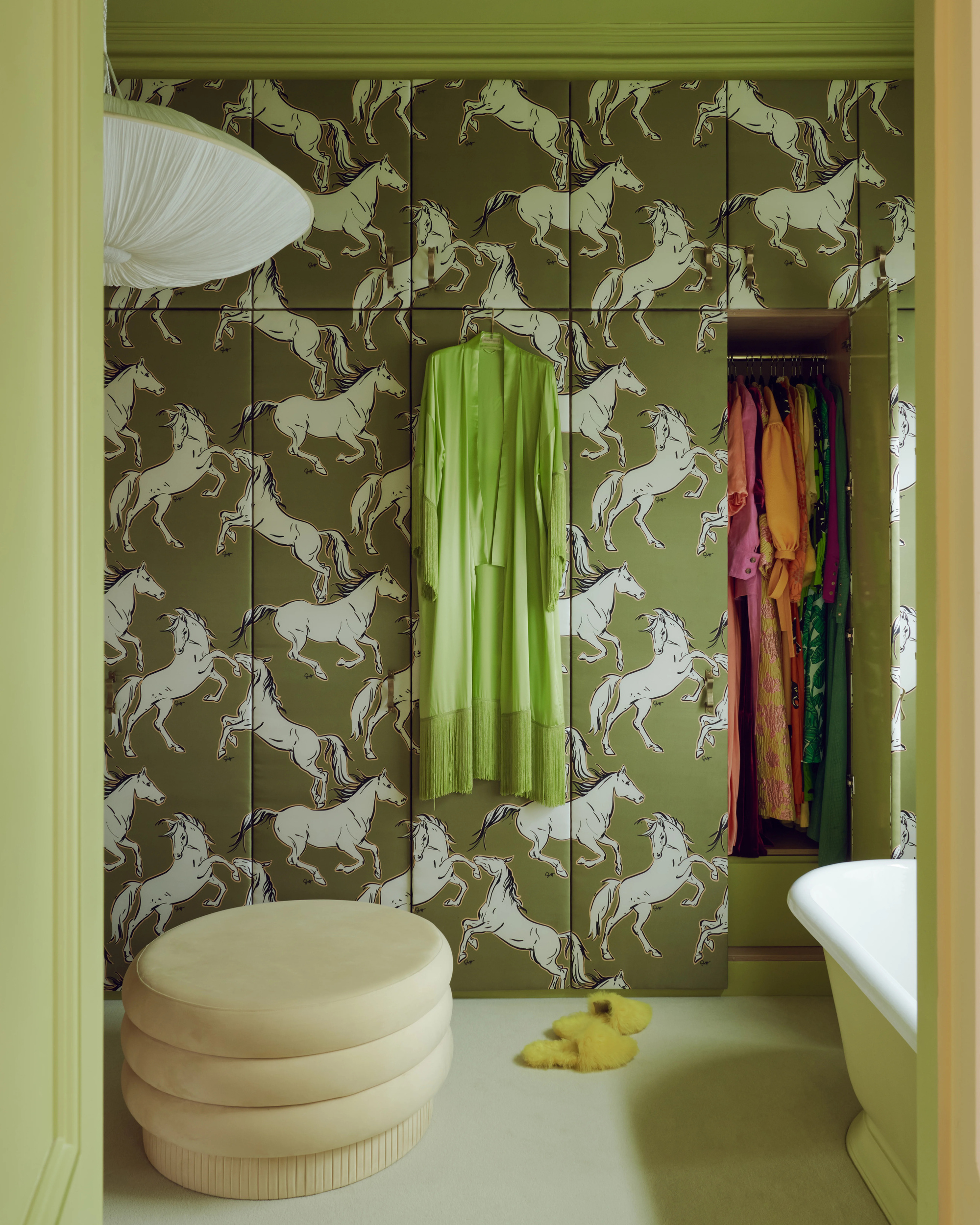
This color-drenched dressing room is the perfect backdrop for our “fashionable, party-loving client” to get ready, explains the design team at Golden.
Its romantic appeal, Edward agrees, goes back to the visions of Egypt as the scene of Nelson’s great victory over Napoleon in 1798. “This is one of the best colors I have ever mixed for its versatility and timeless elegance,” he adds.
It can be incorporated within neutral color schemes for a rounded palette of softness, but also, less expectedly, works with reds, blues, and pinks to set off its more saturated undertones.
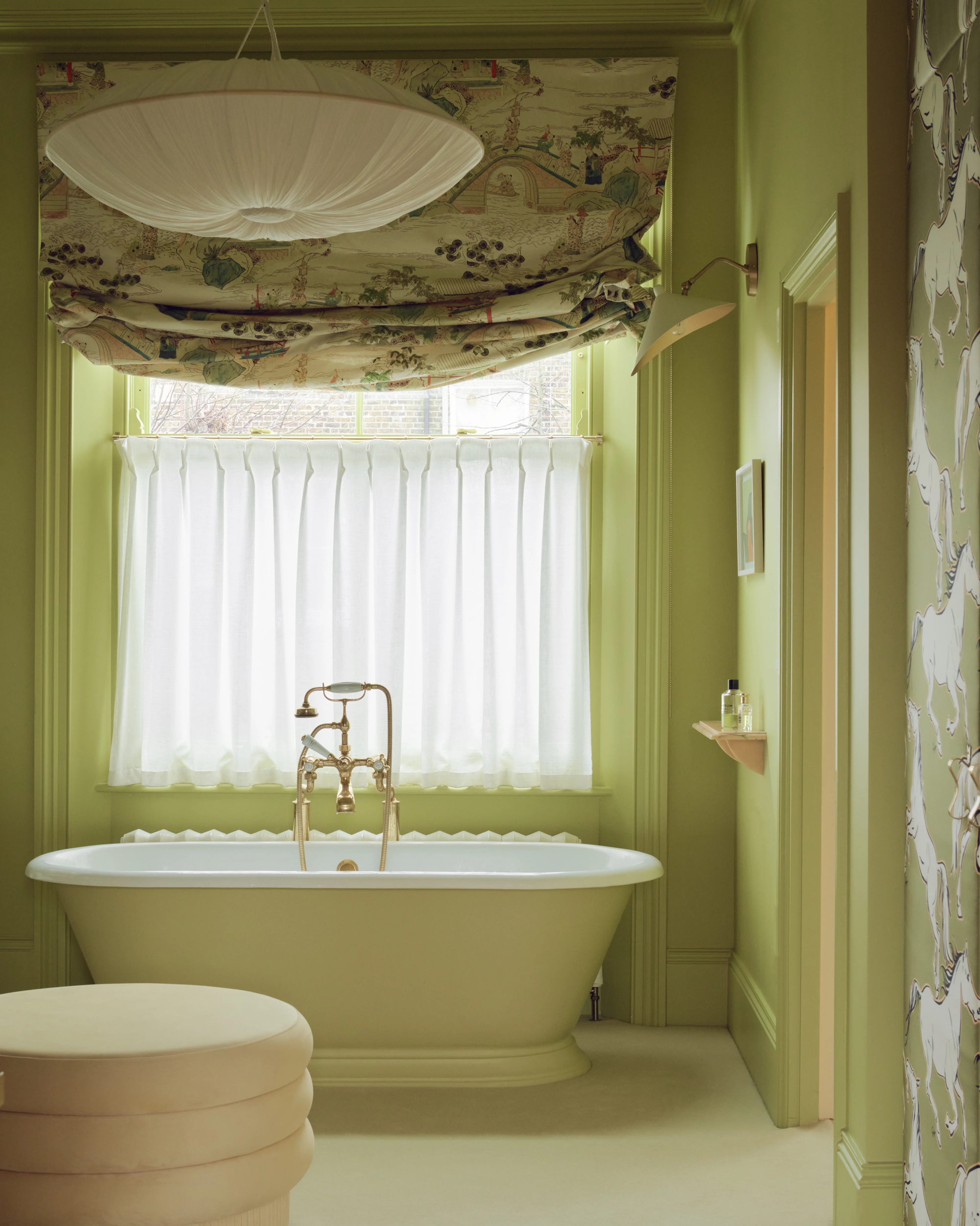
Water reflects light, so it’s no surprise that Eau de Nil does, too.
Lena Dahnsjo, color consultant at Edward Bulmer Natural Paints, says it’s a hue “neutral enough" to provide a beautiful backdrop to any color you want to introduce in a room. “This is a color I will often turn to when there has been a request for green, but where the color shouldn’t be dominant,” she adds.
Designer Max Rollitt has a particular affinity for the shade, so much so that he used it to create his son’s green bathroom. “There’s something indefinable and evocative about it,” he notes.
Its intangibility, however, means that it “can be a risky color, sometimes hovering on the edge of a 1950s hospital green,” Max adds. “But with the right undertones and in the right space, it works beautifully.”
Max Rollitt is a respected British interior designer, antiques dealer, and furniture maker, known for his warm, layered interiors that express a quintessential kind of Englishness. He is based at Yavington Barn, a former grainstore in Hampshire, where his showroom and workshop combine antique dealing with a custom furniture line.
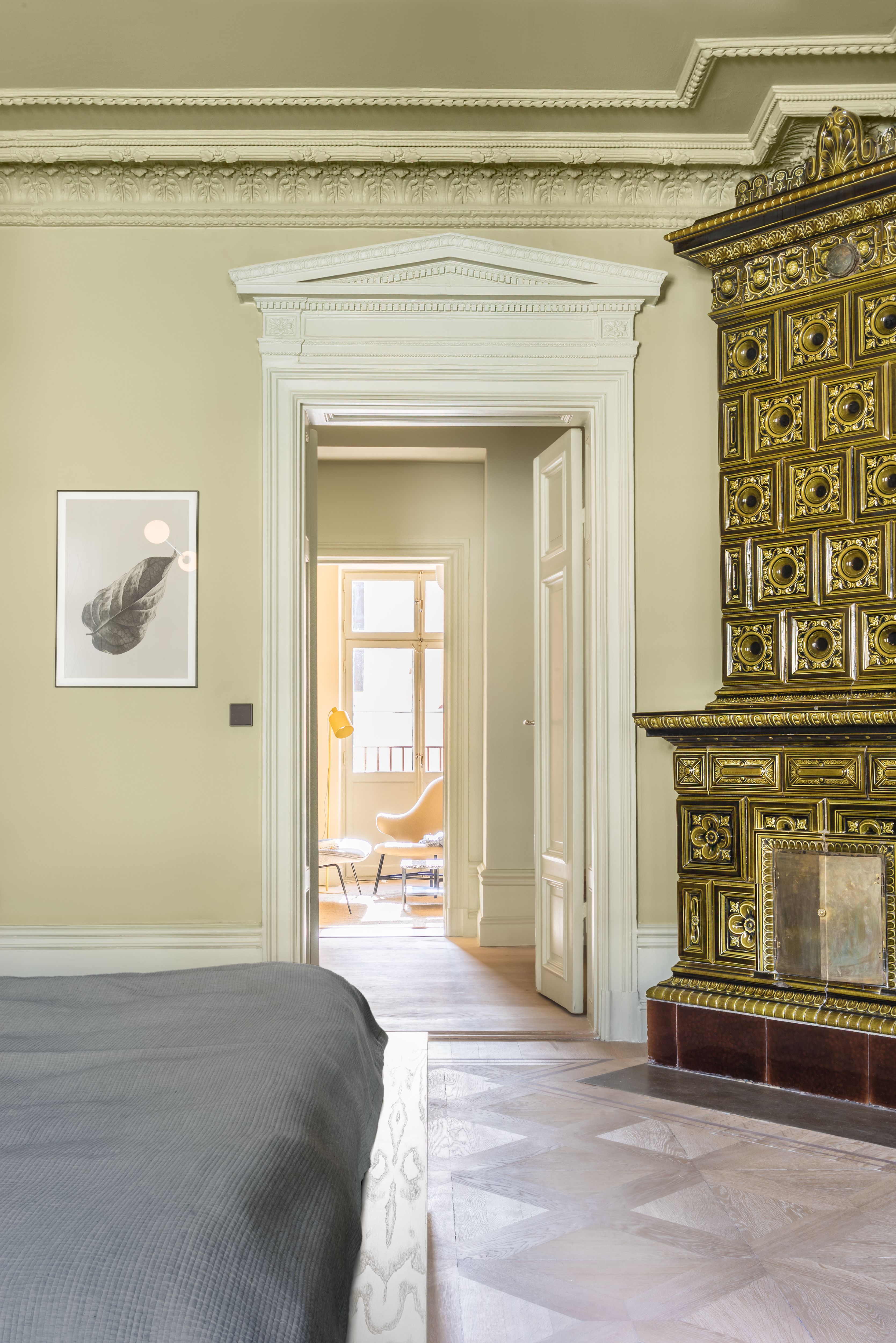
Eau de Nil is the perfect neutral-but-not hue for a space that calls for color, but not too much of it.
For Little Greene's Ruth Mottershead, "A bright pure green 'Eau de Nil' delivers an understated and enduring elegance when used in dining spaces and hallways, or adds a fresh yet nostalgic feel to kitchens and bathrooms."
As for specific complements, she recommends Little Greene's 'Jewel Beetle' or 'Sir Lutyens Sage', or for those brave enough to pair it with a bold contrast, try a hot color like Little Greene's 'Orange Aurora'.
"Due to its origins in the 1930s, it naturally feels at home in 1930s architecture or period-inspired interiors," adds Ruth. "However, like other fresh, pure greens, it is equally suited to country homes or more contemporary spaces."
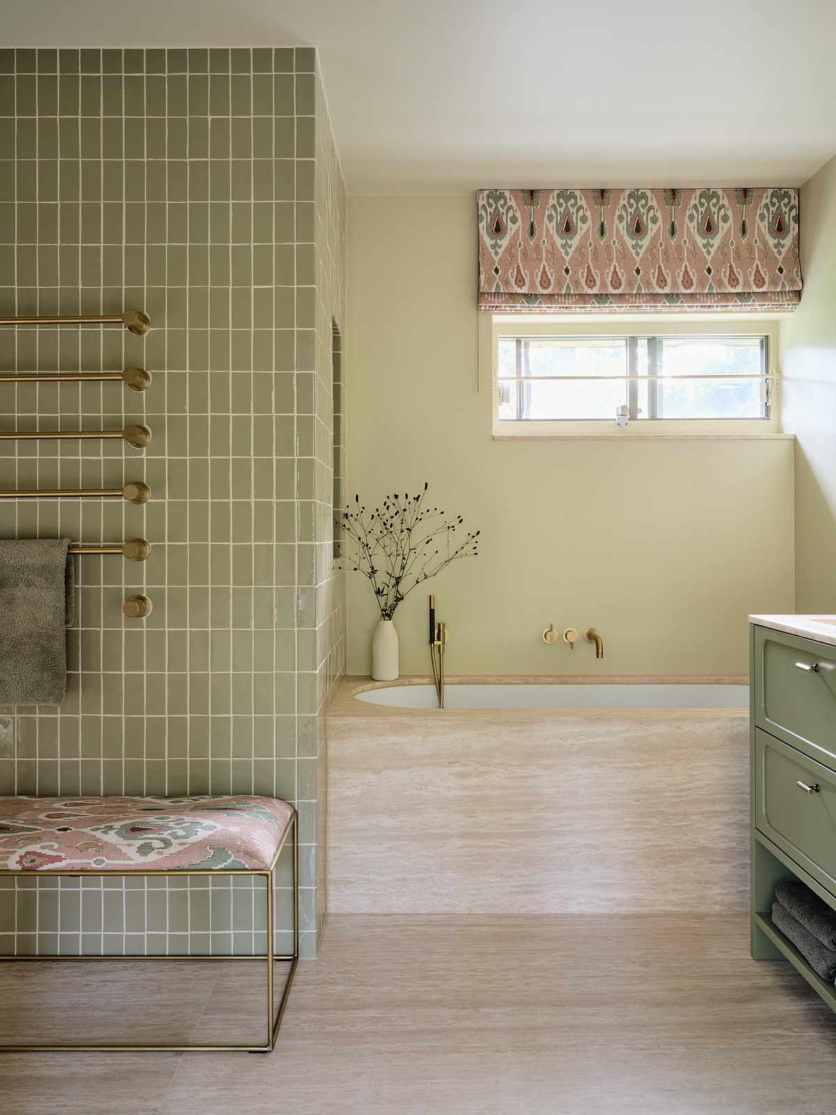
Pair two greens together for a tonal contrast that keeps a room looking fresh.
As it turns out, your choice of paint finish matters too. "Eau-de-Nil is a versatile color that works beautifully when used on bedroom or living room walls in a chalky, almost velvety matt such as [Little Greene's] Absolute Matte, or brings a sense of 1930s glamor to a space when used in reflective high gloss finishes that emulate the lacquered finishes of the era," says Ruth.
And for a color as shade-shifting as Eau de Nil, lighting is particularly important to take into account. "Eau-de-Nil will appear cooler and perhaps more turquoise in a north-facing room, where its blue undertones will be emphasized, or more vibrant and zesty in a south-facing room, where the yellow undertones will be more apparent," she adds.
Eau de Nil's appeal is clearly enduring, and as interior design trends are turning back to all things Art Deco right now, don't be surprised if you start seeing this wonderful, watery hue everywhere.

Divya Venkataraman is a writer and editor with a keen eye for design and a passion for paint swatches. She has covered architecture, interiors and design for titles like Monocle, Vogue Living, and Elle Australia. She has traced Art Deco gems from Mumbai to Miami, covered agriturismos in Sicily, and reported on iconic community spaces on Australia's east coast. She began her writing career in Sydney, where she wrote for the digital and print editions of Vogue Australia. She is currently based in London.


