12 of the Best Sage Green Paint Shades, According to Designers — "We Find Ourselves Returning to It Time and Time Again"
Sage green has a timeless appeal that makes it work in any room of the home — but which paint shades get this nearly-neutral best?

The Livingetc newsletters are your inside source for what’s shaping interiors now - and what’s next. Discover trend forecasts, smart style ideas, and curated shopping inspiration that brings design to life. Subscribe today and stay ahead of the curve.
You are now subscribed
Your newsletter sign-up was successful
Sage green paint has long been specified by homeowners and interior designers for its subtle warmth and soft radiance. It's a versatile, mid-tone green that can create a relaxing bedroom or timeless living room. In some lights it reads gray, which can make it feel modern, while in others it feels like a more vibrant shade of green.
Whether its a darker, duskier sage green paint, or a pale pastel tone, this shade is calming, and pairs well with a range of other colors. "Sage helps echo the surrounding landscape while creating a soothing, elegant atmosphere," says Britt Howard, creative director of Britt White Studio.
When it comes to the best sage green paint colors to choose from, designers often look to brands like Farrow & Ball and Little Greene for inspiration. If you're planning to decorate with sage green any time soon, these are the specific shades they choose.
Article continues below1. 'Card Room Green' by Farrow & Ball
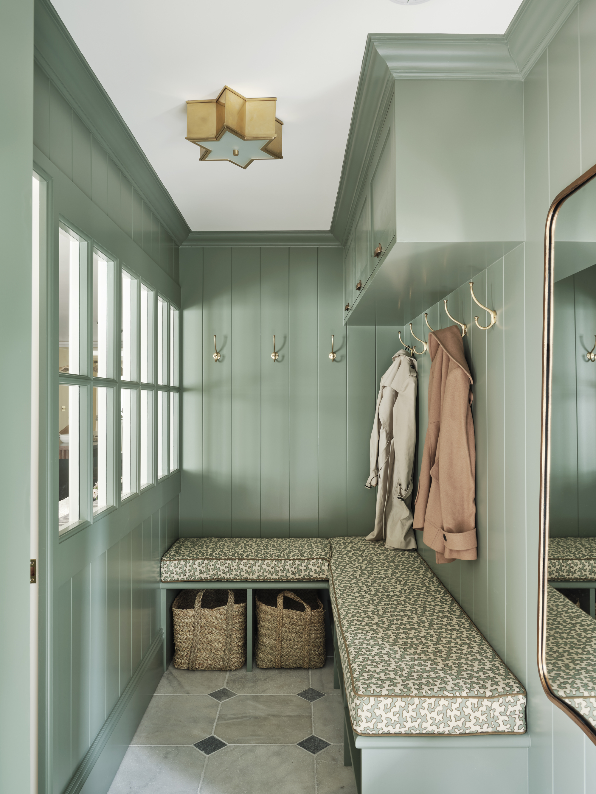
Sage green paint has the power to bring a classic sense of traditionalism to a room.
'Card Room Green' from Farrow & Ball is a dark gray-green shade named after the study rooms that were popular in the Victorian times, reflecting the color's classical connotations.
Rebecca Hughes of the eponymous interior design studio, opted to paint the wall panelling of the mud room shown above in the sage green paint, hoping it would help drive a country home aesthetic.
"I love this shade as it brings a calm, fresh feel to the space without being too cold or overpowering," says Rebecca. "It works particularly well here as it complements the natural light and pairs beautifully with the other textures and tones in the room."
2. 'Saybrook Sage' by Benjamin Moore
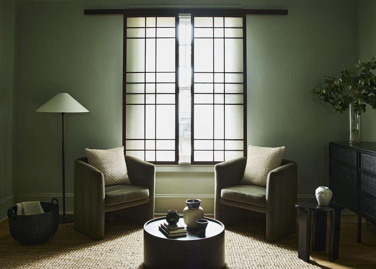
This shade of sage green paint was pulled straight from the surrounding landscape.
Ming Thompson of Atelier Cho drew upon local nature and topography, when opting for Benjamin Moore's 'Saybrook Sage' — a sage green with a splash of gray — for this living room. The result is a calming space that feels cool and soft.
The Livingetc newsletters are your inside source for what’s shaping interiors now - and what’s next. Discover trend forecasts, smart style ideas, and curated shopping inspiration that brings design to life. Subscribe today and stay ahead of the curve.
"This space took inspiration from the Elm trees in our city, and we color drenched the spaces with a range of greens from light to dark," Ming explains. The sage green paint was complemented with linen materials, black metal, and Asian antiques, but you could also pair this color with a cream or ecru for a contrasting look, too.
Interior designer Kathy Kuo agrees that 'Saybrook Sage' is an excellent choice when choosing the best sage green paint: "I love the color for when I'm looking for a subtle green hue that's distinctly in the sage family but also super-versatile," she says. "This is a classic sage green with a cooling undercurrent of gray that gives this paint color a very upscale look."
3. 'Treron No. 292' by Farrow & Ball
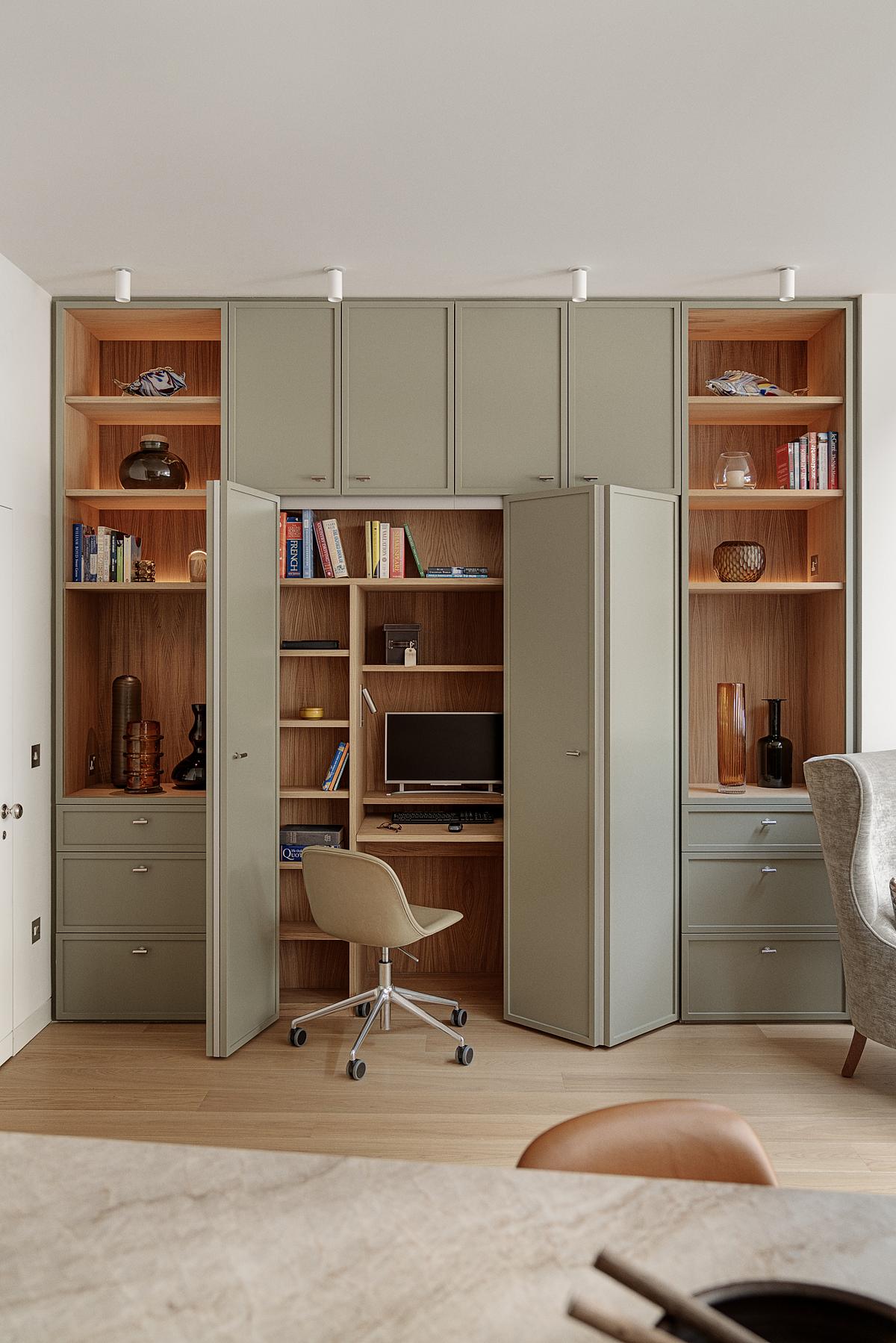
Sage green paint is a versatile shade that pairs well with natural materials.
A darker and more richer shade of sage, the team at Locus Design specified the brand's Trenon paint color for this home office — a versatile color that blends well with natural materials.
"The focus of the design was to rearrange the rear ground floor living spaces to provide more daylight and an improved visual connection to the rear garden space," explain Melanie David de Sauzea and James Cooper, the studio's co-founders. "With this in mind, we meticulously selected natural materials, textures, and colors close to nature. This sage green works harmoniously with the indoor bricks, natural oak floor, oak ceiling, and direct views to the garden."
4. 'Lichen' by Farrow & Ball

Sage green paint is a good shade for making cool spaces feel a bit more vibrant.
This calm and muted sage green paint makes a wonderful color for a north-facing living room. Named after the creeping algae which ages stone, the shade has an underlying stone-y blue tint that the team at Bespoke Only thought was perfect for this elegant space.
"Lichen is a color we find ourselves often returning to time and time again," says Melissa Lee. "It has a unique quiet quality that really calms the space with depth and its underlying blue. It’s precisely how we saw the north-facing music room. It’s unassuming and subdued — and you can almost hear the piano playing in the background."
The cool light in the room was counteracted using Farrow & Ball's Lichen sage green paint, balanced with pops of warm pastel pink and pale brown.

Melissa Lee founded her multidisciplinary design firm, the Brooklyn-based Bespoke Only, in 2012. Lee perceives each space as a living, evolving entity shaped and transformed through intimate interactions over time.
5. 'Green Smoke' by Farrow & Ball

The subtle blue undertone of this sage green paint gives it plenty of character.
For something darker and with a bit more period charm, Farrow & Ball's Green Smoke has undertones of both gray and blue.
"It's this hint of blue which adds depth to the sage green base and is both contemporary and characterful which felt appropriate for a modern modern farmhouse kitchen," explains Lydia Robinson, co-founder at Design Storey.
To bring added warmth to the space, Design Storey chose warm glimmers of gold through brassy hardware and light fittings, balancing the coolness of the shade.
6. 'Nature Lover' by Benjamin Moore
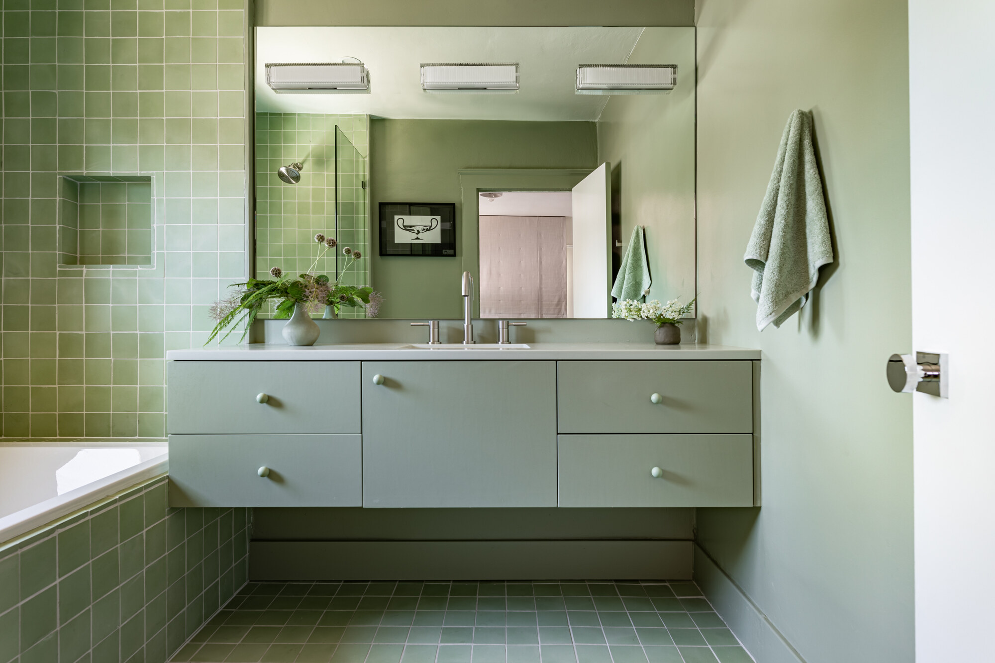
As a warmer shade of sage green paint, this one is perfect for drenching spaces in.
Benjamin Moore's 'Nature Lover' is another shade of sage green paint that's popular with designers. It feels warmer than other shades, and works wonderfully in this bathroom with a monochromatic color scheme.
"We were aiming for a soothing monochromatic palette for this room so we really used the tile as the foundation and built the rest of the color palette around that," explains Leah Ring of Another Human. "I like this sage green as it's calming but doesn't have too much gray, which in my opinion can make sage greens look a little dull and lifeless."

Leah Ring is the designer behind Another Human. Ring honed her aesthetic over the past decade working in high-end interior design and founded her Los Angeles based studio in 2017.
7. 'Sage Green' by Little Greene
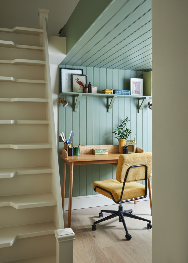
Sage green often changes with the light, bouncing brightness around a room.
Little Greene's 'Sage Green' is another one of the best sage green paint colors, according to designers. It contrasts well with wooden tones and pops of yellow, as seen in this sunny home office.
Laura Stephens paired it with 'Slaked Lime' by Little Greene on the adjacent walls and staircase, the contrast framing the workspace while allowing light to bounce through, keeping everything fresh and uplifting.
"I chose Little Greene’s Sage Green for this space because it’s such a calm, versatile shade — soft enough to make a small nook feel cozy rather than closed in, but with enough presence to define the area as a purposeful zone within the home," she explains.
The paint helps anchor the joinery and creates a visual boundary without overwhelming the room. "Sage Green by Little Greene brings in that connection to nature, feels timeless, and works beautifully with wood and natural textures, which we’ve echoed in the desk and shelf styling," says Laura. "It’s a shade I return to time and again for its balance of subtlety and sophistication."
8. 'French Gray' by Farrow & Ball
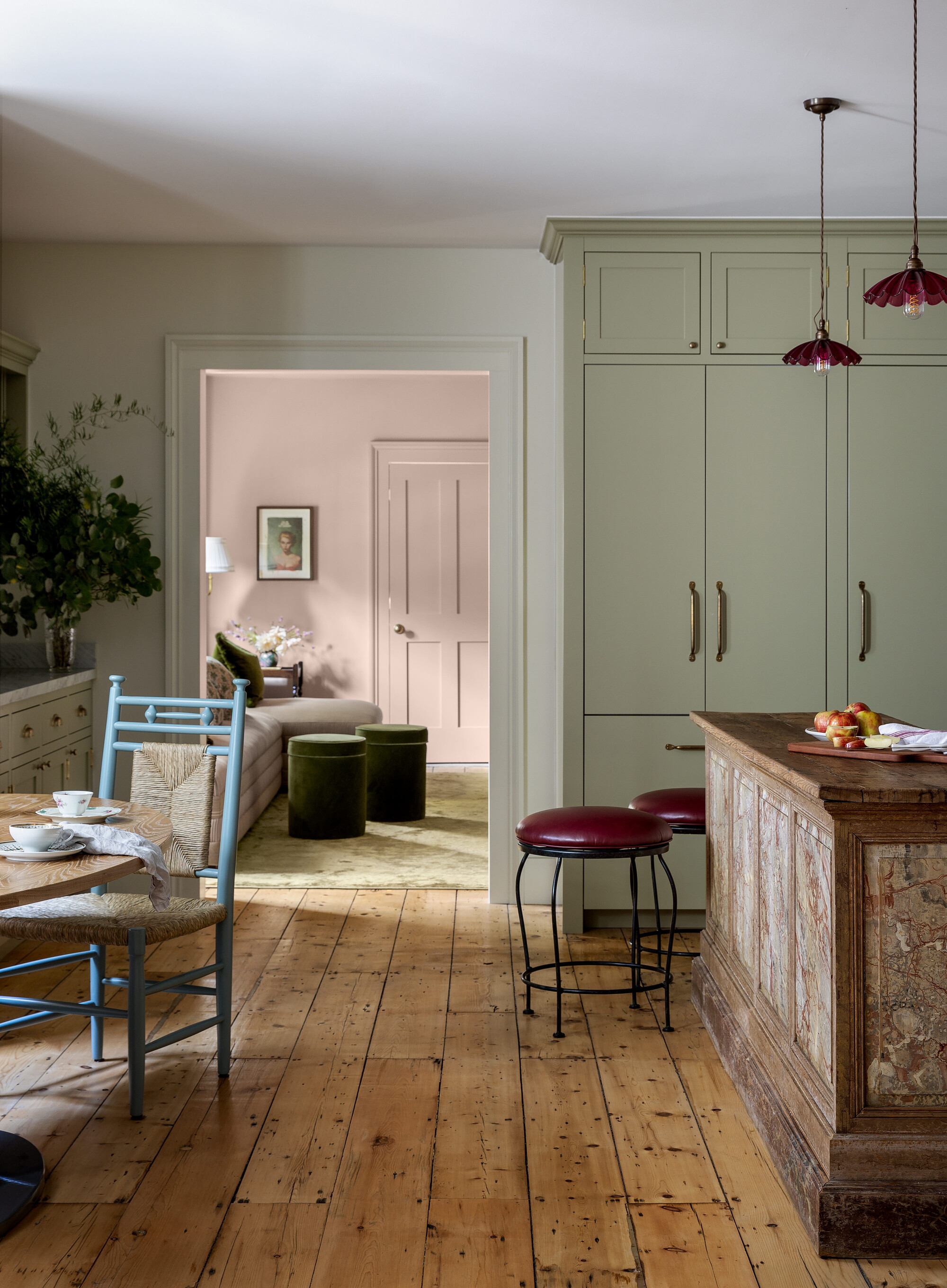
Inspired by 19th-century wallpapers, this sage green paint feels classic, yet timeless.
Taking inspiration from decoration and wallpapers used in the 19th century, Farrow & Ball's French Gray works for exterior woodwork and is also a firm favourite for a front door color.
It's a shade that changes depending on the lighting and the time of day, which is something the team at BNR Interiors considered when selecting the paint and the room.
"At some parts of the day it looks more like a sage green, and others it looks like a putty," says Nicole Fisher. "But there is so much depth to this color. That’s what makes it special."

Unique furniture layouts, rich textures, period pieces and luxurious finishes are pillars of Nicole's aesthetic at BNR Interiors.
9. 'Pond Green' by Farrow & Ball
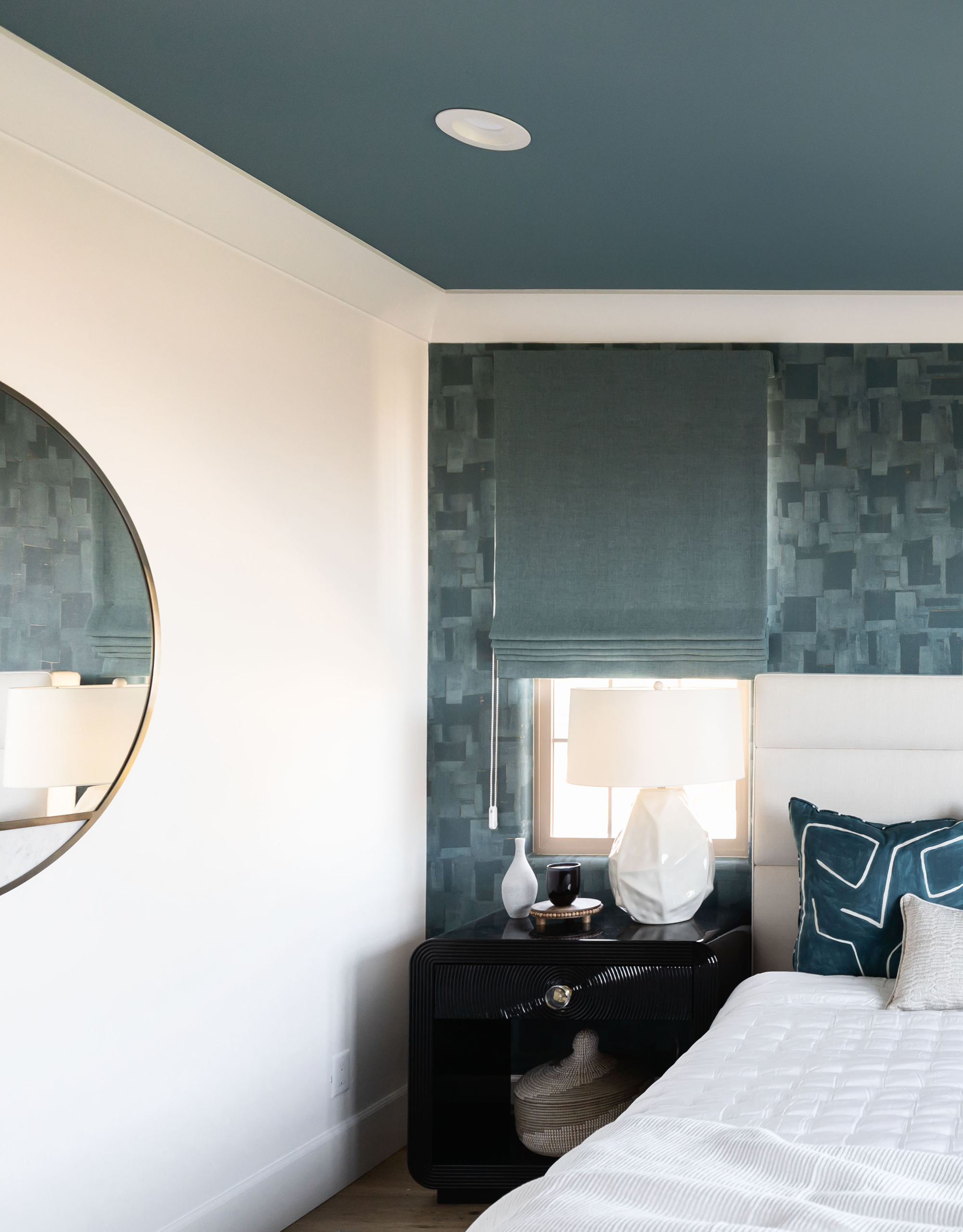
At one end of the spectrum, sage green paint can be deep, invigorating, and charming.
Undoubtedly one of the best Farrow and Ball paint colors from the archive, 'Pond Green' is a deeper mix of green, blue and gray, offering a version of sage green that's capable of making a statement, while retaining its calming superpowers.
It's Lauren Lerner, principal designer of Living with Lolo's go-to sage green paint color. "This green is invigorating, serene, and invokes a feeling of being in nature," she says. "It's also an easy neutral to incorporate through an accent wall or accessories, which makes it a great choice for any room in the house"
10. 'Ho Ho Green' by Little Greene
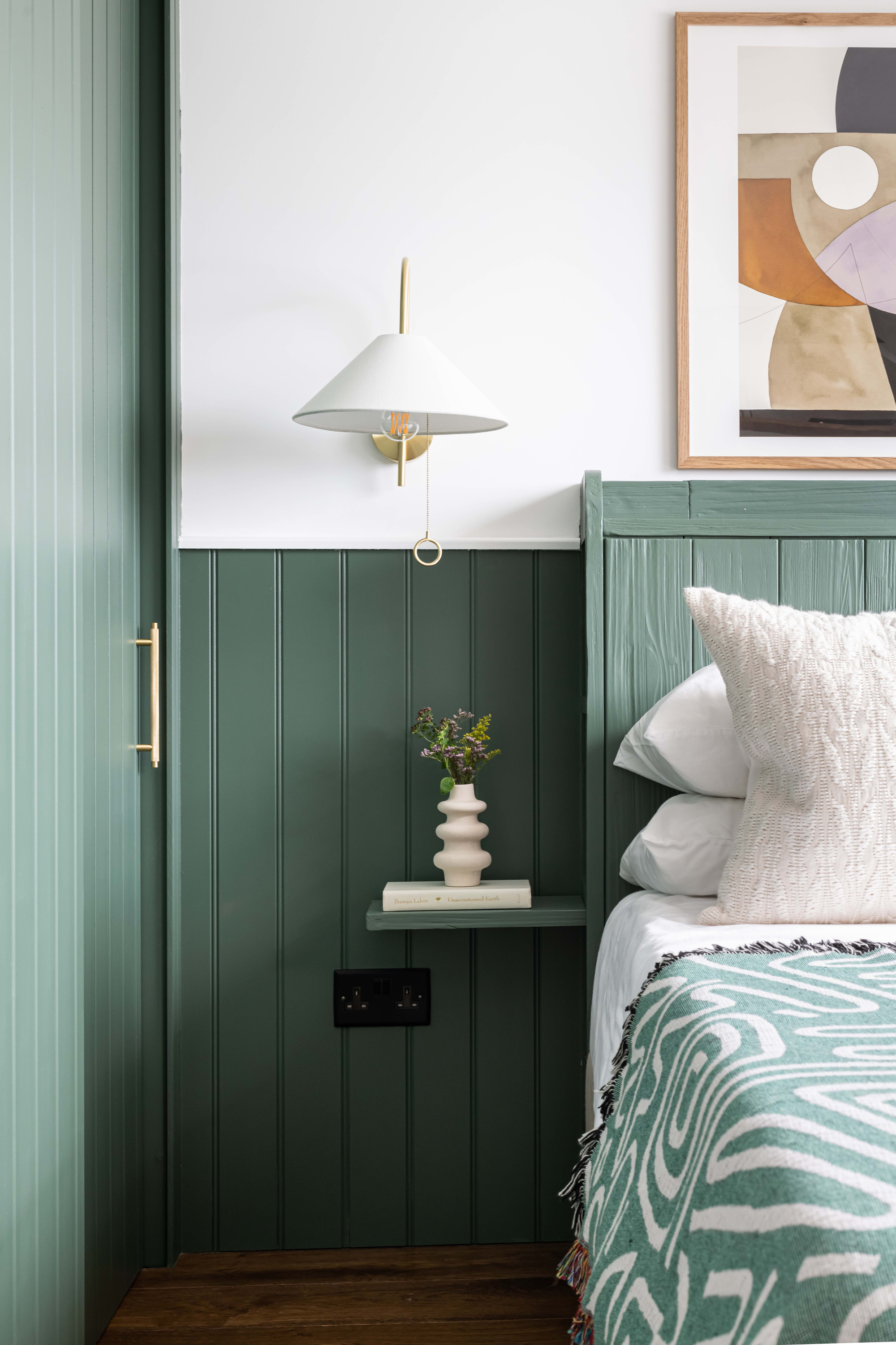
Some shades of sage green paint can be quite rich and vibrant.
While a deeper shade, and rich with pigment, Little Greene's 'Ho Ho Green' still has that near-neutral quality that makes it a choice that can suit all kinds of rooms and interior styles.
"We also find that darker sage green hues add more shadows and create different tones when the light hits,' say Jen and Mar of Interior Fox. It works well with brass tones, and rust and tan tones are also colors that go with this sage green.
11. 'Ramona' by Dulux Australia

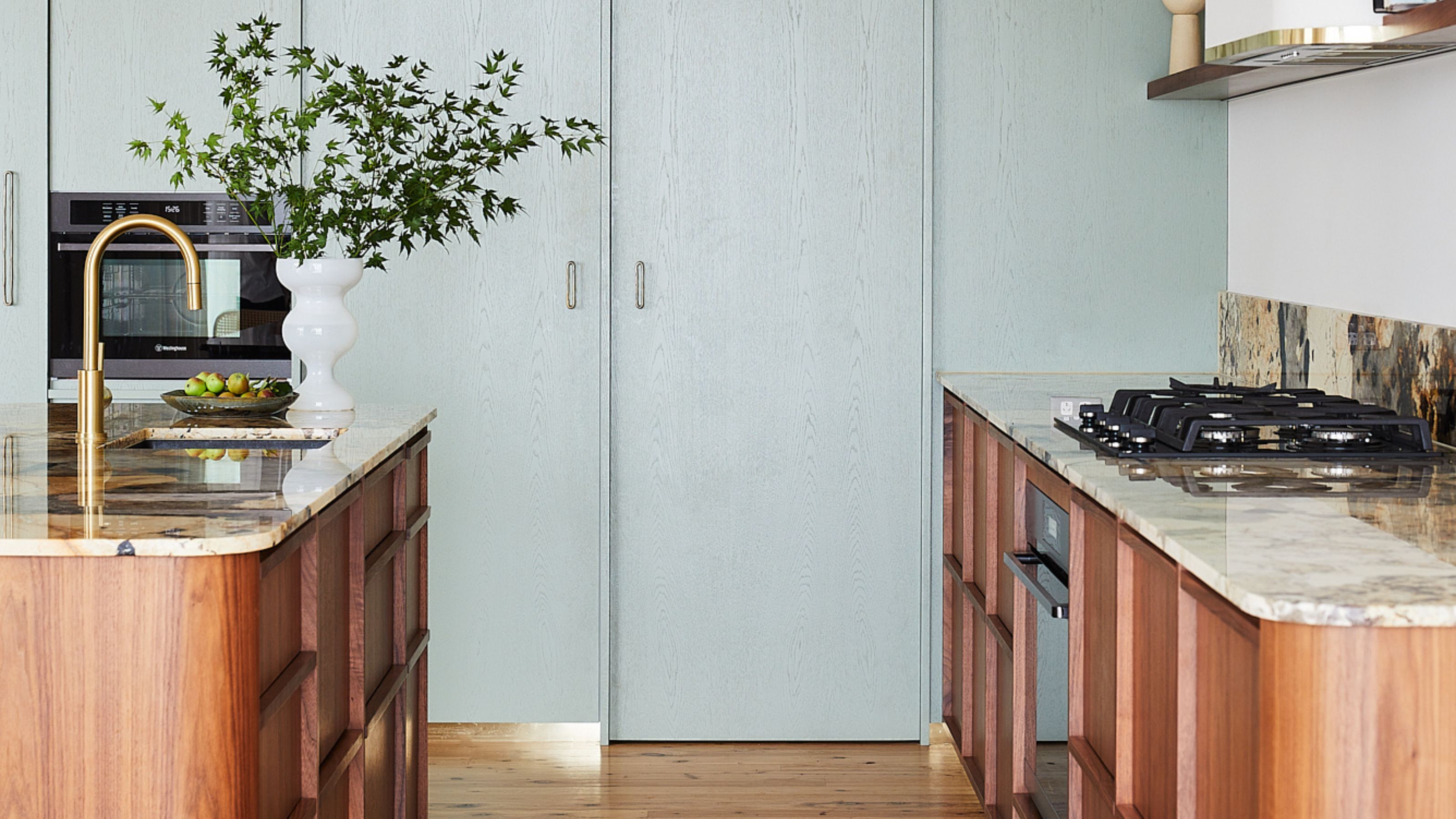
This kitchen filled with natural textures shows how seamlessly sage green sits within that palette.
Australian designer Kerrie-Ann Jones opted for a sage green paint from Dulux Australia, called 'Ramona', for the kitchen cupboards in her home. She coated them lightly so you could still see the grain of the wood throughout.
The shade pairs well with the kitchen flooring and timber island, creating a calming and contemporary feel. She opted for the shade because it "fits with the seaside location and also works with the neutral palette of the rest of the home," she explains.
"Sage green is one of my favourite colors and I felt it worked beautifully here in the kitchen," Kerrie-Ann shares. "I have also used sage green in my guest bathroom and touches throughout the home."
12. 'Escape Gray' by Sherwin Williams
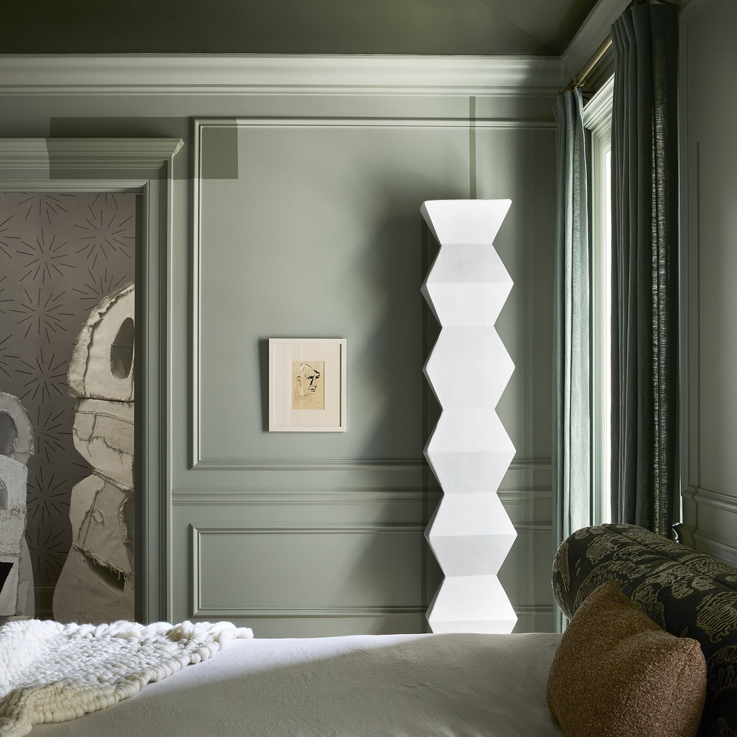
Almost gray-looking, this sage green feels immediately soothing; a nearly-neutral.
Sherwin Williams' Escape Gray works beautifully in this bedroom, creating interplay with light and shadow, highlighting the rails and panelling on the wall.
The use of the color on the panels also means that the room and textures of the walls will look different throughout the day. At some moments, it might feel soft and warm, and other times the verdant green will pop more.
"A mix with gray, this sage green paint color combines a tone that brings a color like green into the updated neutral zone," explains interior designer Jen Talbot, who designed the space.
FAQs
What is the most popular sage green paint from Farrow & Ball?
As with all greens, the best sage green paint will create a calm and relaxing environment which makes this color enduringly popular and timeless.
"One of our most popular sage greens is Treron, a rich sage which is ideal for snugs," says Patrick O'Donnell, brand ambassador at Farrow & Ball. "It is a darkened version of our ever-popular Pigeon, offering a deeper green."
Now you've found the best sage green paint color for your space, it's time to bring your sage green room ideas to life.
"Schemes featuring sage green can often feel harsh when paired with a brilliant white. To combat this, consider layering sage green with off whites which have a nuance of green through them," suggests Patrick. "This will avoid any tonal fighting and instead create a soft shaded scheme."

Former content editor at Livingetc.com, Oonagh is an expert at spotting the interior trends that are making waves in the design world. She has written a mix of everything from home tours to news, long-form features to design idea pieces, as well as having frequently been featured in the monthly print magazine. She is the go-to for design advice in the home. Previously, she worked on a London property title, producing long-read interiors features, style pages and conducting interviews with a range of famous faces from the UK interiors scene, from Kit Kemp to Robert Kime. In doing so, she has developed a keen interest in London's historical architecture and the city's distinct tastemakers paving the way in the world of interiors.


