People Are Saying This Popular Color Is the New 'Millennial Gray' and I'm Triggered — Is It the Next Trend to Fall Out of Fashion?
Green has become a go-to in design lately, it's considered a neutral for many. But do all good things have to come to an end?

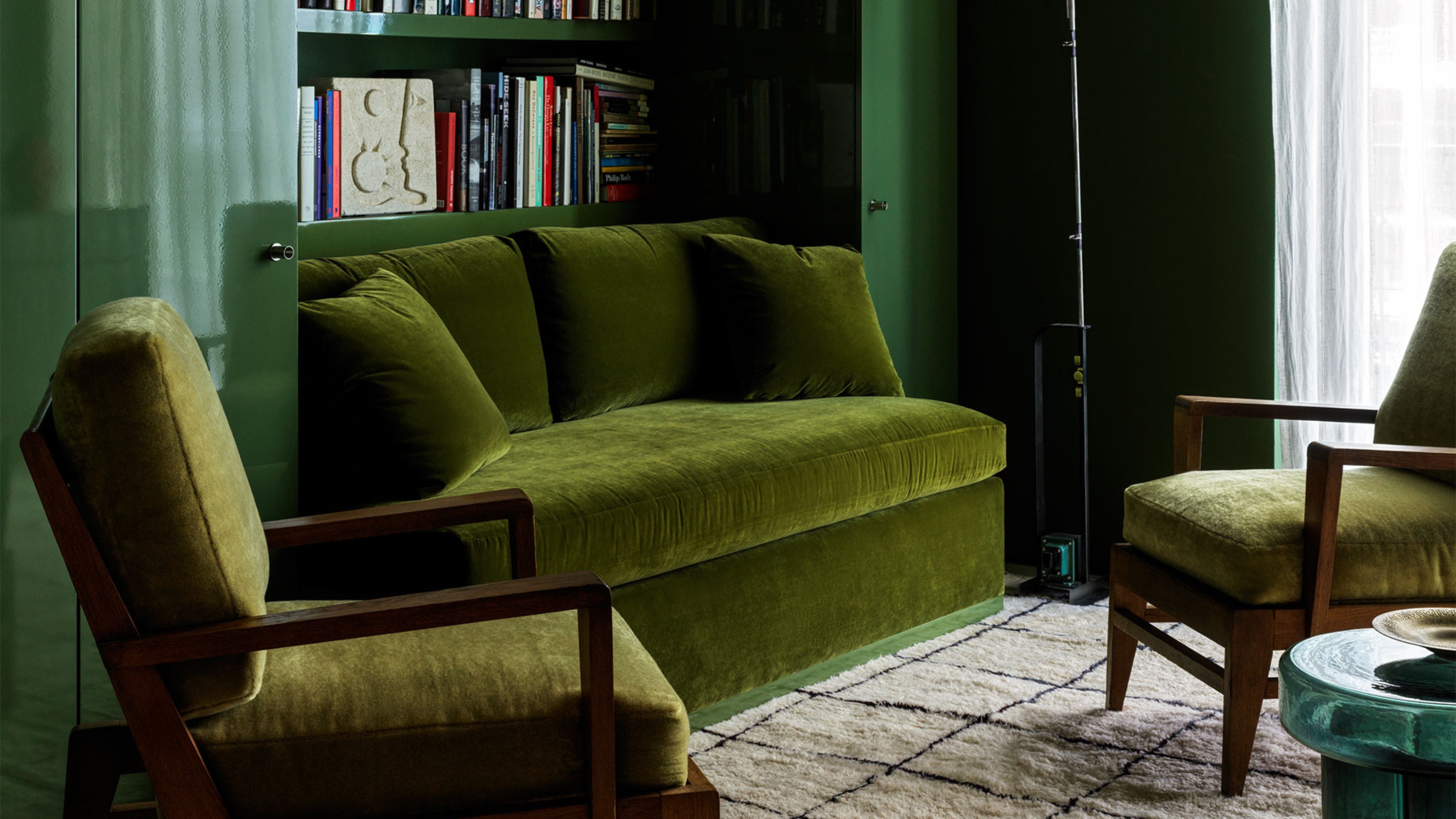
Remember the wave of cool, mid-toned grays that washed over the design world in the 2010s? At the time, the grayscale makeover was an almost avant-garde rebellion against its Tuscan-era design predecessor. But it didn't take long before it was deemed sad and outdated — and 'millennial gray' became lore. Well, a new trend spreading across social media suggests green could be headed for a similar fate...
"I can see where the idea is coming from," says Livingetc's editor Hugh Metcalf. "There's become a palpable sense that it's not a good thing to have a decorating scheme that's too one-note neutral, so people are trying to introduce new contrasts in. However, for the color averse, this particular tone of grayish-sage green is only too easy to reach for, bringing a new connotation to the sorts of homes it's used in."
So, is green the new 'millennial gray' or 'sad beige'? (Yes, it sends a shudder through me, too). In short, no. I don't think so. We've been decorating with green for years, and it has so much more variety than those more neutral shades.
Article continues belowLivingetc's color expert, Amy Moorea Wong, says, "As a color — nay, the color — of nature, I declare with my whole heart that green won’t ever go out of style." (Phew.) "It can’t," she continues. "Our lives are wrapped in it, and as the hue that represents breezy, swaying forests, and soft, rolling hills, it’s got an access-all-areas pass to my house, and my heart."
Green room ideas make our homes feel grounded, soothed, invigorated, and connected to nature in a way other colors (especially gray and beige) simply can't. "Bringing it into our homes was absolutely one of our better ideas. I defy anyone to tell me green does not feel, or look, good in the home," adds Amy.
But, and it's a big but, there are nuances to doing it right. And perhaps that's what people are discussing online. Pick the wrong shade, put it in the wrong place, and it can indeed feel like you're a millennial trying to disguise your otherwise neutral interior... So, how do you avoid this? I asked interior designers and color experts for their advice.
Why Is Green Being Called the New Millennial Gray?
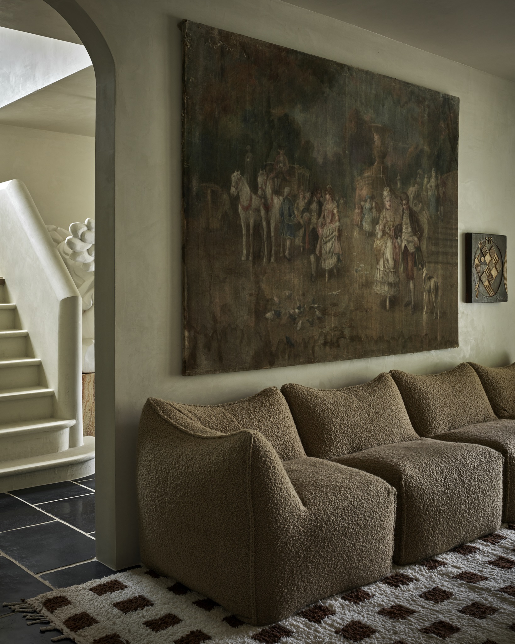
Though color-drenched in green, the layers of several different shades help make the room feel more nuanced and refined, and the mix of textures adds depth.
"The label 'millennial green' appears to reflect a continuing preference for a minimalist aesthetic in interior design," explains Australian interior designer Sally Wilkins, "but this time with a bit more color."
The Livingetc newsletters are your inside source for what’s shaping interiors now - and what’s next. Discover trend forecasts, smart style ideas, and curated shopping inspiration that brings design to life. Subscribe today and stay ahead of the curve.
And although green has depth, and can create contrast and visual interest, "Too much green makes for a cold and clinical space, and has the opposite of the refreshing feeling that nature provides," Sally adds.
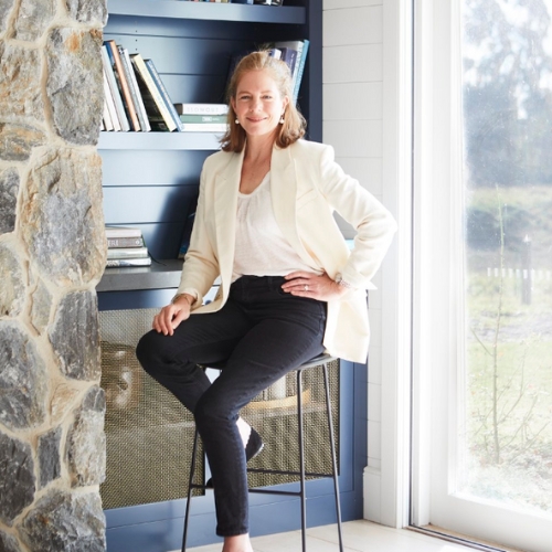
Sally Wilkins graduated from the University of Sydney School of Architecture in 2000. After 6 or so years working in residential architectural studios, Sally founded her own design studio based in Sydney and in the Southern Highlands, Sally Wilkins Studio. Grounded by her 20 plus years experience, Sally designs serene contemporary spaces with clean lines and a deft and creative mix of materials.
It could also have something to do with the popularity of green color trends over the past few years. "We’ve been talking about greens for longer than most color trends, it’s true, and we do have a penchant for chasing the next, experimental, wow-y, 'no-one-else-has-that' hue," says Amy Moorea Wong.
Sage green rooms come straight to mind. "I still think it’s a beautiful color," says Amy. "Though, is it a bold, unexpected hue to decorate with? Not anymore."
Or perhaps it's the fact that we've been touting green as a 'neutral' these days that has made it feel a bit boring, and made it blend into the background. But, is that a bad thing? "I won’t be holding that against it," says Amy. "Green's prominence doesn’t take away from its inherent power to calm and act as a decorative balm."
How to Avoid 'Millennial Green' in Your Home
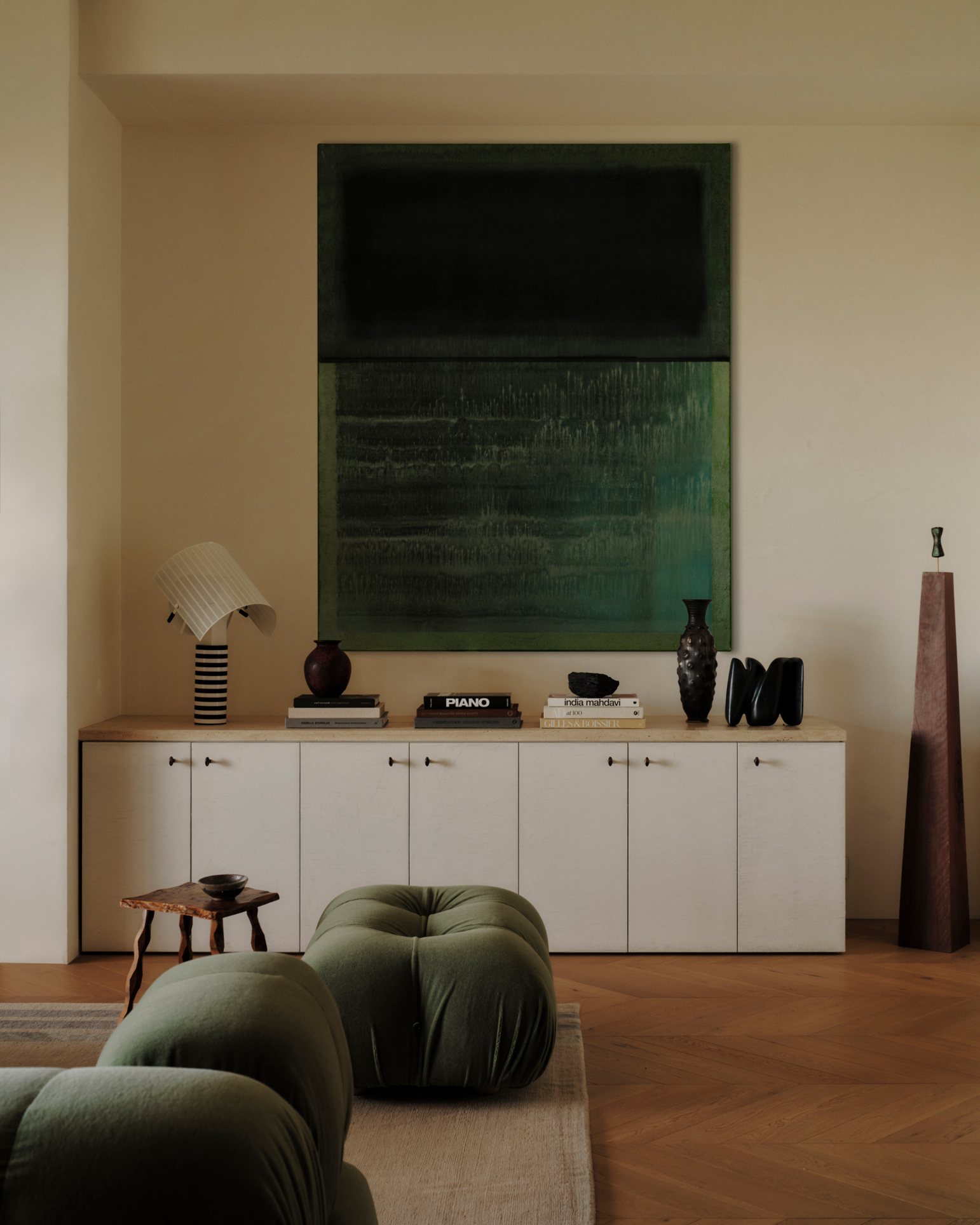
Green can be incorporated through elements beyond just wall color. Here, the warm-toned walls and wooden accents make the sage and forest green tones pop.
The good news? Avoiding the 'millennial green' effect doesn't have to mean avoiding green. There are lots of ways to introduce the shade in a way that feels fresh and contemporary, and a lot of that revolves around how you layer in other colors, materials, and finishes.
"We’re not aiming for a green theme, or trying to actually emulate a woodland — it’s time to think of green as an accent color, part of a wider palette, rather than the dominant hue," says Amy.
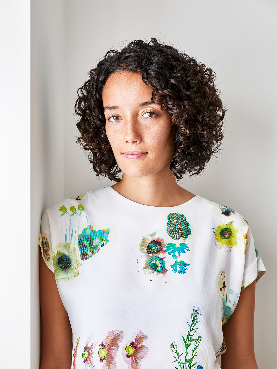
Amy Moorea Wong is a color authority and contemporary interior design writer who has specialized in all things decorating for over a decade. Alongside being Livingetc’s Color Expert, she also contributes to an array of global publications and has a book, Kaleidoscope: Modern Homes in Every Colour. Amy is an ardent believer in the power of color in a home and how creative design should never be intimidating.
To avoid green decor mistakes, Sally suggests trying to "Create interest with colors that either contrast with or complement green." Consider green as a primary accent color rather than a dominant shade (dominant meaning, for example, the wall color). Instead, introduce pops of green through upholstery and textiles.
But, most importantly, to ensure your scheme doesn't err towards 'millennial green' territory, avoid pairing green with an otherwise neutral color scheme. "Introduce a secondary color to complement it, and then add a third accent color, such as soft yellows or blush pink, for visual interest," says Sally. Learning how to use the color wheel to work out what colors go with green will be your best guide.
Alternatively, go all out, using green as your base by color drenching your space in it. "Just make sure to pair it with natural elements for warmth and texture and accent colours for warmth and visual interest," says Sally. "This will prevent the space from feeling cold and clinical."
The Shades of Green That Are Very Much Still In Style
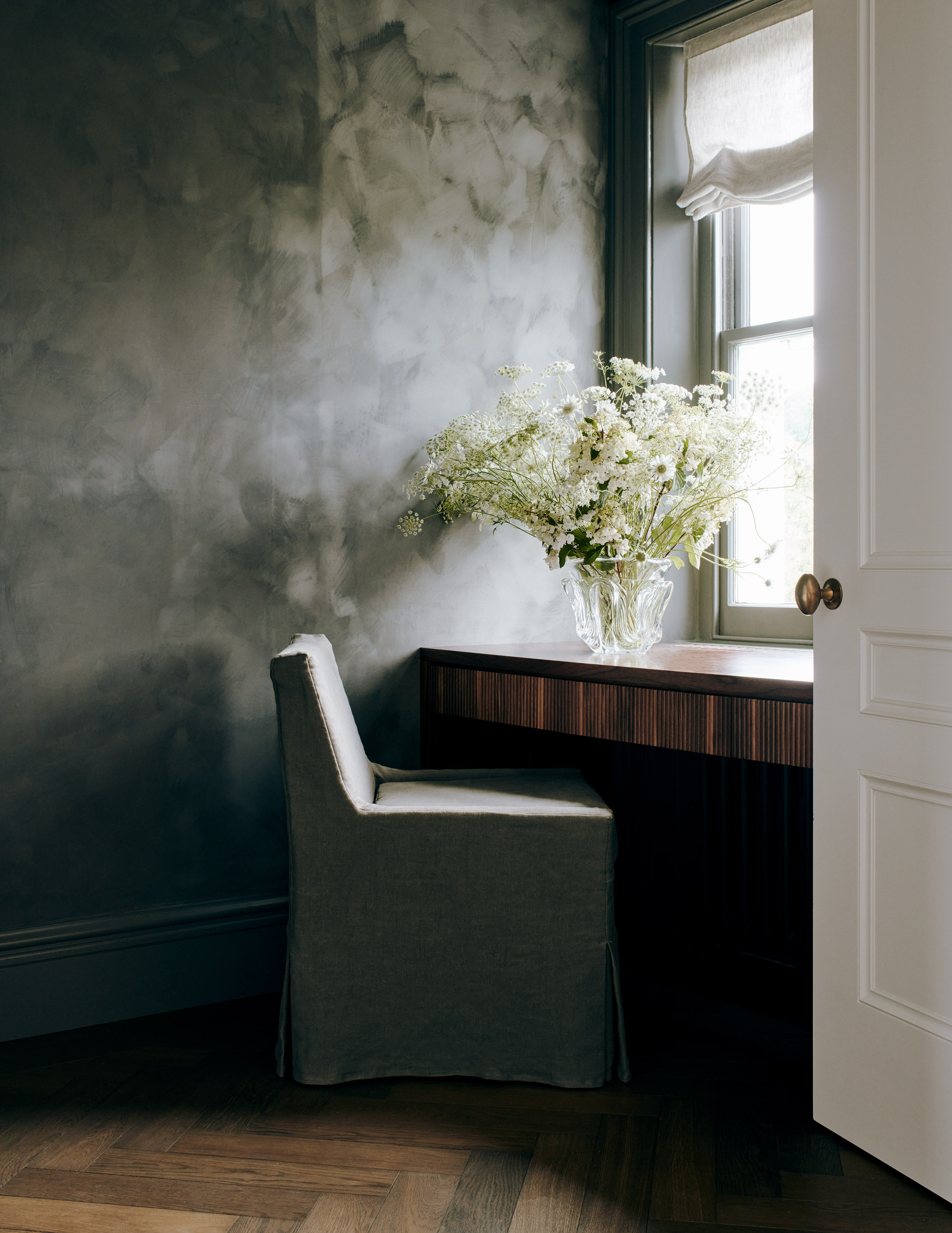
Limewashing is another technique that will help add visual interest to green walls.
So, now we know it's possible to still make green stylish, it's important to know which shades to work with, and the best green paint to choose for a more contemporary look.
"My green shades of choice are on the deep and edgy side, like a dirty olive, a muddy crocodile, or something mossy," says Amy. "A splash of pistachio if I need to liven things up." Her best advice? Look out the window, and build your palette around what you see there.
As for Sally, "My personal preference leans towards natural, yet statement-making tones like muted soft olive greens or tobacco hues," she says. Nature-inspired shades harmonize beautifully with other colors, too.
Green became an easy antidote to the otherwise potentially "boring" palettes of beige, gray, white, and cream that dominated interior design trends over the past decade.
But that doesn't mean it has to be doomed to a similar fate. It's just about finding ways to let it flourish, rather than seeing it as a short-term fix.

Olivia Wolfe is a Design Writer at Livingetc. She recently graduated from University of the Arts London, London College of Communication with a Masters Degree in Arts and Lifestyle Journalism. In her previous experience, she has worked with multiple multimedia publications in both London and the United States covering a range of culture-related topics, with an expertise in art and design. At the weekends she can be found working on her oil paintings, reading, or antique shopping at one of London's many vintage markets.


