7 of the Biggest Kitchen Color Trends That Are Set to Take Over 2026 — And Why Designers Are Choosing Them for Homes Next Year
From bold teals to sensual browns, these are the kitchen colors designers are backing for the upcoming year

The Livingetc newsletters are your inside source for what’s shaping interiors now - and what’s next. Discover trend forecasts, smart style ideas, and curated shopping inspiration that brings design to life. Subscribe today and stay ahead of the curve.
You are now subscribed
Your newsletter sign-up was successful
If you thought kitchen colors had settled into snoozeville, 2026 is here to shake you awake. Next year’s palette is bigger, bolder, moodier, and far more design-driven than anything we’ve seen in the last decade. Forget playing it safe — color is officially the new luxury, and kitchens are fast becoming the place where it shows. Even whites are evolving: Pantone’s Cloud Dancer is the latest proof, a soft, chalky tone designed to sit amid expressive materials rather than quietly fade away.
Industry trend reports are backing this pivot hard. WGSN, Valspar, Benjamin Moore, Sherwin-Williams — everyone is aligning around richer, more expressive kitchen color ideas and combinations. We’re talking smoked teals with real bite, herbal greens that feel quietly upscale, moody burgundies, and textural greiges that read more like material than paint. Even pastels are entering the chat again, but this time they’re chalky and architectural, and all-grown-up. And yes, white kitchens are roaring back, but in a far more nuanced, chalk-matte, light-catching way.
What ties these colors together is not their saturation but their intent. These are shades that sculpt surfaces, highlight craftsmanship, and make stone, wood, and metal feel sharper and more considered. 2026 is the year kitchens stop behaving like workrooms and start acting like decorated living spaces, with color doing most of the heavy lifting.
Article continues belowTeal Is the New Focal Color
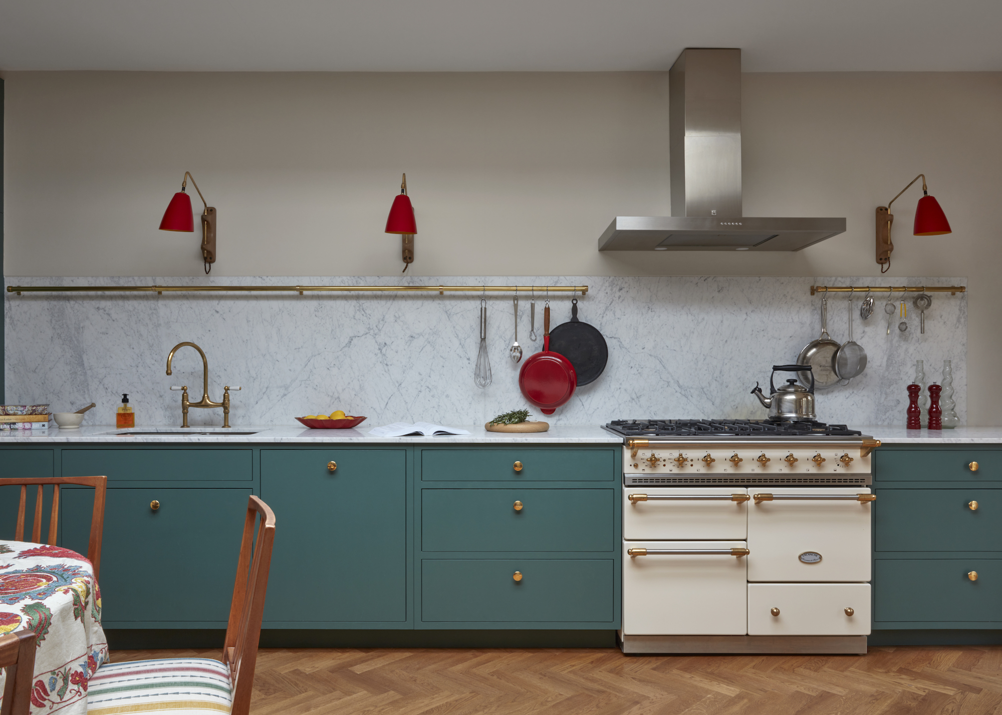
Teal is the real deal if you're looking for a strong hit of color.
Decorating with teal is rapidly becoming the kitchen color trend, reshaping 2026. Not a passing accent, but a fully-fledged in-your-face color hit. Designers are gravitating toward deeper, slightly smoked teal tones that deliver mood without the heaviness of navy or black. The forecasts agree: WGSN has called out Transformative Teal as a key shade for the year ahead, while Behr’s Hidden Gem sits in the same blue-green mid-tone family, chosen for its ability to anchor wood, stone, and steel-driven kitchens.
Teal earns its place by being unusually adaptable. On slab cabinetry, it looks crisp and architectural, and on Shaker doors, it instantly modernizes the profile. Designers are pairing it with warm white walls, pale terrazzo or off-white quartz countertops, and plenty of oak for balance. Hardware is an easy win, too. Brass, brushed nickel, and matte black all complement teal, giving the color long-term flexibility as trends evolve.
“Teal can be a great color for kitchens as blue/green tones are generally very calming, so they bring a tranquil element to what are typically very busy spaces,” says interior designer Kate Guinness. “As blue/greens go, teal is a richer, punchier option, so we would usually use this on cabinetry, paired with a more neutral wall color to keep things from feeling like a paint box. Teal works beautifully with a classic stone like Carrara marble, or with iroko for a more mid-century feel.”
If you’re not ready to commit fully, Kate recommends trying teal on an island or pantry run alongside soft greige cabinetry. The shade has both presence and longevity, creating a cocooning wash of color that still feels calm rather than overwhelming.
The Livingetc newsletters are your inside source for what’s shaping interiors now - and what’s next. Discover trend forecasts, smart style ideas, and curated shopping inspiration that brings design to life. Subscribe today and stay ahead of the curve.
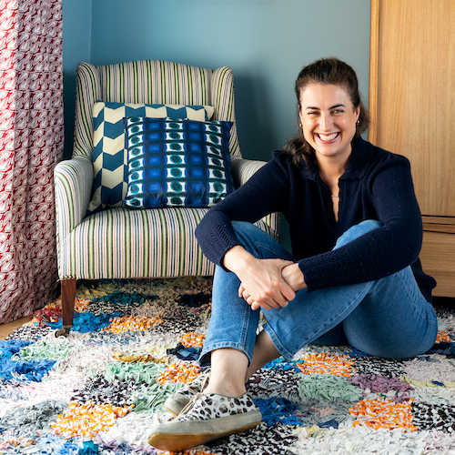
Kate Guinness began her career as a theatre set and costume designer – a background that profoundly influences her unique style. In 2016, she launched Kate Guinness Design, an international studio tackling residential and commercial projects. Her interiors exude a naturally layered aesthetic, artfully blending antiques, fabrics, color, and art.
Herbal Greens
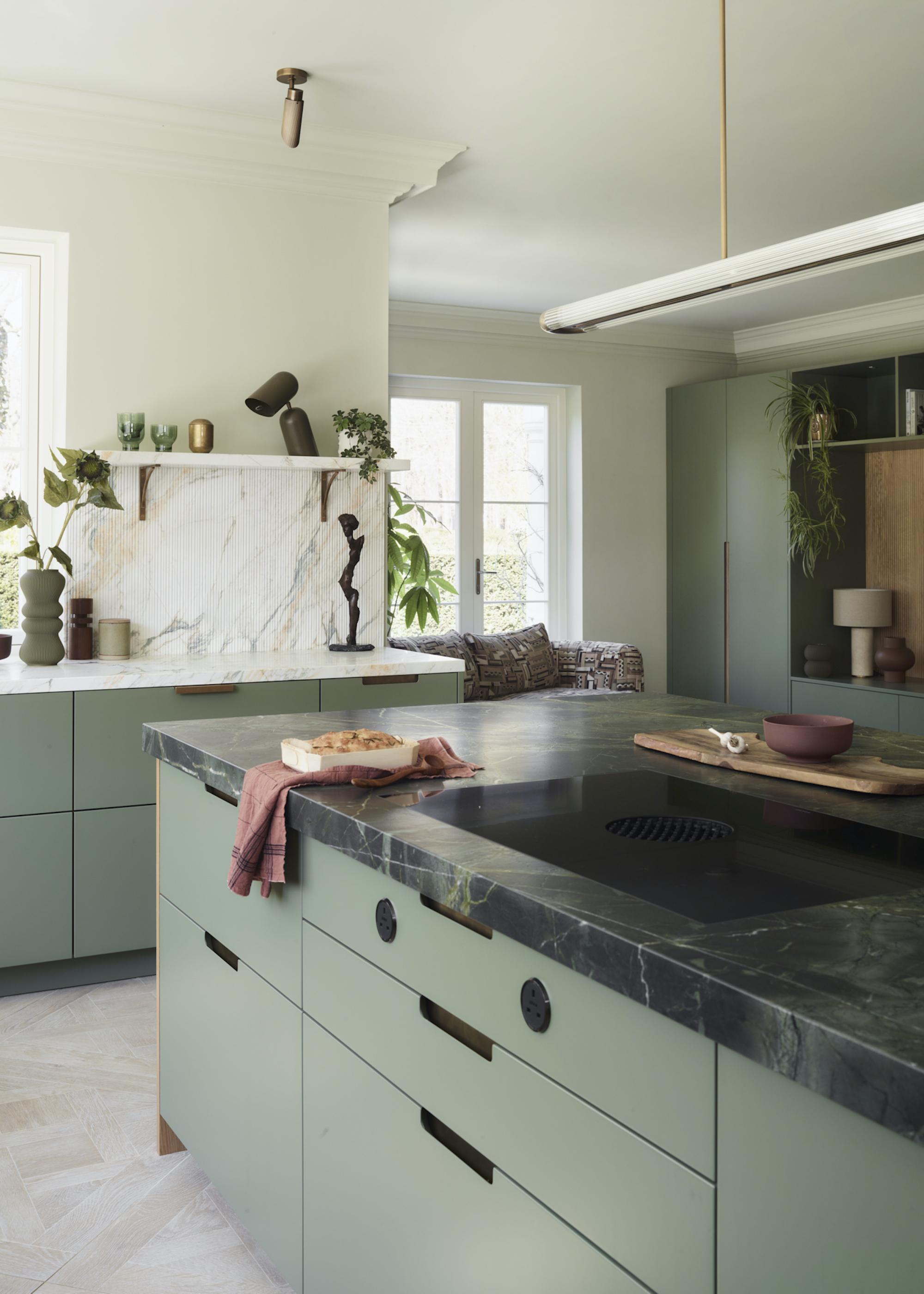
Herbie goes bananas in the kitchen this year!
Green kitchen ideas have dominated for years, but kitchen color trends 2026 are all about the softer end of the spectrum: sage, olive, eucalyptus, moss. These herbal tones feel calm, grounded, and quietly upscale; the opposite of the moody khaki and nearly black forest shades that came before. As ever, the paint world is backing the shift. Valspar’s Color of the Year for 2026, warm eucalyptus, is a warm, vintage-inspired green chosen for its ability to make spaces feel restorative and settled. Industry color reports echo this direction, spotlighting clean olives, fresh sage, and smoky fern as the shades to watch.
In kitchens, these greens excel on full-height cabinets, appliance walls, and generous kitchen islands. They’re at their best in matte finishes or lightly grained wood, where the color absorbs light softly rather than bouncing it back. Roundhouse senior designer Ben Hawkswell sees herbal greens becoming a long-term staple. “These greens have a natural warmth that makes a kitchen instantly more inviting,” he says. “They create atmosphere without overwhelming the room.”
This Roundhouse kitchen in Little Greene’s Sage, with a Verde Fantastico island countertop and Calacatta Monet marble along the rear wall, is a textbook example of how to get the herbal-green palette right. “The muted green cabinetry paired with stones that have soft green and gold veining gives the kitchen a depth you simply can’t achieve with plain white,” says Ben Hawkswell. “It feels refined and relaxed, and there’s a natural warmth running through the materials that makes the whole space more inviting.”

A Birmingham City University graduate, Ben joined Roundhouse in 2010 and is now a senior kitchen designer. Based at the Richmond showroom, for which he oversaw the recent expansion and remodelling, his work champions craftsmanship, sustainability, and bespoke designs that blend function with contemporary style.
Beige, But Make it Pale and Interesting
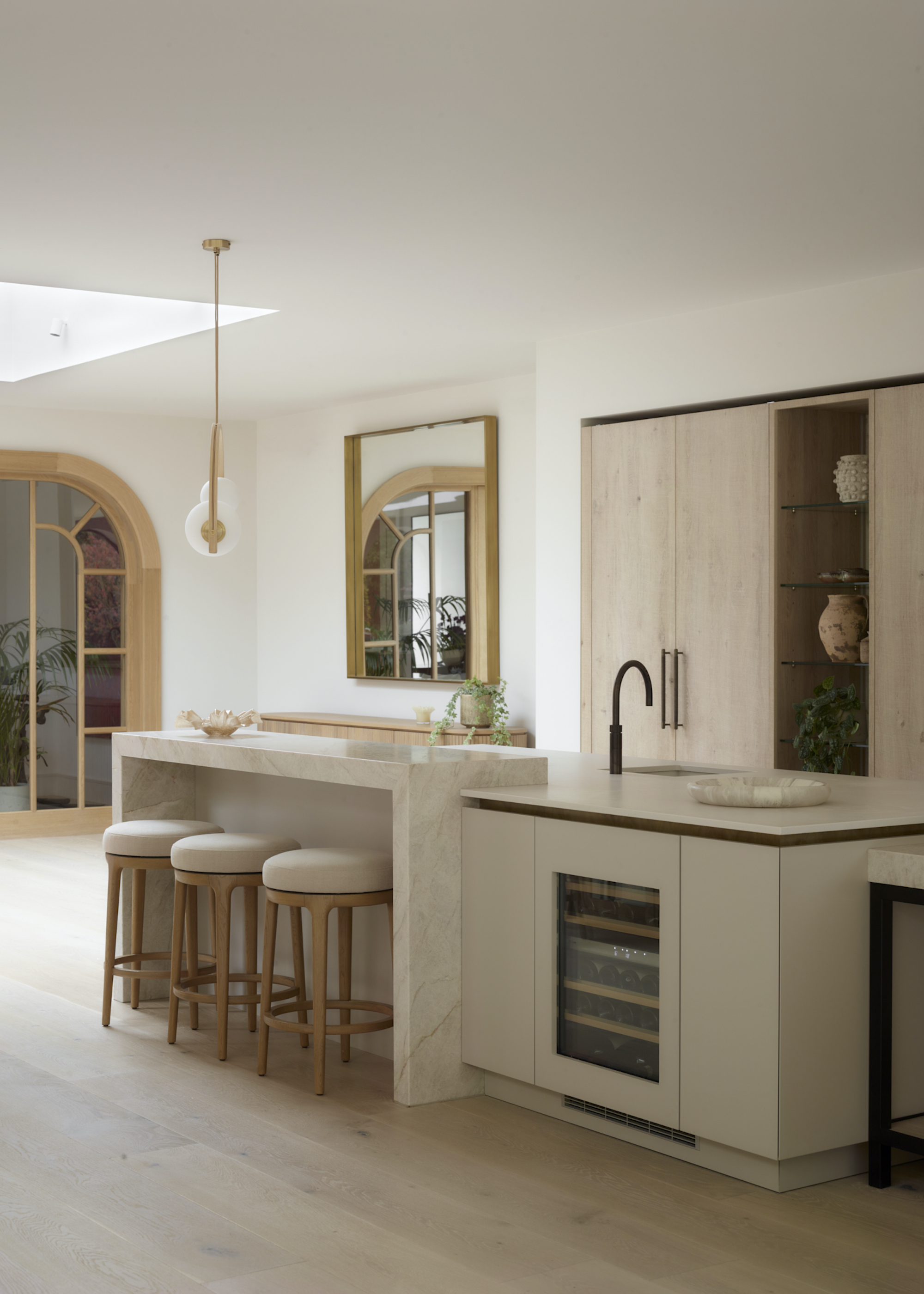
Boring? Not a chance! This year's favorite neutrals are stunning.
Neutral kitchen ideas for kitchen color trends 2026 have real depth. Instead of flat, lifeless stone tones, designers are gravitating toward light putty notes and complex pale beiges and greiges with subtle green, taupe, or red undertones, shades that shift gently through the day and never feel cold. These “character neutrals” are set to become the backbone of modern kitchen design, offering softness, architectural clarity, and long-term flexibility.
Kitchen makers are using them across mixed textures to keep things elevated. Think rough-sawn woods, matte lacquers, sculptural worktops, and metal accents that add quiet richness. The effect is cohesive and calm, a space that feels tailored and sophisticated.
This project shows exactly how the palette comes to life, pairing rough-sawn limed oak with matte lacquer in Cashmere Grey and Jojos White, Taj Mahal leathered quartzite, Cloudburst Concrete quartz, and antique brass handrails. “The beauty of these tones is how naturally they merge. You get contrast through material, not color, so the palette stays calm while the textures do the talking,” says Ben from Roundhouse.
These nuanced neutrals are also extremely adaptable. “If you choose a warm, textural base, you can update bar stools, hardware, or lighting every few years and the kitchen still feels current,” he adds.
Burgundy and Other Boozy Tones
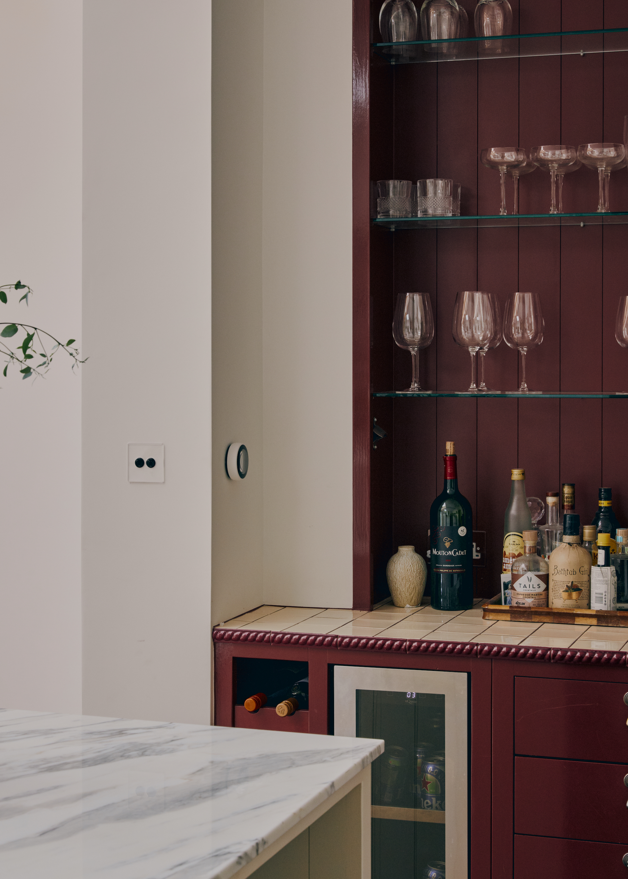
There's nothing wicked about COAT's on-trend Devil & The Detail burgundy hue.
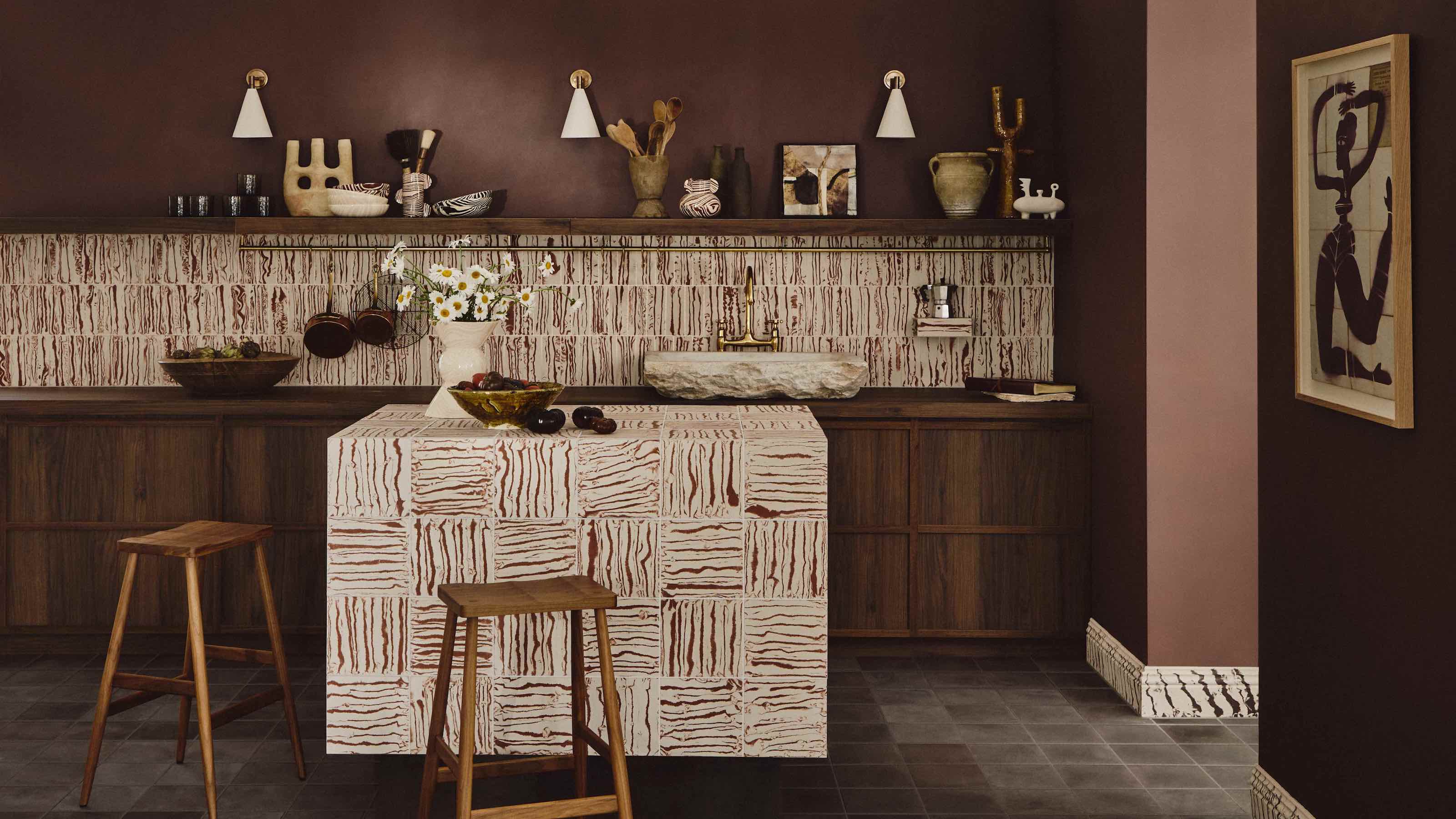
After years of red being avoided like the absolute plague in kitchens (too ‘80s, too McDonald's), deeper reds are emerging as one of 2026’s most confident kitchen shifts. Now, we're embracing colors that go with burgundy, such as wine tones and violet-tinged browns, bringing a warmth that feels familiar yet distinctly modern. “Wine tones are becoming a leading kitchen color for 2026,” says Rob Abrahams, founder of COAT Paints. “These deep burgundies bring richness that feels inviting but still contemporary. The right shades behave almost like a dark neutral, grounding a space while adding intention and atmosphere.”
COAT’s Smith & The Devil captures this mood: an earthy wine tone with depth but no heaviness. Fig-rooted browns such as Brasserie Brown and Gumption offer a softer take. “They have a subtle violet underpinning that keeps the color clear and stable, giving a sensual depth you don’t get from muddier browns,” notes Rob. “Wine colors sit naturally alongside contemporary stones, ceramic textures and brushed or matte metals,” he adds. The result is a palette that feels warm, architectural, and perfectly aligned with where kitchen design is heading in 2026.
The Rise of Quiet Color
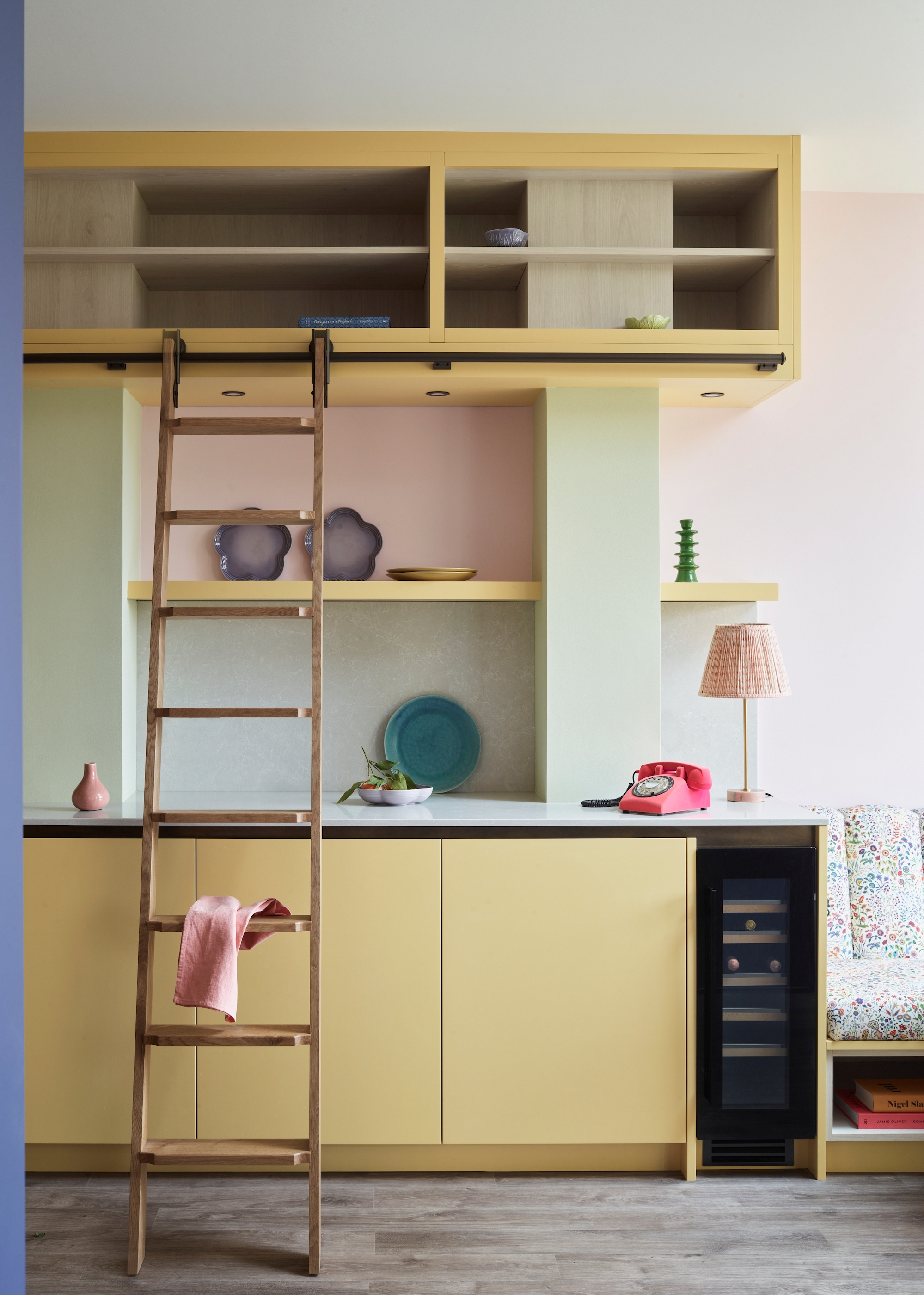
It's time to move pastels out of the nursery and into the kitchen.
Pale blues, butter yellows, and soft lilacs are stepping in as the new supporting players for 2026 kitchens. While bold cabinet colors dominate the headlines, nearly every major color forecast now includes a chalky pastel, a powdery blue, a soft periwinkle, or a diluted lilac that brings just enough color to feel intentional without overwhelming a space.
Paint companies are reinforcing the shift. Benjamin Moore's 2026 Color of the Year palette includes softer tones such as Raindance and Batik — a muted blue-green and a dusty mauve — that add subtle lift and work beautifully for walls or accents rather than statement cabinetry. The 2026 Sherwin-Williams Colormix Forecast also features a Frosted Tints palette described as “airy tinted pastels,” comprising soft blues, gentle greens, and lavenders.
In kitchens, these pastels blend quietly into the architecture: painted walls, plaster-wash ceilings, tiled backsplashes, or even the interior of a pantry. They pair especially well with soft greens, mocha tones, and natural stone, bringing a breath of cool air to palettes that skew earthy or saturated.
This kitchen by Makers is painted in pretty pastels by Mylands, specifically Golden Square, French Green, and Floris. “A pastel palette combined with contemporary cabinetry is so refreshing and fun,” says Lizzie Spinks, head of design, Makers. “If you’re going for a mix of pastels, keep the cabinet design sleek and understated to let the soft shades breathe.”
The magic is subtlety. Pale blues add clarity and freshness; lilacs introduce softness and a hint of modern romance. Used this way, pastels become the palette-balancers, the quiet, atmospheric tones that make bolder kitchen colors feel more refined and deliberate.
Mocha Is Here to Stay
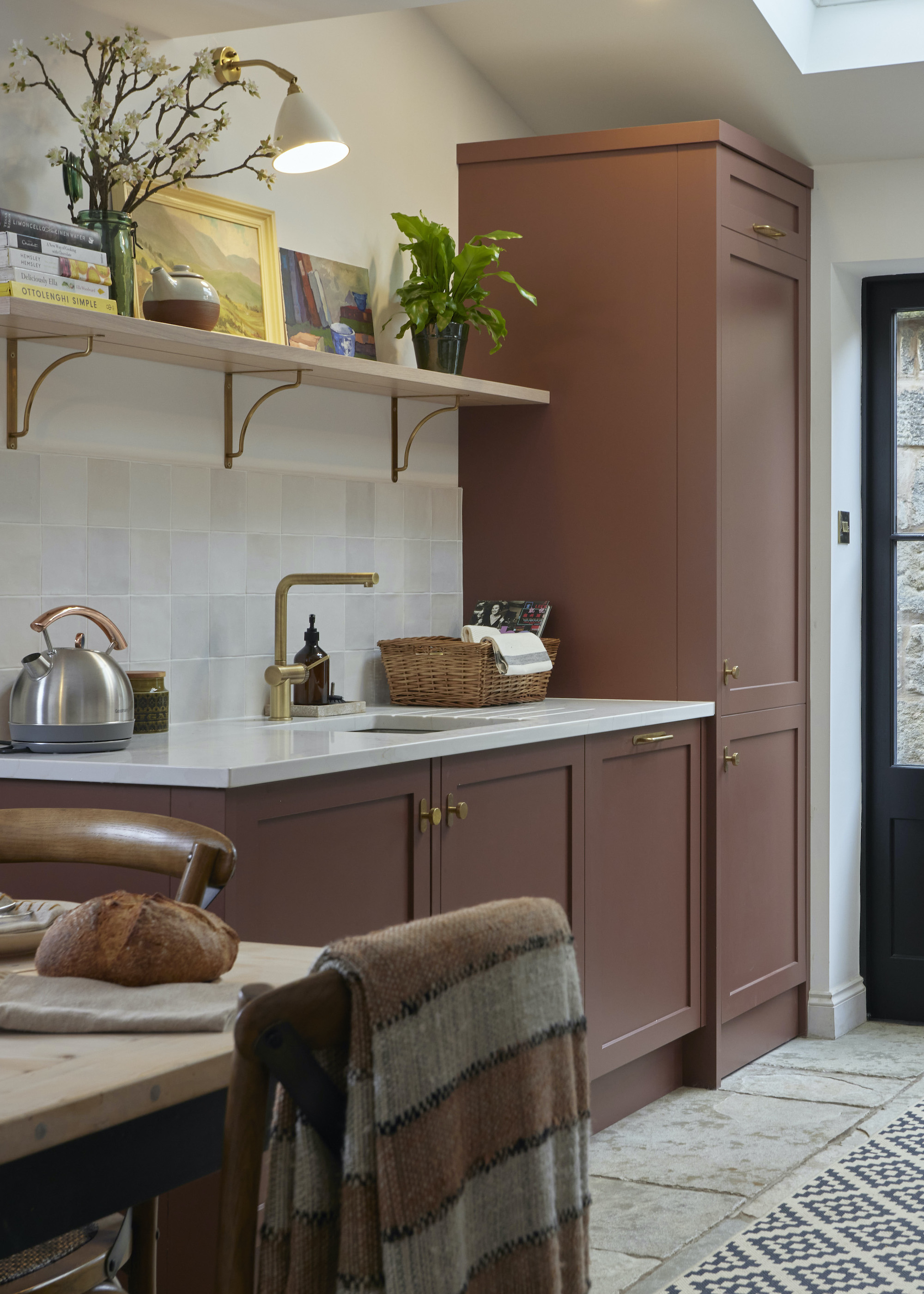
Paint & Paper Library's Masai ensures this simple Shaker kitchen by Woodhouse & Law is way ahead of the curve.
Unless you live under a rock, you’ll probably have heard that brown is officially back in kitchen color trends. Not the heavy mahogany of decades past, but soft, edible shades that feel lifted from a luxury fashion palette. Runways from Bottega Veneta to The Row and Saint Laurent have embraced chocolate, tobacco, and caramel tones, and kitchen trends are following suit. Pantone’s Mocha Mousse and Benjamin Moore’s Cinnamon Slate signaled the shift, and 2026 forecasts are now doubling down on cocoa, coffee, and warm tobacco hues.
The appeal is emotional as much as aesthetic. “Soft brown shades have long been an underrated color within interiors, but Mocha Mousse is really changing things up. This cozy and creamy coffee color has a rich modernity which inherently feels comforting and calming,” explains Damla Turgut, creative director, Otto Tiles & Design. “When used in a kitchen, this neutral and versatile hue with its pink undertones pairs effortlessly with other earthy shades such as peachy terracotta and soft white to create a sophisticated and elegant palette.”
Kitchen lighting ideas play a major role. Warm, layered illumination and matte or honed finishes prevent the palette from feeling heavy, while a lighter element — off-white wall cabinets or a pale micro-cement floor — keeps the scheme balanced. Used well, mocha-based kitchens make stainless-steel appliances feel more intentional and integrated, a real win in open-plan spaces where every detail is on display.
The founder and creative director of Otto Tiles & Design blends Turkish heritage with contemporary style. Born in Istanbul, she launched Otto in 2014 to redefine tiles with artisan craftsmanship. Now based in Miami, Damla’s designs uniquely combine traditional and modern aesthetics, making Otto a leader in the tile market.
White Kitchens Are Back!
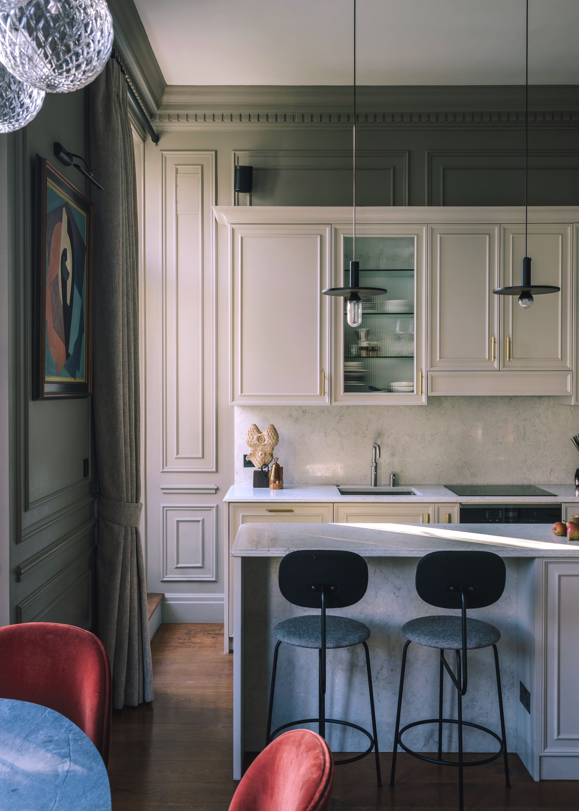
Pantone's controversial "non-color" is a keeper, whether you like it or not.
No kitchen color trend round-up would be complete without taking a look at Pantone’s Color of the Year 2026 — the shade that reliably influences fashion, interiors, and product design around the world. Pantone’s forecasts are so closely followed because they tap into global cultural shifts: what we are craving, what feels fresh, and the colors that will be steering the aesthetic direction of interiors in the year ahead.
For 2026, Cloud Dancer, a soft, chalky white, is set to see white kitchens make a big comeback. “White is often seen as neutral, but it’s actually all the colors in one; white is a prism, not an absence of color,” says interior designer Erik Munro. “For me, it’s less about being a color in itself and more about what it allows to happen around it.”
Used on kitchen cabinets, walls, or even plaster hoods, it acts as a calming canvas that sharpens everything placed against it, from veined marble and warm metals to graphic tiles and expressive woods. “It brings visual clarity and permits one to pause, creating space for other elements to breathe. It's quiet but incredibly intentional,” says Erik. In a decade defined by bold kitchens, Cloud Dancer suggests the most modern move might be a return to white kitchens.
Erik Munro is a London-based designer whose Fitzrovia studio specializes in refined residential and hospitality interiors. Drawing on his fashion background and upbringing on Vancouver Island, he brings a romantic, detail-led sensibility to projects worldwide. Founded in 2015, his studio elevates everyday living through thoughtful, beautifully crafted spaces.
FAQs
What One Color Should We Avoid in 2026 and Why
If there’s one shade designers are unanimously cooling on for 2026, it’s the chilly grays that dominated the last decade. Once considered the last word in sophistication, they now feel old and dull — out of step with the richer, more tactile palettes shaping the year ahead. Designer Jessica Whitley agrees. “I’m avoiding the cold, bluish grays that once felt modern but now read sterile,” she says. “2026 is all about depth, texture, and richer, earth-driven color stories.”
Her pick for a more forward-looking alternative is Behr’s Hidden Gem, a complex blue-green. “Hidden Gem brings a moody sophistication to the kitchen that’s rich enough to feel dramatic, yet grounded in nature,” Jessica explains. Used on cabinetry, it creates instant atmosphere while remaining versatile. “I love using it with warm brass hardware and creamy stone to balance its depth,” she adds. The shift is clear: cool grays are out, characterful, grounded color is in.
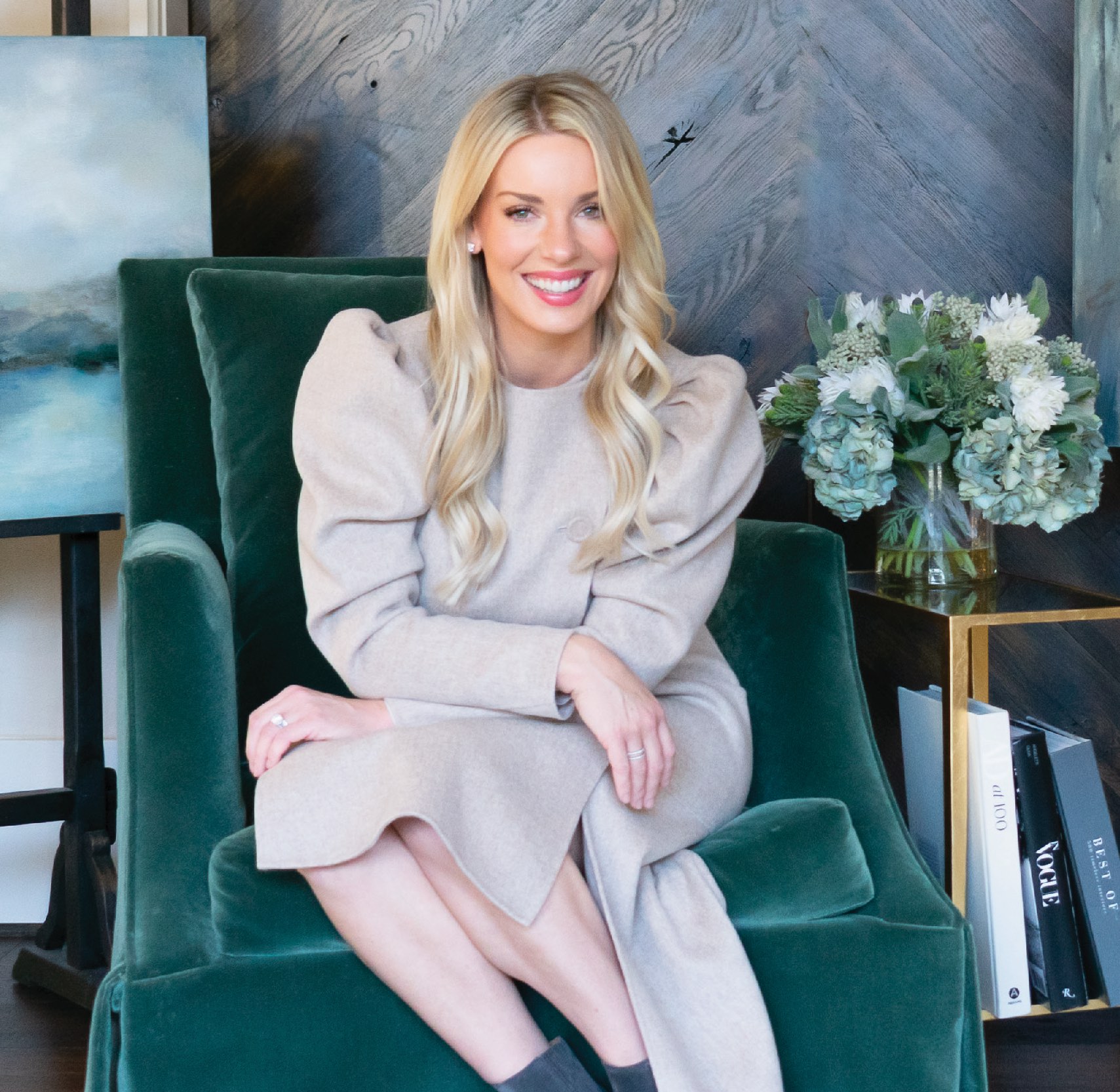
Jessica Whitley is the Lead Designer and Creative Director of Jessica Whitley Studio, a Georgia–based firm known for its warm, approachable luxury. With roots in art, finance, and hospitality design, her award-winning work spans residential and commercial projects from Athens to Aspen. Jessica’s philosophy centers on crafting beautifully livable spaces shaped by detail, depth, and human experience.
These emerging hues prove the kitchen is fast becoming the boldest room in the house. If you’re craving more chromatic inspiration, don’t miss our deep dive into the next big home décor color trends shaping interiors.

Linda is a freelance journalist who has specialized in homes and interiors for more than two decades, and now writes full-time for titles like Homes & Gardens, Livingetc, Ideal Home, and Homebuilding & Renovating. She lives in Devon with her cabinetmaker husband, two daughters, and far too many pets, and is currently honing her DIY and decorating skills on their fourth (and hopefully final) major home renovation.


