In Defence of Pantone's Color of the Year — When Did It Become Cool to Hate on Painting Walls White?
Perhaps the most shocking reveal of a Color of the Year yet, I'm certain Cloud Dancer is going to draw some undeserved criticism from the mob, yet it's all I want to paint my home

The Livingetc newsletters are your inside source for what’s shaping interiors now - and what’s next. Discover trend forecasts, smart style ideas, and curated shopping inspiration that brings design to life. Subscribe today and stay ahead of the curve.
You are now subscribed
Your newsletter sign-up was successful
I'll be honest, I was shocked when I opened an email revealing what The Pantone Color Institute, the world's eminent color forecasters, had chosen for its Color of the Year for 2026.
And I've been in the trenches. I was there for the eye-watering Ultra Violet, and when the color prediction went rogue with a gray-and-yellow duo in Ultimate Gray and Illuminating. But still, 2026's Pantone Color of the Year, Cloud Dancer, really is going to make waves — just perhaps not in the way we'd usually expect.
I'm sitting, writing this response to Pantone's pick under a strict NDA, so no, I haven't seen what the world has yet made of this soft, warm, off-white as the 'color' that trend forecasters say will define the year to come, but I do know this: certain corners of the internet are not going to be happy. It's been a recurring theme I've seen on social media, in recent times — I'm calling it 'color shaming'. It's become an easy way to score points in saying that white walls are boring; that they're an absence of color, rather than a choice in their own right. I can tell you from the front line (getting weekly reports from Livingetc's social media editors) that bright, vibrant, and color-saturated rooms will score you thousands more likes and interactions than a white room will on Instagram.
Article continues belowBut the reality is that this isn't how the vast majority of people decorate. Even as someone who appreciates color, and as an editor who spends all his days looking at the work of designers who wield it in extraordinary and exciting ways, I still don't want to paint my own home anything other than white.
Is white just 'nothingness'? An absence of color? No, not to me. And, I spoke to some interior designers and color trend forecasters who aren't afraid of using white in their designs to better understand what design and culture's relationship with this shade really is.
Choosing White
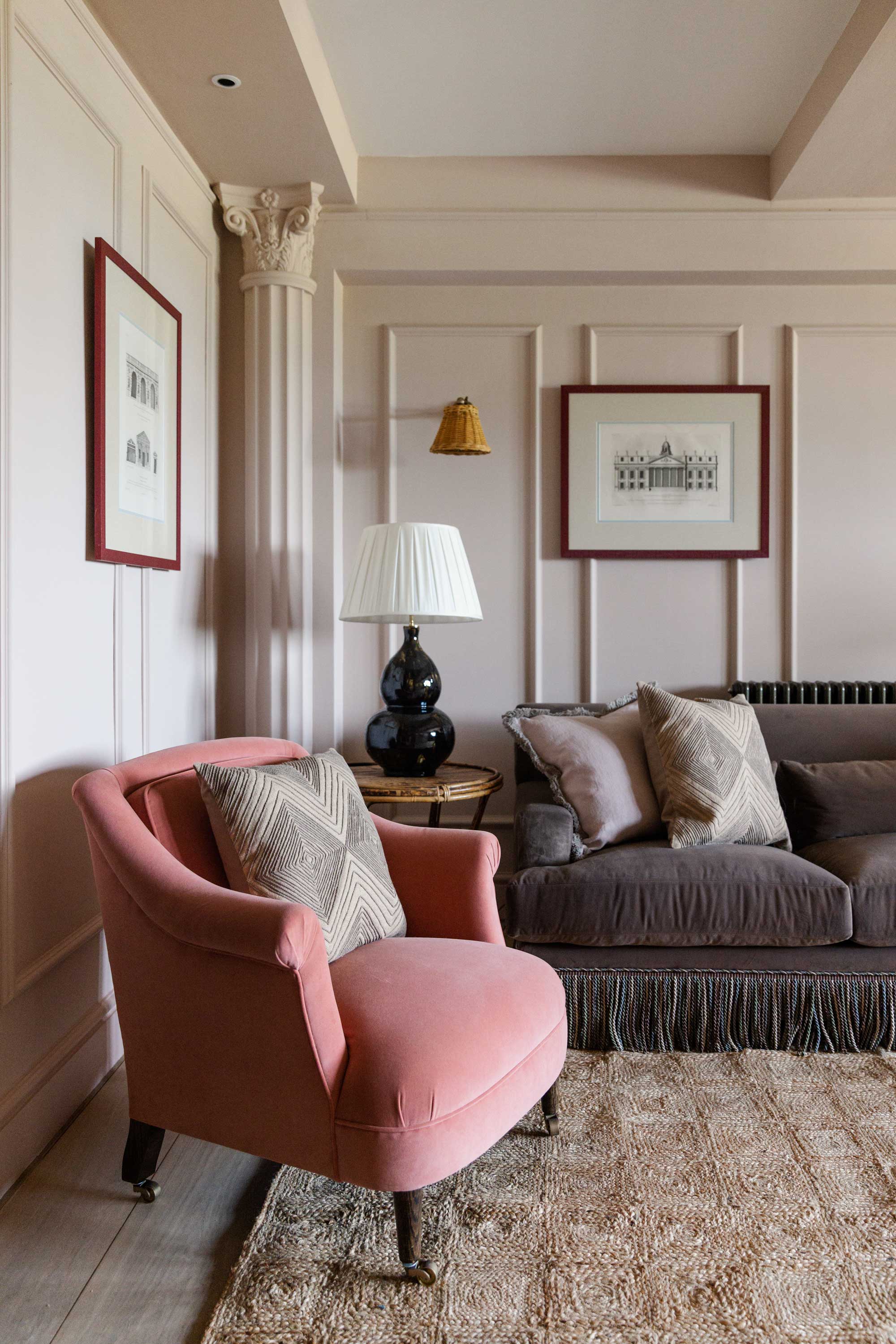
"White, for me, is never a neutral absence; it’s a living surface," says Lucy Barlow.
When I first had a home that I could decorate myself, and even in my first experiences of interior designing spaces for other people, I always felt I had to introduce a wall color. It felt like a necessity to show I was actually making a change, especially given that white-painted rooms are often the starting point. However, it took me some time to understand that there's a difference between white paint as the builder's default and what could be achieved by exploring the nuance of decorating with white.
"White is never a default for us; it’s a deliberate choice," interior designer Lucy Barlow, founder of Barlow & Barlow, tells me. "We tend to reach for it when a room needs breathing space, or when the architecture wants to speak quietly rather than compete with color. If a client is drawn to a layered, textural palette, white can become a brilliant backdrop that allows materials, joinery, and art to take the lead. Equally, in homes where there’s generous natural light, white can make everything feel calmer and more expansive without feeling cold or minimal."
The Livingetc newsletters are your inside source for what’s shaping interiors now - and what’s next. Discover trend forecasts, smart style ideas, and curated shopping inspiration that brings design to life. Subscribe today and stay ahead of the curve.
I have wondered whether the discourse I see on social media about painting walls white belongs in the realm of a loud online minority; more of an internet-centric viewpoint than something that permeates more widely. I ask interior designer Filippo Calvagno, founder of Studio Calvagno, whether he ever gets pushback when suggesting white to his clients. "There really isn’t any project where I don’t use white," Filippo tells me. "I’ve never had a client question it. I actually get more reactions when I present darker tones."
Filippo says he still sees lots of clients who are afraid of color, but that doesn't mean that white isn't a purposeful, impactful choice for his decorating schemes. "For me, it’s always about choosing the right shade of white as the neutral — the one that works for the space, the architecture, and the way the light interacts with it," he says.
Where Is White in the Trend Cycle?
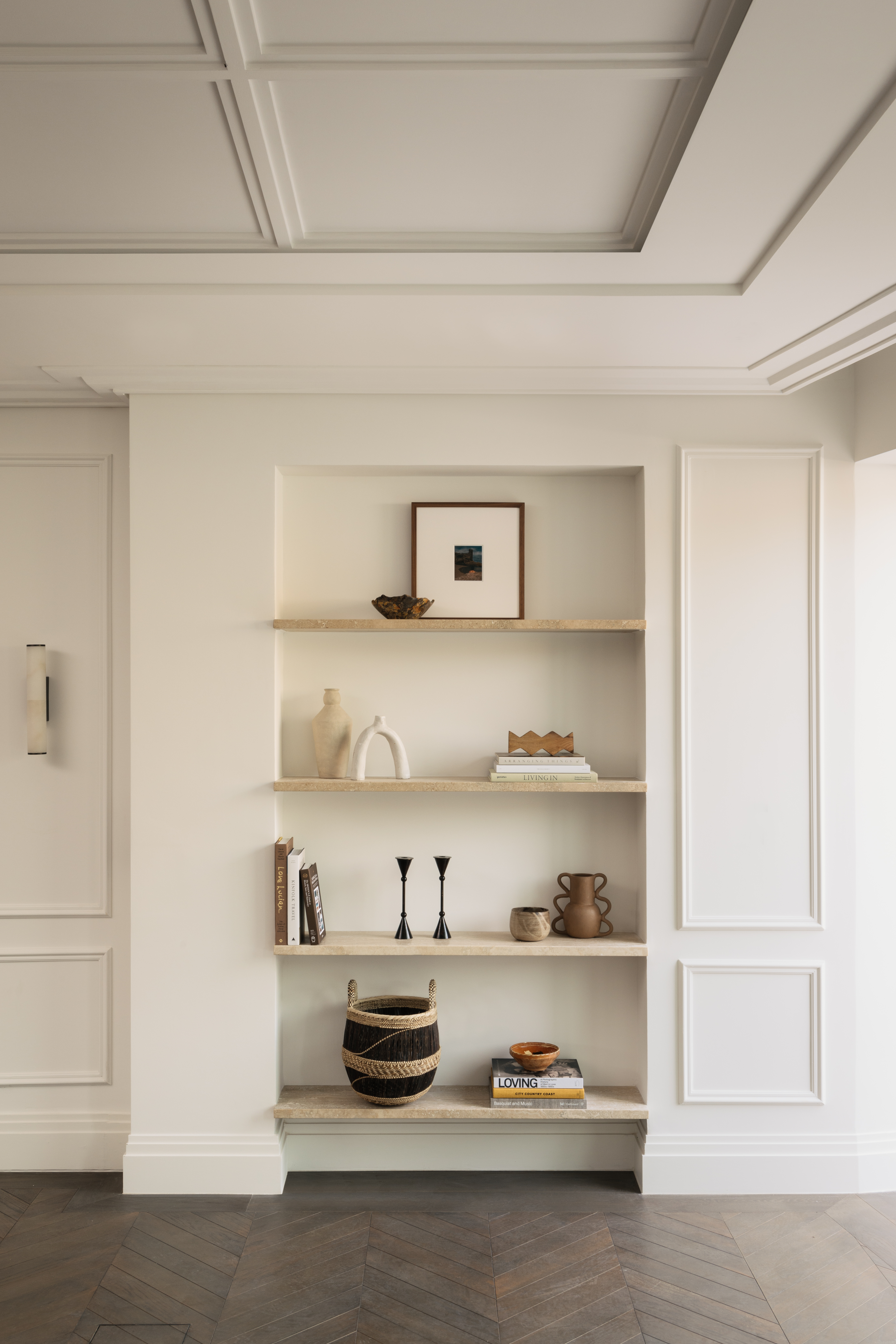
"White allows the materials and other colors in the space — art, textiles, and furniture — to become the main focus," says Filippo.
If you hang around long enough, you get to see the trend cycle of white and color firsthand. In my early teenage years, the script flipped in my childhood home, where walls painted (or more precisely rag-rolled) in rich terracotta shades were unceremoniously replaced with a white color scheme throughout the house.
In more recent times, we've seen ideas such as color drenching — painting walls and ceilings all in one color, largely excluding white — and a bolder use of color in interiors that I can say is entirely reminiscent of my late 90s/early 00s interior design memories. With Pantone choosing an unexpected off-white in Cloud Dancer for 2026, are we about to see that cyclical tipping point in white's favor?
"We’ve been through a long period of people craving calm, simplicity, and a sense of reset, and white has naturally become a language for that," color forecaster Anna Starmer of Luminary Colour. "It offers breathing space, particularly in a world that feels visually and emotionally saturated."
"But the 'trend' isn’t really about minimalism," Anna adds. "It’s about people wanting rooms that feel restorative, and white, when used with intelligence and sensitivity, can deliver a kind of chromatic quiet that people instinctively gravitate towards. At the same time, we’re seeing a move away from cold, blue-based whites to warmer, more natural tones, whites with clay, chalk, or linen-like undertones."
Does White Have Emotion?
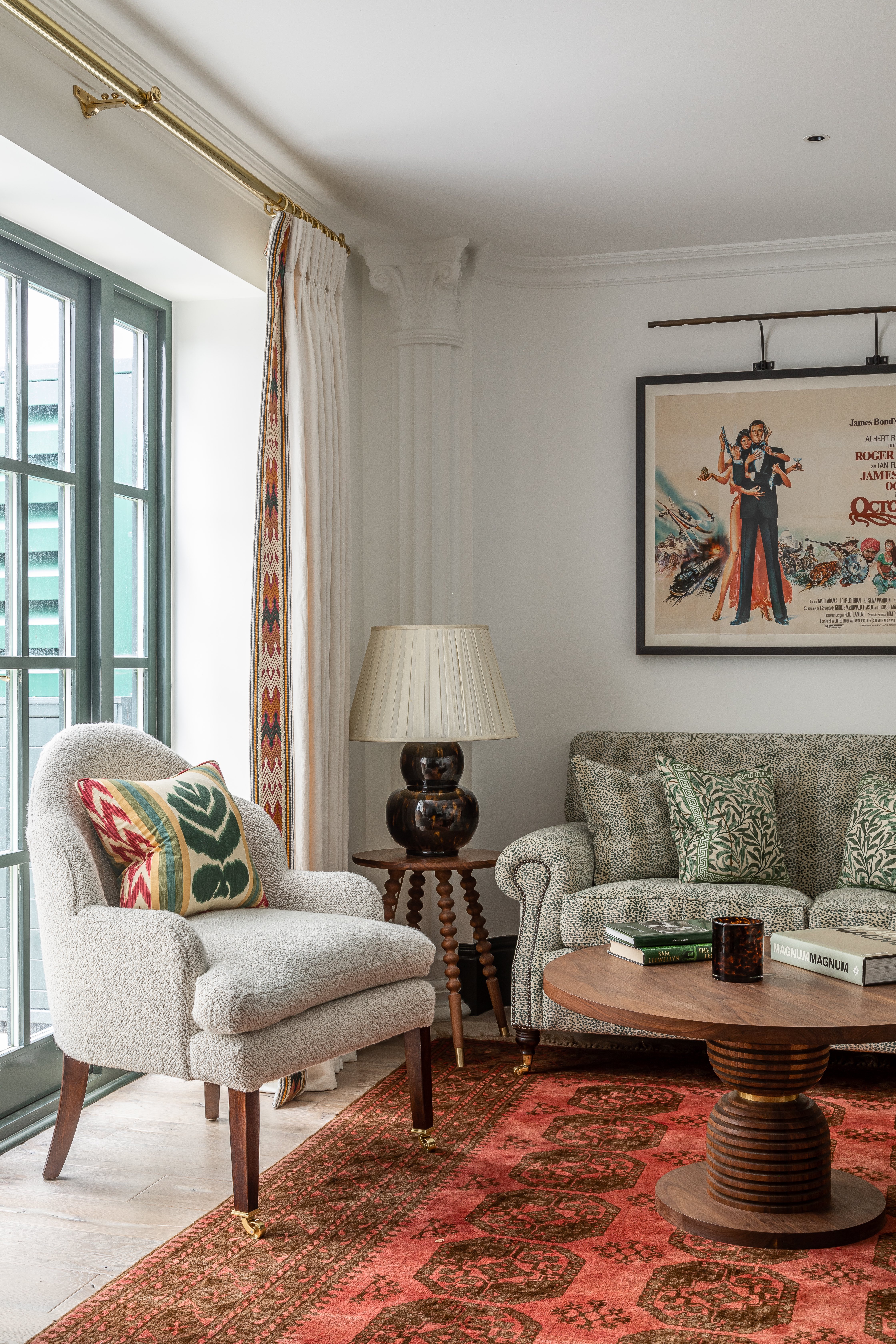
"My relationship with white is always contextual," says Anna Starmer. "I think about how the light moves through a room over the day, the textures in the space, and the natural world outside the windows. White isn’t static, it’s a colour that responds."
I'm circling back to this idea that choosing white is the act of not making a choice in regards to color. The people who say it, I'd suggest, have never spent hours literally watching paint dry — swatches of countless different white paints — trying to find the one that speaks to the emotion of the room.
"White, for me, is never a neutral absence; it’s a living surface," Lucy Barlow explains. "What excites me about white is how expressive it can be. People think of it as neutral, but actually it has an incredible ability to shift the mood of a space; it can feel crisp, warm, chalky, soft, luminous. When used well, white becomes a kind of quiet confidence in a room. It’s the pause that lets everything else breathe."
When we think in the realm of color psychology, there's perhaps the notion that the emotions that white represents are not strong ones. Red is anger and passion; greens and blues are soothing, natural, and restful, as examples at each end of the spectrum. White, maybe, is more introspective in its emotional resonance, but in its balance, it offers its own power.
"White is hugely emotive; it can conjure calm, clarity, and stillness in a way few colors can," Lucy says. "It’s also incredibly nostalgic; we all have our own associations with white, whether that’s old plaster, summer light, or the simplicity of a childhood bedroom. When it’s handled thoughtfully, white can feel surprisingly intimate and deeply grounding."
Just as in shades of other colors, Anna Starmer says that the emotion of white isn't one-dimensional. "A soft, warm white can feel nurturing and gentle, like morning light; a crisp, bright white can feel invigorating and architectural; and a chalky, mineral white can create contemplation and calm," she says. "We often talk about color as emotion, but white holds just as much depth. It’s the colour that shapes atmosphere more quietly than any other."
What Makes a Good White Paint?
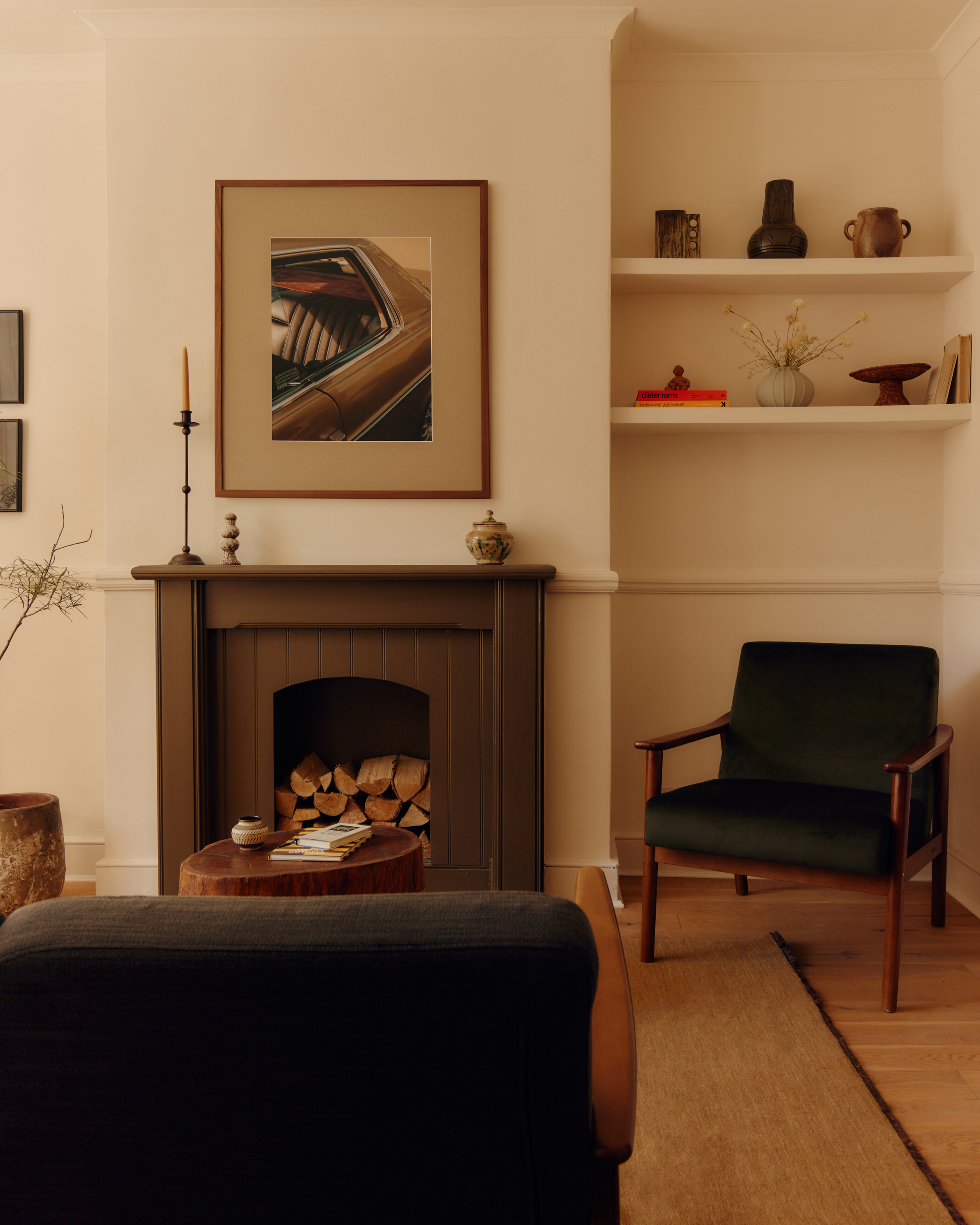
"If a room has a lot of windows and I want the view or nature to speak for itself, I’ll choose white so it doesn’t distract from that," Filippo explains.
I didn't want to dwell on offering you advice for how to decorate with white in your home — we have enough on that on the site already — but I do want to acknowledge that Pantone's Cloud Dancer is not just 'white', it's a very considered, specific warm off-white, one that Anna Starmer describes as 'feeling more human' than colder toned whites.
So, what makes a 'good' white in design? "A warm white. There’s nothing worse than a white paint that has a blue tint and makes a room feel cold. I always look for an undertone with warmth," Filippo explains. "My go-to white or neutral for years has been Dimity by Farrow & Ball, as it’s a great color that really changes with the light. When the sun hits it, it almost takes on a yellow-beige tone, which beautifully warms up a space."
For Lucy Barlow, it’s all about tone. "A good white needs depth; it should never feel flat or sterile," Lucy says. "We look for whites with subtle undertones: a hint of gray, a whisper of pink, a soft creamy warmth. Those nuances mean the color behaves beautifully in different lights throughout the day," she adds. "Texture also matters; a chalky or slightly matt finish can give white an exquisite richness."
It's perhaps a little telling that the initial shock I had discovering Pantone's Color of the Year was a shade of white quickly ceded to exhilaration. I clicked to open the email expecting either an electric, eyepopping color that I'd spend the next few days devilishly searching for rooms painted in; or else something super-restrained and calm that didn't tell me something new about 2026. Cloud Dancer manages to be at once such an ordinary and such an extraordinary choice that I can't help but admire Pantone's boldness.
It's a talking point, yes, but also an acknowledgement that there's more to white as a color than not decorating with color at all, and that, actually, it might be the most nuanced and interesting.

Hugh is Livingetc.com’s editor. With 8 years in the interiors industry under his belt, he has the nose for what people want to know about re-decorating their homes. He prides himself as an expert trend forecaster, visiting design fairs, showrooms and keeping an eye out for emerging designers to hone his eye. He joined Livingetc back in 2022 as a content editor, as a long-time reader of the print magazine, before becoming its online editor. Hugh has previously spent time as an editor for a kitchen and bathroom magazine, and has written for “hands-on” home brands such as Homebuilding & Renovating and Grand Designs magazine, so his knowledge of what it takes to create a home goes beyond the surface, too. Though not a trained interior designer, Hugh has cut his design teeth by managing several major interior design projects to date, each for private clients. He's also a keen DIYer — he's done everything from laying his own patio and building an integrated cooker hood from scratch, to undertaking plenty of creative IKEA hacks to help achieve the luxurious look he loves in design, when his budget doesn't always stretch that far.